La Oficina del Parque by Studio Ingrid Picanyol
Opinion by Eleanor Robertson Posted 23 May 2023
Last month @designershumour shared a meme titled, ‘When I ask my client to send their logo in vector format’. The god-tier client supplies logo.ai, from which point there’s a sliding scale of disgust and incredulity from logo.psd to logo.jpg and logo.doc. The punchline is logo.xls. The joke resonated, attracting over 30k knowing likes (or eyerolls). At one point or another, we’ve all been there.
The meme is also funny because the Microsoft software triumvirate is every designer’s nemesis. While Word is begrudgingly used for functional letterheads, Powerpoint design is notorious for being the shit end of the stick. The idea of tapping into the graphic potential of Excel, however, would be so degrading that it’s unfathomable, ridiculous – the ultimate punchline.
There’s an irony, therefore, in Barcelona-based Studio Ingrid Picanyol’s modular identity for La Oficina del Parque (‘The Park Office’). The café is popular with local freelancers – a place to grab a cup of coffee while working in a comfortable, leafy environment – and so the design team asked themselves, ‘What first comes to mind when you think of an office?’
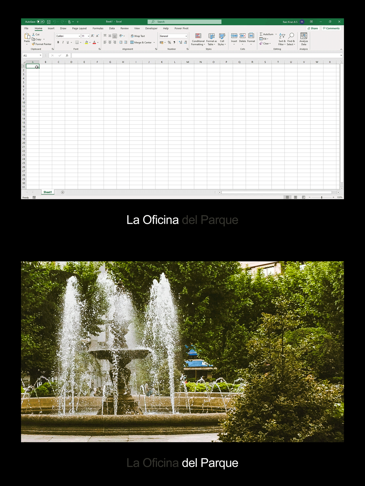
While it’s hard to judge the tone of the work, the answer to this question is implicitly scathing, for the office can be neatly summarised by ‘the iconic visual language of the Microsoft Office Excel programme’. Lol. There are other hints that there’s a deadpan prankster at work. The target audience, for example, is described as ‘digital nomads’, which surely invites scepticism, if not outright cynicism (see also ‘hipsters’ and ‘foodies’). Surely?
But then, perhaps the office is not the antithesis to the design studio after all, because in the unlikeliest of places Studio Ingrid Picanyol has discovered some smart sans serif typography and a robust grid. And it’s made it look beautiful, proving the truth of the saying ‘a bad workman blames his tools’. I’d love to see what Picanyol and team could create with Clip Art and Comic Sans, or how they’d approach designing a website in Photoshop.
The studio has taken some creative licence with the parameters of the interface. Arial hasn’t been the default font in Excel since 2007 when it was replaced with Calibri, but it’s a sensible substitute (if Arial is a poor man’s Helvetica then Calibri is a madman’s). More disappointing is that none of the colours are part of the standard spreadsheet theme, though the groovy orange and cornflower blue do come close to existing swatches. This feels like a bit of a cheat, though I am a fan of the palette, which is both soothing and striking (muted shades of olive green and subtle beige with vibrant pops suit the park locale / digital haven).
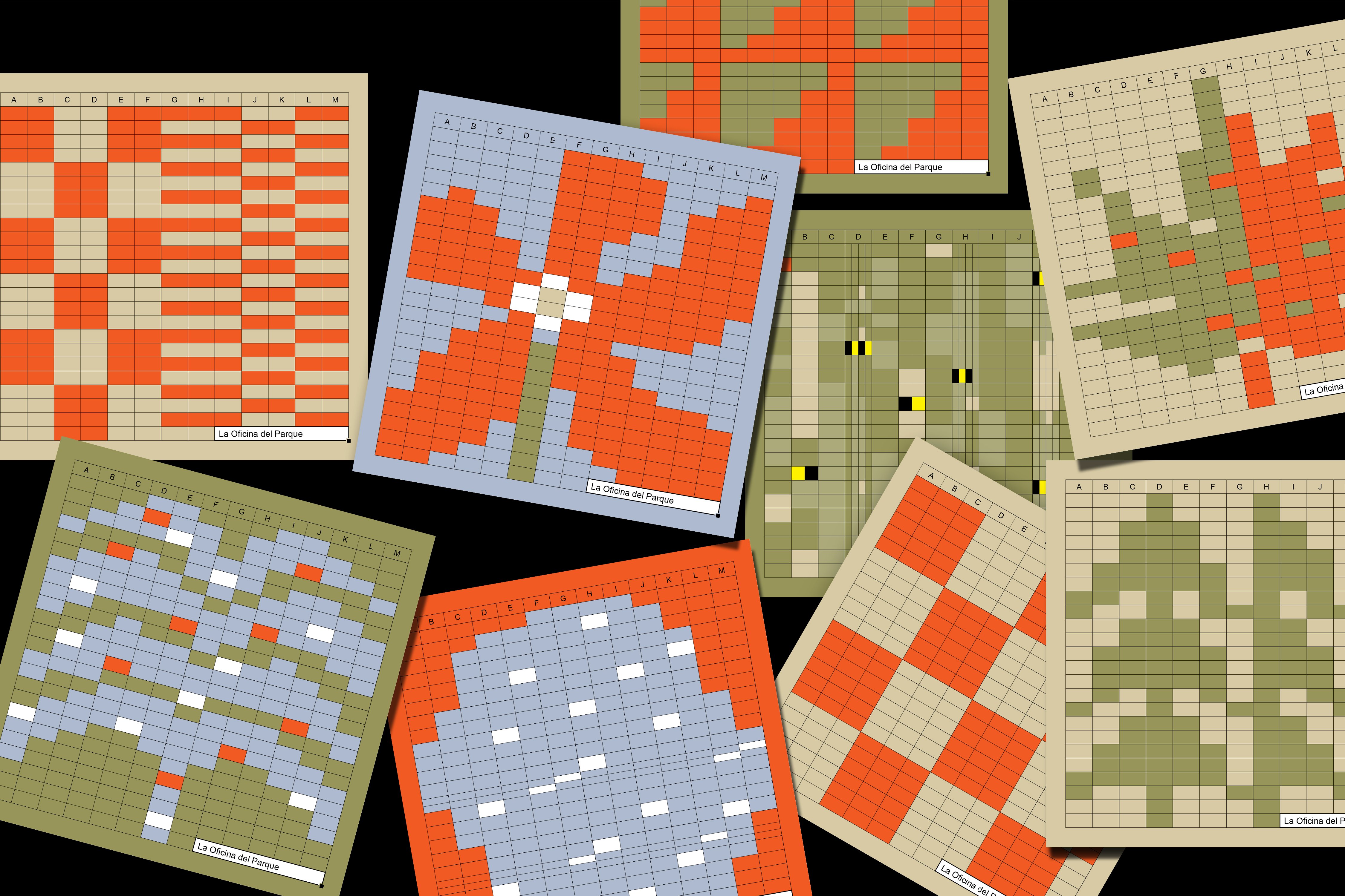
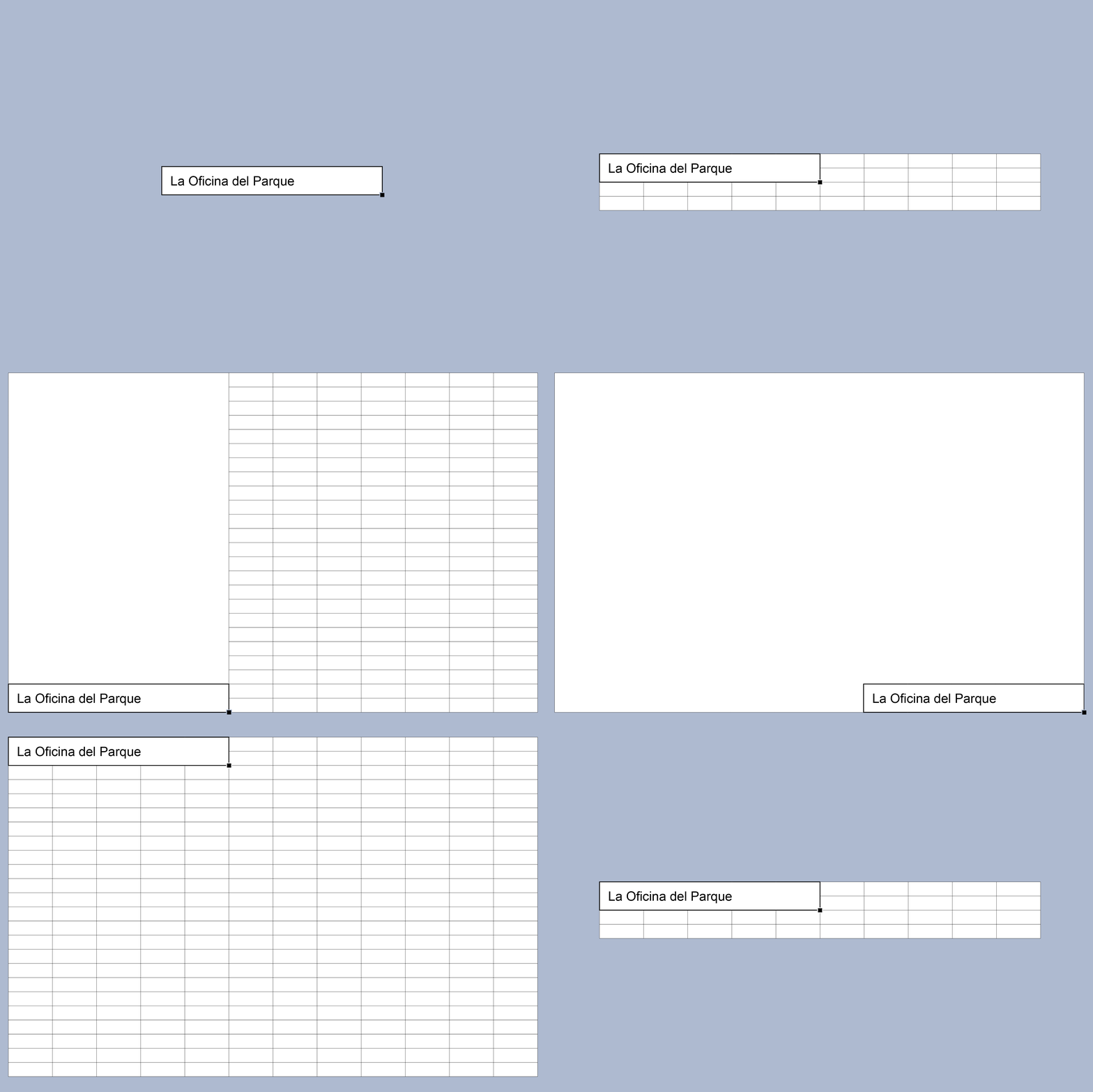
These aspects aside, the design approach is authentic to the software’s essence and is singular in focus. Excel’s columns and rows provide a ready-made, versatile system that can adapt across print and digital applications. Leveraging the grid as a foundation, data cells are treated as building blocks, a bit like Lego. These components are arranged into graphic layouts that reference the surrounding park, such as leaves, flowers, bees and a fountain.
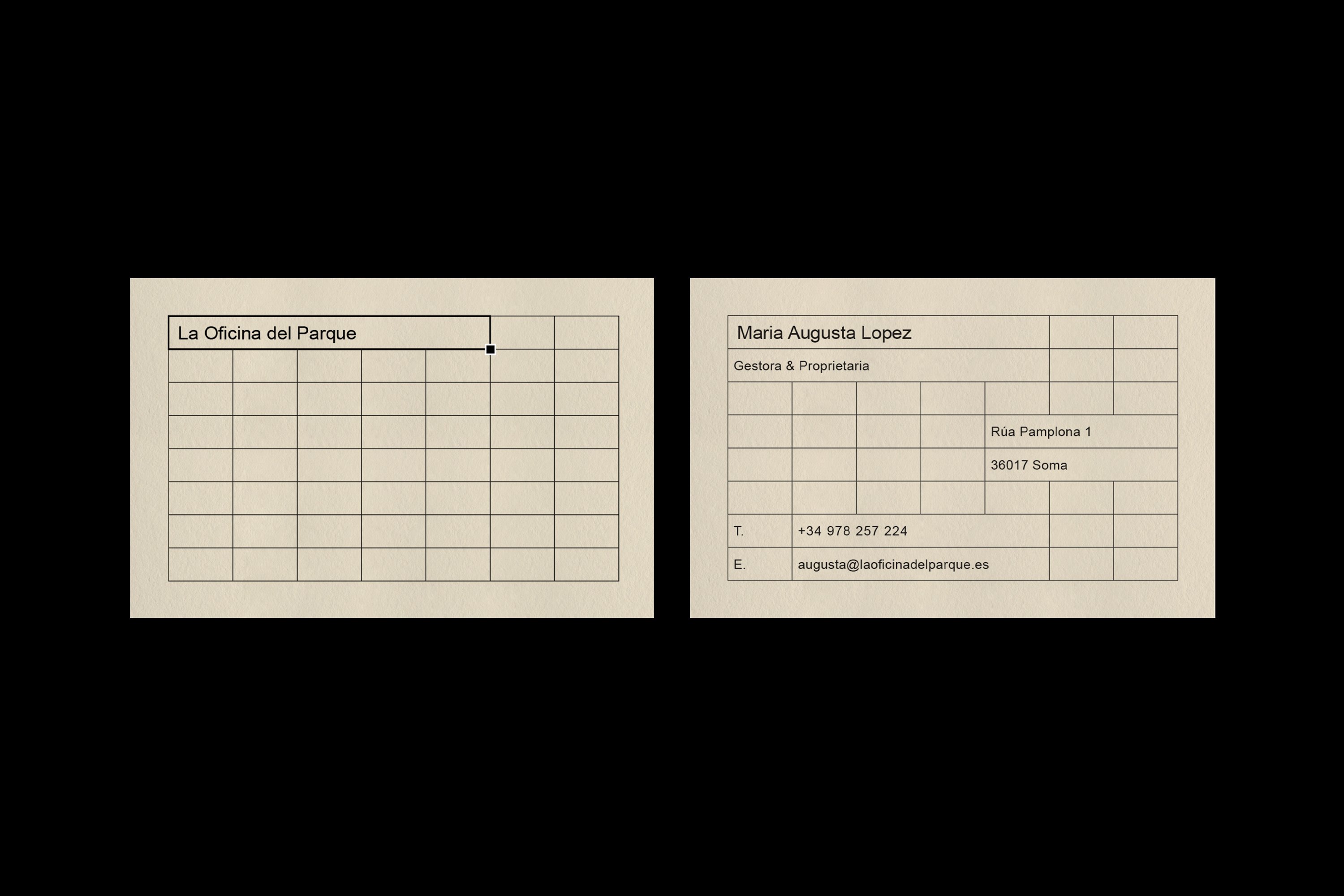
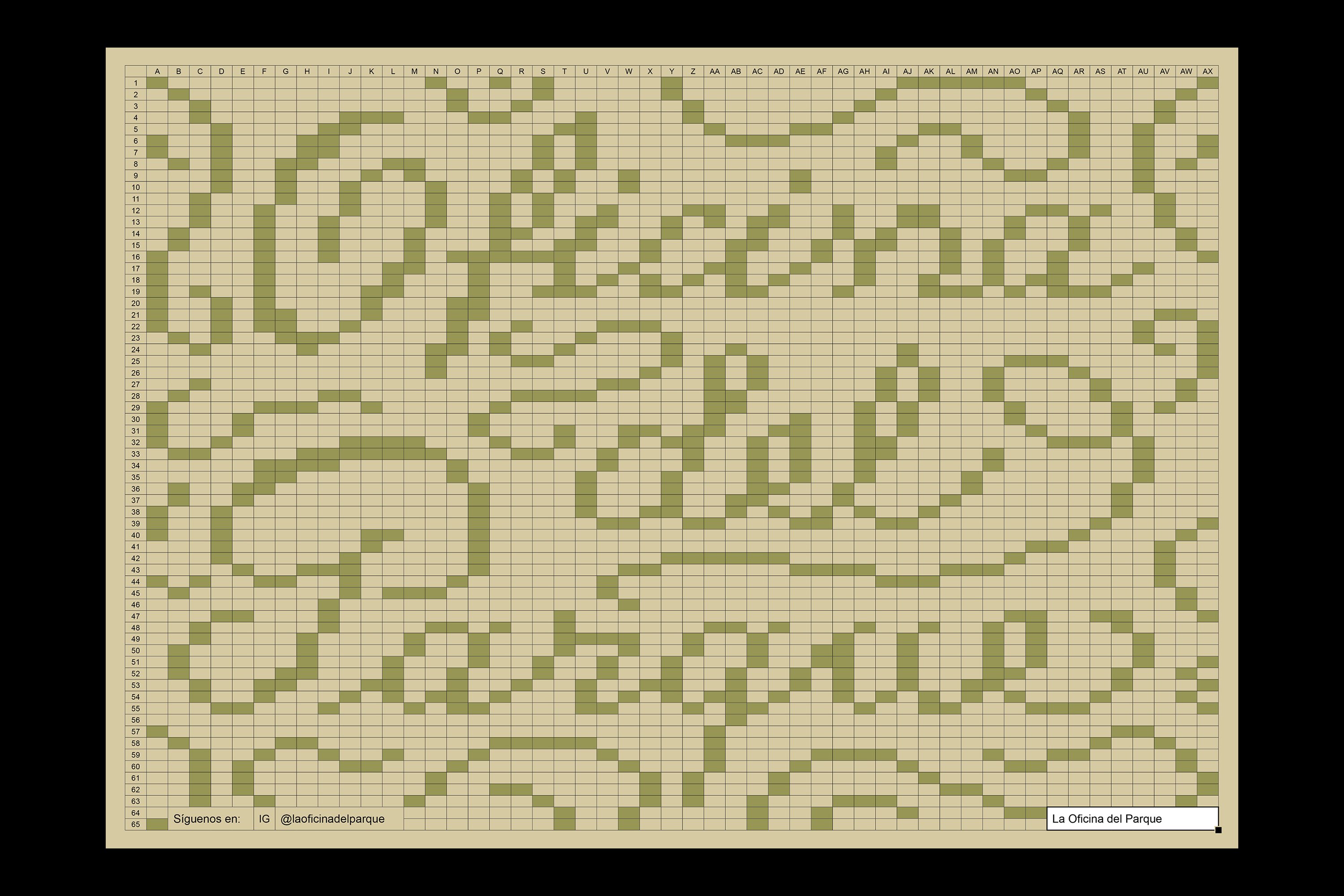
The modular approach is extremely pleasing in its simplicity. Among other things (pixel art, mosaic, cross-stitch), I’m reminded of Christoph Niemann’s mural for Wannsee train station in Berlin, which epitomises the beauty of abstraction. In this piece as much as his Sunday Sketches series, Niemann demonstrates how embracing economy can yield more powerful and distinctive work. Restriction – whether of tools, medium or colour – does not inherently stifle creativity and can, in fact, be a catalyst for innovation and creative problem solving.
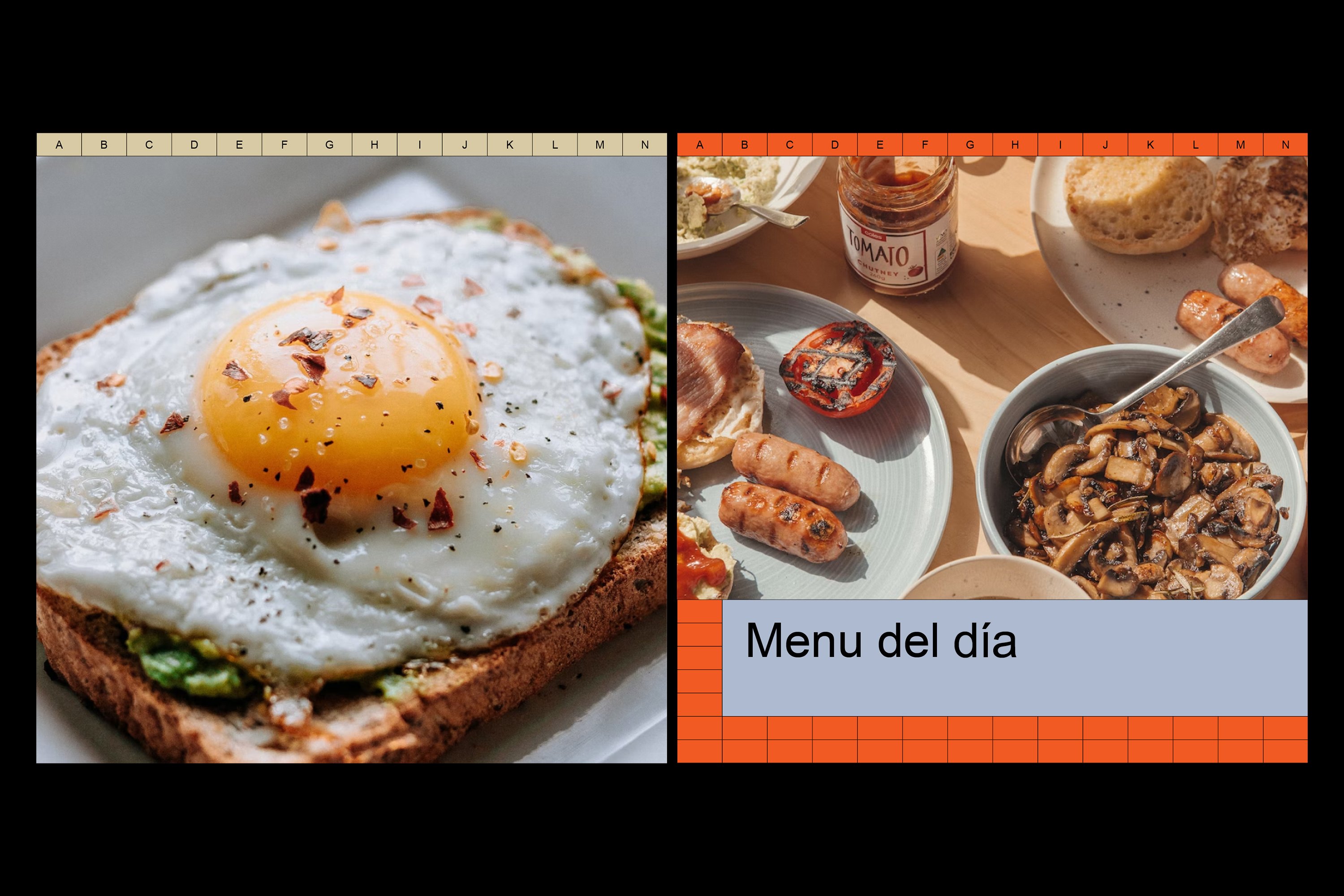
To this point – alongside the playful illustrations, Studio Ingrid Picanyol has used the grid to explore decorative typographic compositions for placemats, and to create coasters, business cards and menus (a table of costs). The flexible format also allows for a particularly adaptive website, where photography introduces another layer to the visual language featuring food, drinks and the cafe’s interior – all finished with warm lighting and tones.
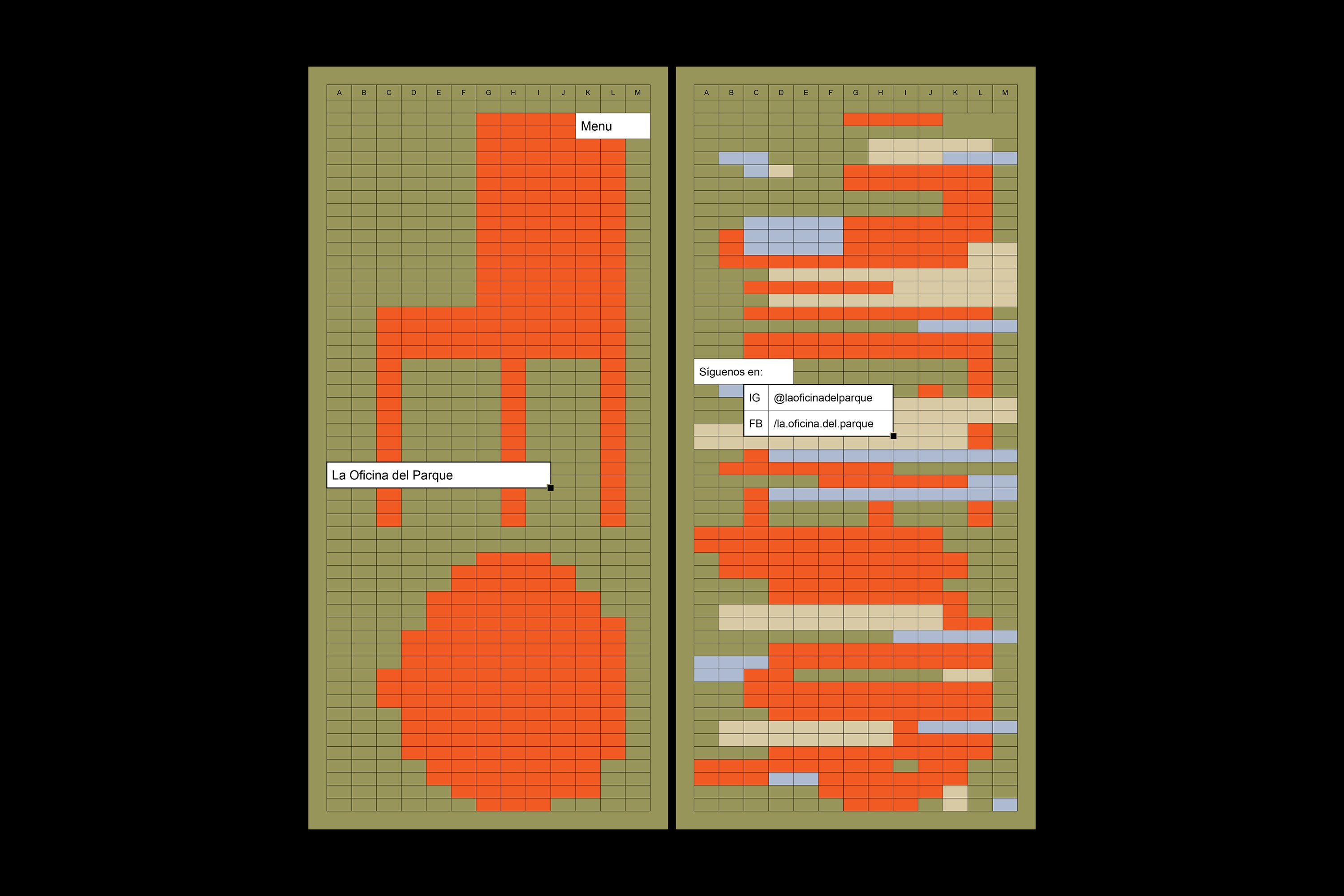
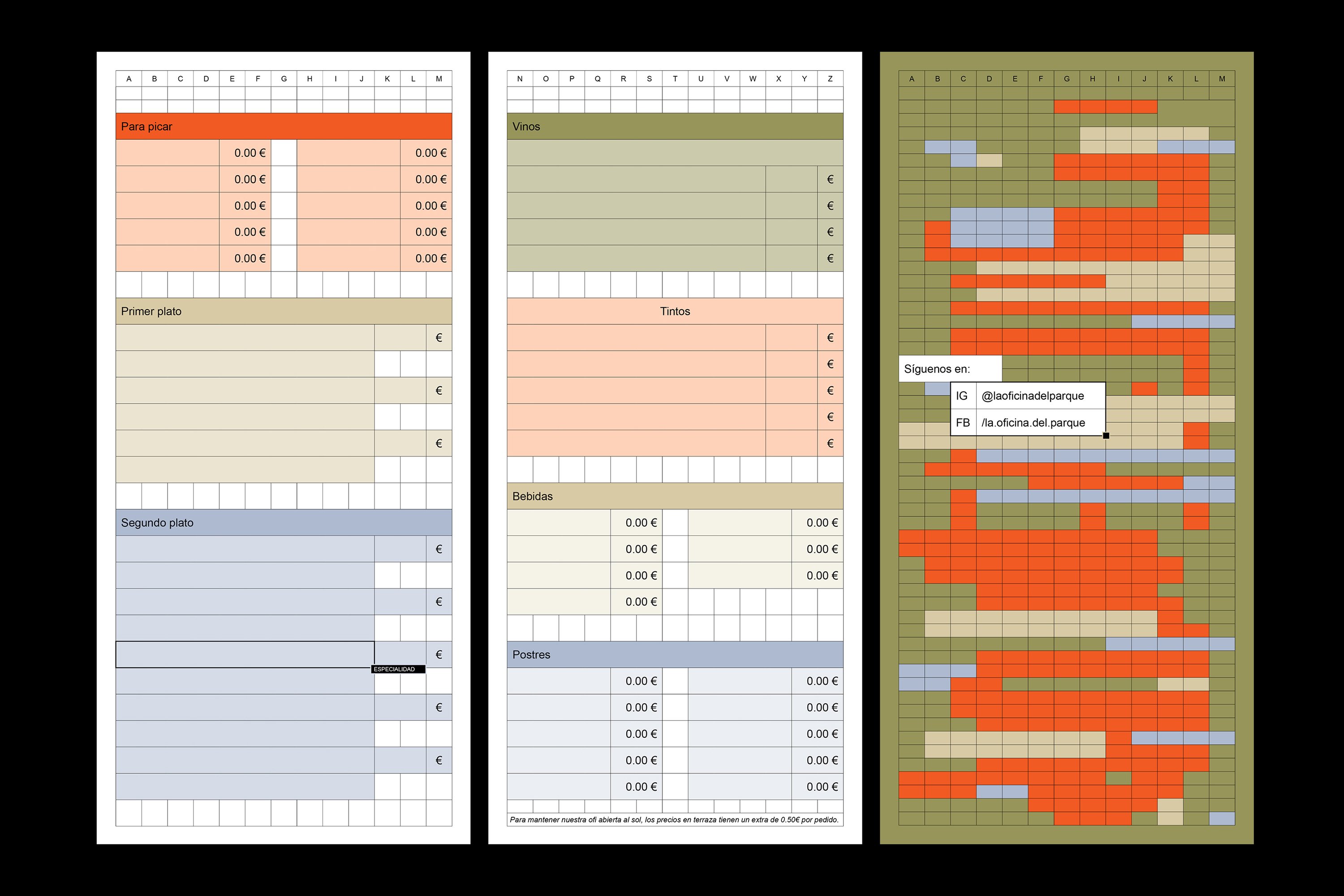
Subtle details strengthen the origins of the identity, such as the small cube in the bottom right-hand corner of a ‘selection’ and the alphabetical cell indicator. Meanwhile the ‘merge’ function is used as a neat device to bring text to the foreground and to group content. It’s a sweet homage to Excel, elevating the mundane to art in a way that is more often seen on the catwalk – but then perhaps there is an interesting stylistic overlap between the bare functionality of normcore and Brutalist web design.
If we go back to the question ‘What first comes to mind when you think of an office?’ and consider ‘What first comes to mind when you think of Microsoft Excel?’, the uniting associations are boredom and dullness. We think about rigidity and sterility; bureaucracy and hierarchy; monotony and functionality. But for Studio Ingrid Picanyol the spreadsheet is an unconventional vehicle for creativity and expression. By challenging the Excel format, the studio therefore also challenges the traditional notion of an office.
So what then first comes to mind when we think of La Oficina del Parque? Something different.
