Cafe Branding
OlssønBarbieri rewrites the rulebook on ‘formality’ in its melodrama-infused Theaterbaren identity
Oslo’s Nationaltheatret (simply translated to English as National Theatre) first opened its doors more than a century ago in 1899, and has since come to not only reflect, but actively shape cultural identity in Norway. Having staged everything from more traditional Norwegian dramas from the likes of Henrik Ibsen to experimental contemporary works, the building itself is also a marriage...

Story Espresso by For the People
The unity of coffee-boffins and great typographic choices seems to be having a moment right now on BP&O. Just the other week we covered the truly superb work for Dark Arts Coffee by Not Wieden + Kennedy. Now, though, we’re heading down under – specifically to the Sydney suburb of Lane Cove, home to Story Café. Story Café opened in...
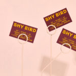
Shy Bird by Perky Bros
Shy Bird is a all-day café, rotisserie and bar in Cambridge, Massachusetts. Its core mission is to elevate chicken, and the experience of eating chicken into the realms of the exceptional through gastronomic know-how, a beautiful interior and a visual identity designed by American studio Perky Bros. Drawing their inspiration from the red junglefowl, the “original chicken” and descendant of the domestic chicken, and...
Old Elephant House by Studio South
Old Elephant House is a new brasserie and courtyard bar in the former elephant enclosure at Auckland Zoo. It offers an à la carte menu and set three-course meals made up of light and elegant dishes. It is a building that is distinct in its proportions and location, with tall doors and windows from which to hear the distant calling siamang...
Tea & Glory by Socio Design
Tea & Glory are loose-leaf tea experts and are described as the antithesis of fast-paced coffee culture. In the same spirit of ancient tea drinking rituals, the brand is interested in the continued promotion of slow-living, a lifestyle that seeks to place more focus on the small details and experiences of everyday life. With a desire to better express this position Tea &...
Daechung Park Cafe by Studio fnt
Daechung Park / 대충유원지 is a cafe located in the South Korean capital of Seoul. It features a distinctive interior of wood and stepped brick walls developed by FHHH Friends, furniture and objects by studio COM and a graphic identity designed Studio fnt. Graphic identity is expressed through menus, coasters, packaging and framed calligraphic posters, but also through small details within the interior...
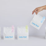
Little Wolf by Perky Bros
Little Wolf is an American small-batch coffee roastery, subscription service and café created by former accountant turned coffee roaster Chris Gatti. Tennessee-based graphic design studio Perky Bros recently worked with Chris to developed a new graphic identity that would link a variety of assets. These included stationery, business cards, individual coffee bags, tote bags, merchandise, subscription boxes and website. Perky Bros describe their...
High Street Wine Co. by Conductor
High Street Wine Co. is a wine bar and shop located in the Pearl neighbourhood of San Antonio, Texas. UK-based graphic design studio Conductor, working closely with architects Dado Group, created a visual identity that expresses something of the cheerful personality of its hosts, the ambience and community of a busy bar and its distinctive interior design. Drawing on the name for...

June’s by Föda
June’s is a cafe and bar located on the corner of South Congress Avenue, Austin, Texas. It offers breakfast, brunch, and grab-and-go pastries and coffee throughout the morning, and has an all day bistro menu that is served late into the evenings. The bistro menu is complemented by a changing wine and bar program managed by Master Sommelier June Rodil. June’s...

The Dayrooms by Two Times Elliott
The Dayrooms is a multi-label womenswear store, located in the London district of Notting Hill, created by Aytan Mehdiyeva and Zumrud Mammadova. The store gives a UK platform to emerging Australian designers and is an expression of Aytan and Zumrud’s shared passion for fashion and travel, and Aytan’s love of photography, textiles and Australian craftsmanship. This is reflected throughout The Dayroom’s graphic identity, developed by Two Times...

Caldo Coffee by 25ah
Caldo Coffee is a café serving organic coffee and fresh salads, sandwiches and pastries from its location in the Scandic Continental, a hotel in the centre of Stockholm. It features a distinctive and modern interior design of light wood, tall shelves and a long wood panelled and marble topped counter. It also includes a large custom-built menu board, neon signage and a...
Earls.67 by Glasfurd & Walker
Earls is a family-owned premium but casual restaurant chain with 66 locations throughout Canada and the United States and a thirty year history. The hospitality sector has seen a lot of change in this time. It continues to be highly competitive and often demands innovation and adaptability to remain relevant. With this in mind, Earls commissioned Canadian graphic design studio Glasfurd & Walker and interior...