Future Observatory by SPIN Studio
Opinion by Thomas Barnett Posted 26 July 2023
SPIN Studio continues its working relationship with the Design Museum (after branding its Waste Age exhibition in 2021 and Wim Crouwel’s first UK retrospective in 2011) by putting its inimitable spin (this won’t happen again, I promise) on Future Observatory, the museum’s ‘national research programme for the green transition’.
Perhaps more so than any other studio working today, SPIN has a knack for imprinting a distinctive studio style on its work, while still remaining laser-focused on the demands of the client. For over thirty years the team – led by Tony Brook and Patricia Finegan – has pushed experimental typography and graphic design into mainstream branding, suavely sidestepping bland and polite design trends at every opportunity.
Alongside an almost monomaniacal focus on typography, the South London-based studio’s work is often distinguished by a fine art sensibility, rejecting the high-gloss polish of contemporary branding to deliver a more deliberately raw, textured finish that is reminiscent of David Carson or Chris Ashworth’s iconoclastic ‘post-Swiss’ work in the 90s. All these tensions are evident in the recent work for Future Observatory, and while some are resolved more successfully than others, it is a joy to watch SPIN grapple with them.
SPIN was also responsible for Future Observatory’s previous brand identity, created for the programme’s launch back in 2021. What can be gleaned from an archive version of FO’s website, is that the original scheme was a rather skeleton affair, perhaps constrained by time, budget or both. Rather than a ‘rebrand’ then, this new work appears to represent a fuller development of an initial idea, with SPIN revisiting a promising seed in order to nurture it to full efflorescence.
Launched in 2021, in partnership with the Arts and Humanities Research Council, Future Observatory’s research investigates how design can respond to the challenges of the climate crisis. Director Justin McGuirk outlines their aim as ‘bring[ing] cutting-edge design research to broad audiences, making it accessible and engaging and enabling it to have a greater impact’. He adds that ‘Future Observatory redefines what a museum can be: a place not solely focused on the past or the present but one that can help shape the future’. SPIN’s brief, therefore, was to take the cutting-edge and make it accessible, keeping one eye on the past and one eye on the future.
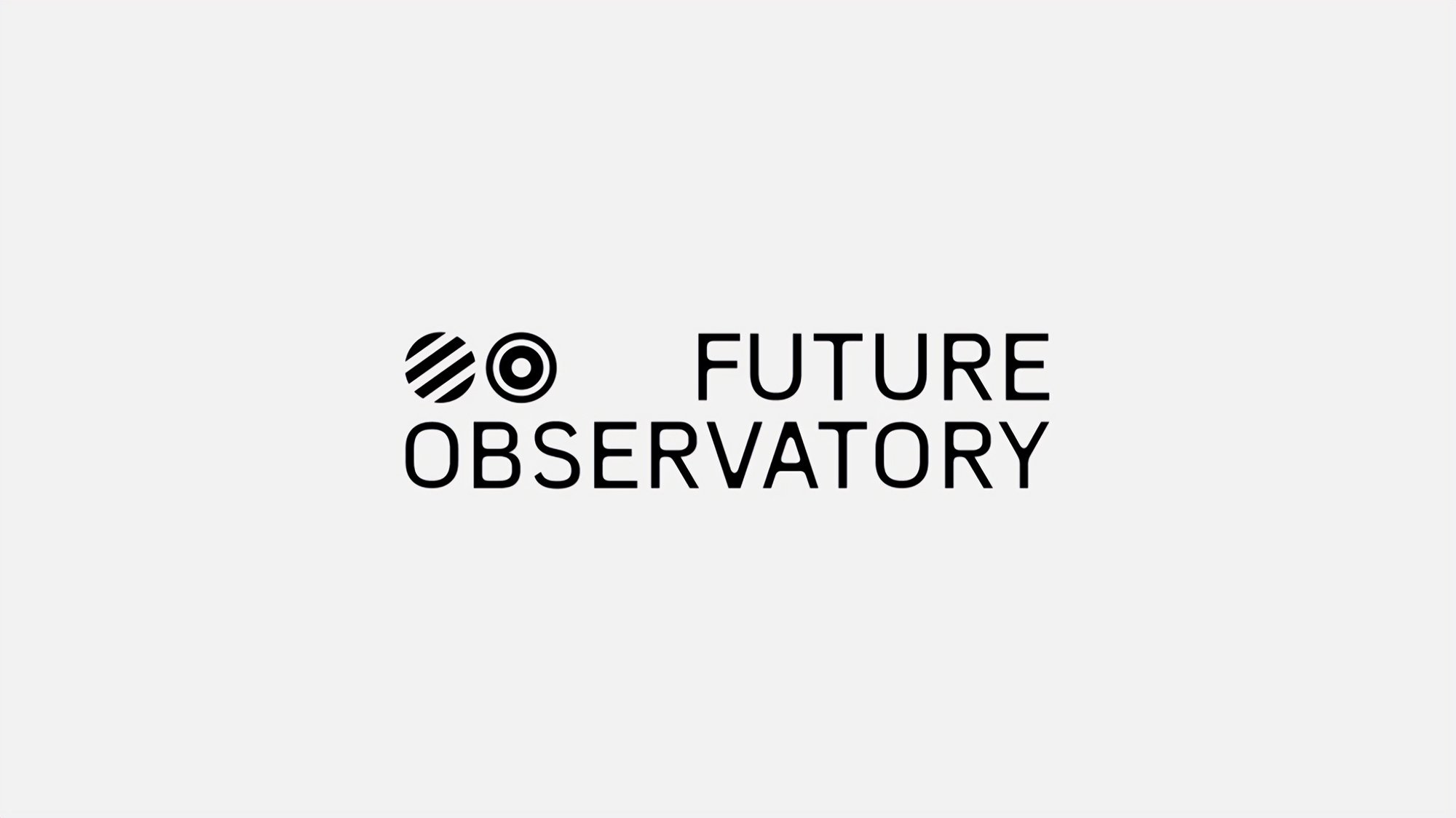
Those two eyes are perfectly represented by FO’s logo, which takes the solid (if rudimentarily executed) original idea from 2021 and treats it to an understatedly weird typeface, and a revamped ‘binocular’ symbol of two circles that vary in design depending on the application.
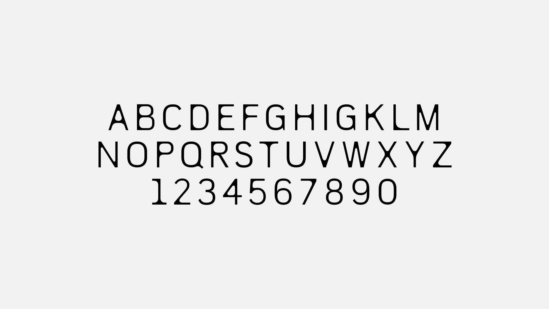
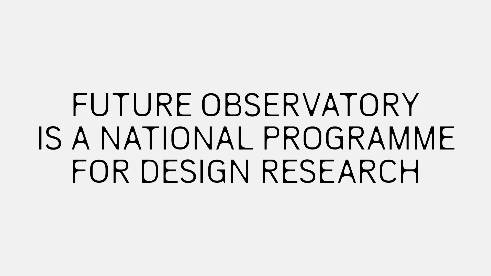
The bespoke font is conceptually impressive and executed with elegant restraint. It successfully captures the mix of organic and digital aesthetics that defines FO’s vision for the future of design (and conveniently aligns with SPIN’s house style). It casts forward to an unknowable, alien future whilst simultaneously harking back to a rich 20th century legacy of digital type design (ink traps, Leo Magg’s Westminster etc).
SPIN Creative Director Tony Brook says that the typeface began ‘with the idea of creating something organic, referencing the way tree branches break away from the main trunk, or the way bamboo grows, to create rounded connections between stems and crossbars’. Whilst this particular sense of natural growth doesn’t quite feel palpable in the finished product, the typeface does feel organic in a more alien cyborg kind of way, with the rounded connections between stem and crossbars evoking organic sinew grafted to a sharp-edged robotic skeleton. Not as bucolic an evocation as SPIN intended, but nonetheless one that conjures future design frontiers.
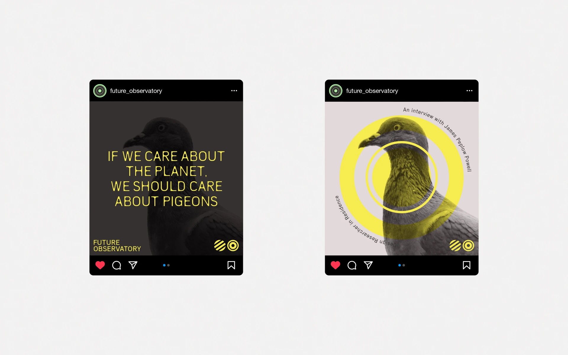
In the studio’s case study, SPIN presents three versions of the logo: two stacked and one horizontal. The two different stacked versions (one with icon to the left, one with icon inline with ‘Future’) are perhaps to allow for the logo to be placed in right and left corners, but otherwise it’s unclear what purpose these variations serve. The logo seems to most often appear centred in layouts, or used with the wordmark and symbol broken apart (see social media concepts). This quibbling about logo variants might be pedantic, but it’s symptomatic of a general sense that these (individually excellent) brand elements would benefit from more rigour in application. A tighter set of guidelines and clearer visual hierarchy are perhaps needed in order to properly regulate the relationship between them. This is perhaps most evident on the website, which sometimes feels a little crowded.
The logotype is expanded into a display typeface (unnamed, but for brevity we’ll call it FO Display) that is used for titles and headings across the website and other applications. SPIN states that FO Display has two weights: regular, and a very slightly bolder weight that also has shallower internal rounded corners. However, on the website, hovering over FO Display reveals another variant: regular weight, but with more deeply rounded internal corners. The effect is really nice, but it is somewhat disguised by the fact that the font and background colours also change on hover, which masks the more subtle typographic effect. It also makes it unclear whether this is a stylistic choice, or just an attempt to optically balance the negative space when FO Display is used on different coloured backgrounds. Either way, intentionally or not, this typographic hover effect makes FO Display feel much more ‘organic’ than it does as a static design, and would again benefit from being given a clearer, more intentional role in the brand.
The overall typographic scheme could perhaps benefit from there being more contrast between FO Display and the two secondary fonts: the sans-serif Executive and serif Media77. Like FO Display, Executive is a tall, narrow, somewhat loosely-spaced sans-serif, yet the two don’t quite harmonise. In another throwback to mid-century analogue technology, Executive is itself inspired by the distinctive lettering of Hammond typewriters.
Similarly, Media77 is a 70s period piece. One can’t help feeling that so many nostalgic nods run the risk of focusing the twin telescopes of the observatory more on the past rather than the future. But with that said, when Media77 is used for headings and body copy it feels like a welcome contrast to the Display font, and it is a shame that it is confined to being buried away in the article pages. There is no hint of it being part of the brand in SPIN’s case study, nor does it appear anywhere on the homepage or index pages of the website. This is a shame, as Media77 works to gently disrupt the typographic scheme and inject some warmth into the brand, and it deserves to be integrated more thoroughly.
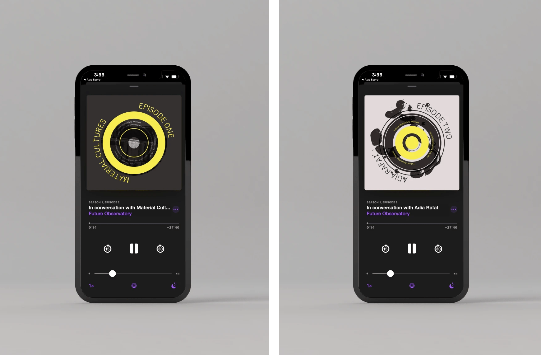
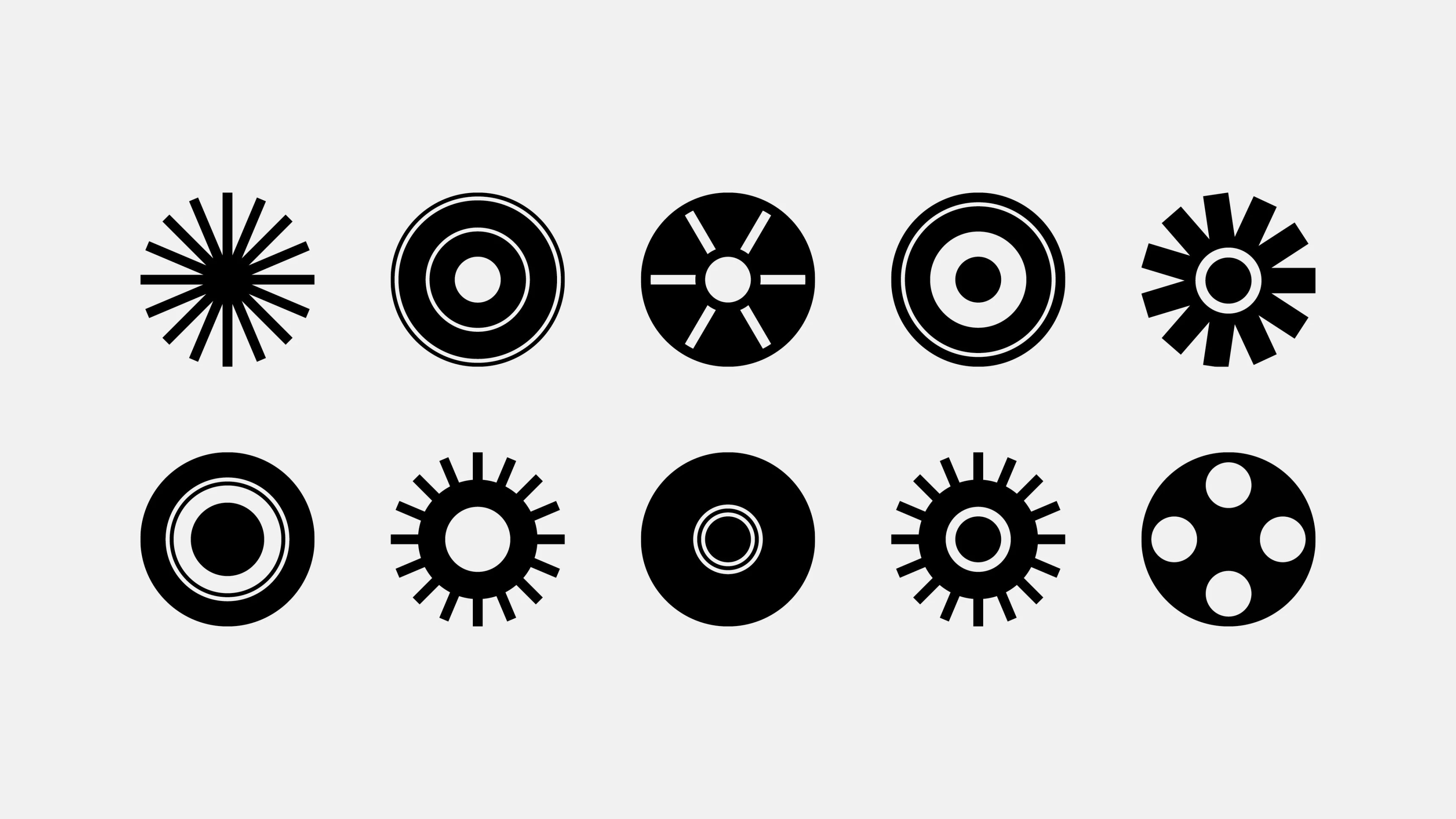
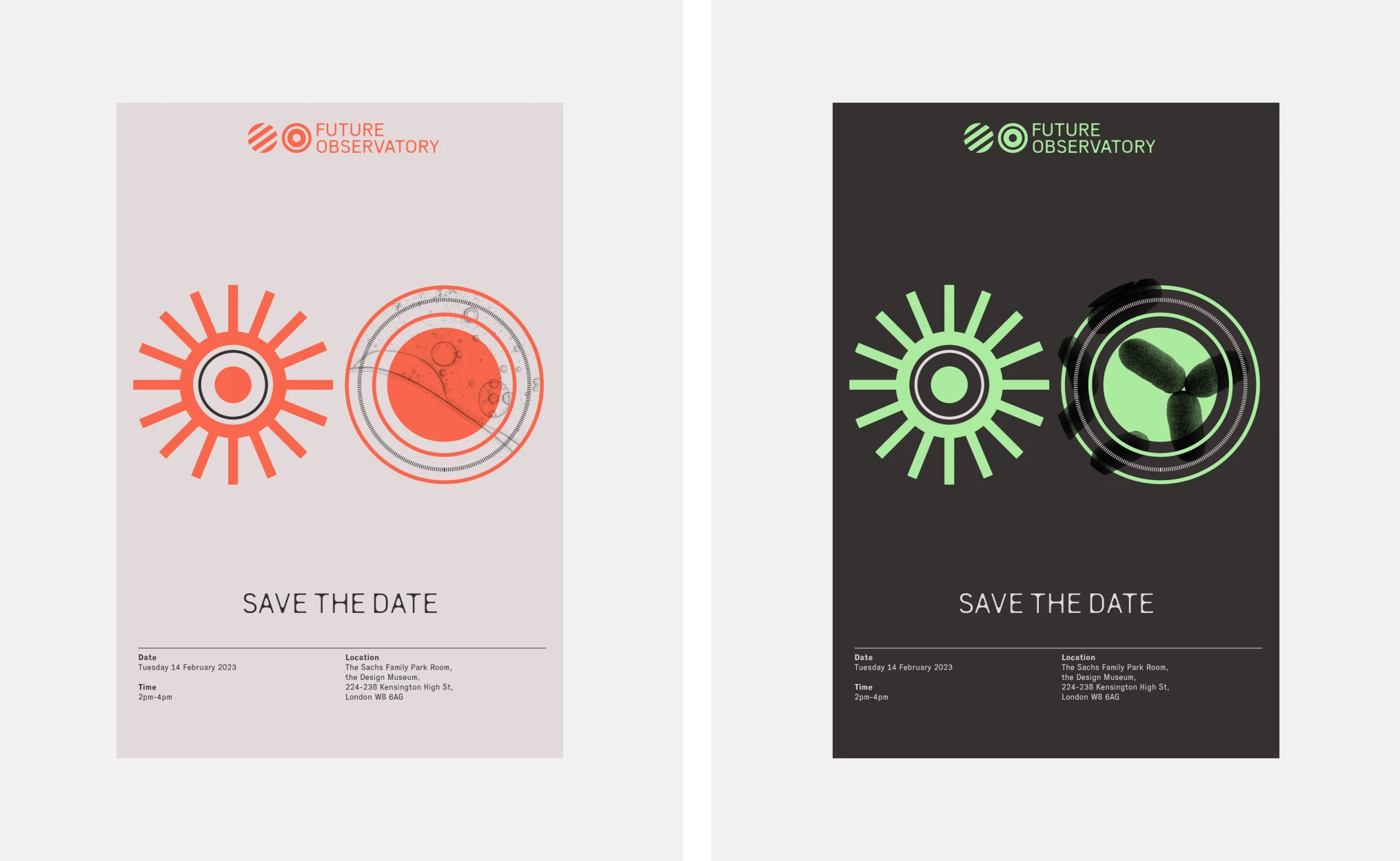
To support logo and typography, SPIN has devised a clever graphic language of concentric circular symbols that evoke (among more abstract forms) film reels, tape spools and other mid-century analogue technology. This may sound like an old-fashioned view of the future, but when animated and layered over video footage the graphics feel suitably future-focused, and prove a highly effective way for FO to easily create distinctively branded video content.
The animation of these circular graphics simulates dilating pupils or refocusing optical lenses — an ambiguity that again smartly captures the dialectic of the natural and man-made. One animation in which the circles spin on their vertical axes feels incongruously PowerPoint-y (perhaps because it breaks the otherwise strict two-dimensionality of the brand design), but otherwise the animations are enjoyably varied and unpredictable.
The retro-futurist feel is complemented by a nicely restrained colour palette. Faded and acid toned accents work well with the various shades of warm, pinkish grey that round off the palette. This manages to feel retro-technological, but not cold. It makes the brand feel Brutalist, but in the way the Barbican is: softened in form and palette by lush vegetation hanging from every balcony, and windswept, grassy planting in every courtyard. SPIN conjures a rather 1960s utopian vision of nature, technology and humanity harmoniously and stylishly coexisting. It is an interesting design philosophy to reference: certainly resonant, but also ominous, if we reflect on the largely failed legacy of Brutalism’s lofty goals for the future of design.
This slightly apocalyptic vision of the future is perhaps apt, as the Observatory is going to have to face down some truly frightening problems and paradigms in its mission to assess how design can impact our future in a meaningful way. This is a brand that rejects techno-utopianism for something darker and more ambivalent —the brand overall does make me think of Dr. Strangelove and shadowy Cold War research projects, and this is perhaps no bad thing.
In this work, the team at SPIN have skilfully avoided cliches of environmental branding. Instead of insipidly ‘green’, Future Observatory feels concrete; confidently focused on design’s role as humanity’s most eloquent way of interfacing with nature.
