Food Nation by Seachange
Opinion by Emily Gosling Posted 18 July 2023
It’s about time plant-based brands found their sense of humour. Having been a vegan for 17 years now, I can safely say that veggie/vegan brands have historically been tiresomely dull – and until recently, they’ve been allowed to be. But with the recent years’ boom in all things ‘plant based’, simply existing because there’s no other type of soy milk doesn’t cut it any more. Long gone are the days when Linda McCartney was the only purveyor of non-meat sausages, where non-dairy milk meant Alpro, when vegan cheese meant weird, oily yellow plastic.
With the influx of new brands in the sector, they’ve had to step up their game and behave just as every other FMCG product does: they have to make us want to buy them over and above their rivals, do a little bit of old-fashioned shopper-courting.
As such, we’ve been gradually seeing playfulness creep into the previously rather po-faced, right-on sector: there were adam&eveDDB’s surreal Quorn ads; Brooklyn agency Mythology’s genuinely funny, often celeb-studded ads for Just Egg; Oatly’s much-aped ‘now for the boring bit’-style copy and quirky type-led packaging.
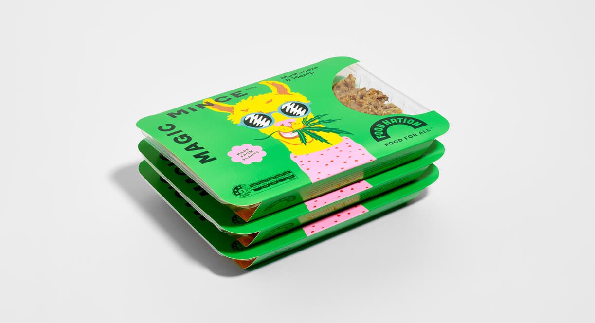
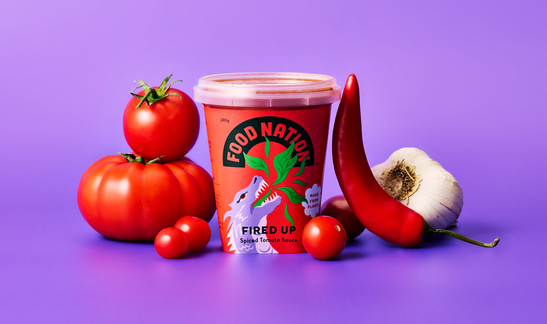
Despite these developments, it’s still a treat to see excellent visual identities for plant-based brands, such as this superb work by New Zealand agency Seachange for fellow NZ-ers Food Nation. Billed as a ‘disruptive new plant-based food brand on a mission to get people eating more plants,’ the brand sets itself apart from other plant-based products that are filled with soy, starch, and fillers by using ingredients based around fresh vegetables, mushrooms, legumes, herbs, and spices.
Seachange worked across the entire brand identity, including packaging design, copywriting and tone of voice, bespoke brand illustrations, photography, art direction and printed collateral. ‘The brief was to create a joyful and spirited brand; something totally unique and inclusive to celebrate plant-based food,’ says the studio. ‘In a retail environment that leans into a more quiet approach, along with visual clichés of what is “natural”, we wanted to do the opposite to make the packaging leap off the shelf.’
That’s perhaps why the work is so brilliantly refreshing: it doesn’t lean into preachiness, or health cues, or its ingredient credentials. Instead, it leans into the unique sensibility of the brand, letting its attitude do the talking rather than spelling out how virtuous it all is. In short, Seachange’s designs prove that such virtuosity and ‘fun’ aren’t mutually exclusive.
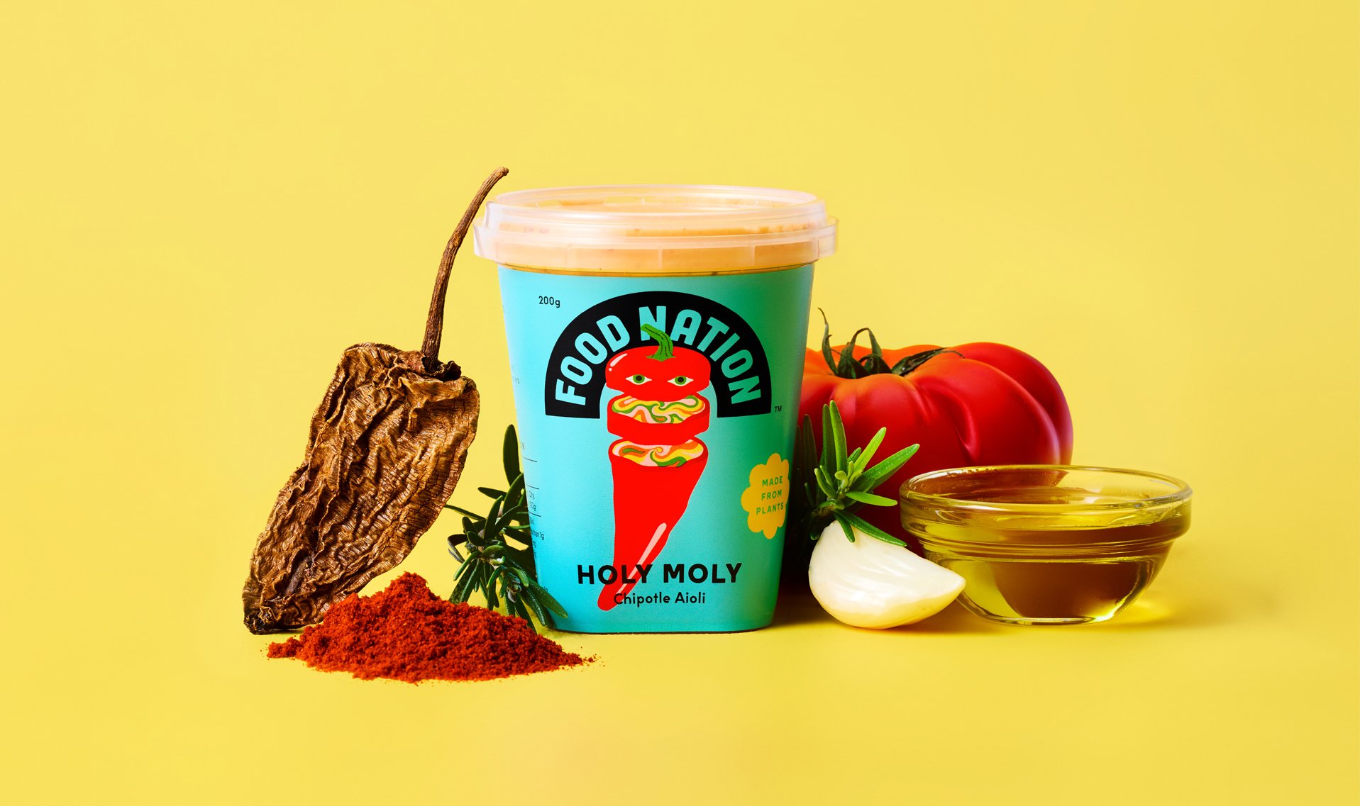
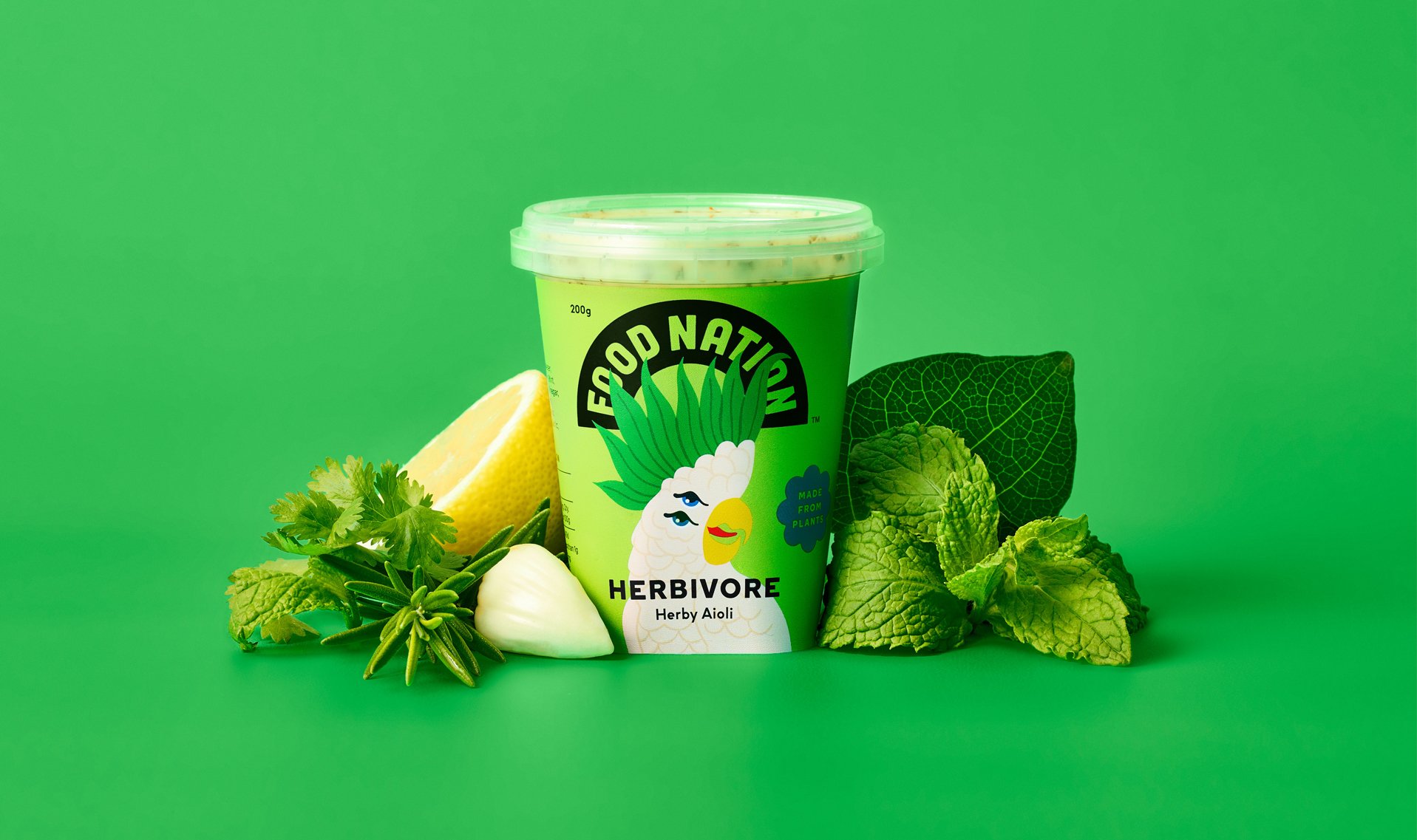
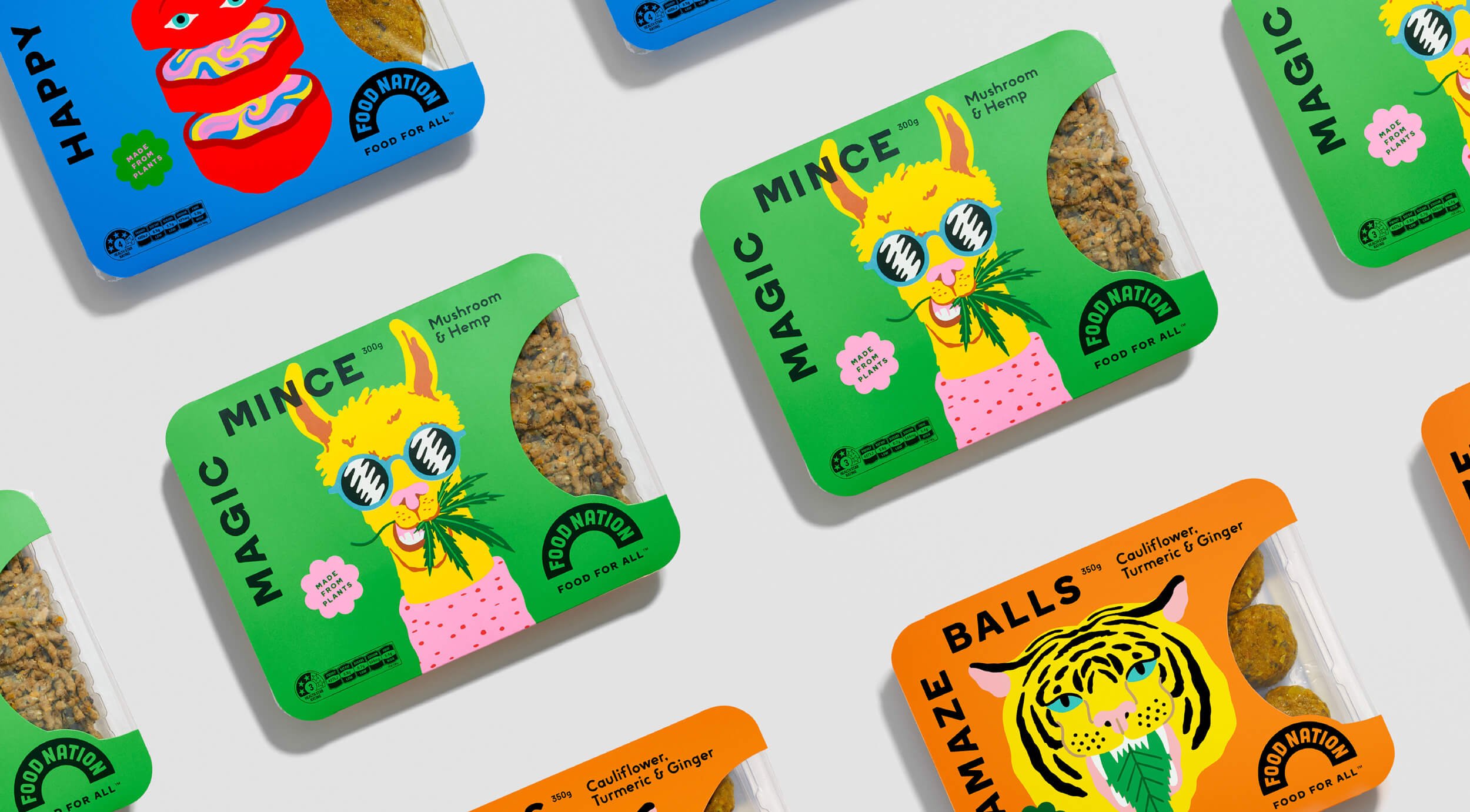
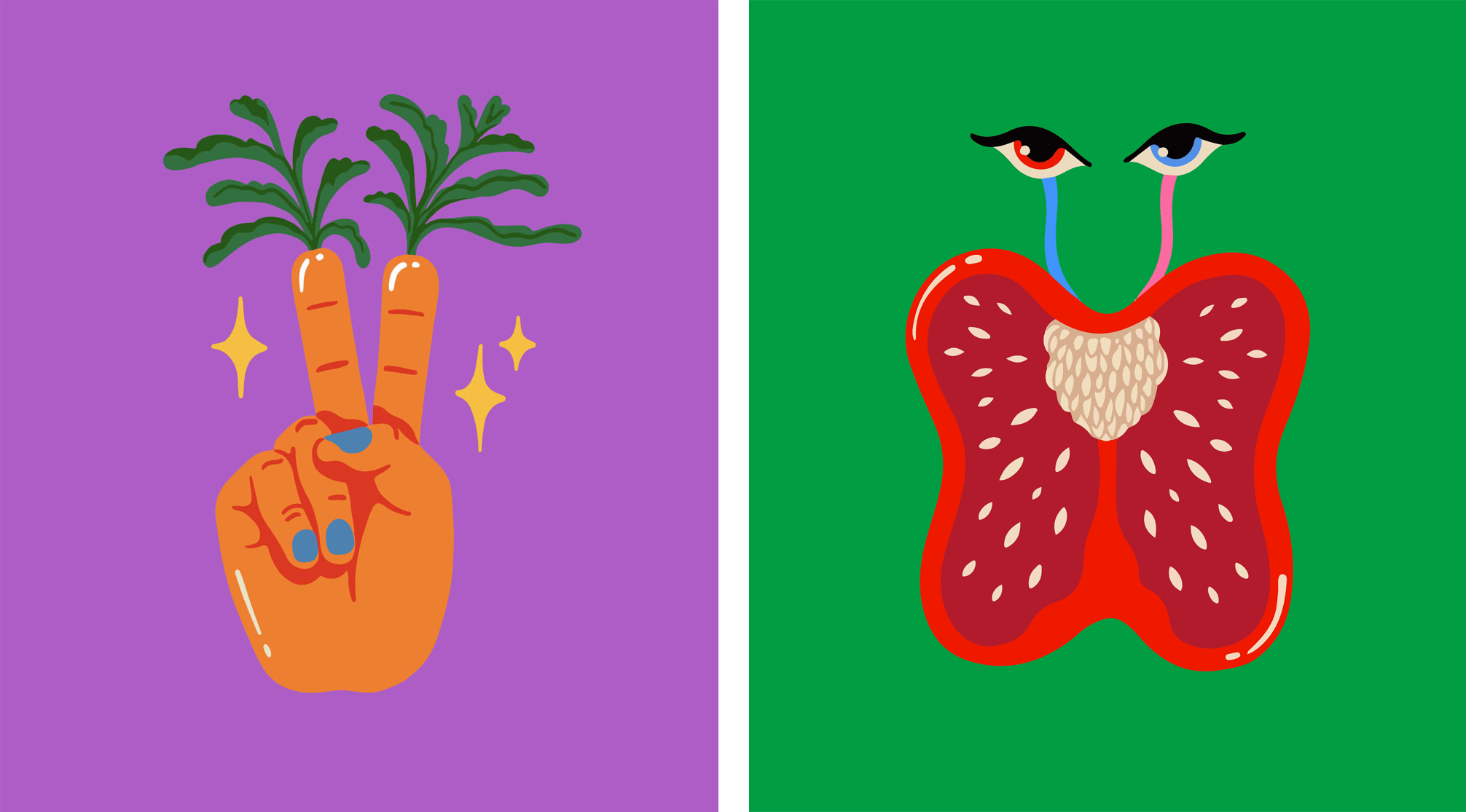
This is reflected in the decision to use illustration as the hero visual element on the front of Food Nation packs rather than the tired cliché of glistening, ‘fresh’ food photography styled to within an inch of its life. The idea was to create ‘something bright, bold, and spirited,’ according to Seachange. ‘We imagined what characters would look like if they lived in a plant-based utopia, and gave each product SKU its own unique personality. Each character combines a plant-based ingredient with life in a fun and surreal way.’
This results in a raft of weird and frequently adorable characters such as a high-heels sporting, leggy mushroom; a well-coiffed broccoli poodle; a leaf tongued tiger and many more.
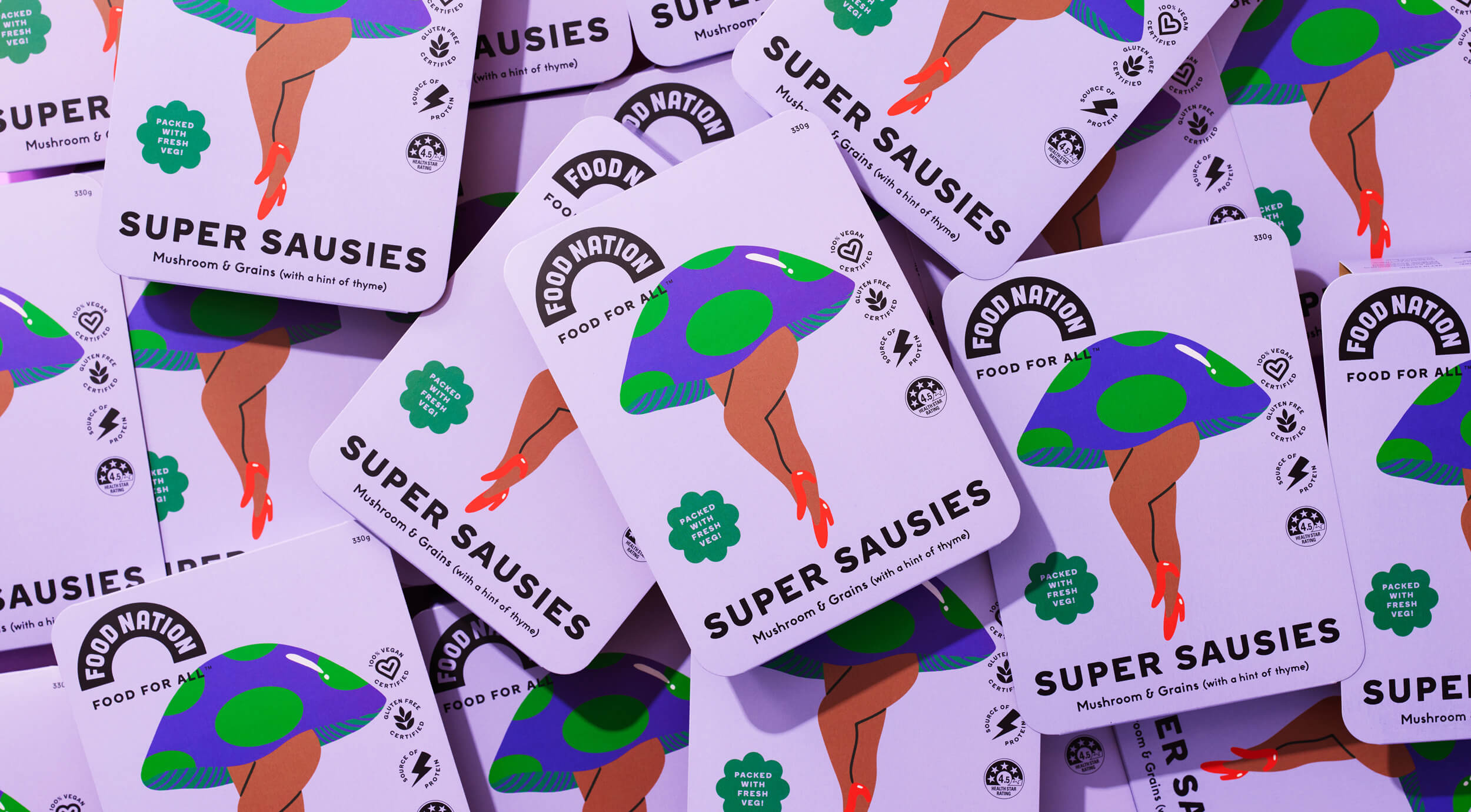
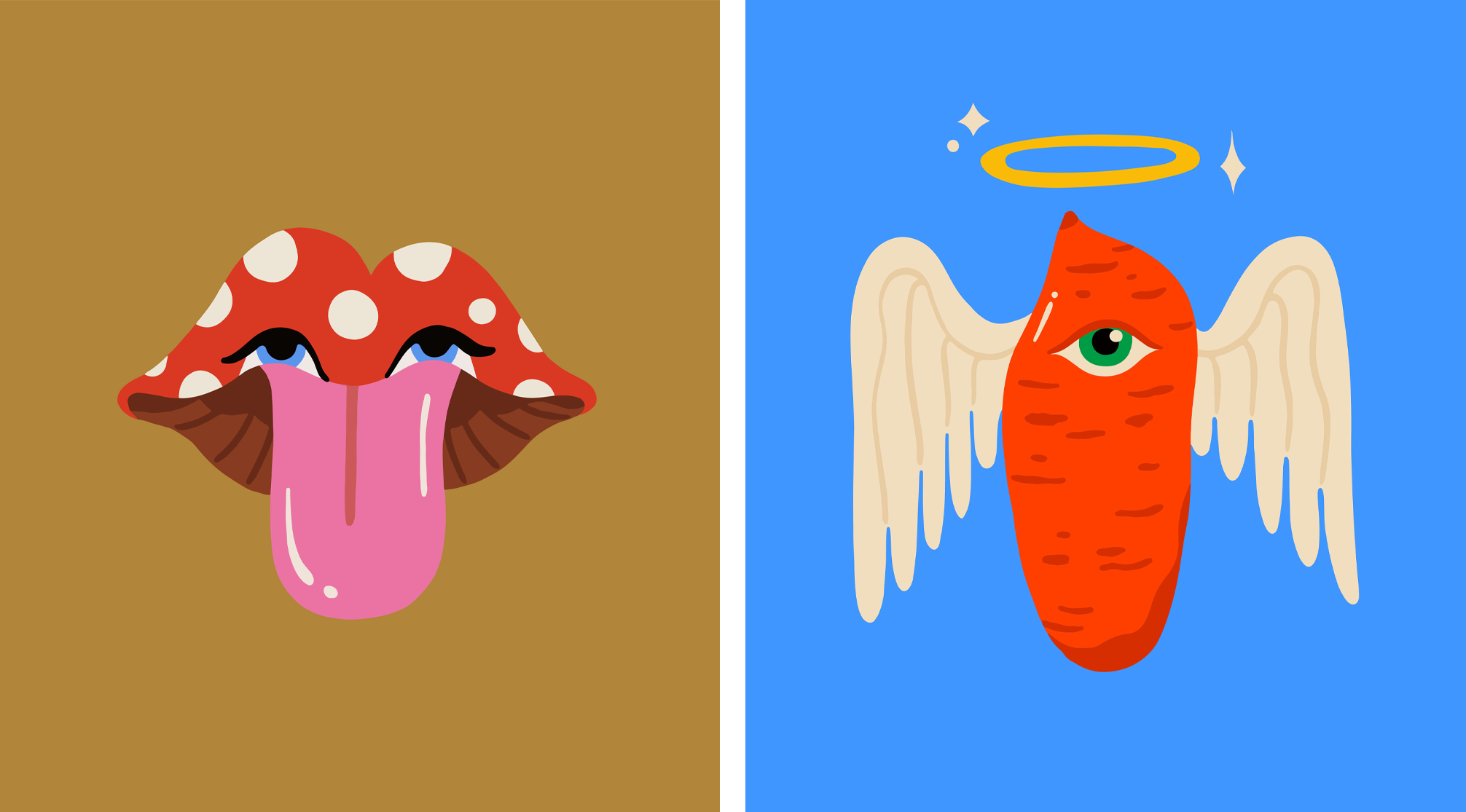
The typography is kept fairly simple, using pretty much one font in all-uppercase. Seachange opted for Boing Bold by London-based foundry A2-TYPE, a chunky rounded sans serif font that has a solid, no-nonsense but friendly feel to it. The font manages to pack in a lot of character while also checking off the boxes of legibility and instant impact; as well as being versatile enough to use as a characterful display font on campaign materials, a brand font on packaging, and for longer chunks of text.
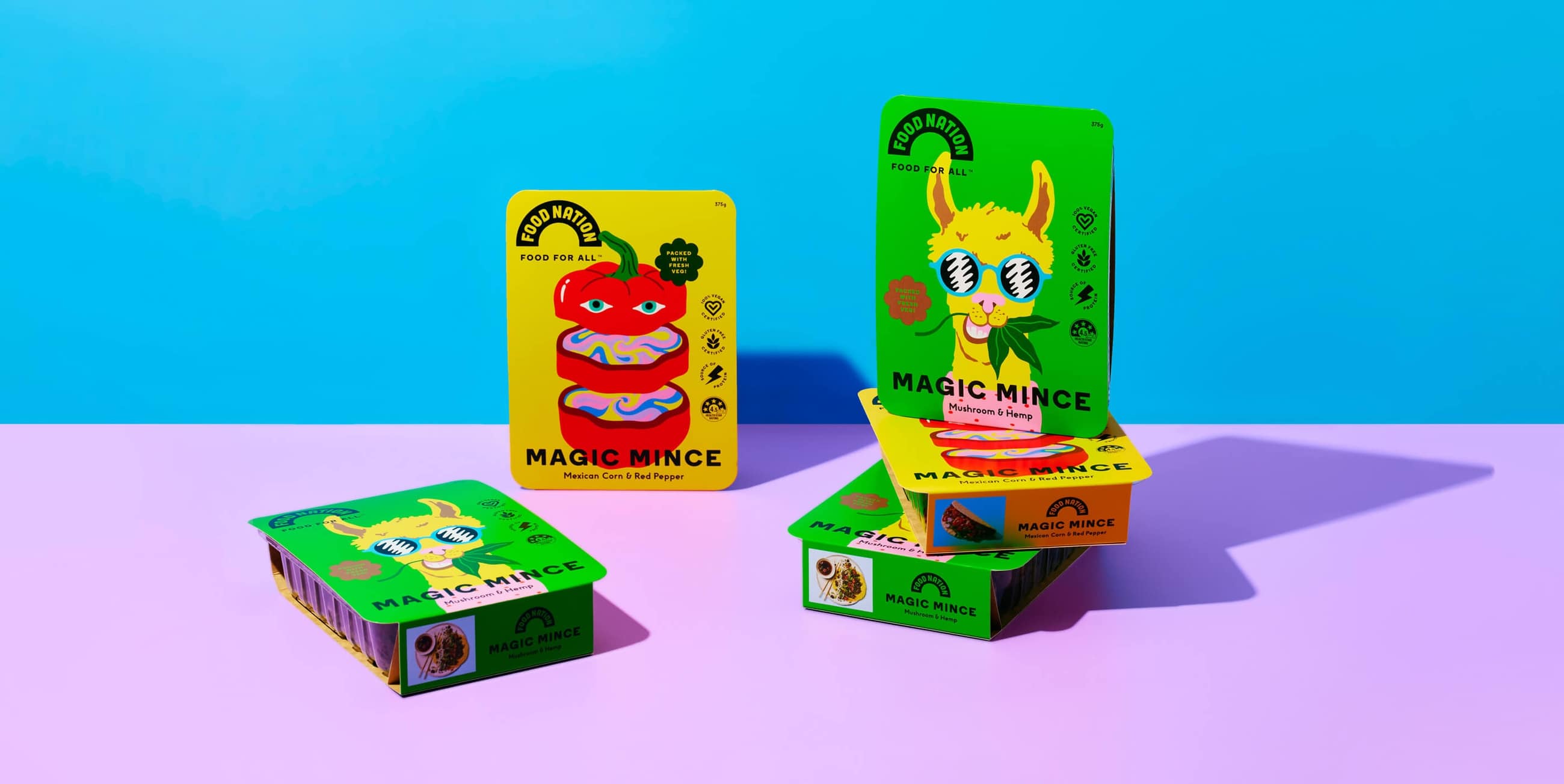
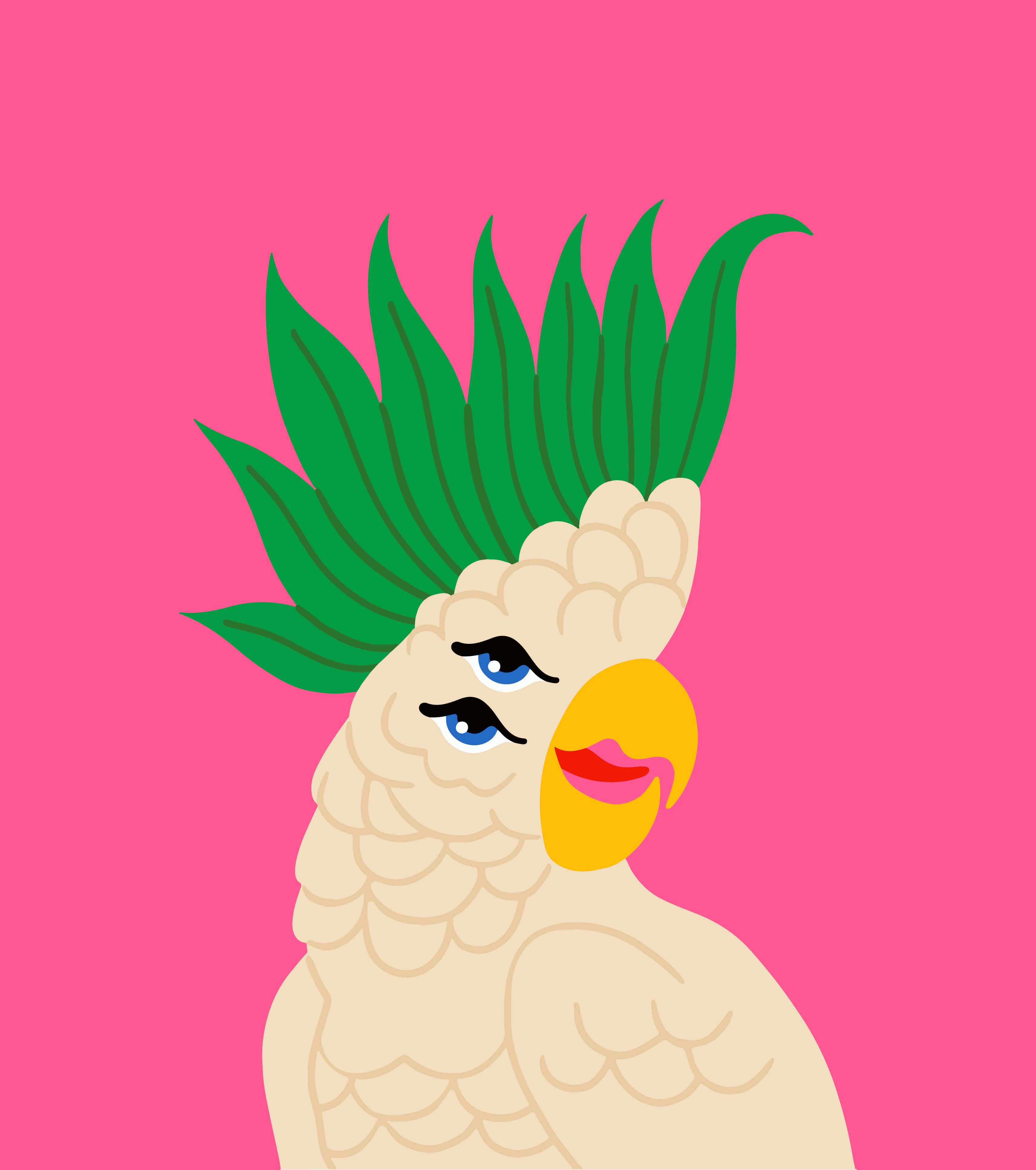
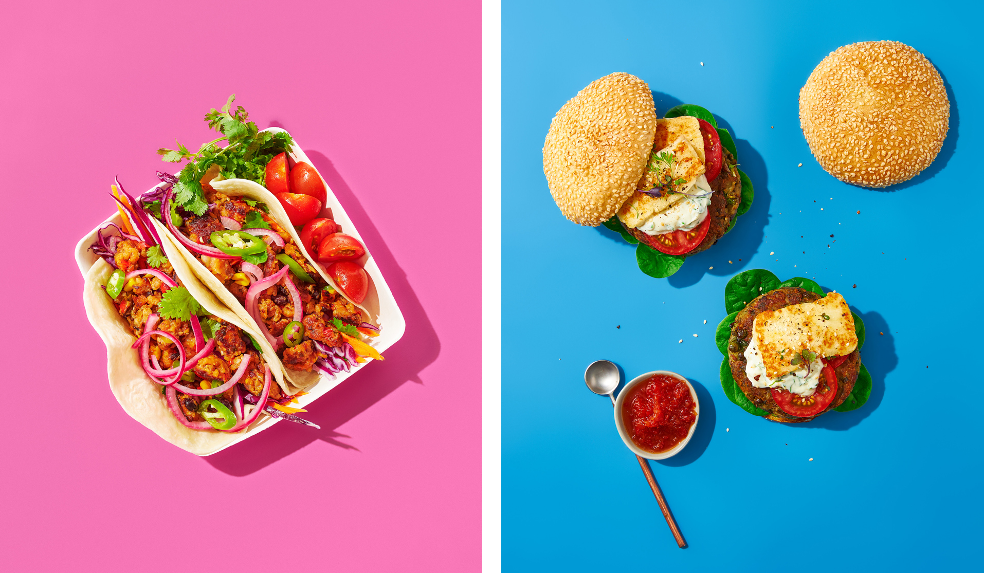
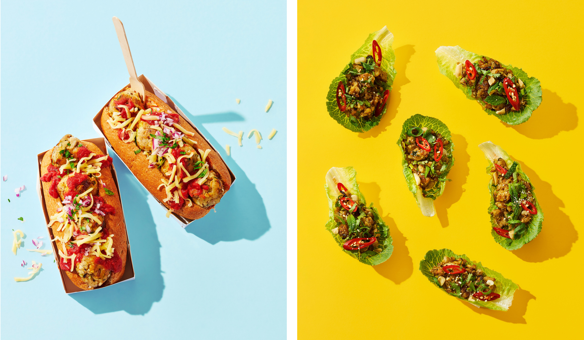
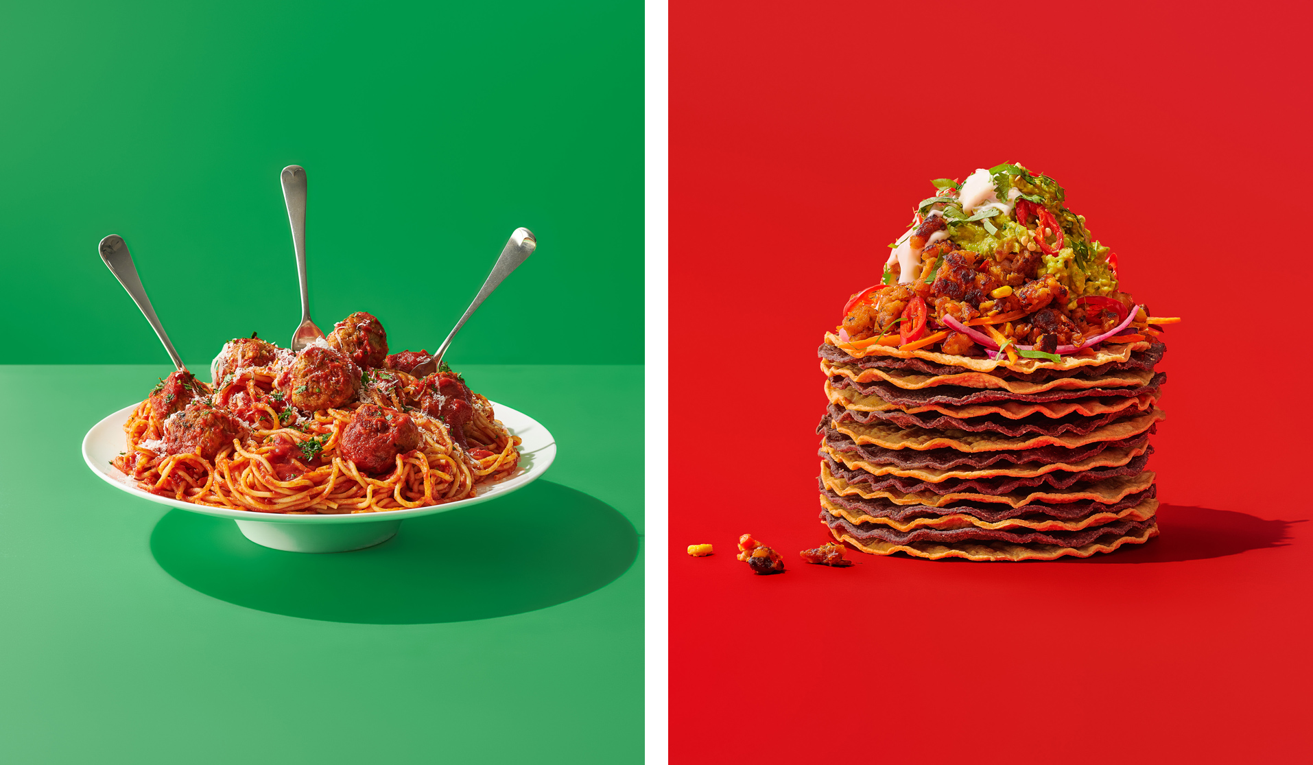
In-keeping with the bright colour palette and cute, surreal character design, the tone of voice across product naming and all supporting copy for Food Nation was kept lighthearted, direct, but playful in tone. Seachange also developed a suite of icons that highlight various health benefits, along with supporting brand and food photography. The various brand elements look to work together to underscore how ‘Food Nation not-so-subtly reminds people of the magic of vegetables through a bold and visually brave new brand’.
Deftly dancing on the right side of the lines between cute and twee, and playful and infantile; Food Nation uses bold colours and an illustration-led brand identity that’s utterly charming.
