ZVYK by .Oddity Studio
Opinion by Emily Gosling Posted 8 August 2023

Most people agree that demarcations like ‘millennial’, ‘Gen Z’ and ‘Gen X’ are redundant – little more than age brackets created for the convenience of marketing teams which have become shorthand for a series of traits we’re expected to believe somehow define an entire generation. It’s curious, then, that for every diatribe against such groupings there’s at least ten more design briefs that specifically call for an aesthetic and strategy that targets Gen Z – everything that’s cool and edgy.

By this point, there’s a number of easily recognisable design cues we’ve come to associate with this amorphous group of hip young things: the nuclear glow of ‘terminal green’; deliciously viscous, liquid metallic typography; glitch-laden rehashes of MTV’s retina-searing ’90s aesthetic; art direction that’s either hyper-saturated or desperately styled to within an inch of its life to convey ‘authenticity’/‘realness’.
And it’s not hard to spot projects that blithely pilfer from that grab-bag of youth-baiting stylistic shortcuts, hoping that no one will really notice that those fonts/colourways/layouts etc are in no way rooted to the actual brand. Good branding isn’t just about the look and feel: it’s about inherently communicating through that look and feel what the brand is. Every element needs to feel as though it’s been used for a brand and purpose-specific reason – not just to ‘appeal to a Gen Z audience’.


At first, it’s hard to place Hong Kong-based .Oddity Studio’s recent work for ZVYK on the spectrum of ‘Gen Z cliche or smartly apt brand design’. According to the studio, ZVYK is ‘a new brand of one-of-a-kind skin care’ that ‘celebrates the unique beauty in each of us and promotes good habits for a healthier and happier self’.
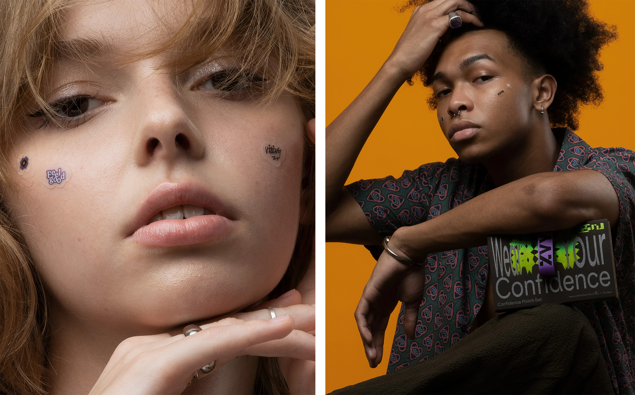
The small ZVYK range includes ‘confidence patches’ – little stickers that claim to create a protective barrier, ‘preventing picking and drawing out all the impurities and fluids from breakouts’, while also making a ‘fearless’ statement. There are 66 patches in various sizes and shapes in the range, each with a unique design such as geometric shapes, mirrored glyphs, butterflies, and typographic messages like ‘Slay’, ‘Snatched’, ‘Vibing’, ‘I love me’, and ‘You are Art’. ZVYK also sells an acne serum housed in packaging that users can customise with stickers.

.Oddity Studio (not a typo, the studio’s spelling really is an oddity) was brought in by ZVYK founder and CEO, Grace Lee to work on the brand’s concept and visual identity; packaging and e-commerce website design; photography, videos and more.
The visual identity is based around the concept of repetition, looking to underscore the idea of ZVYK helping people to easily enforce good habits. This plays out as a series of simple shapes, which .Oddity then repeated, rotated, mirrored, or otherwise transformed until the shape ‘becomes a unique, bold, beautiful, and expressive shape – as rare as you are,’ as the studio puts it.
The choice of materials used in the packaging design is clever in ways you might not notice on first glance. The Confidence Patch packaging, for instance, uses a mirror-like reflective silver pouch; reinforcing the idea of repetition throughout the visual language of mirroring.


The logomark’s typography delights in distortion: using a customised version of Melanzane by Copenhagen-based foundry PlayType, letterforms are stretched, squished, layered and generally treated in a way that’s hyper playful and joyfully breaks the formal rules of type. For the body copy, .Oddity chose ES Klarheit Kurrent from Swiss foundry Extraset for its unusual, playful cut-like quirks which nod to the quirky shapes of the logo. The idea of typographic rule-breaking looked to nod to the natural rebellious streak of teens, ZVYK’s primary audience.
![]()

.Oddity worked closely with ZVYK founder and CEO Lee on the project, and interestingly, Lee’s background is more in marketing than in skincare. She’s said that it was in a previous marketing role that she realised how few brands had a clear purpose, and so quickly faded away – leading to her goal to create her own brand which provides ‘real value to people, bring meaningful changes, spread positive messages and deliver top-notch products’.
Her brand-led ambition certainly casts a new light on the brand’s end result. That ‘purpose’ seems to be based around some rather buzzword, if very noble ideas: confidence, celebrating imperfections, fearlessness, self-care, et al. So far, so perfectly Gen Z.
However, in this case it’s unfair to just see the dayglo colourways, quirky kinetic typography and neon green and assume it’s just another branding project in a long line of Insta-friendly D2C products. Cultural context is important too: ZVYK (let’s be honest, not the most memorable of names) hails from Korea, where beauty culture is huge. It deliberately rails against the complex, multiple-step skincare routines that many Korean brands and influencers promote, and looks to do the opposite by making things fun and simple. And the design work certainly reflects that.