Woven by Adam Smith by Magpie
Opinion by Thomas Barnett Posted 30 August 2023

Coworth Park is a grand 18th-century manor-house-turned-luxury-spa-hotel, set among a profusion of wildflowers in a sumptuous patch of Berkshire countryside. It’s part of the Dorchester Collection: ten prestigious hotels scattered across the world, all owned (through the Brunei Investment Agency) by Hassanal Bolkiah ibni Omar Ali Saifuddien III, the Sultan of Brunei. Bolkiah rules as an absolute monarch, and personally spearheaded the introduction of barbaric legislation in 2019 that punishes homosexuality with death by stoning.
In this vexed spot, so typically English in both its blooming prettiness and in the blood-soaked foreign lucre that irrigates that beauty, lies Woven by Adam Smith. What was formerly a blandly luxurious hotel-restaurant has been transformed into a vibrant dining destination, resplendent with a newly-minted Michelin star.
The interior of Woven by Adam Smith was reimagined by Martin Hulbert Design, and the accompanying brand overhaul was handled by Magpie Studio. The London-based agency was approached by the Dorchester group to create a new visual and verbal identity for the restaurant that ‘matched the artistry of the kitchen, elevating the profile of its headline chef’ and ‘establishing the restaurant as a dining destination in its own right’, according to David Azurdia, creative partner at Magpie.
In addition to the visual branding, the team at Magpie also devised the new name for the venue, which references the philosophy of eponymous executive chef (you guessed it) Adam Smith. Smith observes that ‘memorable dining is created by so much more than the food we eat… stories and knowledge from my entire career, alongside inspiration from our idyllic surroundings, will be woven into the new restaurant.’
The overarching visual concept is of textures, colours, materials and finishes being ‘woven’ together to emulate the way Smith combines his ingredients, memories and stories to create a holistic dining experience — a whole that transcends the sum of its parts. Magpie’s brief is an ambitious one.
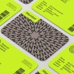
The work is all about print: luxuriously bound ‘menus’ have been created for every course, each embellished with evocative reminiscences of halcyon dinners past. These menus/short stories are accompanied by bespoke signage, business cards and other gloriously tactile ephemera. There appears to be almost no digital aspect to the Woven brand. This is partly explained by the restaurant’s ‘website’ being merely a page of the Dorchester Collection’s own (terribly underwhelming) domain.


The logo, however, is refreshingly simple. The rather nondescript sans serif is nothing to write home about, but the crossed second and third diagonals of the initial ‘W’ is a nice bespoke touch. The one morsel of digital-focused design I could find was a simple animation of the logo on one of Magpie’s own Instagram stories, where the crossed diagonals neatly weave themselves together. It is unclear where this detail would find actual application in the Woven brand, as the restaurant also doesn’t seem to have its own social media channels.
The rest of the brand appears to use the logo typeface, or something similar (the case study stills look more like Monsterrat, although the downloadable PDF menus use Corbel…) Headings are set in loosely tracked caps and body copy is light weight, which is inoffensive but rather plain. It is a shame that the nice woven detail of the logo isn’t replicated elsewhere in the brand typography. Perhaps a studio with a more rigorous type-led focus might have prioritised this, whereas Magpie are content to let the typography take a back-seat, instead opting for a more maximalist design approach.


Which brings us onto the real strengths of this project: a series of beautifully delicate illustrations depicting various elements of chef Adam’s menu. Leaves, lemons, the cap of a (no doubt painstakingly) foraged mushroom are all rendered in perfectly balanced linework evoking woodblock prints. This style is ideally chosen to layer atop the linen-bound menus (a woven finish that is entirely appropriate, if rather low-hanging fruit).
![]()


Even better are the sculpted embossed illustrations, which are without a doubt the standout feature of the work. These gorgeous gossamer artworks go beyond chiming with the neat but slightly contrived ‘woven’ theme, and actually delve deep into the unabashedly nostalgic soul of Adam Smith’s culinary philosophy. There is a small thrill in seeing such humble implements as a wooden chip-fork, a jammy dodger, a chintzy paper doily depicted with such elevated craft, and allowed to sneak between the heavy-laid pages of these prestigious menus. They capture the phantom shimmers of the memories behind Smith’s dishes — the ghost of ‘nan’s roast dinner’ and that childhood seaside fish and chips.


It is no coincidence that these are the least ostentatious and most successful aspects of the scheme. Where the Woven brand elsewhere seems over-bedecked with the luxurious texture and shiny foils that are de rigueur for this kind of fine dining, here we have something that has true individuated meaning. I only wish that these genuinely moving, understated and lyrical illustrations were not so drowned out by an occasionally noisy colour palette and an overenthusiastic approach to luxury finishes.

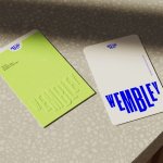
The colour palette is similarly maximalist. Some parts are clearly aligned with the interior decor — most noticeably a rusty orange that matches the tan leather of the restaurant’s chairs. A deep burgundy and blush pink provide nice points of contrast. However, the further addition of pale sage green, bright butter yellow, lilac, deep forest green and an indeterminate (yet lovely) bronze shade perhaps risks tipping things over the line. When these colours are used in carefully chosen pairings for the menus/introductory stories for each course, they work. When they are used all together in the wine list, it feels a little uncoordinated.


Most of the time, the brand is charming enough to just about sustain this embarrassment of riches (and one strongly suspects that everything gels together more convincingly in person than it does in Magpie’s case-study photography). However, one unfortunately overcooked delicacy that may be beyond redemption is the ‘sculptural signage’, which although striking on first impression feels rather clunky and aimlessly decorative on closer inspection. The interlocking blocks feel more like unsuccessful carpentry than the delicate weaving of diaphanous memories that Smith talks about. The pockmarked plaster (is this meant to imitate the embossed paper artwork?) and clashing wood textures feel clumsy, while the superfluous stream of kintsugi gold running through the sign feel like a concession to the brainlessly gilded dictator-chic embraced by the Sultan himself (of which there are many utterly depressing examples).

I must caveat all that I have said by repeating my suspicion that this project probably needs to be seen, touched (and tasted) in person to be properly appreciated. Magpie have created a brand that is deeply entwined with the holistic dining experience at Woven. However, dear readers, I regret to inform you that a visit to the restaurant was out of the question, your author having no wish to further line the already amply gilded pockets of a man who would have me stoned to death in Brunei as readily as he would offer me hospitality in Berkshire. It is difficult (and, I think, pointless) to disentangle ethical considerations from aesthetic criticism when assessing a project such as Woven, but in their diligent work Magpie have certainly achieved their objective of ‘establishing the restaurant as a dining destination in its own right’. If only the artistry, culinary skill and architectural beauty of Woven and the rest of Coworth Park could somehow be cut free from association with the horrors of the Sultan’s murderous regime, to be truly enjoyed ‘in their own right’.