Ark by OMSE
Opinion by Emily Gosling Posted 7 September 2023
I’m a sucker for Yves Klein blue, and fun typography, which can mask a multitude of sins. But even these crumbs of visual joy can’t overshadow the reality that paying £1500 per month for an ‘all inclusive studio’ – essentially a space smaller than most hotel rooms, with a microwave that a tall person could probably operate with their toe while lying in bed – is not, in any shape or form, ‘affordable’.

Ark, a property development in Wembley, north west London, is billed as a ‘new community led co-living space… your very own retreat in the city where you can work, work out, or hang out… a home for creativity,’ and an antidote to London’s ‘tricky landlords, unaffordable rents and lack of quality options’. For those not fluent in ‘estate agent’, Ark comprises a number of small bedrooms in one big building, which also has (like many other places you can rent and live in) a communal kitchen. You can opt to stay for a few nights, or a few months.


What sets Ark apart are its amenities like an onsite gym, Peloton studio, and co-working spaces. In short, it combines elements of a modern apartment building, a hotel, and compact living spaces. But with Ark, additional charges apply for couples, friends staying over need to fork out for their own room, and no kids are allowed — a somewhat unconventional approach to community living.
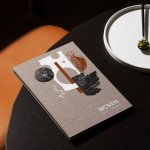
Its other selling point, and the reason we’re talking about it, is its lovely visual identity, created by London-based design consultancy OMSE. The idea behind the overall visual identity was to create a ‘brand that feels welcoming and supportive,’ says OMSE. The result is a recognisable, yet flexible system that reflects all the different ways members can enjoy the spaces.
According to the studio, the visual system and logo were informed by the name, and also the brand’s ‘inviting personality’. That suggests the name was in place before OMSE came on board, but nonetheless ‘Ark’ feels rather cheeky: after all, it suggests a Biblical refuge, a literal port in a storm, the structure that salvages humankind and all the animals (two by two) against the ruins of god’s catastrophic wrath. Meanwhile Ark, the property developer, arguably augments catastrophe by proposing that the solution to ‘tricky landlords’ and ‘unaffordable rents’ lies in costly, glorified bedsits. But the name is a strong, as a visual peg.
![]()

And so, back to OMSE’s work. The aforementioned logo and visual system are based on a semi-circular form (the ‘arc’, in both the sense of an archway and a massive boat, or ark). While these are largely used on promotional materials for the development, such as posters, social media content, and the website (there’s a lovely ark-like carousel); the designs also carry through to the building itself, with the semicircle shape appearing in physical interior touchpoints such as door mats and signage, as well as branded stationery like the studios’ welcome pack and exterior wayfinding. The shape is deliberately ‘referenced in subtle ways to ensure the interiors always feel like home’ but ‘never overly branded,’ according to OMSE.
This is where the branding feels at its smartest: it’s all recognisably ‘Ark’, but in a way that’s totally unintrusive – there’s no mad, wacky bespoke type or kooky symbol, instead it’s just a simple semicircle shape and a lovely off-the-shelf font. The semicircle could, of course, appear anywhere; but in context, it feels distinctly Ark.


The font in question is very apt indeed. OMSE opted to use Right Grotesk by Montreal-based type foundry Pangram Pangram: a typically functional, neutral-feeling Grotesk – a ‘workhorse’ font through and through – but one that oozes gently charming personality thanks to its slightly unusual forms, smooth curves and moderate contrast. As such, depending on the application, Ark’s type can be an all-singing all-dancing logo mark, or simply act as informative copy that sits quietly in the background.
‘Not trendy, not timeless either,’ is how Pangram Pangram describes Right Grotesk, and so it’s the perfect fit for a brand like Ark that aims to look effortlessly zeitgeist, but which also has to withstand the test of time, and be both robust and flexible enough for its expansion plans.

OMSE also made wise decisions around its commissioning for the brand’s photography and films, working with photographer Phill Taylor and director Matthew Sterling to develop a suite of assets that feel understated but hip, aspirational in a louche fashion editorial way, but also sort of relatable.
The typography, photographic imagery and illustrations by Steve Gavan are combined in different configurations according to their applications on ads and social media, accentuating the flexibility of the identity and aiming to form ‘an invitation for people to join the Ark community in a playful, authentic way.’ With a basic form to tie the whole visual system together, the brand style can vary to reflect new locations and help make each home feel unique.
Even the most charming, aesthetically pleasing identity can’t entirely mask the fact that this client appears to have repackaged existing entities with trendy terminology, targeting a demographic of affluent, young (presumably childless) individuals who, Ark hopes, will blindly embrace whatever happens to look ‘hip’.
But Ark’s shortcomings are not OMSE’s fault. The branding work looks great. It’s smart, the right balance of playful and informative, and seemingly does exactly what the client wanted: make the area of Wembley, and its new ‘studios’ by the Boxpark, seem like desirable places to live