Wisl by andstudio
Opinion by Thomas Barnett Posted 21 September 2023

Shaking off a hangover on a crisp Sunday morning kick-about with the boys; dunking a perfect basket on a court raked with the long shadows of a high-summer sunset; obliterating Janet from HR in a ‘friendly’ after-work squash game/grudge-match. These vignettes, I am assured by those who participate in such wholesome activities, capture both the hazy idyll and everyday reality of communal sport, but as a chronically-unathletic layabout I’ll have to take their word for it.
As such, when first examining andstudio’s branding for Wisl, a ‘social sports community platform’, I naturally concluded that I was not the target market for this app. I’d decided this before I had even decoded what a ‘social sports community platform’ actually was (it’s a highly-specialised social network designed to ‘connect you with players, oversee stats, and choose venues in one simple app’.). And yet, Wisl is so obviously a smart idea, and the brand in which it is newly clothed is so prepossessing, that somehow even I was lured into this alien world of voluntarily playing sport with strangers.
Wisl approached Lithuanian agency andstudio ‘with a desire to visually convey its community-oriented goal: to be a platform where new relationships are born through an effortless user experience of organising games’.

As well as forging the visual brand, andstudio also handled the naming. Andstudio says that finding teammates ‘should be as easy as whistling, so just wisl’ – a neat bit of copywriting that is wasted languishing in the case study introduction. There is no sign of this cute line anywhere in the actual brand, which is a shame, as it does help to reinforce both the meaning and pronunciation of the name. ‘Wisl’ conforms to the Silicon Valley startup convention of final vowel deletion, but andstudio went further and also deleted two silent letters from the original ‘whistle’ (take that, English and your fusty superfluities). While the name does still work, one can’t help wonder if allowing the ‘h’ to remain might have worked better: ‘whisl’’. A persistent part of my brain does insist on reading ‘Wisl’ as either ‘wise-el’ or ‘wiz-ul’.
Perhaps phonetics were sacrificed at the altar of form – the logotype feels wonderfully compact and tightly sprung in a way that a bandy-legged ‘h’ may have interfered with. According to andstudio, the lettering was inspired by ‘hand-drawn strategic schemes and the trajectories of a bouncing ball’. The case study features numerous mockups of the logo on t-shirts, bucket hats and other merch that may or may not really exist. In any case, the logo looks great in these applications, which highlights how well it scales: simple enough to be legible at tiny app-screen sizes, but formally satisfying enough to effortlessly occupy an entire t-shirt.
![]()

The stylised ‘W’ of the logo serves as app icon, and is also used to create various ‘playful mascots’, cleverly forming the torso and arms of characters, while legs clad in beguilingly nineties basketball shorts and lace up sneakers are added in cutely doodly lines. The ‘W’ is stretched and compressed to create an impressive array of different poses across various sports. Some work better than others – a ‘mid-air basketball dunk’ adds an extra corner to the ‘W’, which feels a bit like cheating and ruins the fluidity of the letterform. The characters are appealingly chunky, and even a little clumsy – not in execution, but in the sense that these hapless little squiggles don’t really look like they’re 100% sure how to actually play badminton, but they’re giving it a go anyway. Andstudio expresses this well by describing their creations as ‘easy-going and quite naive’. Resisting the urge to make these characters too lean and tigerlike is a wise move, chiming well with the brand mission of creating ‘an approachable platform for a wide range of audiences and ensur[ing] that it showcases adaptability to any sport.’
The characters work well as individuals, but when they are arranged into a repeating grid-formation (on posters, app screens and other applications) they become a bit bewildering. Because the ‘W’ registers so much more forcefully than the darker-blue lines, and there is no buffer space between the repeated motifs, it becomes hard to read it as anything other than a zig-zag line.

One particularly cool (if outlying) application shows the logo on a frisbee, enlivened with holographic stripes. It is fun to see the hitherto-only-subtly-hinted-at 90s aesthetic embraced more explicitly. There is probably not a compelling case for why this contemporary and practical app should have a nineties throwback feel, but it is inexplicably cool nonetheless. Though it is only one frisbee mockup, it hints at an appealing injection of visual messiness, suggesting sports spaces with contrasting and clashing team colours, mascots, crests, emblems and sponsorship deals.
The bright colour palette also gestures towards this exciting and subtly nostalgic world. Andstudio’s case study shows key colours of basketball-orange alongside a sensible sporty dark blue, backed up by a riotously nineties additional ensemble of play-dough pink, purple and green.


Alongside these punchy colours and the playful illustrations, the photography is a nice, if unremarkable, counterbalance. It serves a valuable function playing the comic foil, grounding the graphic elements in a more recognisable reality. Some discreet video work adds further depth, without distracting from the main event.
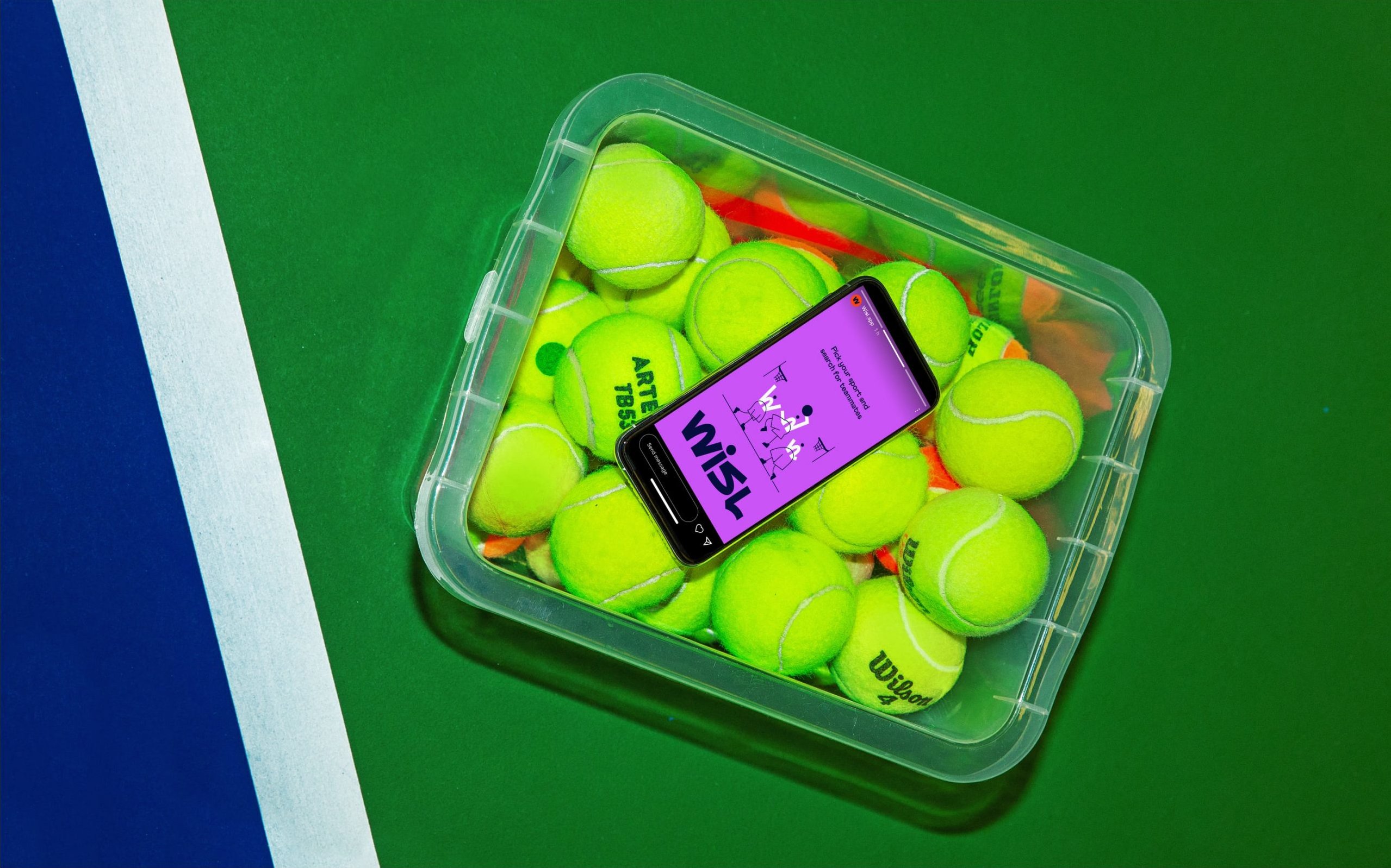
The key application of this particular brand design would of course be the Wisl app itself. However, at the time of writing this is not yet available to download (you are invited to sign up to a waiting list), and even the mockup screenshots on Wisl’s website appear to be unbranded. It’ll be interesting to see if the brighter, more fun elements of the design scheme translates to the functional space of app UX design, without compromising on its essential character.

It is worth mentioning that the website (which does not feature in andstudio’s case study and so was presumably designed without their involvement) is underwhelmingly clean and tidy, and feels like a missed opportunity by Wisl’s brand managers/web agency to utilise the more fun aspects of andstudio’s work. For example, in terms of colour the website is restricted to just the orange and navy, with a washed-out peach colour as mediating neutral shade. The scheme is tasteful, but generic compared to the lively, evocative palette andstudio have created. Let’s hope a fuller website is in the works to coincide with the app launch, and that andstudio’s delightfully wacky illustrations and colours aren’t left on the bench by overly conservative brand managers.

Overall, this is a thoroughly enjoyable and versatile brand. That logo, like any brilliant athlete, makes heavy lifting look effortless with its delightfully taut and springy form. More importantly, andstudio’s work manages to capture the passion for sport while sidestepping any feelings of clique-iness; reconciling sportiness with a relaxed accessibility is no mean feat. In its vibrant but undemanding presence, Wisl makes one feel they need never worry about being the last picked for the team.