Copywriting
Phoenix Organics by Marx Design
It’s a tale as old as time: a once beloved brand – a pioneering brand even, the first of its kind or category – that gets rather lost over the years, muddled in a confusion of sub-brands and spin-offs. Such brands often fall victim to a sort of design by committee – and rarely intentionally: as companies grow and expand...
Bettr by Anak
Between the late 2000s and the early 2010s, the coffee industry turned its attention to ‘craft’, elevating the beverage to a gourmet offering. When it came to brand storytelling, flavour notes, provenance and sustainability became key components. These features came to define what’s now known as ‘third-wave coffee’, which pre-dates the gamified science-infused ‘fourth-wave coffee’ movement in terms of textures...

Hello Klean by Two Times Elliott
Beauty is, of course, in the eye of the beholder, but there’s no denying that objectively, its branding and identity design has undergone some huge changes over the past decade or so. Gone are the days of faux-luxurious designs that were all about swathes of abstract silk; women coiffured to within an inch of their life; a microscopic lens on...
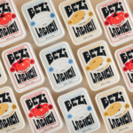
Bezi by Red Antler
Bezi was founded by Ilay Karateke – an Istanbul-raised, New York-based, ex-McKinsey consultant turned cheesemaker – and Hasan Bahcivan – a Berkeley-trained engineer from one of Turkey’s largest and most legacied cheesemaking families. Both grew up in large families, with their lives punctuated by big family-style meals shared with friends and neighbours. Labneh, a Middle Eastern spreadable cheese, was ever...
Precise by Design Bridge
Mortgages aren’t exactly the most sexy or fun concepts, nor are the companies that offer them. Likewise, the sector isn’t exactly known for a bold or forward thinking approach to brand design. But it’s often the more traditionally dull-leaning brands or companies that make for the most creative – not to mention difficult – branding projects. Perhaps that’s part of...
Sendwave by DesignStudio
The concepts of ‘money transfer’ and ‘community’ don’t immediately seem to go hand in hand: the former feels cold, slightly dry, potentially confusing and rather literally transactional; the latter is all cuddly and feelings and people-y. But uniting these two seemingly disparate worlds is exactly what DesignStudio did recently in its rebranding of Sendwave, a digital platform offering money transfers...

Murray’s Cheese by Base Design
The ‘shoppy shop’ trend shows no sign of abating. For those not in the know, the term – popularised by New York Magazine’s Grub Street – indicates those small-to-medium businesses selling upmarket ‘provisions’ (charcuterie, legumes, sauces, tinned goods) with a veneer of heritage, authenticity, and (seemingly) innovative ingredients, as if they were the modern ‘general stores’ of olden days. On...
Pamipe by Omni Design
In recent years we’ve seen some radical shifts to the ever-booming pet care sector. That’s thanks in no small part to the Covid 19 lockdowns that saw many of us seeking solace and company in domestic animals, taking advantage of the WFH policies that, once upon a time, felt endless and unwavering. Another catalyst, perhaps, is that in an increasingly...
Barnardo’s by The Clearing
Barnardo’s is the UK’s largest children’s charity, and it undoubtedly does much good in the world. However, its history up to this point is also littered with uncomfortable controversies. Certainly, the most outlandish transgressions are concentrated in the late-19th and early-20th centuries. Founder Thomas John Barnardo was taken to court 88 times for kidnapping children (or ‘philanthropic abductions’, as old...
Qasa by Bold
Now that the likes of ed-tech (education technology) and fin-tech (financial technology) have become a natural part of everyday parlance, it was surely only a matter of time before prop-tech (property technology) entered the equation, too. Proptech largely refers to platforms and services that use tech to help people buy, sell, research, market, and manage a property – ranging from...
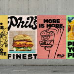
Phil’s Finest by Gander
It’s a moot point now that the last few years have seen an explosion in all things vegan and ‘plant-based’ (a term arguably used lightly, when you consider the ingredients in many no-meat, no-dairy, no-animal product alternatives). There’s vegan cheese that actually tastes nice, there’s mushroom and hemp ‘magic mince’, even vegan tuna. I’m writing this while eating a vegan...
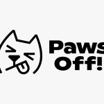
Paws Off! by Seachange
Anyone who’s ever had a dog, or just interacted with one, has likely spotted that over and above pretty much anything, food is the centre of their universe. Unfortunately for us, though, it’s not just dog-safe food that they’ll do whatever it takes to get their paws on: human food, it seems, often has the most appeal. But just as...