Plume by Human After All
Opinion by Thomas Barnett Posted 19 December 2023
Plume is a Denver-based telehealth service (or ‘virtual-clinic’) tailored specifically to the needs of the trans community across the US, offering a range of services including prescriptions for oestrogen or testosterone. This is a hostile political landscape to step into, but Plume is doing it with bright and bold panache, courtesy of a fresh rebrand from London-based studio Human After All.
To map just a fraction of that hostile topography: 2023 has earned the grim sobriquet of being a record-breaking year for anti-LGBTQ legislation in the US, with a staggering 589 bills introduced across 49 states. These bills span almost all areas of domestic policy, including education (Florida’s ‘Don’t Say Gay’ bill), entertainment (Tennessee’s ludicrous restriction of drag performances), the interminable dog-whistle issue of public bathroom access, and, of course, healthcare.
There are now bans or restrictions on best-practice gender-affirming healthcare for under-16s in 19 states. This multidisciplinary care is backed by years of rigorous research and endorsed by leading health authorities, such as the American Academy of Pediatrics and the American Medical Association. Even in states where access to gender-affirming healthcare is not being incrementally stripped away, it’s a distressing reality that LGBTQIA+ people face significantly poorer healthcare outcomes and experiences than their heterosexual counterparts – a disparity that is even more acute in the case of trans individuals.
In the groundbreaking US 2015 National Trans Survey, one-third (33%) of those who saw a healthcare provider in the past year reported having at least one negative experience related to being transgender, such as: being refused treatment, being verbally harassed, being physically or sexually assaulted, or having to teach the provider basic information about trans individuals. 23% of respondents did not see a doctor when they had needed to because of fear of being mistreated as a transgender person.
To address this desperate need for better, non-traumatising access to gender-affirming healthcare, former medical-school buddies Matthew Wetschler and Dr. Jerrica Kirkley founded Plume. Their vision is radical not just for catering to a marginalised community, but also, according to Wetschler, for ‘offer[ing] a way of accessing this…trans-specific care regardless of policy or insurance coverage’ – for a fee of $99/month.
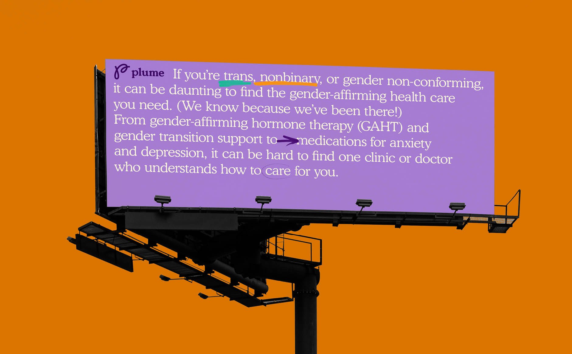
As Plume grew, London-based branding and communications studio Human After All was chosen to develop a brand that could keep up with Plume’s growing ambitions. Initial work on the name and logo had already been completed by Koto, but Human After All identified that ‘as the business entered a new phase, partnering with major health institutions, Plume needed a more compelling identity, which built on the established brand’. Human After All identified one of the key demands of this brief as needing to devise a brand that would ‘project confidence, but also feel inviting to people at a sensitive stage of their identity journey’.
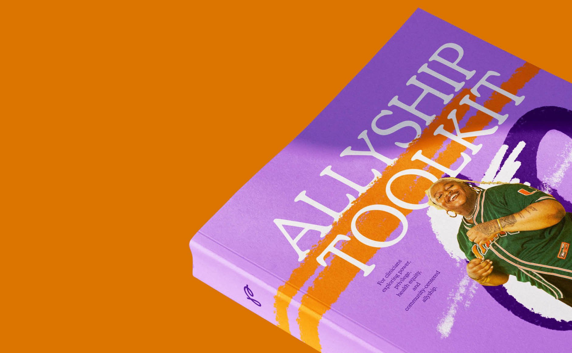
This challenge was met with the core concept of Finally Home: the notion that ‘everyone should feel at home in their body… your body is your private space, and only you can decide what that space has to be’. It is a strong concept that palpably informs all aspects of the visual brand – particularly the anarchic doodles that are scrawled across layouts and peppered throughout the typesetting. If we are invited to read Human After All’s brand design as an allegory for a liberated human body, then this feels like one who has joyfully tattooed themselves and dyed their hair purple.
This allegory of brand-as-body led to a brand system that is ‘not rule-bound’. The chimerical illusion of a brand (which is unavoidably a set of dos and do not’s) that is not ‘rule-bound’ is notoriously difficult to pull off, but Human After All has managed it. A profusion of hand-drawn elements is creatively suffused throughout the brand, using the double-loops of Koto’s ‘P’ lettermark as a jumping-off point to create a brand lexicon that is both joyfully anarchic, yet brilliantly coherent.
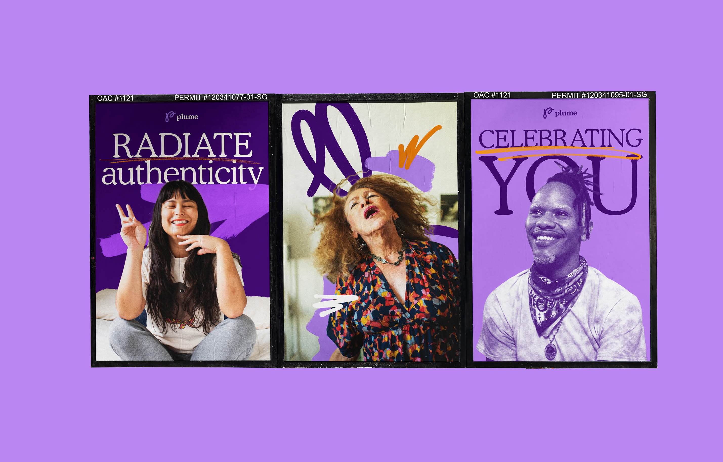
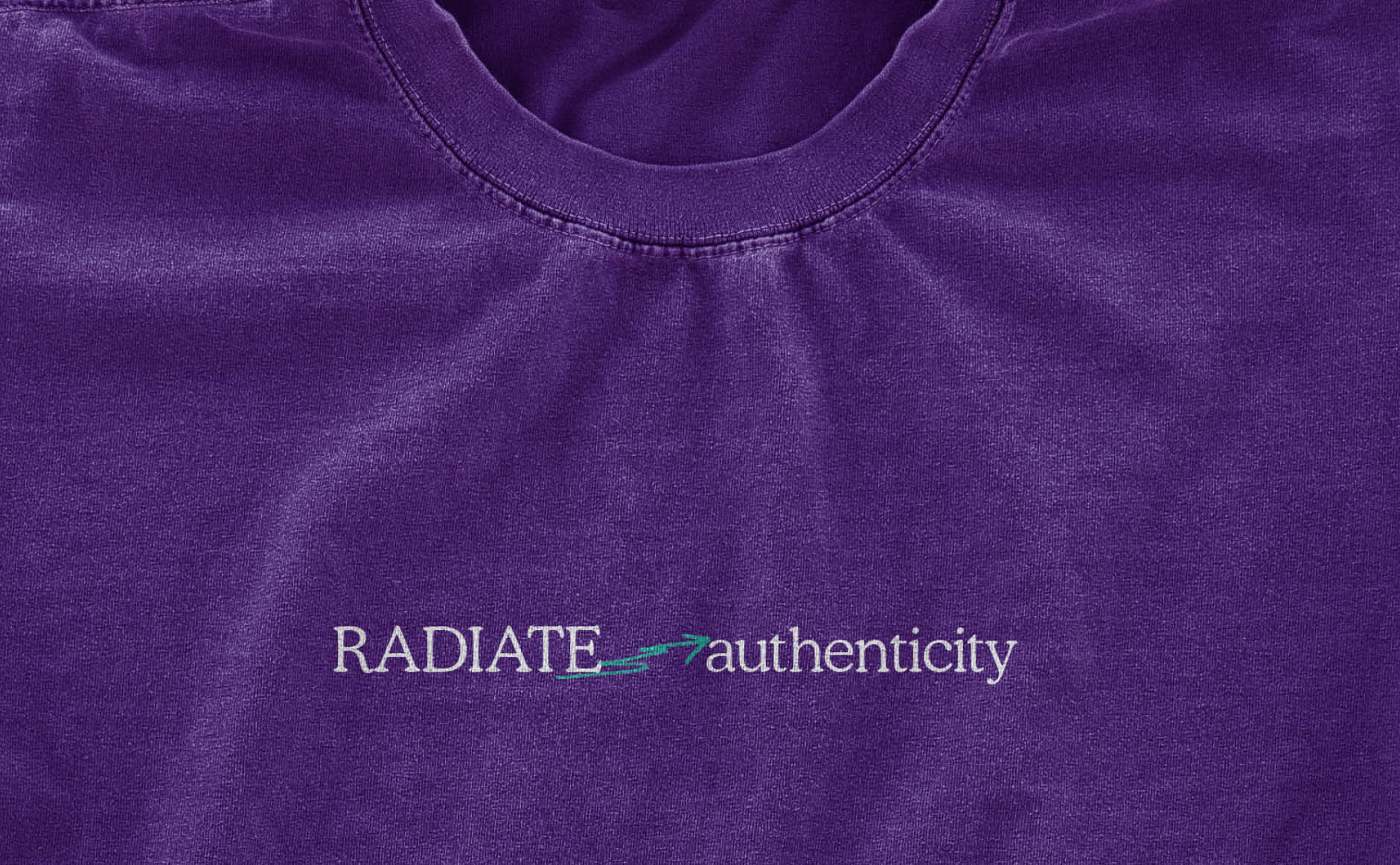
On paper, the use of hand-drawn typographic ornaments (underlines, arrows, playful scribbles etc) does not promise to be a sufficiently original approach for this radical organisation. Ostensibly ‘hand-drawn’ typographic flourishes faux-jauntily adorn any number of otherwise joyless, generic corporate brands like the garlands of threadbare tinsel at a lacklustre office party. Very rarely do ‘hand-drawn assets’ convincingly look as if they are actually the product of pen-or-pencil-tip on paper, let alone the idiosyncratic expression of a real person’s hand and mind. More often they look like the only too obvious progeny of a plugin brush preset, birthed on an Illustrator artboard.
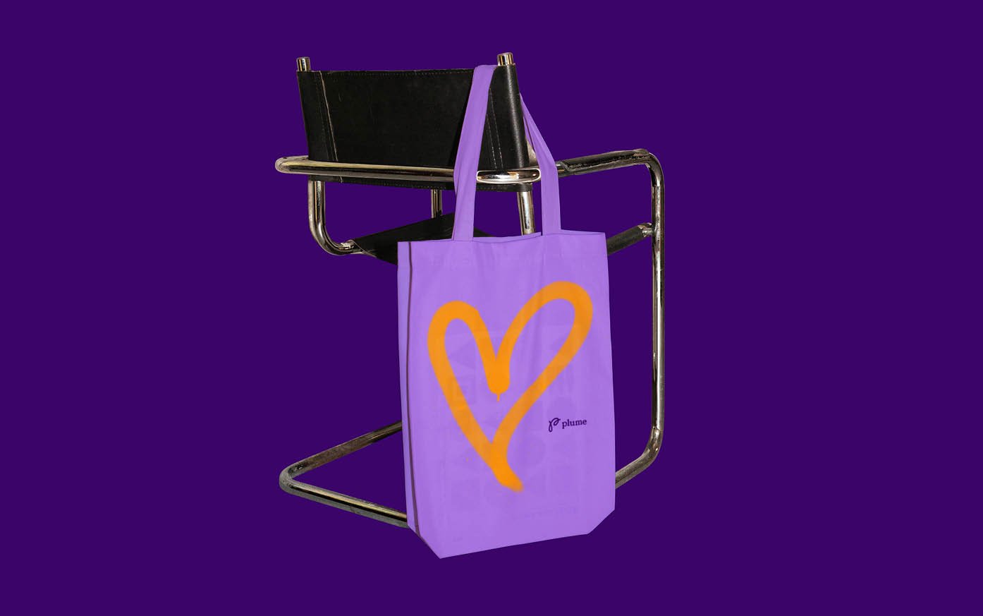
However, unlike these inferior examples of the type, Human After All’s hand-drawn work for Plume is both beautiful and meaningful – elevated by the rich textural quality of the elements as much as the depth and thoroughness with which they are integrated into the brand. There are charcoal, pastel and other dry-material textures, spray paint, as well as highlighter pen/ink washes. This variety of dry and wet media combines to create a sophisticatedly complex pattina. The superlative quality and enormous variety of textural details make these genuinely charismatic features that also seriously connect to the core idea of a brand that is not ‘bound by rules’ and that represents a sense of somatic integrity and individuality.
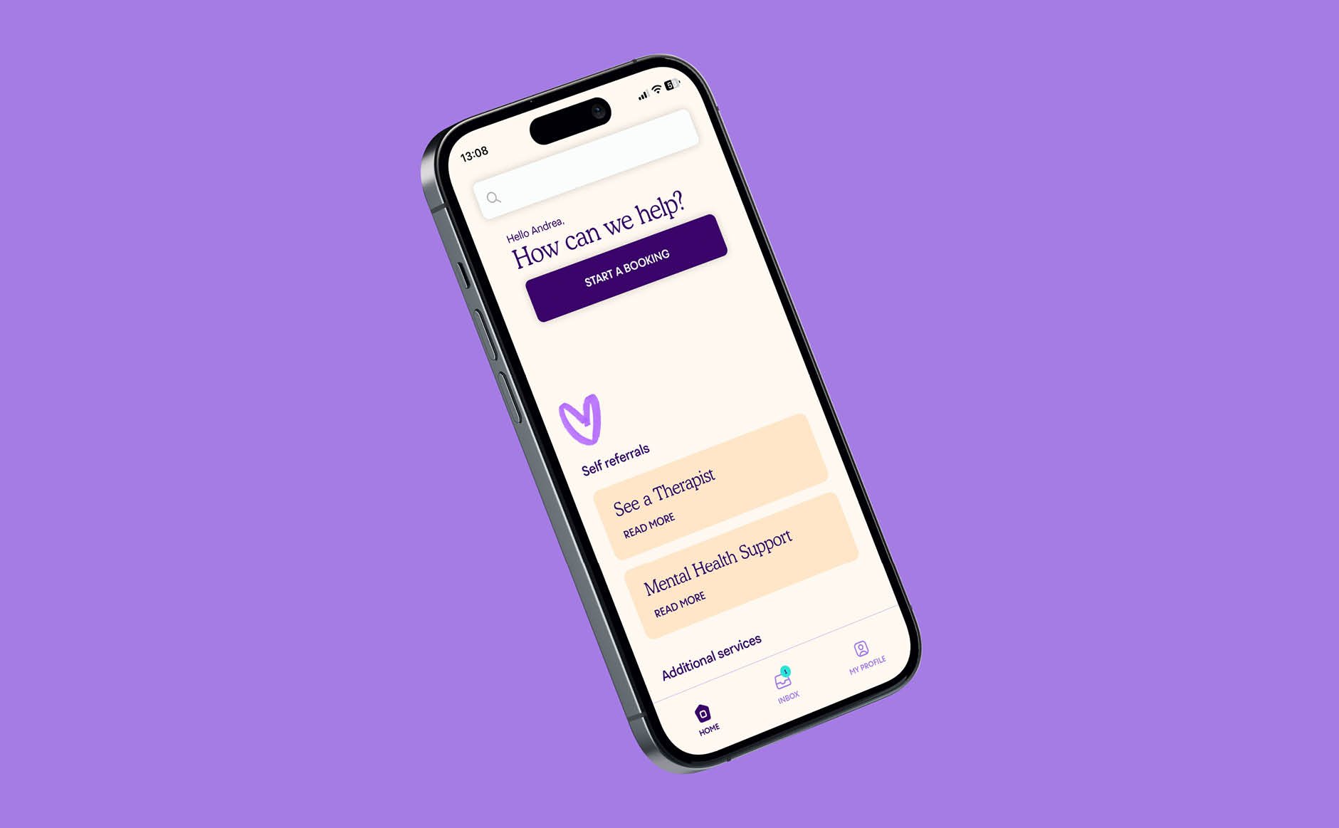
The same level of thoroughness and imaginative flair is displayed in how these doodled elements are deployed throughout the brand. They are expanded into a highly distinctive iconographic language, scaled up into structural elements that provide interesting and varied frameworks for grid-less layouts, as well as being collaged into larger patterns and textures that are combined with photography to make bright and engaging branded imagery.
Animation is simply but creatively used to further deepen the joyous collage of mark-making, with lines and shapes flickering from form-to-form and sparkling in brand-palette multicolour. The more you look, the more there is to see. If you’re going to use hand-drawn elements in your branding, take note: this is how you do it.
A rich trio of purples, peach and turquoise comprises the colour palette, each with light, medium and dark tones to allow the trio to be combined harmoniously. The bright palette captures a resolute optimism, tempered with the unabashed boldness in the way these colours are used throughout the brand, which subtly evokes the protest graphics of front-line activism.
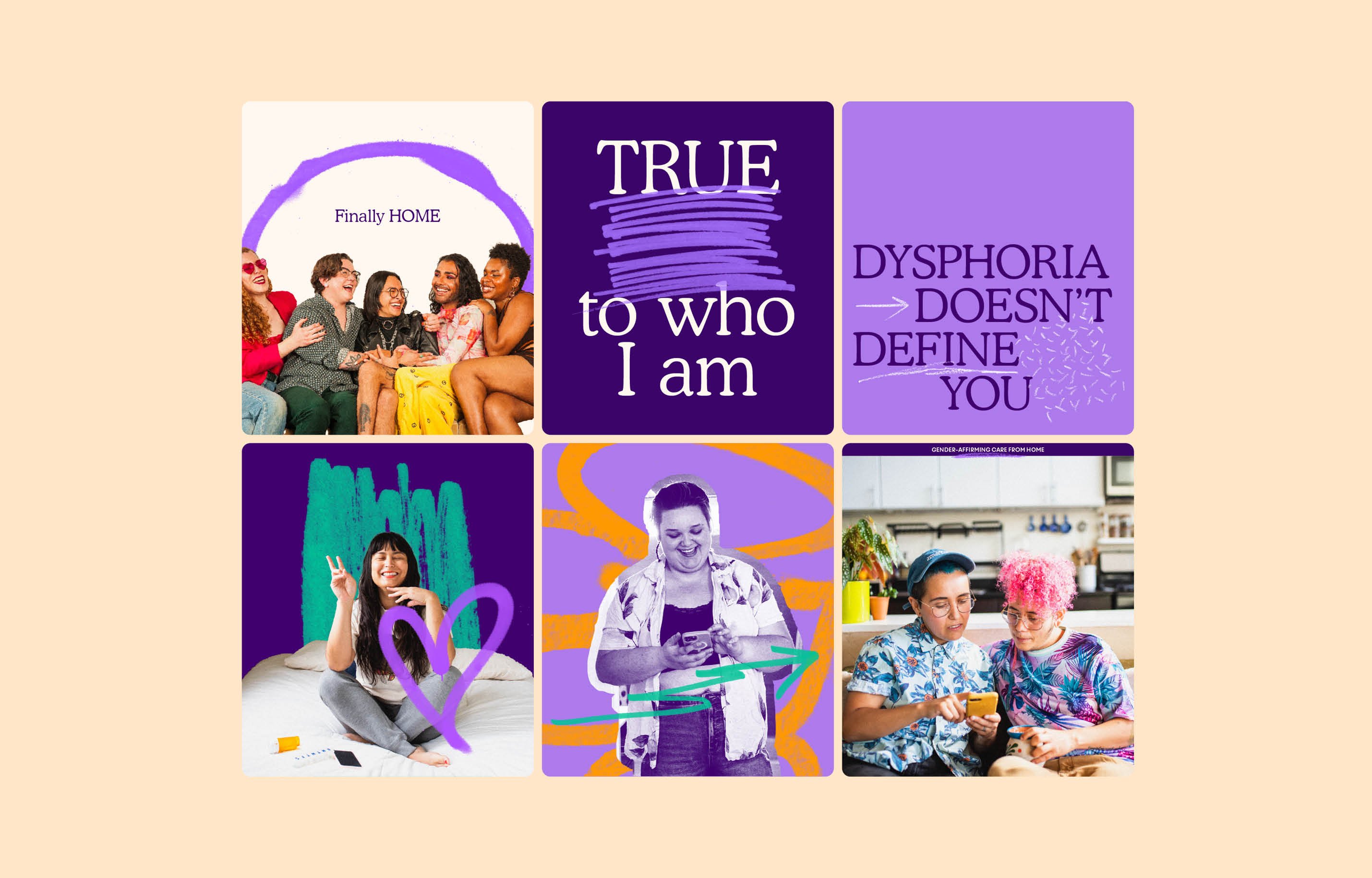
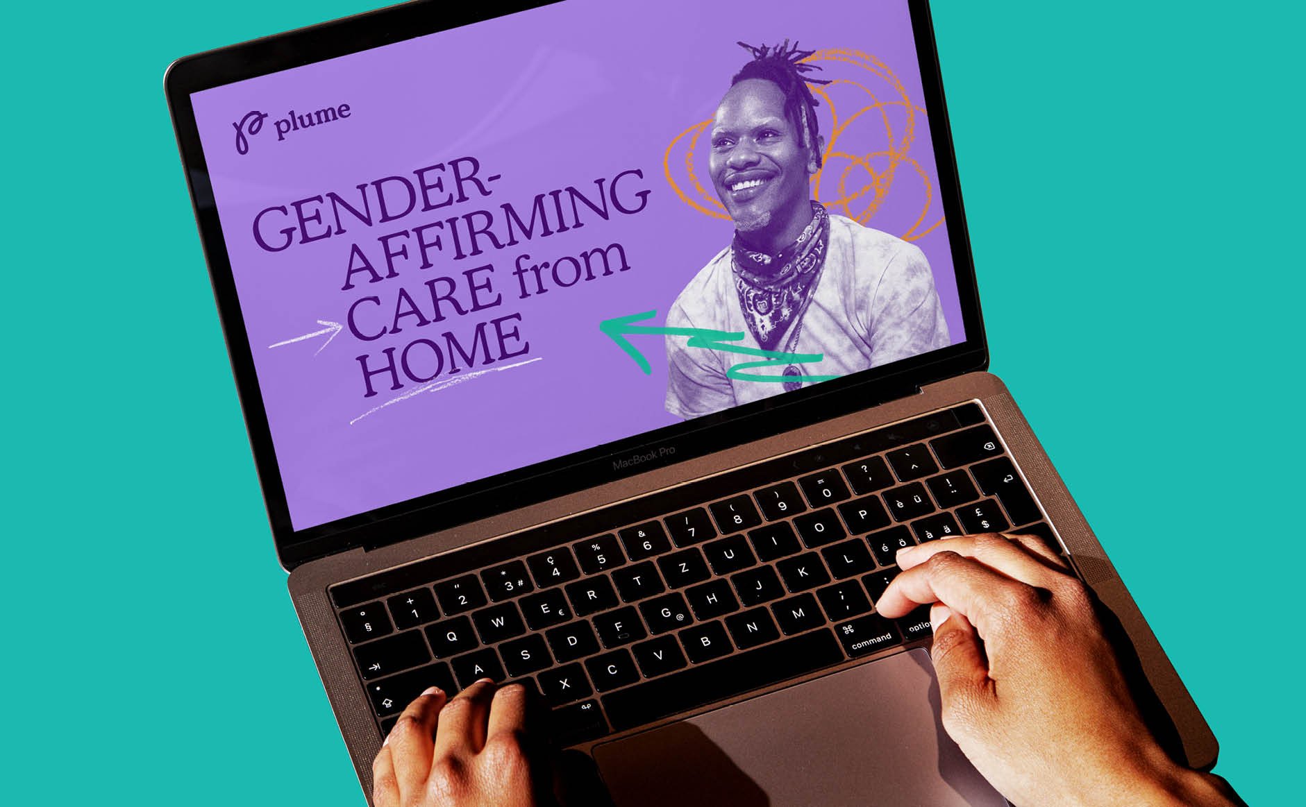
Hero font Cooper is a softened and rounded serif, friendly yet knowledgeable and disruptively un-digital. Though we are rapidly approaching over-saturation of the typographic trend of ‘characterful’ serifs used in surprising digital applications (see my recent review of Wholesome), in this application the font choice is perfect, straddling the difficult mid-ground between approachability and trustworthiness.
In a similar vein, though the photographic treatment of ‘well-lit people smiling naturally at the camera’ is not a particularly original style of art direction, the commitment to showing happy, healthy trans individuals in this most generic of corporate imagery styles renders it unexpectedly subversive. The combination of full colour imagery and subtler monotone photos allows for versatile usage of photography in those textural collage-like layouts.
Despite being composed of deceptively tame individual components (doodles, Cooper and smiley photography), Human After All’s work for Plume is courageous. It is unabashedly optimistic and assured, even in the face of a dark and rising tide of state-sponsored bigotry. For that it deserves every plaudit.
