Francos de Montréal by LG2
Opinion by Thomas Barnett Posted 4 January 2024
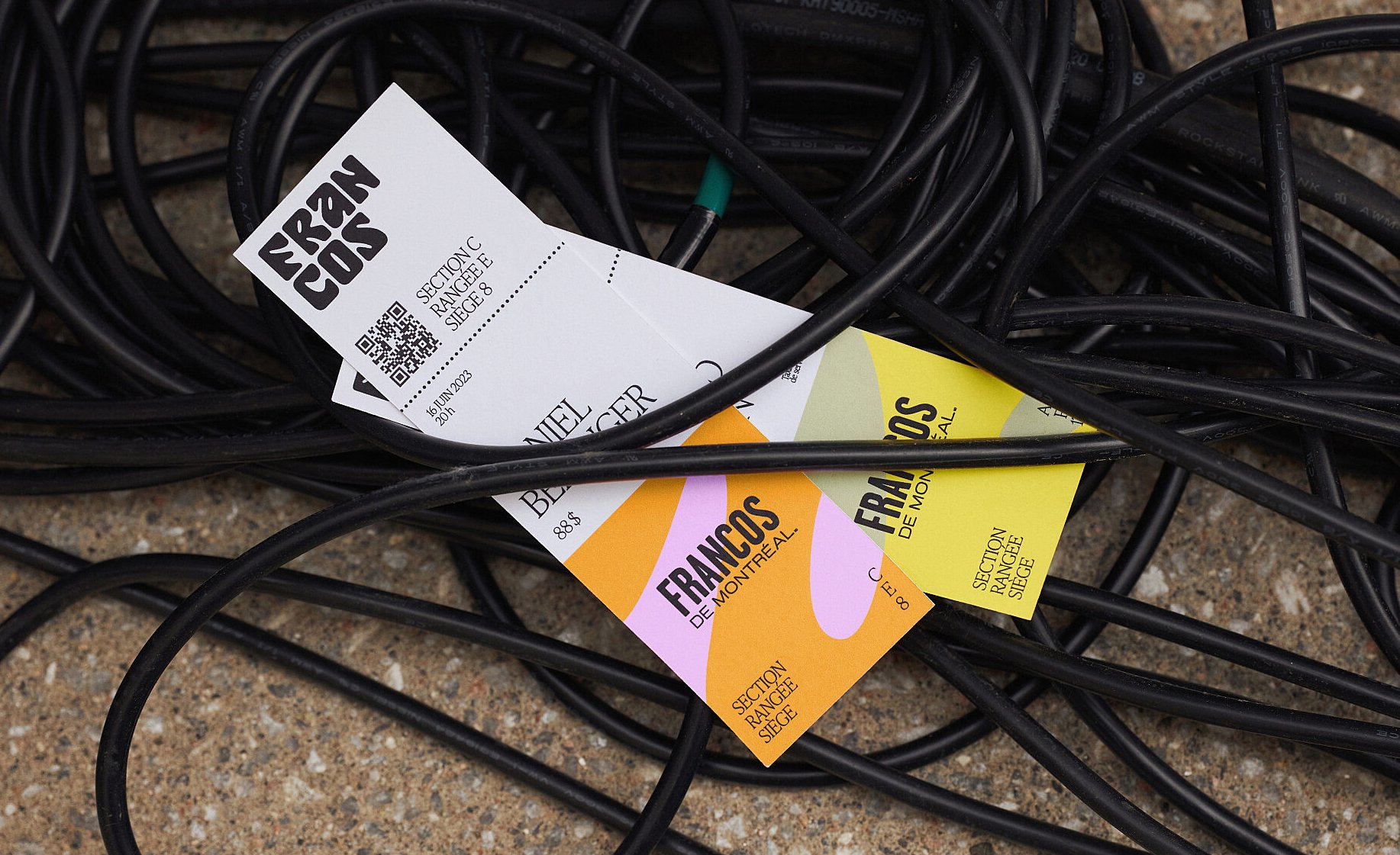
Les Francos de Montréal is Canada’s premier festival of French language music and culture. Held annually in downtown Montréal, it is a fixture in both the social calendar and cultural life of the city, and the wider francophone world. This year’s edition of the festival has been given a sophisticated new look, courtesy of LG2, Canada’s largest independent creative agency and Canadian Design Agency of the Year 2023.
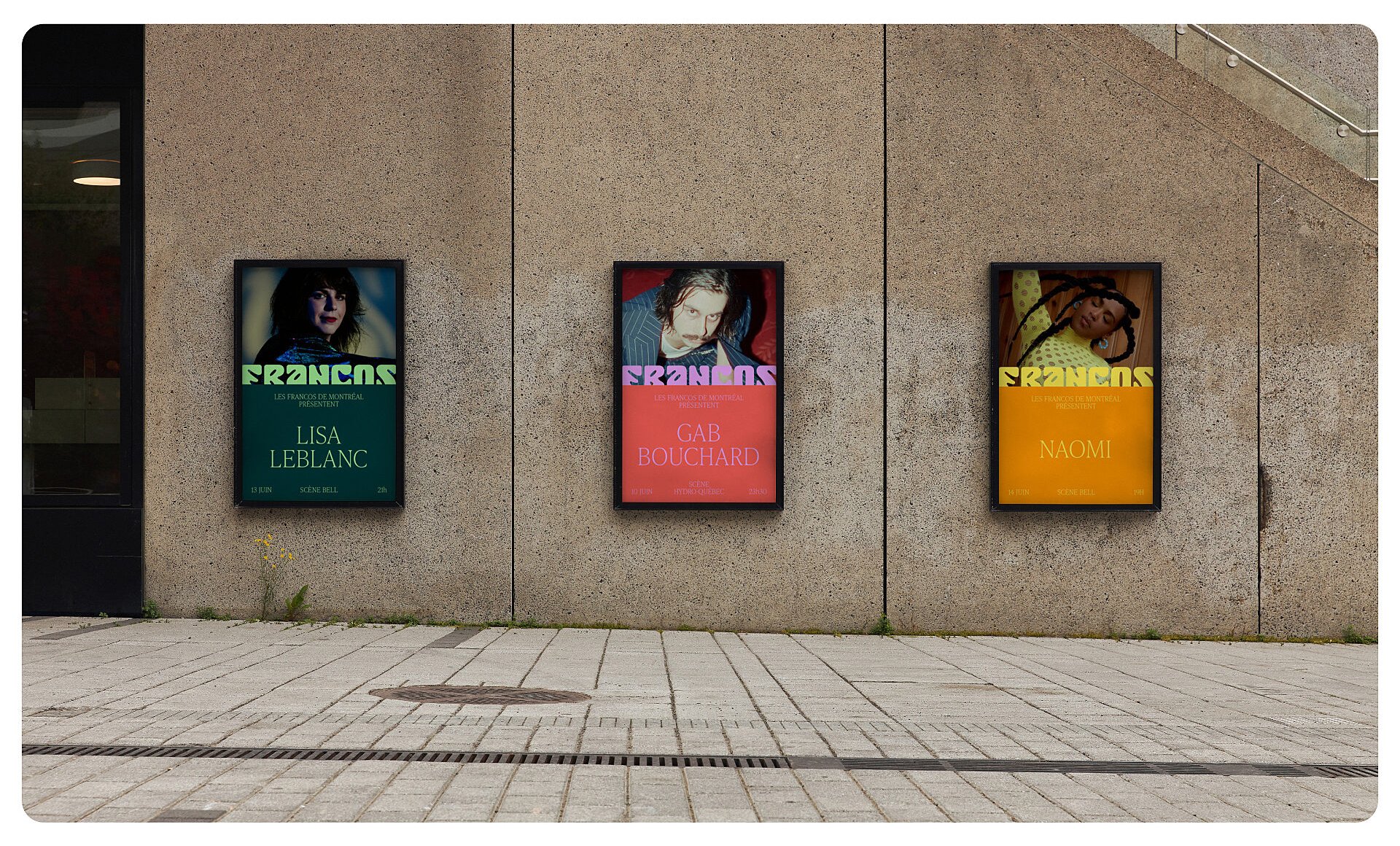
There is a palpable sense of hometown pride in this cool, sumptuous work which adds vital warmth and heart to a sleek typographic-led brand. Whereas the Francos’ previous identity was passable but unmemorable, this resplendent new skin is unmistakably tailor-made and distinctively chic.
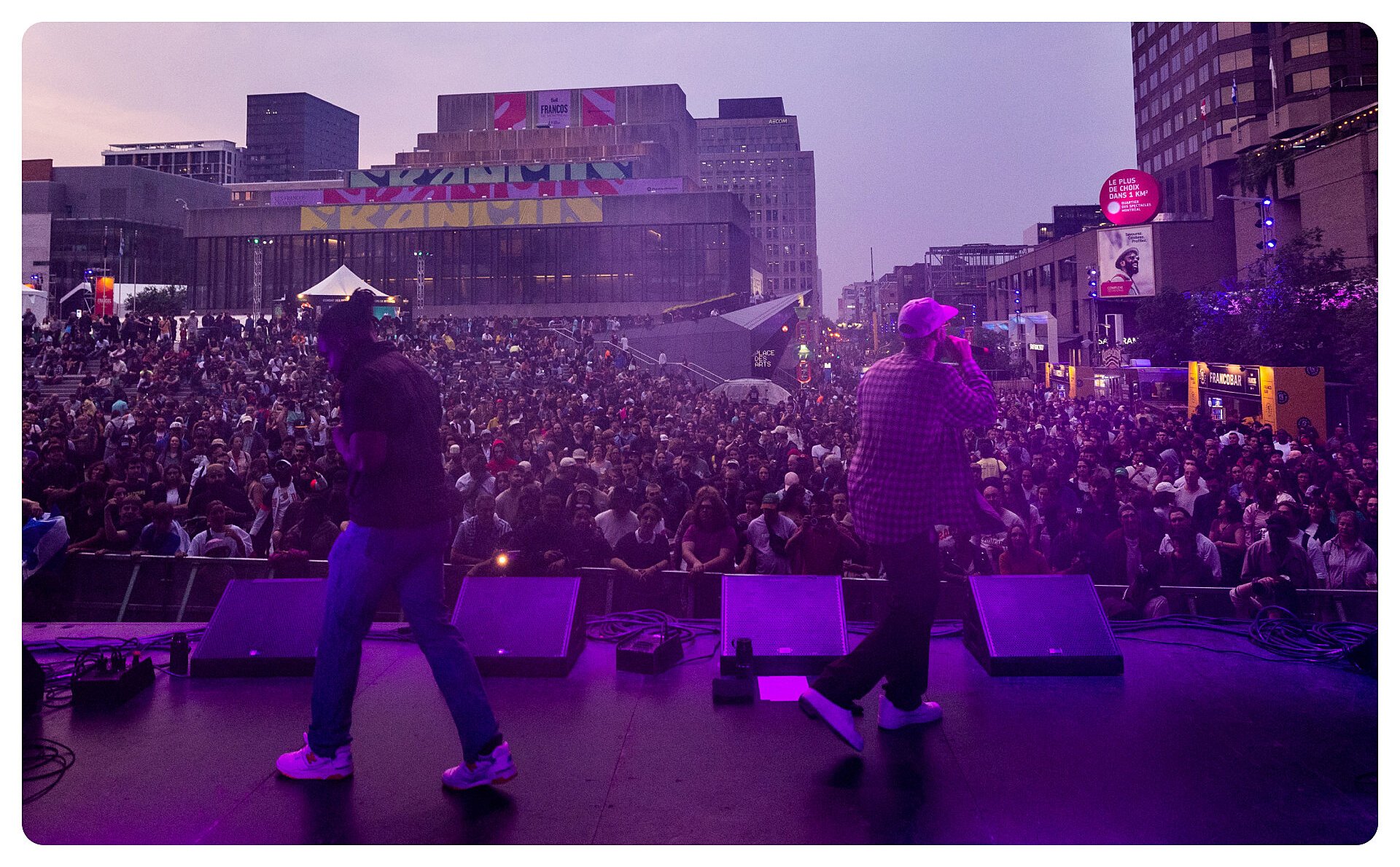
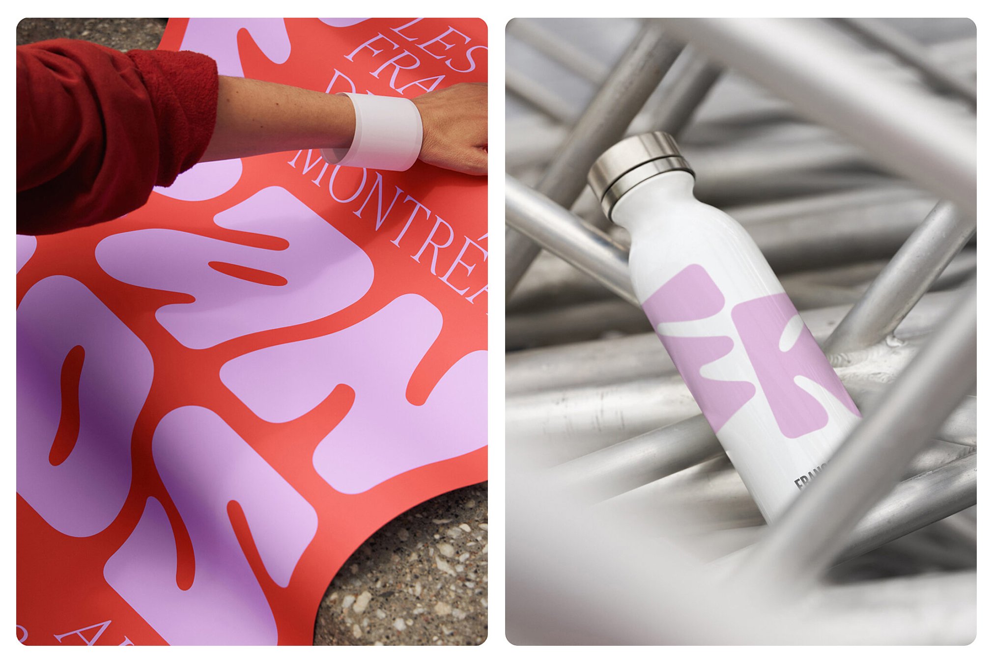
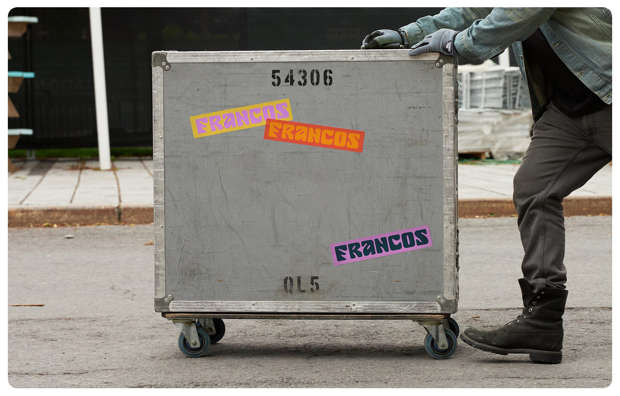
The logotype is composed of seven playfully abstracted letterforms, abbreviating the name colloquially to Francos. The logo is immediately recognisable – about which LG2 are so (rightly) confident that they take a delightfully devil-may-care approach to how the logo is used. It variously appears abbreviated to just ‘FR’; split insouciantly across two or three lines; partially peeking from behind other layout elements. This demonstrates a supreme and well-placed confidence in the inherent formal strength of the logotype. This approach to the deployment of the logo wouldn’t necessarily work for other kinds of brand, but for a festival identity it is perfect. This boundless flexibility allows the digital touch-points to mirror the huge variety in the physical applications of the logo across the festival site – filling 100ft long banners, projected onto stages and the sides of buildings, popping up as large scale sculptures.
One small criticism is that the ‘F’ itself is fractionally less formally satisfying than the other constituent letterforms, which inhibits the ability and inclination to use it as a standalone initial. Compared to the rest of the letters it feels unbalanced – perhaps a little too irregular, or perhaps not quite irregular enough.
Though stylistically contrasting, the logotype letterforms have the same overall height and width profile as their counterparts in the brand font, Ivy Presto. This allows the custom letters to be selectively, provocatively switched into headings and artist names. The juxtaposition of classical elegance and contemporary abstraction in the pairing of a Romanesque Old Style serif font and the custom, abstracted logotype feels stylishly eclectic and playfully iconoclastic. This approach also creates a typographic vocabulary that cleverly spans the diverse multitude of musical genres and performance arts that Les Francos showcases– LG2’s typographic system can compellingly announce cutting-edge techno DJs, virtuoso concert violinists and everything in between.
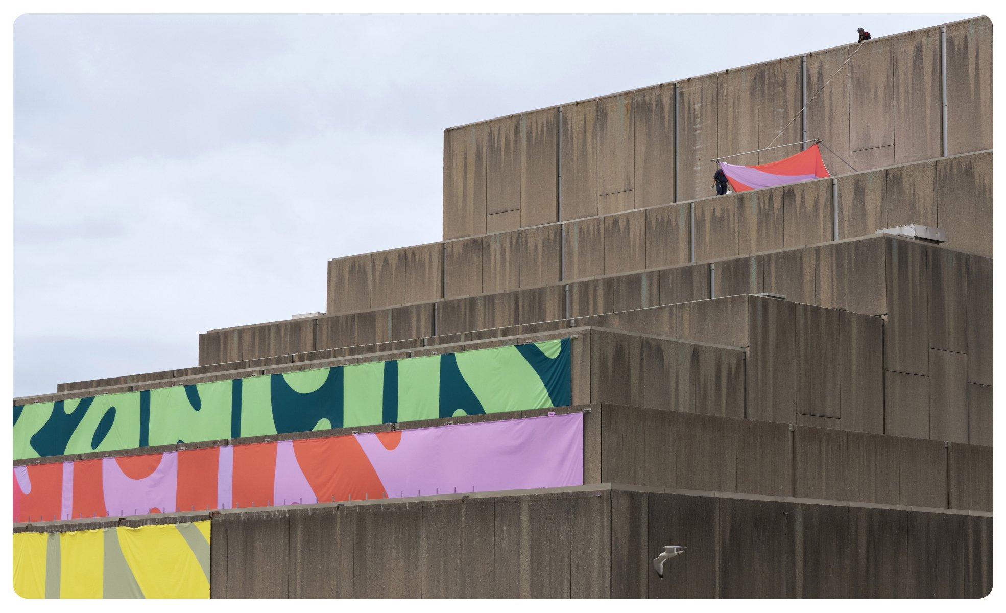
The seven letters of the logotype also provide the magic number for the seven-colour palette. According to LG2, ‘each letter was drawn in a colour inspired by the spring season’. This must have been an early iteration of an idea that didn’t make it to the final execution (the logo only ever appears in one colour), but it gives an insight into the structural thinking that underpins the rich, rainbow palette of springtime tones. The use of colour throughout this brand is exceptional. The palette has been so carefully configured that each colour pairs with any of the others to create an effect that is either harmonious or provocative – either way it feels both intentional and fresh. Such is the careful consideration obviously given to the palette that even in layouts that feature artist photography which inevitably doesn’t conform to the brand palette, the effect is always painterly rather than lurid.

Strangely, the application of this appealing new brand seems to have been limited to physical touchpoints for 2023’s edition of the festival. The website uses a limited selection from the colour palette, none of the typography, and most strangely, the old logo. The new letterforms appear only as barely recognisable background graphics. A cursory flick through Instagram also reveals a sometimes shaky grasp of the brand aesthetic, in need of the typographic discipline evident in LG2’s case study.
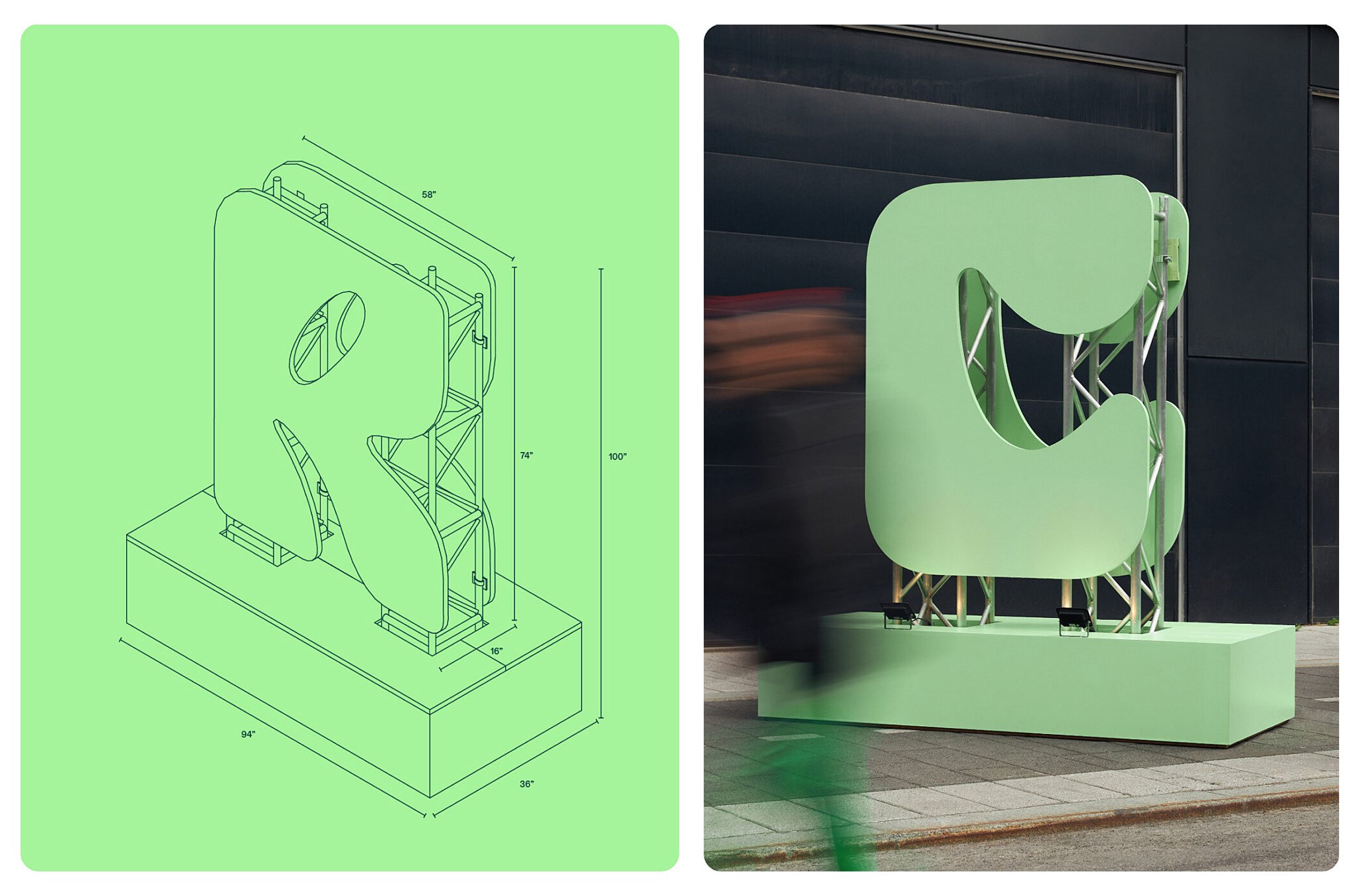
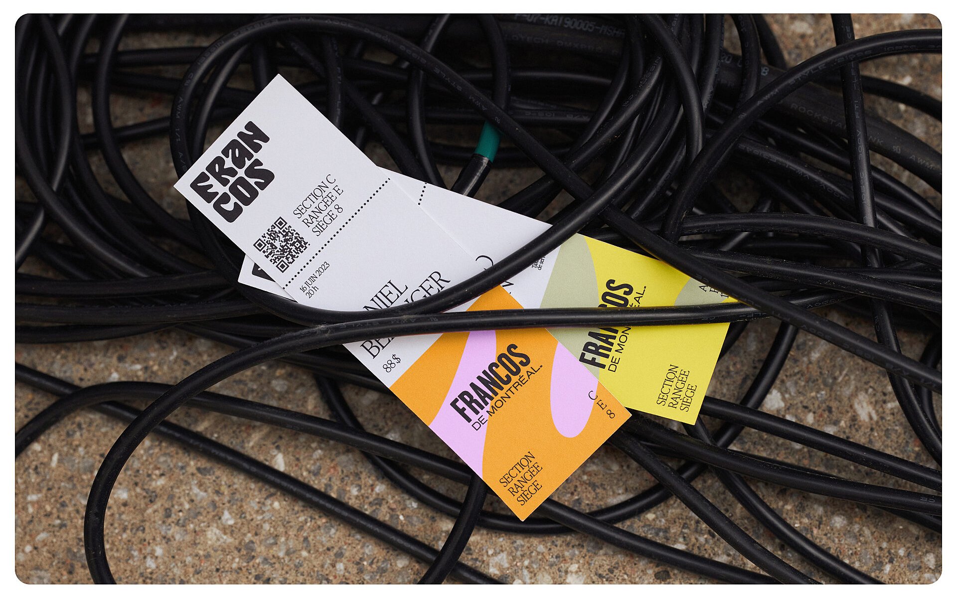
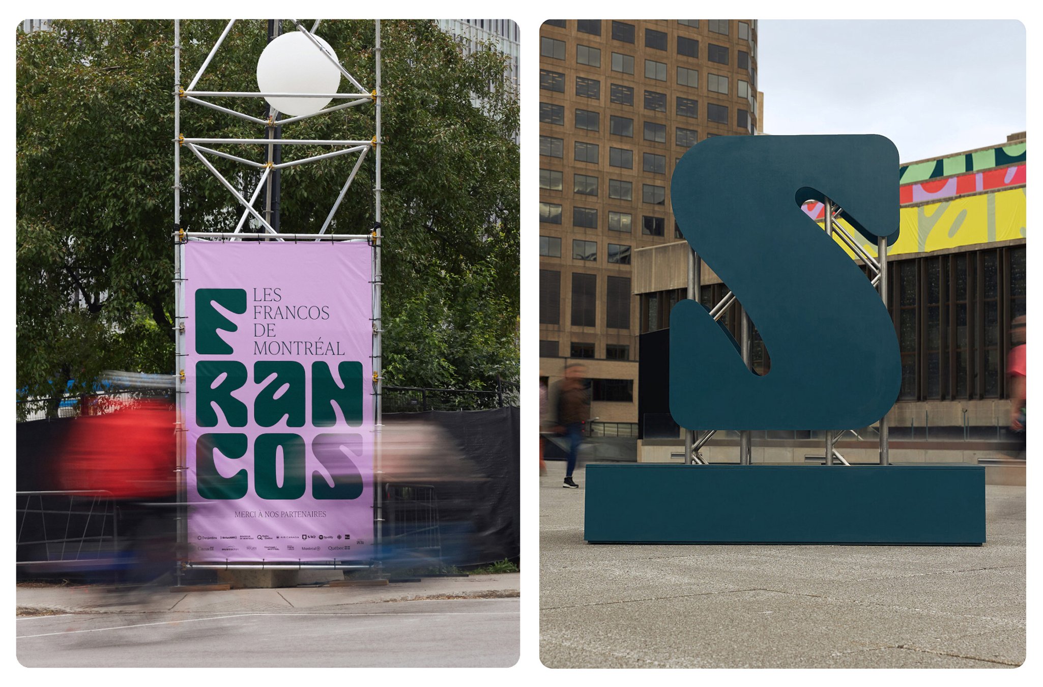
Even in that case study, the bland old logo incongruously appears on mockups of banners on scaffolding towers. It is unclear what role this old logo still has to play in the new brand, and what rules govern how, where and why it is used instead of LG2’s much stronger update. A guess might be that the old version is a closer simulacrum of the logo for L’Équipe Spectra, the cultural agency responsible for hosting Les Francos (as well as the Festival International de Jazz de Montréal and Montréal en Lumière festivals, and several venues across the city). Frustratingly however, it’s not even an exact match. They are both tall, narrow, Gothic sans-serif logotypes, but the similarity ends there. Here’s hoping LG2 is being brought back in to work on an overarching identity for L’Équipe Spectra, to capitalise on the home-run of its identity for Les Francos.
Of course, none of this speculation has anything strictly to do with our consideration in this article of LG2’s excellent work. I mention it only in case anyone from L’Équipe Spectra is reading this. If they are, I wholeheartedly urge you to hurry up and roll out this gorgeous new identity across your website and all other touchpoints in time for the 2024 festival.
