Parkette by Kinoto
Opinion by Emily Gosling Posted 9 January 2024
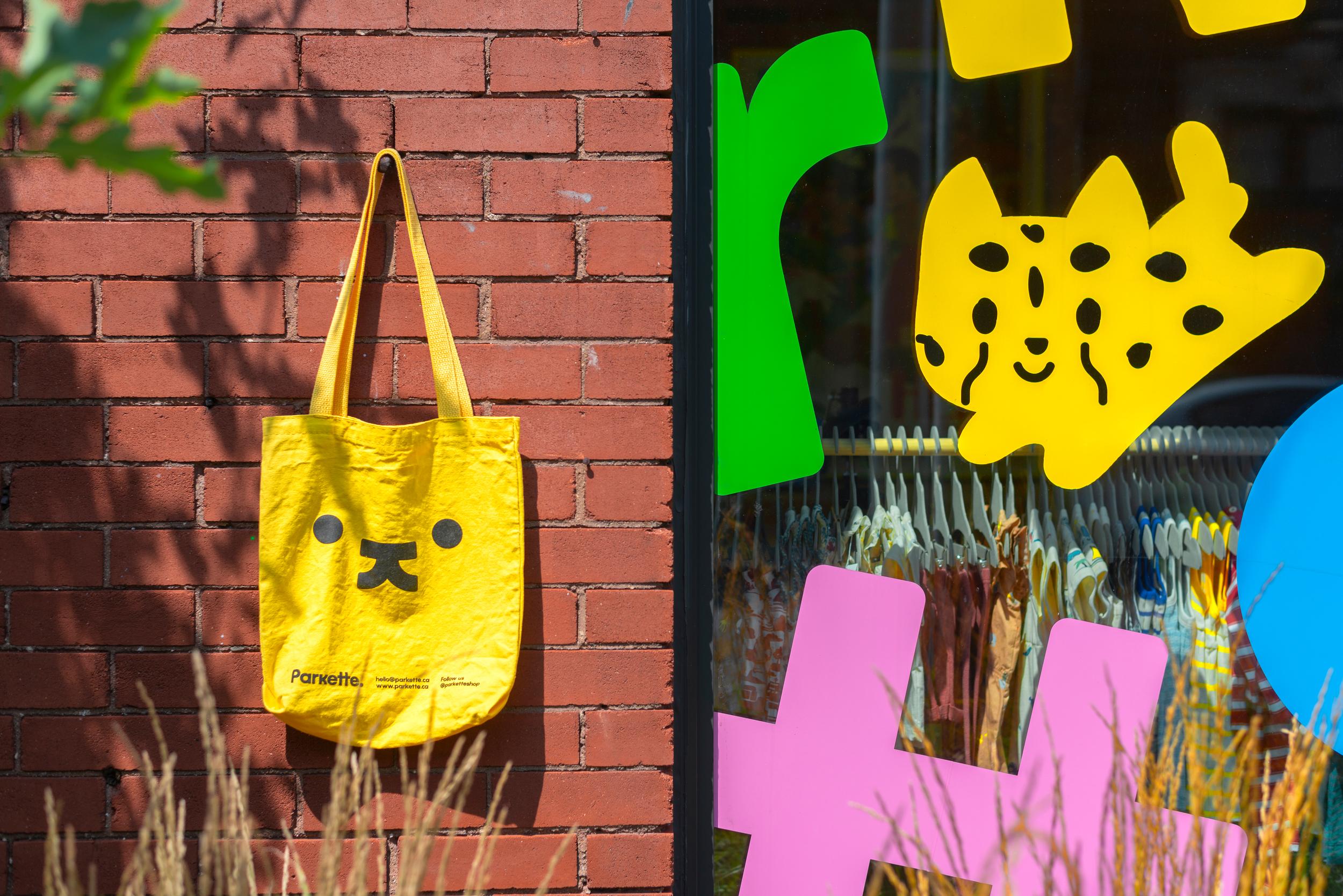
Cute, bright, and striking; there’s very little not to love about this identity for Parkette. Based in Hamilton, Canada, Parkette is billed as a boutique shop ‘dedicated to kids and the kids at heart’, selling crafts kits, clothes, accessories, books, homeware, toys, and ‘other treasures’.
The name is taken from a term many locals in Hamilton use to describe a ‘small park with play areas for kids’, according to Kinoto Studio, the design and branding studio that’s behind the boutique’s gorgeous new look.
Kinoto, which is based in Buenos Aires, Argentina, says that its mission when initially defining Parkette’s identity was based around capturing the essence of its core principle: ‘Forever fun’. And in that respect, it’s certainly achieved it.
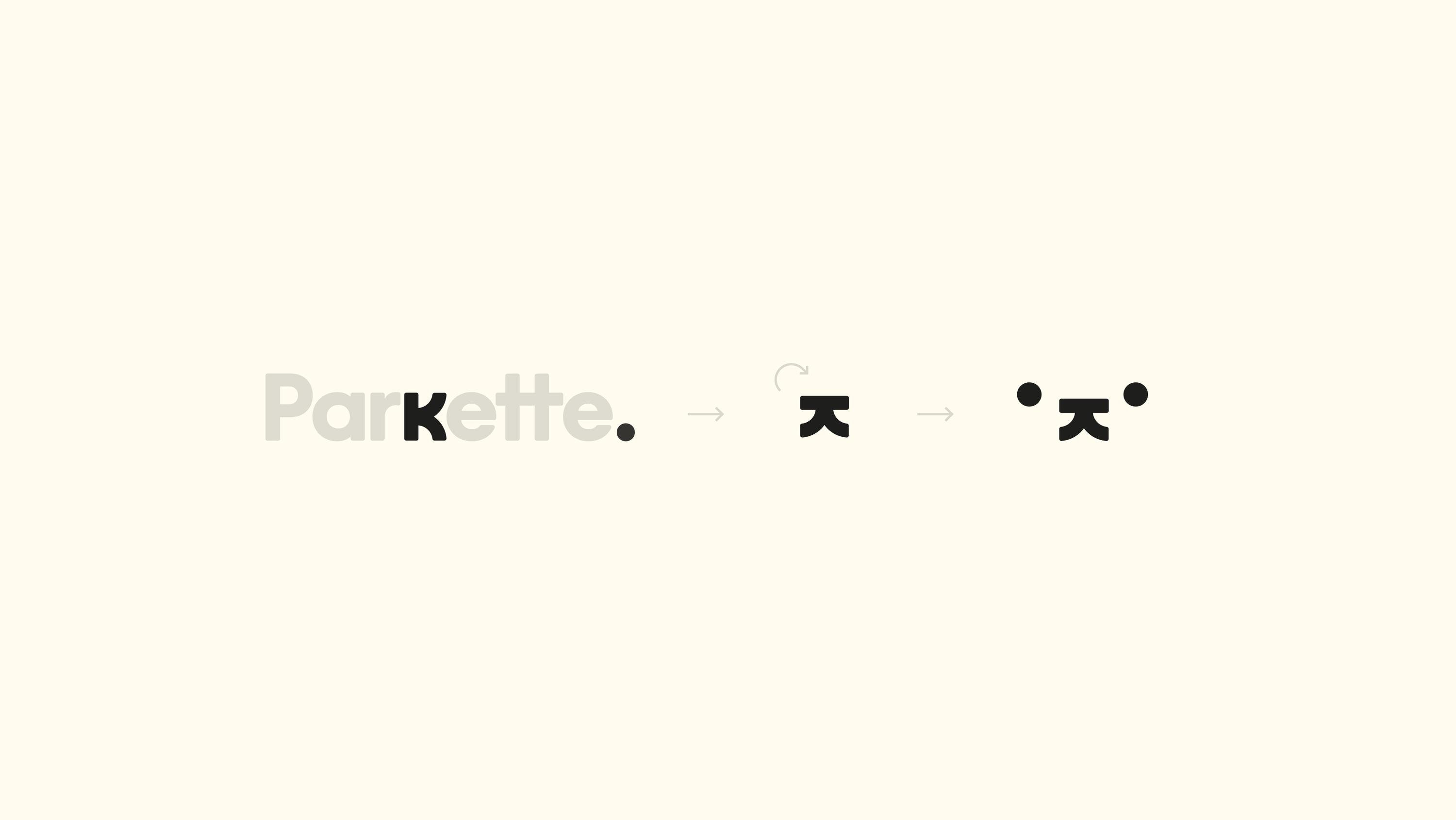

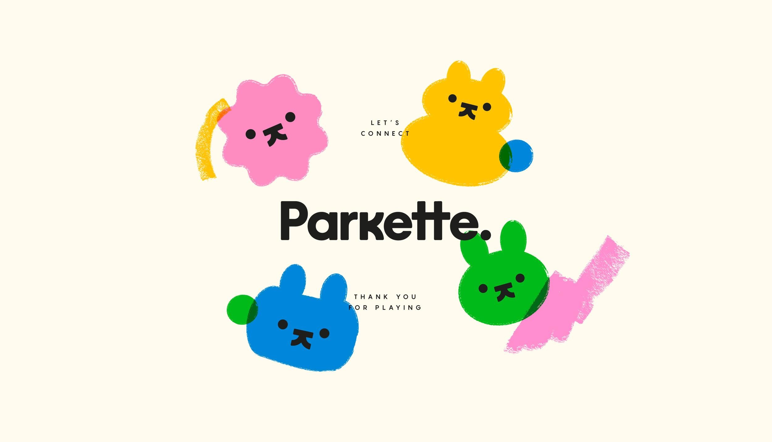
The branding centres on a very cute, but minimal logo that’s smart in the old-school ‘great logo’ design style – the sort of ‘hidden arrow in Fedex’ school of brand design. Formed of an amorphous character face (maybe a cat, dog, rabbit, bear, or whatever you want it to be), it uses the ‘k’ of the Parkette wordmark, rotated horizontally alongside the full stop circle of that same wordmark, to form the sweet little eyes, nose and mouth. It’s so simple, but so straightforward – the sort of thing that feels effortless but incredibly clever all at the same time.
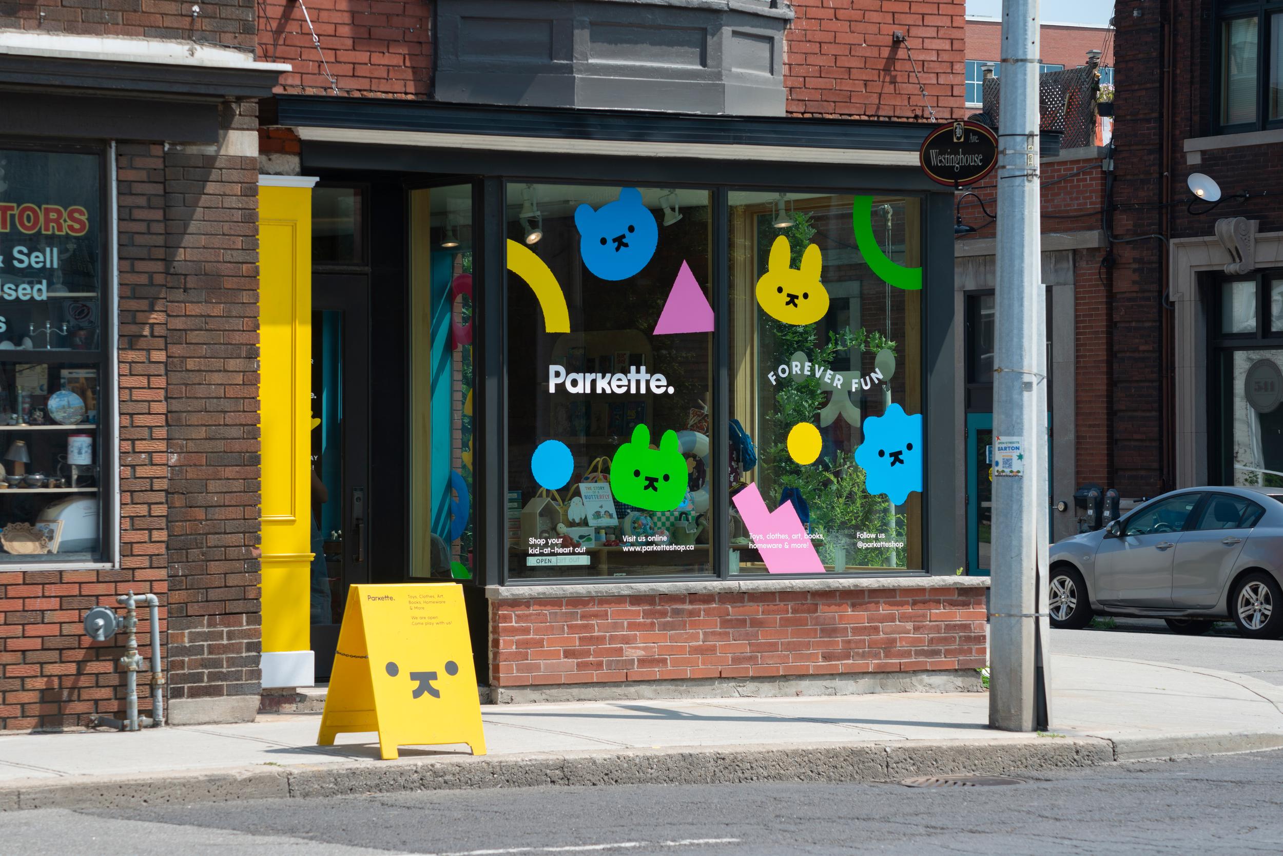
That logo is ‘at the heart of the brand’ and is both a ‘versatile mascot and icon’, according to Kinoto: ‘It embodies the spirit of Parkette, serving as a symbol of playfulness and creativity, where you’re invited to shape and reinterpret as you please, making it your own’.
That idea of letting the viewer become the final piece in creating the design seems particularly fitting for Parkette: the store seems to specialise in things like craft kits to create your own volcano, boxes to grow your own crystals in, tools like pencil crayons, or kits for making slime/putty and so on. In short, stuff that requires playfulness and interaction – the sort of thing that needs kids’ (or adults’) participation to be realised. Kinoto has done a superb job, then, in making the branding itself mirror the ethos of Parkette; as well as just creating a design system that’s striking and adorable in its own right.
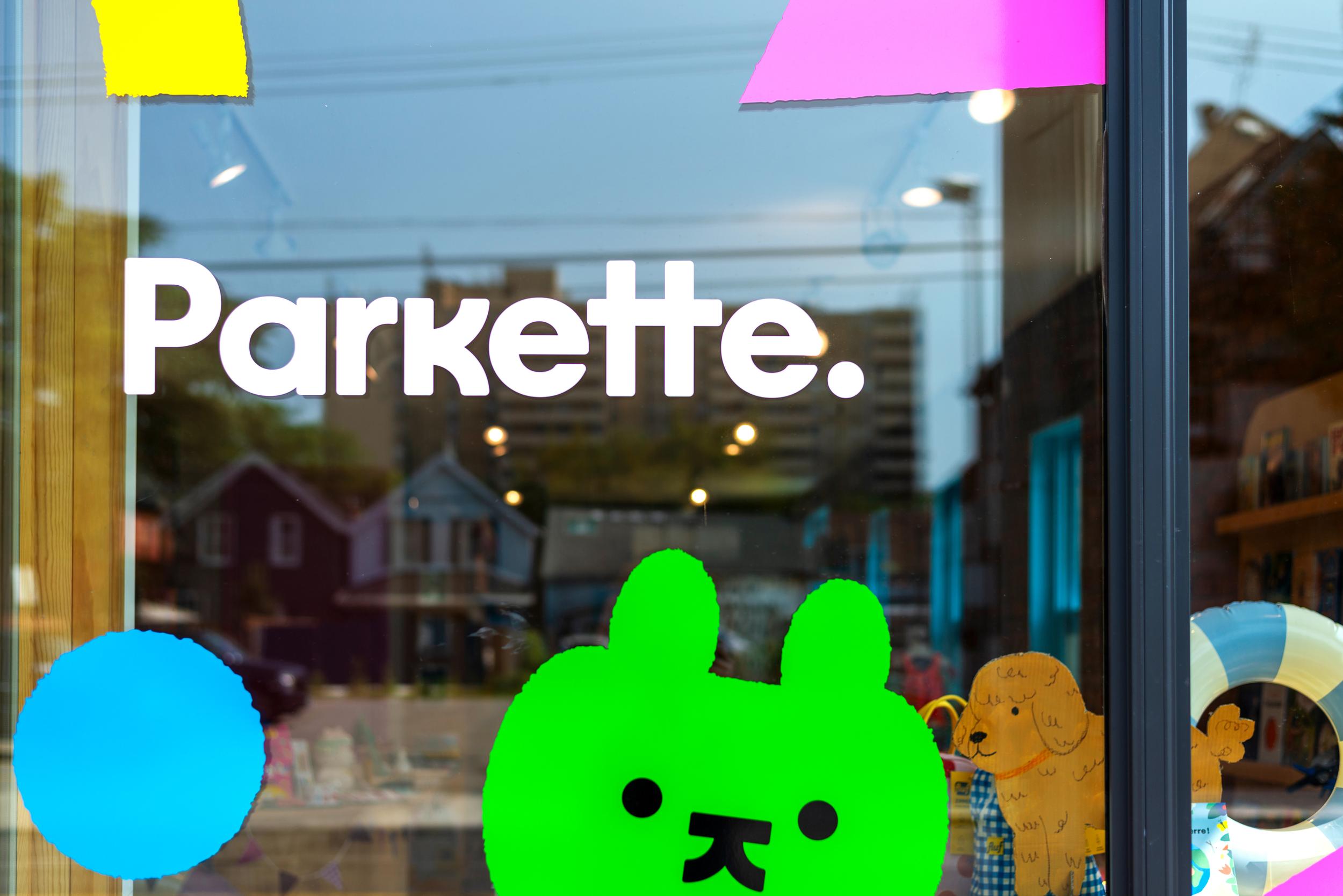
The wordmark uses a playful but not overly ‘kooky for the sake of being kooky’ typeface that’s based on open counter letterforms, a sense of bounciness, and little quirks like certain letter forms (namely the two ‘t’ letters) being conjoined in an otherwise neatly spaced configuration. Elsewhere, such as on the Parkette website and in other in-store brand copy, the identity uses the geometric sans serif font Pangram Sans by Pangram Pangram foundry, a nice straightforward counterpart that still feels friendly and warm while functioning as a solid workhorse typeface.
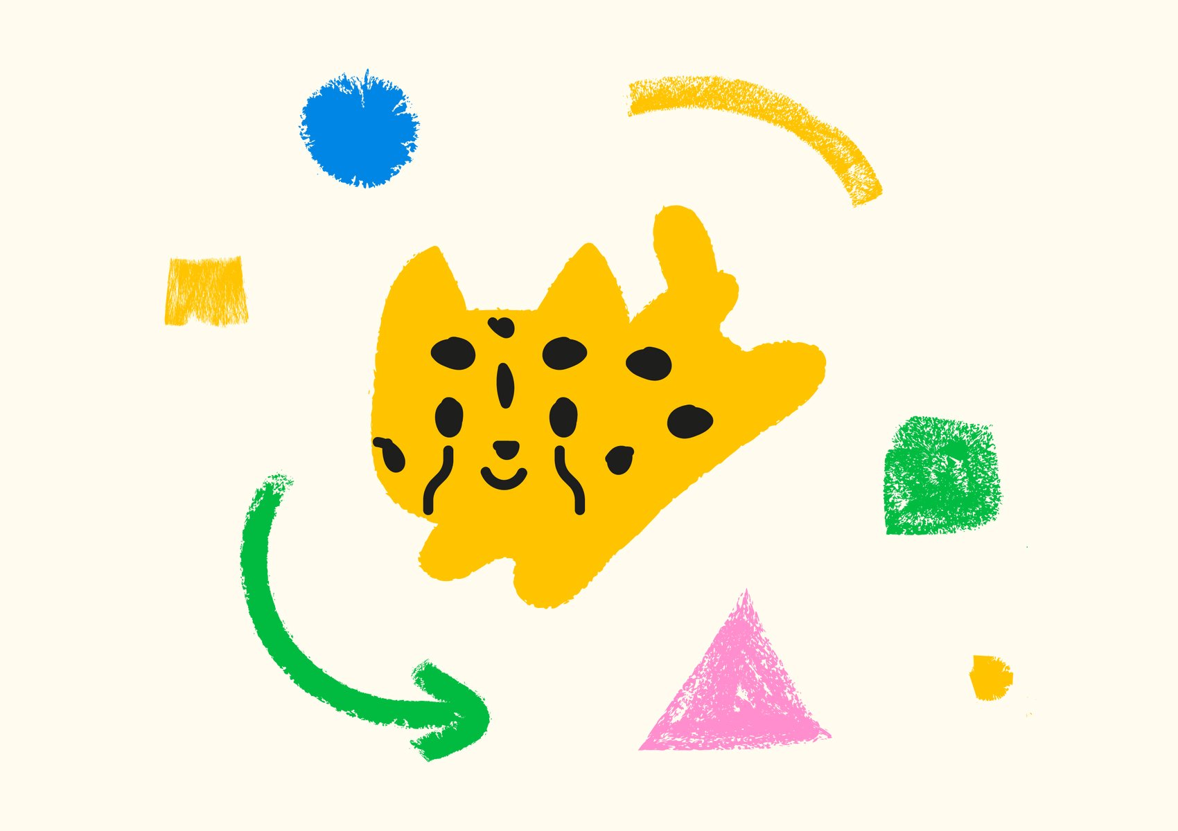
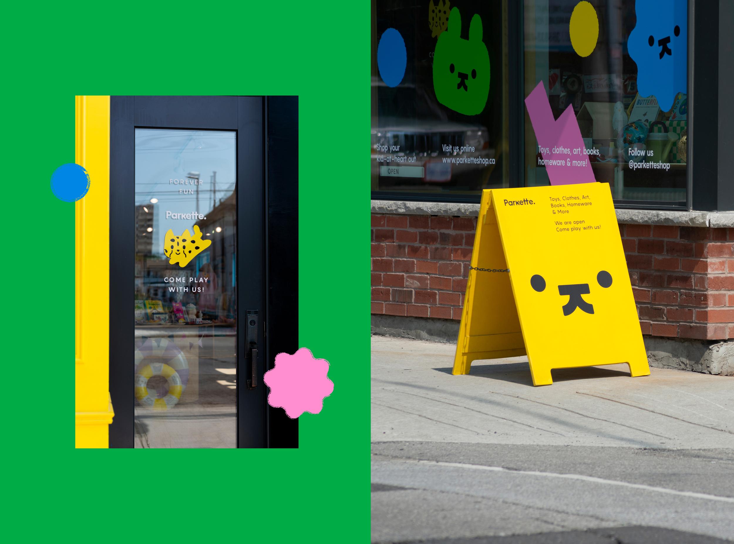
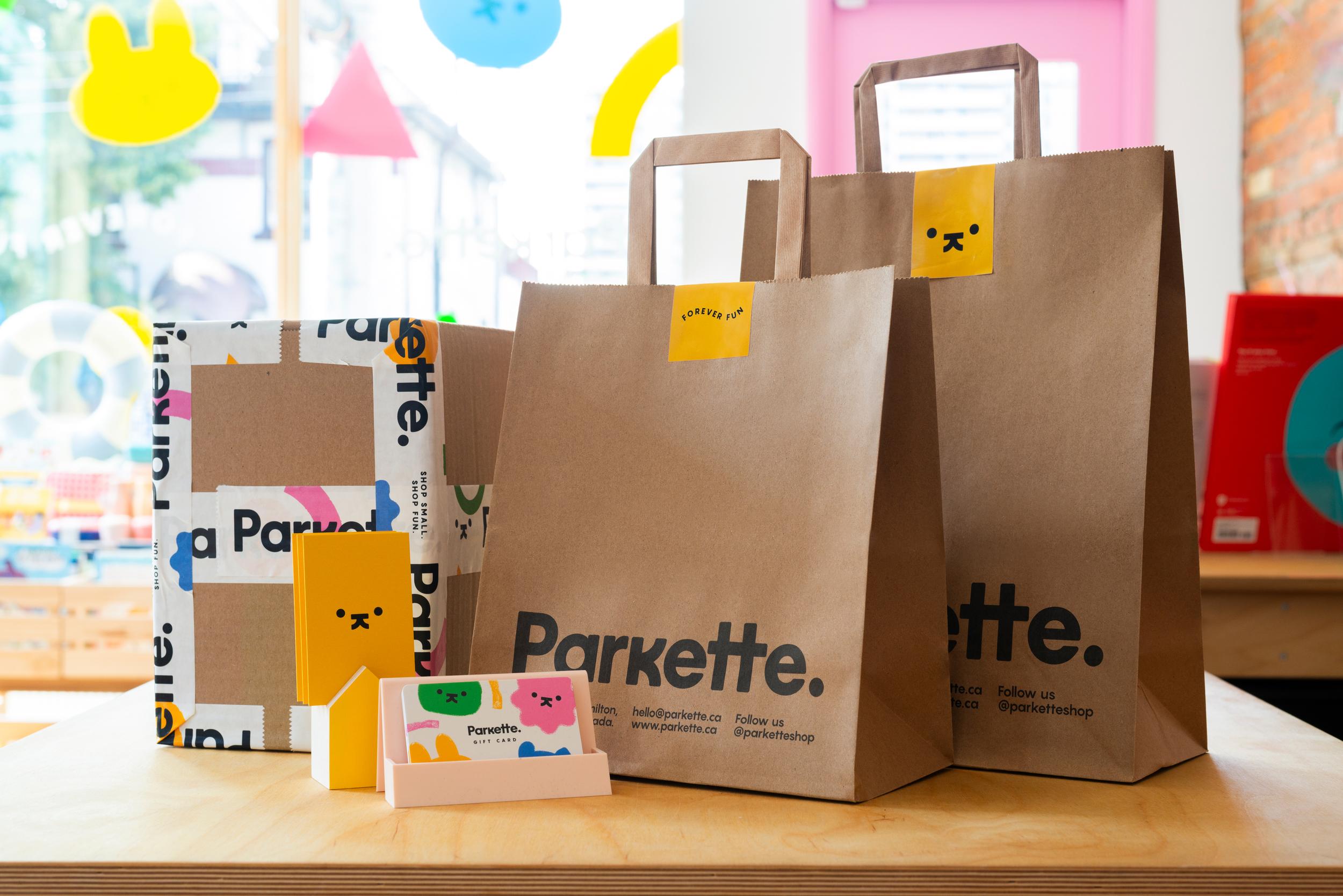
The logo is mirrored throughout the identity by a suite of other characters, with similarly simple, adorable little faces. They’re a little reminiscent of beloved rabbit character Miffy, with their dots for eyes and cross (or in Parkette’s case, ‘k’) mouth; and can ultimately be what you want them to be, like the main logo itself.
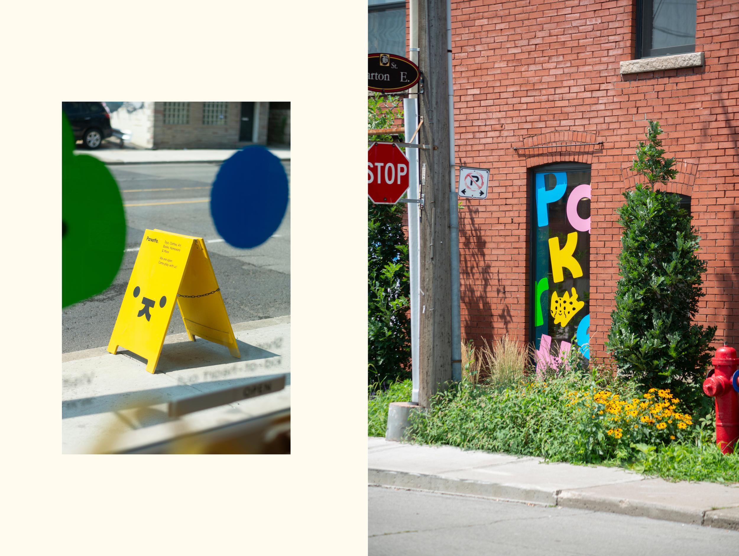
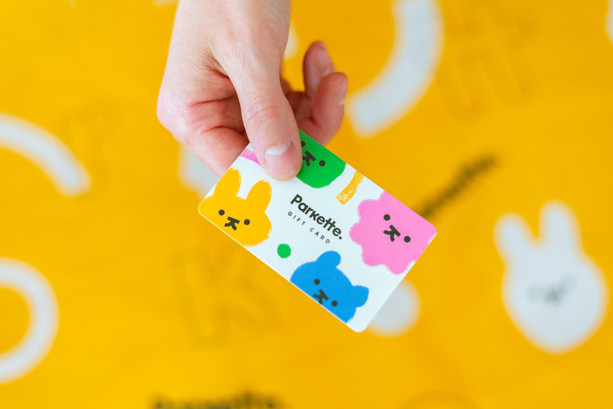
The characters appear across the identity in bright blue, yellow, green and pink; reflecting the vibrant, joyful colour palette used throughout. Sometimes, they have a textural feel (a nod again to the craft stuff, perhaps) or have a translucency that lets other colourful shapes overlap with them.
Everything about this identity is fun; yet, crucially, never overtly ‘wacky’ or showy or irritating. It’s genuinely fun: not amped-up kids TV presenter fun, not ‘you don’t have to be mad to work here’ office manager fun, not ‘organised fun’ fun, just fun. Most importantly, among all that fun, it really works as a strong, solid, ownable and functional brand identity. Form follows function, and all that.
