Ami Ami by Wedge
Opinion by Emily Gosling Posted 13 February 2024
We’ve all, at some point in life, encountered a few “But Actuallys”: the kind of people who always know a little bit more than you, constantly correct you, diligently fact check in social situations. They’re perennially just that smidgen More Right than you: a heady combination of The Simpsons’ Comic Book Guy; the classic pedant (or pendant if you want to really annoy them); the Mansplainer; bores who talk about ‘macronutrients’; people who resolutely “only like the early stuff”, and the bro’s still peddling the whole bearded-craft-beer-guy-thing, the ones who look like they walked into a tattoo parlour and simply, indiscriminately asked for “lots of tattoos, please”.
But Actuallys are neatly summed up as the sort of people who, at a public Q&A, will raise their hand and utter the dreaded six words: “More a comment than a question”.
To be clear, there’s a huge difference between geeks/nerds/enthusiasts and But Actuallys: the former have a genuine interest in something that helps them enjoy life, whereas the latter actively want you to enjoy life just a wee bit less, because you’re actually very slightly wrong, actually.
Arguably, Wine Snobs are among the most obvious proponents of the But Actually genre; those who sit in a restaurant and delight in stomping all over the line between ‘discerning’ and ‘expensive drink, very boring chat’.
That’s why it’s incredibly refreshing to see a brand make wine seem so fun and joyful, and which truly bucks trends – all while rethinking how it’s shipped and packaged to be as environmentally friendly as possible. The project in question is the new branding for Ami Ami – slightly confusingly, a French wine brand based in California – by Montréal creative studio Wedge.
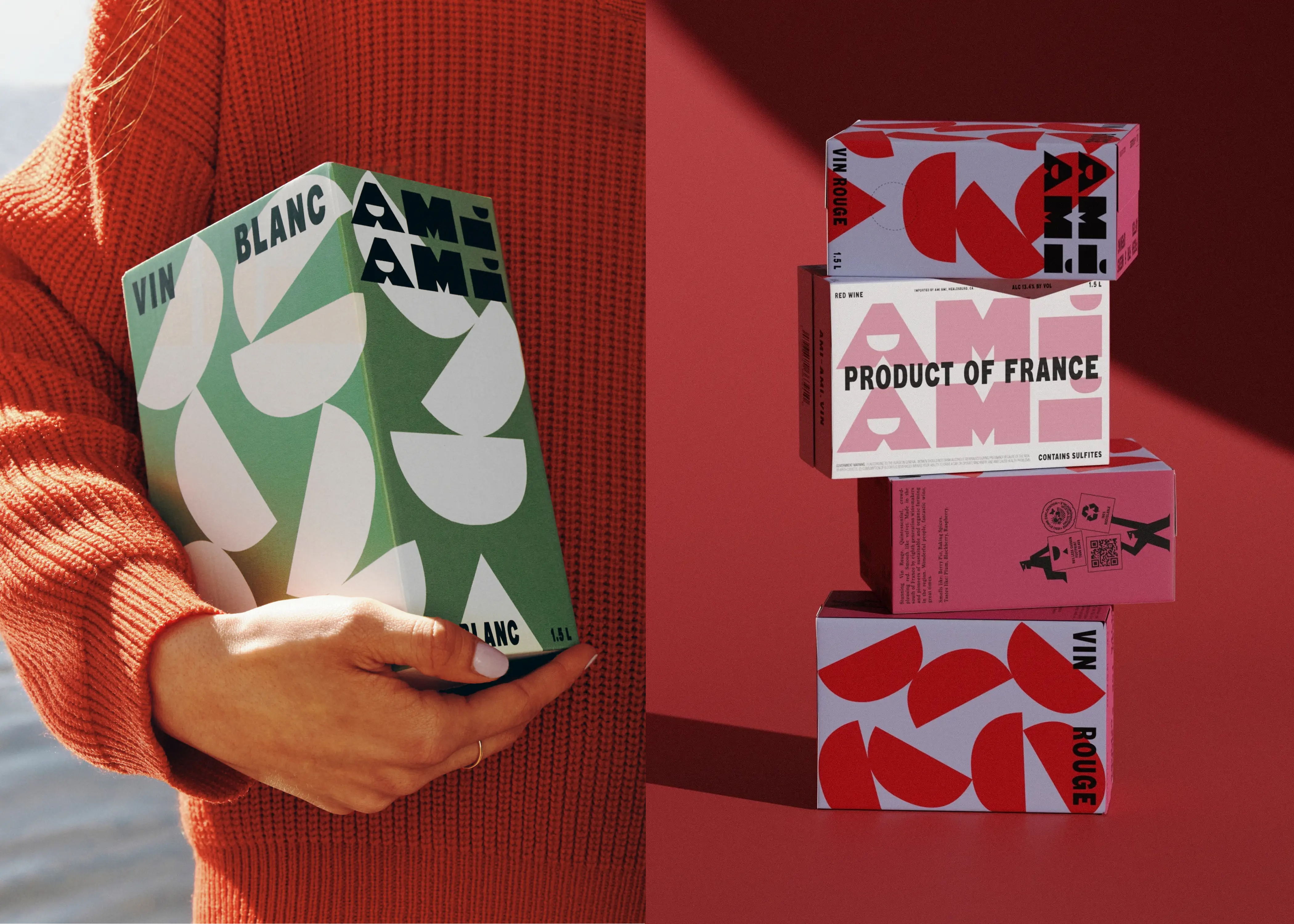
The project is one of a handful of Wedge Ventures – an arm of the studio that sees it “partner with entrepreneurs we believe in,” says Wedge, which uses its existing in-house talents across brand design, strategy, and storytelling “to land further investment and grow. We are typically involved between Seed and Series A,” it adds. In Ami Ami’s case, Wedge joined the brand’s co-founders Woody Hambrecht and Ross Dawkins to “build the brand vision from the ground up,” says the studio.
As such, Wedge worked on everything from the name to brand strategy and narrative; Ami Ami’s visual identity; packaging designs; tone of voice; creative direction; and bespoke brand photography.
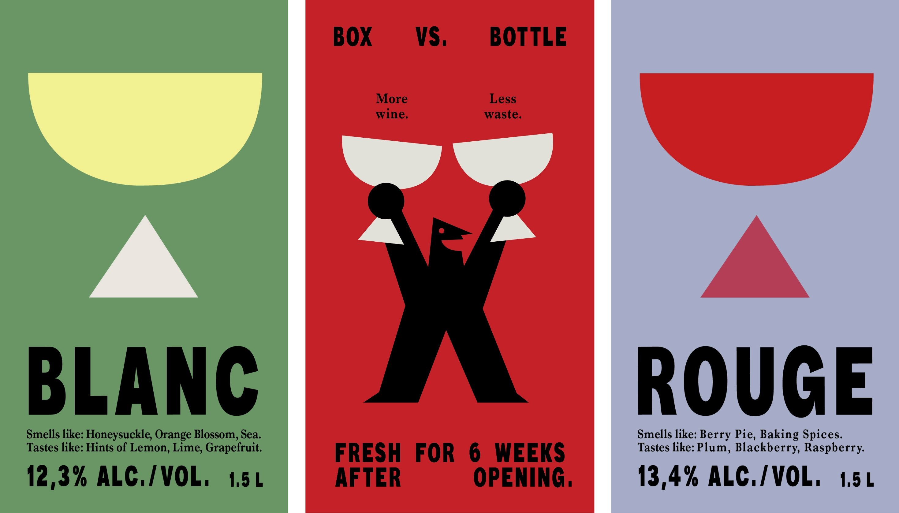
Ami Ami is unusual in that it shuns the trad bottle format entirely, instead selling boxed wines (one red and one white, sorry Rosé Girlies) because, according to Wedge, shipping wine in a box over an ocean makes 50% less carbon impact than with bottles.
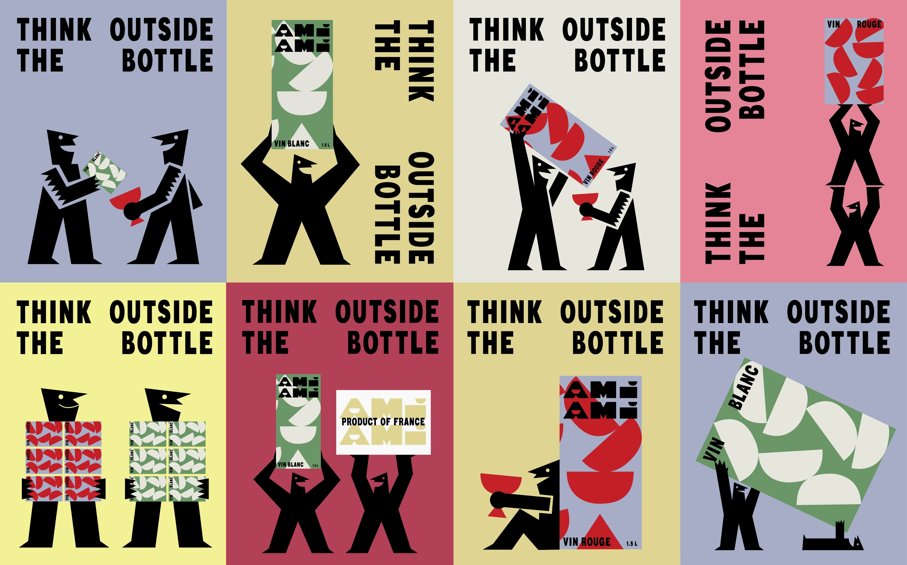
The branding totally elevates boxed wine into a thoroughly beautiful, slightly aspirational but ultimately, very accessible format. No longer the preserve of Wetherspoons and festival-goers, the designs look to make “the box a thing of desire,” says Wedge. It’s worth pointing out that in a sensible bid to shake off low-brow boxed wine connotations once and for all, Ami Ami’s packs are half the size of usual boxed wines, holding 1.5 litres.
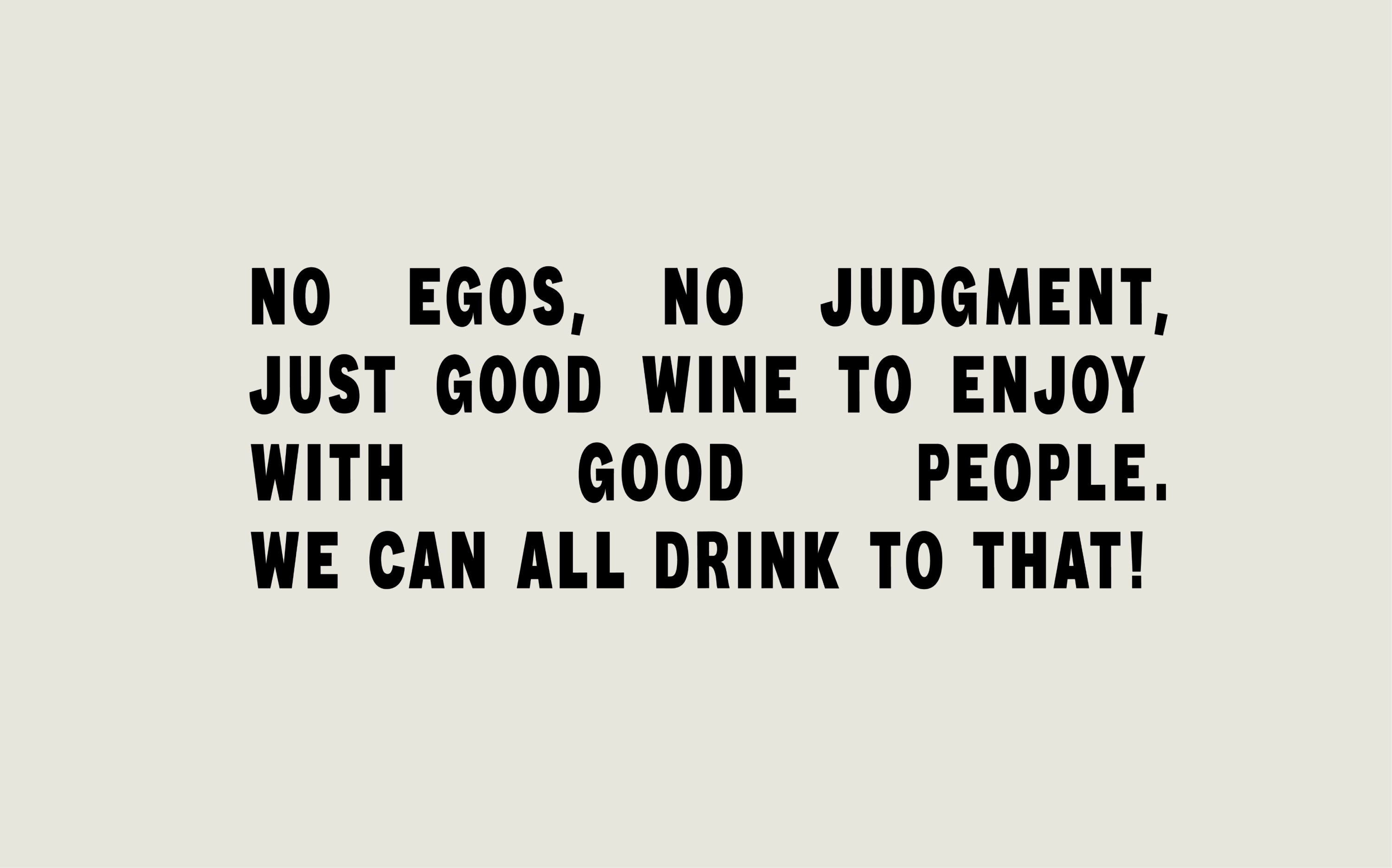
The studio adds that it aimed to “define a distinct signature that invites you into a world of wine without rules, at every touchpoint”, leading to branding that’s “unfussy and friendly” for wine “made to enjoy how you want to”, while being eye-catching on shelf, online, and on your table.
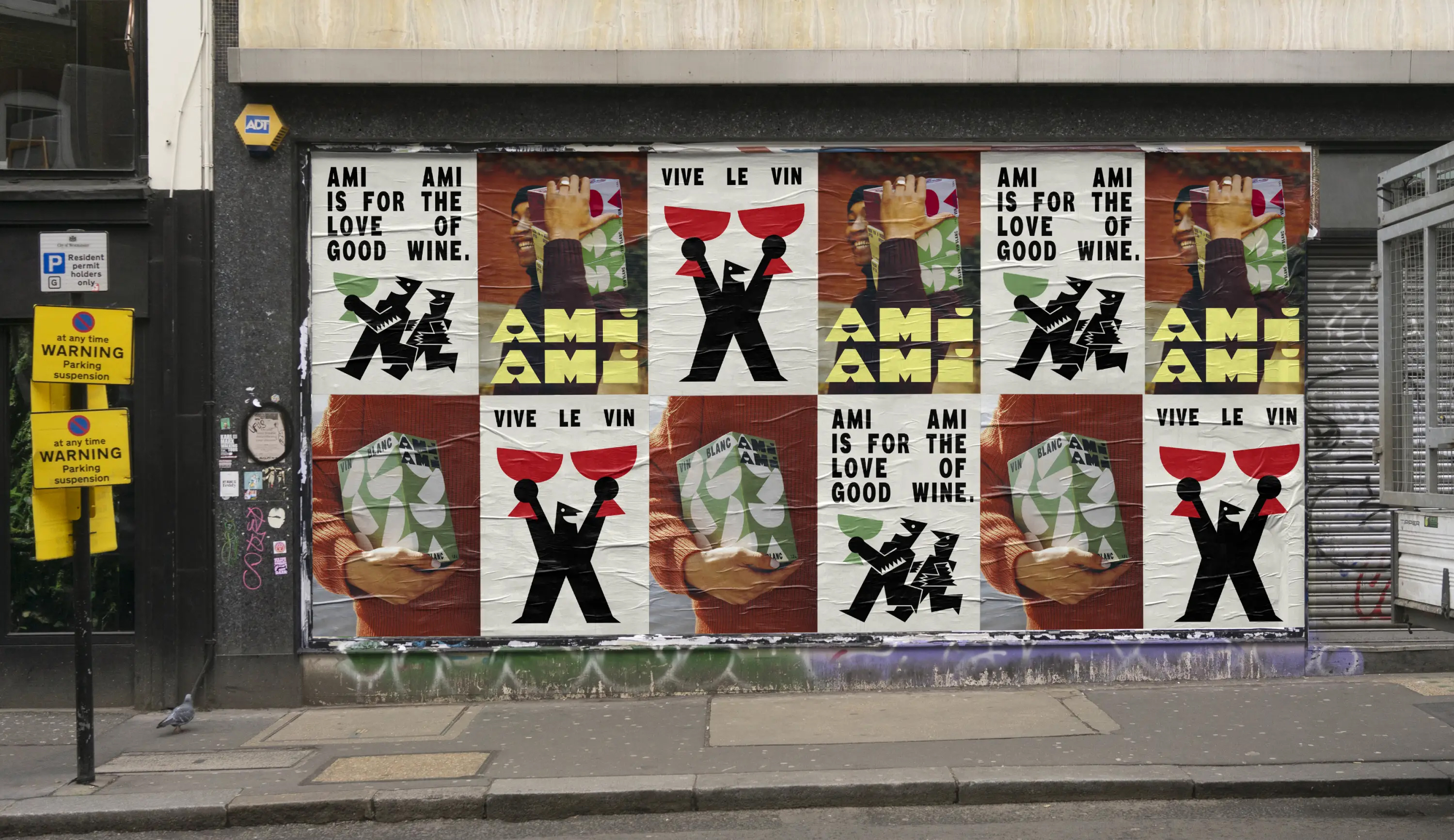
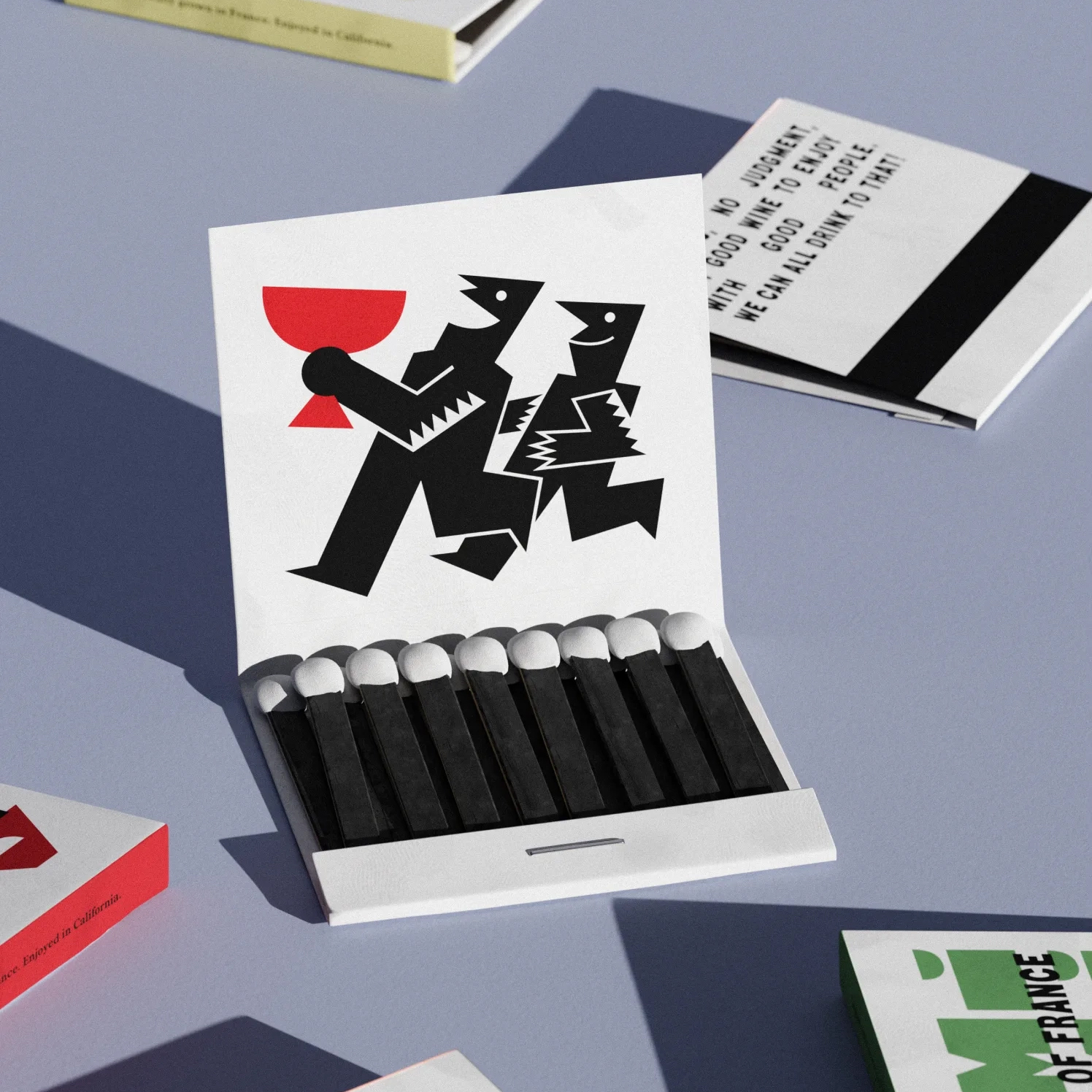
It absolutely succeeds at every turn. I really, really love this branding: the blocky, letterpress style brand typography; the illustrations that recall everything from traditional woodcuts to Saul Bass to shadow puppetry; the deliciously off-kilter wordmark; the geometric shapes and patterns that look like they’ve been born of an unlikely Matisse/Bauhaus collab.
With such bold, dynamic elements in the illustration and type, the colours are more pared back; shunning anything too garish for more tasteful shades of green, a pasetlly lilac/blue, muted yellow and pink, offset with pops of bright red.
Wedge designed a custom typeface for the project, named Ami Ami Vin, which the studio has said was inspired by the lettering on vintage French wine crates. We’ll take their word for it but it feels like a stretch: to me at least, it’s simply (but brilliantly) pure letterpress à la Anthony Burrill: the closest I could find to a blocky sans serif were this, this, and this, on an admittedly limited Google image search.
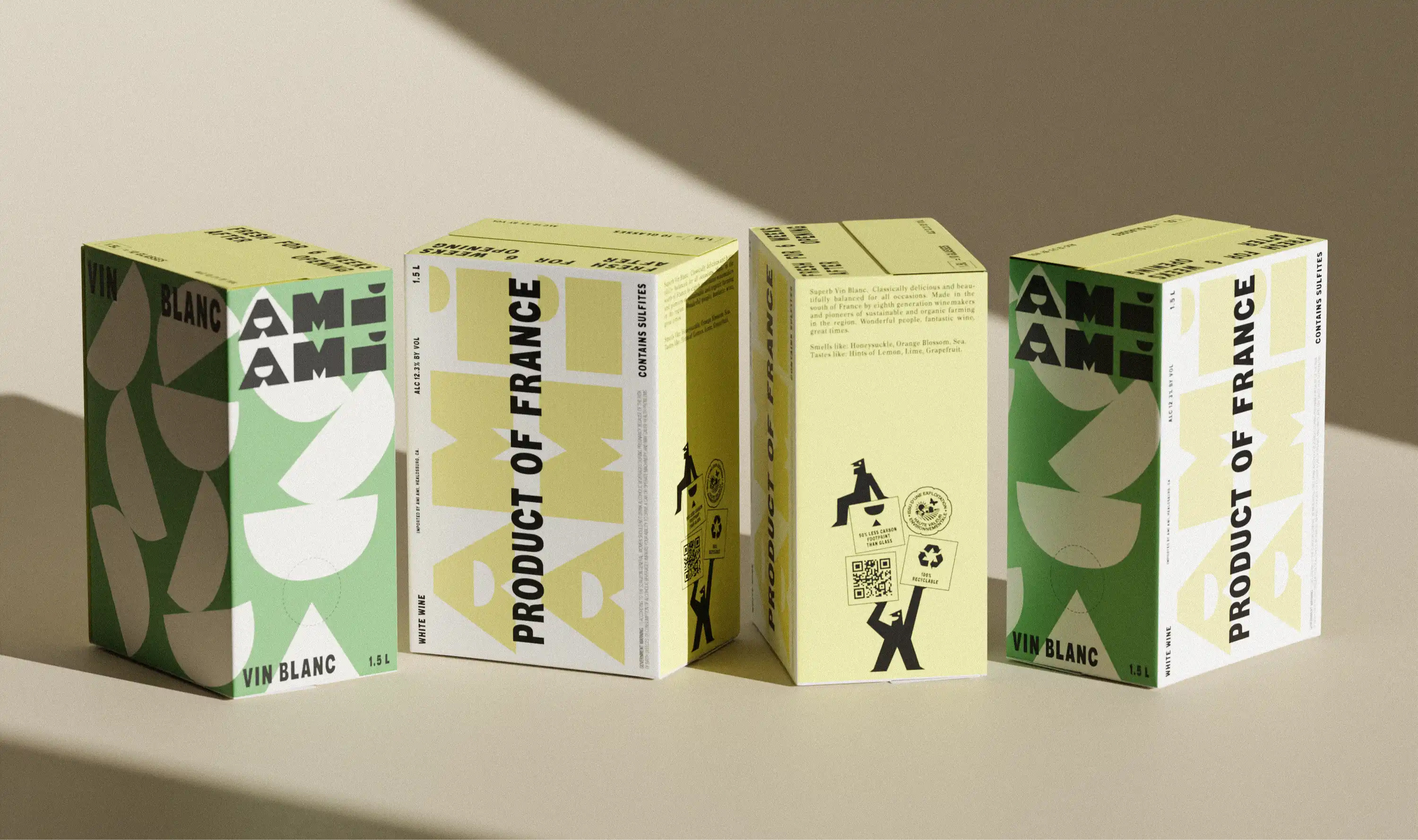
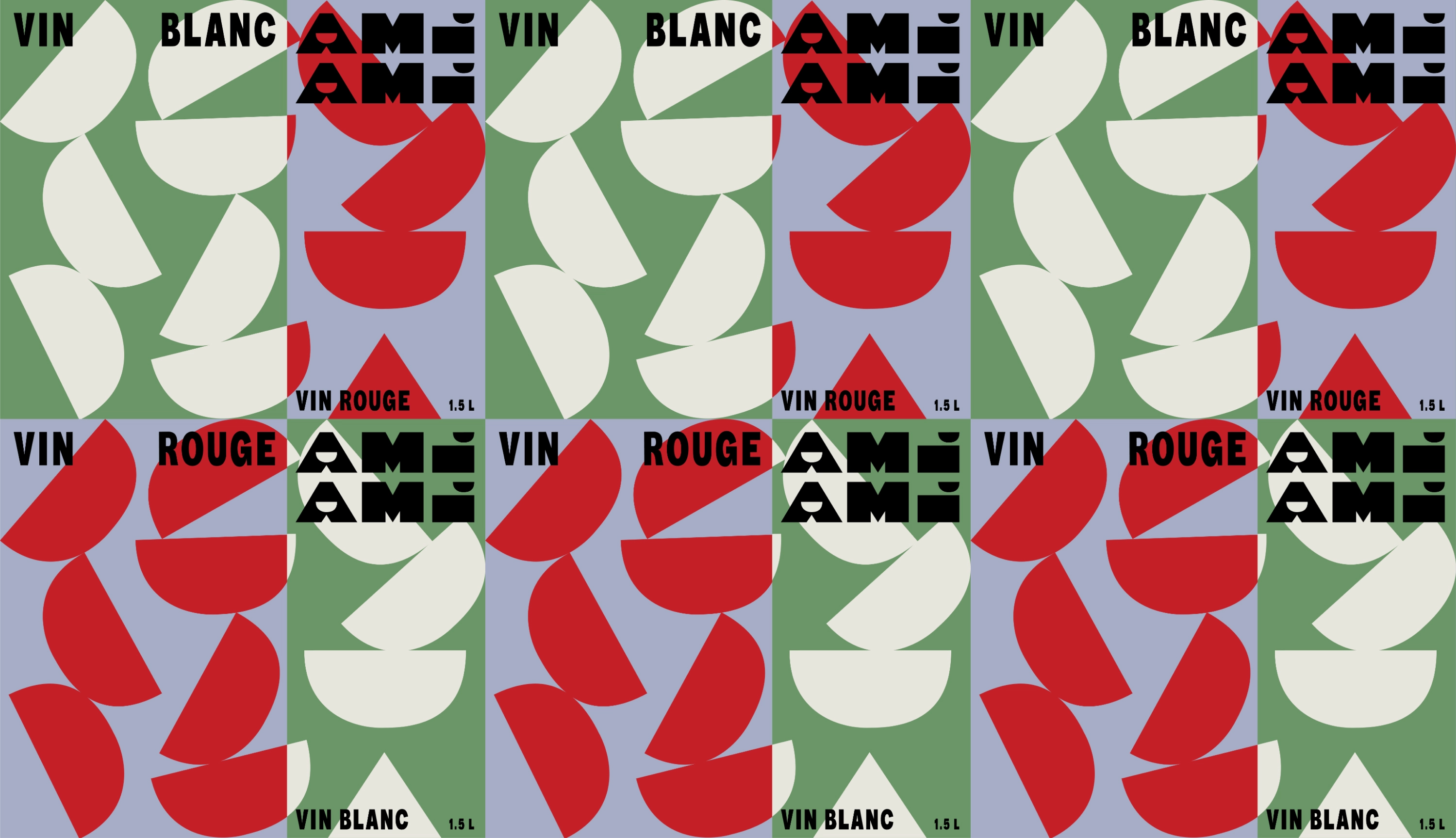
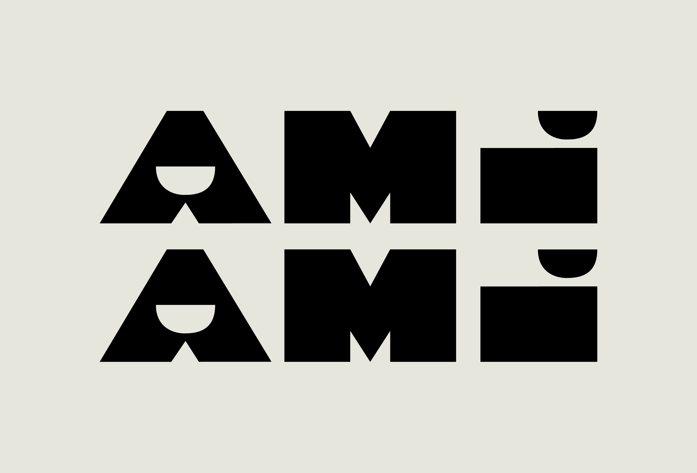
The brand’s wordmark takes cues from the semi-circle cup shape that’s used as a graphic device across pretty much all branded touchpoints, forming the counter of the ‘A’ and the dot of the ‘i’. There’s something a bit peculiar about the kerning, at least visually, but that really works here – not only aesthetically, but in keeping with the ethos of the brand itself.
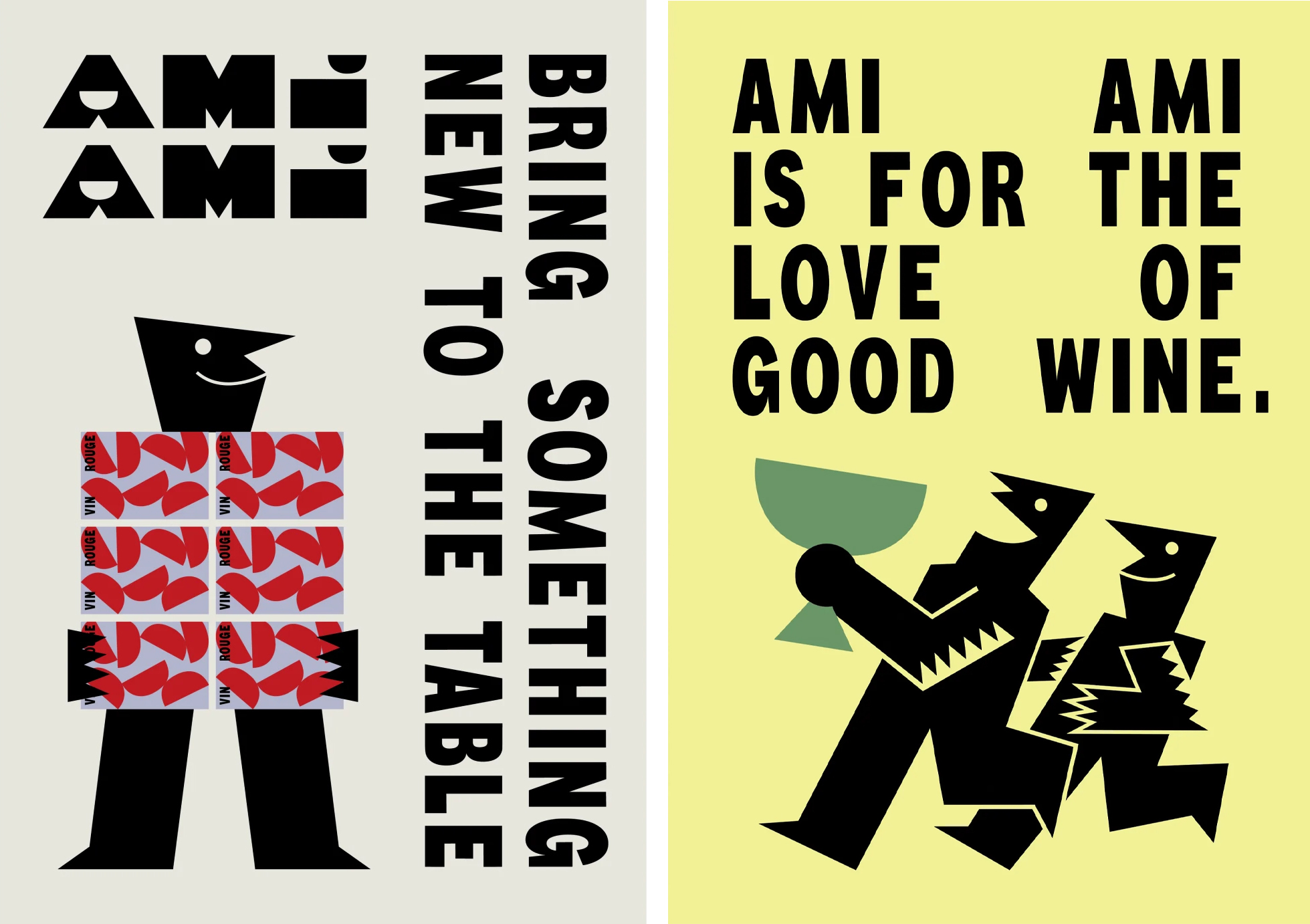
The striking illustrations, meanwhile, were created by Montreal-based illustrator Mathieu Dionne, who looked to Italian futurist artist Fortunato Depero for inspiration – a source that seems a lot more obvious in the strangely contorted, slightly abstracted figures and their weird little limbs.
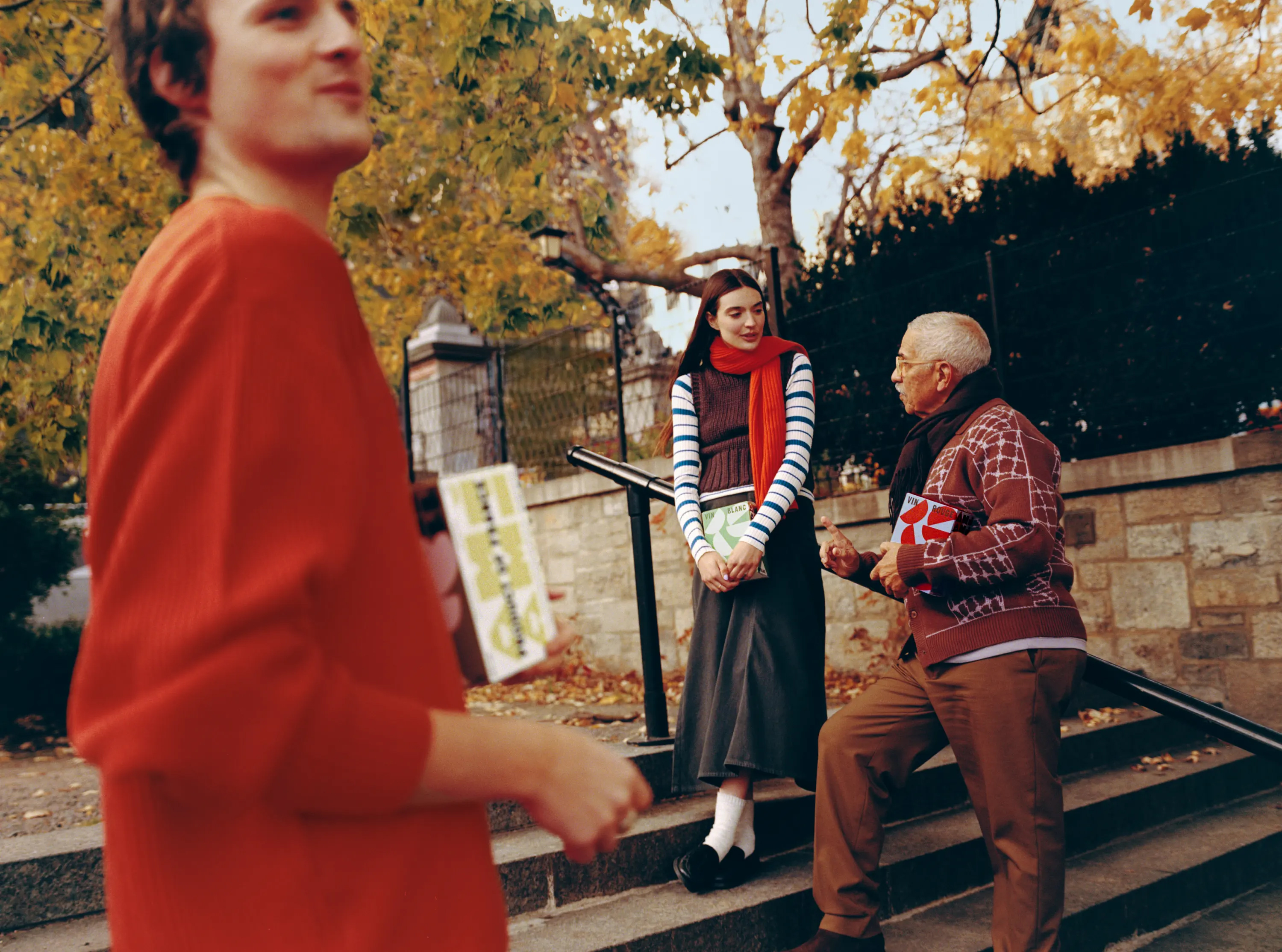

Something else I really like about this project is that its photography isn’t in that Vice circa 2006, over-lit, “raw” style that’s suddenly everywhere – especially in brands with otherwise really original, interesting visual identity elements. Created by London-based fashion photographer William Arcand, the photography is aspirational without being gross, lifestyle-ish but without the cliches – just nicely done shots that show off the product and give a sense of the pride Ami Ami clearly takes in moving boxed wines into new territories. It even manages to make street drinking look not only intergenerational, but vaguely chic (see image four here).
One of the most refreshing branding projects I’ve seen in a while: and not a whiff of But Actually Wine Snob energy to be found.
