Antara 128 by Mucho
Opinion by Richard Baird Posted 18 April 2024

GT Alpina is described by type foundry and BP&O regular GrilliType as a workhorse serif that also delights in playing with the very meaning of concept, reaching into the ‘grab bag of typographic history to resurrect shapes some may falsely see as too expressive’. This feels an apt description for Antara 128, and the visual identity created by Mucho that employs GrilliType’s ‘workhouse’.
Antara 128 is an ‘avant-garde’ bakery and restaurant that fuses European traditions with a contemporary Australian influence and inhabits a space created by renowned architect Kerstin Thompson.
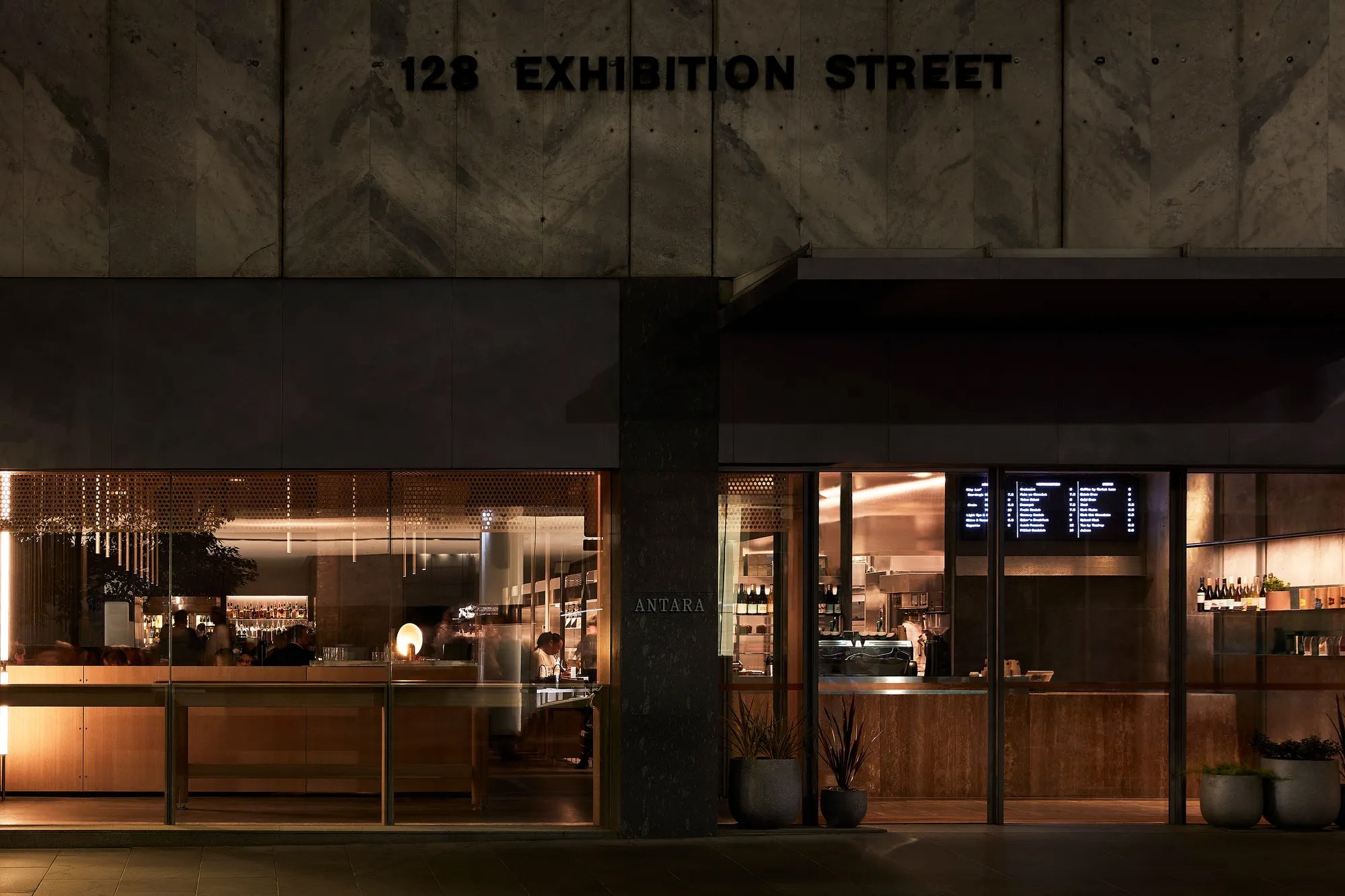
Antara’s design supports and celebrates the 24hr production of baked goods. Its layout is structured by the process and sequence of pastry and baking. What usually goes on behind the scenes is on show, providing an ‘enticing spectacle and delight for diners’ as well as passers-by on Exhibition Street. Industrial baking ‘machines’ anchor the space and produce delicate pastry that travels through the production sequence, visible to customers who can buy produce direct from the cooling racks at the end of the line. Just like GT Alpina, what was once perceived as utilitarian and industrial could be understood as an expression of expense, or rather, value.
![]()
The intersection of craft and industry, the openness of work and the warmth of the interior design are channeled into the brand identity devised by Mucho. GT Alpina is perhaps the most subtle articulation of this, however, the logo – an iconic folded ‘A’ inspired by the lamination of dough (process, persistence, patience) – and an earthy baked colour palette (flour, earth, bone, kaya, kraft) further this.
Online, these elements intersect interior imagery; an open fire, material details, and used alongside ABC ROM. This takes inspiration from typeface applications in conceptual art catalogs from the ’60s and ’70s, ROM’s. The mid-century foundation also extends to the logo, which could have easily come out of one of the volumes of Franco Ricci’s Top Symbols & Trademarks of the World. What could have cold and modernist is given warmth in its association and colour palette. The logo is given a further value as it expands and contracts like dough across different packaging, from coffee cups to tissue paper to paper bags.


There’s an attempt here to broaden the visual system beyond the logo, with the addition of some fine-line curves, dotted lines, and few other random elements such the grids of the coasters. There’s not much in these. They do little to add a coherent visual interest or used to develop a distinctive and varied social presence. There are, however, some nice uses of the logo; blind embossing, an outline version, and the spiral of the tissue paper. You get the impression that the studio was reluctant to stamp the logo on literally everything…but when you’re 80% of the way there, the remaining 20% seems conspicuous.


Social defaults to interior shots and product photography, which does enough to peak interest and draw further enquiry but not strategic. There’s also another typeface in the mix in this context that throws things off a bit. I remember a time when I was disappointed to go from case study to website and find something less than resolved, now it’s social. Despite this, the website is fab. Type, colour and logo does much of the lifting here, and supports the Antara 128 concept and its interior design.