Frank Penny by Bedow
Opinion by Emily Gosling Posted 23 May 2024
Frank Penny is a consultancy specialising in AML – anti-money laundering. Knowing next to nothing about financial matters, I had no idea such companies existed. But like pretty much any other business, to succeed and stand out against their competitors, at some point or another anti-AML consultants need to think about their brand identity.
Stockholm studio Bedow was recently tasked with creating the branding for Frank Penny, working on everything from brand strategy to naming, visual identity, motion design, website development and more.
According to Bedow, Frank Penny – which was only established this year – is a rising star in the anti-money laundering sky and ‘saw itself as a rebel with a cause… the opposite of the stereotypical consultant, instead focused on being personal, friendly and hands-on….’ The agency continues, ‘By dedicating their professional lives to the world of AML, they weren’t just carving out a niche; they were also laying the groundwork for a brand built on their expertise.’
The name is very straightforward (if arguably confusing/nonsensical) and reflects the firm’s ‘core belief in honest money’, says Bedow. ‘It’s not just a name; it’s a manifesto for financial righteousness’. How? I’m not quite sure, since it just sounds like two names, unless there’s something in Frank as in ‘frankness’; and Penny as in ‘pennies’, which perhaps seems not unlikely, but still slightly odd.
It’s that idea of honesty that comes up time and again: the entire identity is based around the newly articulated brand narrative and ‘North Star’ of ‘transparent transactions’. This is especially evident in the very charming logo, a device formed of two intersecting coin-like discs that Bedow says is the ‘perfect symbol’ for the brand’s pursuit of honest, straightforward financial interactions. The logo really comes to life in motion: it’s no frills, no fuss, not even any bold colours – just simple monotone and very smart use of negative space.
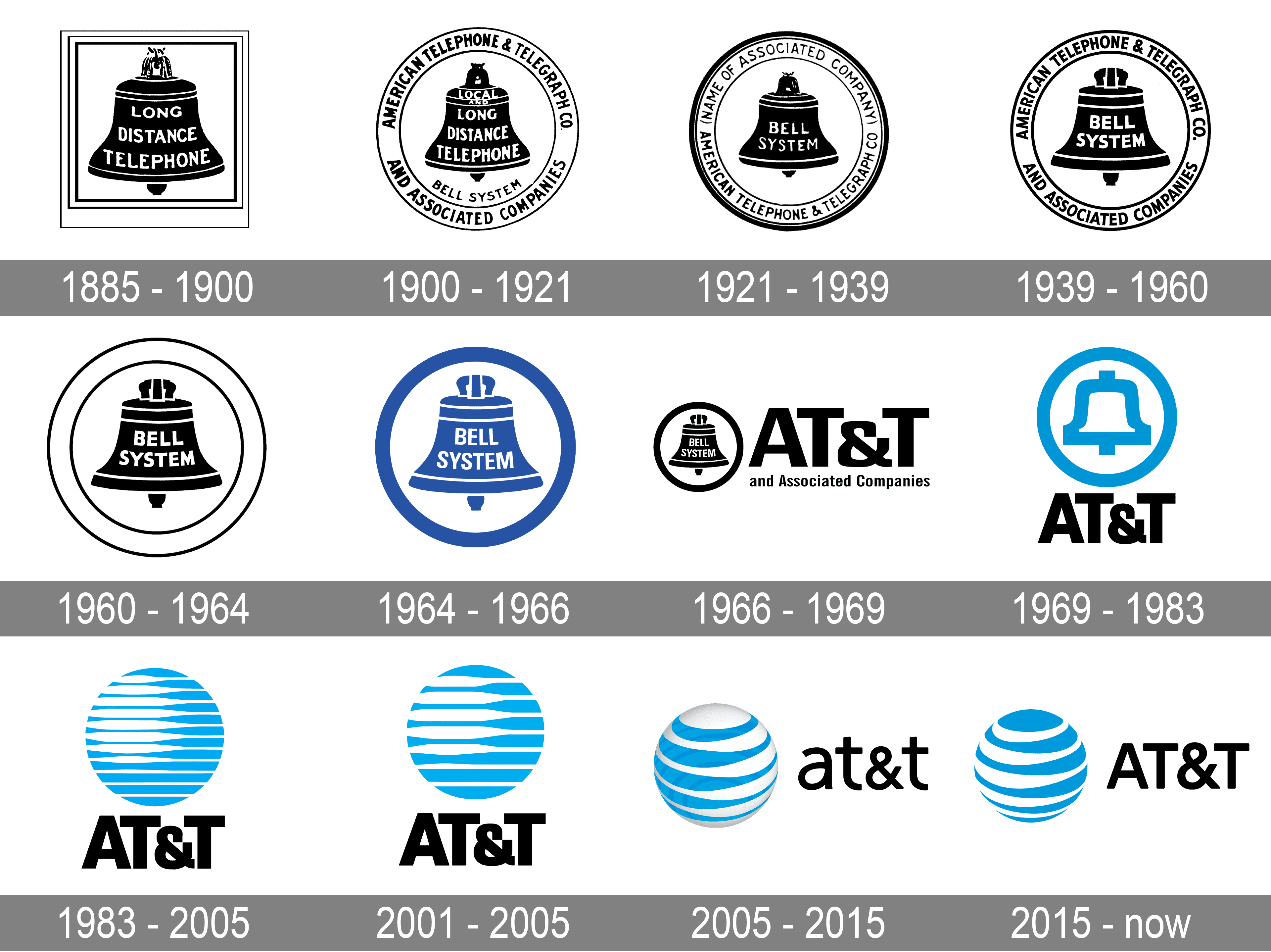
It feels like a nod to the classic 20th-century logo greats, like 1961’s Chase bank logo by Chermayeff & Geismar. It’s little surprise that Frank Penny’s intersecting coins icon has been compared to the 1980s to early 2000s 2D AT&T logos designed by none other than Saul Bass, thanks to the simplicity of the circles and the slatted look that uses the interplay of positive and negative space.
And perhaps that’s no accident: after all, for financial services – especially those that work to combat things like money laundering – the entire business is built on trust and reassurance, so having a gentle visual nod to a familiar device that feels strong, trusted, and part of the furniture is quite shrewd. In another smart move, Bedow’s designs here are firmly facing the future, though, not the past: they’re designed to be in motion, and don’t feel one bit nostalgic, rather slick, minimal, confident and modern in their gentle motion design and bold stripping away of any superfluity and fluff.
The wordmark is one of the elements that sticks with tradition and seriousness, using Teodor by Prague-base type foundry Displaay – an elegant but no-nonsense serif with a lovely classicist aesthetic and striking high contrasts. Bedow opted to use another Displaay font elsewhere in the banding’s applications, a counterpoint to Teodor in the sans serif Greed Standard – surely a slightly tongue-in-cheek name which, due to the nature of Frank Penny’s business, can’t be entirely coincidental.
![]()
The colour palette flexes better for some applications than others; with dark and light shades of copper, gold, and silver; grey; black; and white keeping things Penny-leaning, but simple. One small aspect of the project that I’d argue isn’t always successful is when these brand colours and the slatted-style patterning that works so well for the logo are used as brand elements in their own right. As isolated background layers or slices of colour (as shown here), they seem wishy-washy and a bit limp compared to the confidence of the rest of the identity, especially on touch points that could have been really bold and dynamic, like Frank Penny t-shirts. They work superbly on digital applications like the Frank Penny website and social posts, however.


Another slightly jarring element, but one that still works, is the photography style. As we’ve seen with a number of projects recently from petcare brands to youth hostels; the overly-lit, heavy-on-the-flash look is by no means the preserve of magazine editorials or hip clothes stores (the post-American Apparel effect, if you will). The suite of brand photography for Frank Penny includes not only images of effortlessly smart-casual people smiling, presumably because they’ve thwarted/are now safe from the threat of money laundering; but some weird crops of details like marble-effect table tops and staircases.
Somehow, it works – why not have a bit of fun with the less glamorous-sounding sectors after all? – but I’m slightly baffled as to what it has to do with the rest of the brand. However, the starkly flash-lit closeups do indeed underscore that whole ‘transparent transactions’ thing; and further reflect what Bedow has said about Frank Penny as ‘personal, friendly and hands-on’.
The overall identity designs look to use imagery and personal touches to ‘reveal not just what [Frank Penny does] but also who they are – the kind of consultants who bring a bit of flair to the financial world,’ according to Bedow. Undoubtedly these designs help Frank Penny move away from any consultancy stereotypes of fustiness and formality, and it’s always great to see brands doing something a bit risky and unexpected – not just for the sake of ‘disruption’ but because, as here, it really works.


:format(webp)/f/69091/1428x1920/a8e2eaccbd/bedow-frank-penny-visual-identity-19.jpg)
:format(webp)/f/69091/1440x1920/327ade0296/bedow-frank-penny-visual-identity-18.jpg)