Brooklyn Org by Mother and Mother Design
Opinion by Thomas Barnett Posted 28 May 2024
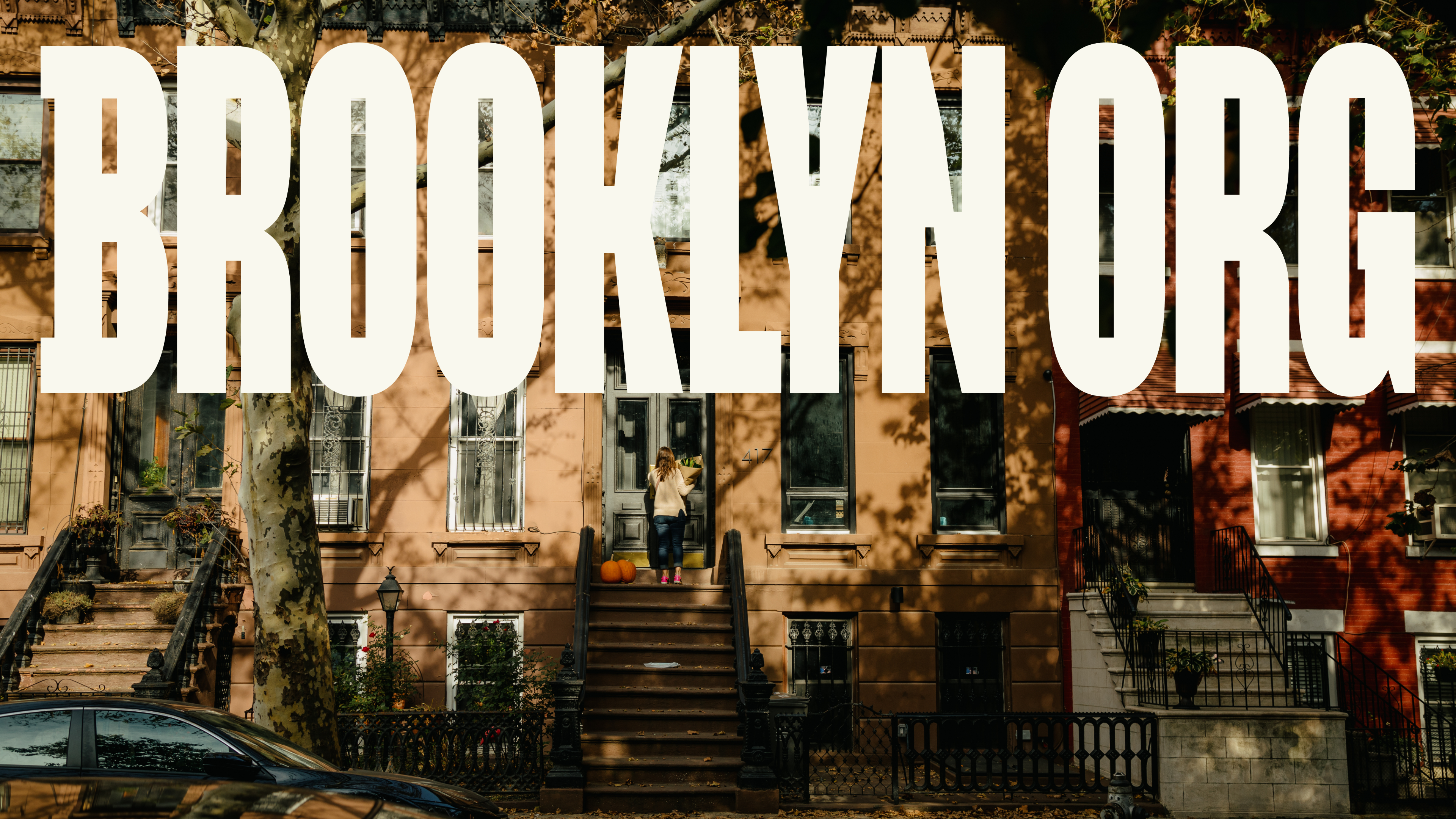
Mother New York and Mother Design (Fhirst, Brooklyn Org, Peerspace) have overseen the rebirth of Brooklyn Community Foundation as the commandingly named Brooklyn Org. The sea change arose from a desire to distance the organisation from ‘notions of traditional philanthropy, seen largely today as elitist, dysfunctional, and detached’. If that sounds like a solution to a problem that shouldn’t exist (who hates charities?) then consider the alarming statistic (as reported by Associated Press) that in 2024, ‘26% of people said they distrust philanthropy’ – a vertiginous five percentage point leap from the previous year. As I touched on in my recent review of The Clearing’s rebrand for beleaguered UK children’s charity Barnardo’s, big money philanthropy has suffered too many scandals to rest on its once dependable laurels.
Brooklyn Community Foundation was ‘an institution’ (read: stuffy, fusty, judgy white people) looking to become ‘an institution’ (read: living legend). To use an Anglocentric example: King Charles III is an institution; David Attenborough is an institution.
However despite the new name and facelift, the admirable mission and goals that fire Brooklyn Org (née Community Foundation) remain essentially unchanged. Mother eulogises that it rarely has ‘the honor of working with an organization that betters the lives of so many people in such palpable ways, so close to home’. Over the organisation’s 15-year history, it has bestowed (or ‘moved’, in the casualised and slightly Narcos brandspeak) over $110 million of wealthy donors’ dosh to various worthy nonprofits, as part of a ‘new model for community philanthropy as a partner and platform for transformational change for Brooklyn’.
Perhaps then, ‘moving’ money isn’t such an inappropriate term, considering that one of the main achievements of this substantial rebrand seems to be painting Brooklyn Org a more believable laundrette, taking in dollars magnanimously released from the diamond-ringed claws of inevitably dodgy, avaricious old-money types, and pushing it out as good, honest community funds for the benefit of good, honest, salt-of-the-earth types, like you and I.
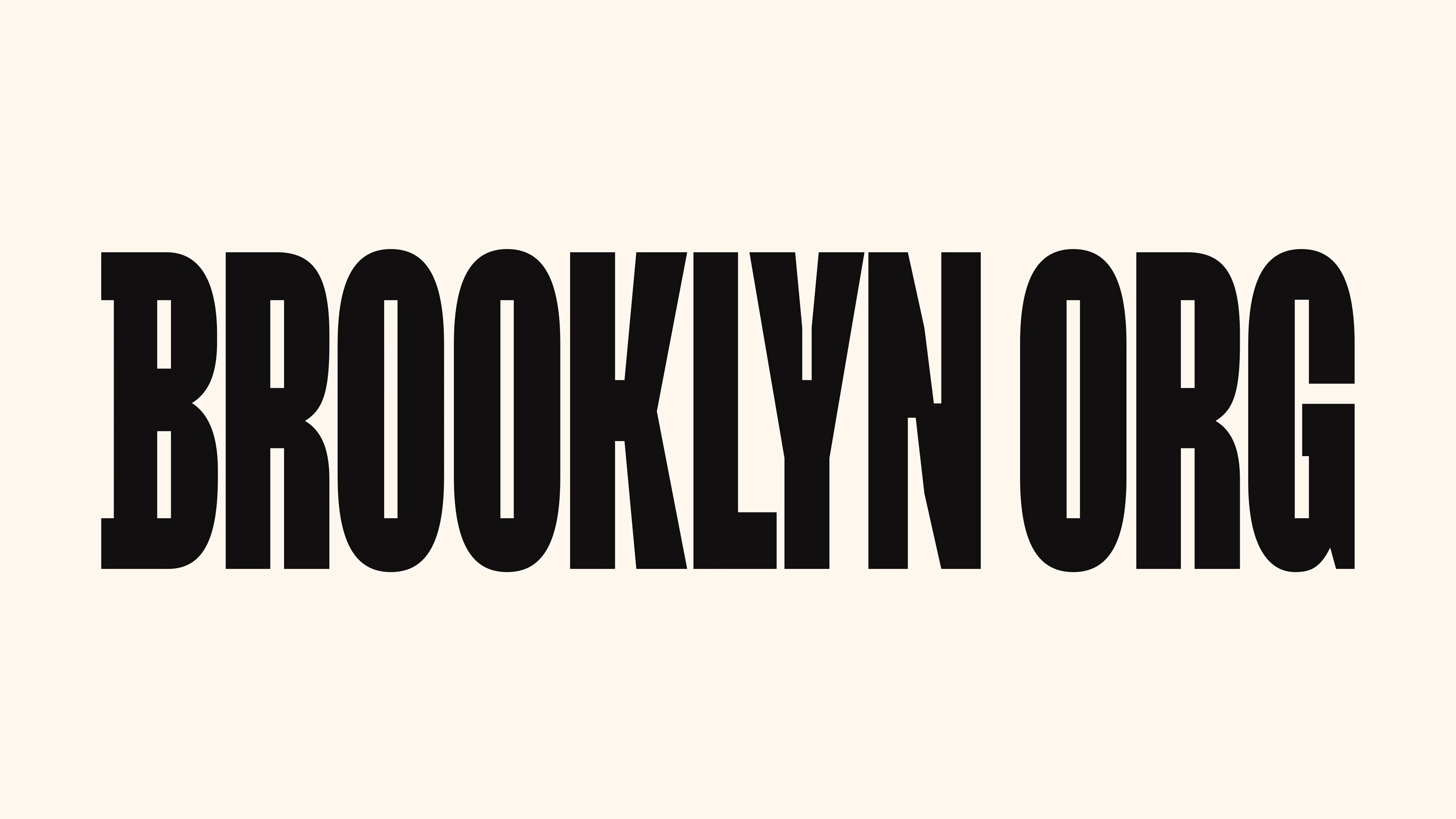
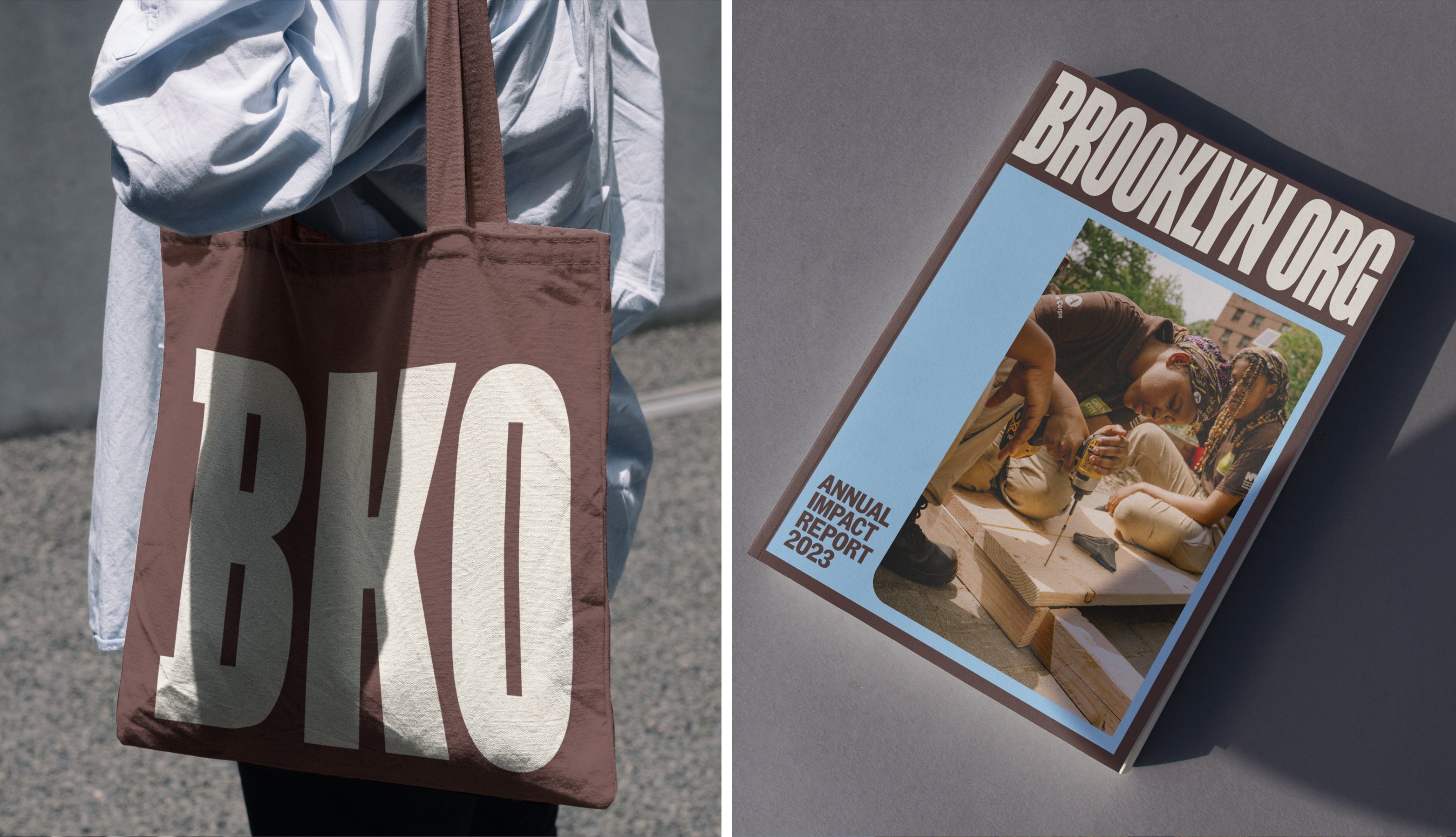
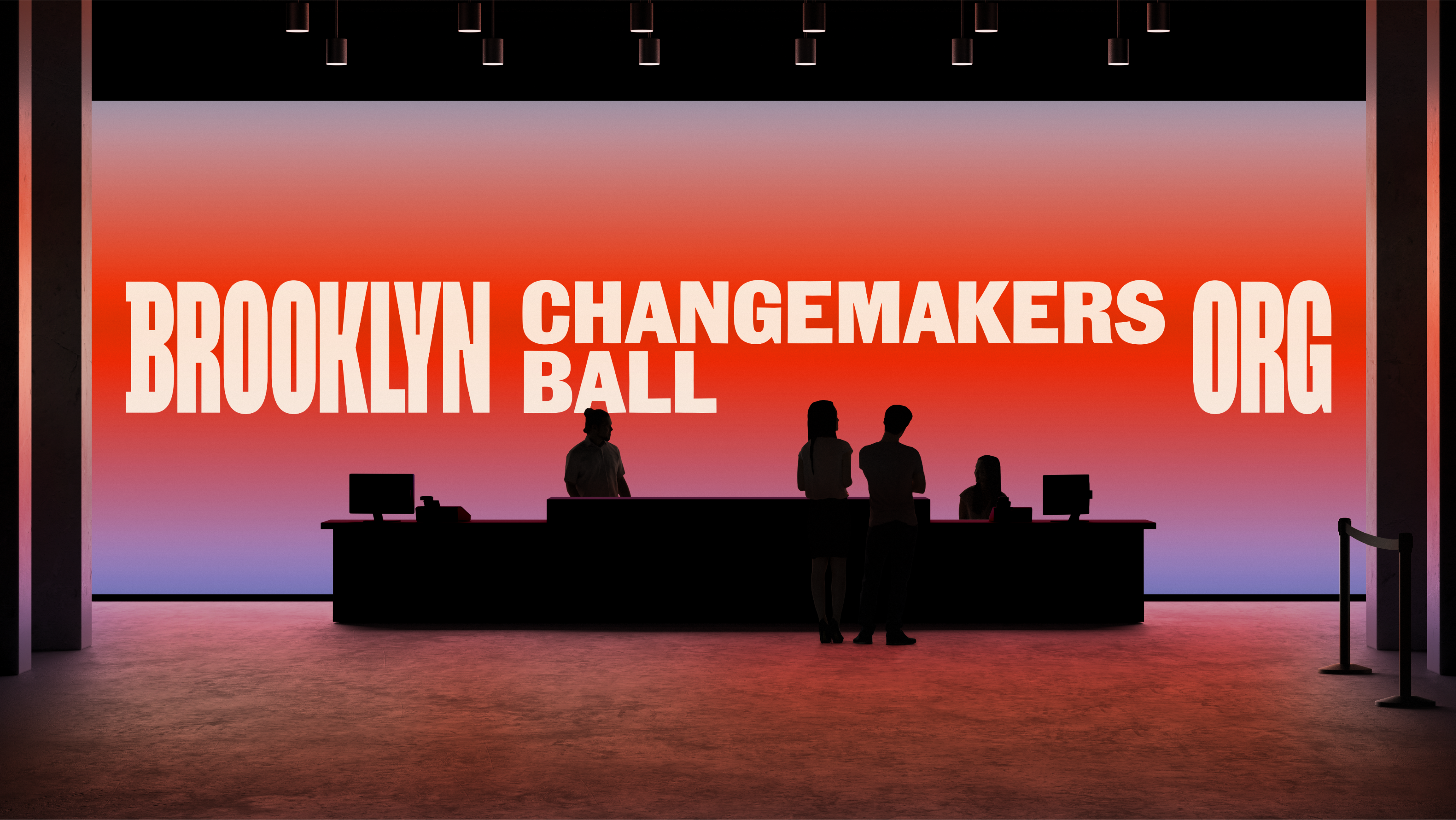
To accompany the direct, geographically-grounded new brand name, Mother has crafted a magnificent new gothic sans-serif logotype that is so crammed with charismatic Brownstone-esque details, you almost expect to see black metal fire escapes zigzagging down the towering letterforms. As well as the facades of these architectural hallmarks of Brooklyn, Mother identifies another source of inspiration as being the borough’s ‘densely populated “blocks”’ – specifically, ‘the geographic shape of a block’s center courtyard’ as seen from an aerial view. This elongated rectangle can be seen in the three ‘O’s of the logotype, and also in the angular cutouts of the remaining letters.
Tastefully selective slab-serifs for the ‘B’, slightly flared strokes and contrasting angular counter spaces throughout create a sense of bristling dynamism, an energy that is simultaneously toweringly elegant and explosively cramped – much like the borough itself.
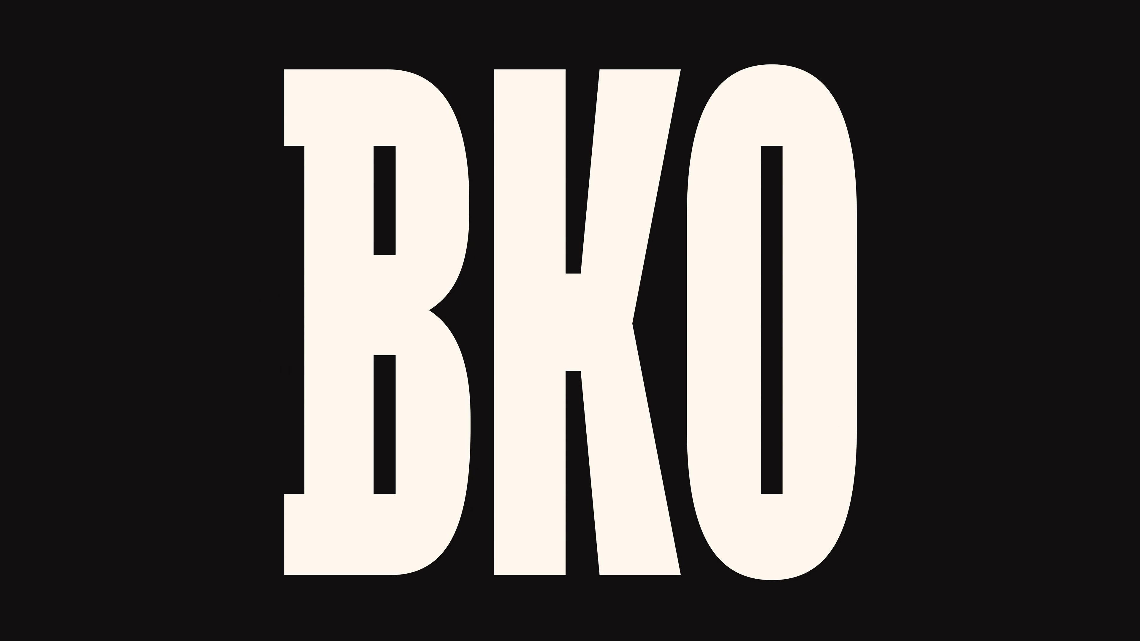
The social media icon version of the logo uses the abbreviation ‘BKO’. If this feels a little forced, consider how Mother’s name-gurus would have been confronted with the equally unprepossessing choices of ‘BO’, ‘BORG’, or ‘BRKLYN’, (BRKLN? BKLYN?). In the context of this tricky call, BKO is an understandable choice.
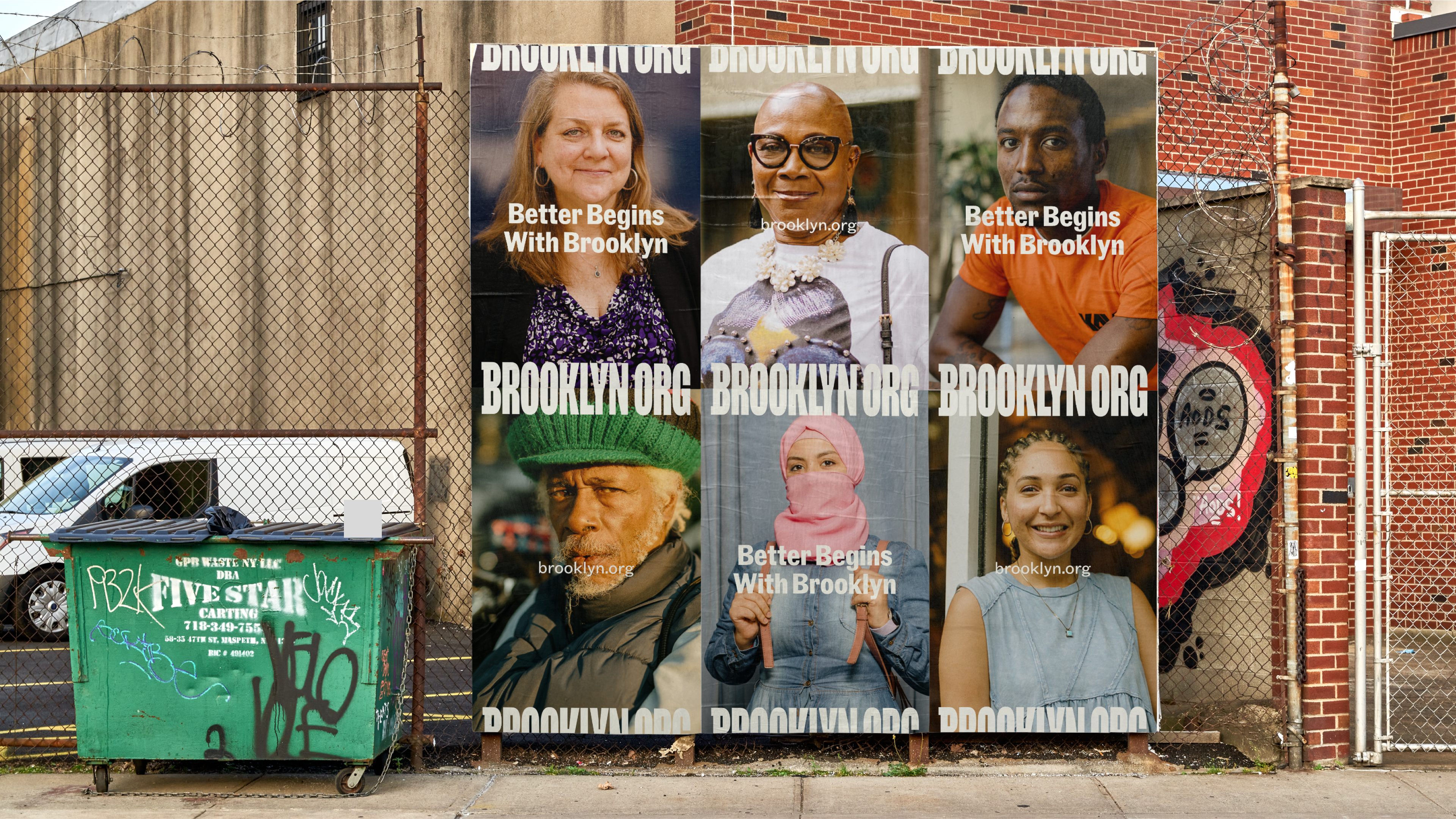
The Community Gothic type family is used for all headings and body text. The ease with which this five-weight, two-width family covers this wide range of applications is a spectacular endorsement of its versatility, for which Brooklyn-based foundry Frere Jones should be applauded. In its case study, Mother remarks on the aptness of both the typeface’s serendipitously suitable name for the former Community Foundation, and ‘its diverse styles and human qualities’. Its application for Brooklyn Org seems truly predestined.
Community Gothic is one of those rare typefaces that actually lives up to the oh-so-often flung around accolades of ‘versatile’ or ‘workhorse’. Frere Jones describes the creation process of reviving the ‘gritty forms’ of the ‘jobbing’ genre of mid-to-late-19th century typefaces – mismatched fonts thrown together by printers to fit the constraints of certain printing projects. In its embrace of hodgepodge, Community Gothic deliberately sets out to complicate notions of ‘family’ or ‘genre’.
On Brooklyn Org’s website, hero headings are enhanced with simple, springy animations. One might have wished for something a little more sophisticated and commanding to better match the monumental logotype. But perhaps this instinct was reined in precisely to avoid veering back into that ‘top-down’, monumentalising sense of ‘institutional’ philanthropy. Or perhaps there were simply limits to the motion budget for this pro-bono project.
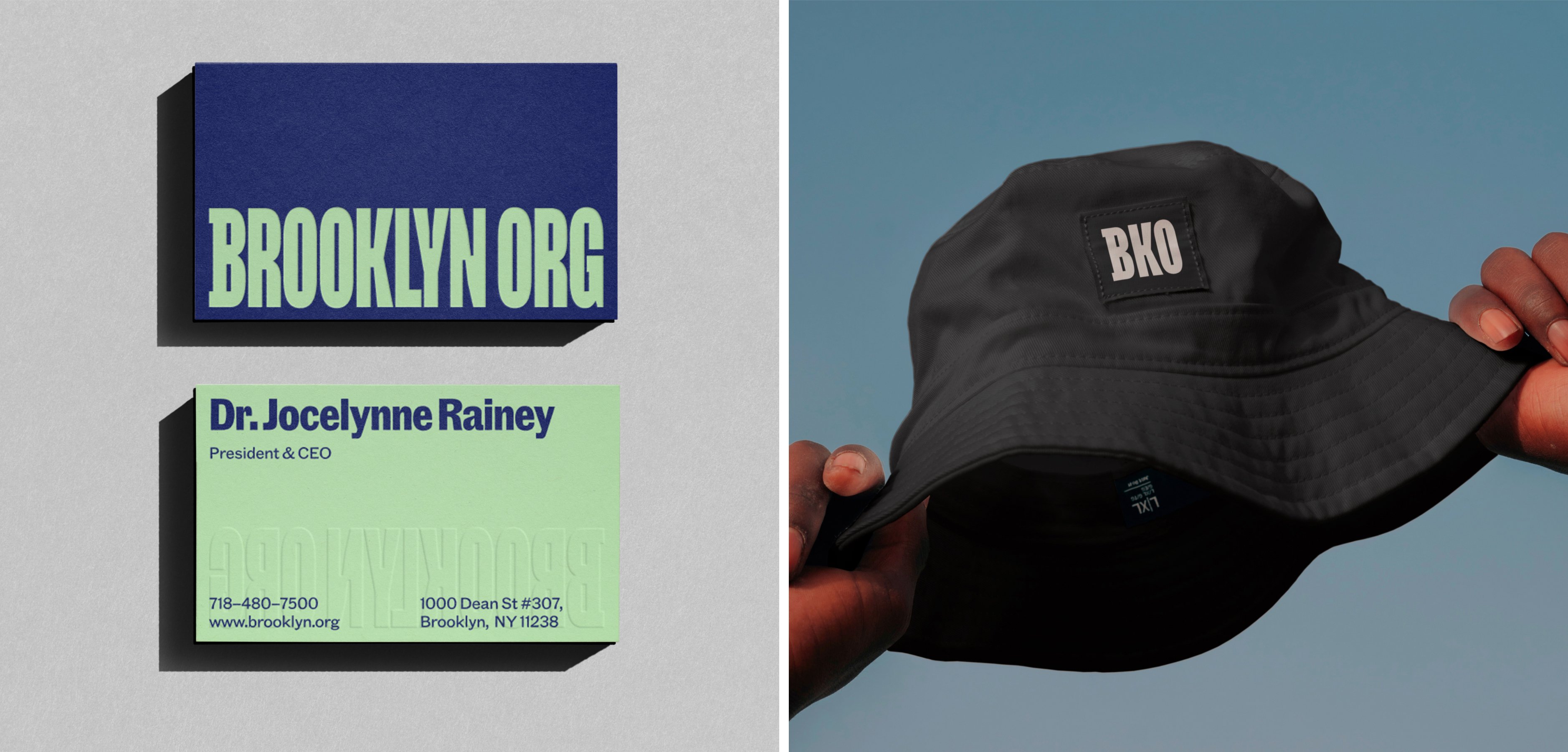
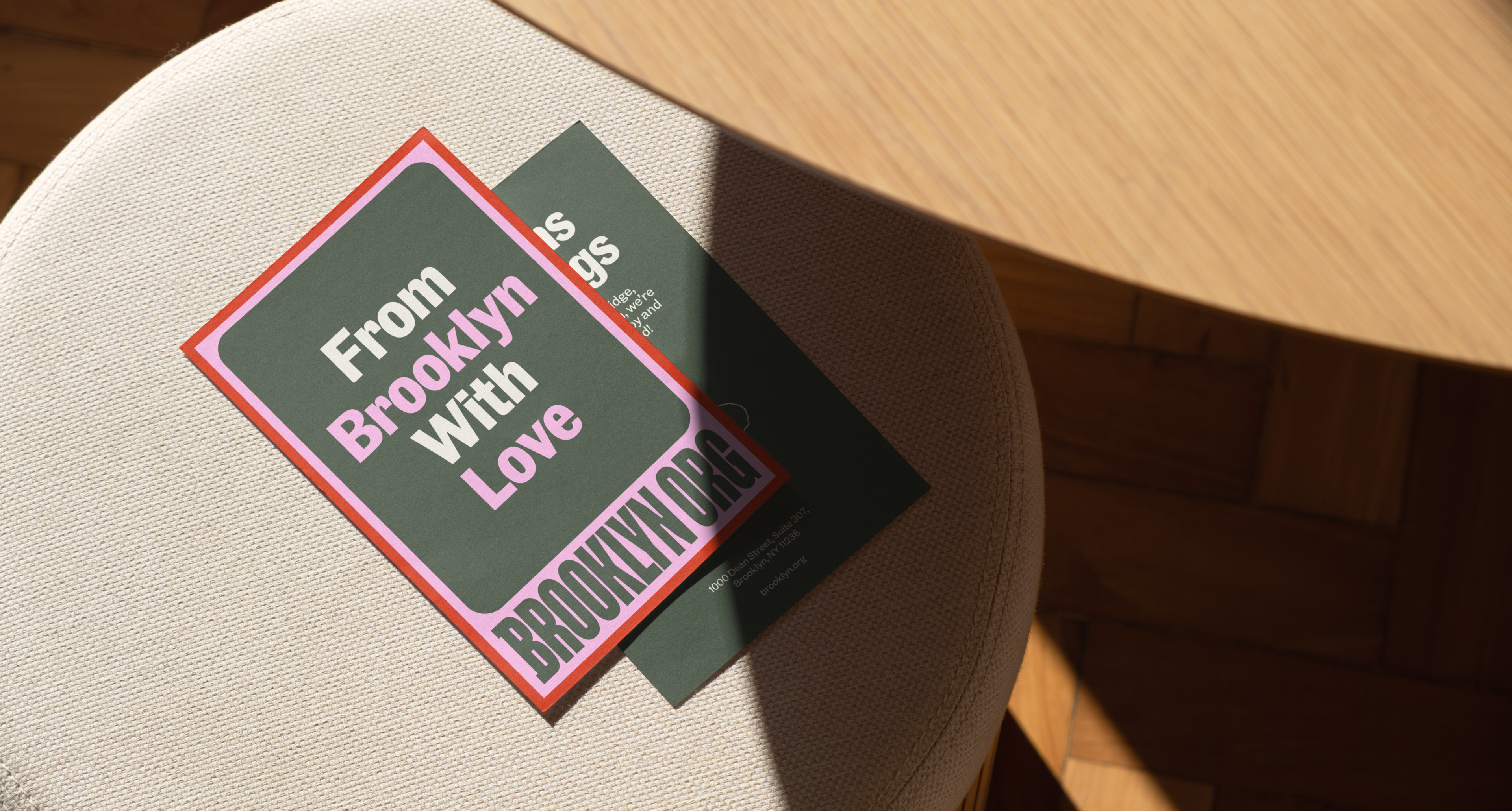
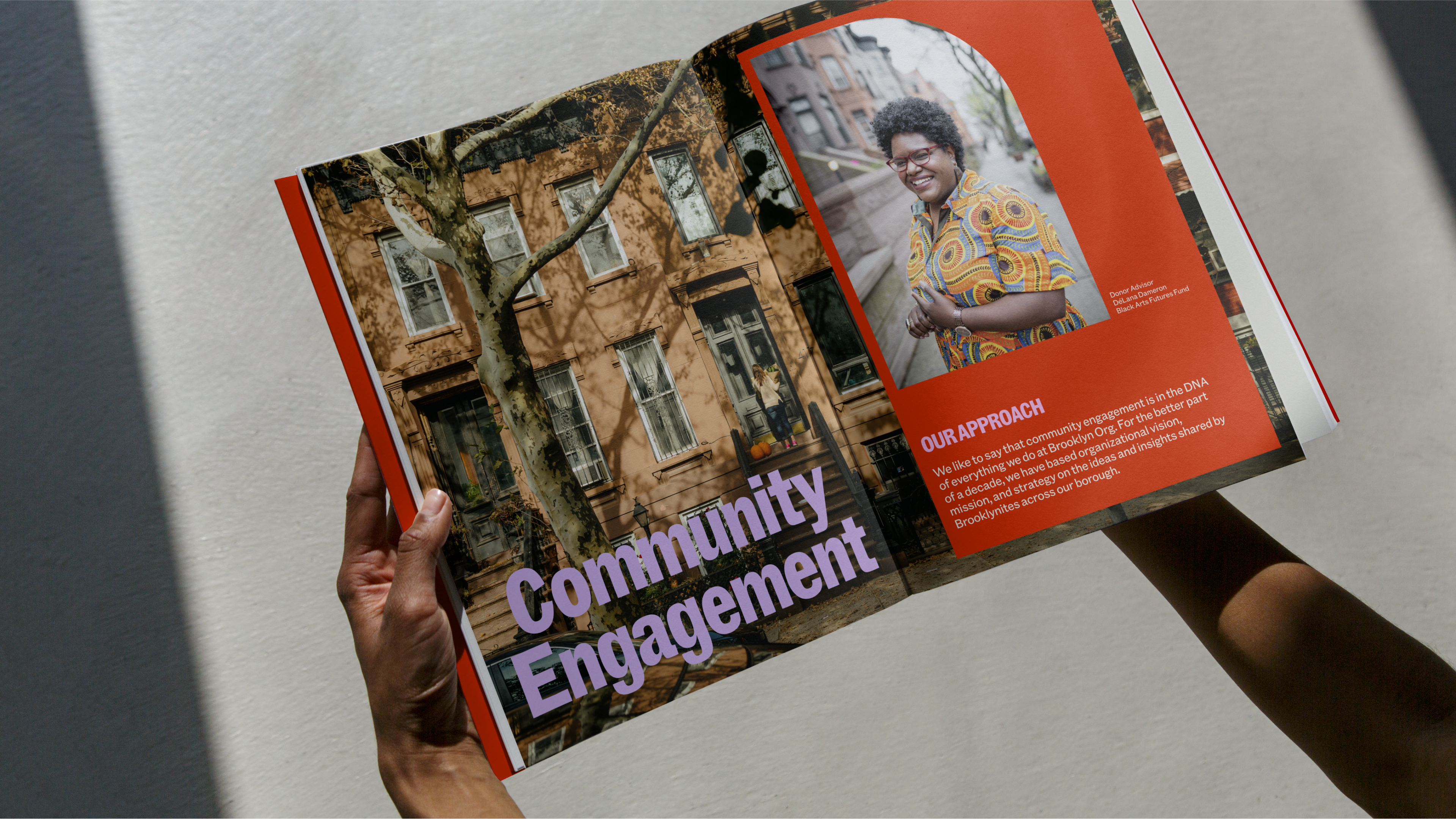
For the brand colour palette, Mother (somewhat dubiously) claims to have used the Brooklyn flag as a source of inspiration. It’s not clear where these colours have ended up – there is a dark blue that’s not quite the one in the flag design, and a golden yellow that’s also not quite the right shade, and neither are used with particular prominence. However, the limited resemblance is probably for the best – Brooklyn’s flag is chromatically pretty dour. Instead, Mother’s decision to ‘infuse fresh, bright hues affectionately named after Brooklyn icons’ has proved a much more fruitful strategy, yielding festival-bright pastels with idiosyncratic location-grounded names such as Red Hook, Lavender Lake, Green Lady and Wheatpaste. This meaningful and attractive colour palette has allowed Mother to honour the borough’s geography and history, ‘while injecting a sense of dynamism and modernity’.
This bright and sophisticated palette is brought together in bold and provocative combinations in dynamic, layered frames for imagery and text. These collage-like devices, layering square corner forms atop/inside rounded ones, cleverly pick up on the dynamic contrast between inner and outer details as seen in the counter-spaces of the logotype. A standout layout using these framing devices is a striking ‘Red Hook-red’ subway poster, the square corners of the inner frame are allowed to explosively burst out through the rounded corners of the outer. This simple but playful development of the idea brings some enjoyable tension to the gentle curves and crepe-paper colours.
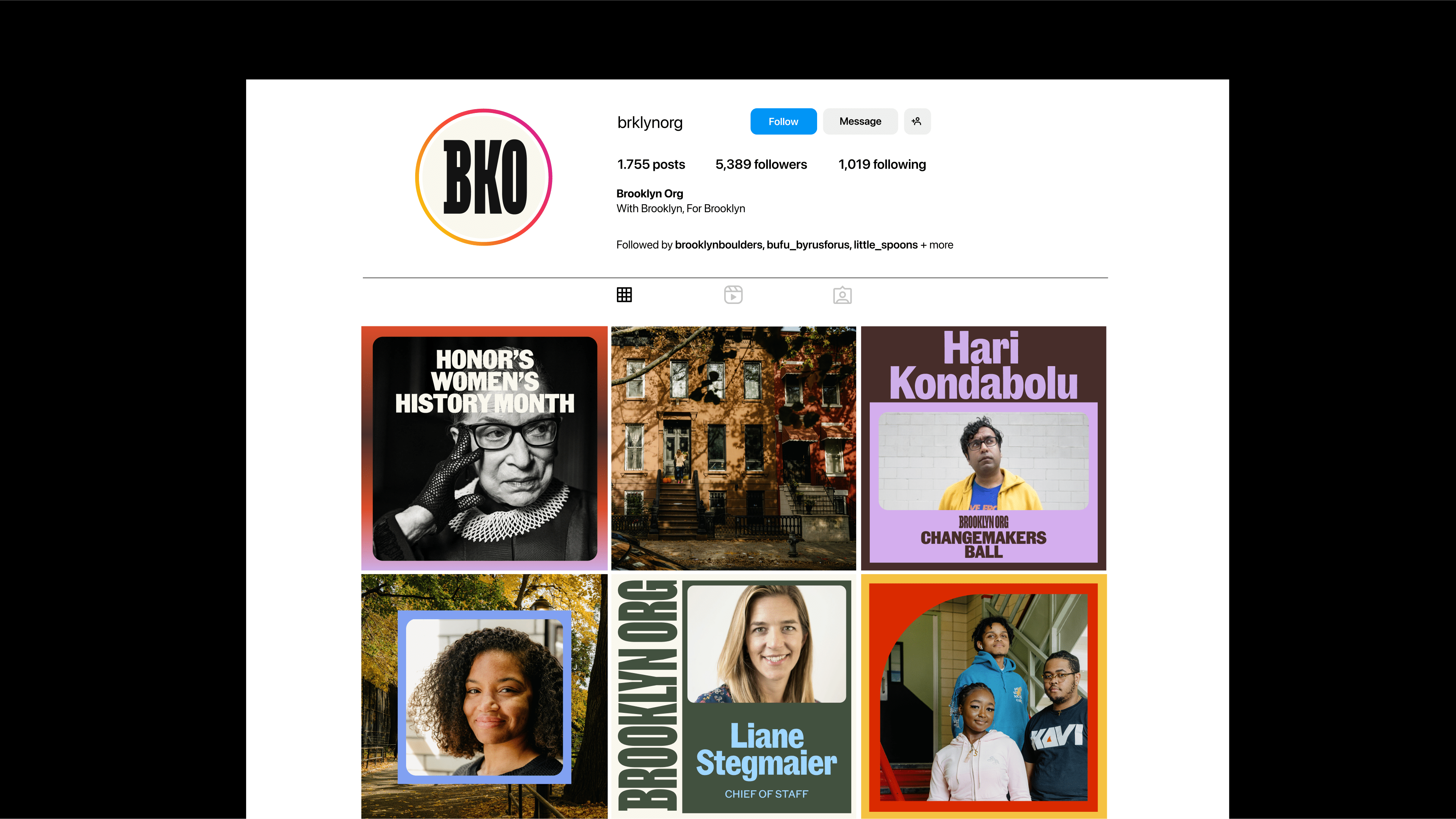
With frustrating ambiguity, Mother traces the inspiration for these multi-layered borders back to ‘postcards from Brooklyn’. A cursory investigation has yielded little indication as to what these geographically-specific examples of archival printed ephemera could be (beyond the universal convention for early/mid-20th century postcards and photographs to be printed with a regular, rectangular border). Mother’s case study would be substantially enriched by elaborating on the specific references that apparently inspired these framing devices, to show them as not just attractive and versatile, but also as a meaningful response to the core of the brief to ground the new identity in geographic specificity.
Mother has forged a strong and commanding identity for Brooklyn Org that decisively reorients the organisation towards an vision of philanthropy far better suited to engaging sceptical, disillusioned contemporary audiences. If the surrounding identity never quite lives up to the aesthetic promise and geographic idiosyncracy of the extremely cool logotype, it is undeniably pervaded by a bright, bracing clarity that captures a positive vision of the essence of Brooklyn more effectively than any hackneyed motifs of bridges or brownstones ever could.
