Barnardo’s by The Clearing
Opinion by Thomas Barnett Posted 25 April 2024
Barnardo’s is the UK’s largest children’s charity, and it undoubtedly does much good in the world. However, its history up to this point is also littered with uncomfortable controversies. Certainly, the most outlandish transgressions are concentrated in the late-19th and early-20th centuries. Founder Thomas John Barnardo was taken to court 88 times for kidnapping children (or ‘philanthropic abductions’, as old TJB would have it). But more concerning are the scandals that have dogged Barnardo’s in recent decades.
In 2011, it was widely criticised for providing ‘welfare and social care facilities’ at the Cedars immigration detention facility, used to hold children pending deportation. In 2014 and 2020, respectively, the Northern Ireland Historical Institutional Abuse Inquiry and Scottish Child Abuse Inquiry investigated the physical and sexual abuse of chidren at various Barnardo’s projects. In 2017, Barnardo’s was also implicated in the sprawling UK Independent Inquiry into Child Sexual Abuse (IICSA) for deporting hundreds of children to Canada and Australia in the first half of the 20th century. Cue the grimly predictable testimonies of horrifying child abuse, torture and enslavement arising from the wildly irresponsible government-backed policy.
Leaving aside the significant moral and ethical dimensions of these controversies to consider Barnardo’s from a PR and branding perspective: a history as chequered as this must surely have complicated (or, more likely, dictated) brand strategy for London-based creative agency The Clearing, which has devised new brand architecture, positioning, strategy, identity and tone of voice for the charity.
One can imagine how The Clearing might have seemed a perfect fit for addressing Barnardo’s situation, with the agency’s stated focus on creating ‘Clear Defendable Territory’ for its clients. The inherently defensive conceptualisation of branding that this implies feels like a natural fit for brands that find themselves on the back foot, hampered by scandals or bad press.
But (if you subscribe to Oscar Wilde’s assertion that ‘there is only one thing in life worse than being talked about, and that is not being talked about’), the predicament facing Barnardo’s was even bleaker than the rap sheet conveys. According to The Clearing, Barnardo’s own research found that 50% of children and young people ‘didn’t know Barnardo’s or how it could support them’, and that the perception of Barnardo’s among many adults was limited to children’s homes.
The challenge, therefore, was not only to shake off the noxious miasma of bad publicity, but also to cut through a thickening amnesiac fog of irrelevance and anonymity. The Clearing has grappled to reorient Barnardo’s brand to show how this 150-year-old organisation can be relevant and useful to the increasingly anxious, isolated and disenfranchised young people of our chaotic modern times.
The previous branding was utterly unfit for this task. While not actively hideous, it was bland, dated and uninspiring. This faded aesthetic was compounded by being inconsistently applied, with endless variations of fonts and symbols combined in rough approximations of the official logo and slapped across 600+ Barnardo’s high street stores. The whole affair made Barnardo’s feel like precisely the kind of hopelessly old-fashioned and slip-shod operation that would be susceptible to mistakes (of the kind detailed above).
Considered from this angle, a well-intentioned rationale begins to emerge for why a sleek rebrand would be a priority for a children’s charity that as recently as 2023 faced scrutiny over its claims to spend ‘92p in every pound on good works’. A charity lives and dies on the faith that people have in it, and in the context of its beleaguered recent history, Barnardo’s old brand was a liability that painted it in precisely the colours it most wished to wash off.
The Clearing’s new approach is to put children (for too long mute and stripped of agency) front and centre, not as passive beneficiaries, but as active participants. The rebrand began with a series of workshops with children and young people using Barnardo’s services across Wales, Scotland and England. These groups told The Clearing that ‘it can feel like they have nowhere to turn and it’s easier for them to switch off from the world’, so in response the agency decided that it would create the new brand ‘with them – for them’. In doing so, the work aims ‘to do exactly what Barnardo’s as an organisation does – and help [children] feel safer, happier, healthier and more hopeful’.
The co-creation with children didn’t stop at the strategy. The Clearing equipped the youngsters with paints, pens and coloured paper and asked them to ‘express things they’ve been going through and how it made them feel’. The groups were also asked to draw the first letter of their name in the same way. Getting children to work on the brand is undoubtedly ingenious, and has given rise to a design vocabulary that is authentically infused with the inimitable, unfettered energy of childrens’ visual imaginations. Certainly, this kind of child labour feels like a significant improvement on the slavery forced upon less fortunate children deported to overseas imperial territories by Barnardo’s in the 1920s.
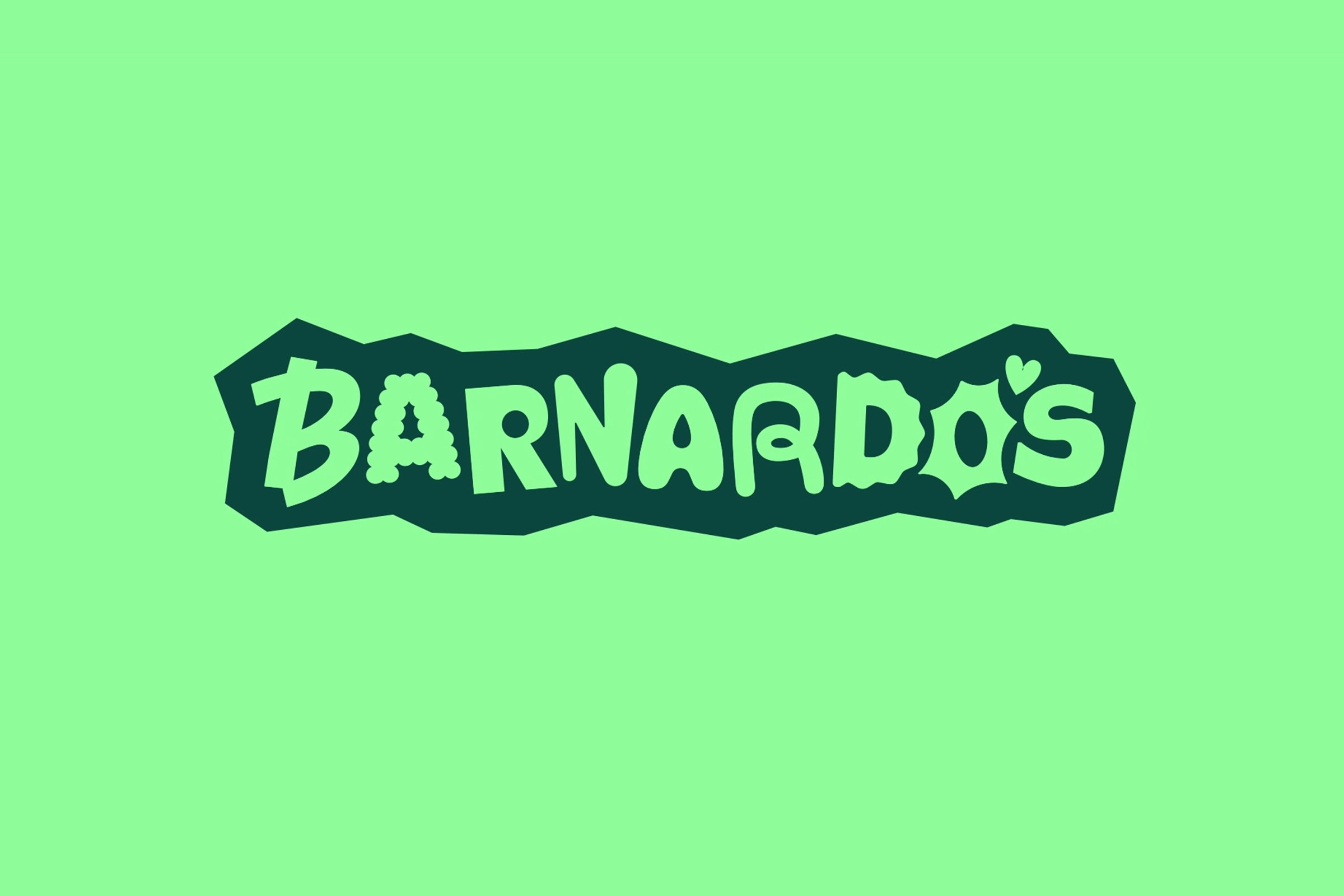
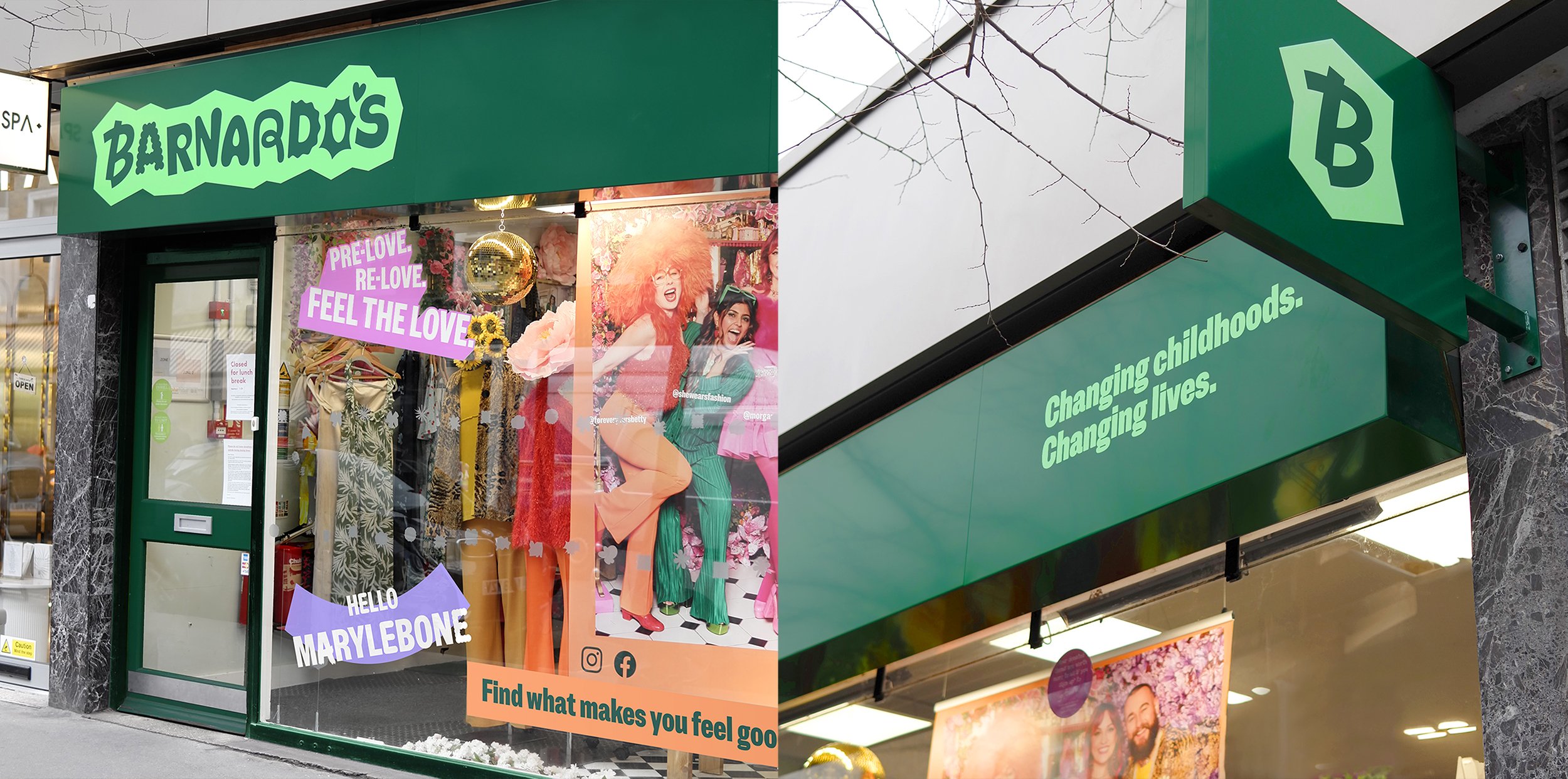
The activity inviting the children to draw the first letter of their names in a way that expresses their emotions directly led to the development of the new logotype, which ditches the old pictorial symbol and leaps headfirst into a maximalist typographic approach. The new logotype is composed of nine entirely bespoke and individuated characters (plus a sweet heart-shaped apostrophe). Letters bounce, spring, lollop, and coalesce into arrangement in a beautifully complex logo animation. Each letter represents a different emotion – an explosively spiky ‘O’ bristles with frustration, the counter of the ‘A’ is animated as a teardrop, while the ‘B’ performs a carefree pirouette.
The studio’s focus on ‘Defendable Territory’ appears to have extended to the design of the logo too, by binding it in an irregular but snug containing shape that The Clearing describes as ‘a visual metaphor for a safe space’. However, this defendable/safe space is not a hiding place, but rather a place of open and honest expression, where ‘everyone can express whatever they’re feeling… each letter captures a different emotion, held within the “safe space” of the holding device’.
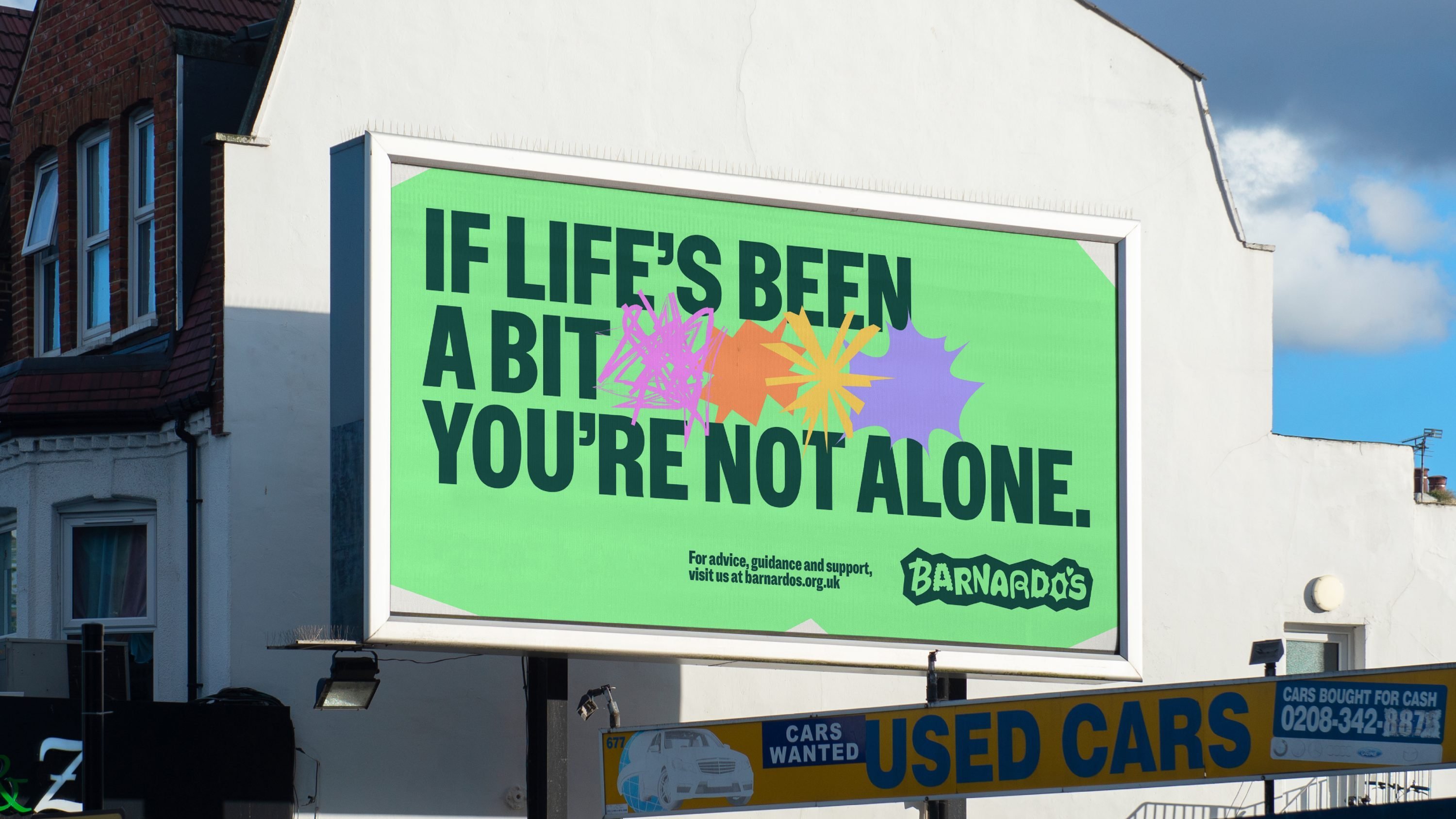
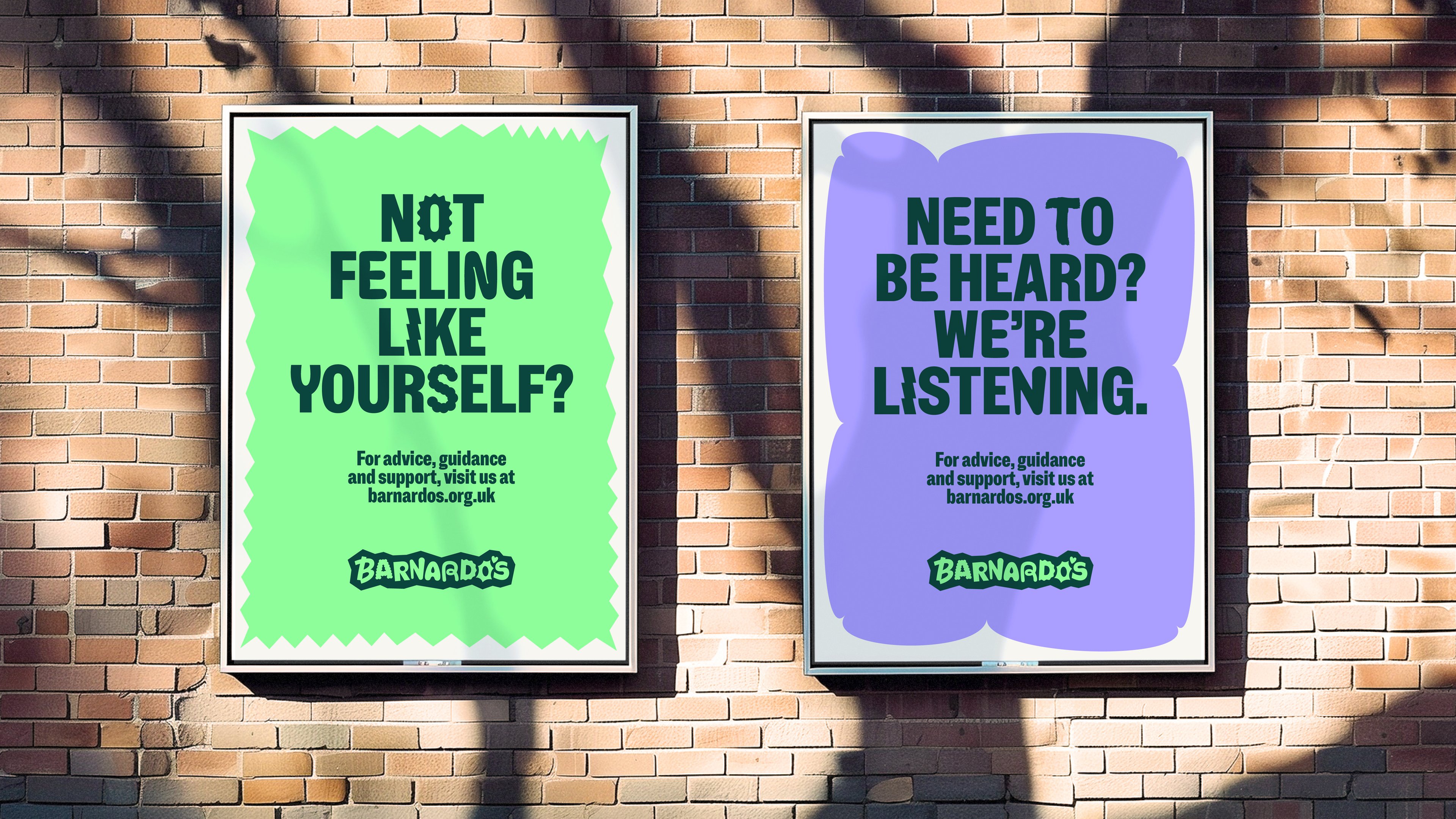
The expressive typography is continued through headings. Standard headings are authoritative but friendly, set in charismatic gothic sans-serif Barnardo’s Speak, which is a custom version of NaN Metrify Condensed Black. Barnardo’s Express, an alternate version of the same font, includes the custom characters derived from kids’ doodles. Body copy is set in Arial, no doubt with the aim of keeping things simple for a large, loose organisation with many volunteer staff members.
This exuberant and expressive typographic approach moves the brand in a positive direction, replacing mental images of orphans and children’s homes with a sense of celebration and individuality. The achievement of this work is to make it feel animated by real children, not a faceless homogenised mass of passive victims who are variously picked up, kidnapped, rehoused, adopted and fostered, shipped around the world.
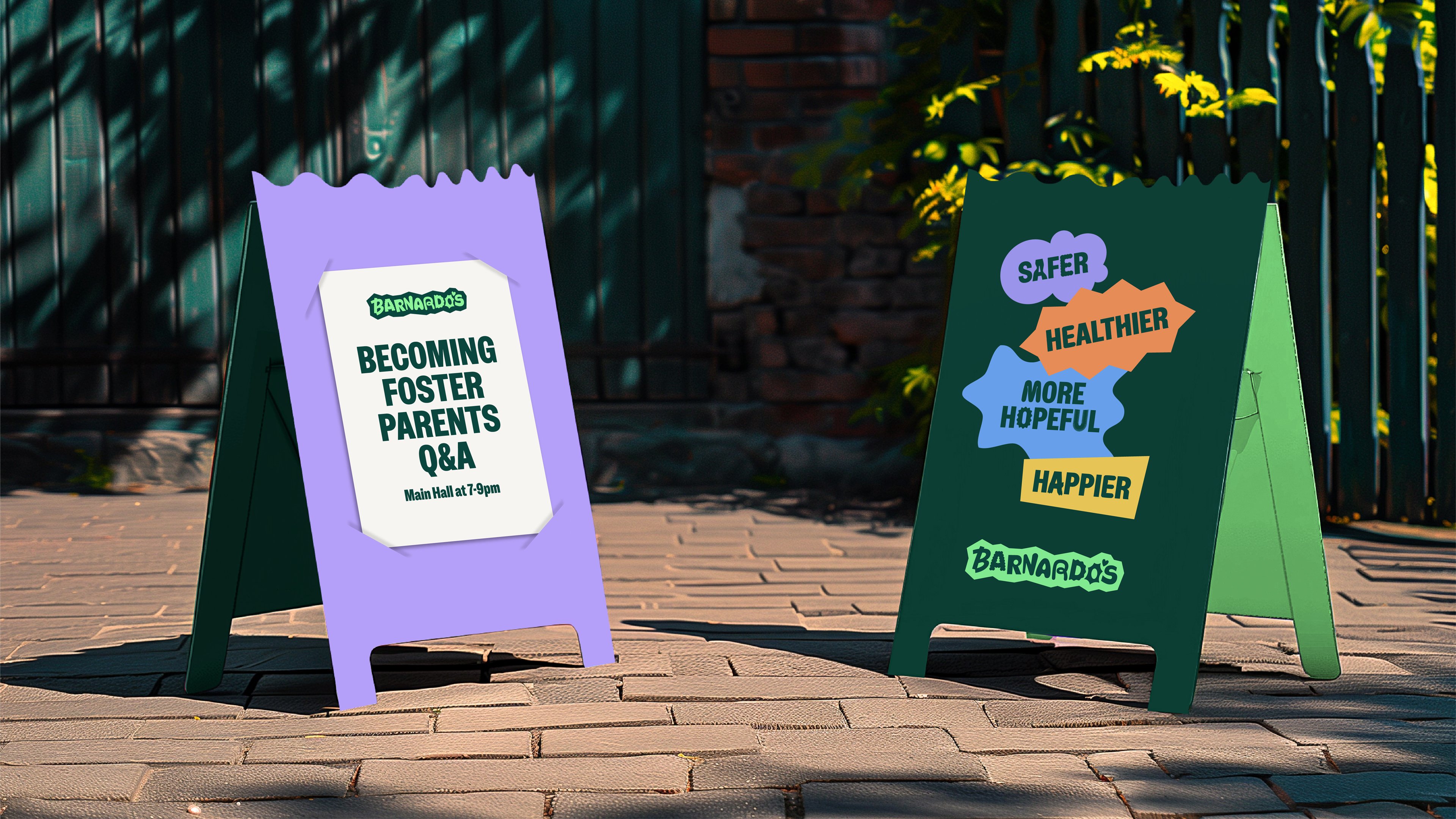
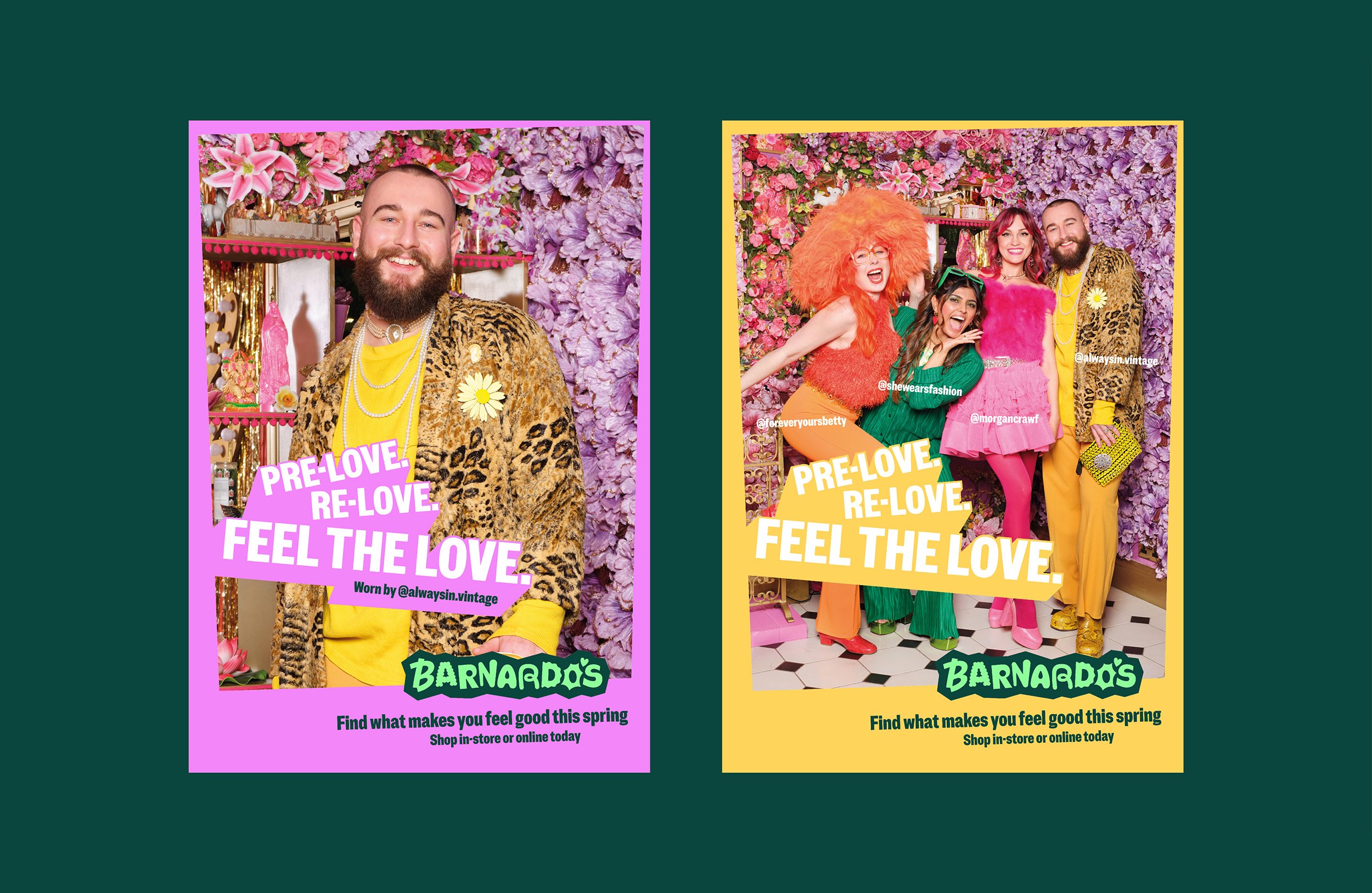
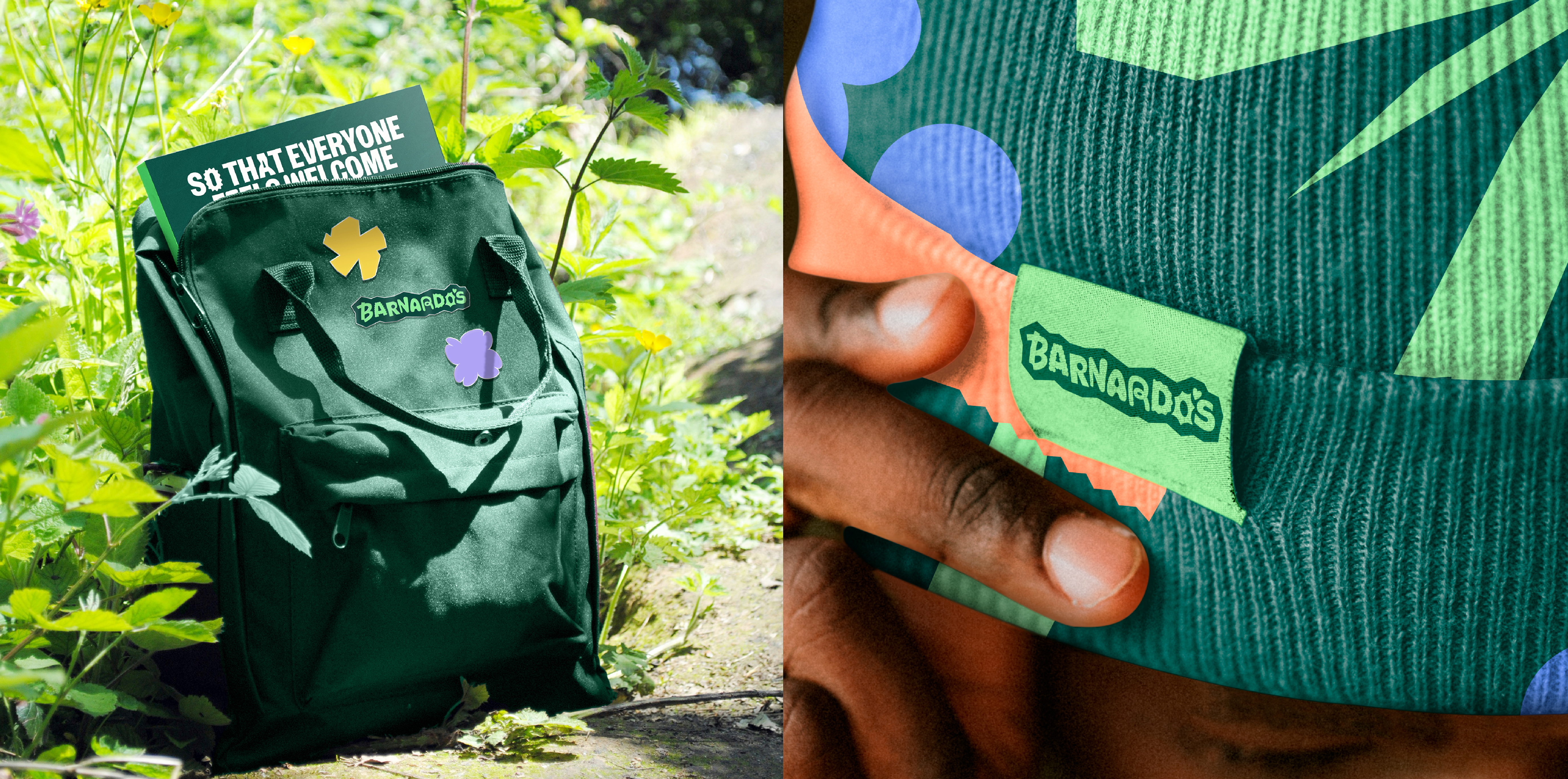
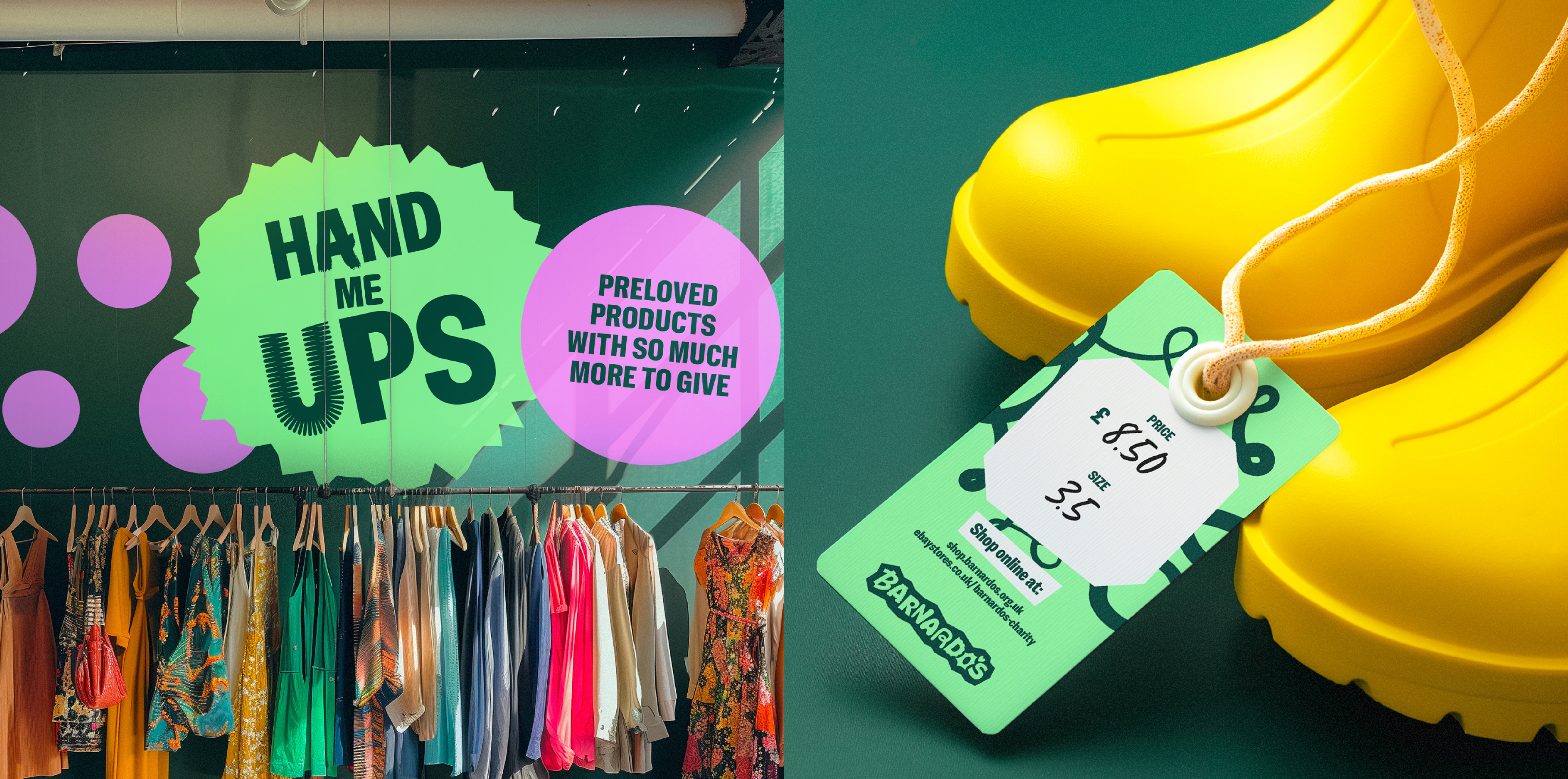
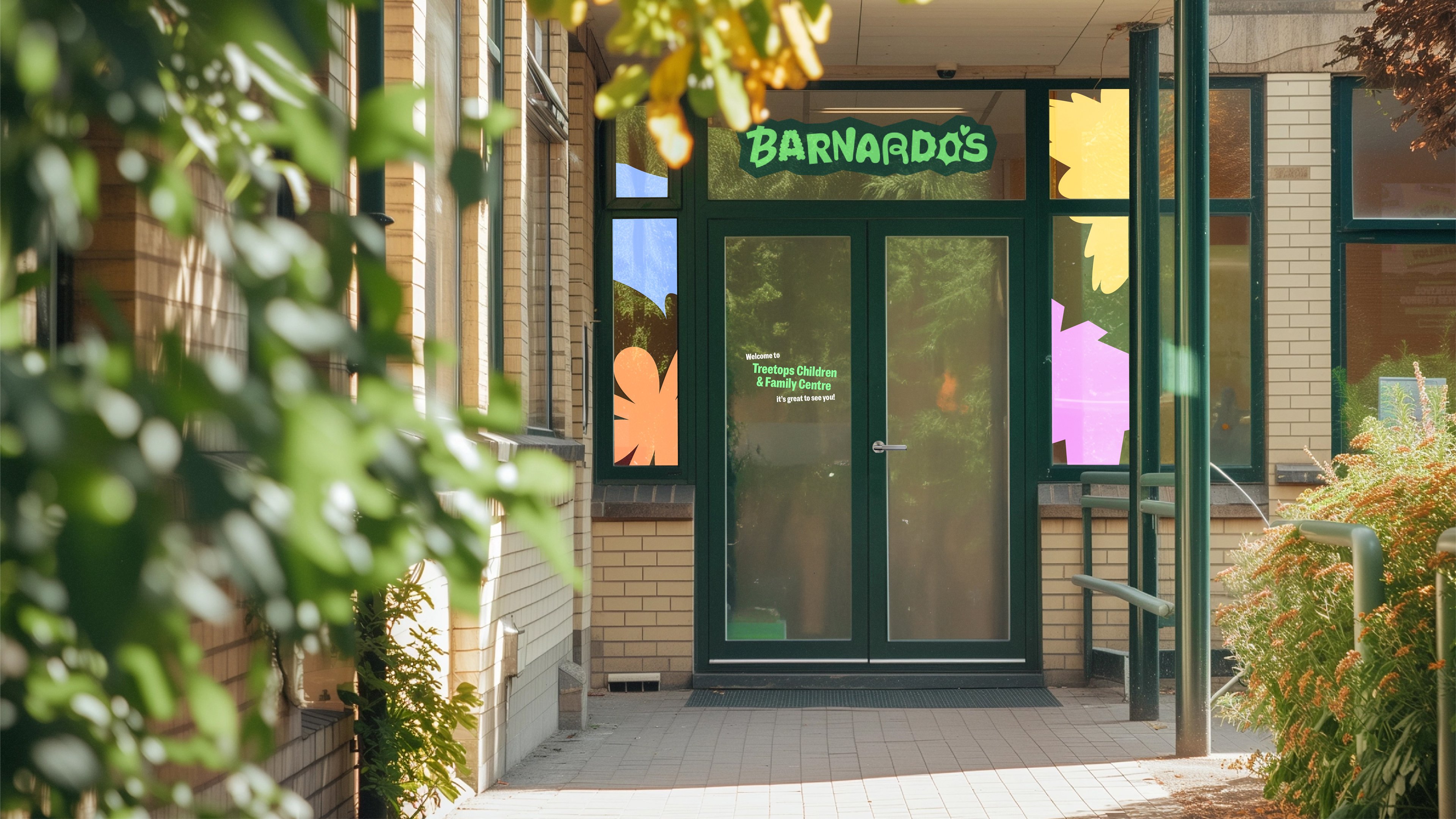
Charity brand identities are complex beasts because they need to work for national or global campaigns on social issues, but also work for very specific and demanding retail environments (often without adequate funds for significant visual resources). On this point, The Clearing’s work really excels: the graphics and colour palette work extremely well in retail environments. From the few glimpses on the studio’s case study, these have easily combined to create a genuinely appealing retail environment for Barnardo’s armada of charity shops.

The Clearing’s work for Barnardo’s is a highly competent rebrand, with some lovely imaginative touches courtesy of the children involved in the process. The branding pulls off the difficult task of refocusing attention on the successes of Barnardo’s work, while tacitly responding to the very real problems facing this beleaguered charity. If the overwhelming feeling after delving into Barnardo’s history is one of surprise that the brand still exists at all, then at least this rebrand sets up the charity in the best possible way to rebuild a reputation as a relevant, progressive, and trustworthy force for good in the world.

&


