Trulli Ulivi by Here Design
Opinion by Emily Gosling Posted 4 June 2024

Most people have likely never played the game ‘Italian Food or Italian Celebrity’; but trust me, it’s a pretty fun game – great for car/tube/bus journeys, or whiling away a bit of time after Christmas between gorging on something and watching Eastenders Omnibus.
The premise is simple: someone says a name, the others guess if it’s an Italian food, or an Italian celebrity. For instance: Gino Giennli (obv, Italian food, as anyone who was alive in the 90s will know from those infuriatingly catchy ‘tutti frutti, what a cutie!’ adverts); Bella Lasagne (celebrity, though arguably not really Italian, what with being a character from Welsh kids’ TV show, Fireman Sam); Gino D’Acampo (arguably both food and celebrity, thanks to his Asda-stocked range of cookware, ready meals, etc).
Now, finally, a new product has arrived that will get IFOIC players scratching their heads: olive oil brand Trulli Ulivi. Leaving inane games to one side, there’s no messing about when we say that the branding by London-based Here Design for the newly launched Trulli Ulivi – which is obviously the reason we’re really here – is truly gorgeous.
According to Here, Trulli Ulivi’s founders ’embarked on a project to restore a masseria in Puglia and make it a home’, having become ‘custodians of around 1000 ancient olive trees’. The agency was approached by the founders around two years ago to work on the range’s debut capsule collection of ‘luxury pantry ingredients’; taking on everything from strategy and naming through to packaging designs, tone of voice, digital and social platforms, and art direction.
![]()

At the heart of Here’s work for Trulli Ulivi is the idea of storytelling – ‘of place, the seasons, the people and the process of making olive oil’, and which follows the year in Puglia. This chimes with a crucial aspect of the product: Trulli Ulivi’s founders’ aim for the brand was to support its local landscape, community, and industry in its homeplace of Ostuni, through its seasonal production. As such, an important part of Here’s brief was that the branding communicated the importance of place and its inextricable link to the product itself, while offering a contemporary, fresh take on the ancient traditions of Puglia.

The logotype itself – made up of confident, yet thoroughly calm and un-shouty all-caps lettering – directly references said place, in that it’s drawn from Ostuni’s street signs. The whole place concept also naturally fed into the brand’s positioning: its inspired by that of natural wine which ’emphasises agricultural variables such as climate, soil type, production methods, and – of course – crop variety’, says Here.
From all that, you might expect a somewhat earthy, slightly rustic look and feel – but the identity instead presents a very fresh take on all of these influences and feels as much aligned with the geometric shapes of Bauhaus design as the Italian soil. It’s thoroughly modern, and seems to be taking Puglia, its seasons and its produce bang into the 21st century while simultaneously celebrating its natural landscapes and traditions.


That’s largely thanks to the visual identity’s central symbolic components – geometric circles and triangles that are inspired by the ‘architecture of local trulli — the signature conical stone huts of Puglia which informed the brand name’, Here explains. The studio says that these constructions are, according to some, representative of the signature of the stonemason, while others claim they offer spiritual protection; but for the Trulli Ulivi brand, they ‘represent the essence of place — a pure distillation of Puglia, past and present’.


As with the shape-based brand elements and the wordmark, the colour palette is restrained yet poised; using largely grey, black and white with flourishes of a bright yellow-green chartreuse that emulates the tone of the oil itself.

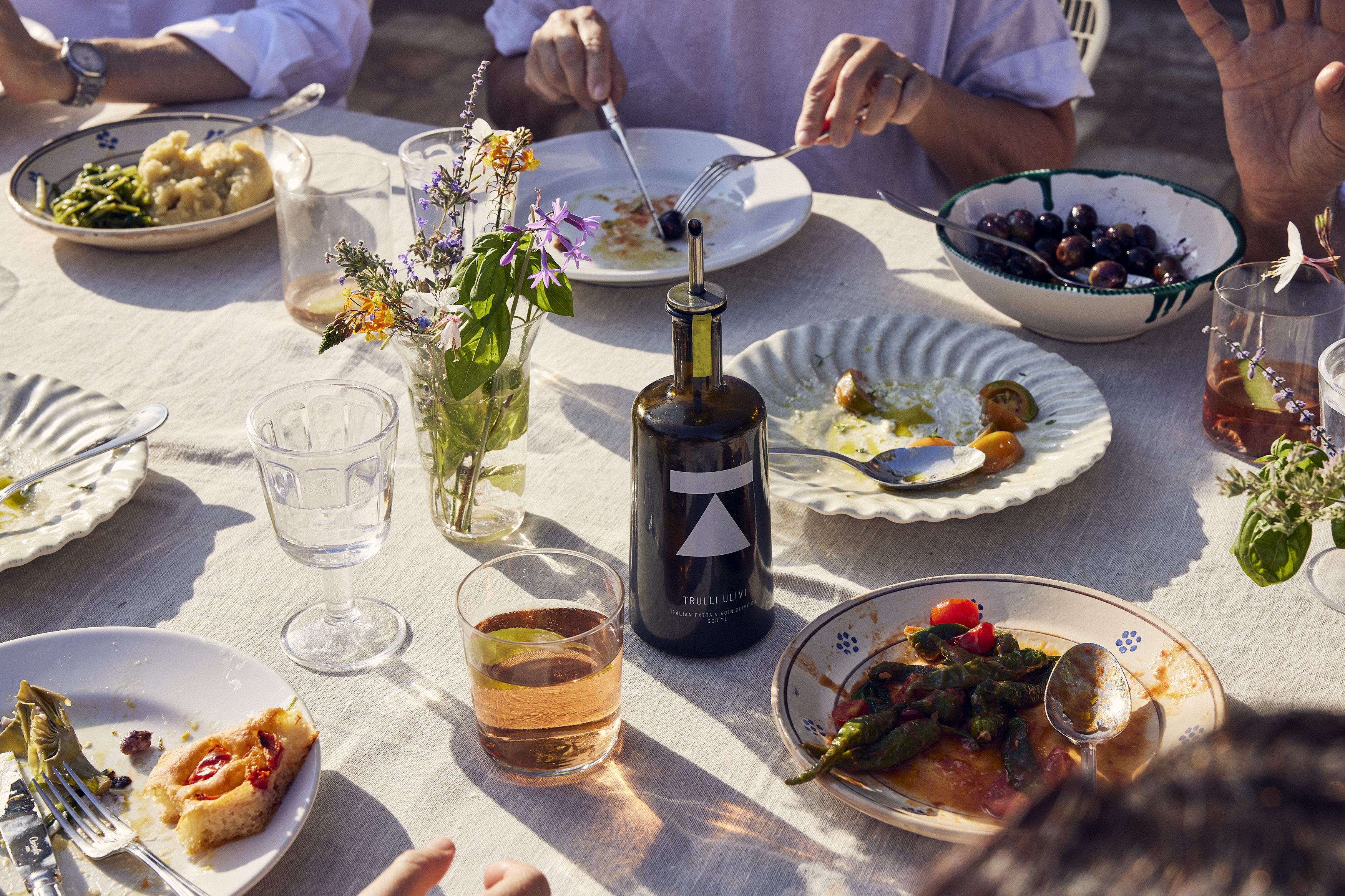
Meanwhile the suite of photographic imagery art-directed by Here was shot by Chris Simpson at the site where the brand’s olives are grown, Masseria Borzone, and feels refreshingly original for brand photography; offering a genuine insight and snapshot into the hyper-specific area that’s fundamental to Trulli Ulivi’s product and aesthetic.
All in all it’s a lovely identity that merges contemporary cues; traditional values; a superbly minimal but charming series of graphic elements; and a photography style that feels almost documentarian in its range and focus.