RSPCA by JKR
Opinion by Emily Gosling Posted 6 June 2024
It’s often the launch of major charity rebrands that puts the gulf between how the design world views something, and how the rest of the world might, into sharp relief. Countless headlines abound bemoaning the £££millions ‘spent on a new logo’, as if that’s just about all there is to it, and now the children/animals/elderly etc will directly suffer as the result of, say, a font. The ‘my 11-year-old could have done better!’ brigade comes out in force (they didn’t though, did they, and I’m pretty sure they weren’t even invited to pitch for it).
Sadly, there’s still a fairly widespread misunderstanding – perpetuated in no small part by broadsheet and tabloid media alike – about not just what branding is, but what it does, or has the power to do. And likewise, charities have to invest in making more money for their cause: just as a commercial business needs a decent identity to be successful (i.e. profitable), a charity benefits financially from one too. The point is very often missed.
We saw all this stuff play out once again when the new RSPCA identity launched earlier this year. Created by JKR (yes, the ones that did the Burger King rebrand that nary a designer/design publication has stopped harping on about since 2021); the new RSPCA branding is the first major overhaul it’s had in more than 50 years.
Predictably, the Daily Mail dubbed the rebrand ‘wildly woke’ in a headline we won’t link to, while the Telegraph opted to put it into a frustratingly point-missing listicle titled ‘Four controversial charity rebrands – and why they backfired’.
However, the rebrand came about because reportedly, financial modelling suggested the charity ‘could lose significant income if no change was made’, and the RSPCA itself has said that the rebrand costs were ‘less than 1% of annual animal welfare operations’.
The new visual identity, positioning and purpose also marks the charity’s 200th anniversary; with the charity feeling that it was about time things were re-evaluated in the face of new and growing animal welfare challenges worldwide.
Aside from the sensible retention of the charity’s former blue, it’s a brilliantly radical overhaul. The whole thing feels bright, modern, and versatile: it’s not radical for the sake of it, but because that’s fit for purpose. With these sorts of projects, there’s a tricky balancing act between designing something thoroughly future-facing and contemporary, and not alienating people – especially the older, loyal audiences who often form a charity’s most staunch supporters.
JKR’s work initially involved an intense research phase to get a holistic, thorough understanding of everything behind the scenes at RSPCA, and take in the breadth of its animal welfare work.
This saw the studio tagging along with various facets of the RSPCA team, attending internal leadership conferences and business meetings, joining animal rescue officers on the road, and visiting various local RSPCA charity shops; as well as participating in and facilitating a number of ‘immersion days’ at RSPCA Assured Farms and Animal Centres.
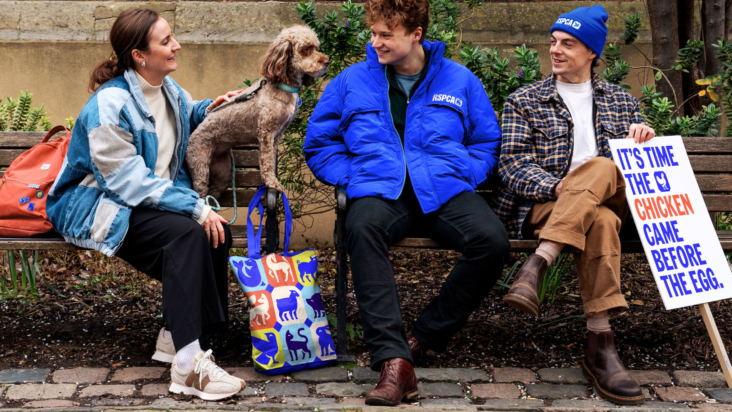
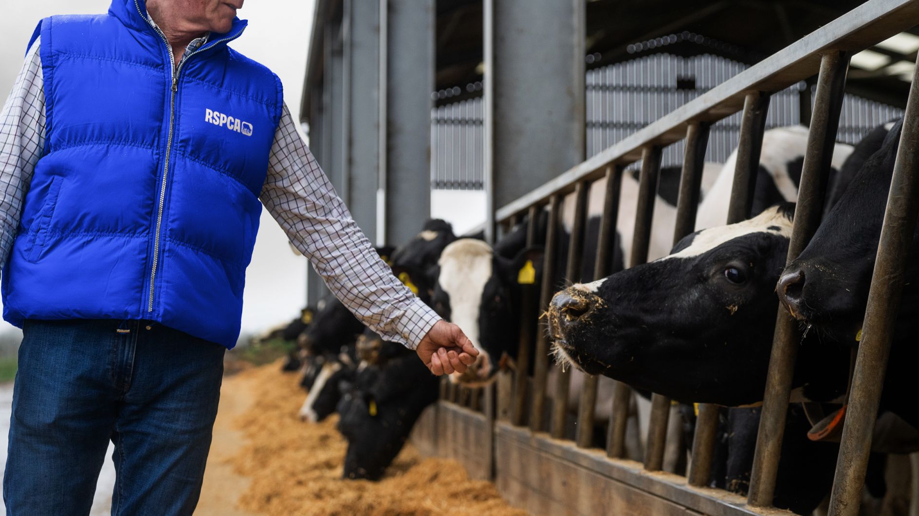
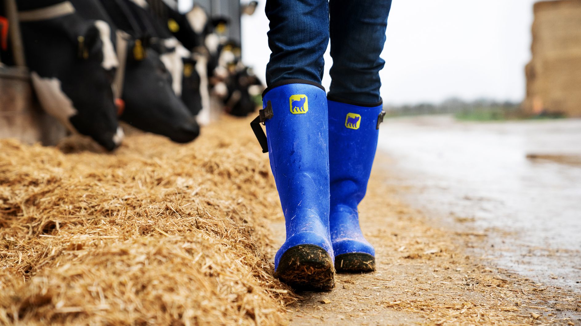
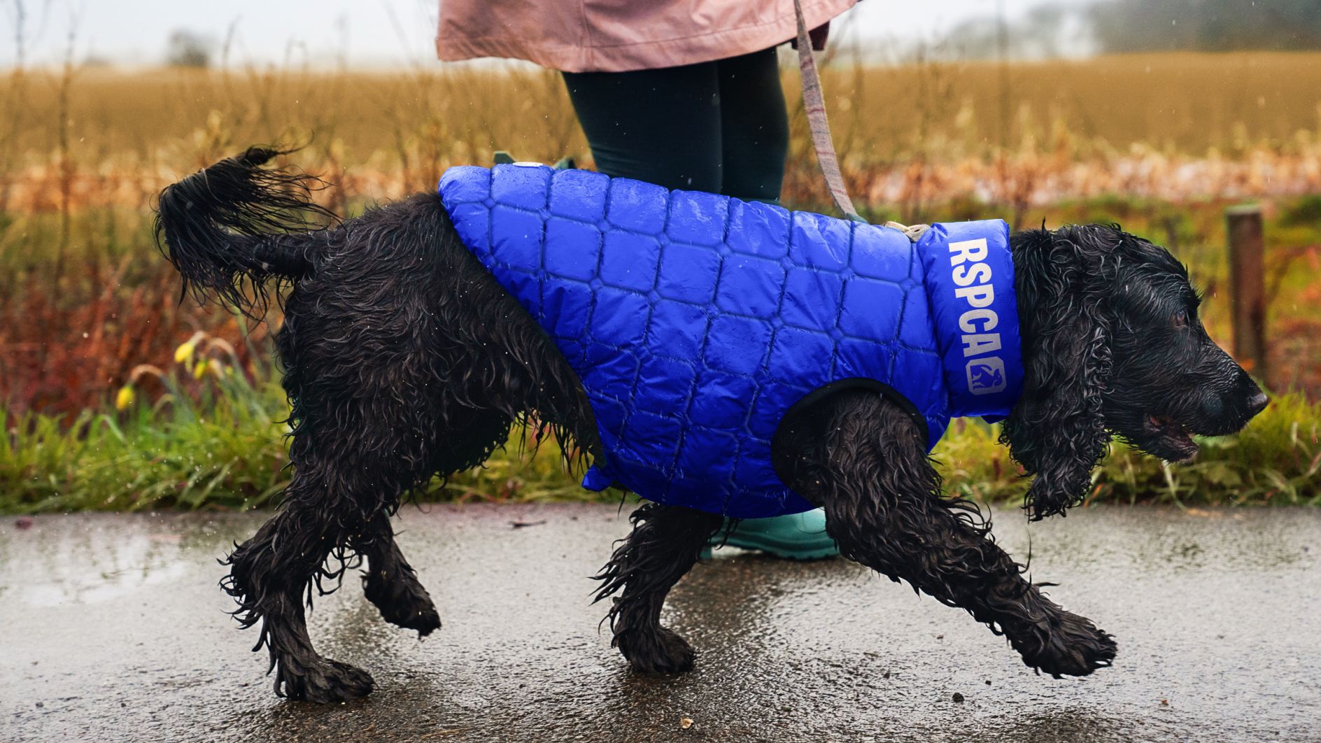
Using these insights, JKR then defined the RSPCA’s new purpose around the central idea ‘inspire everyone to create a better world for every animal’. This statement underpinned the rest of the new RSPCA positioning and identity, which spans everything from physical branded touchpoints (such as charity shop signage, stationery, billboards, posters, animal and human ‘uniform’ elements such as welly boots and dog coats, and merch such as tote bags); digital elements such as social posts and the overhauled RSPCA website; and overall tone of voice. It also morphed into ‘for every kind’, the name of the wide-ranging ad campaign executed by AMV BBDO which centres on a powerfully sweet but hard hitting two-minute film featuring all the greats, from Aretha Franklin to Brian Blessed and Chris Packham. I cried. A lot.
So back to the branding. There’s no denying the familiar former logo had its charm; but in the same way that bourbon biscuits or repeats of Blind Date have their charm – they’re nostalgic in that very Nan-specific way. The blue octagon with its oddly joined all-caps white ‘RSPCA’ felt entirely part of the furniture of a Britain of simpler times – an era of ‘you’ve been Tangoed’, or having to play a long ruler if you forget your recorder in year 3, or finishing school in time for Zzzap!; of gunge tanks and Pogs and collecting Euro 98 coins from Sainsbury’s and Jet from Gladiators and those long strips of KP nuts in the sorts of pubs that may or may not have had a pot-bellied pig out the back, and Findus Crispy Pancakes.
In short, that logo – which bar a change in the shade of blue in 2002, remained unchanged since the 1970s – felt dated. It somehow had that fusty, dusty, possibly death-tinged scent of charity shop about it. It wasn’t exactly 21st century, and certainly wasn’t future-facing.
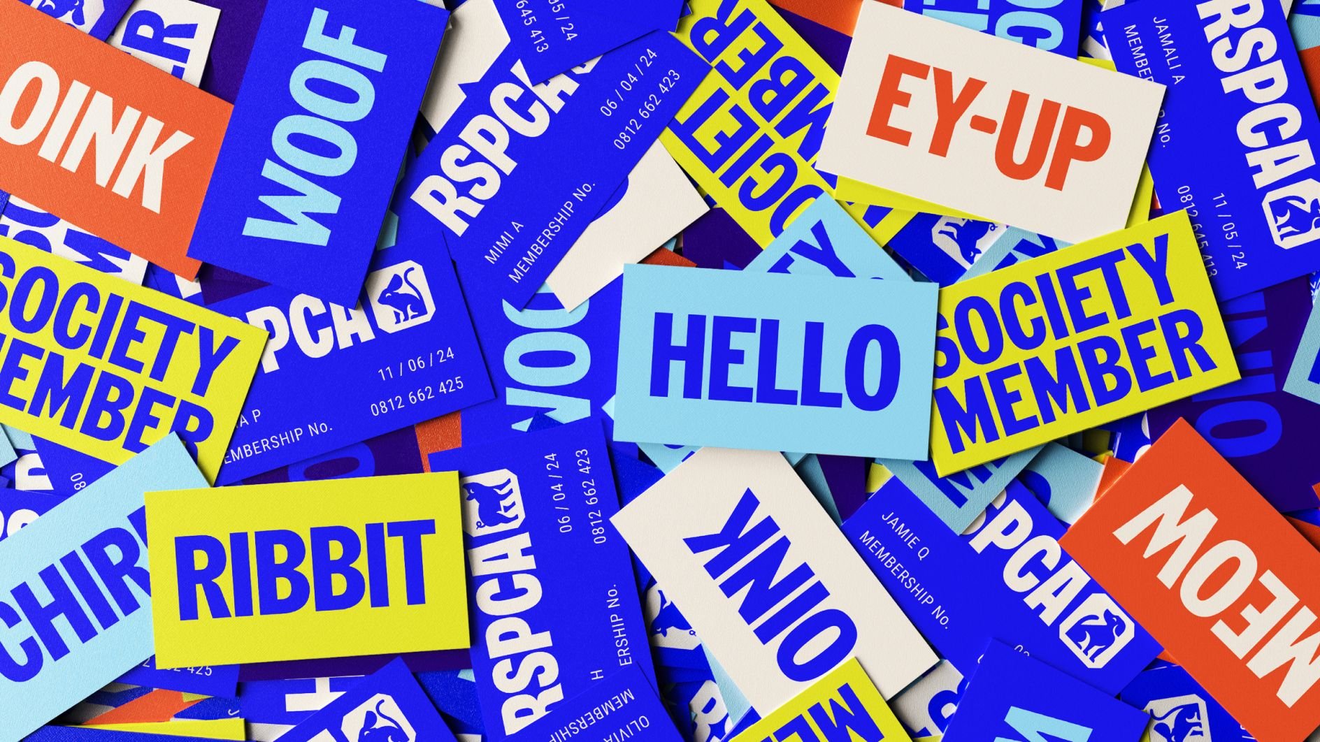
Now, however, things feel far more zeitgeist; and crucially, the designs aren’t trendy, but have a sense of longevity. Once the dust has settled, I really think this identity will stand the test of time. We’ve still got the blue, but a vibrant shade that’s as vivid online as in physical manifestations. But this is now joined with a suite of new brand colours (Rabbit White, Lizard Green, Butterfly Blue, Fox Red, and Swallow Blue) that feel cohesive and fresh, vibrant but without ever seeming too brash thanks to the way only a few colours are ever used at the same time, which keeps it all from ever getting too busy.
The new logotype finally separates the R S P C A letters from one another, and uses a quirky, confident squared full stop at the end which doubles up as a graphic holding device to make it all seem somehow definitive, and proud.
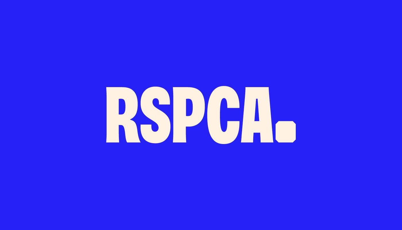
For both the logotype and other brand typography, JKR created a bespoke custom font in collaboration with London-based branding agency/typography foundry Studio DRAMA. Named Wilberforce Sans (after slave abolitionist and RSPCA cofounder William Wilberforce), the typeface is inspired by RSPCA’s activist history, particularly the protest signage Studio DRAMA found in the charity’s archives.
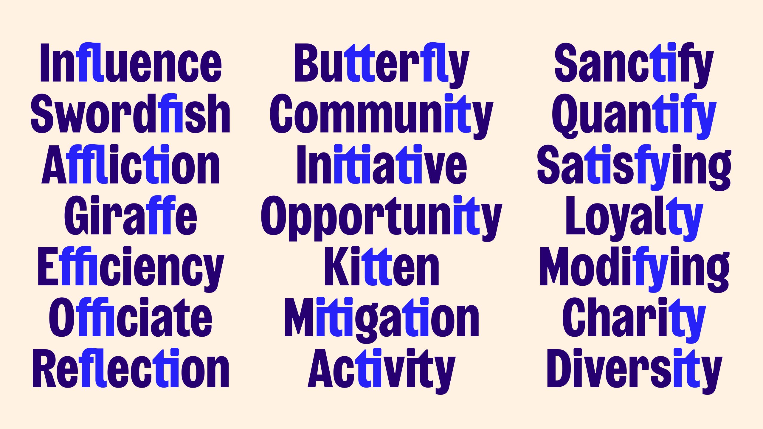
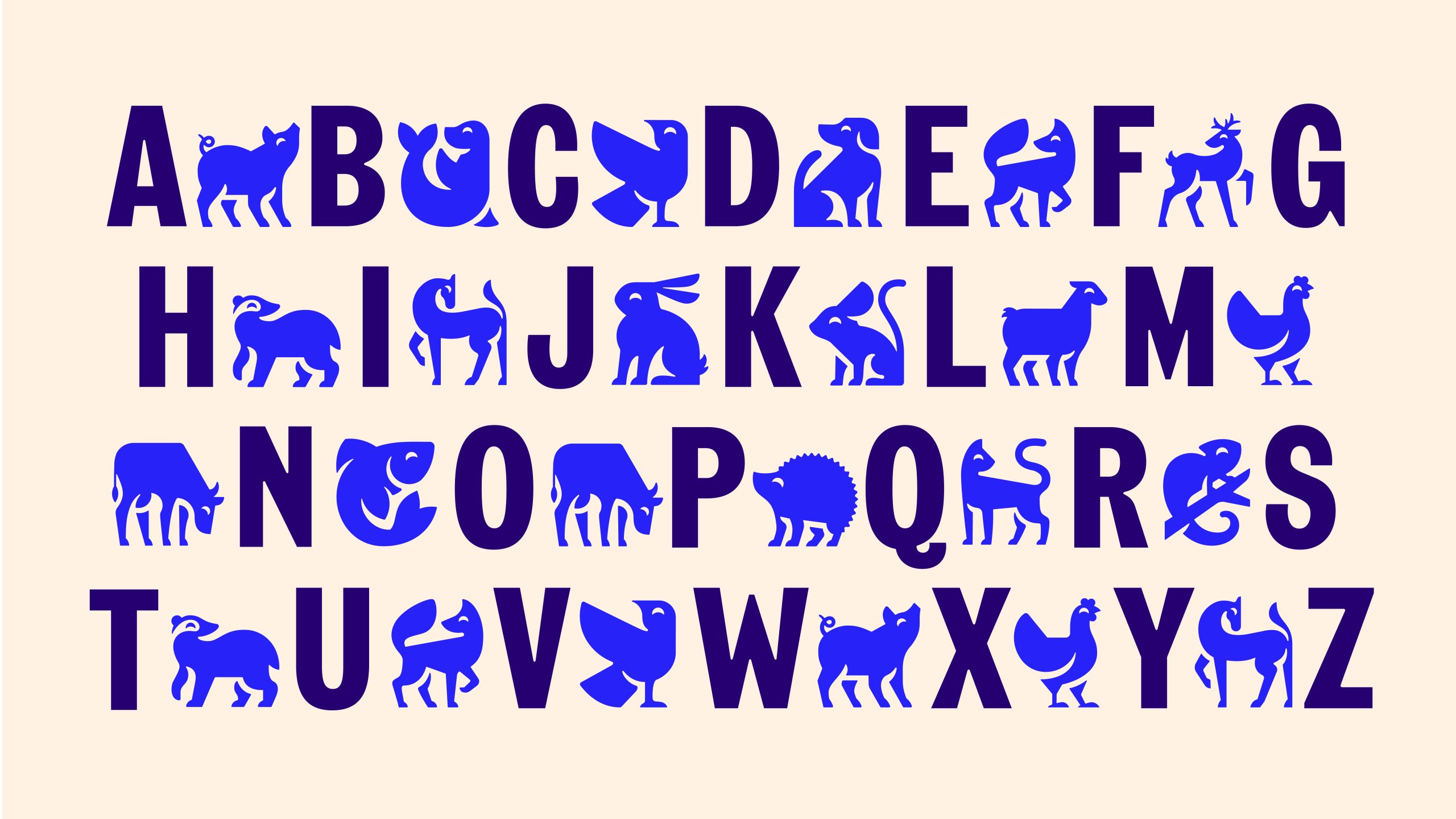
Studio DRAMA has said that the typeface is also inspired by Stephenson Blake’s Grotesque No.9, and the history of Grotesque typography more generally (the first sans serifs, which debuted in the 19th century and usually bore charmingly off-kilter quirks), and this is evident: while the new RSPCA brand is confident and forthright, and commands the respect it deserves, it’s not too serious. There’s a wry playfulness in those letters thanks to the subtle stroke-weight contrasts and a few deliberately designed deviations that chimes nicely with the newly articulated inclusivity of ‘inspire everyone to create a better world for every animal’.
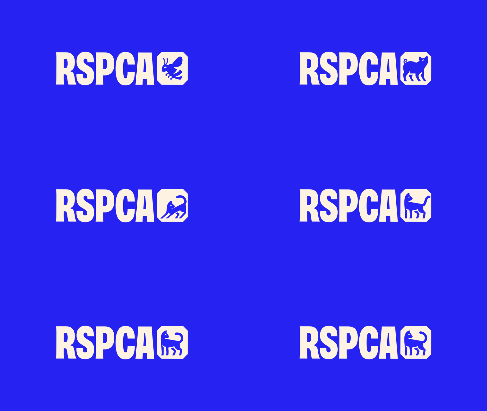
The gorgeous little animal icons JKR has created work superbly with the style of the brand typography, as well as further underscoring the ‘every animal’ thing. It’s not just cats and dogs this time: there’s everything from a hedgehog to a chameleon, a seal, a badger, a chinchilla (I could go on). These wee characters are rendered in simple, graphic forms that look like crisp silhouette cutouts; eschewing any twee or cutesy vibes but somehow still appealing to the ‘awwww’ factor and bringing with them a sense of timelessness.
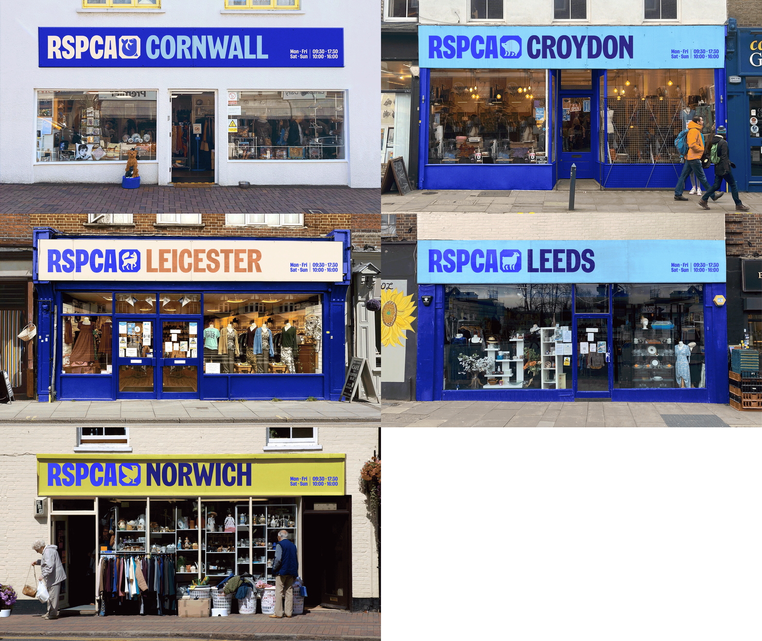
The icons can be used both in general applications as nice branded illustration elements and also create a sense of local differentiation to charity shops, which are also given site-specific colour combinations on their signage and materials. Cornwall, for instance, uses a seal and pale blue shade on its signage; while Leicester bears an orange tone and fox, as a nod to the city’s football team’s nickname.
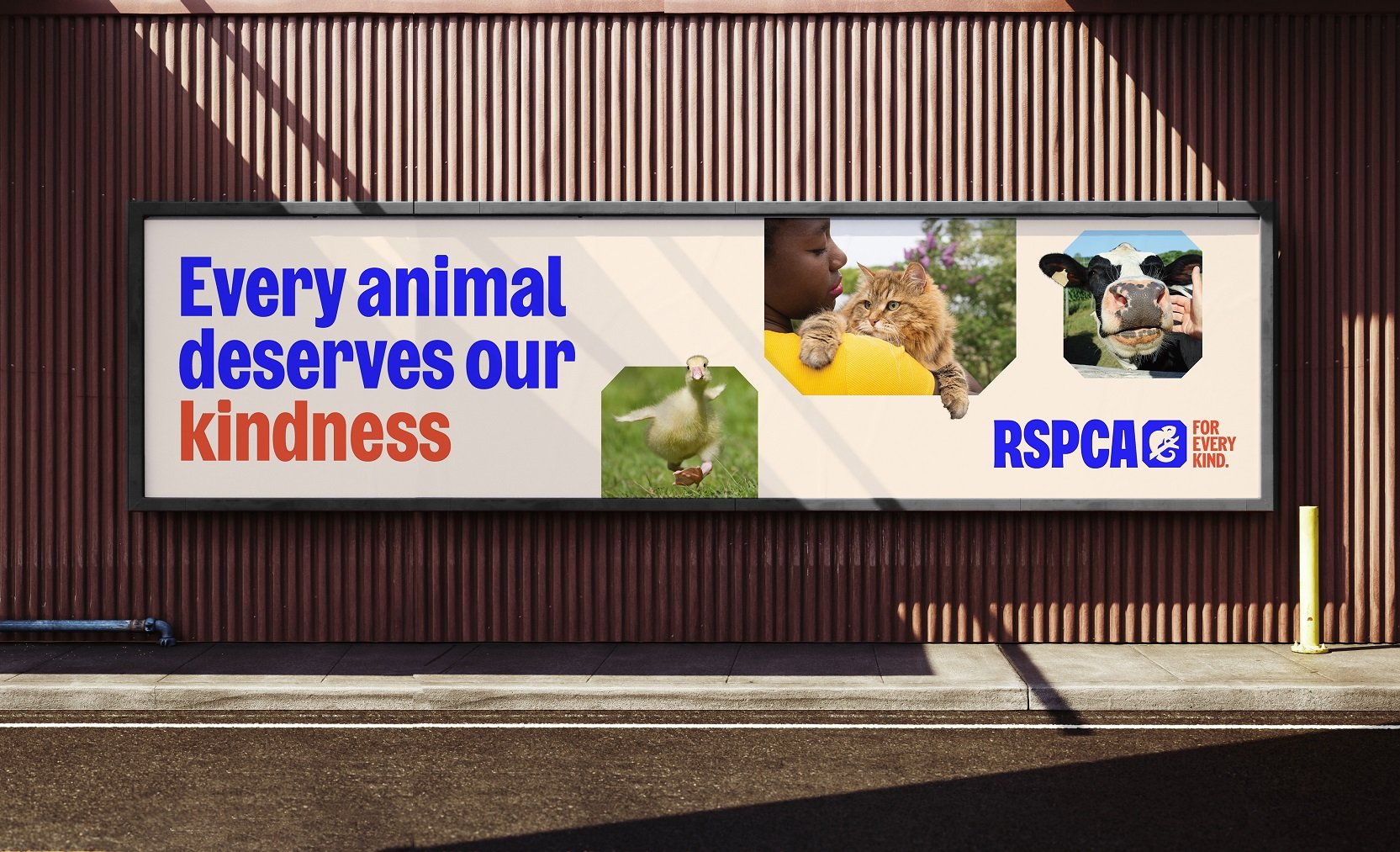
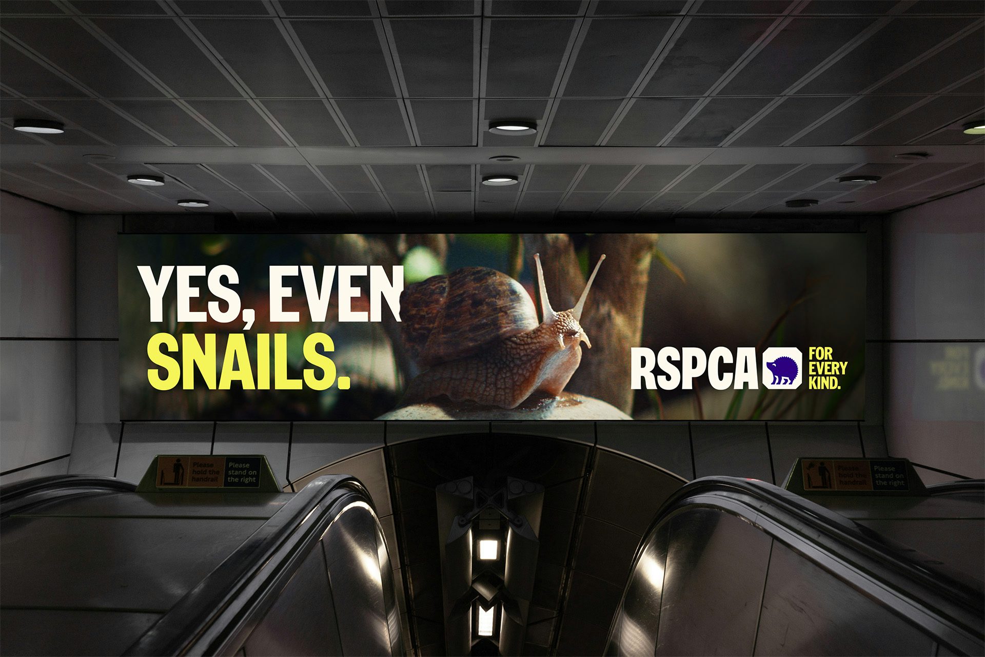
There are countless similarly witty elements to the new designs. I absolutely love how copy and imagery come together on the billboards, for instance (this one is particularly funny, while also very much getting the point across).
If it wasn’t completely obvious, I’m a huge fan of this project. I’m a lifelong animal rights bore who spent a lot of my childhood writing letters to MPs about animal welfare and many hungover weekends as a teenager working at a wildlife rescue centre. But there’s always been a sense that animal rights aren’t taken hugely seriously – that they’re seen as something for mad old unmarried aunties with three cats and a parrot, that they’re more a sweet hobby than a genuine, serious cause. I hope that projects like this, where organisations like the RSPCA are given the sort of strategically minded and meticulously executed identities we see for any other sort of company or organisation, will do something to help change all that.
