LEGO by Interbrand & OLA
Opinion by Emily Gosling Posted 13 June 2024
As recognisable brands go, LEGO is up there with the Nike swooshes and McGolden Arches of this world. Pretty much anything in that red and yellow lockup with vaguely Stay Puft-esque lettering (naturally there’s a LEGO version of that exact sailor) instantly says ‘LEGO’ – even when what it really says is, unlawfully, ‘Lepin’; or somehow scraping into legality, ‘Xinh’; or just ‘Brick’; or in a simple twist of genius, ‘Logo’.
As anyone in the branding world knows, and few outside of it seem to know (or care), a brand is so much more than a logo. But beyond that mark, it’s tricky to recall what else makes up the LEGO identity in terms of things like colour palettes, fonts, or graphic devices. There’s no discernible Cadbury purple (that’s Pantone 2685 C for the nerds) or Oatly cutesy-quirky-drippy brand typography (it’s called John Rounded, in case you were wondering).
Arguably, LEGO hasn’t really needed to worry too much about its ‘brand world’ over the years: it’s gone from strength to strength, expanding its original offer way beyond kids’ products and into the lucrative worlds of adult-focused collectors’ editions – Harry Potter, Star Wars and a whole load more. Founded in 1932 in Denmark by Ole Kirk Kristiansen, LEGO’s famous bricks first emerged in 1958. Having weathered the odd storm in the following decades, in 2021 researchers found that investing in LEGO was more lucrative than gold, stocks, art or wine, according to CEO Magazine.
But with LEGO’s global reach and countless, innumerable variants, partnerships, audiences and more, over time the visual identity has naturally become rather sprawling, with little in the way of cohesion aside from that aforementioned logo.
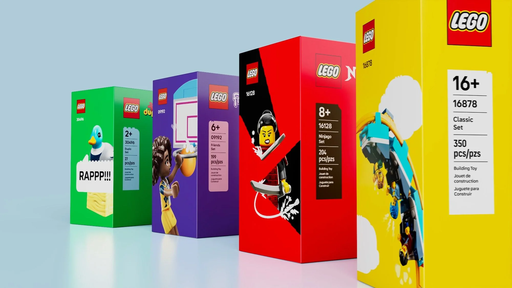
That’s why for the past two years the LEGO Group’s in-house creative and strategic agency, Our LEGO Agency (OLA), has been working with global brand consultancy Interbrand to create a consistent, cohesive design language, as well as ‘refreshed assets and architecture’. The new design system is being rolled out globally across all LEGO physical product ranges, including its partnerships and franchises with the likes of The Walt Disney Company, Lucasfilm, Warner Brothers, and Epic Games, as well as the brand’s digital platforms.
‘The LEGO Group has seen incredible growth over the last two decades…’ says Interbrand. ‘The product’s incredible success led to a unique challenge – there was a need to build on and evolve its own brand DNA that could be easily recognised across all products and digital experiences…With the LEGO Group’s strong attention to detail and focus on quality, there was the opportunity to strengthen the connection within the ecosystem that had already been created.’
Over the decades, LEGO’s identity system had become so unwieldy that across the board it had amassed 23 sets of brand guidelines and more than 110 separate principles; so one of the most important tasks for OLA and Interbrand was to streamline and consolidate these.
The designers landed on five new key design principles: design for your audience; build from its system-in-play (which refers to the way that the LEGO elements bought many years ago will still fit perfectly with LEGO elements bought in the future); tell stories; be playful and optimistic; and keep it simple.
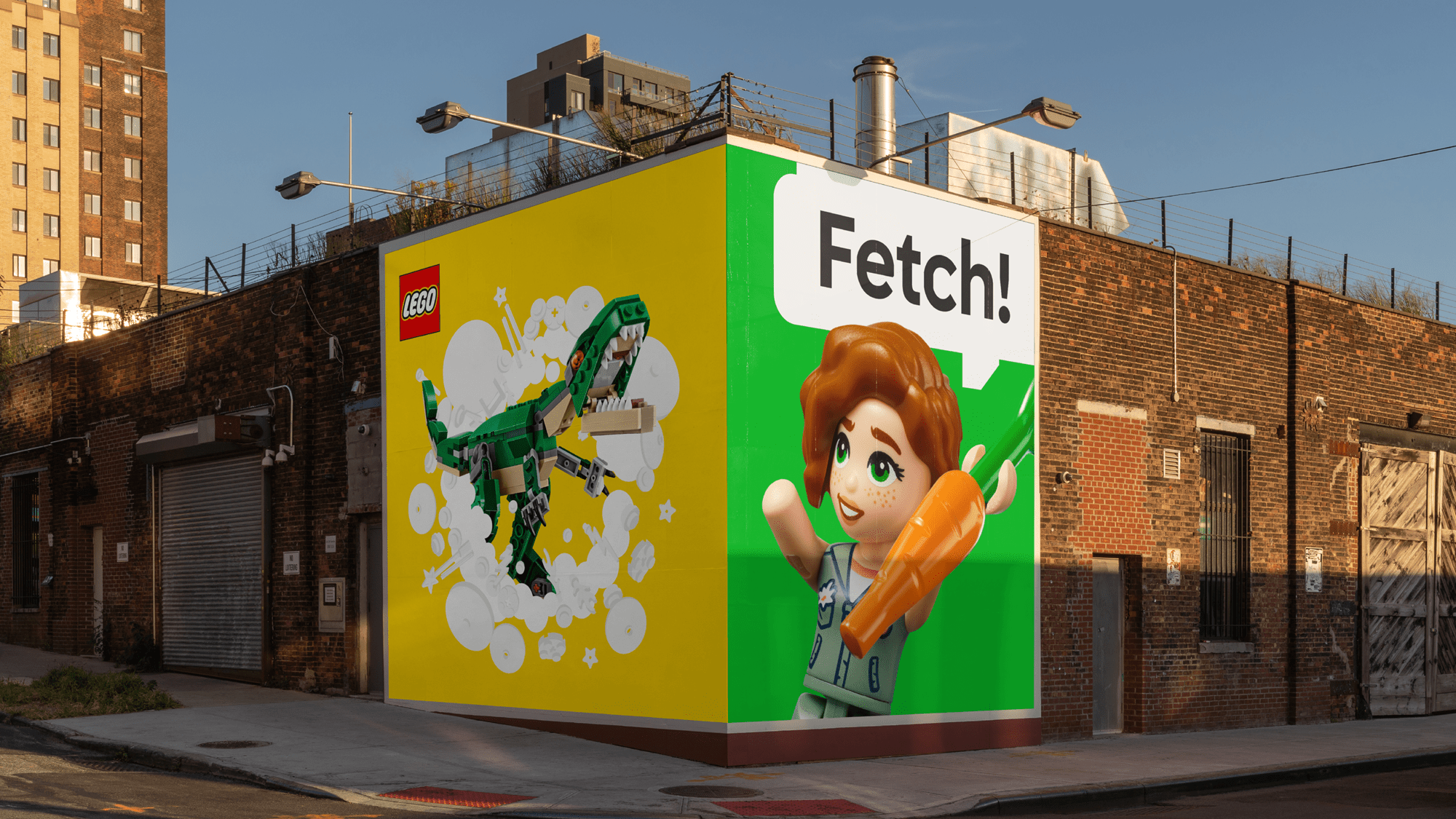
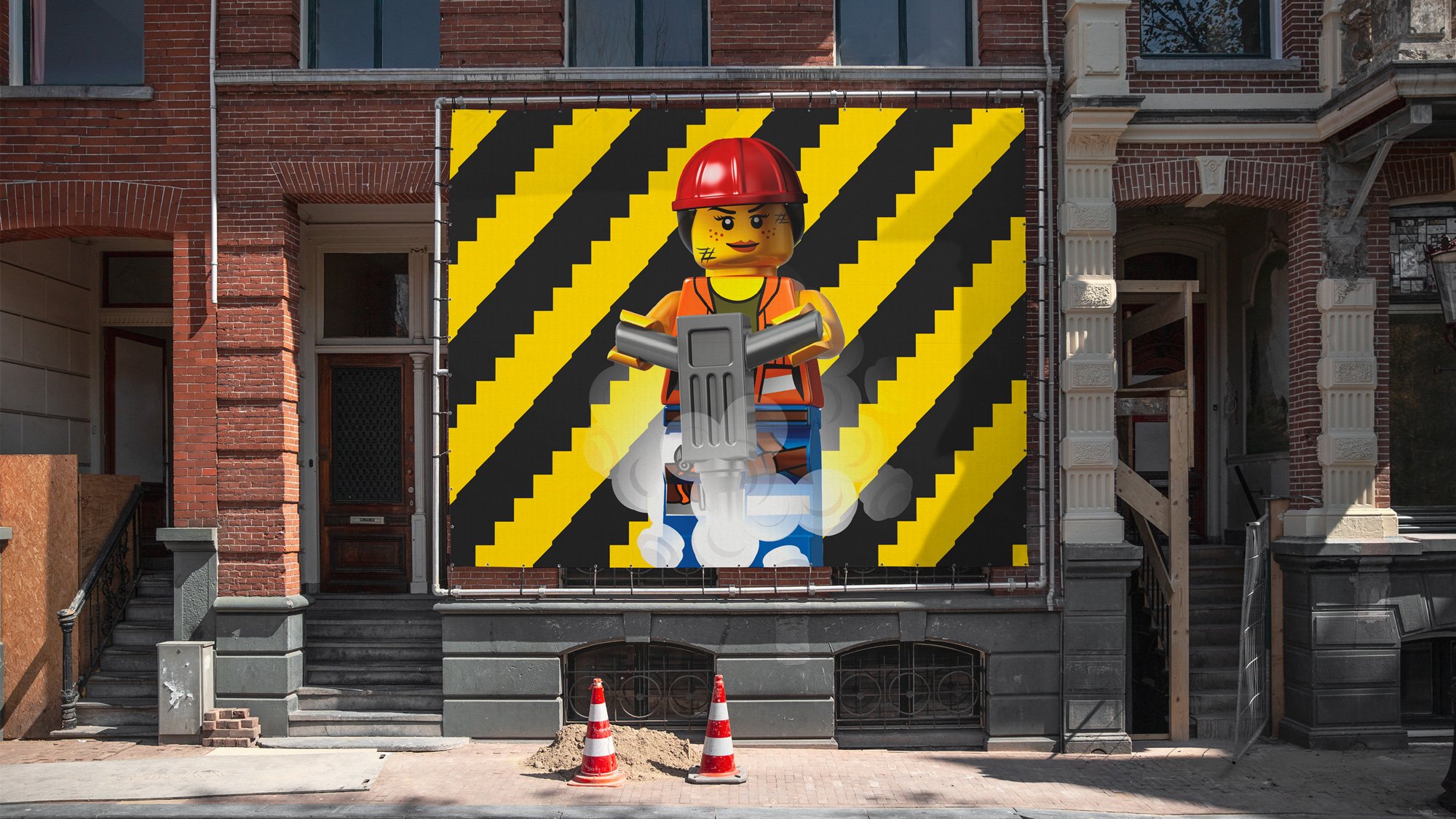
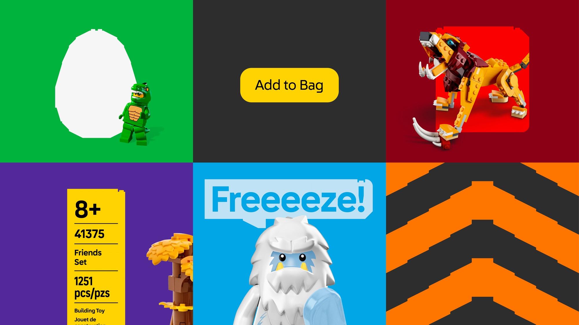
In a nod to the fact that the brand’s youngest fans were often too young to read, the new designs were initially inspired by Interbrand and OLA’s research into ‘modes of visual storytelling’ – namely the semiotics of comic books – which play out in the visual language’s liberal use of things like speech bubbles, and the ‘cells’ used to delineate narrative in comics and graphic novels.
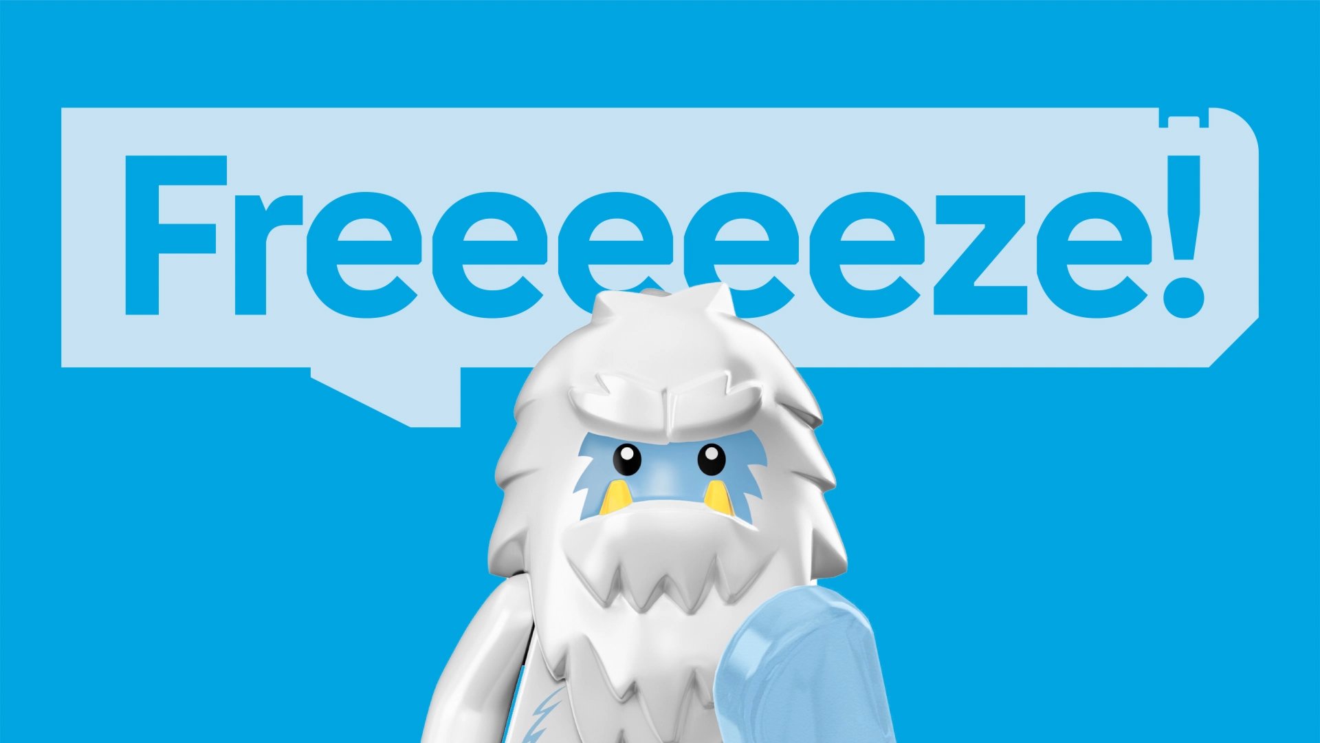
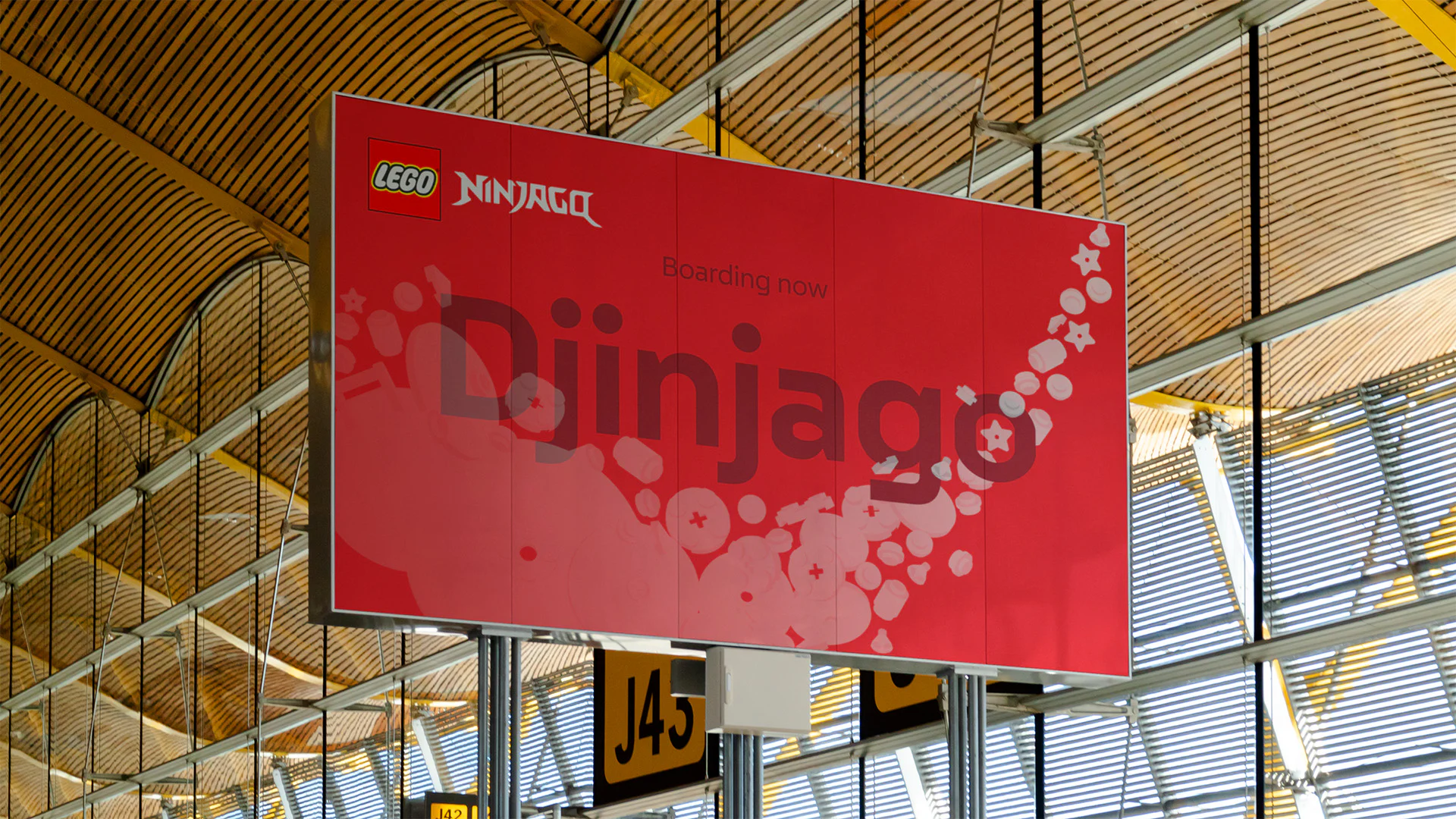
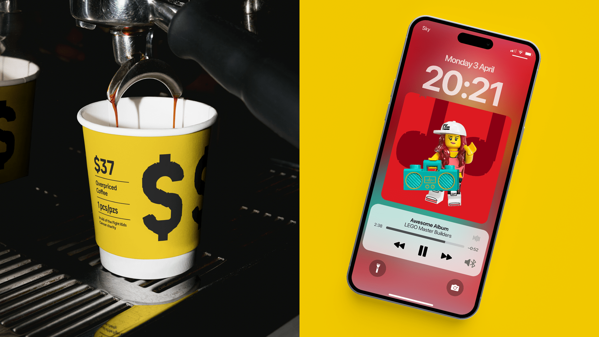
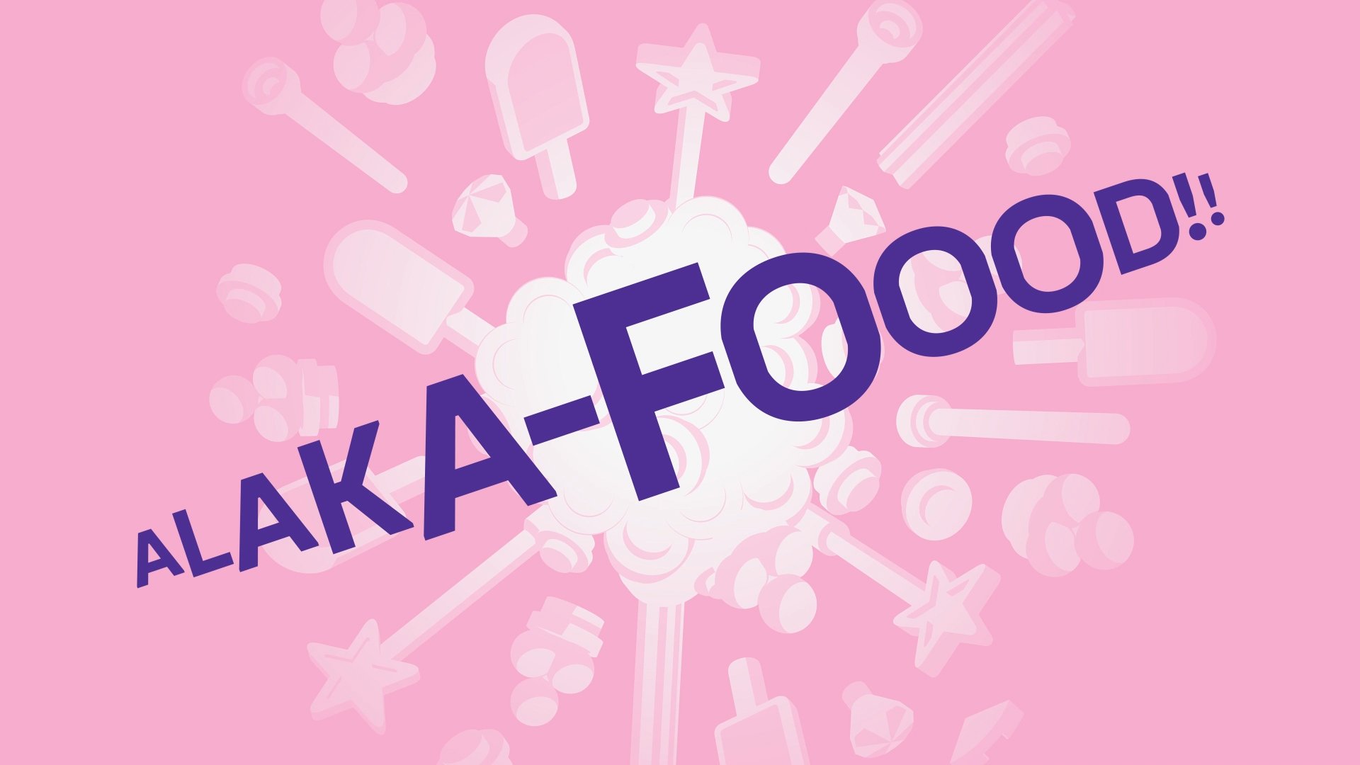
What makes the new design system so smart is that, essentially, it’s built around what LEGO is most famous for: its little bricks. The designers created the ‘clutch system’ LEGO Brick Pro, which works like a font formed of 130 brick-like glyphs instead of letters or numerals – and can create innumerable shapes and patterns as easily as a font can create words and sentences.
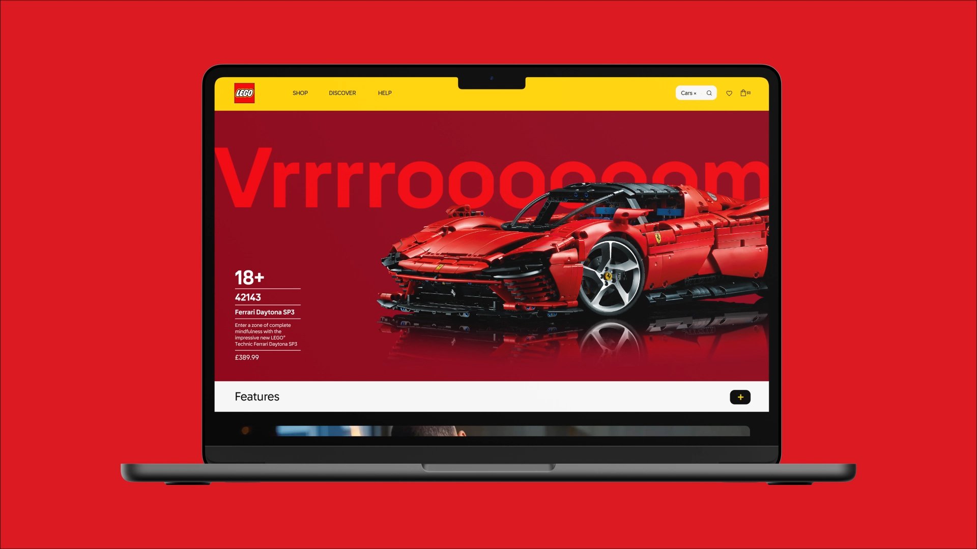
It’s an ingenious move when you think about it: a standardised system to create holding shapes, illustrations, UI buttons and more, which isn’t just simple to use in-house, but which relates back to the core product, and which seamlessly translates from physical to digital and vice versa.
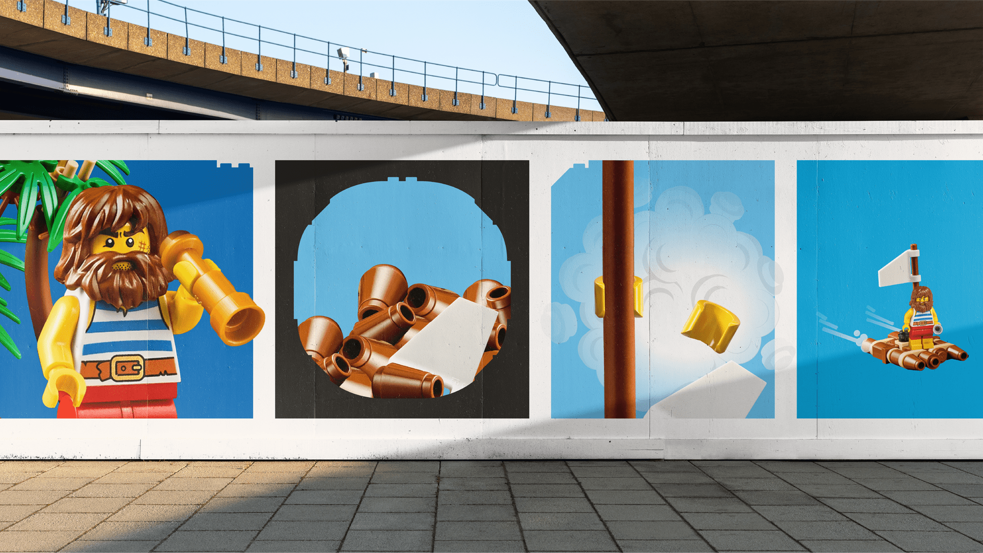
The integration of LEGO itself and how it’s used and how it fits together IRL works beautifully throughout the new identity: the motion principles, too, are based on the recognisable ways in which the bricks play out physically.
Interbrand says that the ‘branded ways of transitioning, editing or moving design elements’ were based on how people use LEGO in real scenarios, including ‘separating, dropping, and even mistakes based on how people play with the product’, and this comes across beautifully. It’s touches like these that give the whole design system the sense that it’s been around forever – that it’s as much part of the LEGO brand as not just that iconic logo, but the wee pieces themselves.
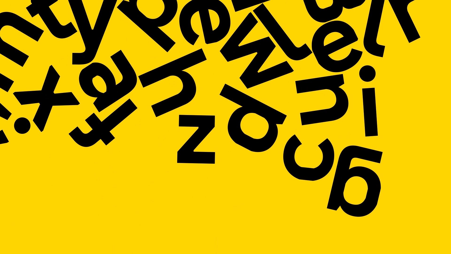
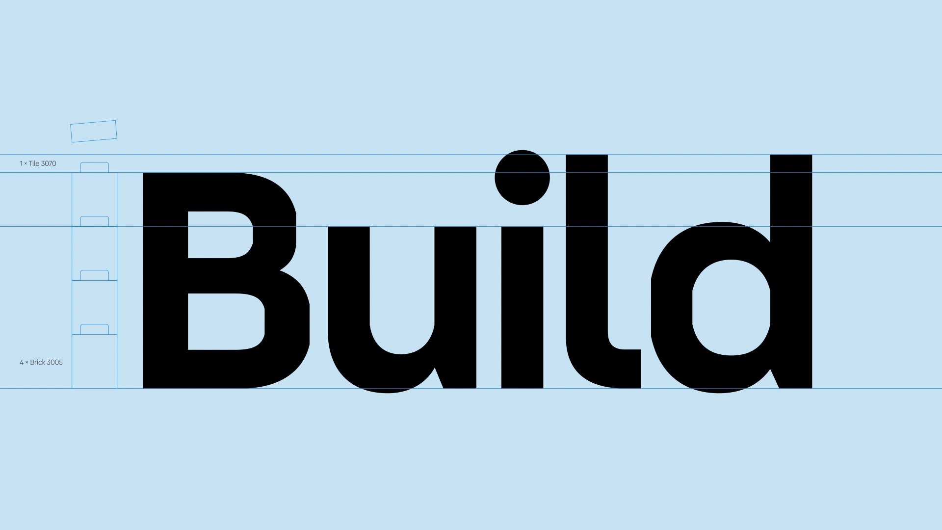
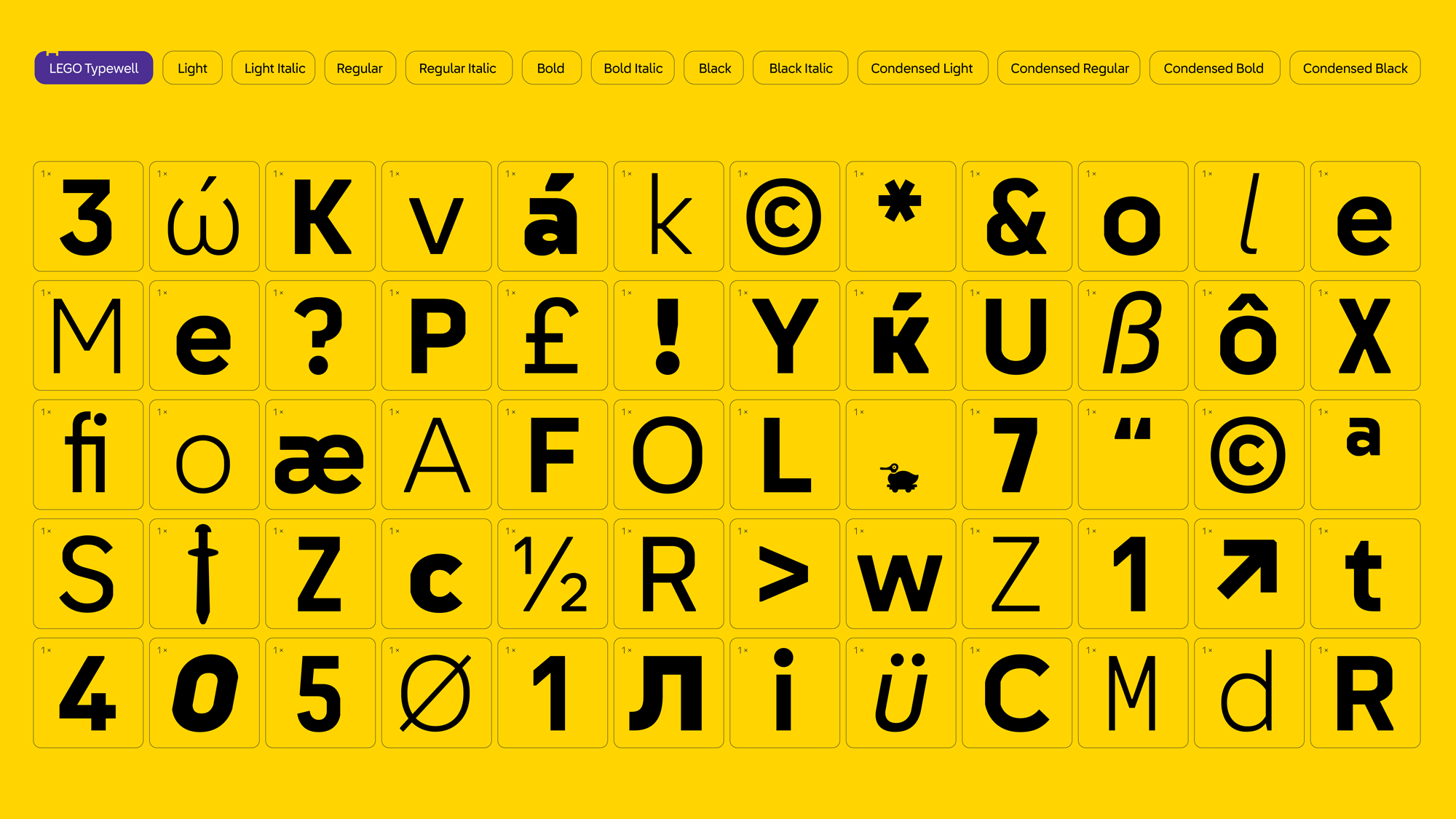
OLA and Interbrand also partnered up with London- and LA-based foundry Colophon to create LEGO Typewell, the new brand typeface, and – remarkably – its first ever dedicated font. Again, this is inspired by the pieces themselves, and will be used throughout all physical products and digital platforms and across 120 languages globally. The font itself isn’t totally remarkable, but neither should it be: it needs to be clear, confident, and legible – as well as subtly replicating the geometry of LEGO pieces, and it does all of those things without becoming overtly childish or brick-ish – crucial to the look and feel, since a significant part of the brand’s audience is far older than pre-school or even school age.
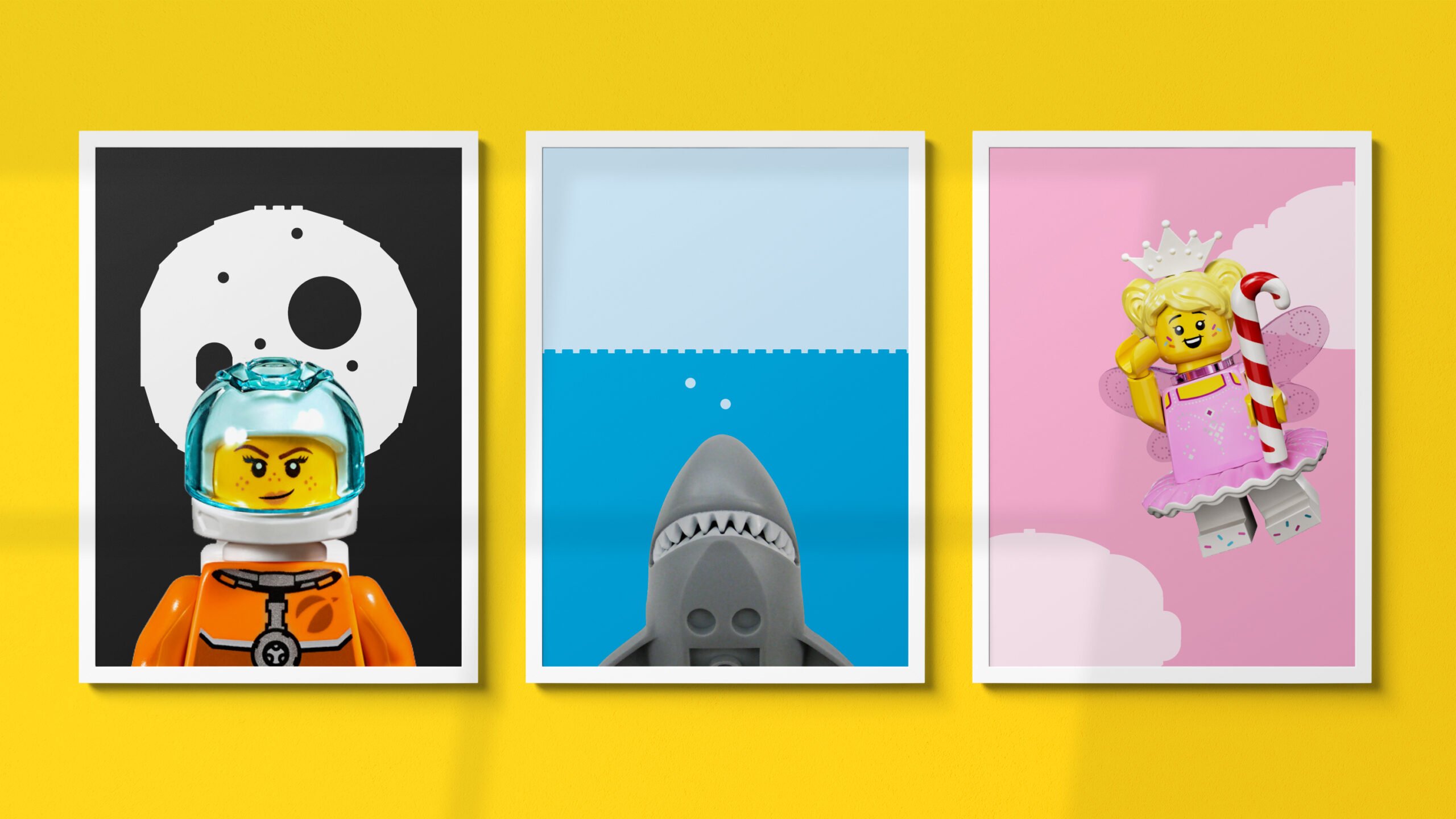
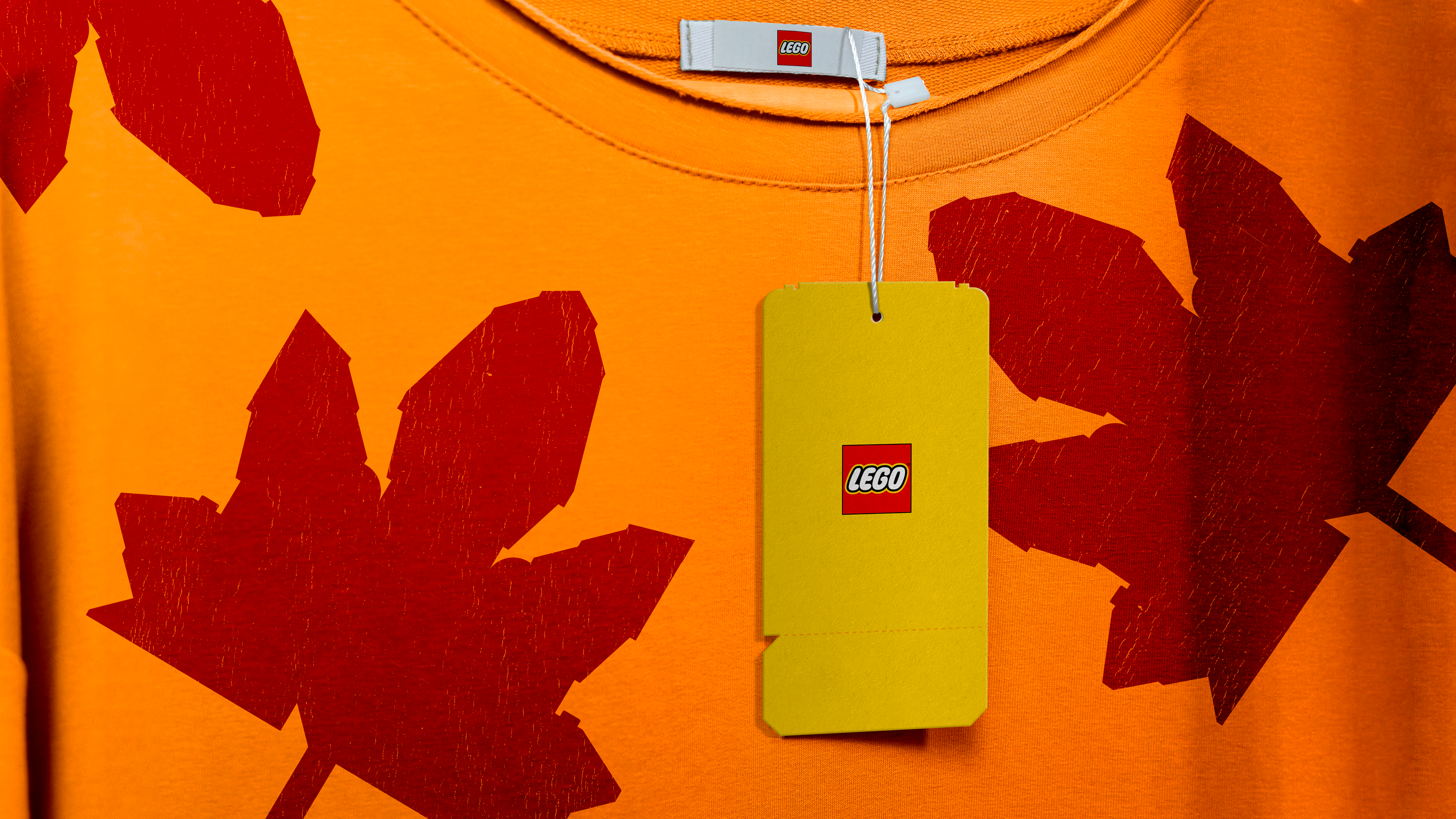
Overall, the new design system feels like a real triumph in that it doesn’t feel new at all: it’s so brilliantly in tune with the LEGO brand and what it needs to do, who it needs to speak to, and what it needs to work with and on that it feels as though it’s been there all along. With a brand like LEGO, the identity doesn’t really need to do a lot – this certainly wasn’t a case where a huge visual shakeup was needed, rather the designs needed to clarify and simplify across a dizzying array of products, lines, countries, and touchpoints.
The last thing it needed was a reinvention or a disruption, and this feels aptly as though things have been gently taken in line and streamlined; like all the little pieces have been quietly stepped into line and formed a unified front, a smartened up and timeless wall of tiny little bricks and cupped hands and interlocking haircuts.
