PAC NYC by Porto Rocha
Opinion by Emily Gosling Posted 20 June 2024
There have been some brilliant logo designs inspired by the very buildings they represent. The Centre Pompidou, for instance, bears a powerfully stark logo that’s been largely unchanged since it was first created in the 1970s: six black stripes crossed by two zigzags representing the site’s ‘caterpillar’ escalator, one of the most famous parts of Renzo Piano and Richard Rogers’ groundbreaking architectural designs for the site. The iconic architecture of Sydney Opera House, too, was sharply pared back and monochromatised in a superb logo by Interbrand Australia.
And in 2022, Landor Associates created new logo designs for the World Trade Centre in Lower Manhattan. Taking the building’s unusual shape as a starting point, the suite of graphic devices hone in on the Twin Tower pillars and play with negative space. It’s fitting, then, that the multi-space performing arts centre located at the WTC, PAC NYC (Performing Arts Center NYC, or Perelman Performing Arts Center to use its official name), also draws from the shape of the building itself – albeit in a more subtle, abstract way, but one that makes for a very striking brand identity.
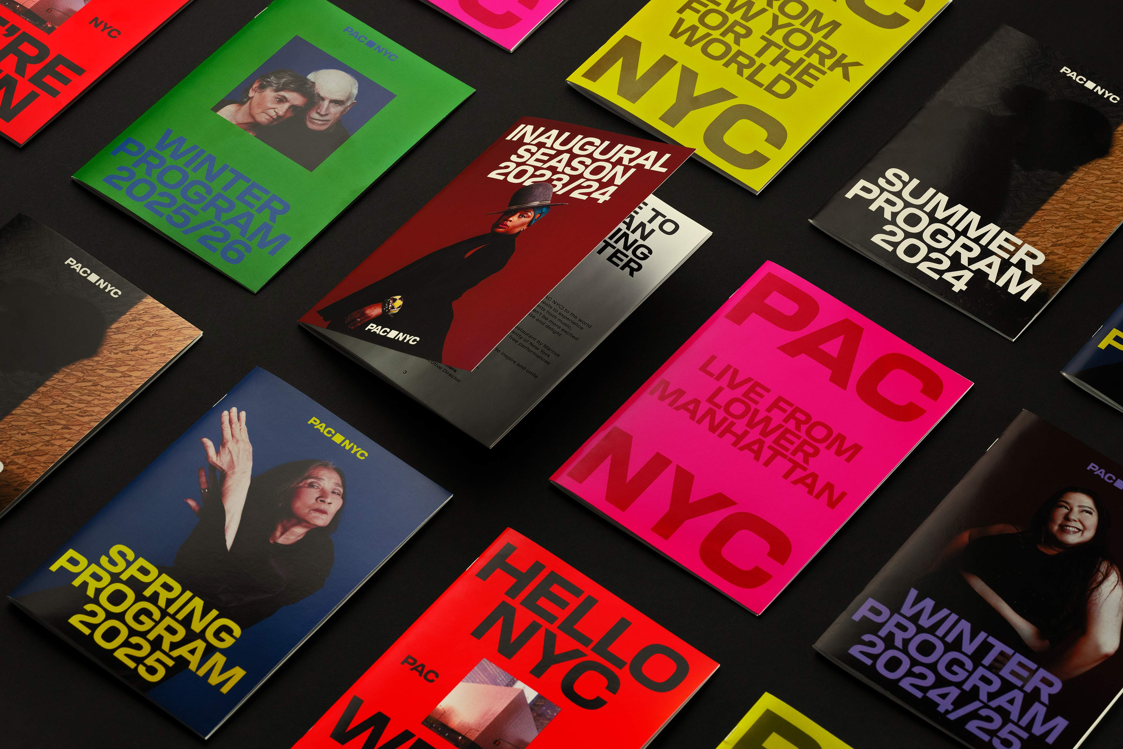
The branding for PAC NYC was created by New York-based agency Porto Rocha, which worked alongside the organisation on naming; brand strategy; tone of voice; and the visual identity, including some great bespoke brand type. The designs are used across everything from billboards to posters, tote bags (natch), interior and exterior signage, lanyards, digital platforms, motion graphics and more.
PAC opened in September 2023 and is described by Porto Rocha as ‘the cultural capstone and final piece of the rebuilding of the World Trade Center after 9/11’. The agency continues, ‘Envisioned over 20 years ago during the re-imagination of Lower Manhattan under then Mayor Mike Bloomberg, PAC NYC offers a new kind of public space where people from all walks of life are invited to gather, eat, drink, and experience the transformative power of performing arts’.


The architecture by Davis Brody Bond and Joshua Ramus, founder of architecture practice REX, uses modular theatre spaces that can be configured to accommodate a range of different shows and disciplines (performances so far have included a ‘ballroom-infused’ production of Cats, contemporary opera An American Soldier, and Laurence Fishburne’s ‘one-man tour de force’).
The designs are based around the positioning ‘The World’s Stage’, aiming to establish PAC NYC as a ‘cultural beacon’ that invites the five boroughs of NY (the Bronx, Brooklyn, Manhattan, Queens, and Staten Island) and indeed the rest of the world to ‘a new kind of performing arts centre’.
That Shakespearean favourite, ‘All the world’s a stage, / And all the men and women merely Players’, a quote from As You Like It, seems to come into its own as an idea underpinning the identity. Porto Rocha says that for the PAC NYC team, the people in the audience are just as crucial as the performers on the stage; but there were a few challenges to overcome in conveying that to people – namely ‘the historical elitism of the category combined with a symbolic site many hadn’t visited since 9/11’.
Those ideas of inclusivity underpin the brand voice created by Porto Rocha, which it’s dubbed ‘The People’s Host’. The brand language aims to be – like a good host – inviting; energising; and in some way, educational. It was vital that copy around PAC NYC was accessible across all the possible audiences it’s looking to attract; straightforward, flourish-free, and welcoming. Overall, the branding ‘needed to capture a contemporary mindset and radiate mass appeal’, the agency adds.
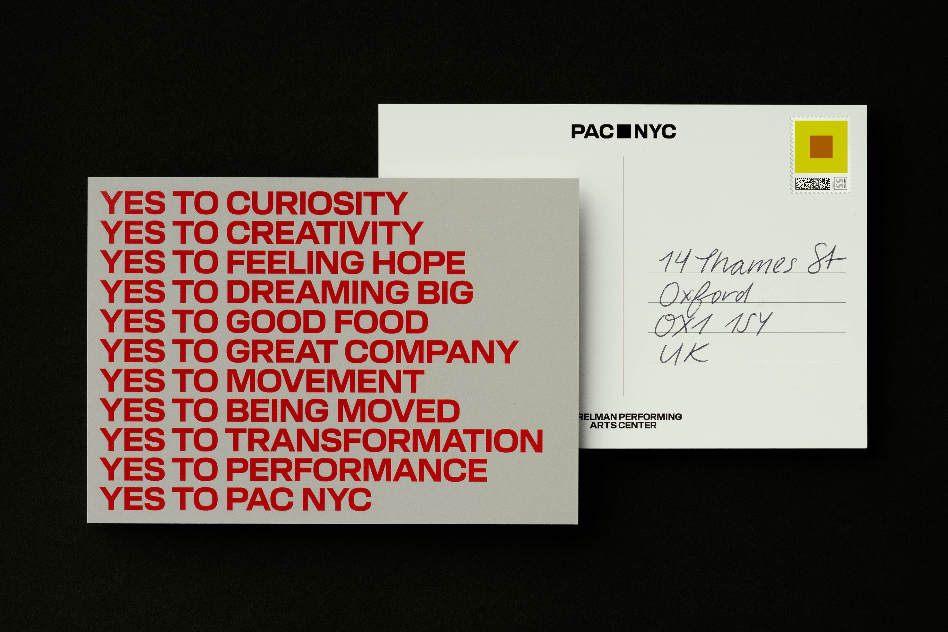
In that, there’s no doubt that Porto Rocha has succeeded. The identity is bold, clear, thoroughly modern and effortlessly hip but somehow also feels timeless – it’s cool but not trendy, simple but never boring. The designs are built around a square device which references the unusual shape of the PAC NYC building itself, which is essentially a large cube – or a square, if viewed from above.

A square as a graphic device seems so simple as to be almost ludicrous, but it really, really works. That has a lot to do with the way the square permeates throughout the rest of the identity, away from the logo: it becomes a framing device for other content in many applications, which not only works from a graphical perspective, but also a conceptual one – the idea being that by using a simple frame, it makes the whole thing more welcoming by becoming ‘a way for people to see themselves in the brand and a glimpse into the diverse programming happening within its walls’.
The square really comes into its own with the wordmark, which capitalises (literally – sorry) on the two sets of three letters that make up the name by sitting ‘PAC’ on top of ‘NYC’ to make a neat geometric square. To top it all off, the letterforms themselves were meticulously designed to a square ratio.
![]()


Porto Rocha worked with Berlin- and Prague-based type foundry AllCaps to create two custom fonts for the project: PAC Display and PAC Modern Gothic. PAC Display’s bold, blocky, no-nonsense letterforms once again bring to mind the building’s cubic architecture; while PAC Modern Gothic nods to New York history through its references to 19th century American Gothic type.


The punchy, thoroughly modern but timeless all-caps lettering was designed to be adaptable enough to use across any and all of the broad range of PAC NYC programming without feeling repetitive, while appealing to pretty much everyone. But thanks to its unique designs, the font is also distinctly PAC NYC, forming a brand asset in its own right.
Thanks to how the lettering is paired with single bold colours, eye-catching layouts, and a flexible approach to typesetting; Porto Rocha’s aim is that over the coming months and years, PAC Display will become synonymous with PAC NYC as an institution and work alongside the logo to become ‘iconic brand gestures people will recognise’. I see no reason why that wouldn’t happen, at this point in time.


Despite the fact the logo is literally just a square – barely ‘designed’ at all – the sum of the identity’s parts manages to be thoroughly ownable for PAC NYC, while also being flexible and dynamic enough to work across every and any possible theme, artistic medium, or audience. Overall, Porto Rocha’s work here is a masterclass in restraint: understanding the power of simplicity, and having the confidence to pare things right back to their most simplistic.