Matheson Food Company by Wedge
Opinion by Emily Gosling Posted 9 July 2024
If nostalgia is a powerful force, arguably ‘fauxstalgia’ – that sense of longing and yearning for something that we never actually experienced – is even more so. Fauxstalgia isn’t the same as trend cycles – the baffling realisation that Gen Z is suddenly, unironically, into Nu Metal, for instance – it’s an internal sensation rather than an external observation. It’s warm and fuzzy and tricks you into grasping for recollections of times and places and smells and tastes that you may have, but probably haven’t experienced.
Maybe it’s experiencing the early days of free parties and raves from the late 1980s and early 90s through a sort of YouTube-engendered loved-up-having-it-large ecstasy by proxy; or perhaps it’s the weird rise of the whole trad-wife thing. Or maybe, as is the case with Matheson Food Company, that fauxstaglia is for foods that feel rather post-war – all cheery 1950s hubris and the suggestion that people’s homes once had space for pantries. That’s not a criticism by any means: there’s no doubt these products seem high quality and thoroughly considered, but above all, they’re aesthetically incredibly pleasing indeed thanks to their branding by Montreal- and New York-based agency Wedge.


Matheson Food Company started life this year and sells a range of foods deemed ‘pantry staples’. It was founded by Matty Matheson, a Canadian chef, restaurateur and actor in, and executive producer of, a TV show called The Bear.
Being totally honest, I’ve never heard of either Matheson or The Bear. Having had a glance at the look and feel of the MFC product range, I’d assumed he was someone of Mary Berry vintage – perhaps the sort of figure who fondly recalled things like rationing and powdered eggs and making-do-and-mending.
But in fact, the guy’s just 42 – yet his fondness for things like macaroni cheese formed from a cardboard package, corned beef, simple flavours and apparently the sort of design work that’s rendered in the punchy, simple, unashamedly practical tones of either movie sets or many decades past would suggest a man double his age. It’s charming, for sure – if slightly confusing that his range is apparently inspired by the foods he enjoyed during childhood.
That childhood would have been the 1980s and early 90s judging by his age – not too far prior to my own, which was all about things like Findus Crispy Pancakes, countless Happy Meals, boil in the bag fish in a nondescript white sauce, and flaccid, lava-hot Chicago town pizzas. Simple ingredients and wholesome, punchy flavours it was not – but clearly Matheson’s formative years were far less microwave-centric than for some of us.


According to Wedge, which created the brand identity, packaging designs, digital touchpoints, creative direction and brand photography, its main challenge was translating the founder’s vision into ‘a lasting brand that reflects his signature: Bold. Punchy. Memorable. Flavour.’ It looked to do this by forming ‘a brand that is focused on the product, a system that can expand across various future categories, and a world that inspires home cooks everywhere to Cook Like A Matheson™’.
And what a system it is: however deep your knowledge of ‘Matty’ runs, whatever your take on packaged mac ‘n’ cheese, these designs are timelessly, perennially lovely.
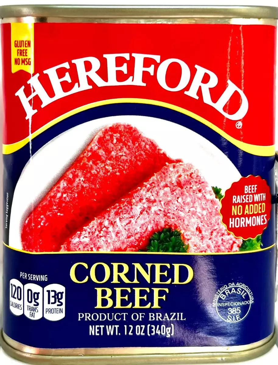
Wedge says that the core identity was inspired by a ‘classic’ product that ‘Matty grew up eating all the time’ – Hereford Corned Beef. Naturally, the designers have been selective about the precise era of that weird tinned beef they’ve chosen to reference: its designs have ranged from the arguably pretty hideous (maybe it’s just me, but I can’t think of many dishes that look more vile than those displayed on tins like this and this, or the terrifyingly neon-leaning red confection shown here) to the far more tasteful striking vintage designs like this (despite the illustration of the poor pre-slaughter cow).
![]()


Stripped right back to its simplest components – no-nonsense typography, a simple primary palette (which acts ‘as an extension of the visual language and vintage vernacular of Matty’s World, seen across his NYTimes best-selling cookbooks, merch, restaurants, and more’, according to Wedge) and a basic, legible layout with a refreshingly straightforward information hierarchy, Hereford Corned Beef does seem like a masterstroke of a reference point. The simplicity keeps the nostalgic beef cues from ever being too twee or veering into pastiche, giving it all a modern twist somehow.
Outside of the wordmark, Wedge opted to use a single weight of Aperçu condensed by London-based Colophon foundry. This appears across all brand touchpoints in various sizes, always uppercase (as far as I can tell). It would have been easy to do that thing we often see of out-there font pairings – combining Aperçu with something wildly different, like a badboy Blackletter font or trad serif – but the restraint here really pays off.


The art direction for the brand photography brings it all to life beautifully, with an unabashedly retro aesthetic that’s all hyperkitsch Pop Art hues, slightly grainy textures and cheeky crops. It works really well, once again making the whole thing both rooted in the past but distinctly fresh and contemporary. The straightforwardly bold, type-centric primary hues of the identity work superbly across the packaging design and digital applications alike – and it doesn’t matter one bit whether or not you remember ‘the good old days’ or not, or if you’ve ever heard of Matty Matheson.
While the identity is upfront about pilfering from the past, it doesn’t do so in a way that feels like a cheap pastiche or a brand playing dress-up – the limited palette, straightforward type and the way it’s pared-back in all the right places works just as well in 2024 as it would have in 1924, and we’d wager it’ll be successful as far into the future as you care to gaze.


