Imperia by Landor
Opinion by Emily Gosling Posted 18 July 2024
As well as being a coastal city in south west Italy (formed in 1923 by none other than Benito Mussolini), Imperia is a pasta machine company that was formed from a ‘little artisan workshop’ in 1932. Imperia soon began to distribute pasta machines around the world; mainly catering to the US’ large Italian community.
From its plant in Sant’Ambrogio, Turin, today Imperia exports to 77 countries globally, and sells more than 25 different contraptions ranging from small hand-turned household pasta makers to huge professional restaurant machines, as well as other kitchen appliances like graters, tomato juicers and meat mincers.
Earlier this year, Imperia’s branding and visual identity was overhauled by branding consultancy Landor’s Milan-based office. The new designs are joyfully pasta-centric; with everything from the illustrations to the logo, a bespoke typeface and motion design principles informed by either the food itself or the machines that make them.
While that might sound a little gimmicky, the end result is anything but: a proud, fun but rigorous design system that marries traditional Italian cues with a thoroughly modern, contemporary approach.
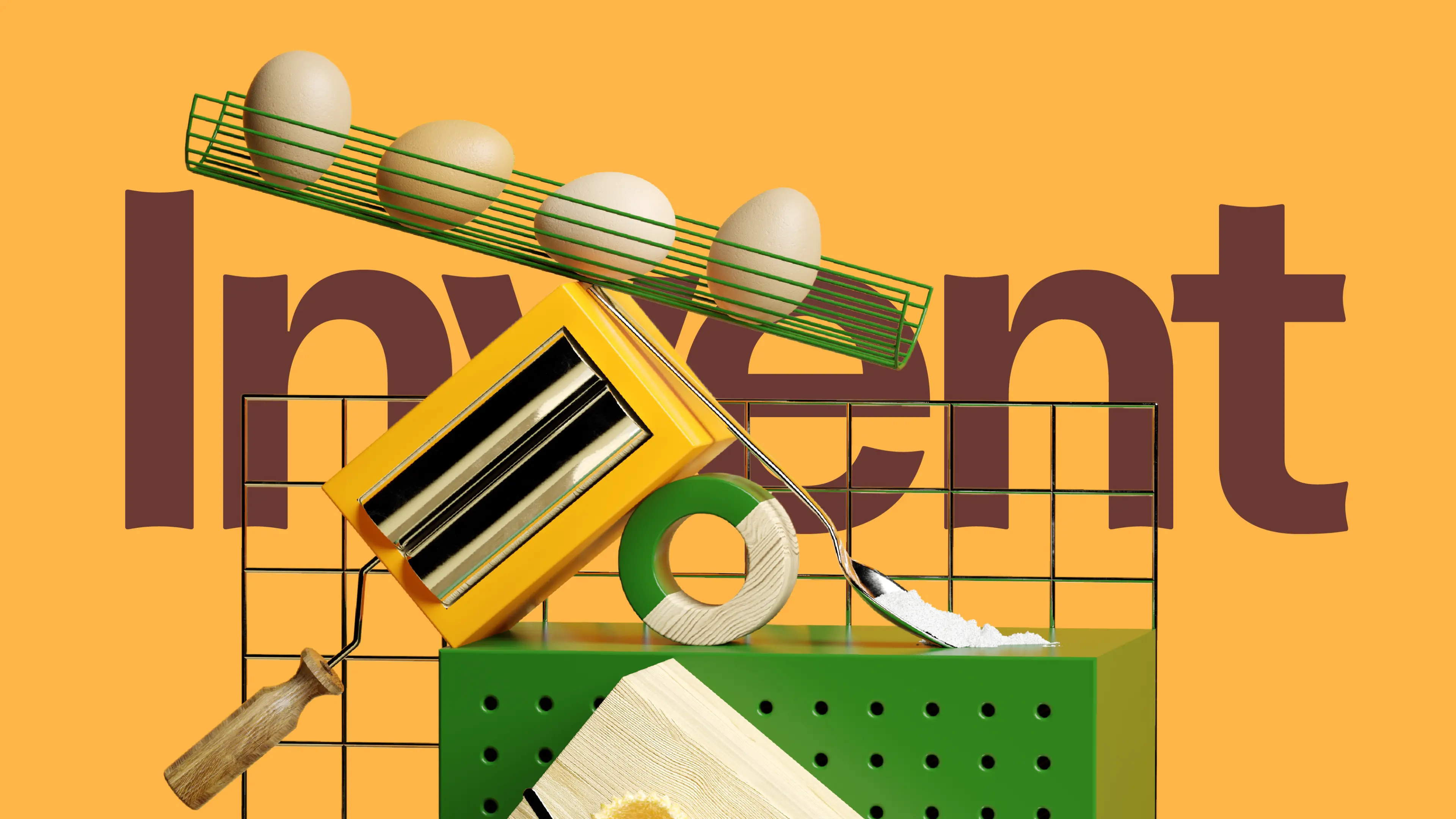
Imperia had ‘found itself craving a dash of innovation to spice up its well-loved heritage’, according to Landor. Its designs were informed by the brand idea ‘il genio di forma e sostanza’, literally translating as ‘the genius of shapes and materials’. ‘We set out to let creativity flourish, enabling machines to create any kind of pasta shape’, the consultancy continues. ‘In Italy, pasta making is an art – a dance of dough that’s as much about the process as it is about the final plate. We kneaded this Italian “fatto a mano” (handmade) ethos into every strand of the brand.’
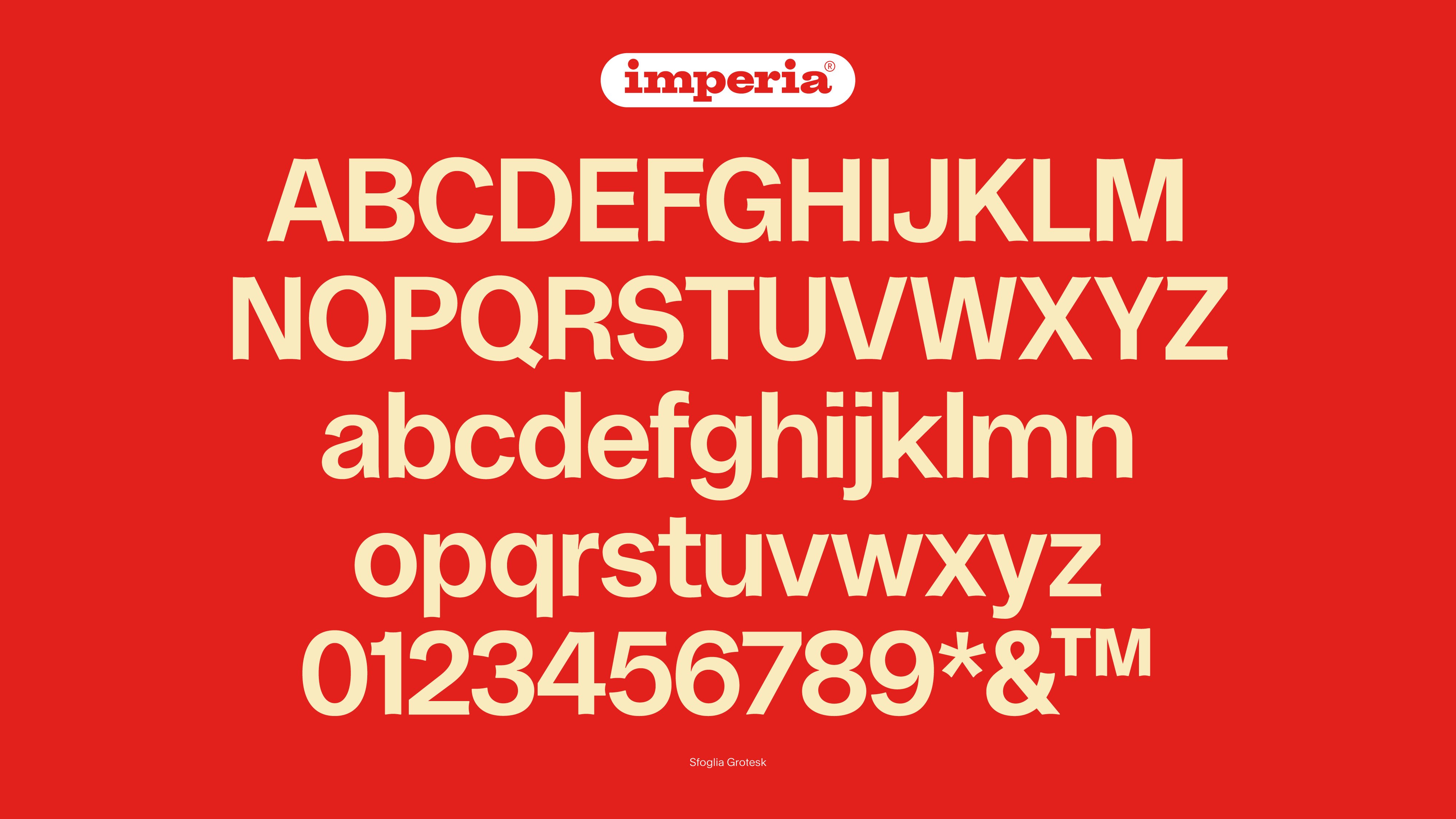
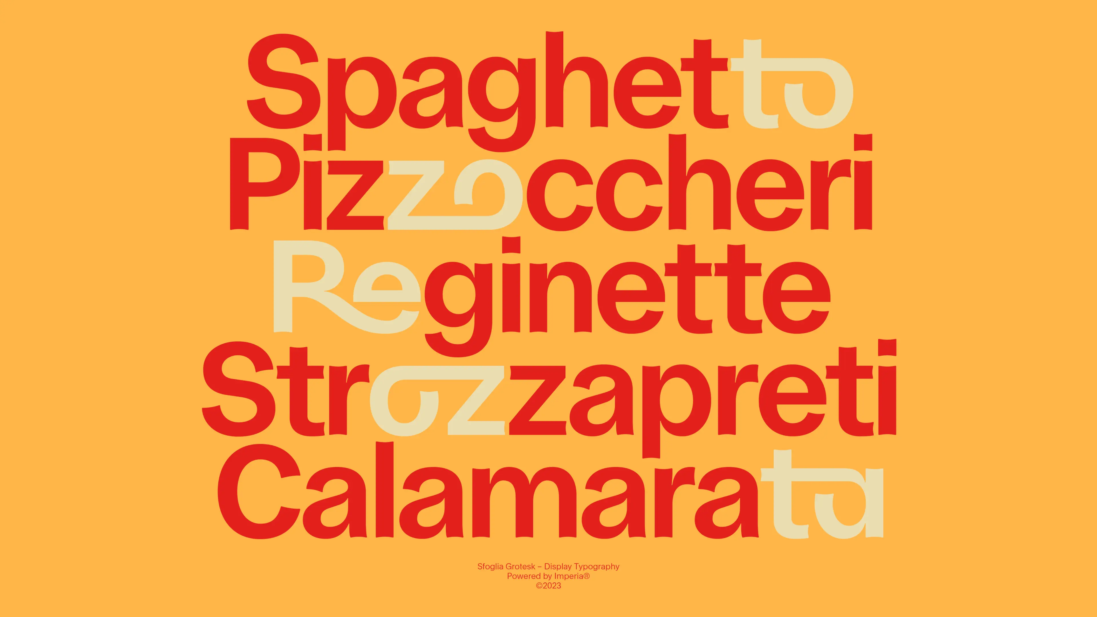
Landor named the bespoke brand typeface Sfoglia Grotesk, drawing on the Italian word for pasta sheets, Sfoglie. It’s hard to imagine creating a brand font inspired by pasta without it looking faintly ridiculous, but the carb-informed elements have wisely been pared back amidst an otherwise confident, legible Modernist-leaning sans serif with a few nice quirks, like the indented stalk ends.
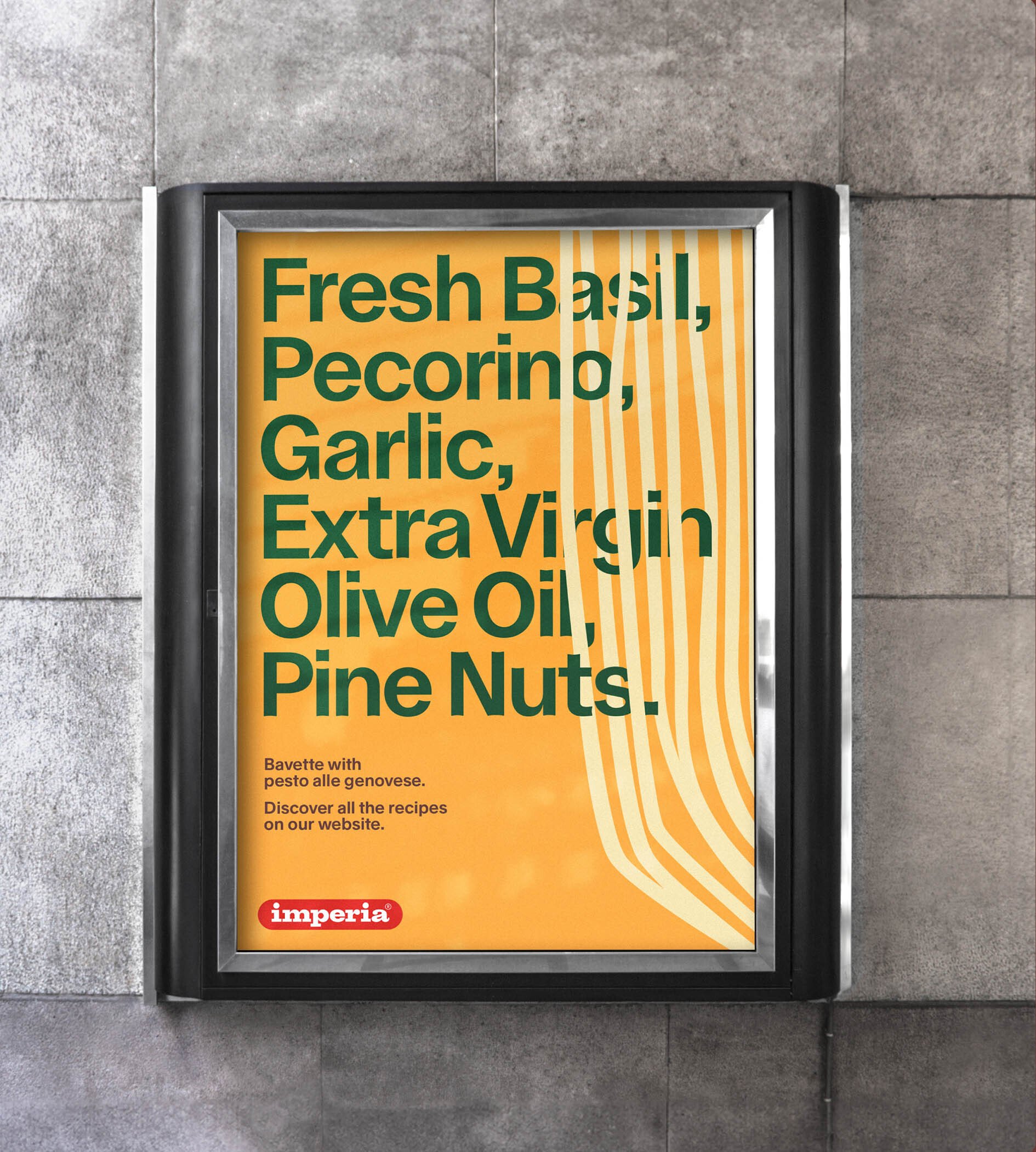
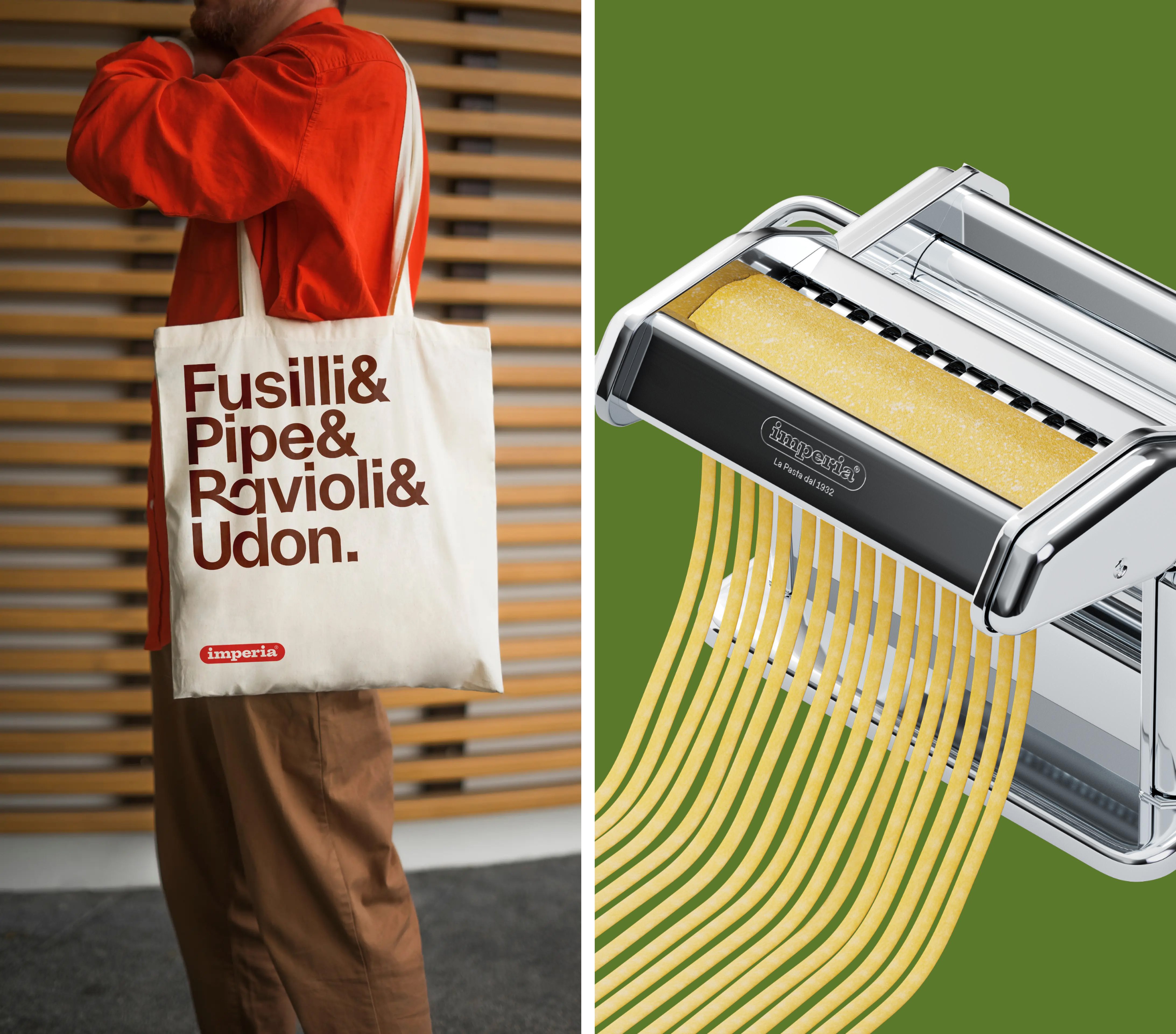
Used as a display font on applications such as poster-like social media posts and merch like the omnipresent tote bag, the typeface sees some characters linking into one another and set in a pasta-beige tone, adding some charmingly playful elements to the brand without being too overbearing. The bespoke type is used alongside grotesque font Rand (naturally named after logo design icon Paul Rand) by Swiss foundry Optimo.
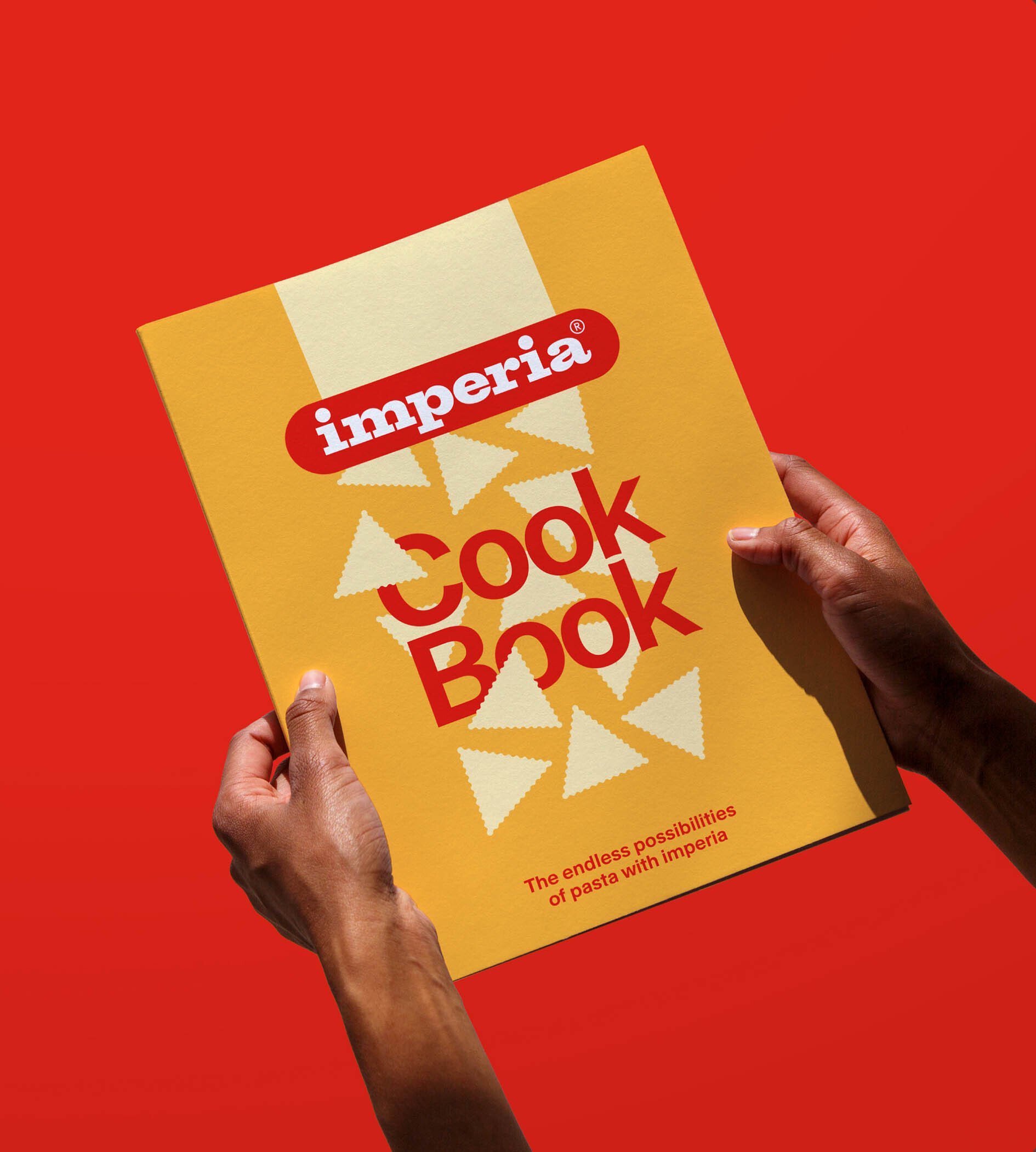
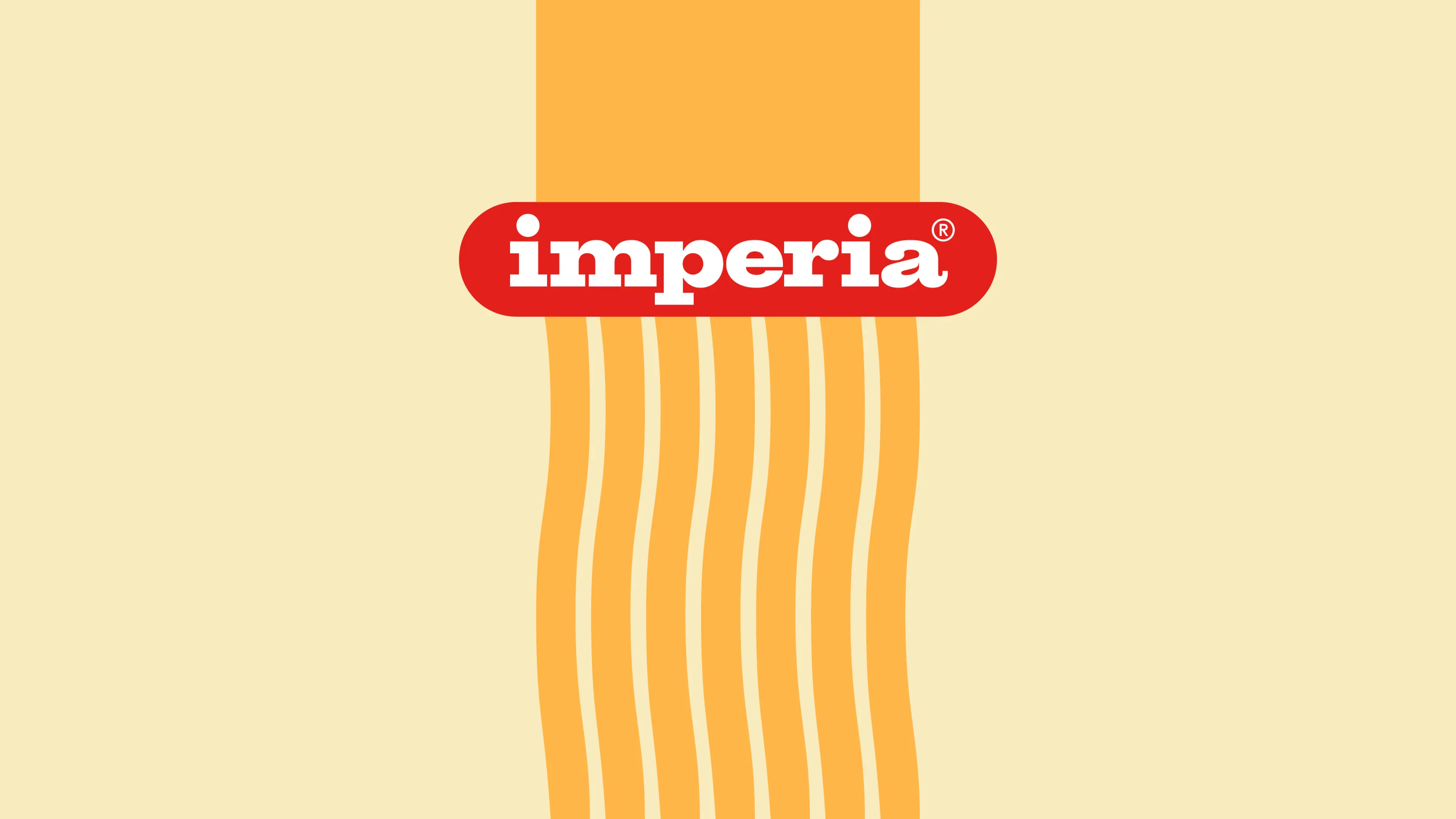
According to Landor, the Imperia logo was ‘transformed into a pasta machine roller’: if I’m honest, I’m really struggling to see that in the design, but that’s not to say it doesn’t look good. It’s a vast improvement on the former mark, which was all about rather dated looking gradients and drop shadows, with white text sitting in a red lozenge shape. The lozenge holding device has been retained, but the colours are reversed and the whole thing has been flattened into straight-up red and white, making it all feel a hell of a lot fresher and more modern.
The new branding retains the vibrant colour cues that are associated with Italy – and especially Italian food brands and packaging – but makes them pack a lot more of a punch. Elsewhere in the identity, the colours are equally as popping – the palette is ‘as rich as nonna’s ragu’, as Landor puts it.
The new logo looks back to move forward, ‘leveraging heavily on the brand heritage’ through extensive research into Imperia’s past. There’s a brilliant webpage packed with various Imperia ads from decades past; and even the most cursory glance shows that there was certainly no shortage of beautiful historical branding examples to inform the rebrand. Among the elements to be informed by the brand’s evolution is the reintroduction of ‘an extended typography, commonly found in advertising pieces from the 40s onwards, but made contemporary and functional’.
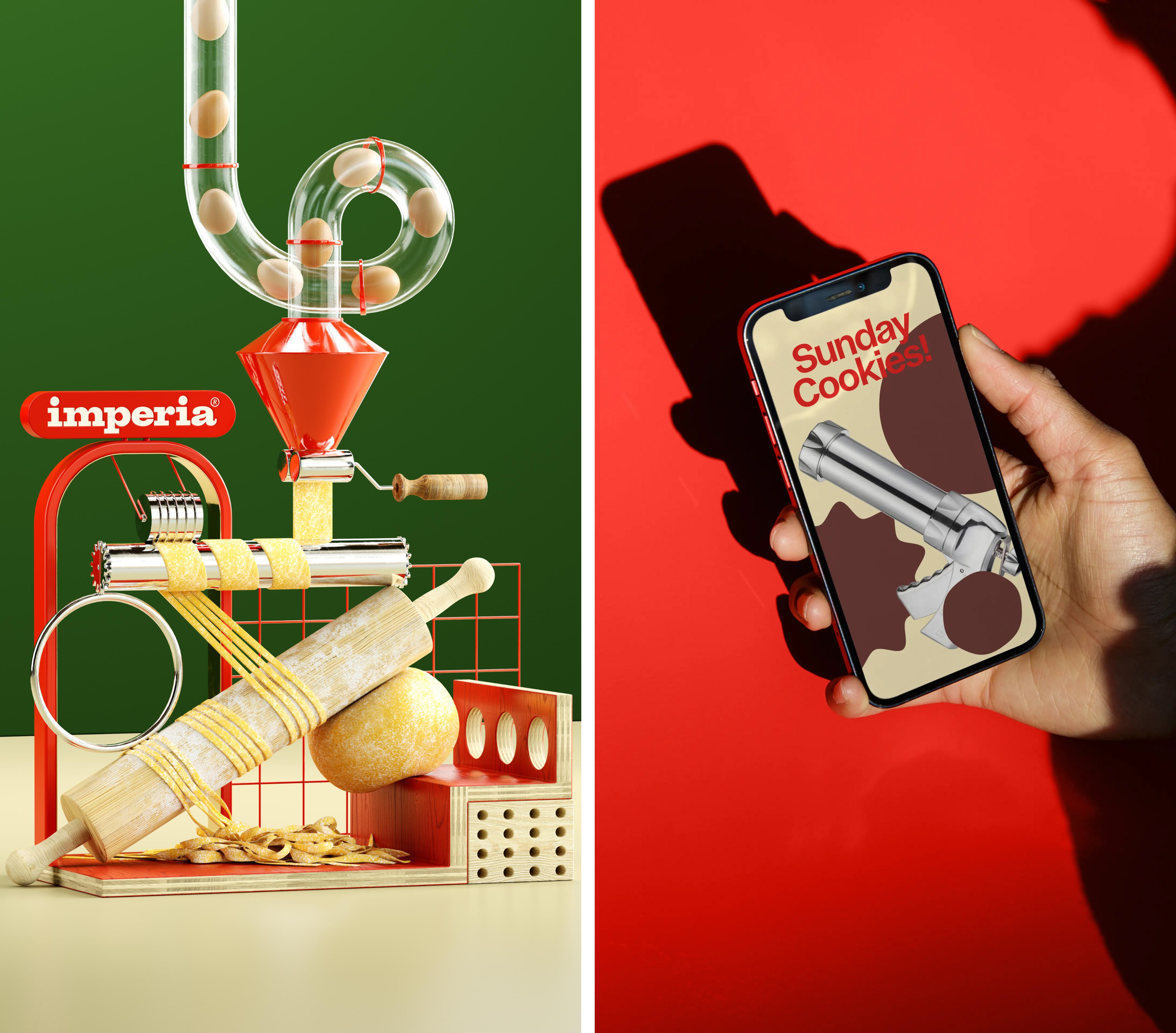
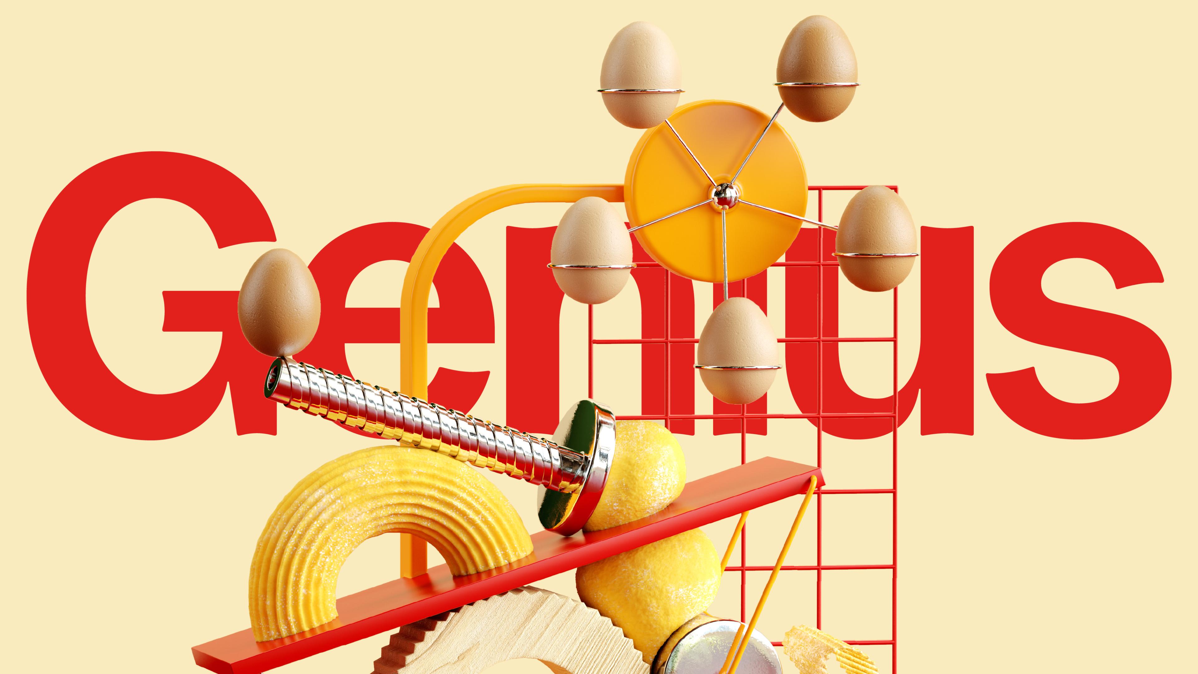
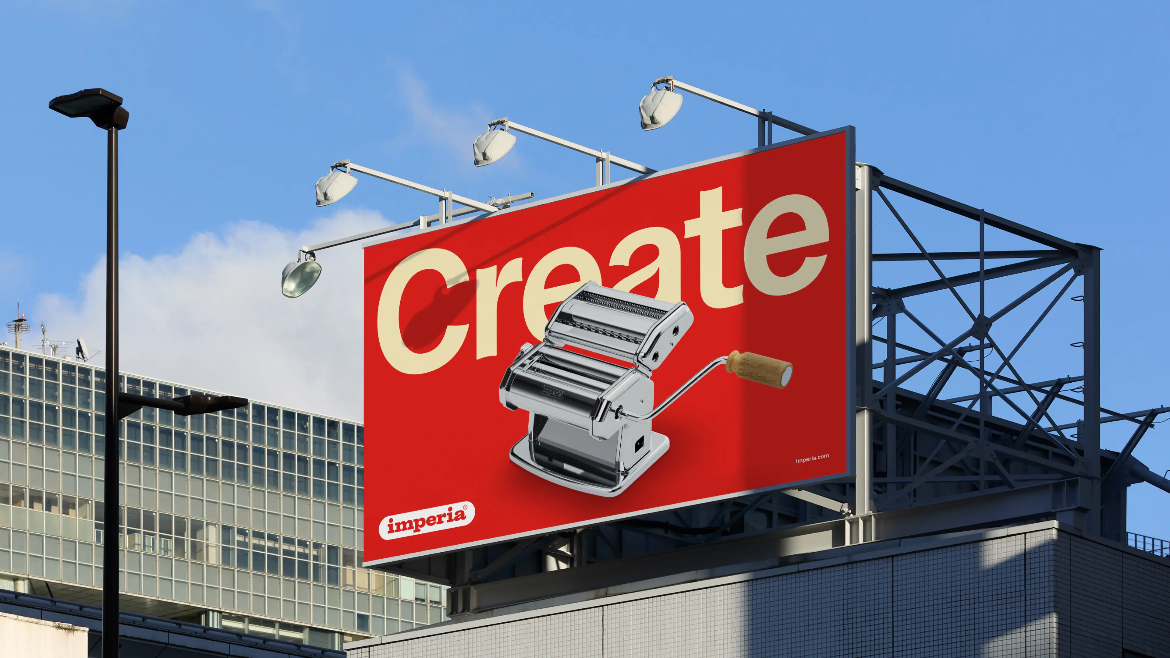
The illustrative approach to the 3D design system ‘inspired by Imperia’s products’ comes to life in the motion designs and the biggest standout of all – the campaign imagery. Showing a series of slightly surreal-looking machine scenes, some with striking close crops, the imagery uses the limited but eye-catching brand colour palette and is inspired by Futurist artist Bruno Munari and his 1930s/40s Useless Machines.
Munari’s series of machine sculptures used techniques deriving from industrial mass production, and are formed of simple geometrical shapes painted on each side in different colours in order to ‘emphasise the perceptual instability of the works, which move autonomously through space, sensitive to even the slightest change in the environment where they are placed’, in the words of arts organisation Museums of Genoa.
But where Munari’s machines were ironic and ‘useless’, Landor has turned that concept on its head for Imperia, instead dubbing its products ‘Useful and Playful Machines’. That idea forms the core of the new positioning of Imperia as a ‘brand that values what people value most: more of what you want, less of what you don’t’. Every single thing about this project in some way links back to Imperia’s Italianness; but does so without ever veering into pastiche or cliche. It’s ultimately simply very charming and fun, but all the while subtly underscoring Imperia’s usefulness and functionality.
