Esprit by John Casado, 1978
Written by Richard Baird Posted 3 August 2024
Esprit was founded in 1969 by Susie and Doug Tompkins. The duo set out to create a lifestyle brand that would harmonise with the spirit of the time. Their approach was distinct, employing a ‘mix and match’ post-modernist approach that used colour, pattern, shape and style in complementary and contrasting fashion across a diverse range of products for ‘teenagers and young women up to the age of 35’. These products included everyday clothing basics, as well as sunglasses, watches, shoes, bags and umbrellas. Through their designs, which were highly graphic yet functional everyday items, Esprit expressed a bright outlook on life, a sunniness straight from the American state of California.
The brand developed from this central concept and a harmonisation of product, organisation and marketing. This manifested itself in many ways, and evolved over time. This would include the commissioning of ideologically driven architects for regional store design (Shiro Kuramata, Norman Foster, Ettore Sottsass and Antonio Citteri), an experimental approach to packaging (Tamotsu Yagi) and the way products were advertised, for example, using images of employees which was pioneering. This led to a brand that was highly specific in its target audience, eclectic, engaging and dynamic. Despite this mix and match approach, the brand was able to develop a graphic through-line, a visual identity that had a basic expression (just like the clothes) but could be reconfigured, played with endlessly and be a critical part of the appeal of the products.

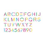
As the foundation of a new Esprit brand was a wordmark designed by John Casado in 1978–Casado also designed the trademark for the first Macintosh computer. The logotype was a derivative of Helvetica, a modernist and highly functional typeface. This was given a further sense of utility with the addition of stencil cuts and moments of reduction (the R) and redaction (the E). This was then redrawn, moving it further away from its formal origins. This would replace a wordmark that had become fixed to the 1970s zeitgeist in its letterforms affording the brand more range within the fashion world that was quickly evolving. The abstraction of letters and move towards simplicity freed the brand to be more flexible and playful, and was described being bold in the unambiguous appeal to a specific target audience.
Some practical aspects were also considered, with three different weights (regular, bold and extra bold) drawn for different sized applications, with the heavier weighted version being used for smaller contexts. As the cap height decreases the letter thickness remains the same.

Where Helvetica was uniform, colour was not, employing six colours for the six letterforms. The mix of modernist shapes yet playful use of colour developed the ideas of functional, fun and fashionable. These notions would be furthered by reinterpretations of the wordmark throughout the 1980s.
An overlapping version was later developed in 1987 in an attempt to give motion to the wordmark without affecting its overall readability. When printed, each letter appeared in a different colour or series of colours depending on the palette created for that season.

As the corporation expanded its divisions in 1987 to include ‘Collection’, ‘Sport’, ‘Kids’, ‘Bath & Bed’ and locations such as Los Angeles, Dallas and London further versions were introduced. This continued growth was also supported by the introduction of a custom display typeface, also designed by Casado, and derived from the logotype. This afforded the brand increased flexibility, and used alongside Helvetica and Univers 59.

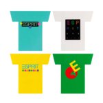
Additional projects called for special adaptations to the logotype although excessive modification of the logotype was avoided to keep the image simple and in character with the original design. However, geometric shapes; circles, triangles or squares were seen as natural embellishments and part of a post-modern aesthetic of individual expression rather than practical need. These logotypes had various applications, as graphic prints on t-shirts and other products to tags and signage.

From the late 1970s to the 1990s, Esprit grew significantly as it expanded further into the international. As an expression of its post-modernist vision, Ettore Sottsass, the Italian architect and founder of the Memphis Group was commissioned to build Esprit’s European headquarters in Düsseldorf, as well as set the visual direction for the brand’s retail stores.
However, as the brand sought to increase its market share and audience its idiosyncratic qualities were gradually lost. While the wordmark designed by John Casado remains intact, the single colour version and the absence of embellishments marked a departure from the sunny Californian outlook it had kickstarted in the 1980s and reflect the financial set-backs it experienced throughout the 2000s and administration of its European operations in 2024.

This article first appeared on Logo Histories, a weekly Substack newsletter. To instantly access an archive of over 120 Logo Histories, just like this one, and receive weekly stories straight to your inbox, subscribe here. Want to see more assets from this brand discover at Brand Archive.

