Public Pool by Perky Bros
Opinion by Emily Gosling Posted 27 August 2024
Suburban pool party culture is rather alien to us in the UK, where only the exceptionally wealthy have pools, and we muddle along in a climate that defaults to ‘grey, fair to middling’ most of the year.
But we’re becoming a little more attuned to the joys of an open air funsplash: over the past few years we’ve seen the rise of ‘wild swimming’ – the age-old phenomenon of swimming in natural bodies of water, rebranded for a specifically middle class slice of the wellness contingent – and things seem to be looking up for lakes’ concrete cousins, the humble lido (special shoutouts here to to London Fields and its perennially warm watery bosom and the Ninja Warrior-adjacent joys of Lymington Sea Water Baths).
In less chilly parts of the world, though, inland but outdoor pools are far more commonplace. However, they’re rarely as revered as the louche, lens-flared glamour of coastal waters, with their endless sands and bronzed hyperbolic physiques and quaint deckchairs and jetskis, and so on.
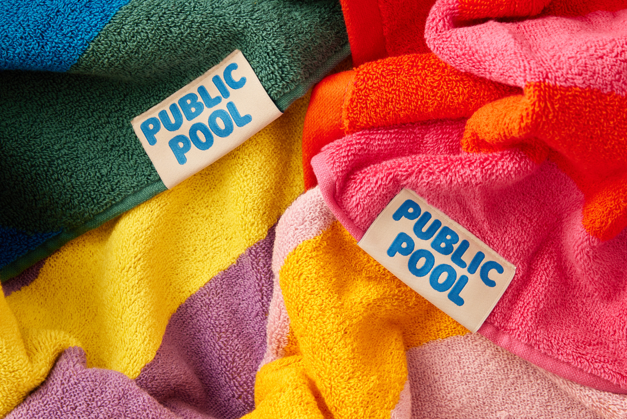
One very aesthetically pleasing brand is making bones to change that image, however. Public Pool is a US-based company that launched in 2022 selling a range of sunscreens; towels; and apparel such as caps, t-shirts, and hoodies. Unlike most swim-centric brands, it’s not all about palm trees, sun, sea and sand – instead, its roots are in a more urban milieu. ‘Growing up in Austin, our summers were sun and chlorine and feet on hot concrete’, say Public Pool’s founders. ‘Public Pool is a celebration of growing up inland.’
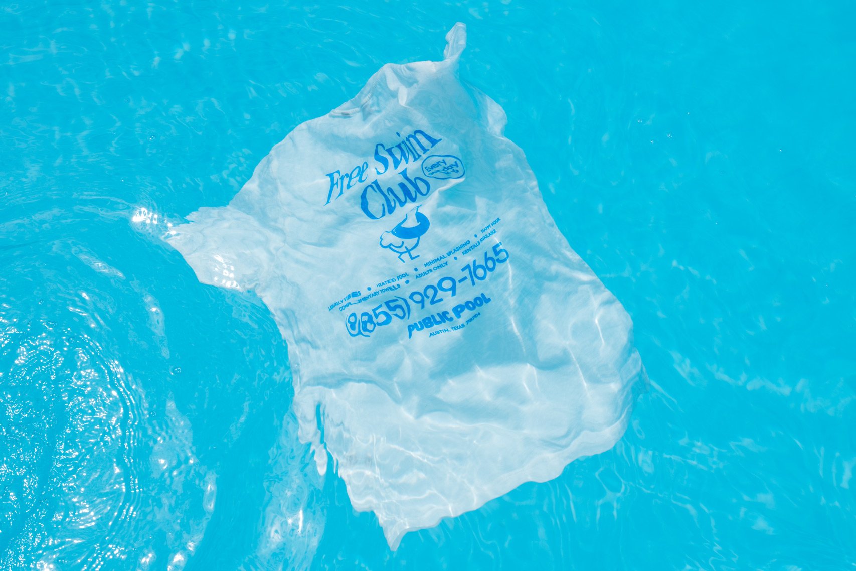
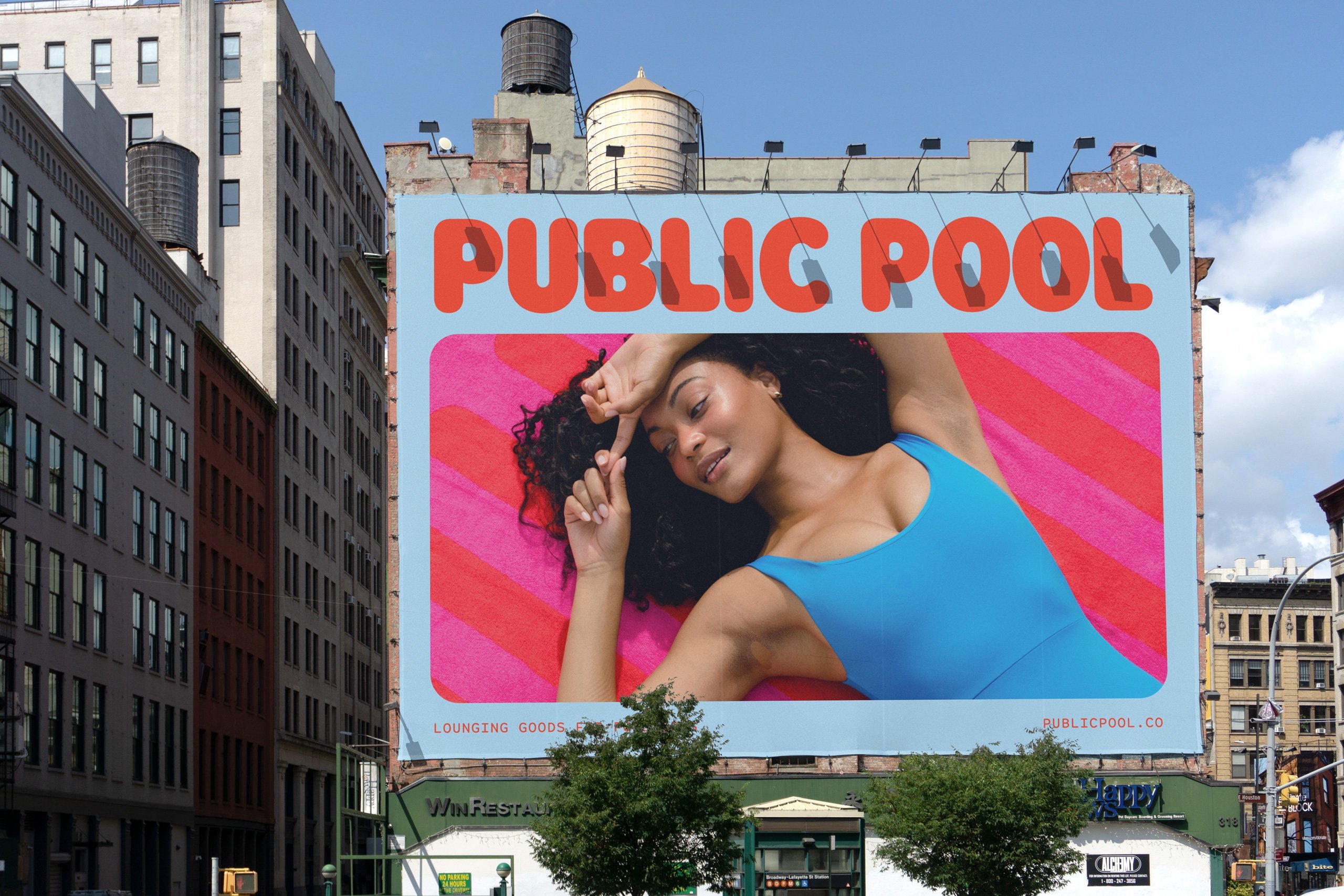
Its branding is a sunkissed, vibrant and playful love letter to all that is brilliant about lazy days hanging out with mates poolside: you can almost feel the warmth and the gentle sting of chlorine in the eyes just by looking at it.
The branding and visual identity was created by Nashville-based design agency Perky Bros (what a name – and it turns out Perky really is the founder’s surname). Perky Bros (Shy Bird, Tembo, Forgotten Boardwalk) was approached directly by Public Pool founder Cole Brown, and worked across the whole brand identity, which is seen across print applications, product packaging, the website and other online channels including the Public Pool socials.
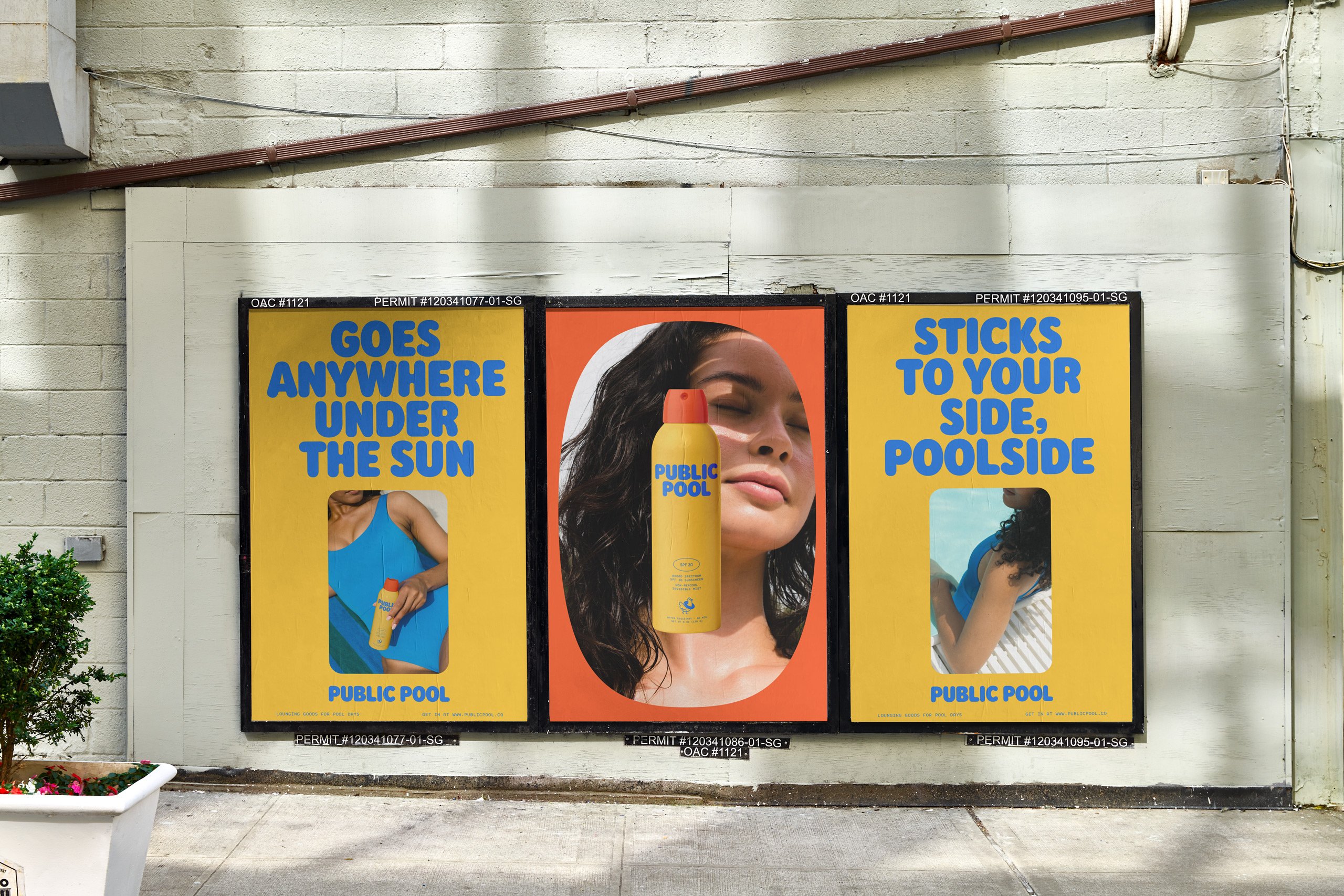
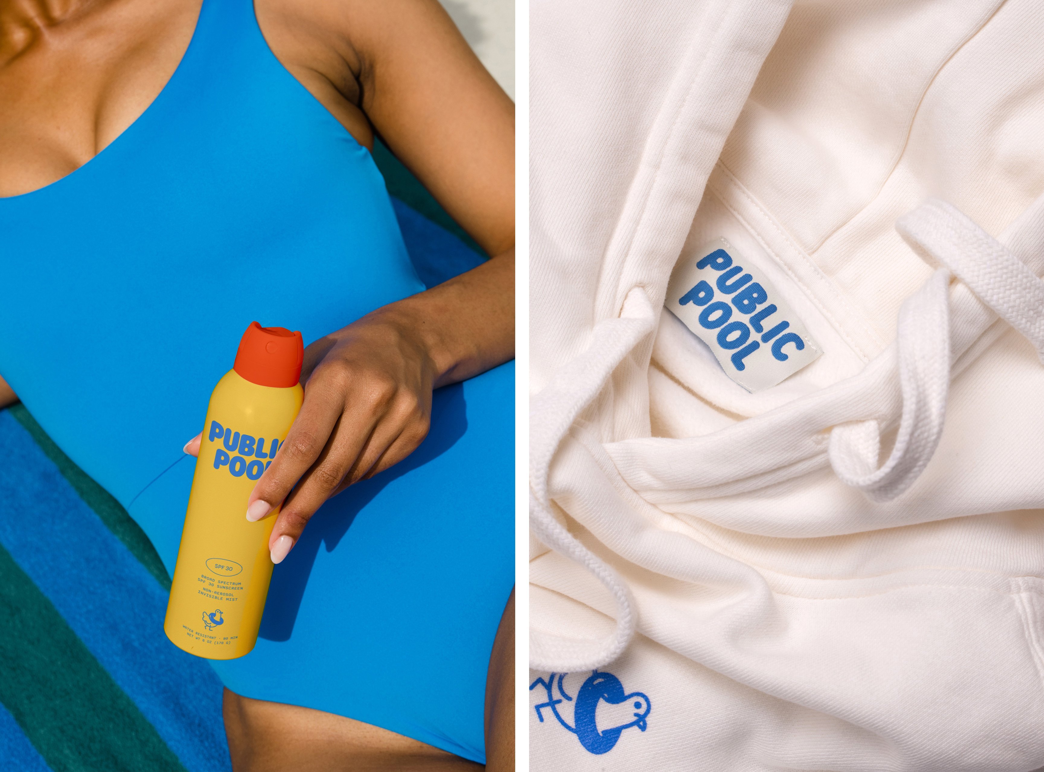
According to Perky Bros, Public Pool ‘adds style and joy to adult swim’, with products ‘inspired by the nostalgic charm of hot summer days at the community pool’, that speak to ‘the fine folks in the middle, not just the beach crowd’. The agency adds, ‘In a market saturated with coastal aesthetics, we sought out to create a distinctive identity that speaks directly to cities and towns between the coasts, celebrating their unique sense of community and identity… Public Pool’s brand identity blends the casual elegance of lounging poolside with the playful spontaneity of a belly flop.’
The designs largely channel a pretty fun revival we’ve been seeing a fair bit of in recent years: that of 1980s – and especially 1980s editorial – design. Take New Balance’s superb retro style ads from 2021, which directly recall its former campaigns. And of course, the much lauded darling of skincare marketing and design, Vacation sunscreen, with its on-point use of thoroughly 80s font ITC Garamond Std; Miami beach, high-legged bikini-slathered art direction; and its focus on a very specifically olfactory nostalgia.
While those examples directly pilfer from the 1980s like a dressing up box (and there’s nothing wrong with that), Perky Bros’ designs for Public Pool take the decade more as a springboard to create a retro-tinged, but thoroughly contemporary look and feel.
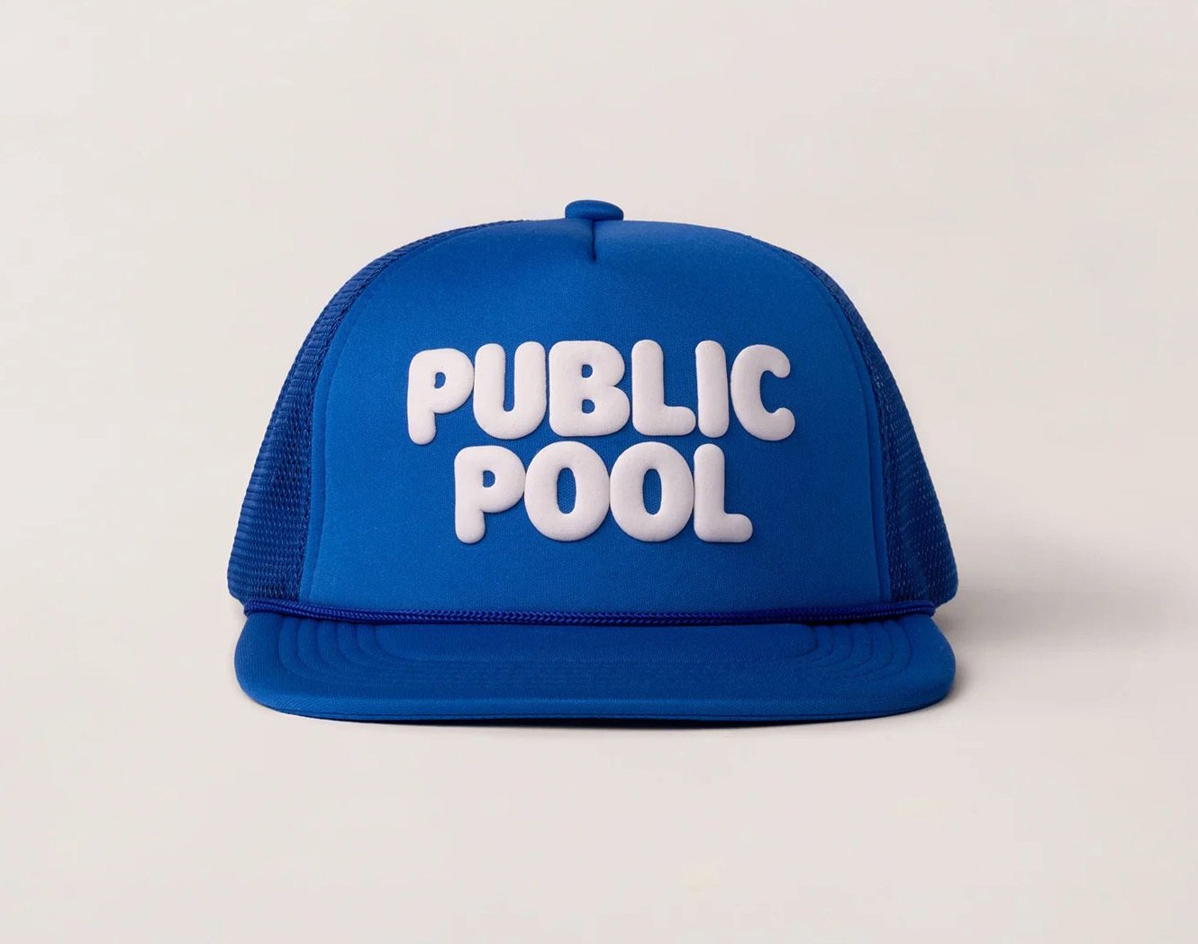
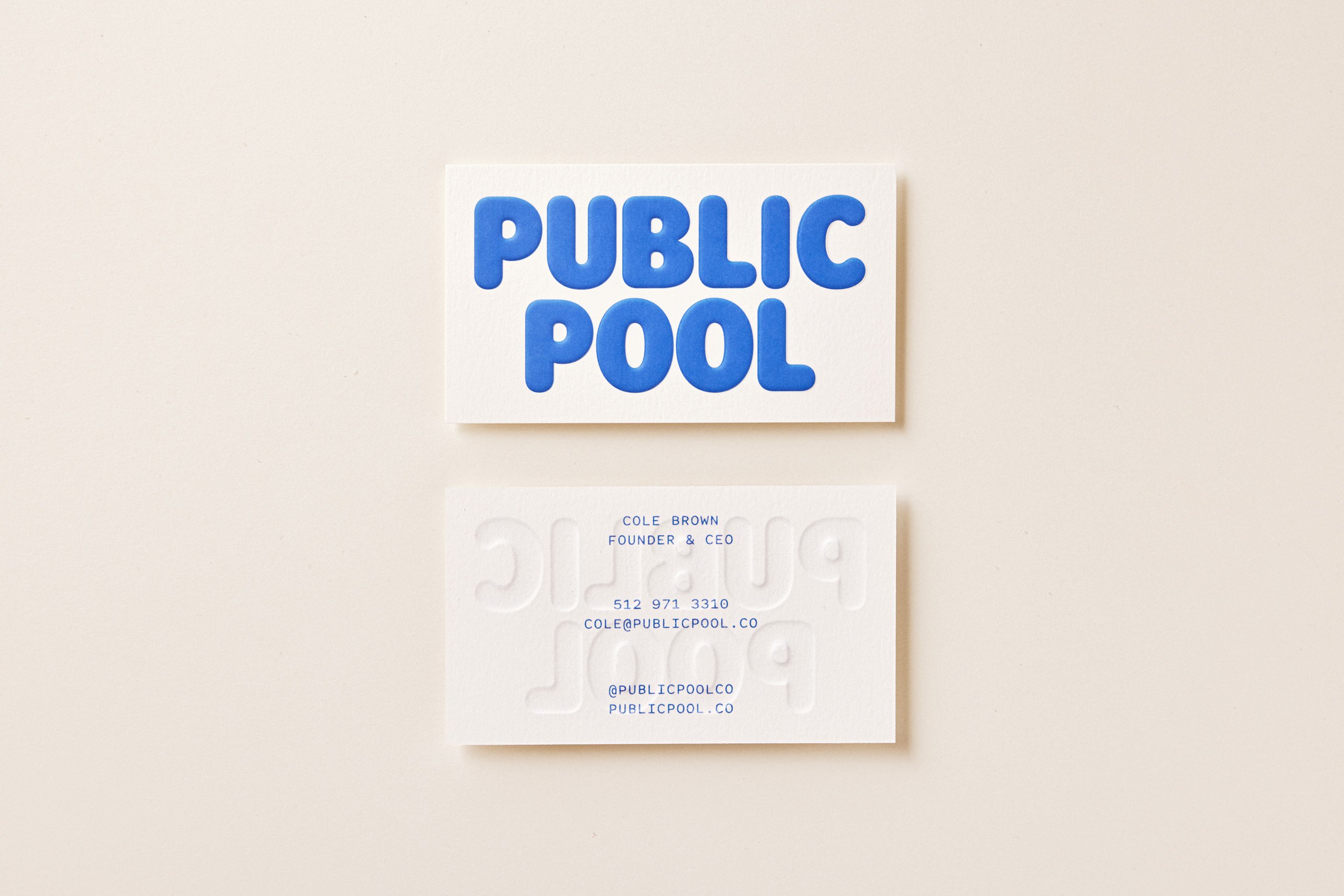
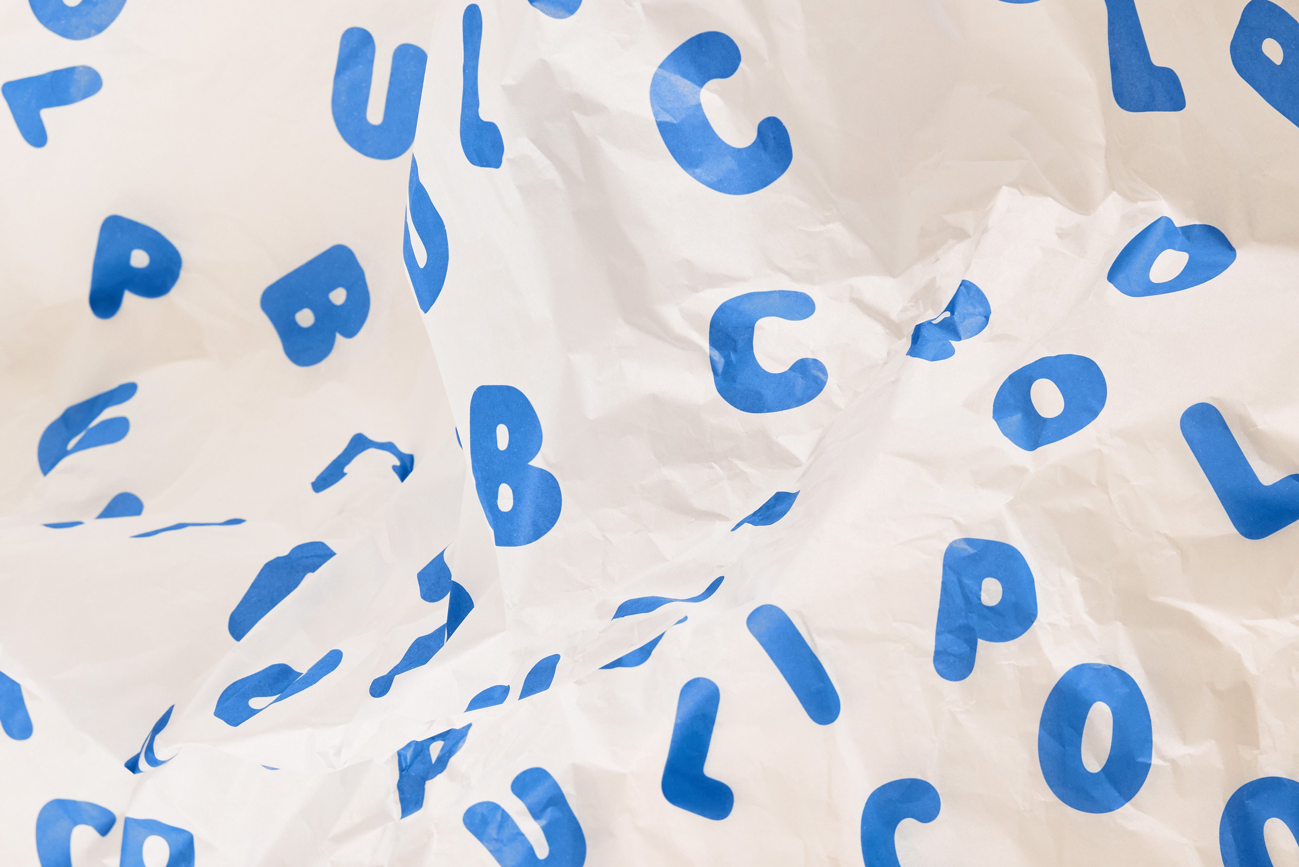
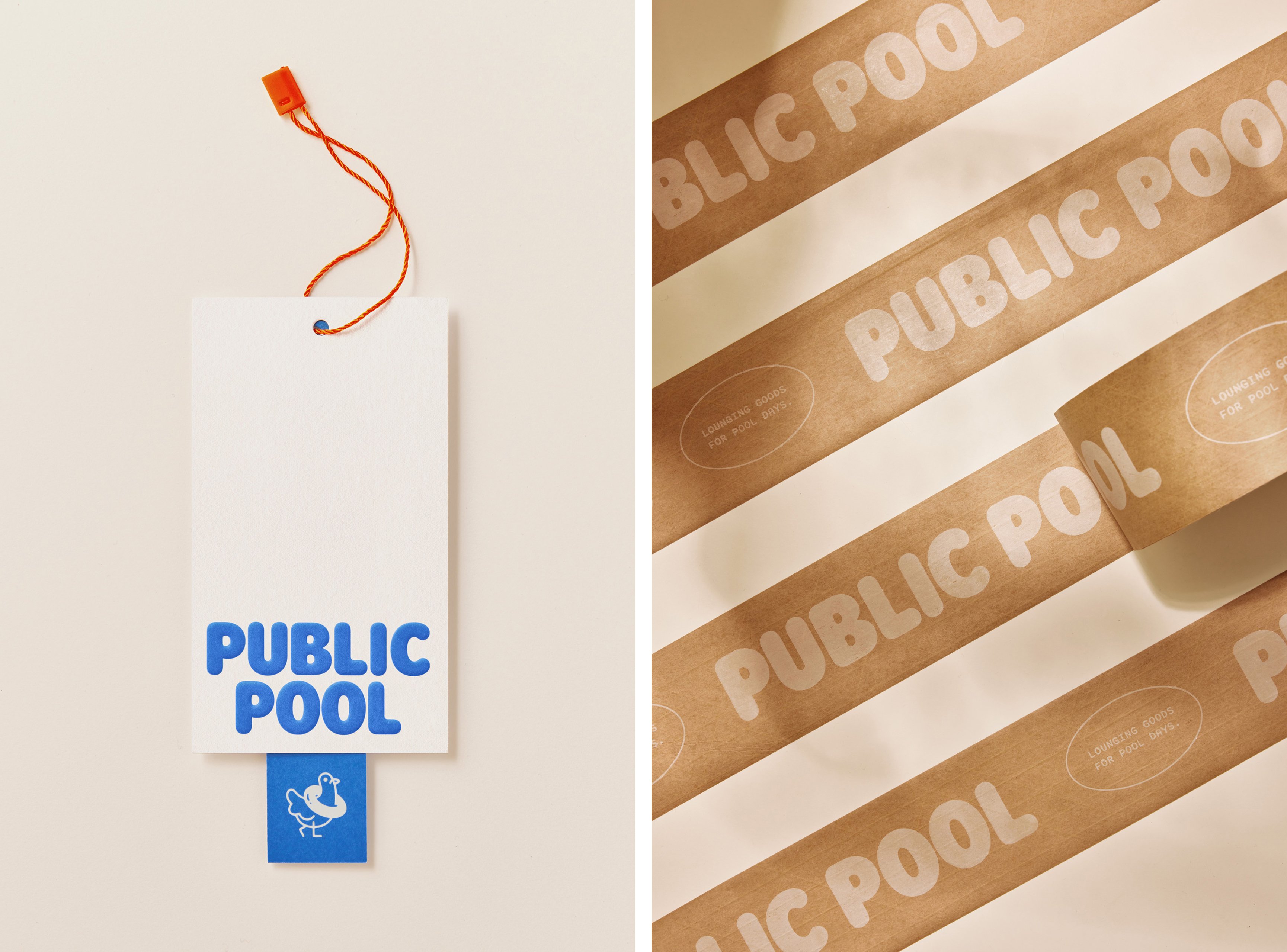
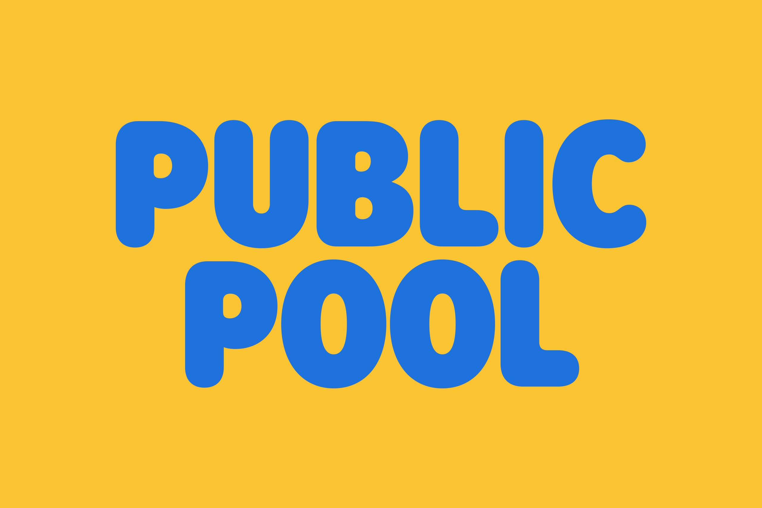
I absolutely love the use of Rodger in the word mark, set in a perky shade of blue that makes it all very much redolent of pool noodles. The typeface, created by Chicago based type foundry Central Type, is a cute rounded sans serif inspired by 1960s and 70s display fonts bearing ‘organic, yet refined curves which walk a fine line between casualness and formality’.
Elsewhere across the branding, Perky Bros opted to use Euclid Circular A by foundry Swiss Typefaces – a thoroughly versatile, classy geometric typeface – as well as Spot Mono by Helsinki- and Berlin-based foundry Schick Toikka, described by its creators as ‘an approachable and familiar sans serif with a warm personality and a soft touch’. If anything sums up the buoyant optimism of the look and feel of Public Pool, it’s approachable and warm, making this combination of fonts very clever indeed.

Alongside the logotype, a rather unusual brand mascot of sorts acts as the Public Pool ‘symbol’: a sweet little pigeon, rendered in a confident but simple mono-weight stroke. It’s a witty choice: no dolphins, fish, or seagulls here – the humble pigeon represents a distinctly inner city take on swim culture – or as Perky Bros has it, ’embodies the brand’s connection to city life and public spaces, symbolising accessibility and inclusivity’.
A design approach that leans heavily on the aesthetics of pool floats obviously works fantastically online and in 2D applications, but the branding is also thoroughly considered for its physical manifestations across product packaging. With graphics like this, it was pertinent to keep the structural side of things simple as a neat contrast to the more bombastic graphics: as such, paper materials feature dome-embossed typography, ‘subtly evoking the sensation of floating just above the surface’.
All in all, the Public Pool branding is a perfect marriage of fun and class. While the 1980s stuff is a very palpable reference point, it’s never veering into cheesy or pastiche -like territory: the bright but limited colour palette manages to keep things chic enough for a premium product that feels trustworthy and gently high-end hip. If, as Perky Bros says, the designs look to blend a sort of approachable, familiar nostalgia with an ‘elevated tone… for today’s discerning lounger’, it’s achieved that brilliantly.
Discover more assets from Public Pool and thousands more assets from brands past and present at Brand Archive.
