Ashton by LG2
Opinion by Emily Gosling Posted 3 September 2024
For the rest of the world, Canada is synonymous with a few things – maple syrup; Celine Dion; wholesome, generally nice people; Neil Young; and when it comes to the realm of food, poutine (fries with cheese curds and gravy, for the uninitiated).
Having opened back in 1969, Ashton is the oldest poutine chain in Canada. With 23 branches in Quebec, it’s become something of an icon in the sloppy chips space; but that had become a bit of a double edged sword – the ‘brand’s image and restaurants have remained frozen in this era’, as LG2, the Montreal, Toronto and Quebec-based creative agency that recently overhauled Ashton’s branding puts it.
In 2022 Ashton’s chain of restaurants was acquired by entrepreneurs Émily Adam and Jean-Christophe Lirette, who had a vision to expand the chain beyond its Quebecois home. The new ownership led to the branding shakeup, with LG2 brought in to help respond to a number of pretty significant challenges. Something had to be done to address Ashton’s stagnated sales, outdated restaurant concepts, and its ageing clientele. The new branding had to work towards bringing in the younger audiences that the chain had historically struggled to attract, and take a newly expansive approach that could help Ashton reach beyond its historic locale.
‘The brand needed some new life’, says LG2, which worked across Ashton’s strategy; branding and visual identity; architecture; content; and ads. The entire concept looked to update the Ashton experience, creating a more modernised whole brand world while maintaining its established traditions and heritage.
A glance at the former logo design reveals just how dated things were: the former logo has the odd typographic quirk of capitalising the ‘T’ as well as the ‘A’, in a typeface that’s a weird mix of utilitarian stencil style and blocky serifs – it’s not quite sure if it’s playful with its contrasts of thick and thin letterforms, semi-joined-up stylings et al, or rather serious with its sturdy serifs.
Another peculiarity of the former branding is the way that the wordmark is housed in a lockup that looks more like the shape of a burger than anything to do with poutine. And to boot, that burgerish shape is partly formed with a scripty cursive ‘chez’ weaved into it. Perhaps it all made sense once upon a time, but it’s hard to make out what’s going on with it all now, in 2024.
In a smart move, LG2 seems to have read from the playbook of one of the most talked about redesigns of recent years: JKR’s graphic design community-beloved Burger King rebrand, which stripped everything back, flattened it all out, and raided the brand’s history to take everything back to a cutesy 60s-leaning vibe with the Cooper Black adjacent custom font Flame Bold.
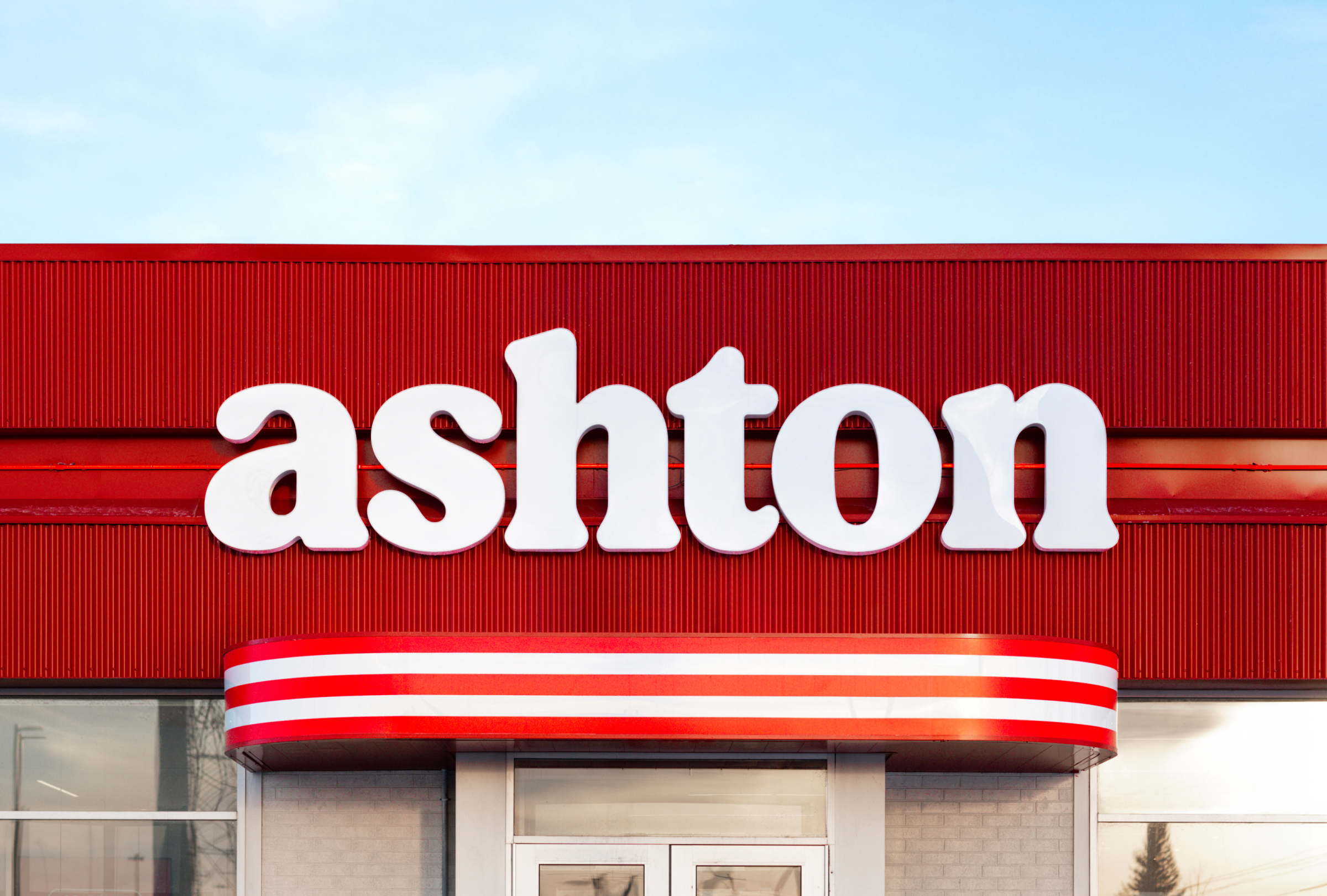
Indeed, the new Ashton wordmark doesn’t fall far from that Cooper Blackish look, and duly ticks the box of all too many recent rebrands in making the whole thing lowercase, despite Ashton being not just the brand name (a proper noun! Which should be capitalised!) but also the name of the chain’s founder, Ashton Leblond (which really really should be capitalised!)
The wordmark, which uses bespoke typography that’s admittedly very charming, is accompanied by some great fonts: Suisse Int’l by foundry Swiss Typefaces (according to LG2, a nod to the ‘ubiquitous changeable plastic letters of old diner menus’) and Tusker Grostesk by Tallinn, Estonia-based foundry Lewis McGuffie Type.
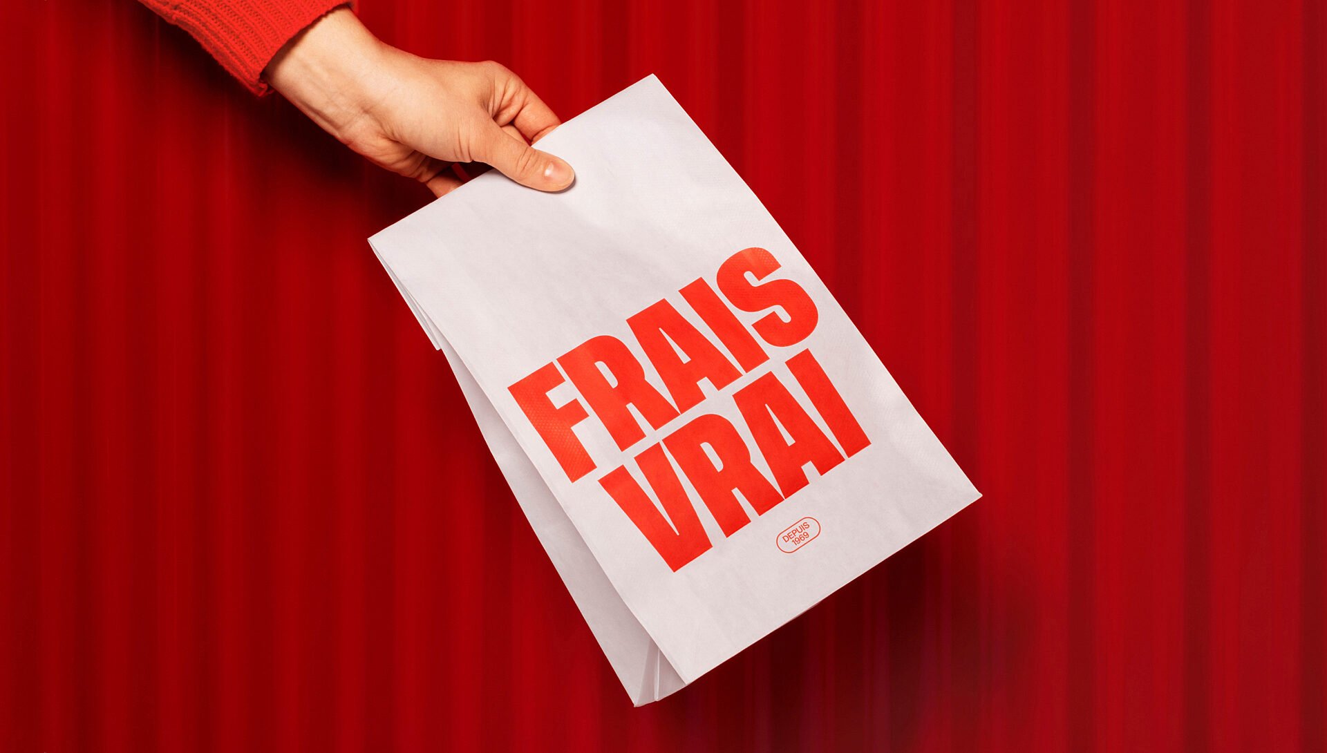
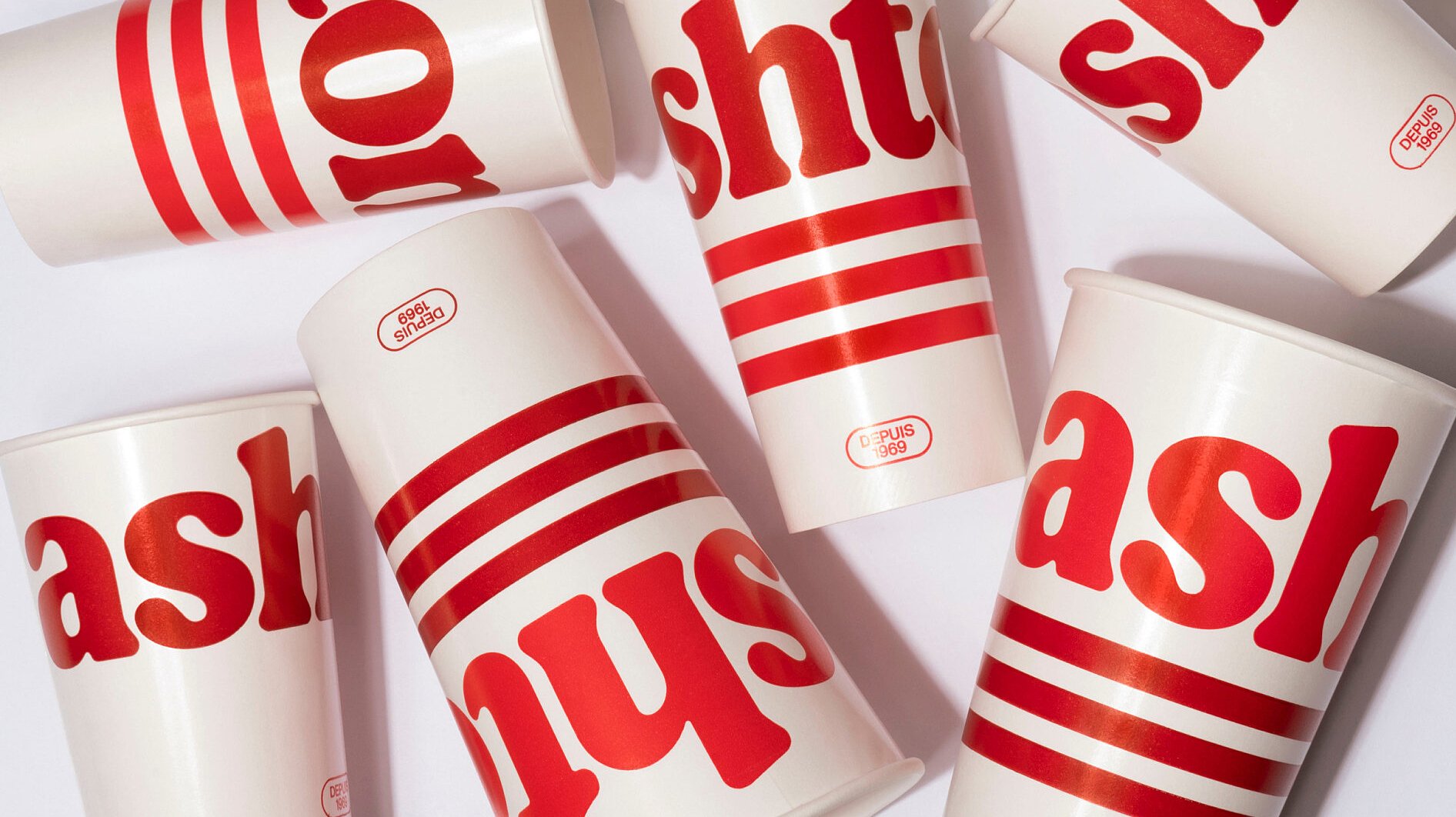
Leblond ended up inspiring the new brand in more ways than nominally. His first restaurant venture was called the Ashton Snack Bar, and a lot of the new ‘visual codes’ were directly informed by ‘snack bar culture’. That comes through in the three stripes, which were used in the former branding but have become more slick and contemporary through emphasising curves rather than strict geometries; while the classic diner shades of red and yellowish-gold-brown have been made more vibrant and bold.
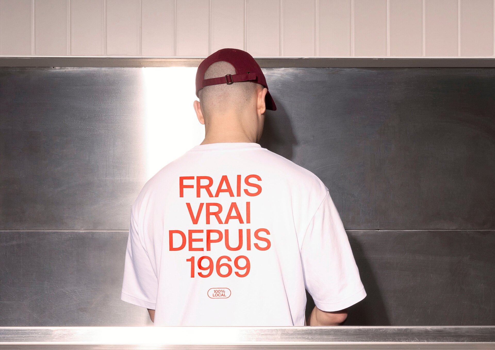
As such, there’s more than a touch of nostalgia here, but it doesn’t feel too cheesy (‘scuse the pun) or pastiche-retro: the new identity is fresh, fun and strikes the perfect balance of referencing Ashton’s history while wrenching it firmly into the future. The most nostalgic/backward-glancing touches are reserved for specific touchpoints: the new brand merchandise (socks, tees, shirts, etc), which features illustrations created to look like one of the earliest Ashton logos.
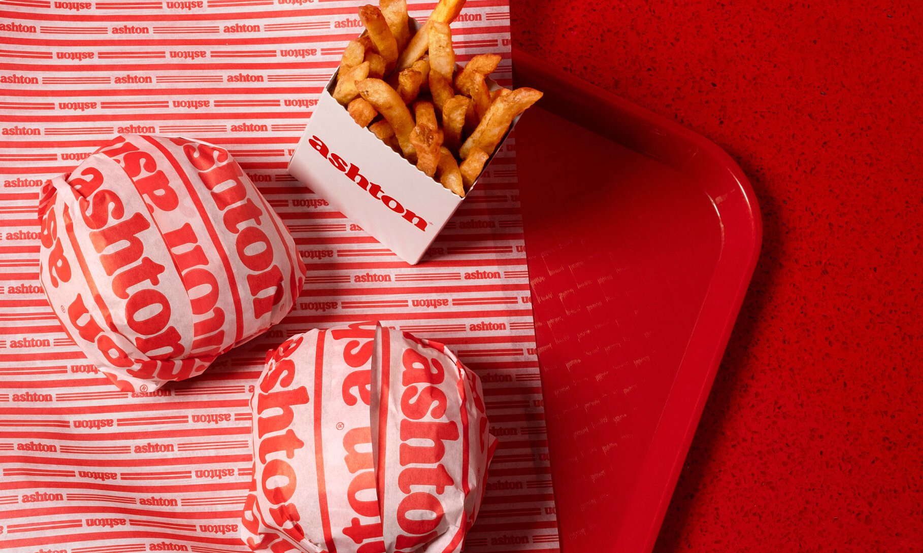
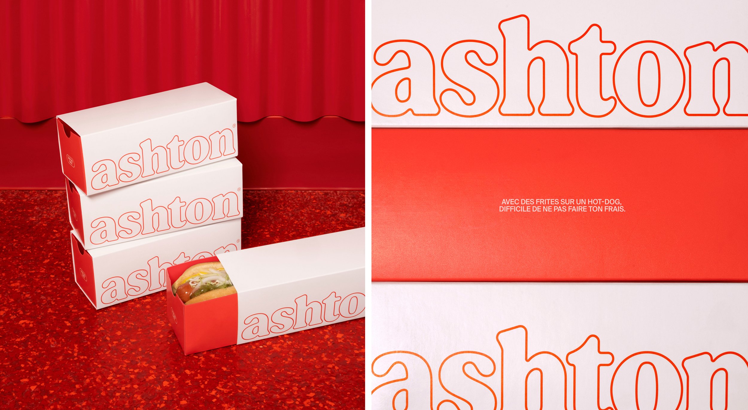
The packaging and wrapping is one of the most striking elements of the new branding: totally stripped back to its simplest components red, white, and the typographic Ashton wordmark), the drink cartons, burger paper and fries boxes show a confidence in the strength of the brand’s fundamental elements.
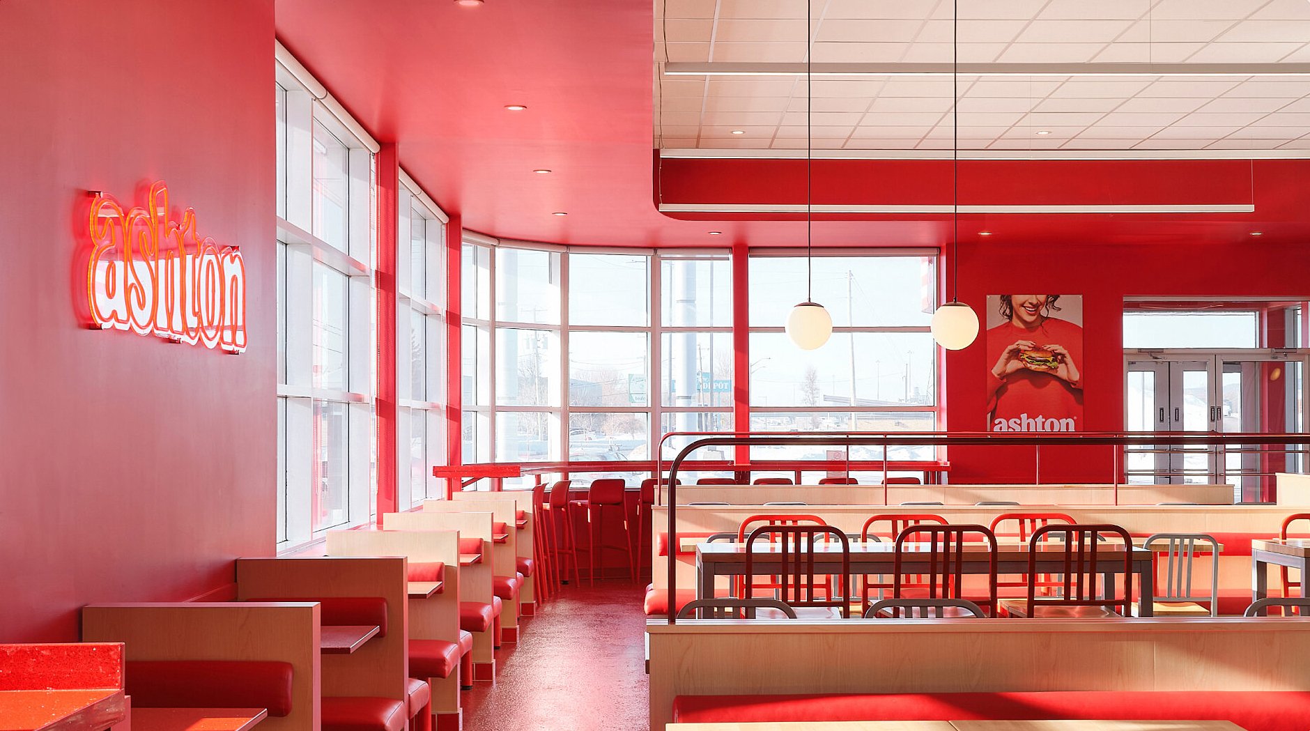
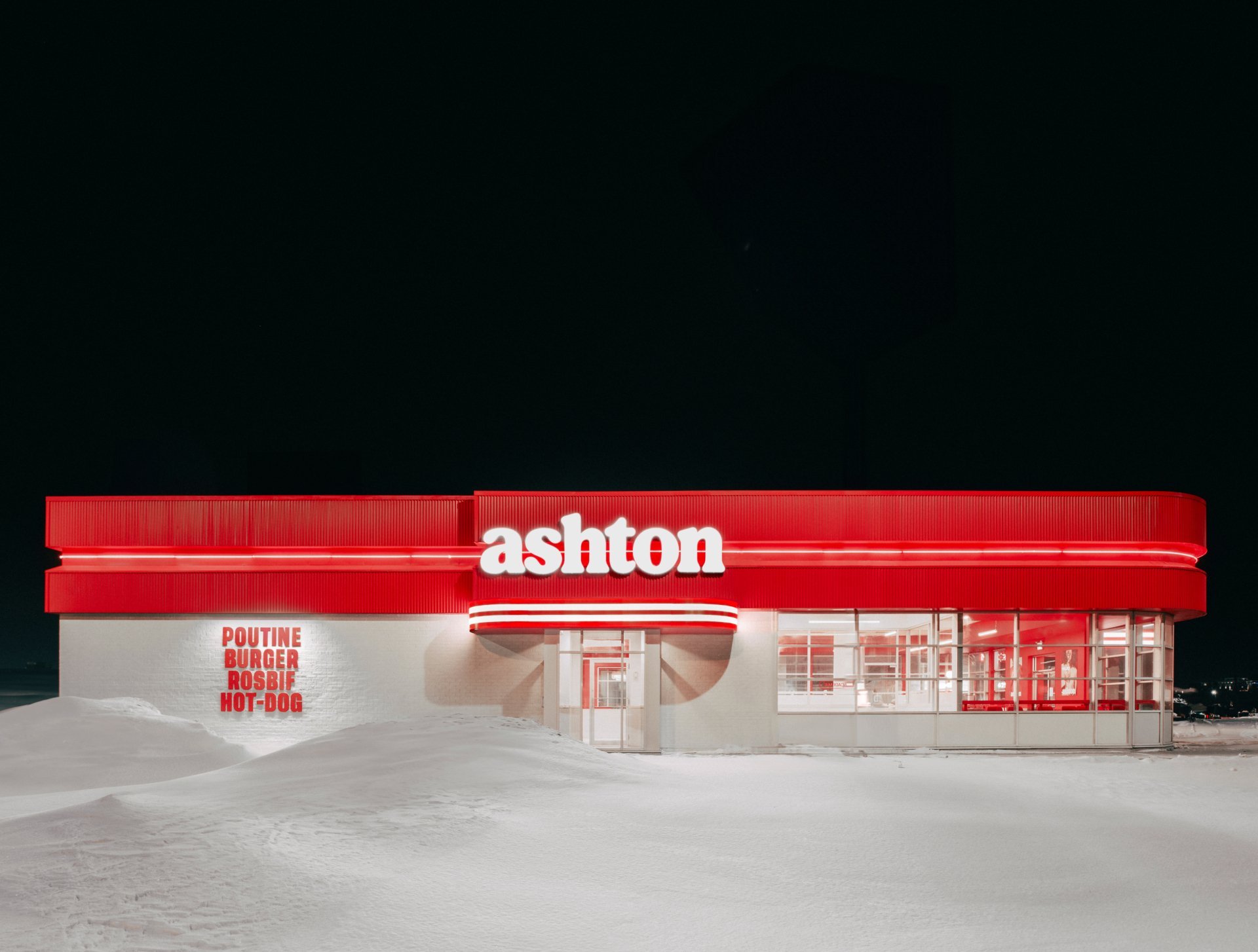
Seeing the brand across these smaller touchpoints and how it extends into the entire physical experience – the wall graphics, signage and even the architecture itself, which uses the graphic curves and colours to brilliant effect, is very impressive. The phrase ‘brand world’ gets bandied about an awful lot, but here it’s realised in perhaps its most literal form – and LG2 has done a really brilliant job of it.
