Oatier by AllGood
Opinion by Angelica Frey Posted 12 September 2024

Demand for dairy alternatives continues to surge. In the United States, plant-based milks and proteins are reportedly popular among a third of adults thanks to their perceived health benefits, as well as consumers’ increasing environmental awareness and plant-based lifestyles. Soy, of course, was the OG substitute, until almond milk came to dominate the market. But now, it’s all about oats.
While this is perhaps driven by practicality – catering to the needs of anyone who has lactose, soya, or nut allergies with one carton – oat milk’s creamy texture has also done a lot of heavy lifting, making it a perfect partner for hot drinks like coffee. When it comes to preparation, there is growing demand for ‘barista-style’ products, and an ingredient profile that yields stable, steam-friendly milk suitable for creative treatments, like latte art.

Enter Oatier, a Dublin-based alternative milk brand that calls itself ‘the oatiest company’ and prides itself on ‘oats only’ production, which essentially means that the final product doesn’t contain other grains, oils, or emulsifying agents – just good old Irish oats, along with sunflower oil and sea salt. Oatier has its sights trained keenly on the coffee shop audience with marketing strategies such as barista training competitions, coffee-sipping Spotify playlists, and even latte art throwdowns.
This was a key part of the branding strategy for design agency AllGood, based in Leeds, which created an identity and packaging with a ‘clear focus on the coffee moment’. The team started with brand story and sales messaging before developing ‘an entire language for Oatier, creating a tone of voice that the brand could own, built from the name upwards’. As AllGood puts it, ‘armed with a whole set of comparative adjectives and a smattering of puns, we then had to craft an identity that stood out in the marketplace’. Taglines include ‘Devoted to the Oat’, and ‘When we pour, we reign’.
![]()


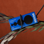
While Oatier confidently claims to ‘steam better, pour better, froth better and taste better than the rest’, AllGood was aware that the product needs to look as good as it tastes. The studio wanted the brand ‘to jump off the shelf’ and so employed a ‘bold is better’ approach to help the packaging make an impact. It achieved this by crafting a logotype and typographic style that does, indeed, feel like it’s jumping off pack, visually emerging from the carton thanks to a chunky, stark black drop shadow. This device is applied to other assets, such as digital stickers (a hand making an ‘OK’ sign, a heart, a rudimentary representation of a globe), creating a simple but immediately recognisable brand language.


The logotype is laid out vertically down the package, helping to maximise space and command attention. The colour palette, meanwhile, has been selected for maximise contrast with four main shades. The logotype takes the lightest, an off-white ecru (or ‘oat’?), with text and line work in rich black. The packaging then comes in two complementary colourways, corresponding to as many drink options: there’s a very saturated, almost neon periwinkle for ‘Classic Oat’, while ‘Barista Oat’ comes in a bright, warm-toned yellow.

After years of finding dairy alternatives shrouded in earth-toned packaging, Oatier joins a cohort of DTC brands whose packaging communicates high energy and zest for life. All Good (NZ) gave its oat-milk cartons googly eyes; Otis Oat Milk adorned packages with fists full of oats; Ghost Town Oats combines bubblegum-pink backdrops with a graffiti-style logotype. These bold and colourful approaches signal that oat is not just an alternative brought to you by dietary requirements, but a gourmet choice in its own right.