Packaging Reviews
Nu-clear your skin
Juana is a Dubai-based company creating CBD-based “bioactive” skincare, founded by Yann Moujawaz Martini, a French-born entrepreneur with Syrian roots and a background in brand strategy or – as he himself put it in an interview – “a decade designing multibillion-dollar wellness and medical tourism mega-projects for governments and Fortune 500s”, after which, he says, he “flipped the script” and...

Where fallow deer roam
Deer feel like unlikely ambassadors/ mascots/ PosterCreatures for olive oil, but it turns out they work brilliantly – when, that is, in the superlatively capable hands of a studio like SMLXL. Said olive oil is D’arbequina, a name which more broadly simply refers to the sort of plant from which the oil is produced: Arbequina is a widely cultivated olive...

Free your mouth
You don’t really hear the word ‘quip’ all that often – it feels somewhat antiquanted in a way, a little eccentric, somehow very English. The sort of thing gracing the cover of the sort of book someone bought as a gift for someone they don’t really know very well, nor particularly care about – maybe 101 of Oscar Wilde’s Wittiest...
Diggin’ it
Just when you thought we were approaching a post-pet-parent era, a brand comes along and proves very much otherwise. Thankfully, though, while pet parenting seems to be alive and well; fingers crossed we’ve left behind the whole rather icky “fur baby” days of things like dog bandanas that read, “My Mom is Sooooo Obsessed with Me”; or dog nail varnish;...
HotDog by SMLXL
From the moment I turned the sound up (as per instructions) on the ‘about’ page of the HotDog website, safe to say I was obsessed with this brand and its branding. It’s laugh out loud hilarious – I truly loled, as did the person I was sharing a room with, and as I’m sure anyone within eye- or ear-shot would...

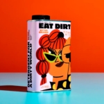
Eat Dirt by Cachete Jack and Marta Veludo Studio
The best branding and packaging projects – or at least the ones that most excite this slightly jaded old design hack – are those that not only take a category and do something genuinely innovative within it, but the ones that rethink structure as much as style. The identity for Eat Dirt does all that and more, and so safe...

Bugg by Seachange
Bugg is a New Zealand-based gardening brand founded earlier this year as the sibling of garden tools and accessories retailer Gubba. It bills itself as “premium products for people who live in the garden,” but its charming brand design definitely goes harder on the latter half of that clause than the former. Not that it looks cheap by any means...
Mutt by Brands & People
We’re at an interesting juncture when it comes to the petcare category – especially when it comes to dogs. Long gone are the days of barbour jackets and wellies, whistles, and gargantuan cans of Winalot; but we’ve also (thankfully) started to leave behind the whole ‘fur baby’ thing – the nauseating ‘cockapoo mommy’ era that ushered in things like nail...
Fhirst by Mother Design
We’ve arrived at a point where the idea of ‘y2k’ as an aesthetic has stretched beyond ‘trend’ or ‘cycle’ and morphed into an entity almost entirely devoid of the temporal placemarker its name suggests. Having been repeated ad nauseum, ‘y2k’ is no longer about a visual/cultural moment and/or collection of moments around 25 years back. Instead, it’s become a Burroughs...
Sigma by Stockholm Design Lab
You could argue that there’s a fair few similarities in terms of Japan and Sweden’s approach to design, and the aesthetics of life more generally. Both are known often for a specific kind of minimalism – a tastefulness that eschews fluff, luxuriates in crisp whites and keeps its edges, everything in its right place, rules and order and form following...
Rolus by Re
Back in the early 00s – the era when arguably Hollyoaks was at its zenith, and bellybutton piercings their most bejeweled – Botox was gradually emerging from the hushed clinics of Harley Street and LA to become part of common parlance. As such, brands cottoned on to the word’s ‘eternal youth’ connotations: I distinctly remember a shampoo ad promising that...
Wholy Greens by Control Studio
Wholy Greens is a B-Corp certified Dutch food brand dedicated to transforming the way people perceive and enjoy vegetables. Its mission is to create a mindset shift from ‘having to eat veggies’ to ‘genuinely loving veggies’ – and it uses pasta as its primary vehicle. It’s a smart set up, not least because, frankly, what experiences aren’t more enjoyable when...