House of Reptile by Studio Gruhl
Opinion by Emily Gosling Posted 17 September 2024
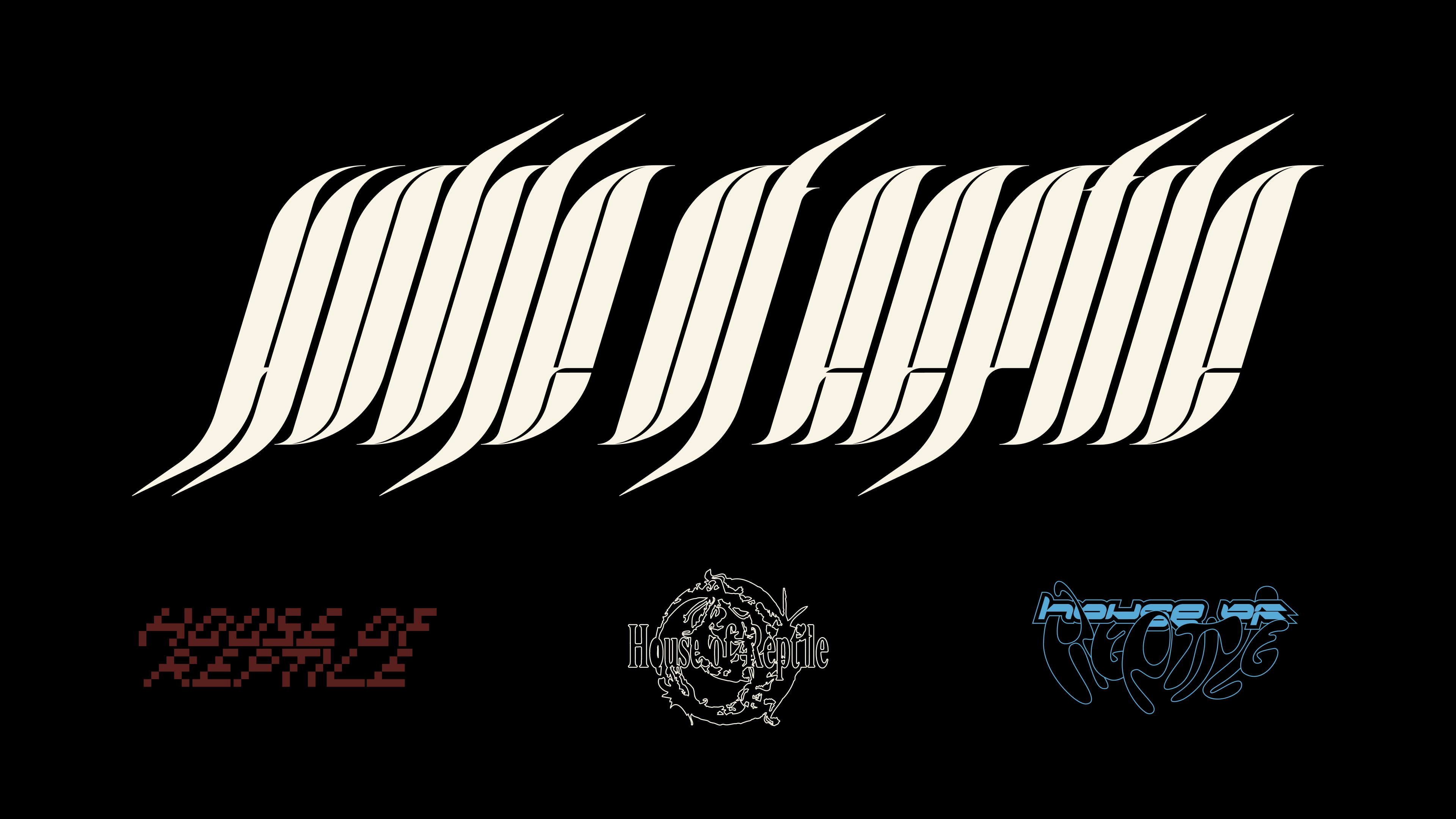
It’s not often that BP&O covers record label design. Unlike sectors such as fintech or FMCG, record labels naturally lend themselves to the more creative side of design and branding – they have far more niche audiences, and usually don’t have to work as hard as something aimed at the supermarket shelf to stand out or appeal to mass audiences. Obviously, there’s tonnes of great work out there in the music space, but some might argue that that’s as much down to the freedoms such projects offer designers as the level of inherent creativity.
In the rare instances we do write about things like record labels, it’s because the work really stands out; pushing boundaries and subtly rethinking what it is to be a brand. Work like this recent project by Studio Gruhl for east London/Boston-based electronic music label House of Reptile.
House of Reptile was founded in around 2020 by Rapha Campos, launching with branding that was also created by Studio Gruhl. The Berlin-based studio’s founder Malte Gruhl and Campos ‘go way back’, according to Gruhl, having met when both worked in design and advertising in London (Gruhl was design director at R/GA during his stint in the city). ‘Both of us have navigated the same subcultures of techno – him in Brazil, me in Germany – which laid the foundation for a good friendship’.
The label’s former identity shares some elements with its new look – largely its use of abstract symbols and graphics, and its central typeface, though the rebrand has seen new elements and colours added to the former primarily black and white identity.
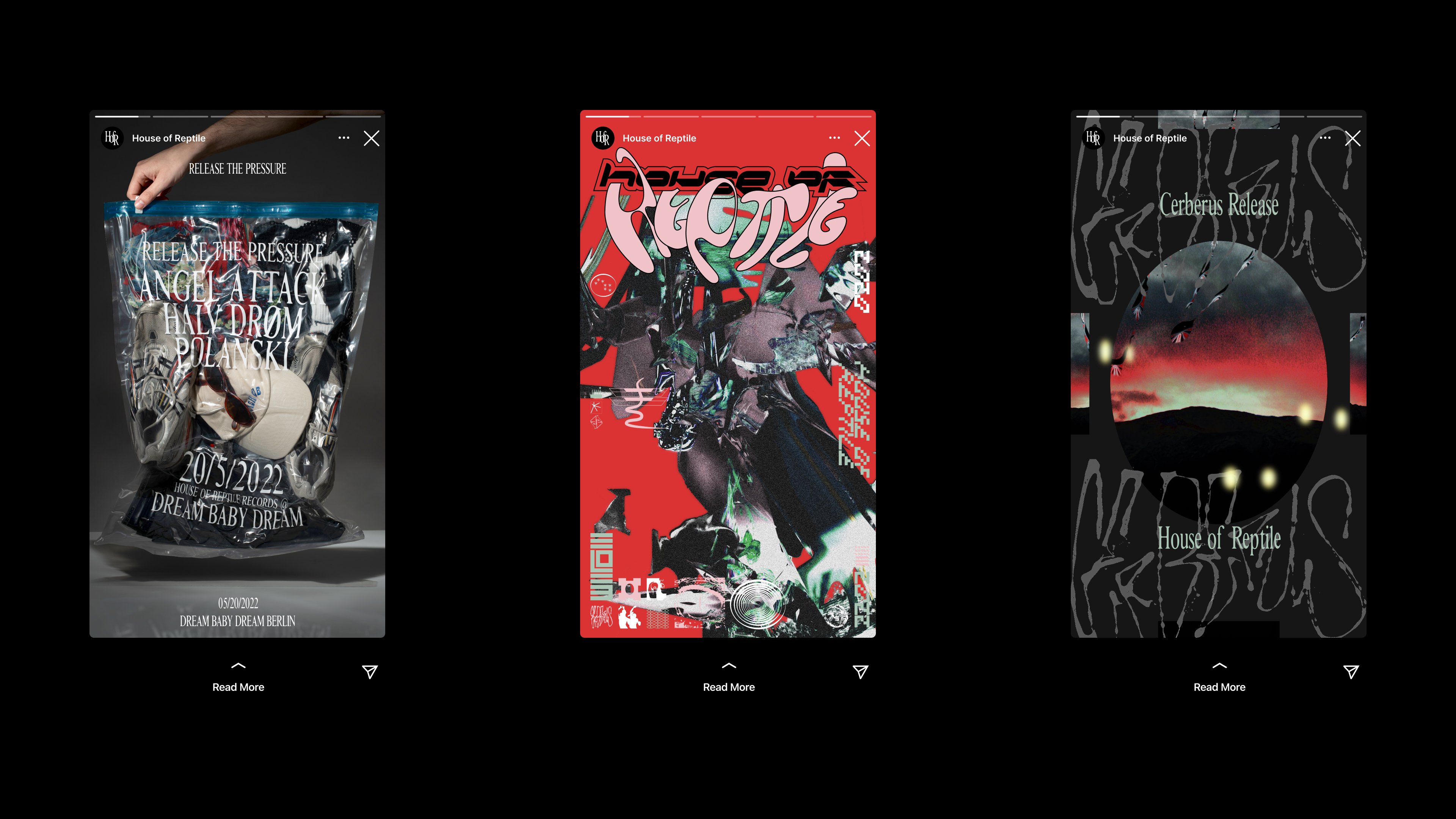
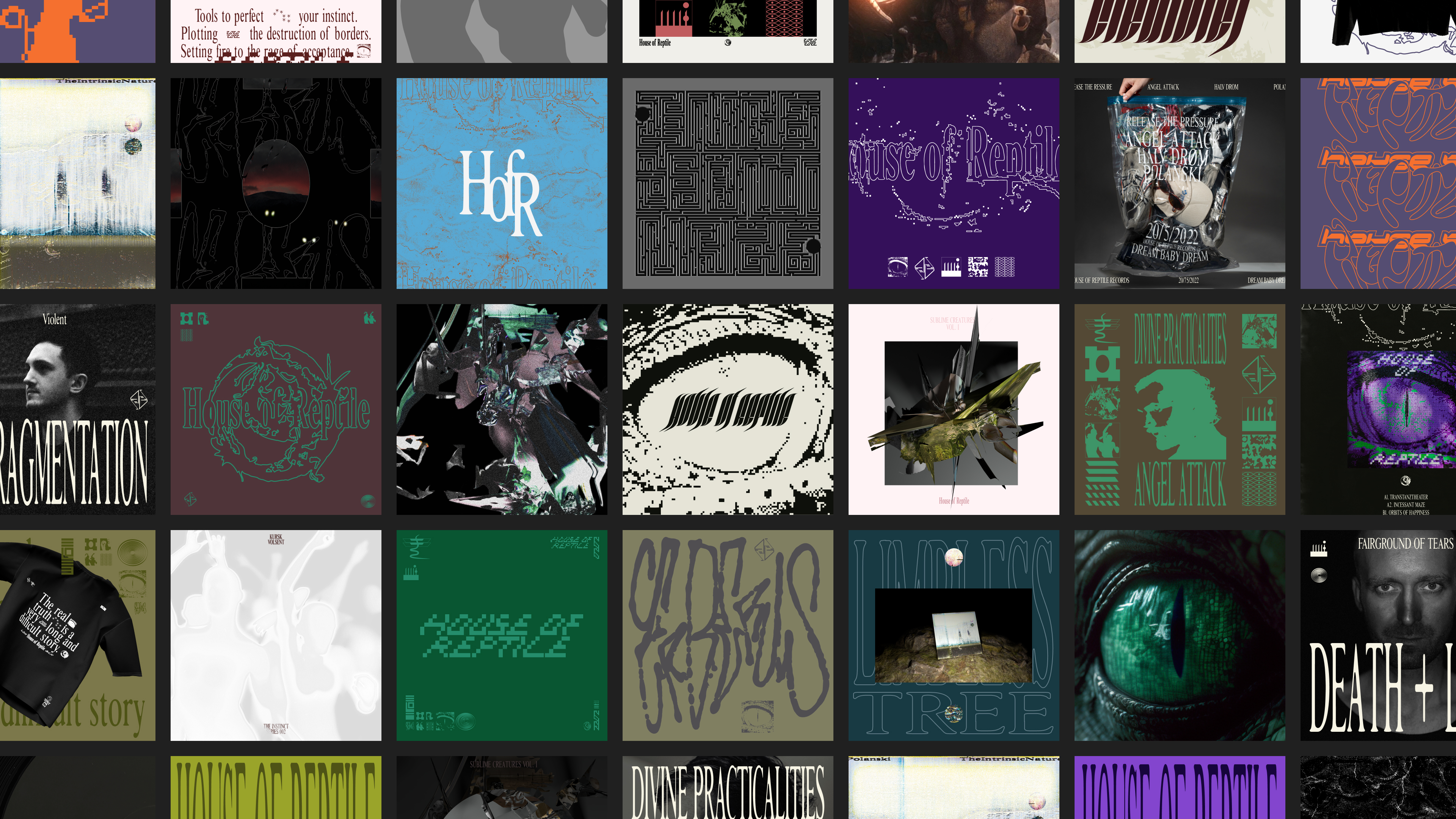
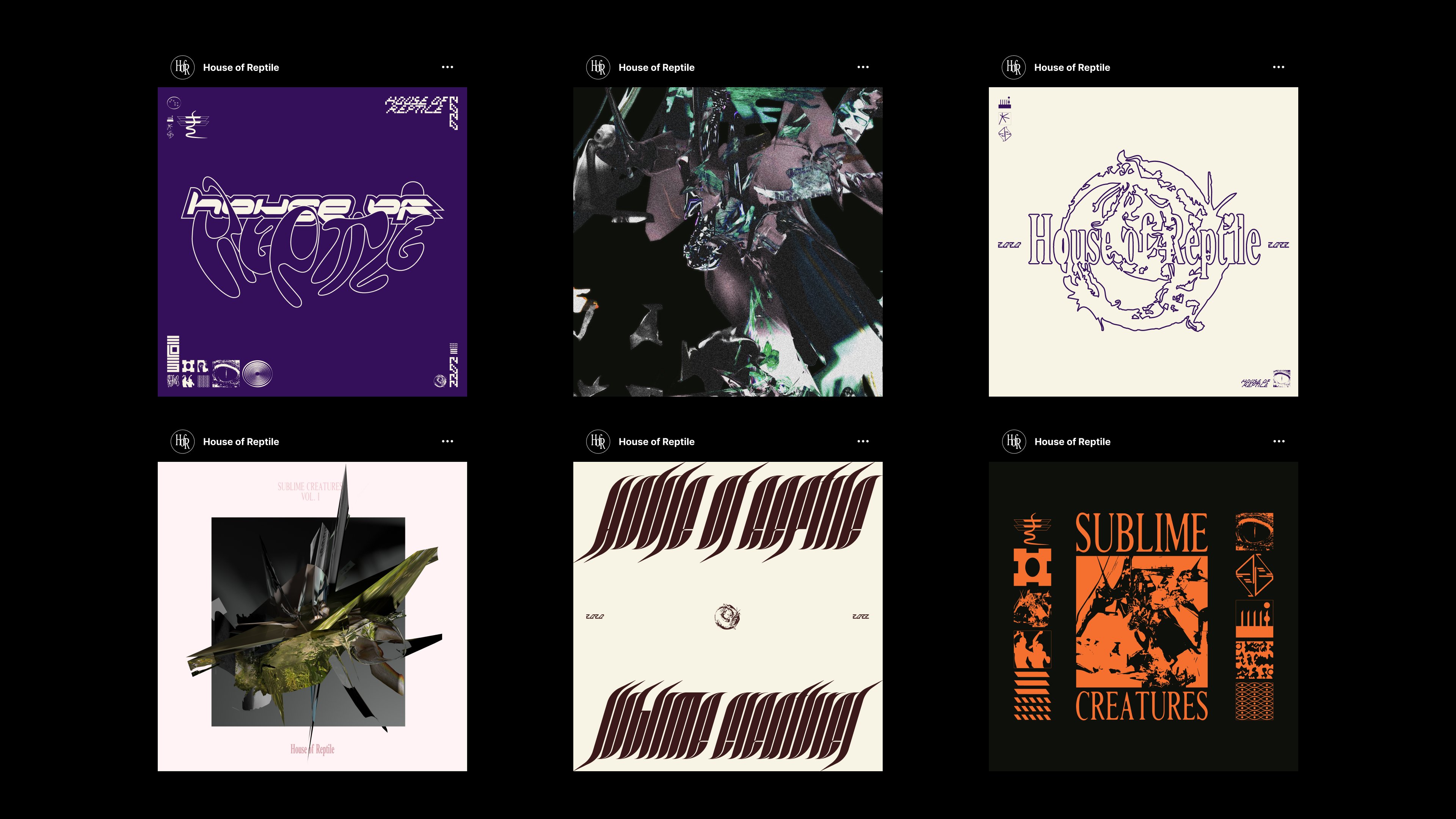
What makes this project interesting is a very bold move in which the whole idea of branding and identity design has been given a shakeup: rather than relying on a consistent, singular logo, or even a single set of icons and colour palettes, the branding is set to change with each new record release. So far, five different logomarks have been created, though Gruhl says the plan is to expand that in future. ‘The brand system is designed to grow continually’, he says, adding that the identity ‘maintains a consistent attitude while expanding its visual and graphical library’.
Such an approach flies in the face of the conventional idea of branding: countless rebrand project stories are based around an agency saying that XYZ brand had ‘lost its way’ over time – that they had to strip everything back, rediscover the core of the brand itself, make the logo more ‘proud’, etc etc.
Obviously, to parrot this piece’s opening, House of Reptile isn’t a beer/cheese/toothpaste product that needs a revamp to ‘aid brand recognition’, ‘attract new audiences while retaining loyal consumers,’ and so on and so forth. But even so, it’s brave to eschew the idea of a consistent look entirely: especially in a space with some very iconic logos indeed – just look at Warp, Ghostly, and DFA; not to mention the legacy of Blue Note’s iconic, blocky mark.
Where the House of Reptile work is smart is in finding new ways to make the brand seem consistent across releases. Yes, the logo, colours, and icons change; but within a uniform set of parameters. ‘It’s super important to us that the colours and symbols work as a cohesive unit so that when they’re used, they create a consistent feeling and work together’, says Gruhl.
The colours, for instance, usually use more ‘earthy, natural tones’. The icons meanwhile look to provide a contrast to these softer tones by being ‘more direct, more brutal’. These strange little symbols were created as a result of having dived deep into the weird worlds of alien conspiracy theories, 90s and 00s web forums, and fan fiction – not the easiest of things to wrestle into a cohesive visual identity, but somehow Studio Gruhl has done it.
Other references include ‘old star maps, ancient symbols indicating other beings, and other cryptic symbols’, which were then used to directly inform the ever-growing suite of icons and design elements for the new branding.
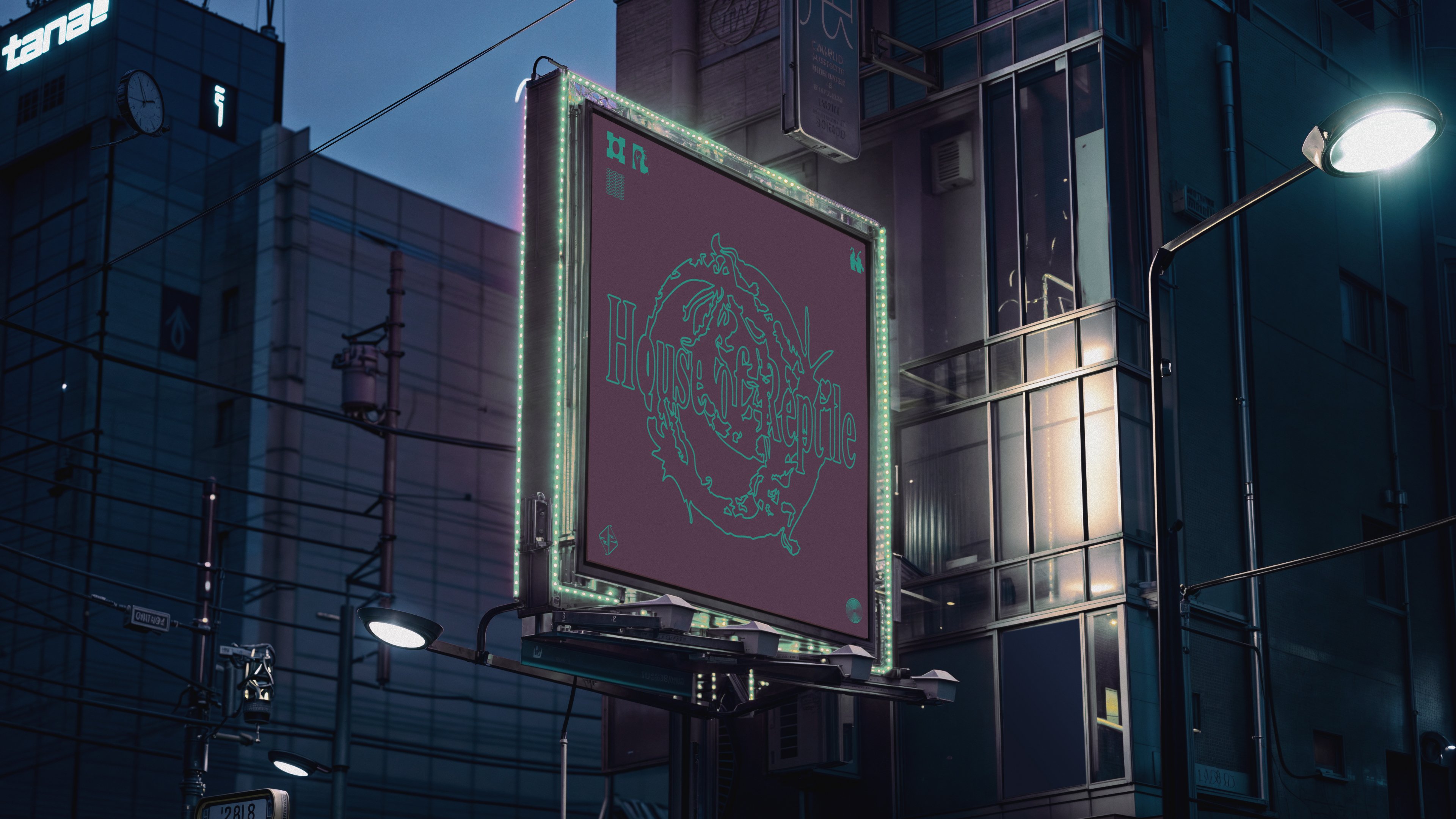
I absolutely love the House of Reptile wordmark, which really comes to life in motion applications like this. The font is quite formal in a way, but wrought in a style that makes it looks like it’s been dragged out of a clunky 1980s Xerox machine. It’s beautifully glitchy, despite being in black and white.
The wordmark typeface was created as a custom design by Studio Gruhl for the initial label’s launch back in 2020, and it works really well across other brand applications: sometimes it’s used on record sleeves, elsewhere it appears online, but it’s very strong and distinctly harks back to certain 1980s acid techno releases – not least the Psychic TV release Tekno Acid Beat, which like the HofR designs, also delights in distorted illustrations, minimal colour usage, and a grainy sort of aesthetic.
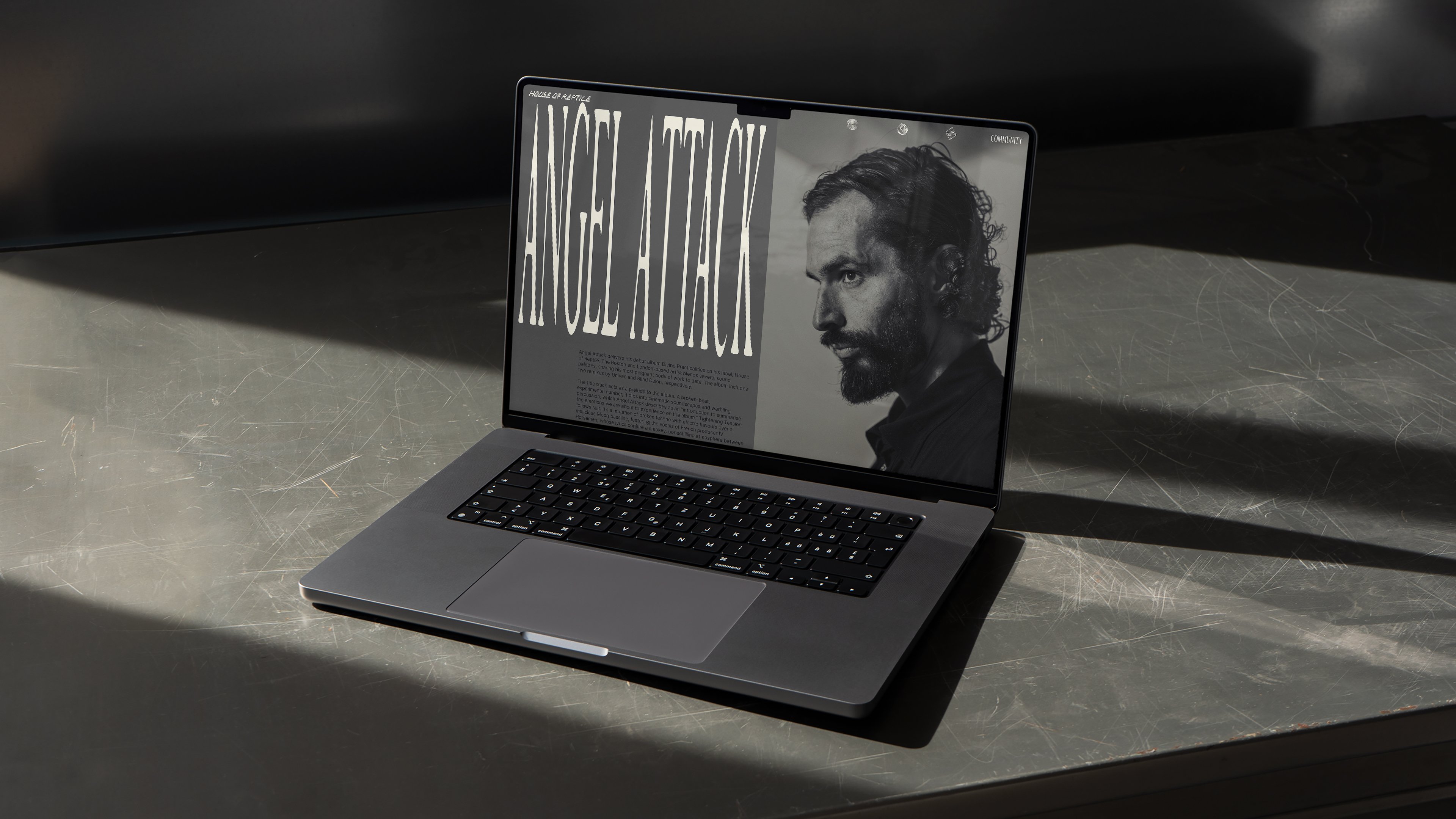
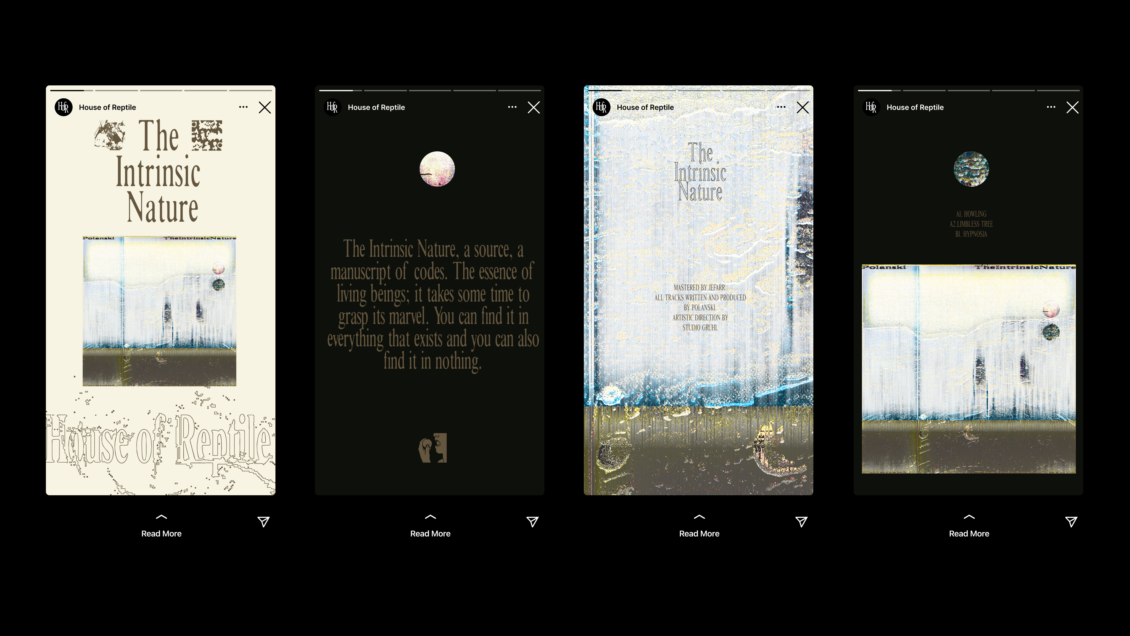
One reason that this design system works well is thanks to the client: where many record labels will use different graphic designers, art directors and so on for each release, it seems that in the case of House of Reptile, Studio Gruhl takes care of all of them. It’s smart to see each release as a branding element in itself: it’s not just the HofR logo slapped on the back, each and every record subtly recalls the parent brand. Here, each record can.
‘It’s like creating a visual history for the label, always adding something to the brand’, Gruhl points out. ‘It’s like creating small micro-campaigns for each release that work within the context of the overall brand’.
