West Loop by Landor
Opinion by Emily Gosling Posted 19 September 2024

The official blurb that surrounds Chicago’s West Loop area is that it’s the city’s ‘hottest neighbourhood… a foodie mecca’, according to Choose Chicago, a ‘cultural powerhouse’, in the words of Landor, which recently created its new brand identity.
Having never been to West Loop, or even Chicago, it’s hard to get a grasp of what this all really means. Such enthused descriptors often require a bit of reading between the lines. It makes me think about Leyton in east London, where I live – a place often optimistically described as ‘up and coming’ (which in fairness, a few tiny pockets – namely a small stretch of road near the overground and the nerve centre of priced-out-of-Walthamstow-yummy-mummydom, Francis Road – are); but which for the most part is still a place where it’s depressingly unsurprising when someone sets fire to your front door.
So to discover the real West Loop, I looked to the trustiest of research tools: Reddit. The consensus seems to be that it’s a pricey-ish part of town that attracts a lot of restaurants since the milieu is generally ‘corporate’. As one Redditor writes, ‘the West Loop gives people that trendy hype feel weather [sic] they’re temp residents till they have kids, big time earners, your clients from out of town, or some suburbanites trying to live it up. It’ll probably calm down one day and there will be a new hip neighbourhood’. So in short, a classic case of gentrification; but one that seems largely inoffensive and foodie-focused.
This all chimes with what Landor says: ‘West Loop’s identity is changing, fast. And everyone sees it a little differently.’ Therefore – as is probably the case with pretty much all place brands – it’s almost impossible to create something that pleases all the people, all the time.
The main considerations behind the new branding, which was commissioned by West Loop Community Org (WLCO), were that it had to resonate with the area’s ‘dynamic community’; help it ‘stand out from its famous neighbour, the Loop’; and cement its identity as a ‘neighbourhood to live, work and visit’, while also honouring ‘the past of West Loop and the memories that Chicagoans still hold there’. The identity had to work hard to please a lot of disparate groups, from those visiting the area for the first time to existing business owners to those who’ve been there for generations.
![]()
Landor’s branding solution broaches that tricky challenge in a smart, simple, and playful way: through using an interactive approach as well as a central concept ‘into the loop’ that’s inspired by West Loop’s ‘past, present and people’.
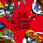
Obviously, the main graphic device is a loop – or a series of loops – which make the whole thing beautifully adaptable and flexible for a vast array of applications and purposes. It also works superbly in motion, and feels fitting for the idea of a place – something which inherently morphs, something that’s constantly shifting, just as this branding has the capacity to.
According to Landor, the ‘loop’ aims to become a ‘shared device that can be embraced by all’ which ‘symbolises not just the process of keeping everyone informed but also encapsulates the individual journeys of each person [in West Loop], highlighting how these experiences connect them with the entire community’.
The community involvement comes into play through more than mere lip service, however: we’re told that people can actively create their own graphics through the ‘create your own loop’ digital experience, but I’m struggling to find out exactly what that is, how people use it, and how long the initiative is in place for. I’m imagining some sort of platform where people can doodle their own designs, which are then displayed on some sort of digital billboard or online – but I’m just guessing here. Were it more obvious how that tool manifests, it would be a really lovely idea and truly underscore the main emphasis of the brand – something that celebrates everyone’s unique interpretation of, and interaction with, West Loop itself.


For the most part though, the loops act as unifying graphic devices, frames for text and imagery, and become simple, single line illustrations of things like coffee cups to represent the area’s various offers. Sadly, often these feel a little bit phoned in.
The colour palette is vibrant, brash and bold. Apparently though, this isn’t just to be even more multifarious and eye-catching, but to nod to various aspects of Chicago’s Meat Packing District heritage (Landor says that different tones represent things like ‘subway map colours, old bricks, new bricks and cast-iron buildings’.)

Perhaps those who are from the area, or who spend a lot of time there might spot those reference points; but to the outsider, these details are lost – perhaps because the colours are all flattened, perhaps because it just feels as though there’s been a hell of a lot of graphics/branding that look something like this in recent times: big bright colours; fat, slightly off-kilter but totally inoffensive display type; faux naif illustration style et al.
That’s my only criticism really – that for all the conceptual stuff and interactive stuff and community involvement (or so we’re told), the designs feel as though they could be for really anything at first glance. But again, place brands are incredibly thorny thing to tackle, and only time will tell how well this new legion of loops beds into the fabric of their nominative starting point.