Sendwave by DesignStudio
Opinion by Emily Gosling Posted 1 October 2024
The concepts of ‘money transfer’ and ‘community’ don’t immediately seem to go hand in hand: the former feels cold, slightly dry, potentially confusing and rather literally transactional; the latter is all cuddly and feelings and people-y.
But uniting these two seemingly disparate worlds is exactly what DesignStudio did recently in its rebranding of Sendwave, a digital platform offering money transfers from countries in North America and Europe to those in Africa, Asia and the Americas. ‘Primarily used by migrants, they aim to make sending money as easy as sending a text message’, DesignStudio explains.
Sendwave started out in 2014 as Wave, rebranded in 2019 to separate Wave and Sendwave (we’re just focusing on Sendwave here, which is now very much its own entity) and earlier this year brought DesignStudio on board to ‘better position the brand for its next stage of growth’ with a new visual identity.
The branding agency says it started out with a series of immersion workshops to garner insights from the communities that Sendwave serves and get direct feedback from its users about their requirements. This appears to be the starting point for the whole community thing: ‘Checking in with them throughout our journey, their feedback helped us create a brand that is always community centred’, says DesignStudio.

The focus on the idea of global citizens is represented brilliantly by the logo: it feels pretty old school in that it would (almost, but not quite) happily fit alongside the smart, succinctly memorable logos of yesteryear – the likes of Chermayeff & Geismar’s 1961 Chase Bank octagon, et al. Comprised of two ‘S’ shapes (I’m guessing it’s two to signify the transfer of money from one to another, since it has nothing to do with the brand’s name), the letters neatly converge together to make a satisfying, swirly globe. It’s simple and it’s clever, and it really comes alive in motion, ‘elegantly referencing Sendwave’s ability to link communities across the world’, according to DesignStudio.
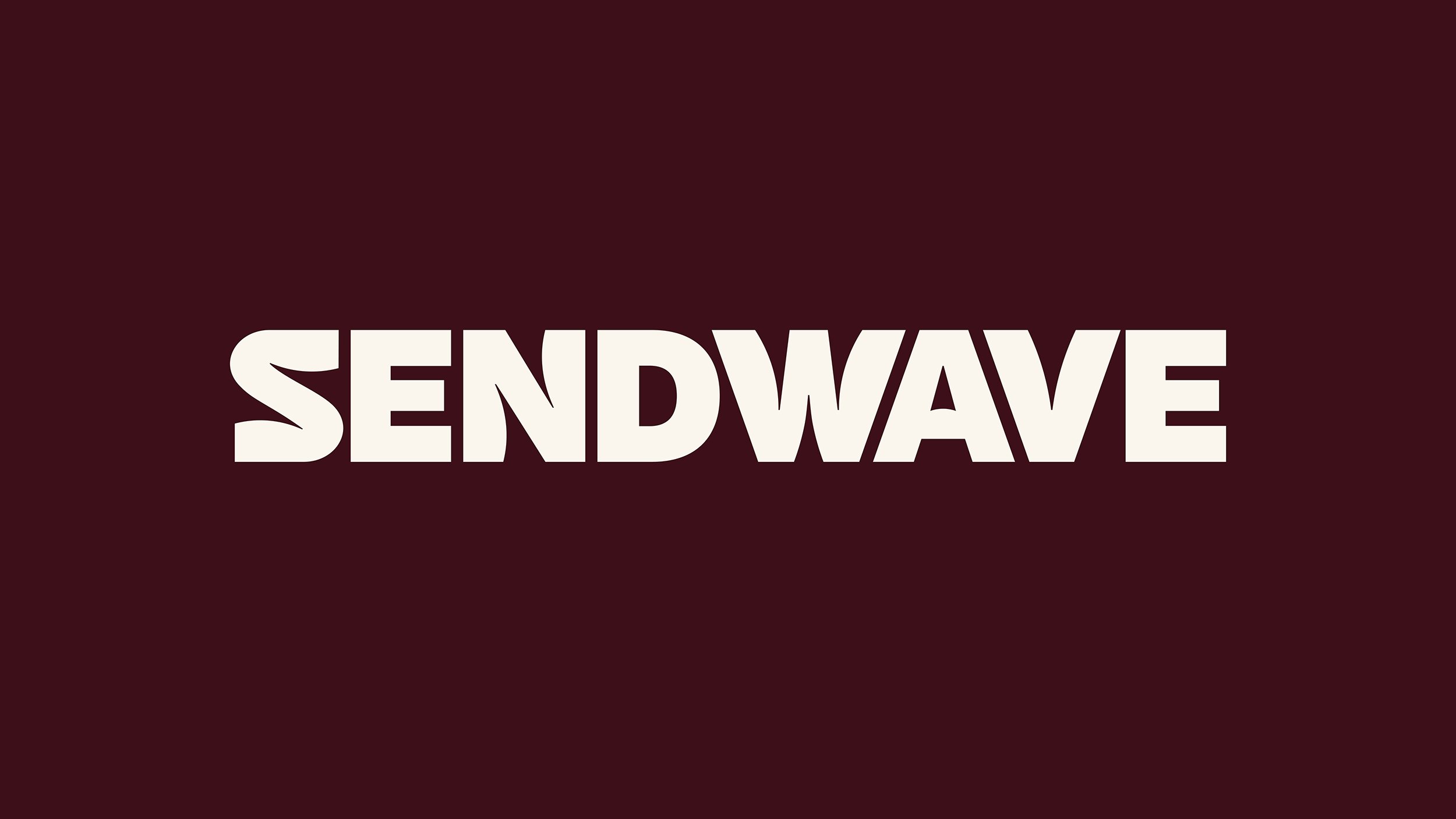
The full wordmark is also lovely, but not quite as great as that icon. For some reason, DesignStudio opted to create it in a dark brownish maroon tone, which is neither eye-catching nor pretty, but all that aside, the letterforms are certainly aesthetically pleasing. They also nod to the brand’s name with their subtly wavy edges on some letters.
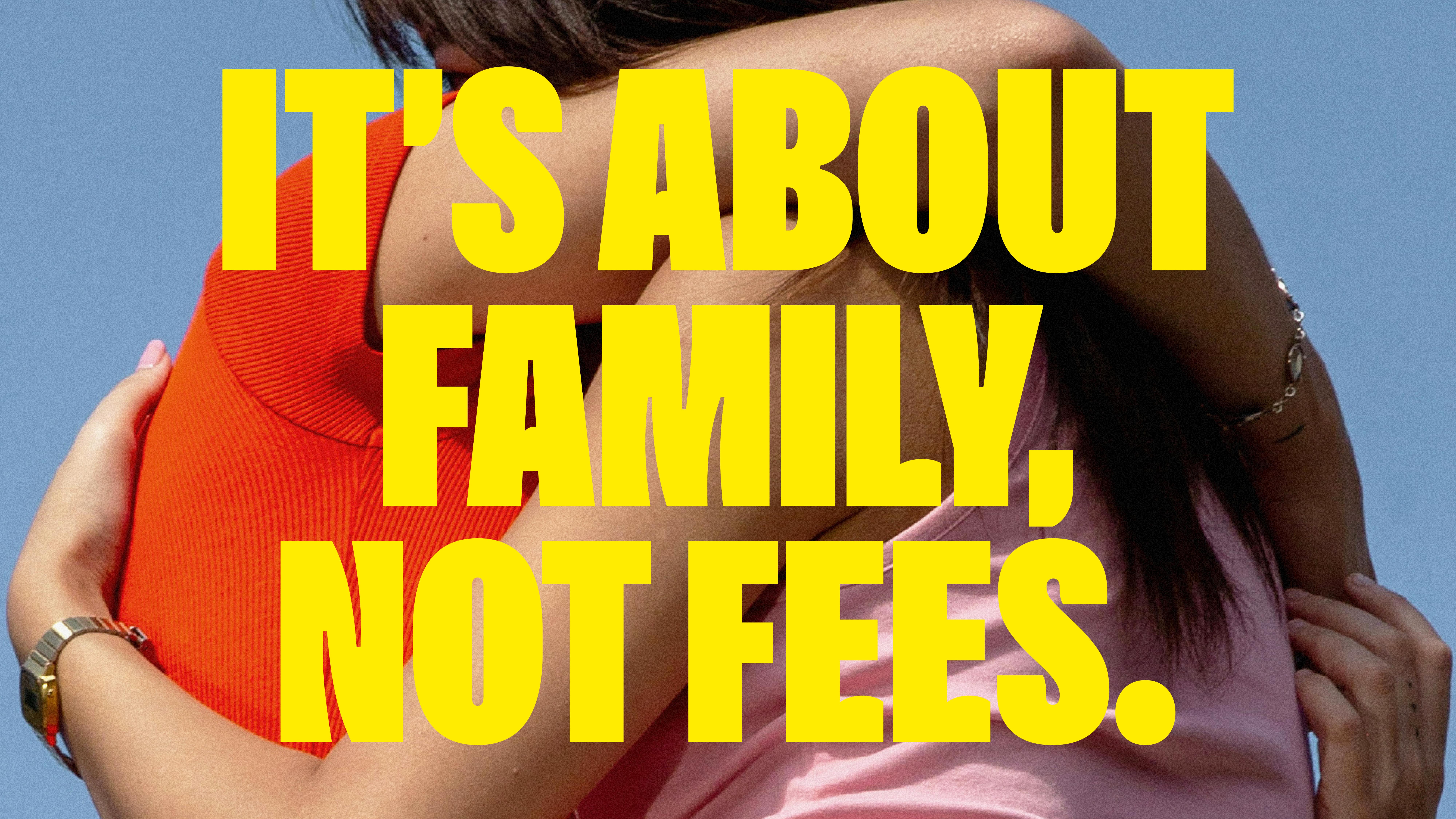
The typography is consistently strong across the identity. DesignStudio collaborated with Czech Republic-based Florian Karsten Type Foundry to create the custom Sendwavy brand typeface – one packed with personality and, naturally, waves. As the studio explains, ‘The typeface features custom glyphs that can change the direction of the wave to create playful typographic layouts’.
Waves – or should I say ‘Sendwaves’ – are the central motif and graphic device for the whole new identity. It’s an obvious route perhaps, but it works: it feels fun, energetic, and certainly chimes with the idea of community in that a wave implies a sort of collective, rather than singular motion.
Likewise, the new brand tone of voice focuses on the idea of being ‘warm and relatable’ rather than the tried and tested more authoritarian, ‘trustworthy’ approach that finance-focused brands have traditionally taken. The new tagline, ‘For here. For there. For home’ doesn’t quite work for me – I’m not really sure what it’s saying, or how catchy it is aside from the repetition of ‘for’, but in the broader context of the rest of the branding, it’s fine.
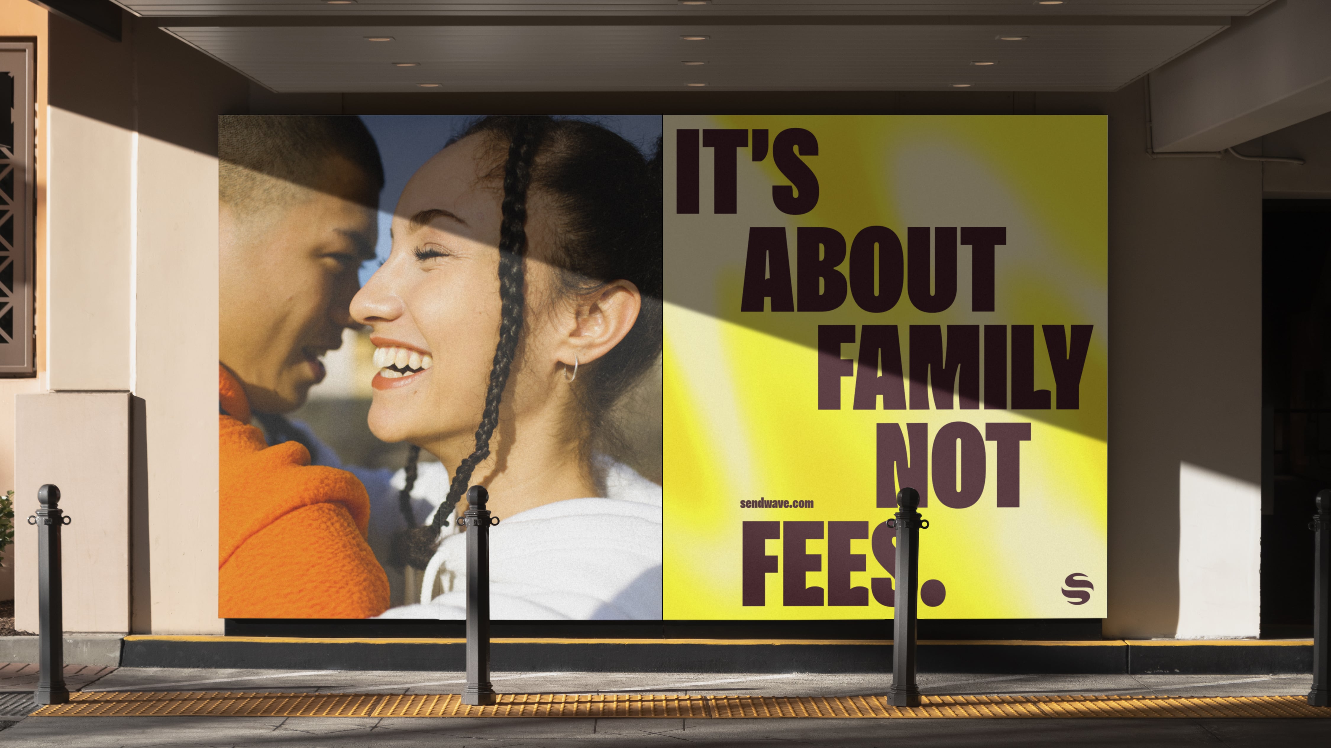
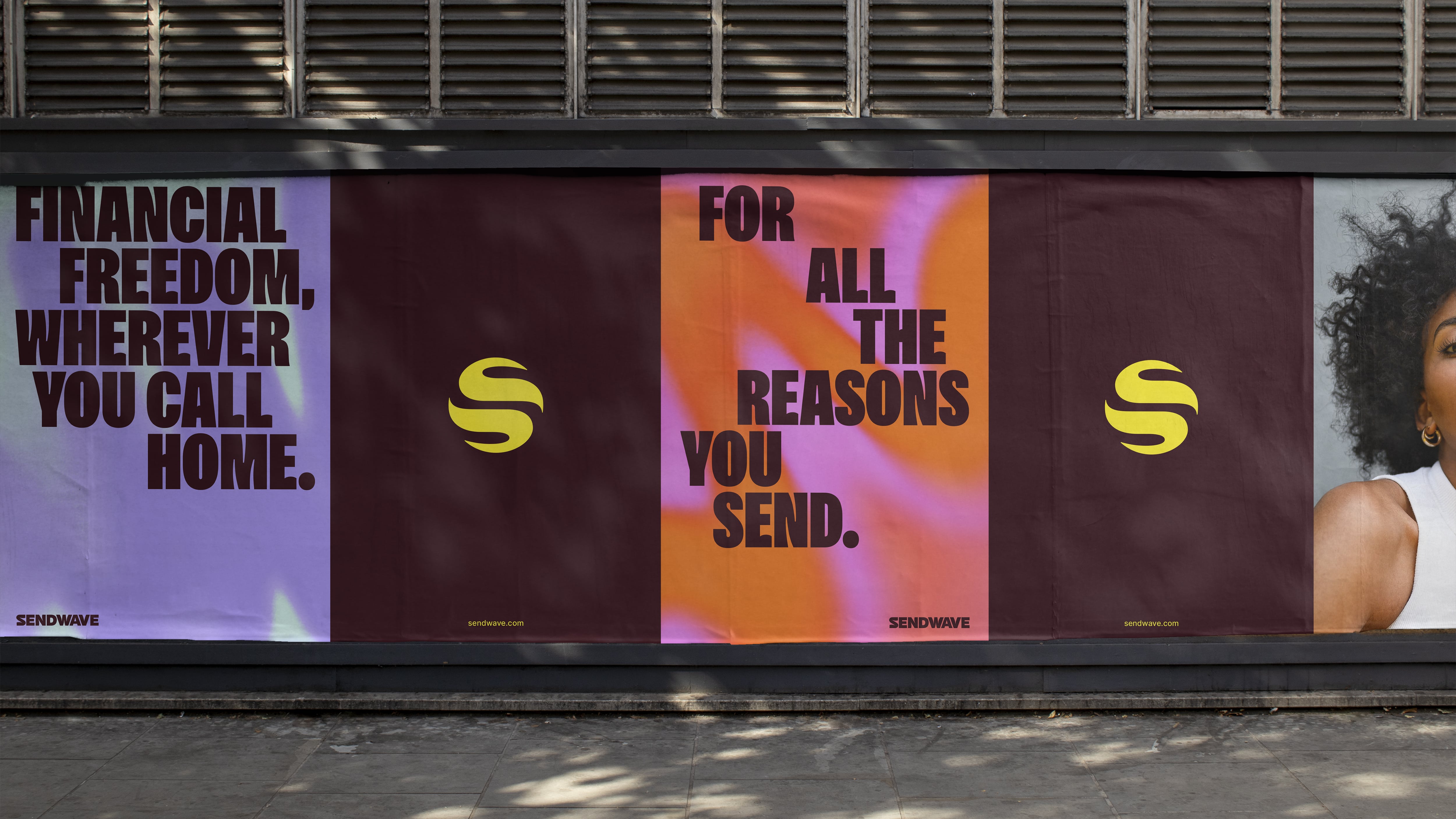
While the Sendwave website sticks to a strange, rather school uniform-ish colour palette of that maroony brown and yellow, things get a lot wilder in brand applications like social posts. The vivid lava-lamp-ish gradients on posts like this undoubtedly look good, if slightly ‘boardroom consensus of what Gen Z looks like’.
The entire approach to the design seems to fly in the face of what you might expect for a brand that’s essentially focused on finance: it’s far more playful than it is serious; more Depop than PayPal. Does it feel more style than substance? That feels debatable – but just because it’s not traditional doesn’t necessarily mean it doesn’t work.


