Jaffa by Earthling
Opinion by Emily Gosling Posted 22 October 2024
This took me probably longer than it should have to get my head around, but bear with me: Jaffa oranges – also known as Shamouti oranges in Arabic – are a specific variety of orange cultivated in Israel, Palestine, Cyprus, Iraq, Lebanon, Syria, Jordan and Turkey, known for their relatively few seeds and tough skin. These qualities make them especially suitable for export, and they take their name from the city of Jaffa in Israel.
The Jaffa name also denotes a global brand for the export of Israeli citrus fruit, and is owned by the Citrus Marketing Board of Israel. ‘Jaffa Fruit’, however, is a different brand in its own right, which comprises various other fruits such as grapes, melon, and pineapples, alongside oranges and other citrus fruits, and is sold in Tesco stores throughout the UK.
It’s the latter we’re talking about today; the reason being its superbly playful, cute, but effective new branding courtesy of London-based Earthling Studio.
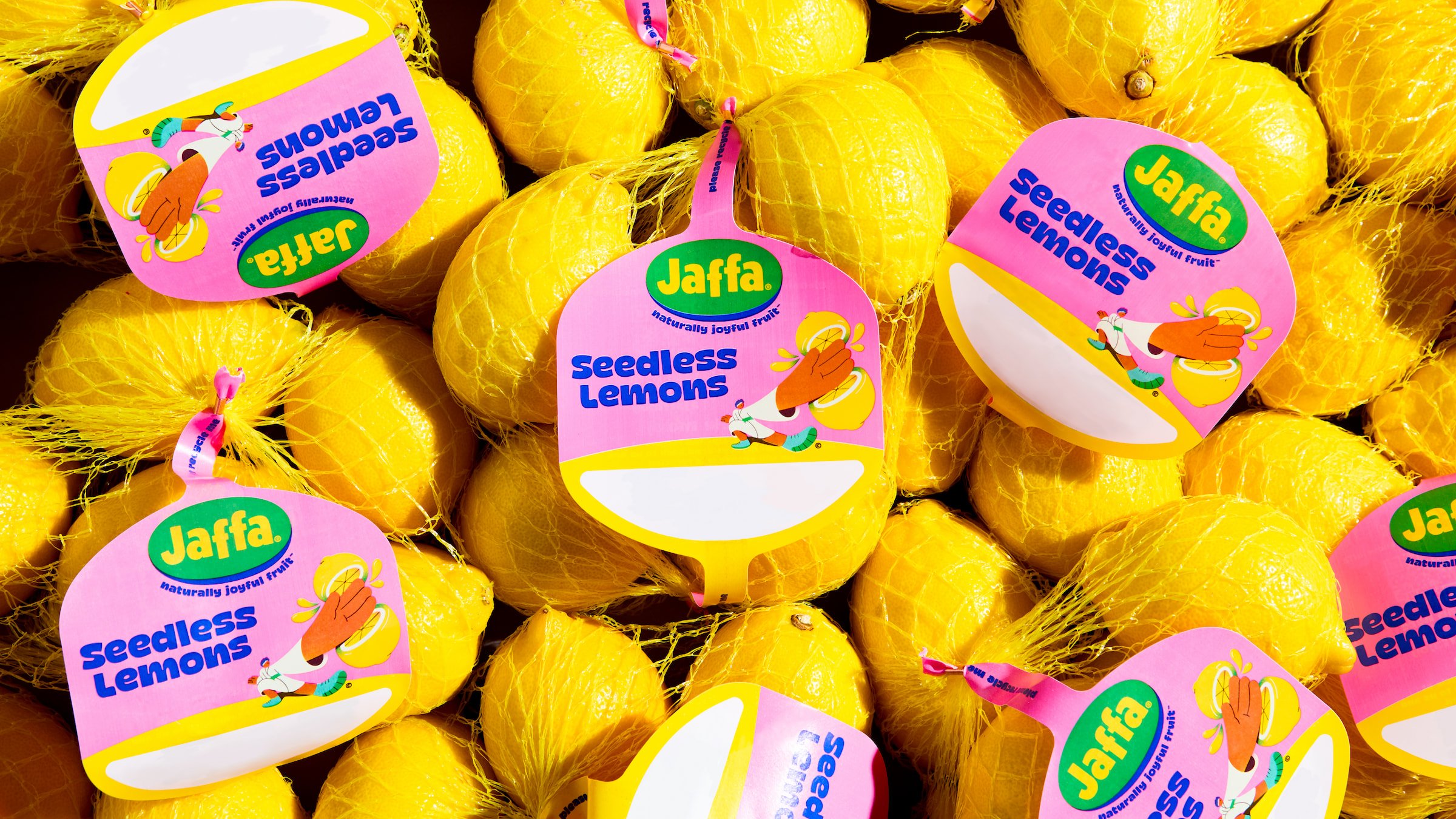
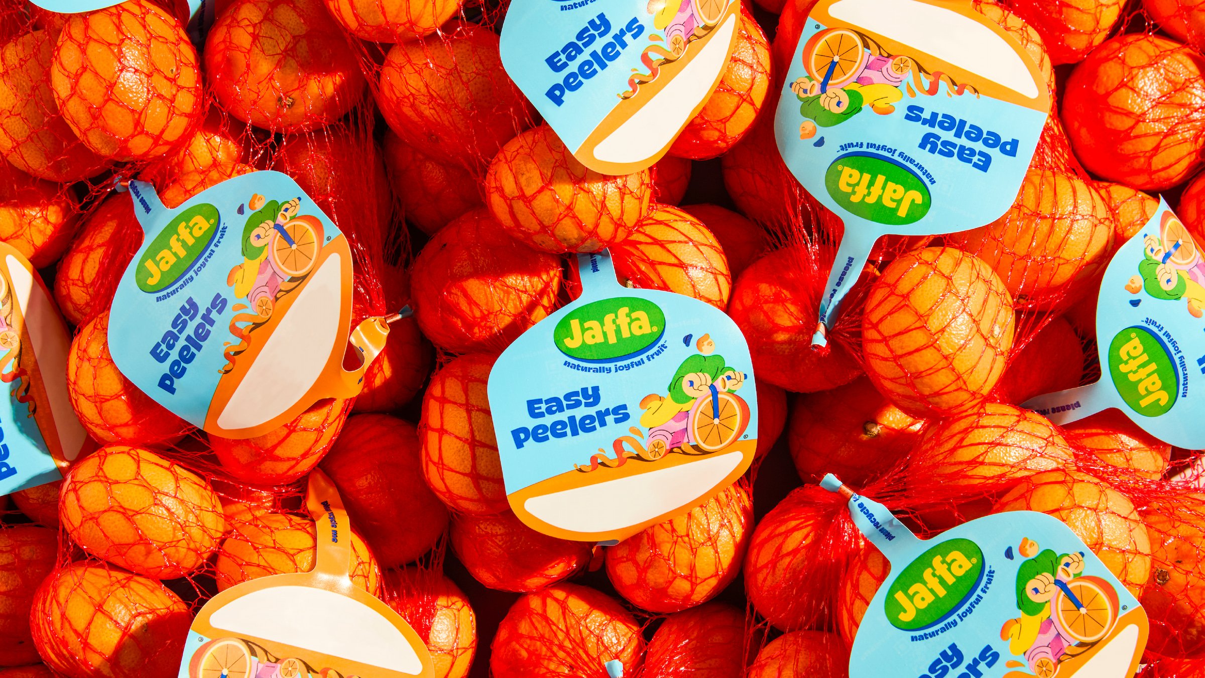
The studio worked across brand strategy, identity, and guidelines; a suite of new illustrations and animations; logo design; packaging; tone of voice; typography; and web design. The identity is used across everything from tiny fruit stickers to the Jaffa website and social platforms such as Instagram; with everything united under the simple, strident and beautifully economical strapline ‘Naturally joyful fruit’.
Earthling says it was briefed to ‘reimagine the identity and packaging for the UK’s leading citrus brand, inspiring a new generation of consumers with a focus on freshness, quality and juicy natural goodness, while providing a system to support ongoing product innovation’.
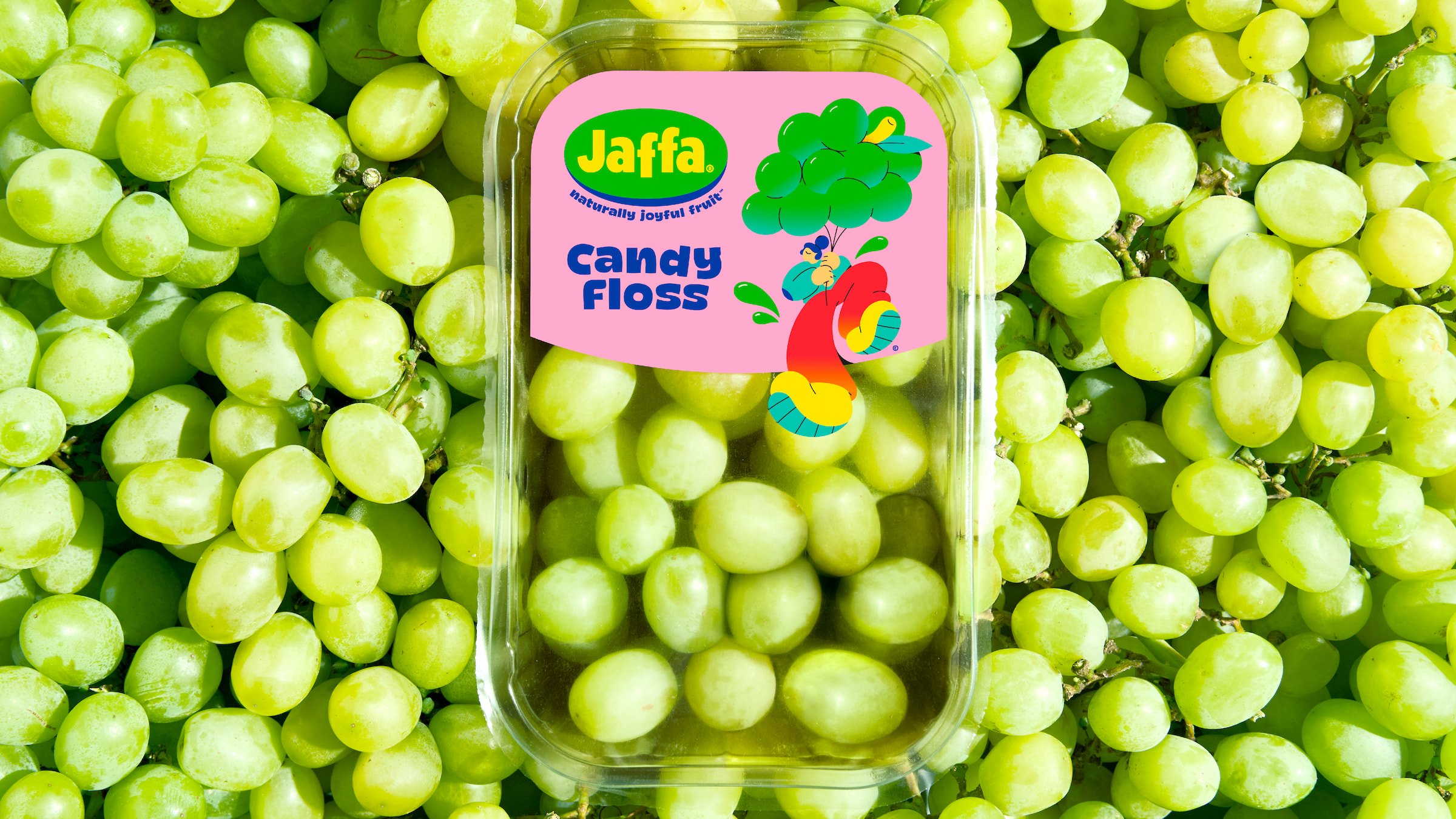
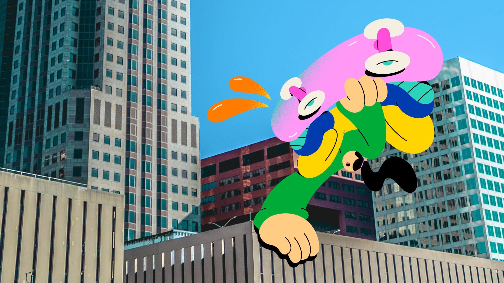
According to the studio, the previous logo didn’t feel totally aligned with the brand’s underpinning principles of ‘delivering quality and everyday joyful moments’. Its first step was to look back to the brand’s heritage and attempt to unearth, as it were, a ‘timeless, simple and playful expression’.
And it’s certainly hit the nail on the head when it comes to playfulness. While the previous logo wasn’t exactly po-faced, Earthling has dialled up the ‘fun’ by brightening up the former colours rather than changing them, and doing away with the sense they had of being viewed through slightly dirty perspex.
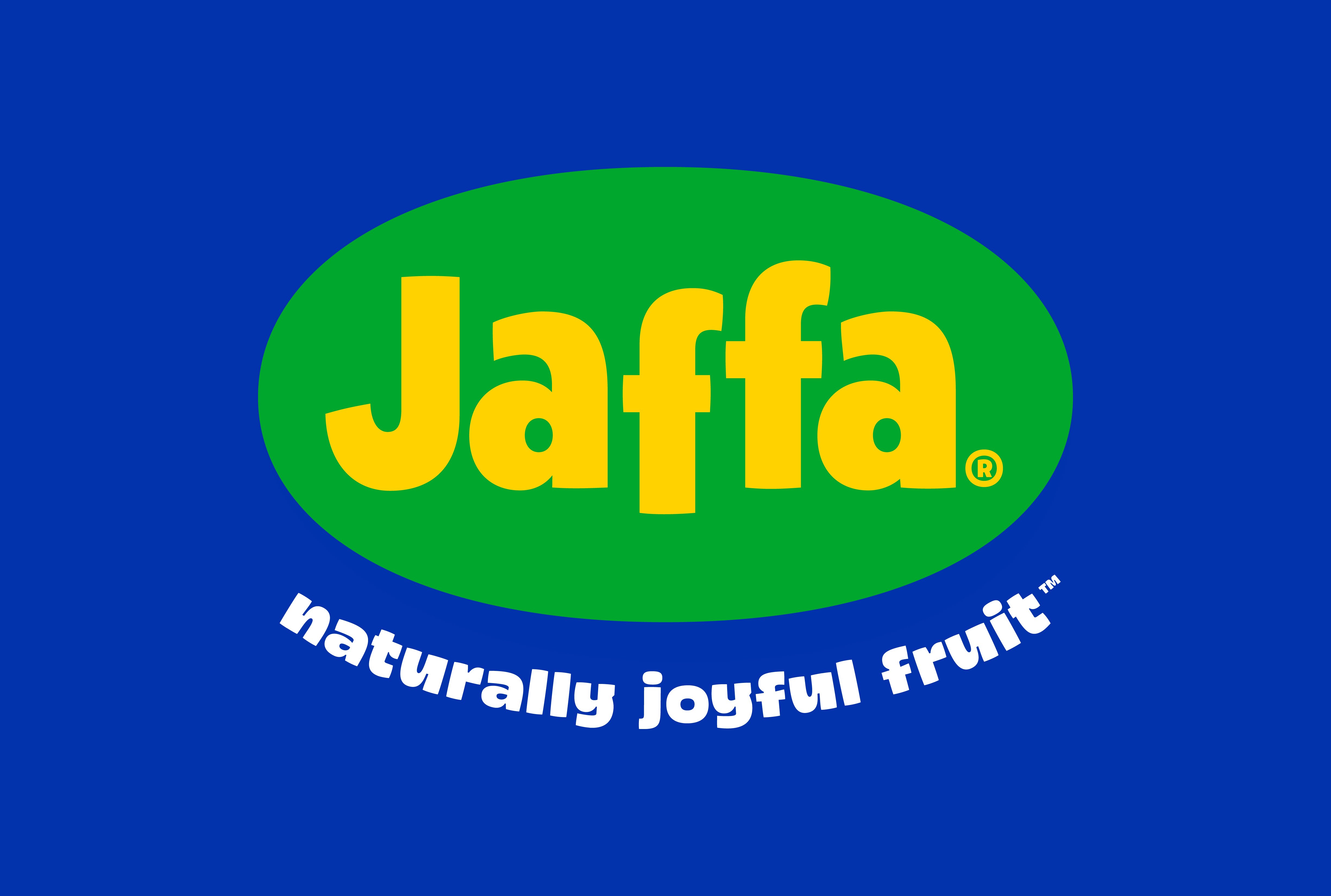
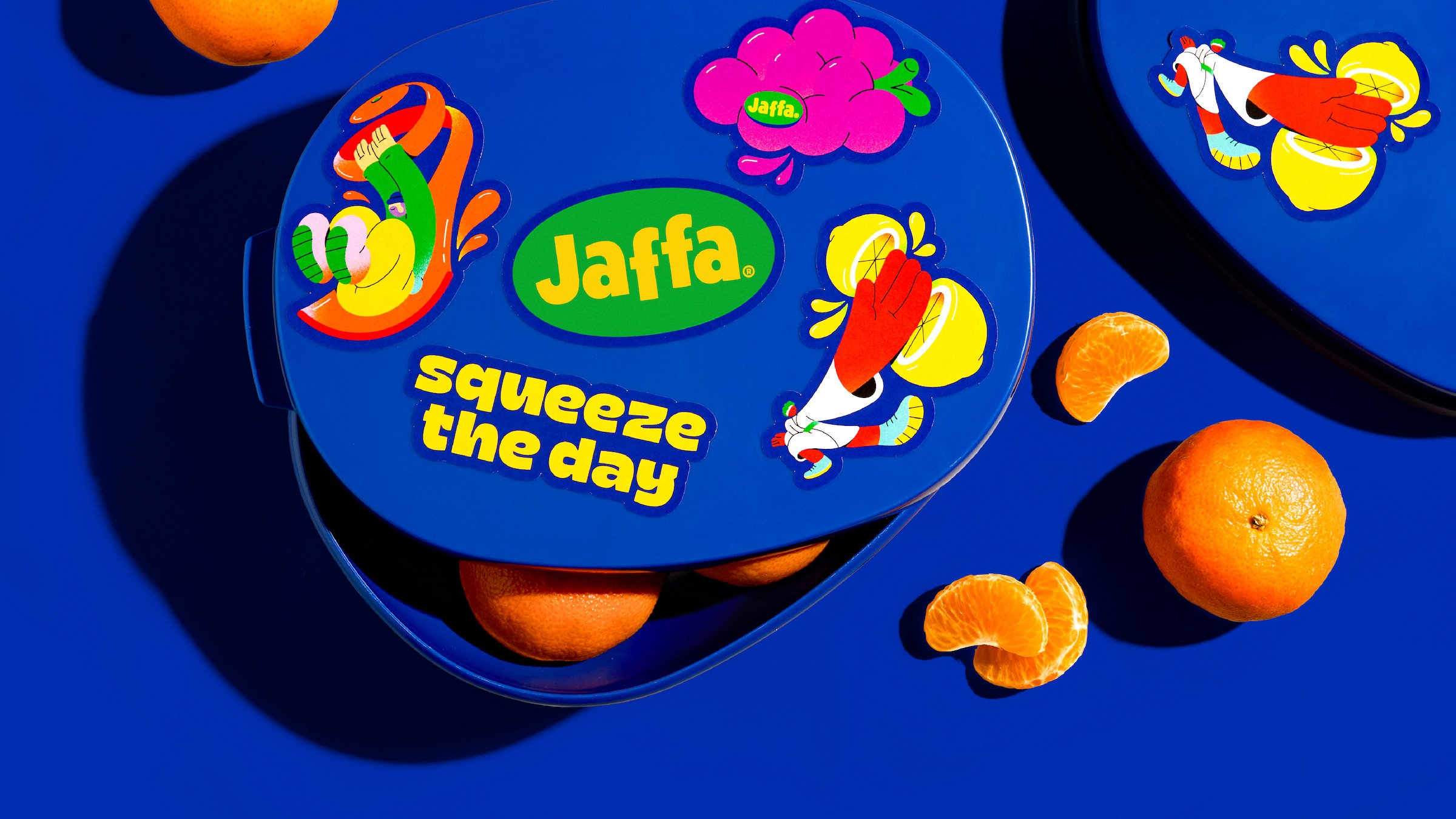
The new identity is all about the pop: bold, vibrant green and blue; typography that’s so full of life it looks like it’s about to jump off the sticker/box/website and dance a little jig with you, just for the hell of it. If it’s increased standout that the new look aims to achieve, we have no doubt it will do so.
Earthling describes the new logo as ‘dripping with humanity’, and we’d agree. The font Chowee by Indonesia-based designer Vova Egoshin is perhaps an unusual choice as a brand font – it’s so ‘out there’ as to be almost an illustrative element in its own right, with its rollicking curves and thoroughly extroverted decorative characters.
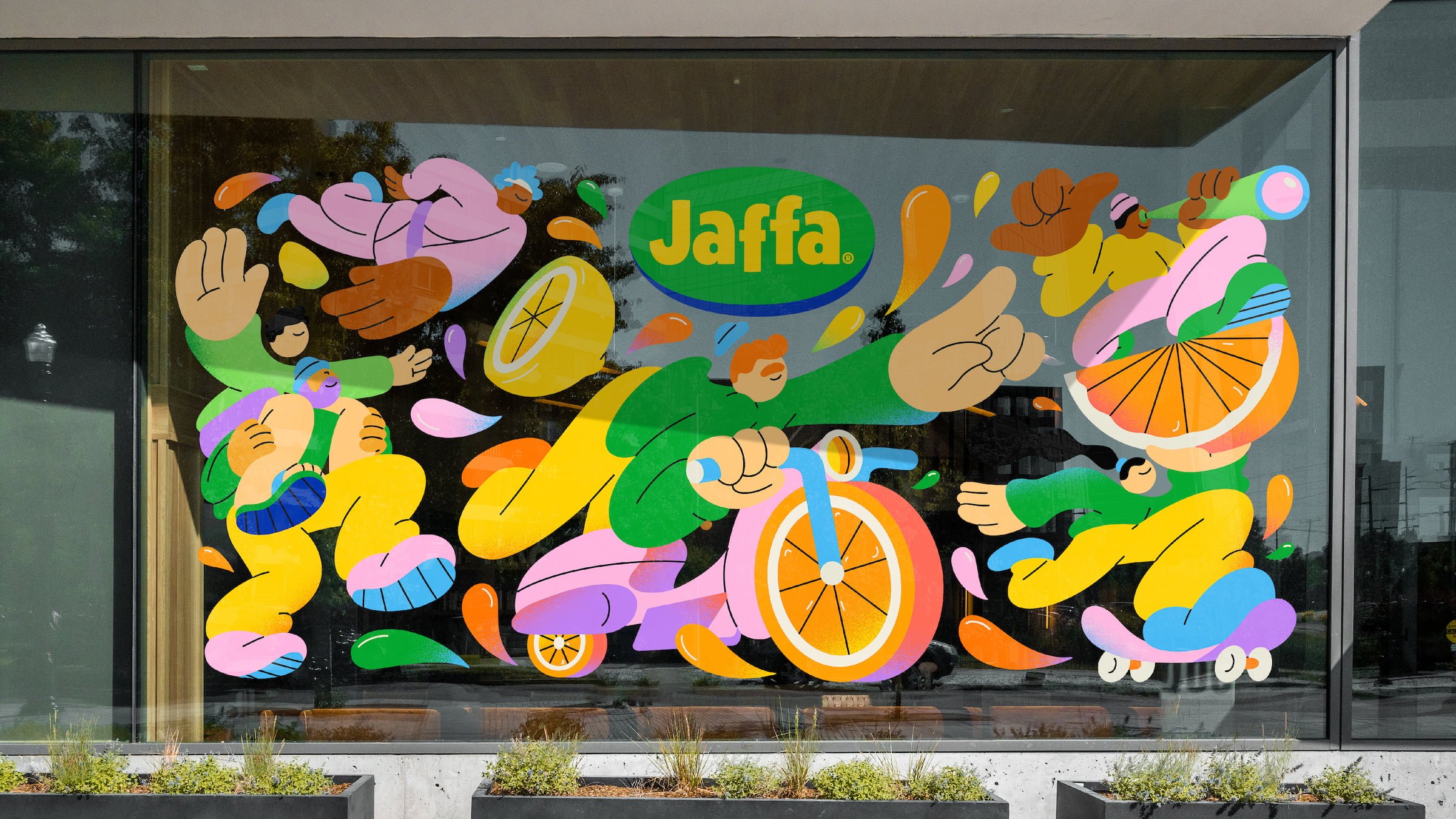
But then the whole identity is absolutely chock-full of life, underscored beautifully by a charming new suite of illustrations by Brooklyn-based illustrator Spencer Gabor. The strange proportions and eye-less faces of his characters are used here in surreal scenes where fruit becomes both scenery and the site of the action – grape hot air balloons, orange bike wheels, etc etc. It’s silly, but it works, and the way the fruits always appear bursting with life chimes nicely with conveying how fresh and juicy they all are.
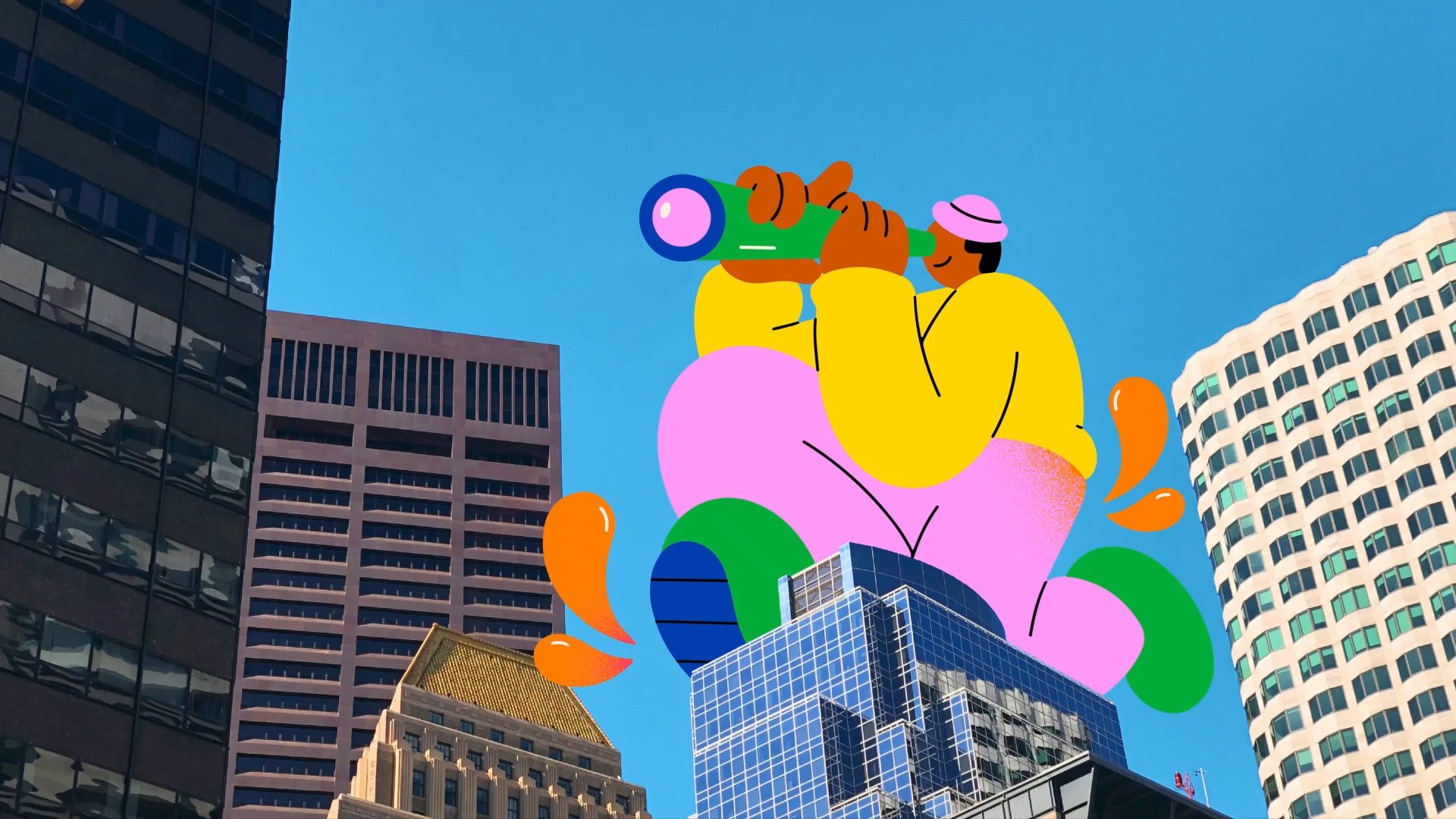
On the website, one thing that lets the overall identity down is the body copy font. Abadi, a sans serif font family designed by Ong Chong Wah and published by Monotype, is used in (I think) its Light weight, and where it works in heavier weights for subheadings and a few applications, the weight used online for larger chunks of text has a little bit of a cheap, system font-y afterthought vibe to it. But that’s really my only criticism – and we’ll let it slide here, since something had to be a little more legible and pedestrian against the rest of the wild look and feel.
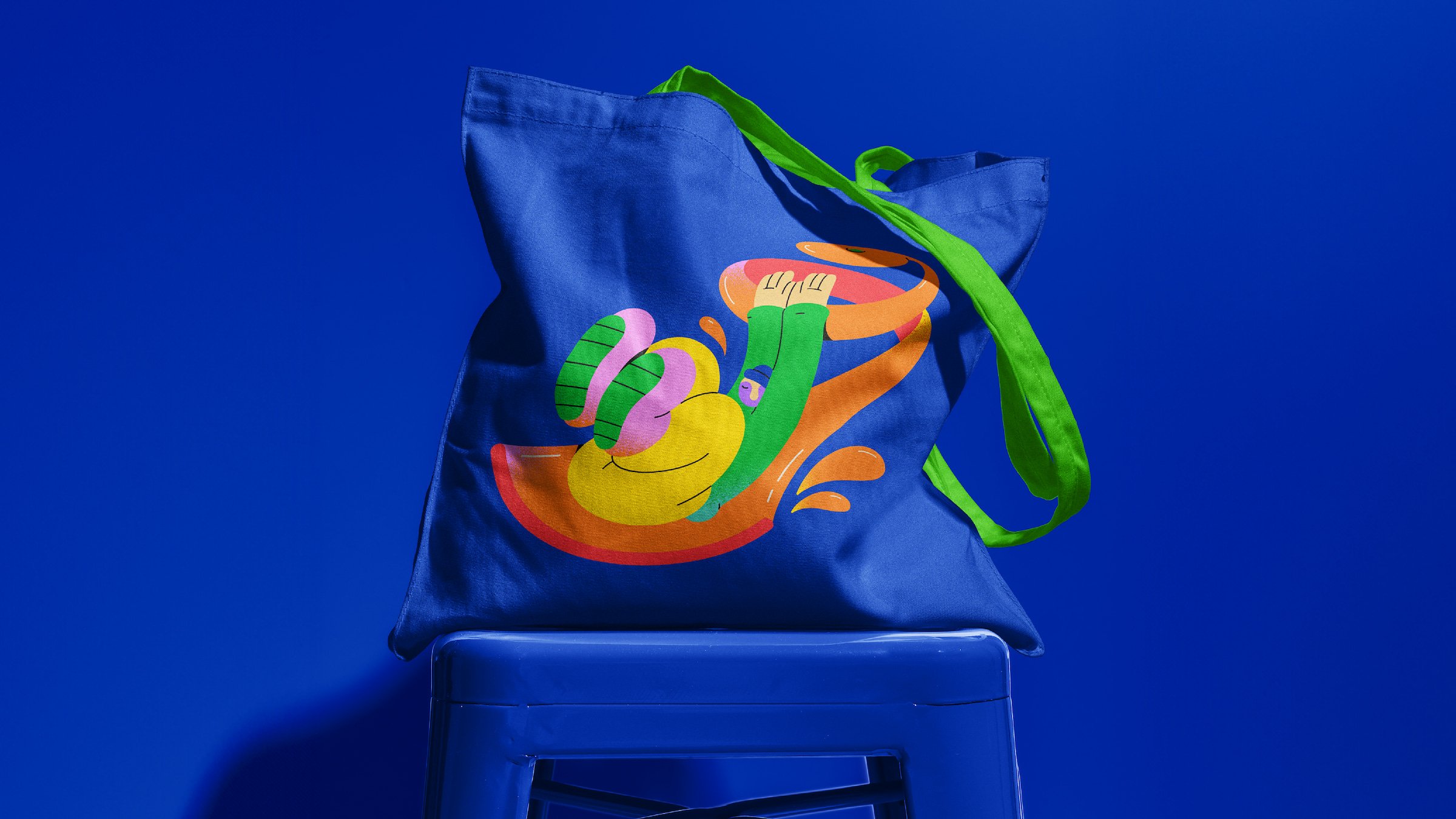
It could be argued that if you were to take the individual brand components as standalone elements they might look a bit too childlike, but as cogent parts of a bigger whole they really work. The brand font alone wouldn’t look out of place in a comic book, or in that mildly terrifying in-yer-face 90s kids’ TV show Zzzap! – so it’s an impressive feat that somehow, Studio Earthling has made the whole thing come together as a brand identity that still manages to look coherent, and something that works hard to create consistency and still underscore the idea of quality it needs to convey. I’ve no idea how they managed, but they have.
