Sustana by Collins
Opinion by Emily Gosling Posted 24 October 2024
For non-design nuts or print nerds, paper might seem pretty high up in the scale of banality and boringness. That’s likely the reason that the Wernham Hogg paper company was the setting of The Office: paper, and Slough, formed an easy sitcom shorthand for all that was unremarkable, trivial, and emphatically dry.
But in fact, there’s a lot more to paper than stationery cupboards. Indeed, the paper industry can tell us a lot about the state of the world, offering a snapshot into everything from how we consume media to how we communicate, the economics of global business and manufacturing, and the factors impacting climate crisis.
All of this and more became obvious when Collins started its work with Canadian paper mill Rolland, a leading North American paper manufacturer.
For decades, Rolland has consistently shown itself to be ahead of the curve in terms of its eco-conscious credentials: it has the smallest environmental footprint in the North American industry.
When Collins came on board, it was tasked with finding ‘a new value creation strategy’ for the company, working across the transformation of both the brand and the business. That’s no mean feat, it seems: according to the agency, ‘The global paper industry is crumbling… Waning demand and rising operating costs have fuelled a decade-long industry contraction and a pandemic of bankruptcies’. Collins continues, ‘Despite the doom and gloom, we saw a bright future for Rolland. Why? Because we knew something it didn’t: It wasn’t a paper mill.’
Well, obviously it is, but what Collins is getting at here is that Rolland had the chance to represent something far more significant: ‘At 140-years-old, Rolland represented the future of materials’, the agency adds. ‘Parallel to the energy transition is the material transition – a movement replacing “dirty materials” (which account for over 50% of carbon emissions but also drive biodiversity loss, contamination, deforestation, eutrophication, and more) with “clean materials”.’
And paper is among the dirtiest of dirty materials – the third biggest polluter of air, water, and land out of all North American industries. Where Rolland shines, then, is that it is in fact ‘clean materials mill’ (so no, absolutely not a paper mill…)
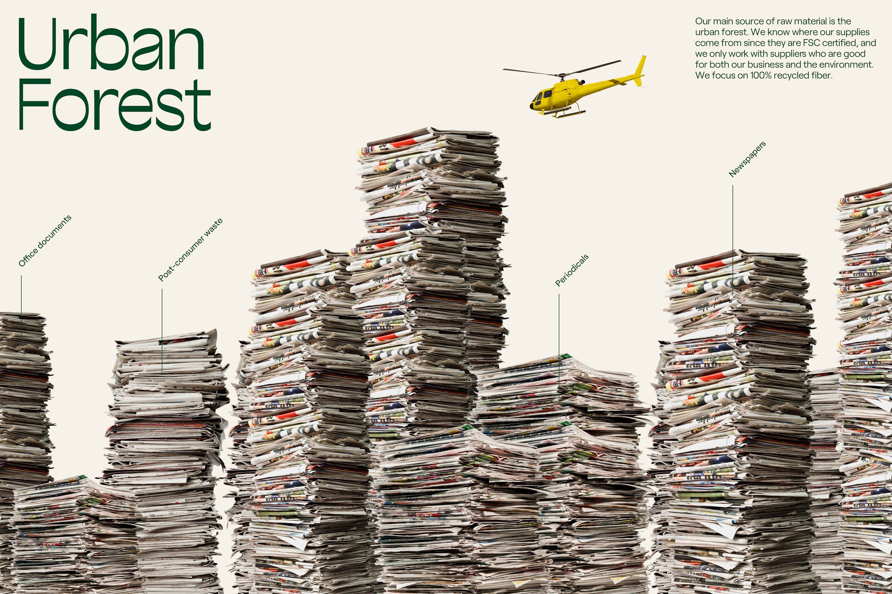
Clean materials are defined as, among other things, those that ‘optimise recycling’ (Rolland uses renewable energy and recycled fibre, as well as recycling 100% of its water) and ‘prevent waste at all stages, from creation to disposal’ (Rolland recycles paper so cleanly that the FDA has certified it ‘food-grade’ quality, we’re told).
The problem with the former branding was that none of these credentials were obvious – to all intents and purposes, it was still very much just a paper mill.
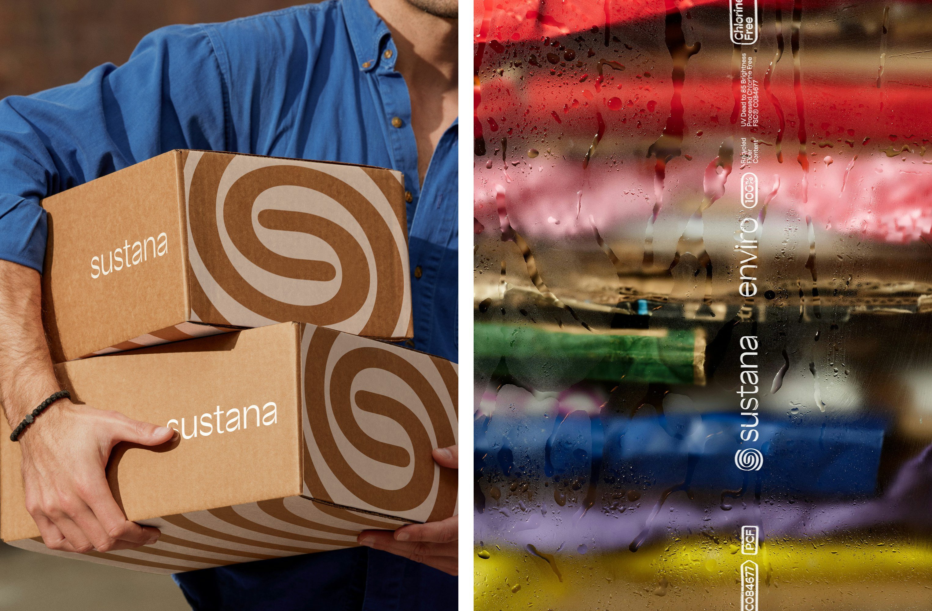
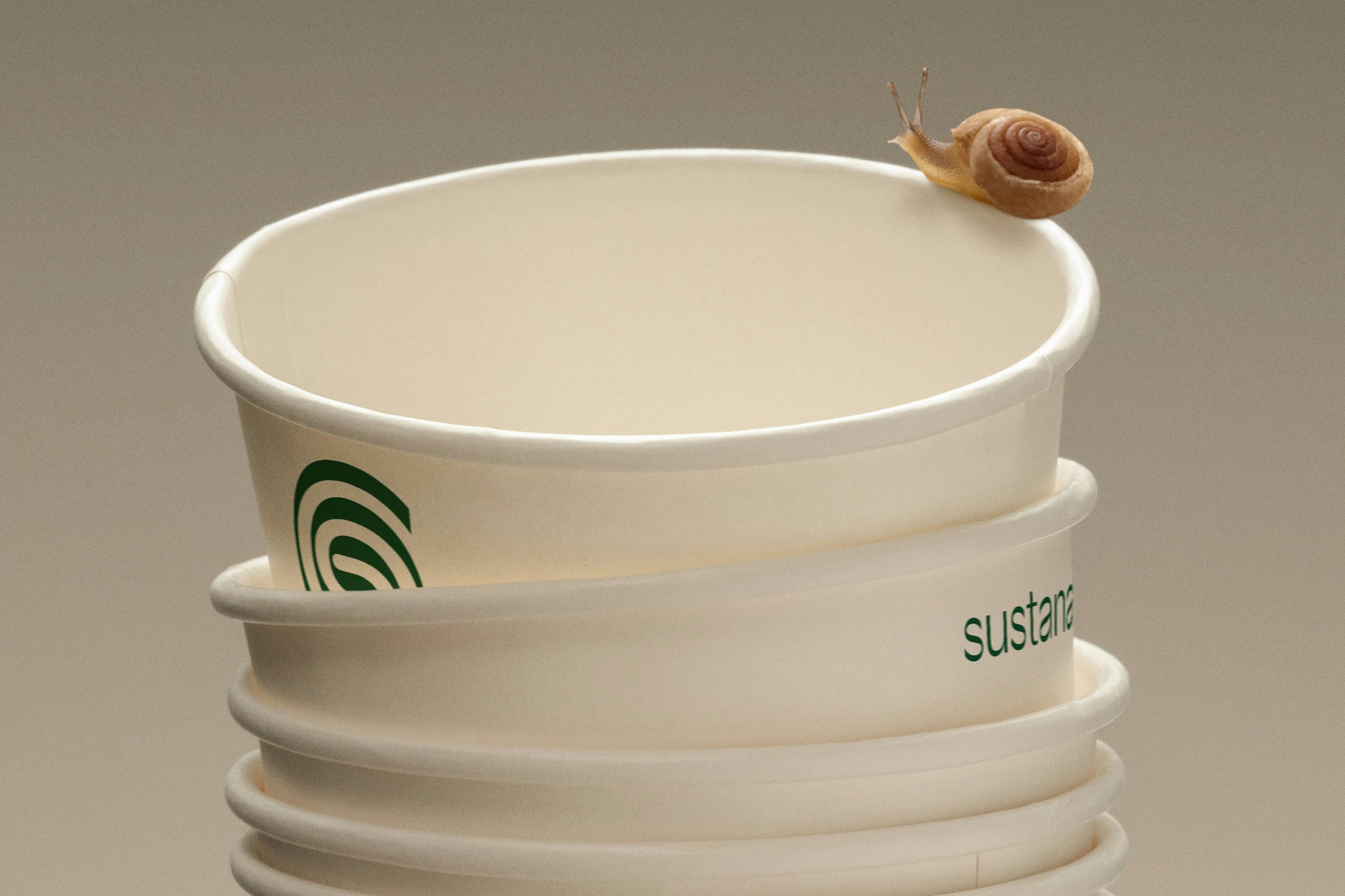
The most obvious shakeup is to the name, with the company relaunching as Sustana. The name (and ethos) isn’t new to the company: it started manufacturing recycled paper back in 1989, and in 2019 released the first Life Cycle Assessment for Sustana EnviroLife fibre – the-mill-formerly-known-as-Rolland’s 100% recycled, fluorescent-free fibre for sustainable food packaging such as paper cups, cartons, food wraps, and food containers.
The new Sustana name spearheads Collins’ other major overhauls to the business, such as defining a ‘clean material acquisition strategy’. Crucially, this instantly helps move the brand away from being all about paper: the market for clean materials (such as the aforementioned food packaging) is apparently 4.5x times larger, so it’s a pretty lucrative shift.
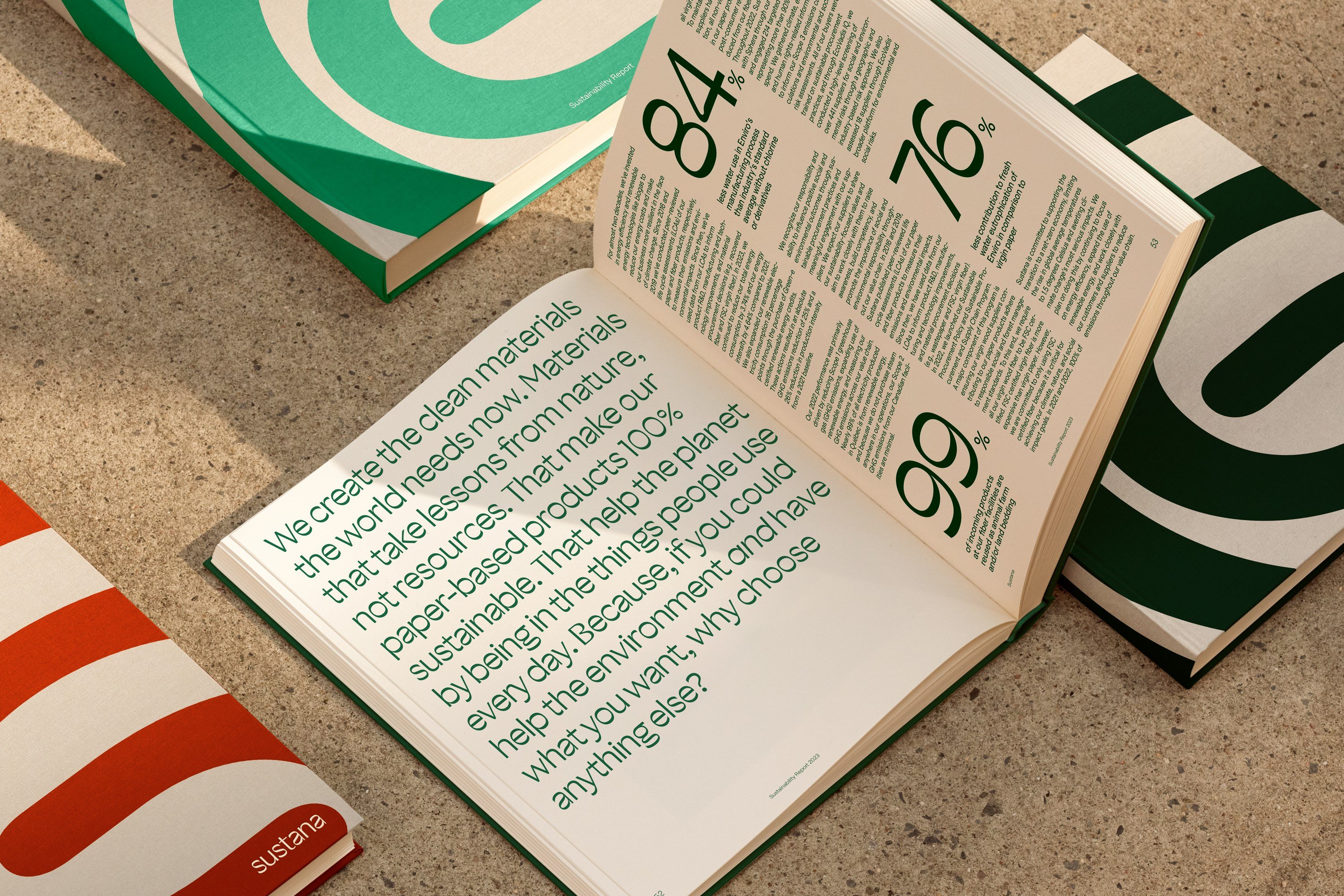
All of that is neatly summed up with a newly defined mission, ‘Adding sustainability to everyday products’. And when it comes to the visual identity, the ‘clean’ thing is conveyed beautifully: nothing about this screams ‘mill’, but it does scream ‘clean’, with a neat pared back colour palette of whites and turquoise.
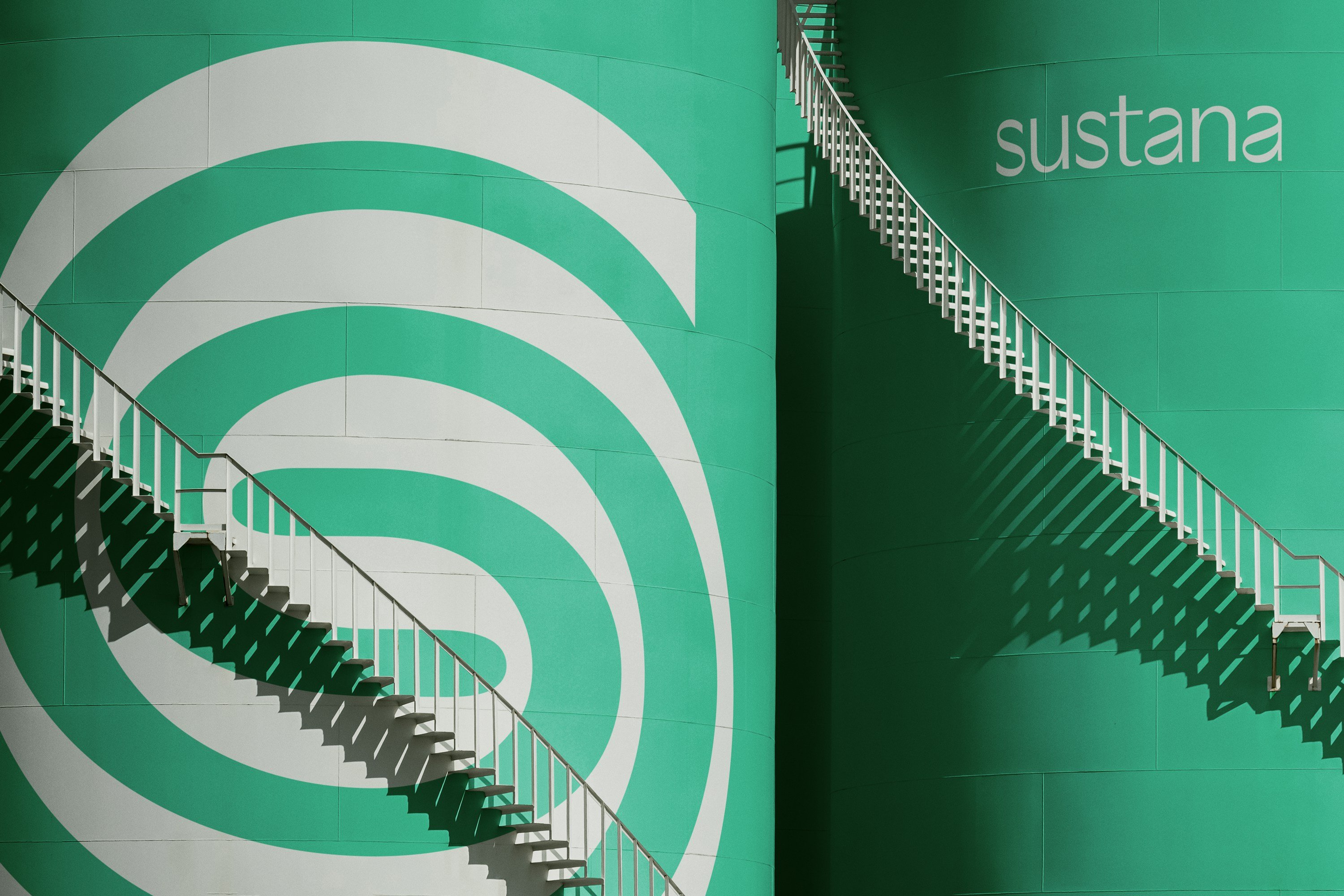
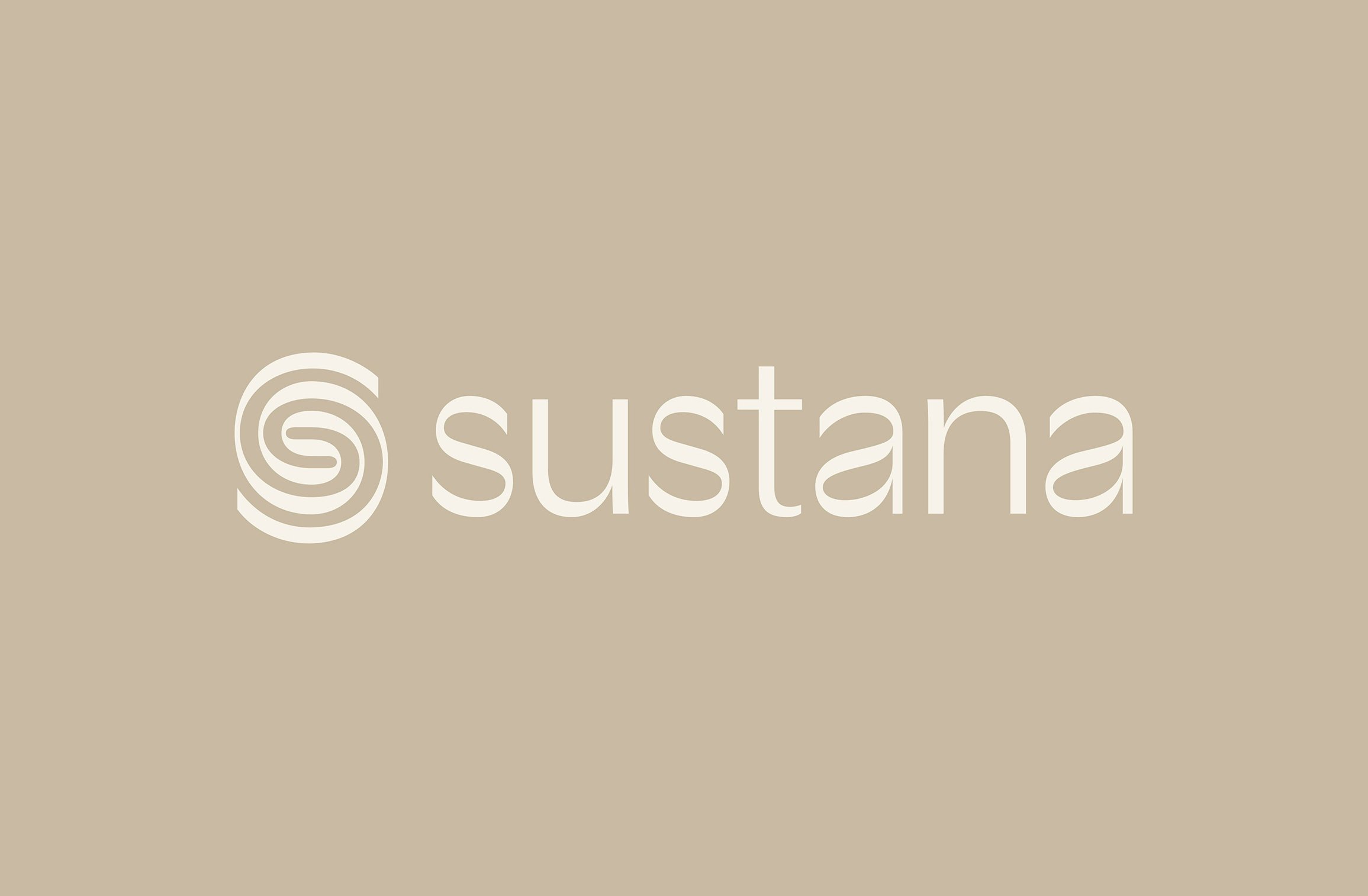
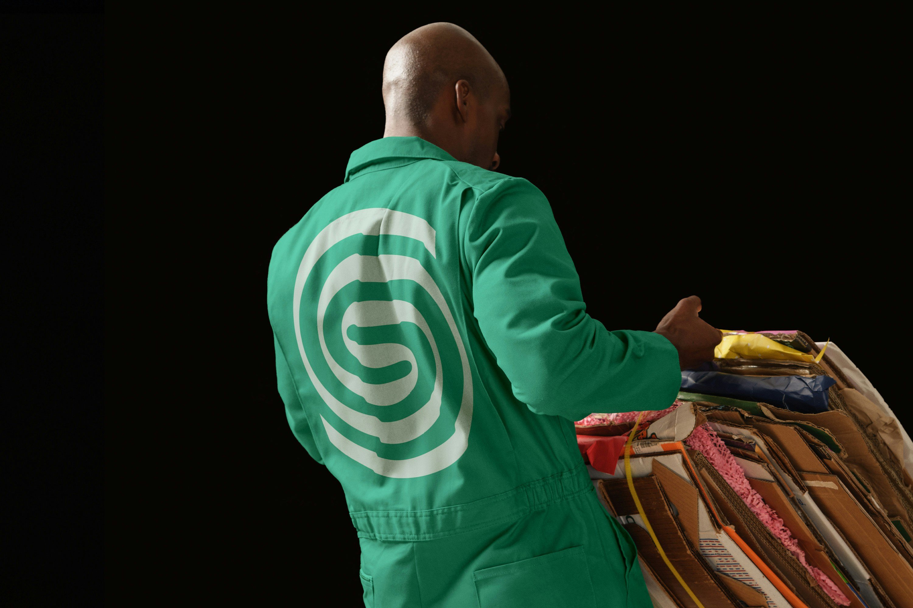
The new swirly logo further firmly reinforces all that recycling, and while I have no idea how paper mills really work, it gives a sense of dynamism that might nod to the whirring of machines, as well as the future-facing processes Sustana uses. A swirl and recycling seem an obvious, tried and tested pairing, but the softer lines here and the mark’s simplicity work well – it feels like a nice reflection of the company’s mix of storied heritage and innovation. This is furthered, to great effect, with the addition of motion that conveys aspects of materiality, recycling and technology.
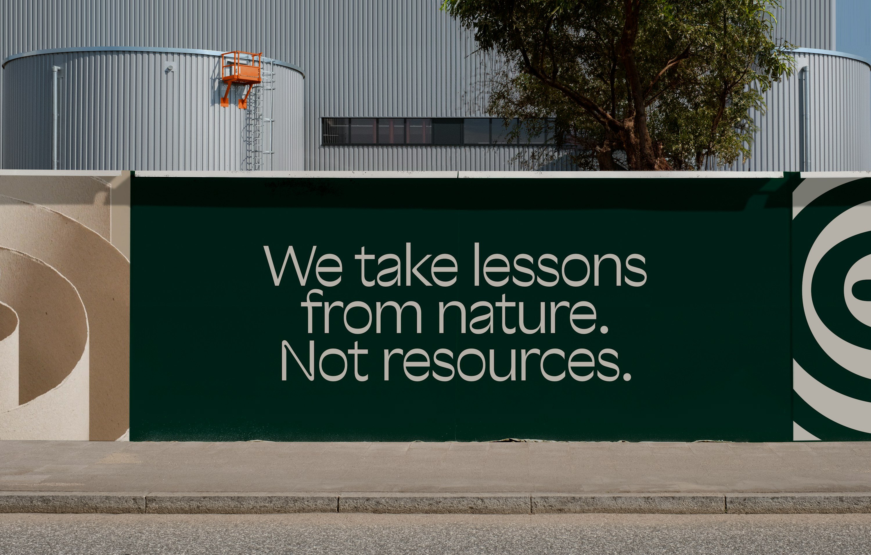
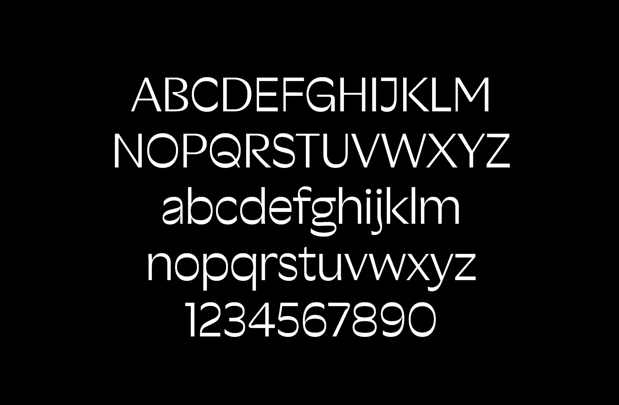
Sharp Type created the new custom font, named simply Sustana – a really classy, fresh looking sans serif which seems perfect for the attitude the company is looking to convey. The Sustana font is used on the new all-lowercase wordmark and headline applications, supported by the rather lovely secondary font Roobert by Prague-based foundry Displaay.
The wholesale renaming of the company to Sustana feels like a smart solution that very clearly communicates its eco-centric credentials, for sure. But I’m not 100% sold on the renaming: firstly, ‘sustana’ makes the laziest part of your brain first think of a sultana with a typo; and very quickly after that, conjures up images of overspilling Humana boxes in the carpark of a suburban Big Tesco (to me at least).
But the biggest issue I have with it is that it might suggest that the company was, ahem, papering over the cracks as it were – trying to hide its former identity with a shiny new name that’s a very obvious signpost to its greenness. The ‘sus’ doesn’t help: it does lead you to wonder what sort of ‘sus’/shady past it might be looking to escape from. We know that this isn’t the case – Sustana has long championed sustainability throughout its processes, head and shoulders above its peers. So it’s a shame that the renaming could feel a little like a wolf donning sheep’s clothing.
However, I’m wholly unfamiliar with the specifics of the North American paper industry: perhaps overhauling the other brand assets and leaving the name alone wouldn’t be enough to convey Sustana’s position as a representative of the future of materials. And when it comes down to it, of all the pairs of hands you’d trust with a major rebrand, Collins is pretty high up there.
