Olympic Museum by Studio Blackburn
Opinion by Emily Gosling Posted 31 October 2024
Few things have a design legacy quite like the Olympics: it’s hard to think of another event or organisation that has both a history spanning more than 120 years (the first modern Olympics’ was in 1896), and a distinct graphic identity each time it takes place. Since every Games has its own unique ‘emblem’ logomark device, the events become sort of minibrands under the vast umbrella that is the Olympics, all united by those iconic five interconnecting Olympic rings.
To use a very 21st century brand design way of putting it, The Olympics has effortlessly garnered a suite of distinctive, ownable graphics and brand elements (the rings; the colour palette of black, gold, blue, green and red; the three pillars; the torch, etc.). So a brief like the rebrand of the Olympic Museum must be simultaneously incredibly exciting, and rather daunting – a challenge Studio Blackburn faced when it was tasked with doing just that earlier this year.
Housed in a 11,000 square-metre, five-storey building designed by Mexican architect, Pedro Ramírez Vázquez (also known for his significant contribution to the visual identity of Mexico ’68) and Swiss architect Jean-Pierre Cahen, the Olympic Museum opened just over 30 years ago in Lausanne Switzerland (known as the “Olympic Capital” since it’s where the International Olympic Committee, or IOC, has its HQ). It houses the world’s largest and most complete collection of Olympic heritage, counting more than 100,000 artefacts spanning more than 2000 years including Olympic torches, kits and historic sportswear, medals, and an entire wing dedicated to the organisation’s graphics and branding history.
“Our goal was to create a strong emotional connection and generate excitement around the experience and its artefacts, in the museum in Lausanne as well as internationally through their website,” says Studio Blackburn. “The majority of the future audience for the Olympic Museum will experience it remotely. It was crucial that we approached this with the concept of a museum that lives locally and thinks globally.”
The brief was very clear that the museum had to very much have its own identity, distinct from that of the Olympic master brand. Among the biggest changes Studio Blackburn brought about was a “rationalisation of the existing brand architecture”, which led to it dropping the ‘The’ from the logo and moving away from the Olympic Museum’s previous acronym of ‘TOM’.
That’s a smart move: ‘TOM’ seems totally devoid of anything to do with the Olympics unless you already know what it stands for – it reminds me of those nice but slightly twee plimsoll type shoes, or just a shouty shortened version of Thomas.
Another more practical reason to drop the ‘the’ is that the identity had to operate not just in English, so ‘the’ but in French and German, too, which makes the acronyms change anyway – starting with ‘l’ in French and ‘d’ in German. It all feels a lot more cohesive and dynamic as simply Olympic Museum/Musée Olympique/Olympisches Museum.
While the museum had to stand alone from the Olympics masterbrand, it had to share that sense of the profundity and power of the Games and its history. Museum identities, broadly speaking, have to give the impression of confidence and expertise – after all, people generally go there to learn things, and feed existing interests – but with something as powerful as the Olympics, this identity needed to fulfil the extra task of conveying emotion.
And where the superb typography is non-nonsense, bold, and assertive (more on that in a moment); the overall identity system Studio Blackburn created is underpinned by its expressiveness. Taking part in, or even just watching the Games is a huge experience for people, so capturing that energy across all assets, both static and in motion, was vital.
The third crucial element, alongside demonstrating authority and emotion, was making the whole thing feel iconic – just like the Games itself and its graphic legacy. There’s no doubt that Studio Blackburn has achieved this through paring everything right back, using the elements associated with the Games as consistent nods to the theme while making it very much stand proud as a museum in its own right.
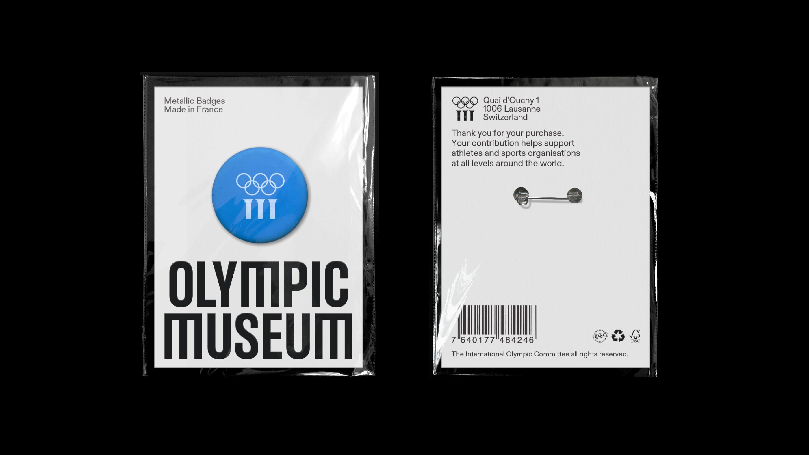
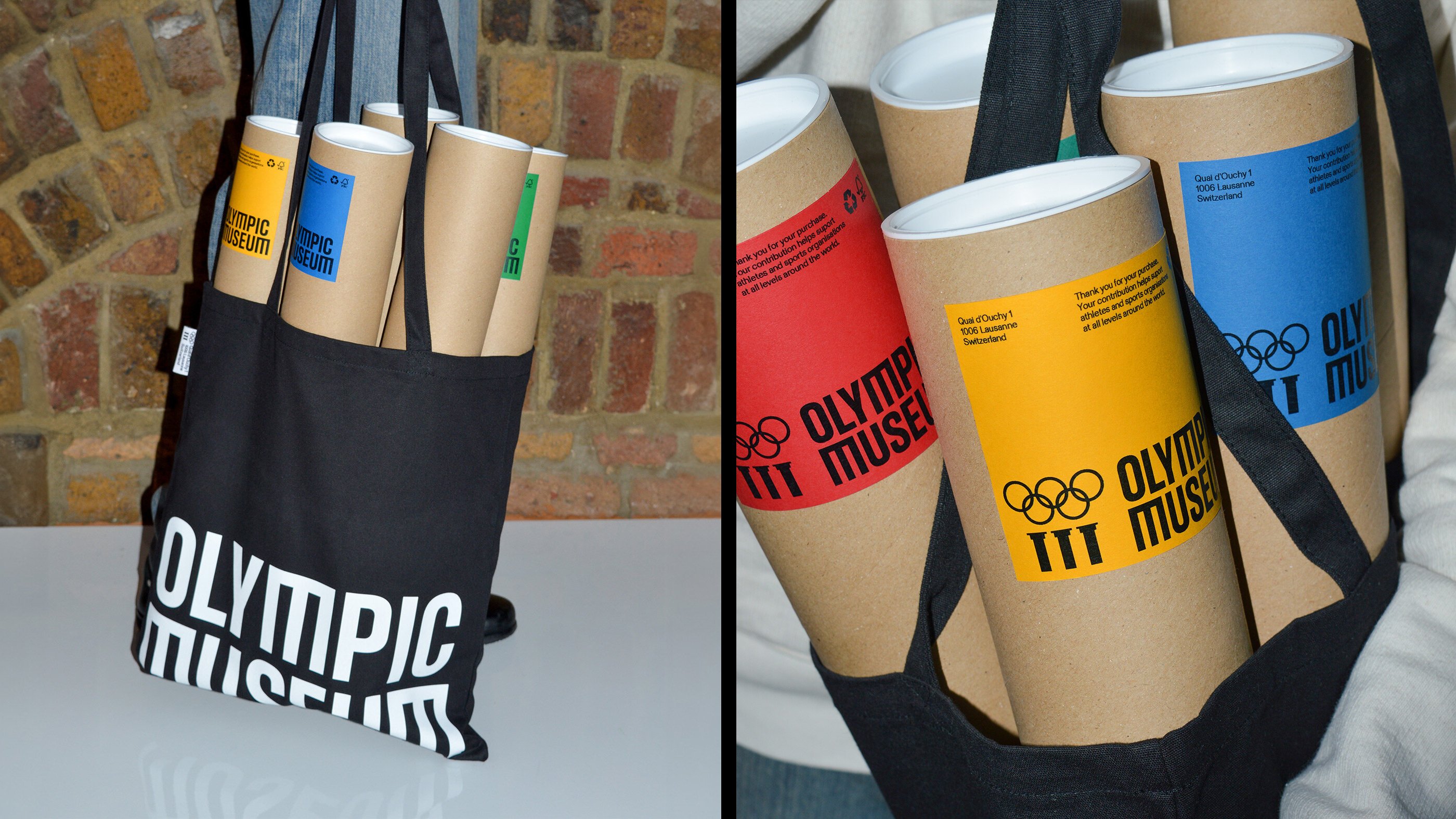
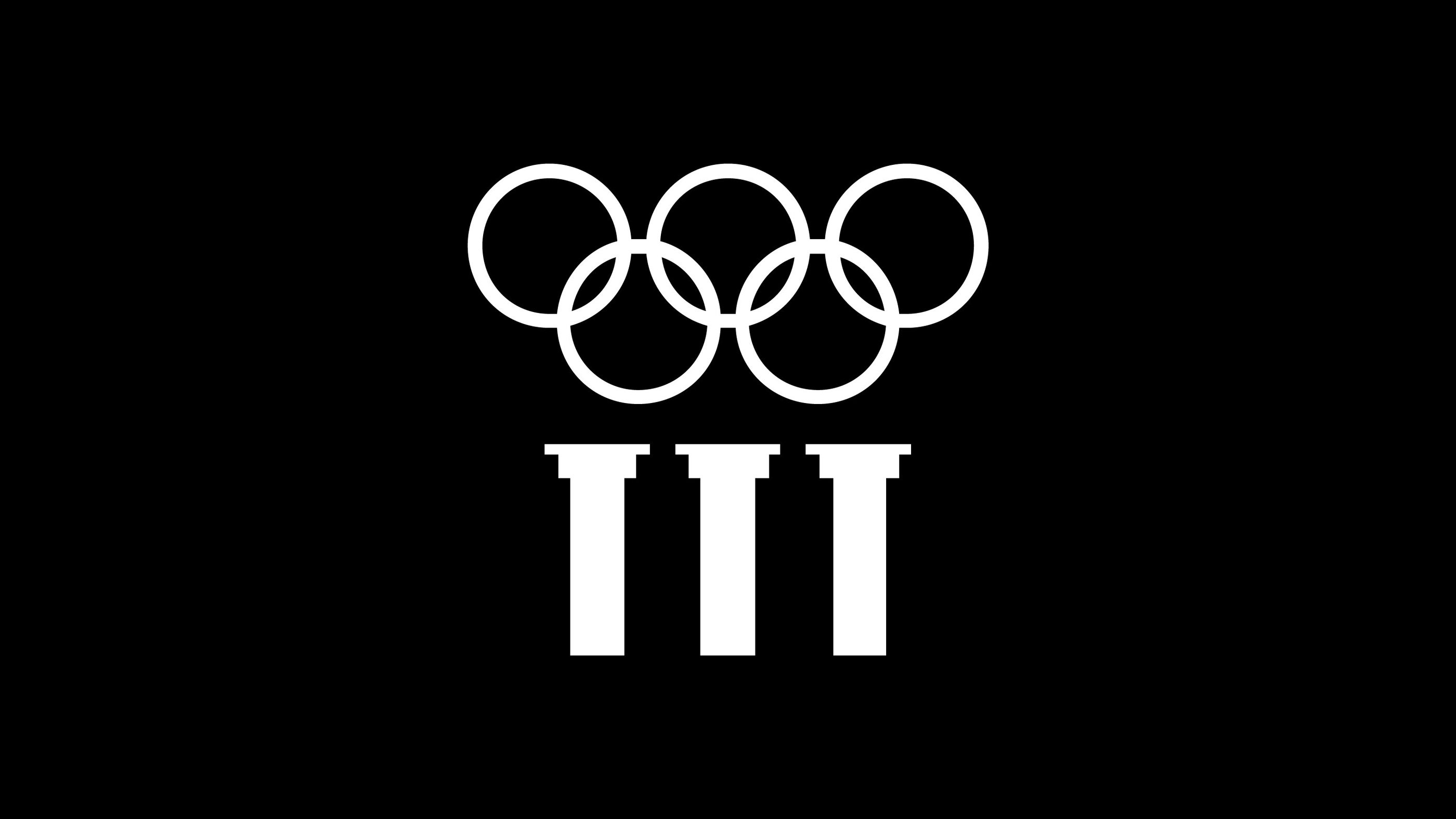
As such, the colour palette uses blocks of red, yellow, green, blue and black; while the logo device combines a monochromatic version of the interlocking rings and the three pillars symbol, which represents the Olympics values of ‘excellence, respect and friendship’ and nods to its roots in Ancient Greece.
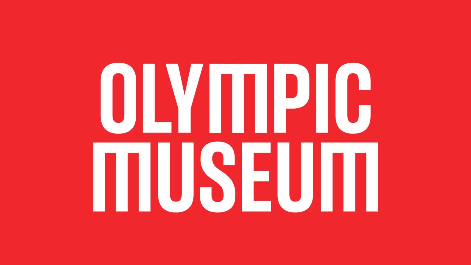
One of the standout aspects of the new identity is the way that these pillars are used in the typography to form the capitalised ‘M’ of the museum’s name. The customised letterform of the wordmark is somehow both playful and classy – like the identity more broadly, it works on a lot of different levels thanks to its flexibility.
Studio Blackburn retained the former custom typeface, Olympic Headline, designed by Julien Hébert of Montreal-based studio Principal. The typeface was part of a suite of fonts commissioned as part of the overhaul of the Olympics brand by Canadian Agency Hulse & Durrell, which started in around 2020 and saw its full rollout at this year’s Paris 2024 Games.
The museum identity has many elements that are shared with the main Olympics brand, including that typeface, but Studio Blackburn has been deft in fulfilling the part of the brief that ensures the museum is a separate entity in its own right. “The identity needed to ensure that the Museum maintains its influence within the cultural world and emphasises its significance beyond sports,” the studio explains.
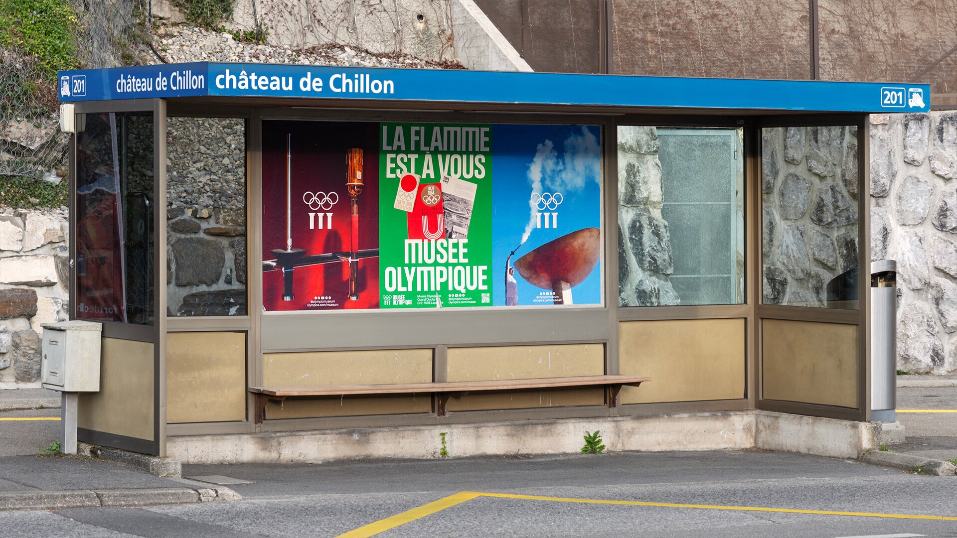
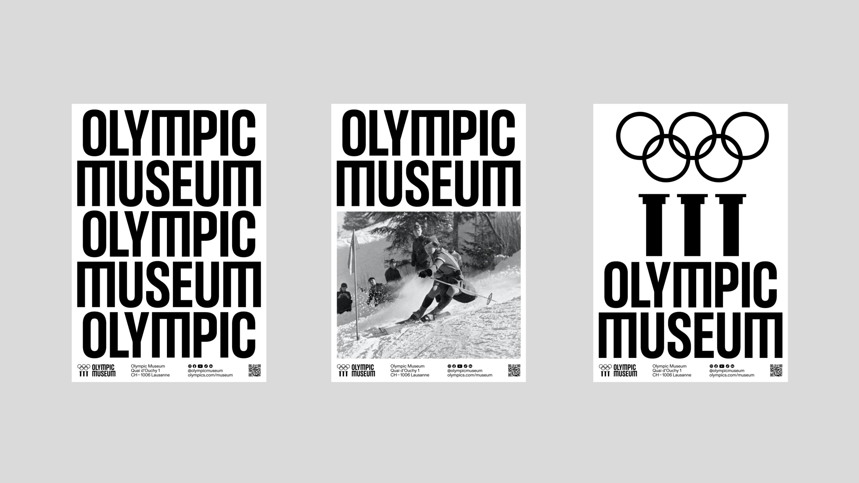
This aspect comes to the fore most prominently in a beautiful series of posters. These look very striking, and feel thoroughly contemporary (I really cannot get enough of that typeface and its custom ‘M’) – and crucially, they each hero an object or artefact housed in the museum. Using a backdrop of one of the Olympic rings colours in a bold block tone, the isolated objects are placed in a new context, taking them into the world of art, design and culture while still obviously remaining rooted in sport.
The new Olympic Museum designs manage to strike the perfect balance between fun and authoritative; seamlessly marrying sport and culture in a way that feels fresh, and never forced. Studio Blackburn says that it wanted the designs to show the world that “the Olympic flame is for everyone,” and the new visual identity here is undoubtedly doing a hell of a lot of legwork when it comes to furthering that cause.
