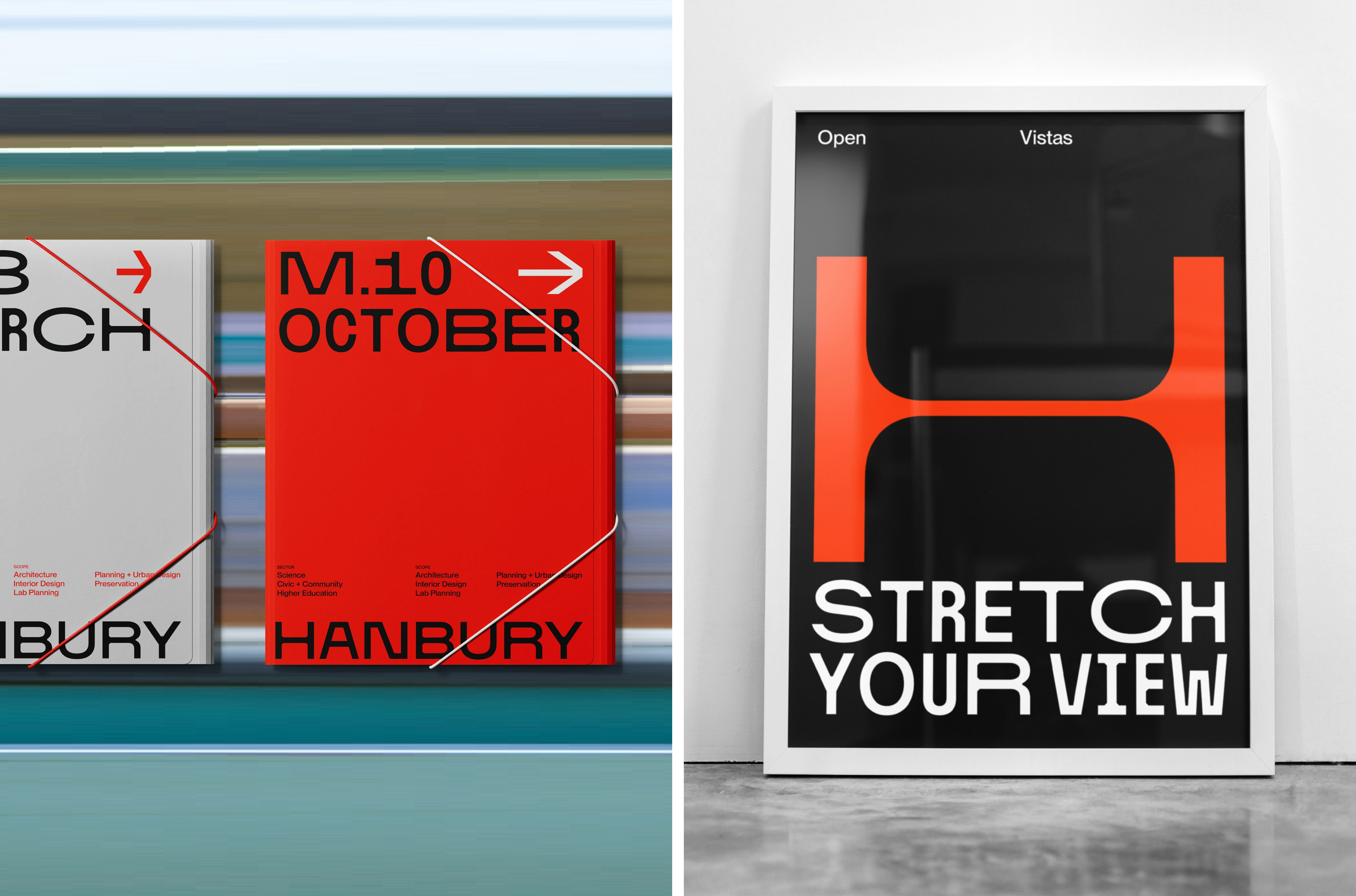
Hanbury by Base Design
Opinion by Angelica Frey Posted 19 November 2024

Hanbury is an American architecture firm, founded in 1979 and based in Virginia. According to international agency Base Design, which recently delivered a rebrand for the practice, the last decade has witnessed a ‘transformative’ period of growth and diversification with the team increasing from 40 to 160 individuals, and expanding from one to eight office spaces. For Hanbury, which started out specialising in buildings for higher-education, growth also meant branching into other architectural categories, and an entrance into new geographic areas and emerging markets.
To embrace this spectrum of opportunity, Hanbury enlisted Base (Murray’s Cheese, Divine Farmer & andSons)to create a nimble and adaptable framework across brand identity and digital experience. The overarching strategy devised by Base was ‘open vistas: delivering ideas with stretch’, which the studio describes as a ‘manifesto’ for Hanbury’s evolution, embodying experimentation, innovation and versatility.
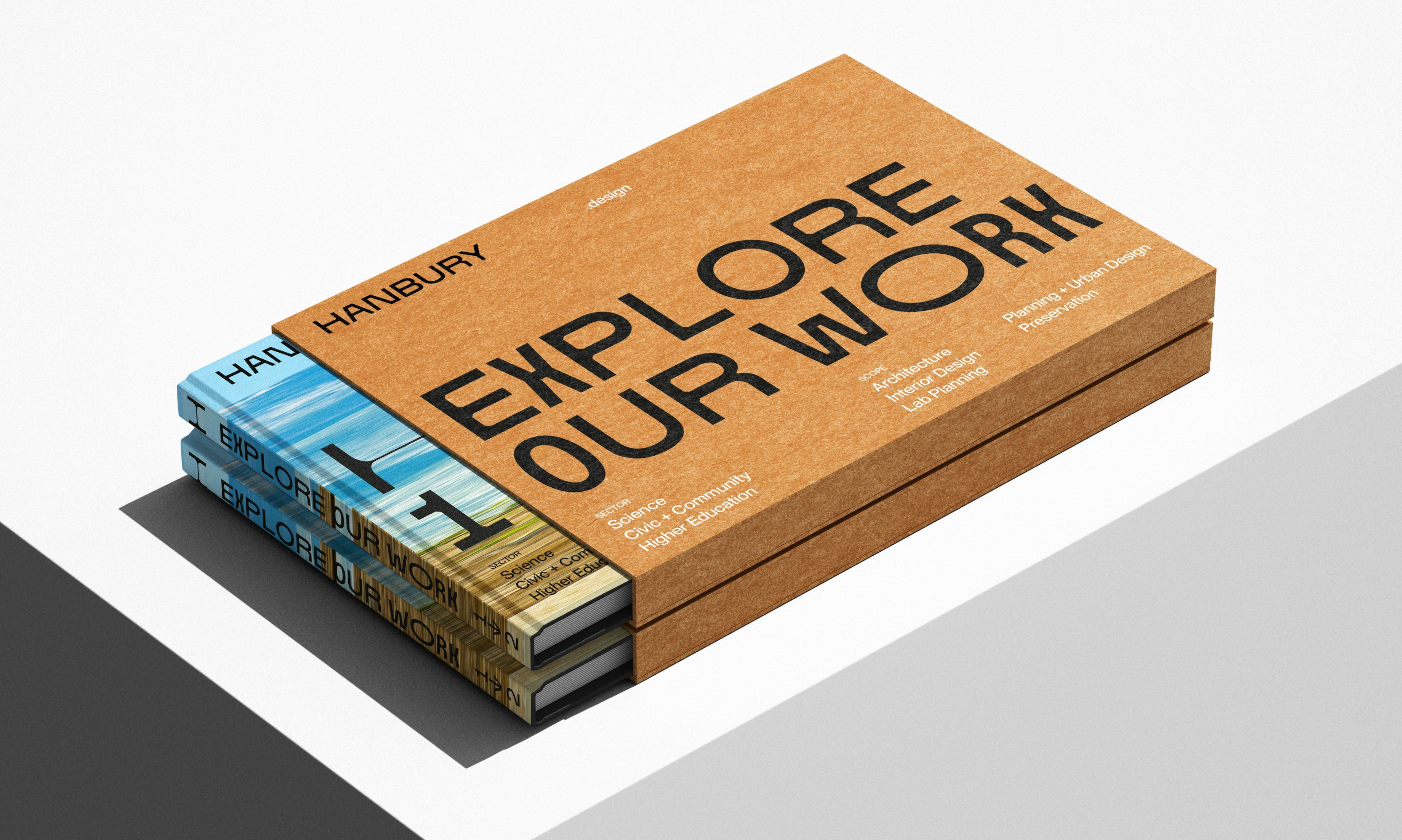
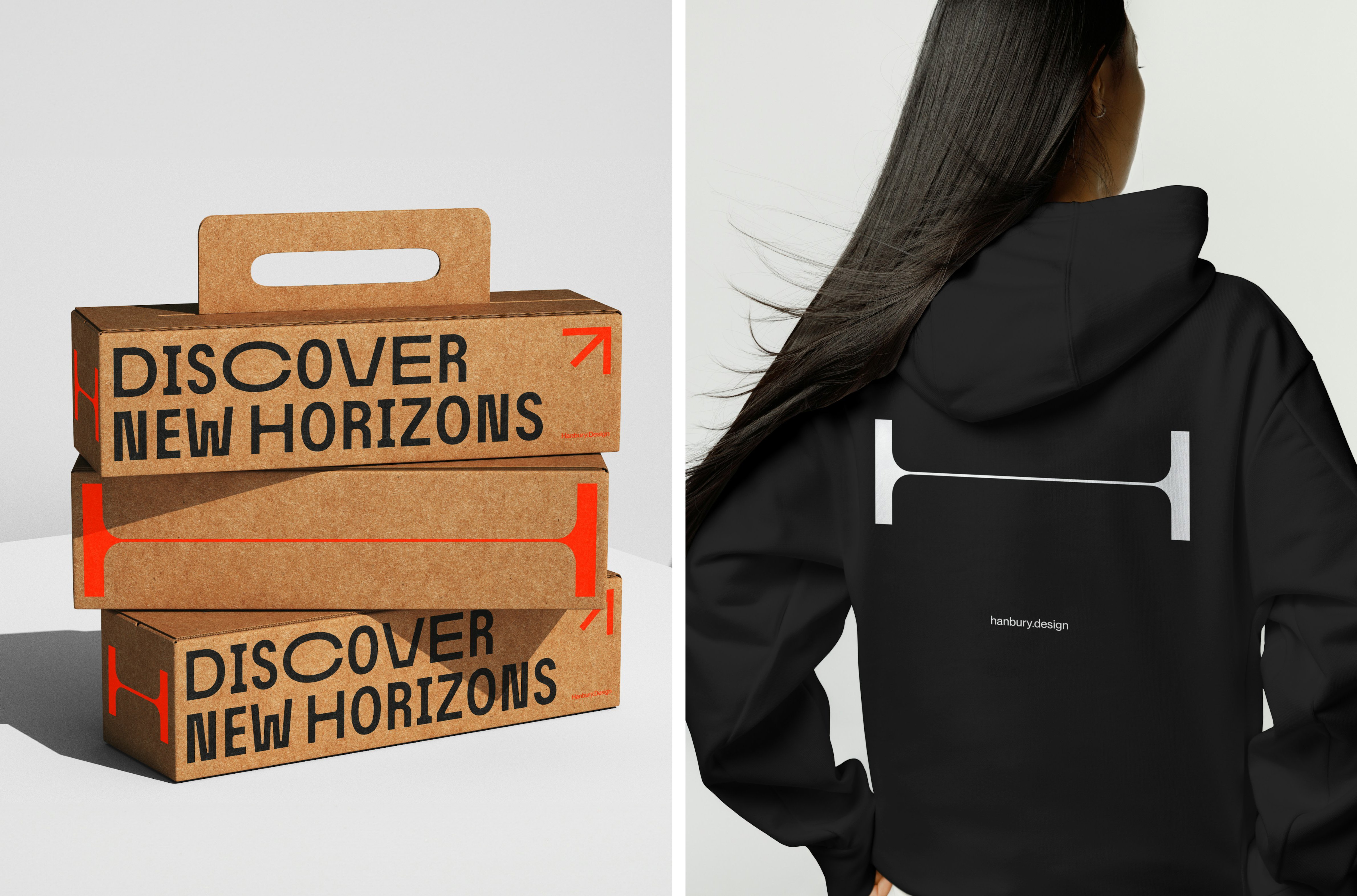
The themes of stretching and constant motion recur throughout Base’s work. A custom-designed dynamic custom typeface is at the heart of the project, with variable width characters that expand (or ‘stretch’) to fit any space. An extending logotype is set in the same typeface, with industrial bevelled corners, while the accompanying monogram is more refined with greater stroke contrast and rounded details. On Hanbury’s revamped website, this initial ‘H’ playfully doubles as a scroll bar – the further it stretches, the closer you are to the end of a section.
This is the sort of UI element which takes a scheme that could be predictable within the sector (a modernist leaning, minimal brand, composed on a structured grid) and establishes Hanbury’s point of difference – a bit more experimental, a bit more radical, a bit more ‘fun’. This attitude is brought further to life with two navigation modes, named ‘experience’ and ‘grid’, with the former offering a radical three-dimensional browsing journey.
In this mode, a series of photographs float across the page, like a stream of cards, suggesting controlled chaos and unfettered creativity. Clicking on one of these images will bring it to the foreground and lead to another page. It’s seamless and slick thanks to smooth motion transitions. There’s also an integrated search function that yields AI-based results. Base is proud of the technical skill it took to achieve these results: we’re told that the site was built using ‘a headless approach’ with Craft CMS, Next.js, three.js and Algolia.
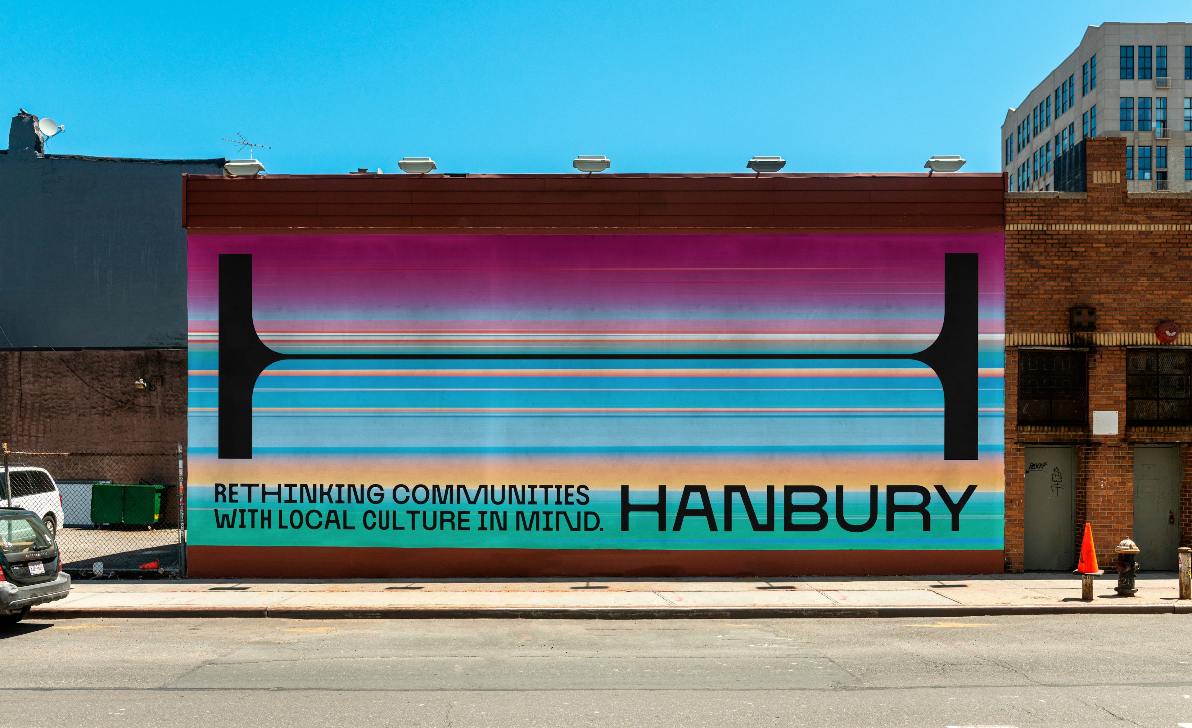
For Base, this a dynamic high-tech user experience serves to highlight that Hanbury doesn’t simply provide architectural design (the outcome of which varies by client brief), but a consistent process: ‘Hinging their brand story on this value proposition, Hanbury prioritised maintaining a clear perspective on their unique approach, and their place in the world to effectively communicate their identity’, the studio explains.
Here the combination of traditional design and digital craft combine to deliver an ambitious visual identity for Hanbury that showcases the firm’s portfolio through dynamic storytelling and interactive content. Through a holistic approach, Base has delivered and adaptable and versatile scheme.
