Coolhaus by &Walsh
Opinion by Emily Gosling Posted 21 November 2024
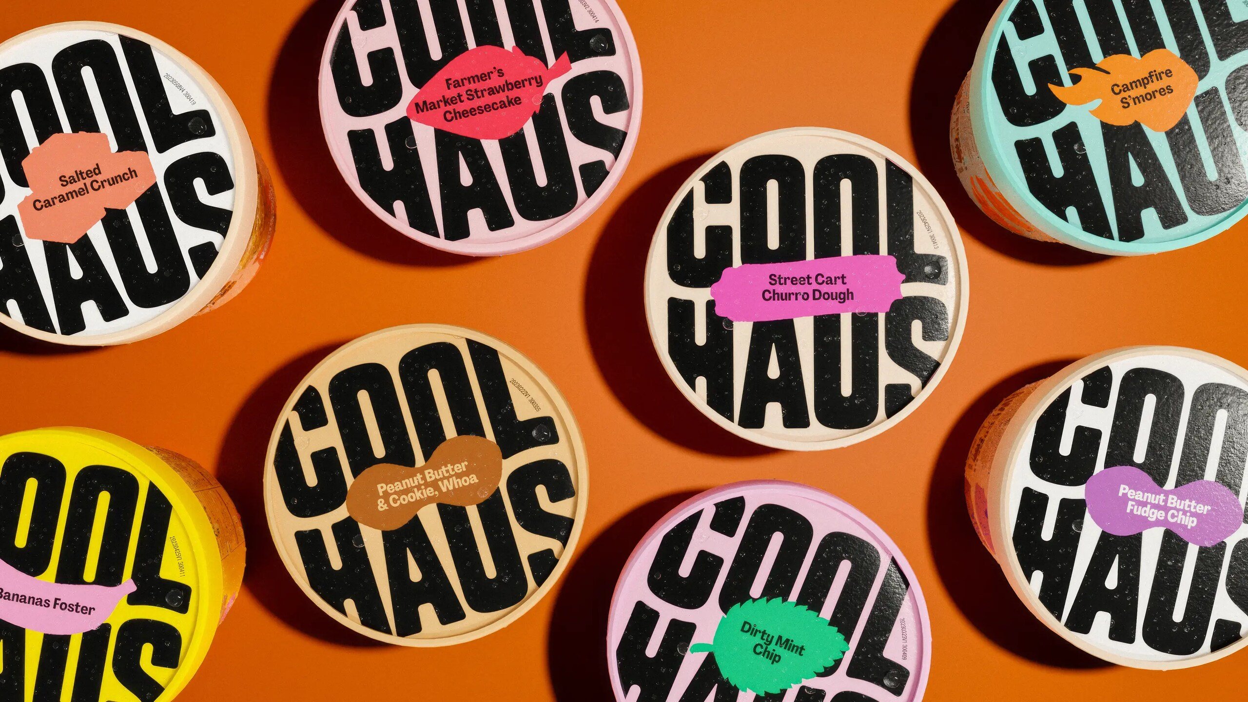
Dessert-centric power couple Natasha Case and Freya Estreller met in around 2008, soon forming a partnership in both life and business: Coolhaus, a range of ice creams and other frozen treats that looks to inspire other female and LGBT+ founders. For those thinking, ‘what, like Rem Koolhaas?’ – yes, you’re right. Estreller originally trained as an architect, and before Coolhaus-proper existed, had been experimenting with making ice-cream sandwiches named after architects.
Coolhaus, as brand and as pun, stuck; and since then, the brand has gone from its early life in a $2500 postal-van-turned-ice-cream-van (which was so shonky that it had to be towed to Coachella festival for its retail debut) to a titan in the world of sweet afters. Now the top women-led ice cream company in the US, Coolhaus sells a range of ice cream sandwiches (or ‘sammies’), cones, pints and cups in thousands of stores, including Whole Foods, as well as branded food trucks throughout New York and LA.
In 2021, San Diego-based agency BexBrands created a new look for Coolhaus, introducing the stacked, wavy wordmark; but there was still work to be done: things were a bit messy in terms of the diversity of aesthetics across the brand’s innumerable ranges and products. The wordmark was good, but it still didn’t feel like a totally cohesive brand.
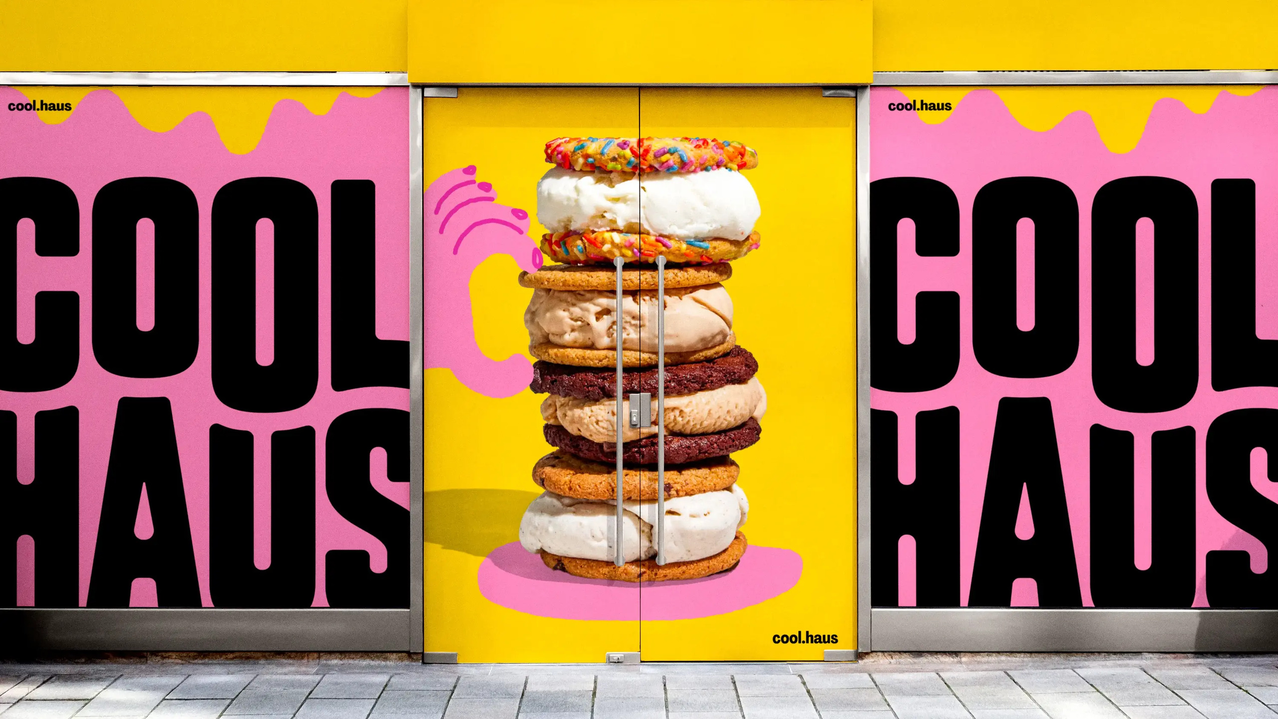
Enter &Walsh (QX, Gut & Plenty), which started working with Coolhaus on its rebrand in 2023. It seems like the perfect choice of agency for the brand: &Walsh’s portfolio is characterised by its loud and proud, colour packed, typography-forward work; and the women-to-the-front energy that’s shared between designer and client here feels like a no-brainer.
The brief was to “imagine an identity for a brand founded on the belief that ice cream offers endless possibilities,” according to &Walsh. “While some ice cream brands want you to try their Neapolitan, Coolhaus encourages you to savour the taste of fries dipped in your milkshake.”
Well, it’s an unusual premise, but what it seems to be saying is that Coolhaus is a bit different – it has a personality, and a boisterous one at that. The studio landed on the idea of centring the brand direction on ‘Edible Creativity’, bringing the whole personality thing to the fore by highlighting each unique flavour using blocks of vibrant colour, a new illustration system and some pretty out-there variant names.
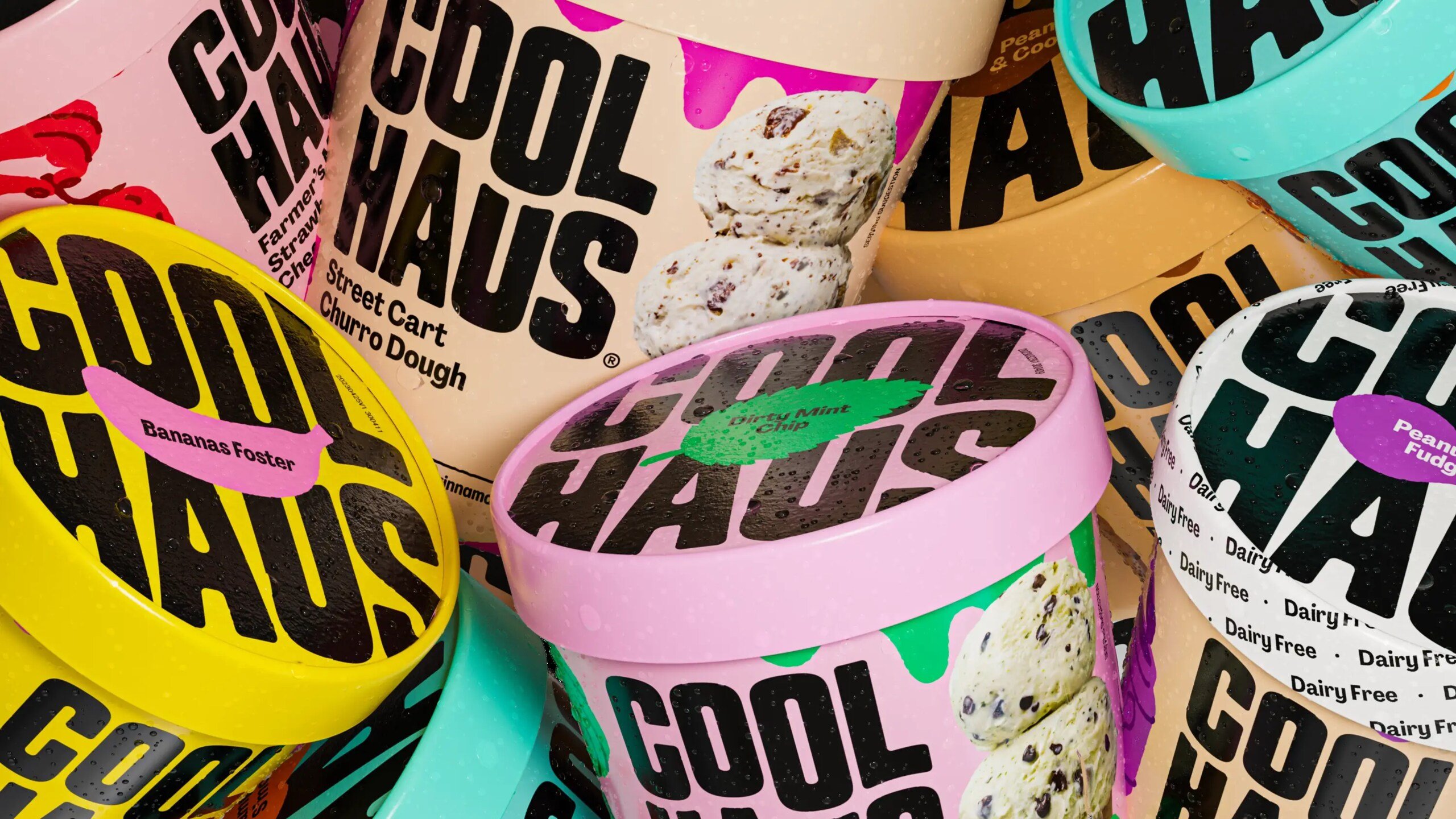
The only part of the project I’m not totally sold on is the naming: ‘Dirty Mint Chip’, ‘What’s Up Dough’, ‘Peanut Butter and Cookie, Whoa’, ‘Thrilla in Vanilla’, or ‘A Lotta Horchata’. At best, they don’t make a lot of sense; but overall they just feel a bit too ‘oohhhh look I’m crraaazzzyyyyy, me!’. The brand itself is so strong thanks to the other elements, that sort of forced wackiness makes you wince a bit – it’s trying too hard, and doesn’t feel necessary.
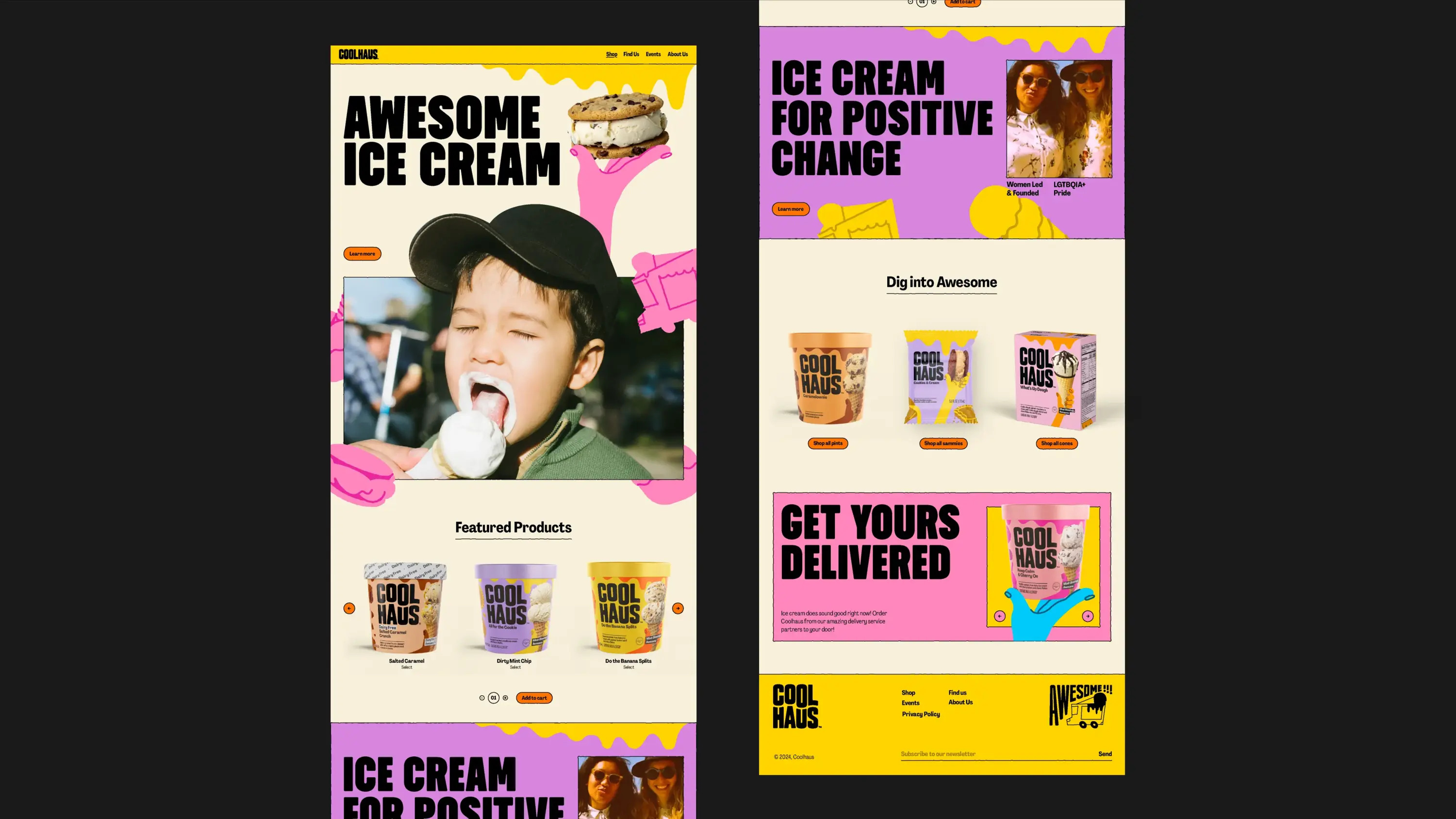
Overall, though, what makes the new branding so strong is the consistency: &Walsh has worked absolute wonders with that wordmark and introduced a cohesive brand hierarchy that spans Coolhaus’ 60 SKUs and three distinct (but slightly confusing) categories: Dairy, Dairy-Free, and Animal-Free Dairy.
A suite of more than 100 hand drawn illustrations was created to use across all brand touchpoints, from packaging to campaign materials and online (at the time of writing, the Coolhaus website seems to be down – it looks good from the &Walsh documentation though).
The idea was to create a robust system that would allow the Coolhaus internal team to apply these illustrations and colours across new flavours as and when they come along. “Taking production constraints into account, we designed each illustration to work within the limits of printing, using just two distinct tones,” &Walsh explains. “This approach ensured a strong brand presence and streamlined, cost-effective production.”
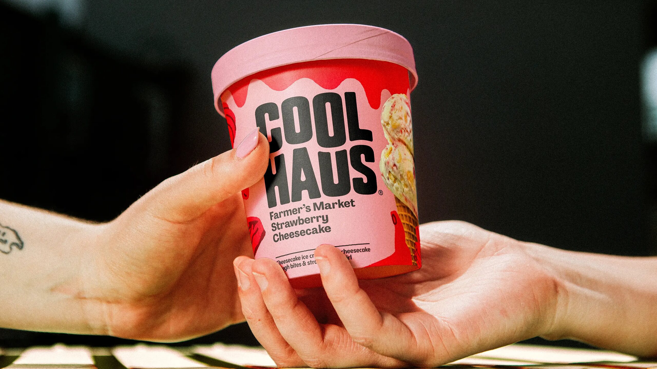
The product photography by Brooklyn-based artist and food photographer Henry Hargreaves is fab, doing exactly what it should do – making everything look absolutely delicious, with uncompromising closeups and hyper clear depictions of what you’re getting. This is supplemented by some more lifestyle leaning campaign images, which are really nicely shot and chime beautifully with the uplifting, positive, personality packed vibe of the rest of the brand.
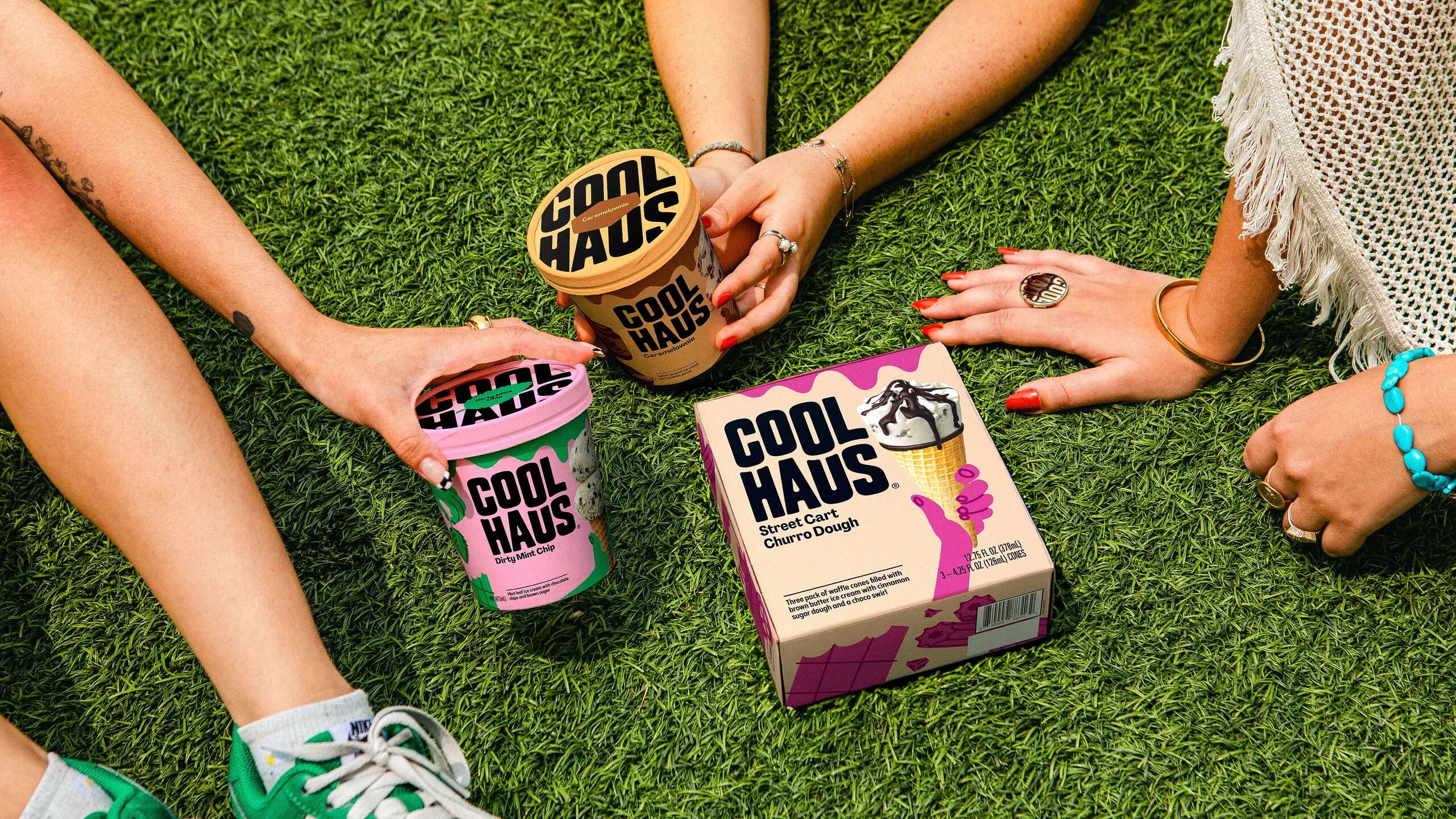
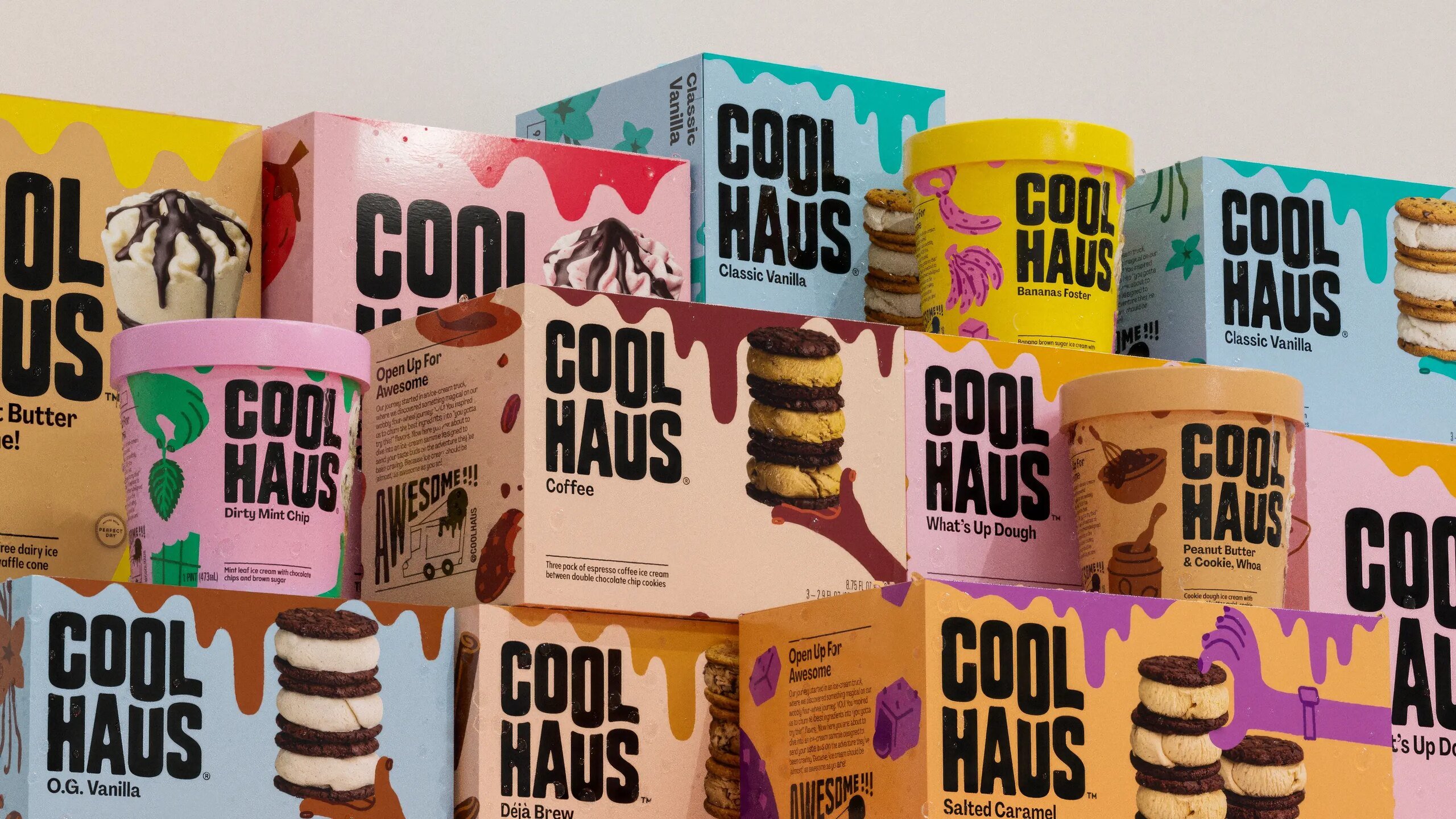
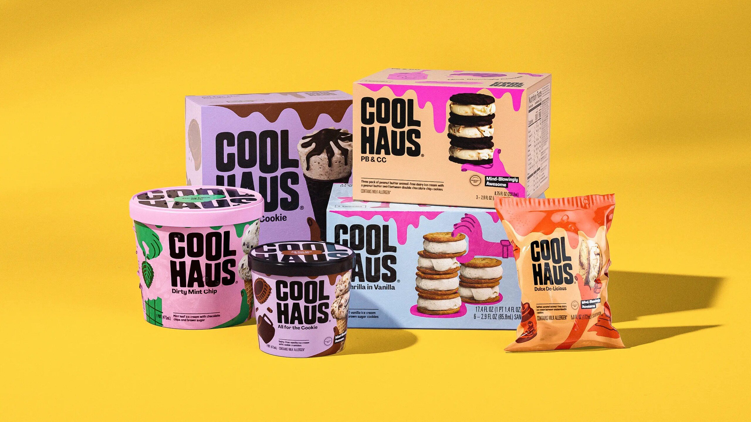
The Coolhaus brand itself is at the fore thanks to heroing the wordmark and giving it the space and stature it deserves; while smart use of those block colours does a lot of the heavy lifting when it comes to signalling flavour. The palette is bold and bright but, crucially, doesn’t try to be too clever: pink and red for ‘Farmers market strawberry cheesecake’; yellow for ‘Do the Banana Splits’; peachy beige and brown for ‘Dairy Free Salted Caramel Crunch’.
It’s no mean feat to create an identity that ensures individual flavours and products are distinctly their own individual proposition, all the while maintaining an overarching strong brand, but &Walsh has shown how to do it here.
