Precise by Design Bridge
Opinion by Emily Gosling Posted 5 December 2024
Mortgages aren’t exactly the most sexy or fun concepts, nor are the companies that offer them. Likewise, the sector isn’t exactly known for a bold or forward thinking approach to brand design. But it’s often the more traditionally dull-leaning brands or companies that make for the most creative – not to mention difficult – branding projects.
Perhaps that’s part of the reason that this work for mortgage lending company Precise has been so celebrated: it’s sharp, wittily tongue-in-cheek, minimal and punchy. Created by Design Bridge and Partners’ London studio, the project comprised a complete “business refresh in what the brand stands for, defining all customer and broker touchpoints, and how it operates on a day-to-day basis”.
From there, the studio worked on a holistic rebrand strategy and new visual identity that celebrates and reflects “Precise’s brutal simplicity and concise approach”. One of the most obvious changes was to the company’s name, cutting the previous moniker, Precise Mortgages, to make it simply Precise.
According to Design Bridge, there were two main reasons that Precise was looking to rebrand: the first was that “time-poor mortgage brokers need speed, simplicity, reliability and transparency”. The second was simply the fact that “almost all” the company’s competitors had recently launched new brand identities characterised by “bright colours and flashy graphics that create more complexity and friction in an already complex process”.
As such, Precise’s new identity looked to buck that trend and instead reflect the way the business itself aims to shun “the traditionally overcomplicated lending process”. Indeed, the whole thing thoroughly, confidently leans into total clarity and minimalism – but crucially, never in a way that’s boring, despite the predominantly greige colour palette.
According to Design Bridge, that shade is actually ‘vanilla’ rather than greige (perhaps it’s my eyes that see a more dishcloth-esque hue, or perhaps it’s the prejudices about an industry that seems both so overwhelmingly complicated and incredibly dry). The colour was chosen as a direct riposte to the aforementioned shouty, vibrant competitor companies; with Design Bridge asserting that vanilla is “a safe choice for an ice cream, but a bold choice for a brand… Precise confidently stands out.”
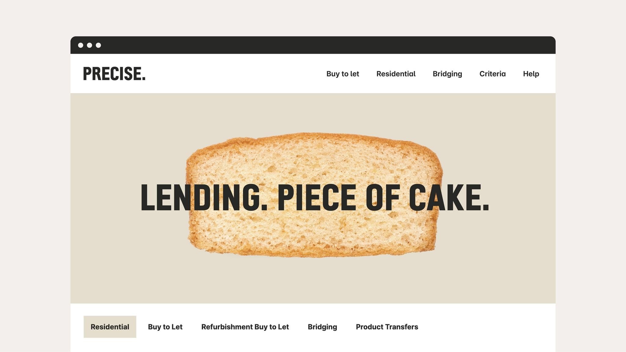
The scope of the project included designing and building new broker and customer websites, with the former debuting new tools and enhanced functionality; as well as creating new brand photography imagery, a totally revamped tone of voice, and visual identity brand designs used across merchandise, print materials and campaigns, and physical experiences.
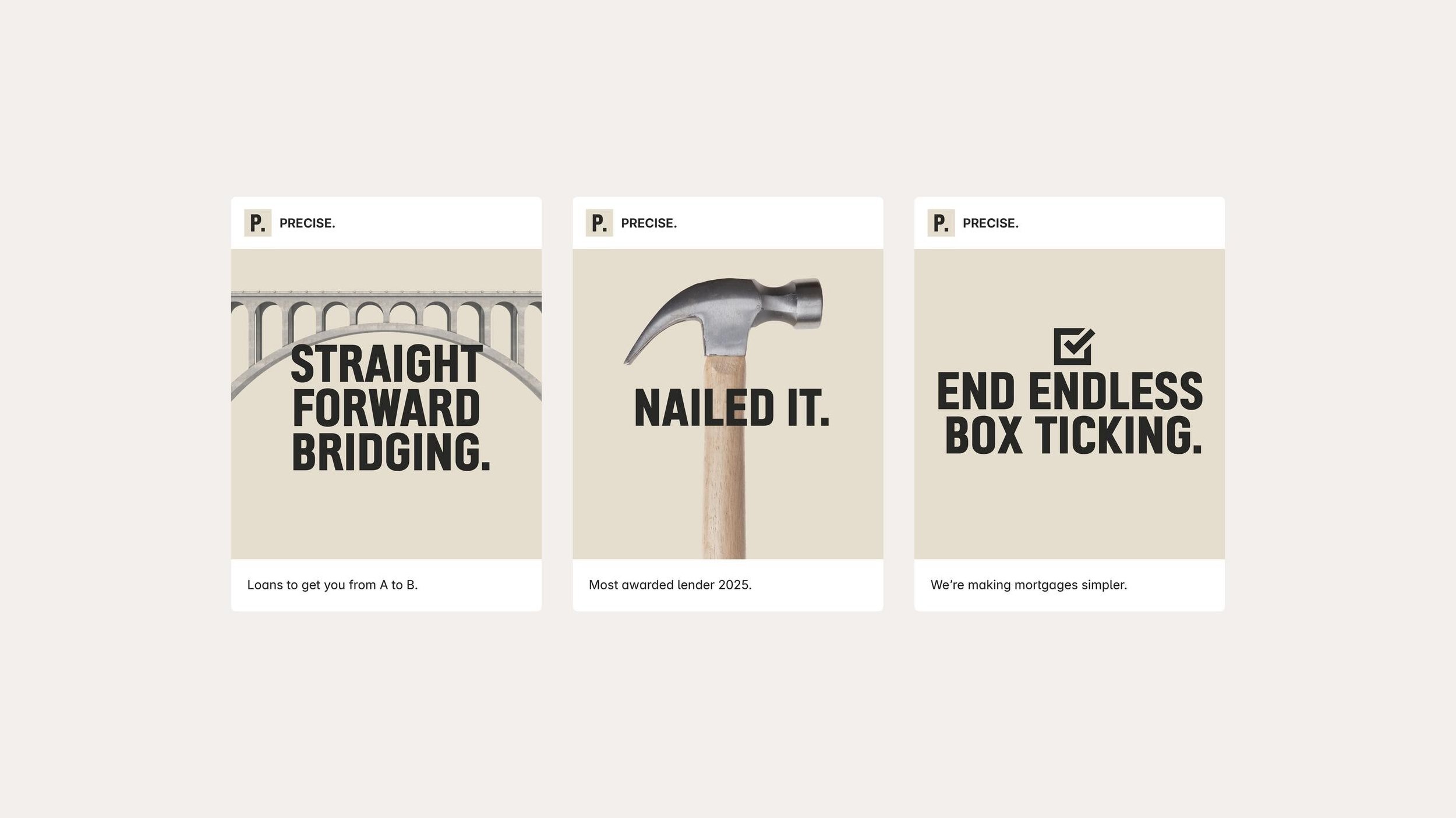
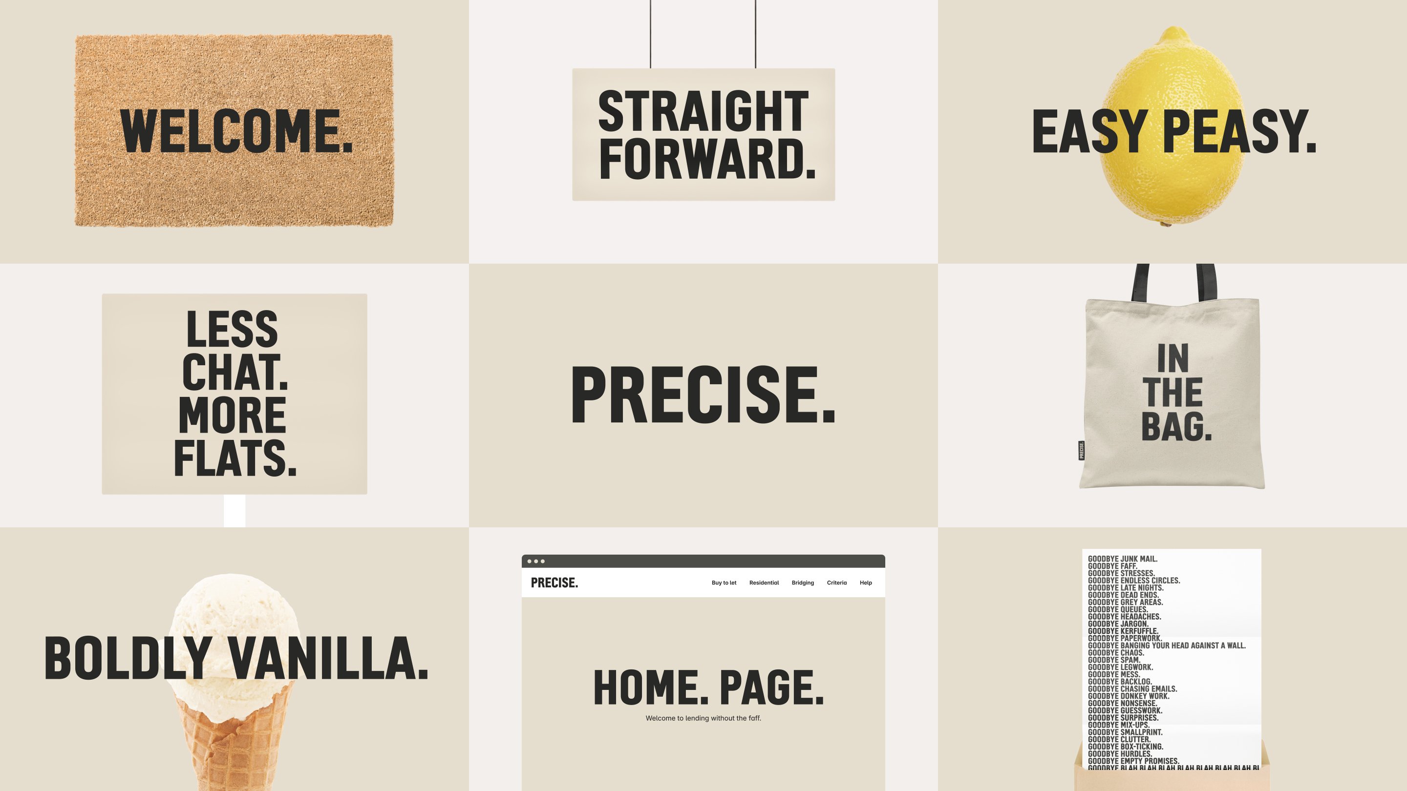
The whole thing feels brave and unmistakably contemporary in its daringly stripped back approach. The new brand imagery was created by shooting everyday objects – such as a welcome mat; a tote bag; and, er, a lemon and an ice cream cone – “straight on with no fancy lighting, shadows or effects”. The stark cutout snapshots against the uniform single-tone backdrop make for grabby, ownable brand visuals that are effortlessly hip (yes, and it’s for mortgages!), but without seeming too ‘try hard’.

The tone of voice, meanwhile, is anything but monotone: slightly cheeky, a bit playful, and packed with way more attitude than you’d expect from anything to do with mortgages (or, in fact, precision).
The absolute standout aspect here is undoubtedly the typography – and not just because all other brand elements are so pared back to within an inch of their lives.
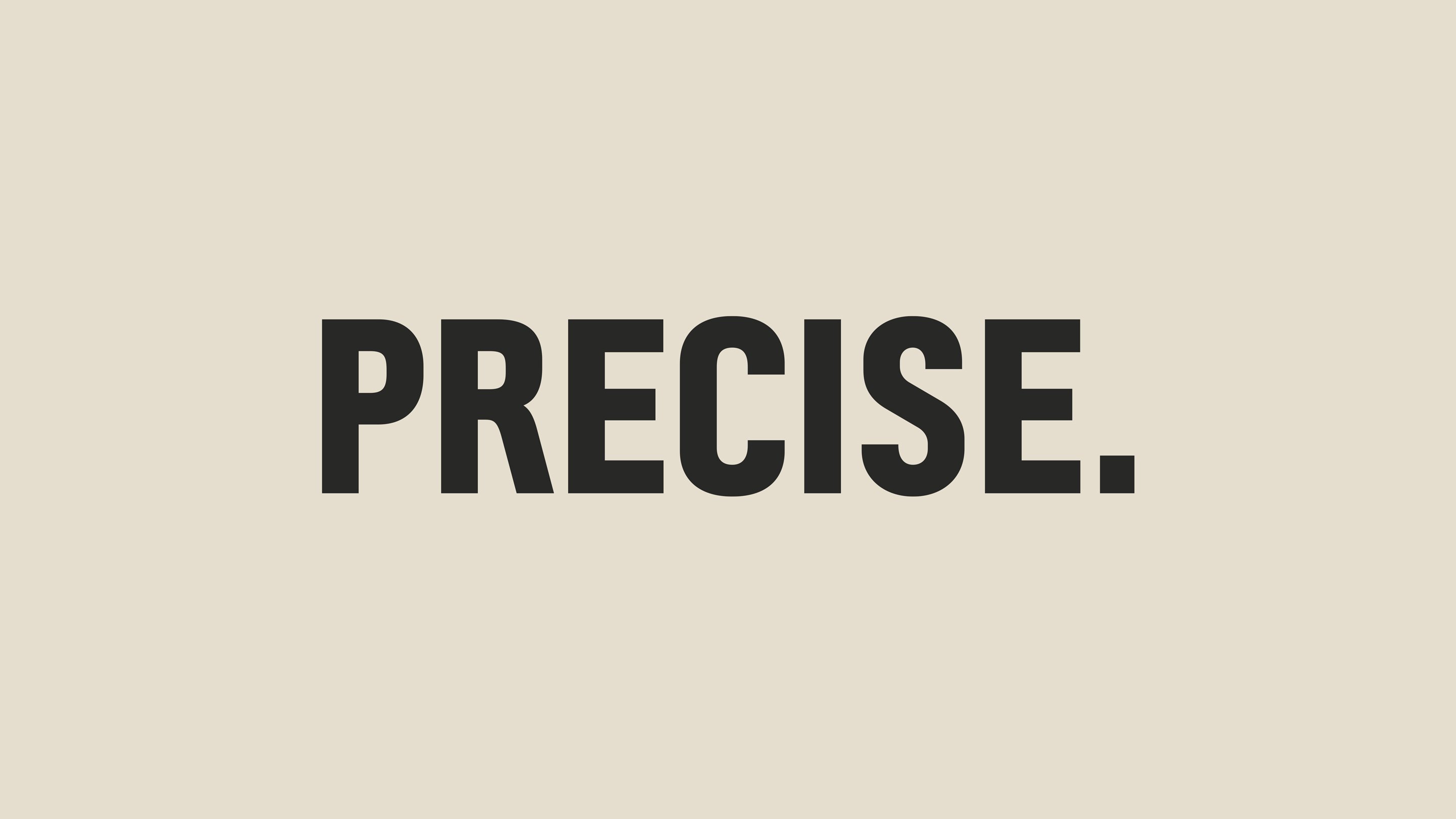
In a very smart move, Design Bridge commissioned a custom cut of the iconic Motorway font, designed by Margaret Calvert and Jock Kinnear for the UK’s motorways back in the late 1950s. This seems to have been a conceptual decision: according to the studio, since the original Motorway font was designed to be read at 70mph, “our typeface is perfect for the time-poor brokers!”
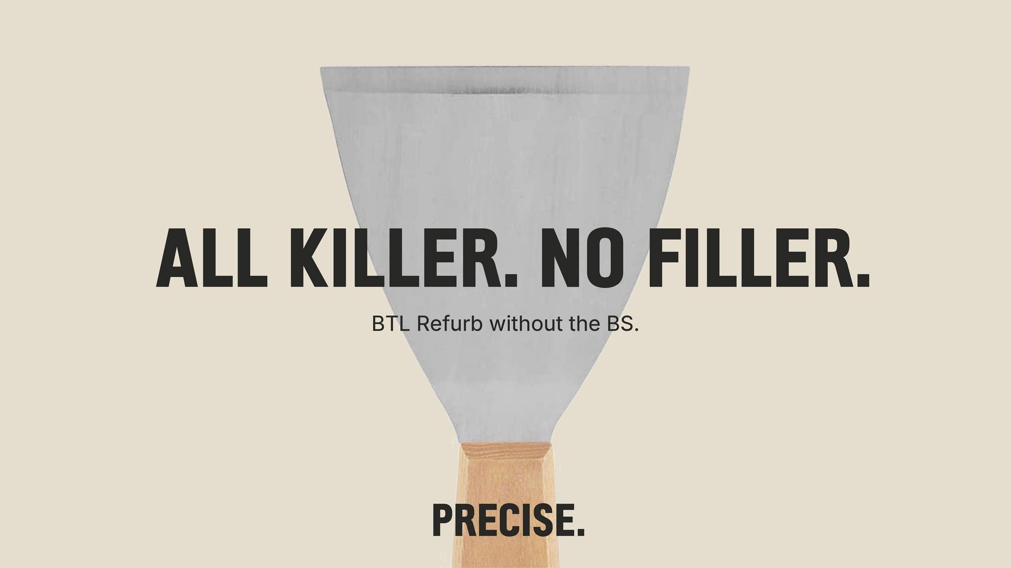
It’s a great font choice: unapologetic, seemingly always all-caps, and thoroughly bold; but there’s a very slightly off kilter sensibility too which gives the whole look and feel a human touch. I can’t quite pinpoint what makes it feel so delightfully ‘off’, but whatever it is, the bespoke letterforms cut by Manchester-based type foundry K-Type give Precise a modern, slightly spiky, and highly unique edge.
It makes for a design that’s reductive in all the right places – aesthetically pleasing not because, or in spite of the brand being something as seemingly dry as mortgages, but simply because it looks really, really good.
