Fuku by Red Antler
Opinion by Emily Gosling Posted 27 March 2025

Fuku (no sniggering at the back please) is a ‘fine brining establishment’ – i.e. some sort of eatery, you can safely assume – specialising in a specific type of chicken ‘sando’, or in normal language, ‘sandwich’.
According to Red Antler, the Brooklyn based design agency behind Fuku’s branding, ‘the Fuku sando first hit the scene as a secret menu item at David Chang’s Momofuku Noodle Bar in the East Village, spiralling into such a spicy sensation, it got its very own restaurant: Fuku’. It’s not 100% clear from the website if Fuku has a specific bricks and mortar site, but it seems to be a sort of multipronged sandwich concept selling said ‘sandos’ at various sports and music venues across the US, from NY’s Madison Square Gardens to Miami’s Hard Rock Stadium to Baltimore, Vegas, LA and more.
Red Antler worked across the Fuku brand strategy, brand identity, UX design, art direction, packaging, retail concepts, and go to market strategy; describing its goal as evolving the Fuku brand ‘in a way that celebrated its roots in the culinary scene and paid homage to its no-frills approach to good food’.

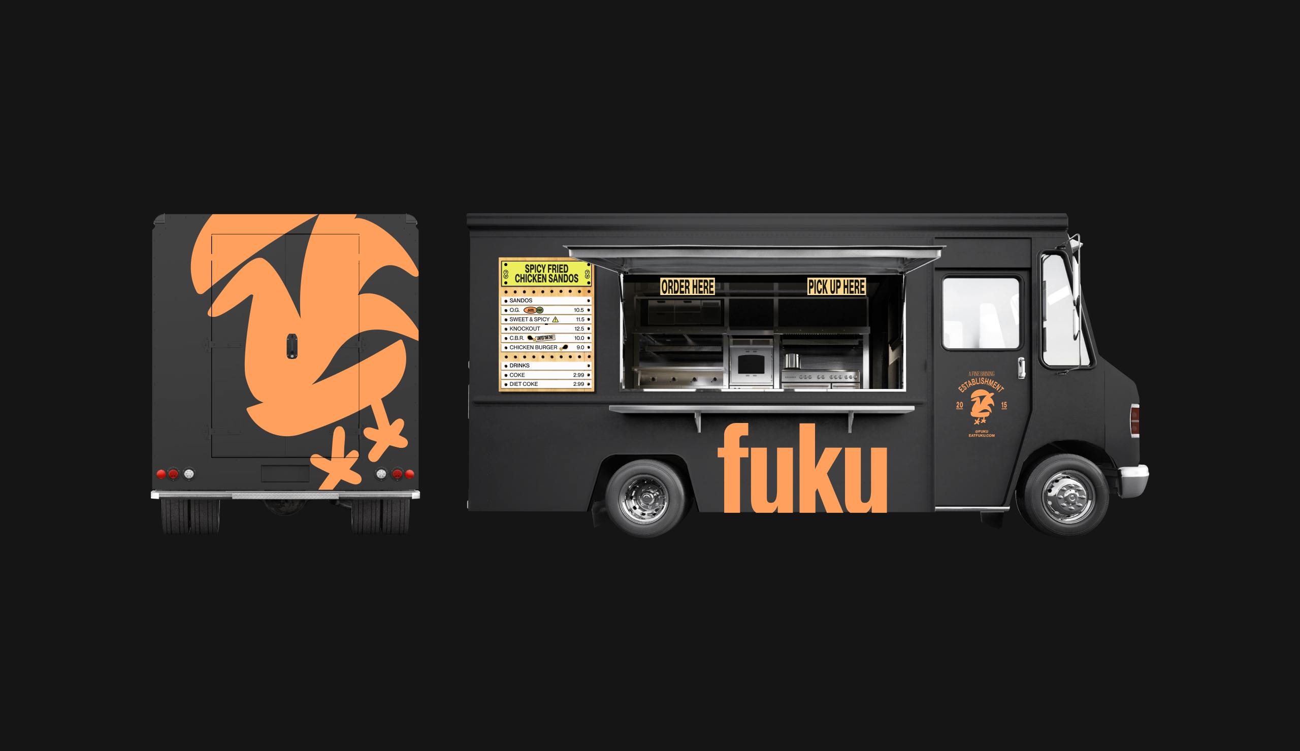
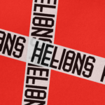
There’s a lot to like about Red Antler’s branding for Fuku; and yet there are also so many questions – not least, when did people start saying ‘sando’? Another is the choice of logo – perhaps it’s because it’s been more than 25 years since I’ve eaten meat but I can’t get my head around an icon depicting an actual chicken (albeit a silhouetted cartoon one) in a burger bun. But then what do I know: at least the icon reflects the no-frills, hyper-confidence of the rest of the brand identity – even if it is a bit on the nose.
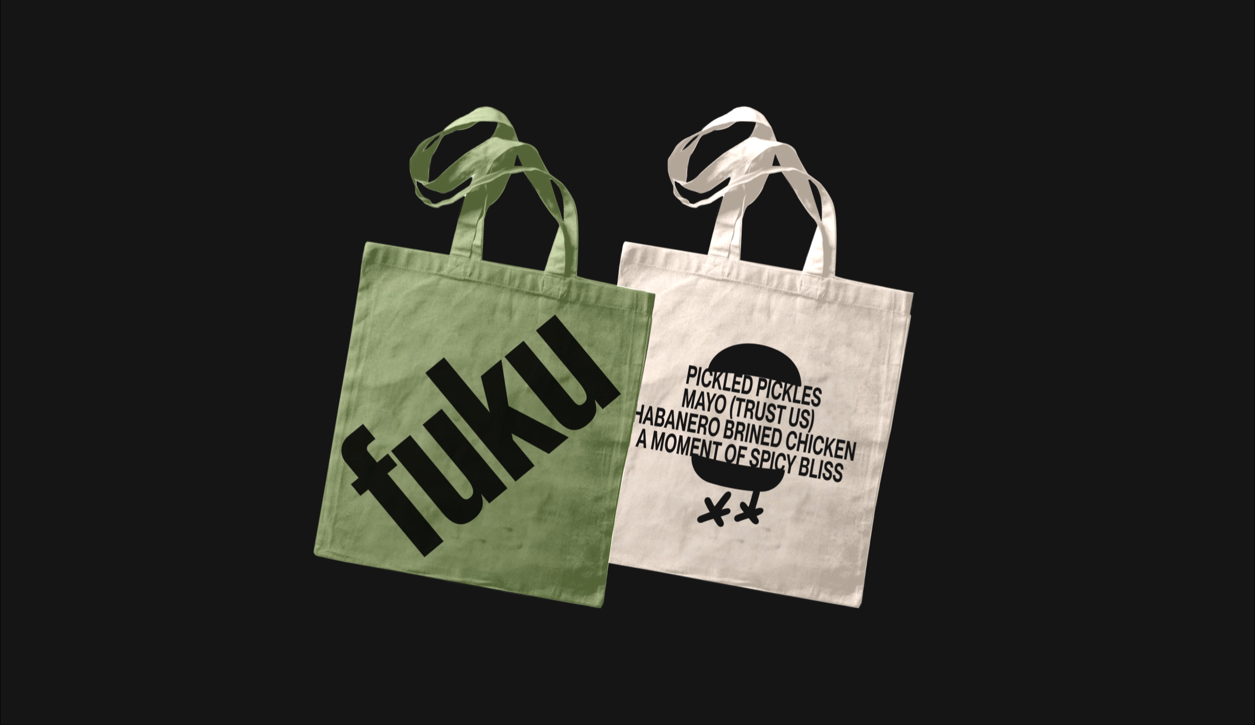
And finally, some of the copy has really got me scratching my head – perhaps it’s lost in translation, perhaps I just don’t get it – like the ‘fine brining’, which to me, feels like it’s a pickle parlour. And the ‘take it or take it’ tagline… Yeh, no idea.
![]()


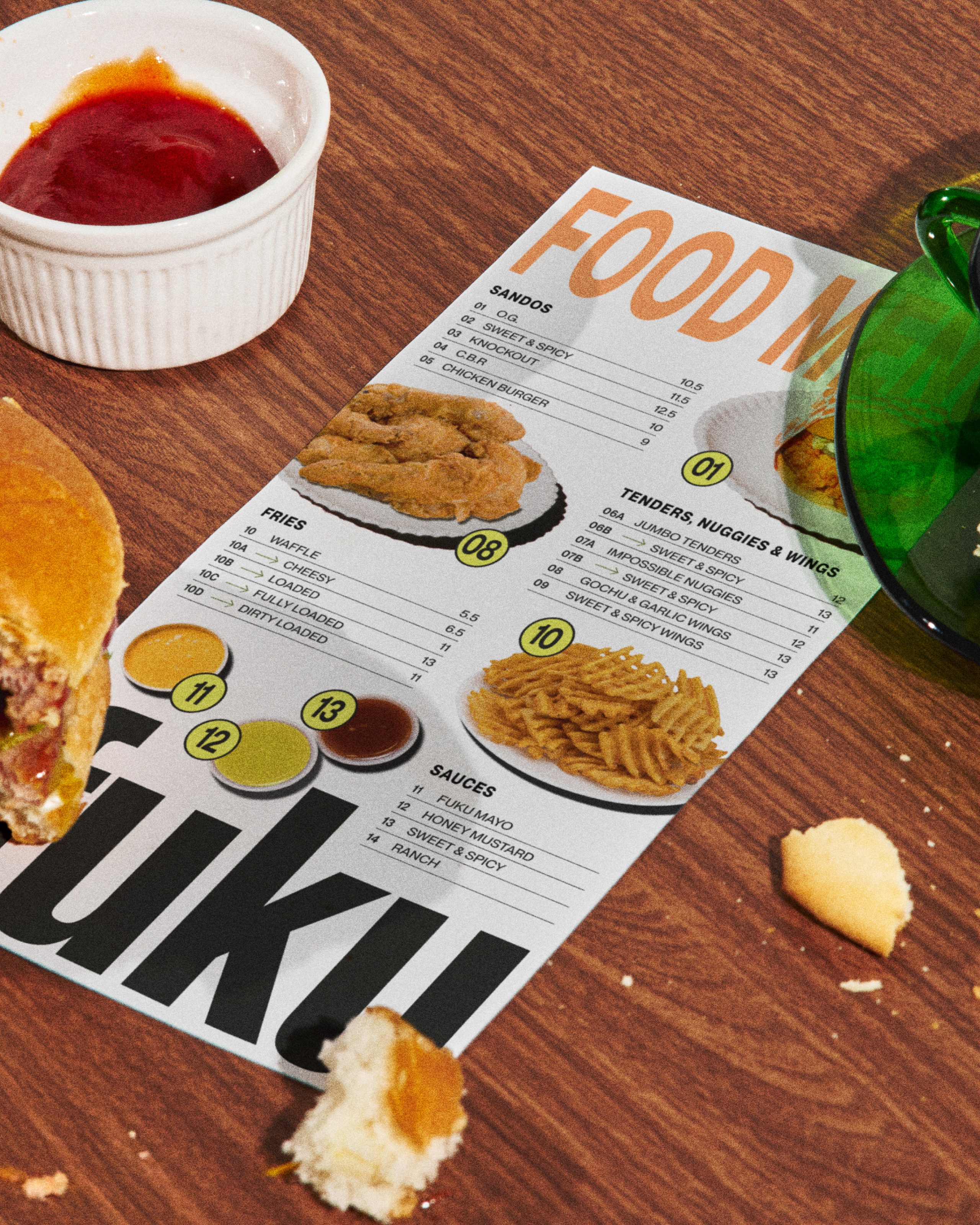
On a far less confused note, I love the choice of typefaces here: the branding mixes and matches two fonts from the ever-brilliant Montreal-based type foundry Pangram Pangram: the sans PP Neue Montreal, billed as a versatile grotesque ‘with the spirit of a display font’, and PP Right Serif, a multifaceted workhorse of a font.
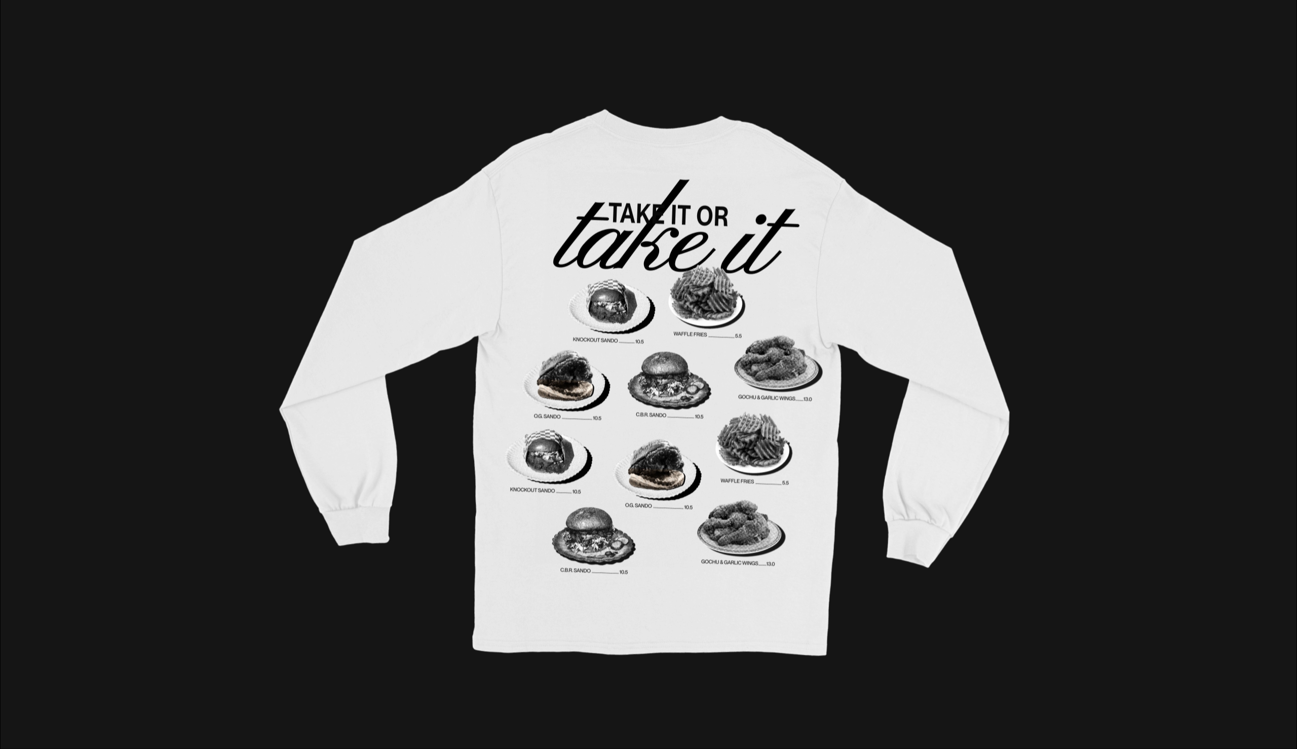
And the campaign art direction is superb: the editorial-leaning, no-nonsense flash photography works superbly: it feels really dynamic, exciting – it sweeps you up in a very New York at nighttime vibe that’s irresistibly charming.
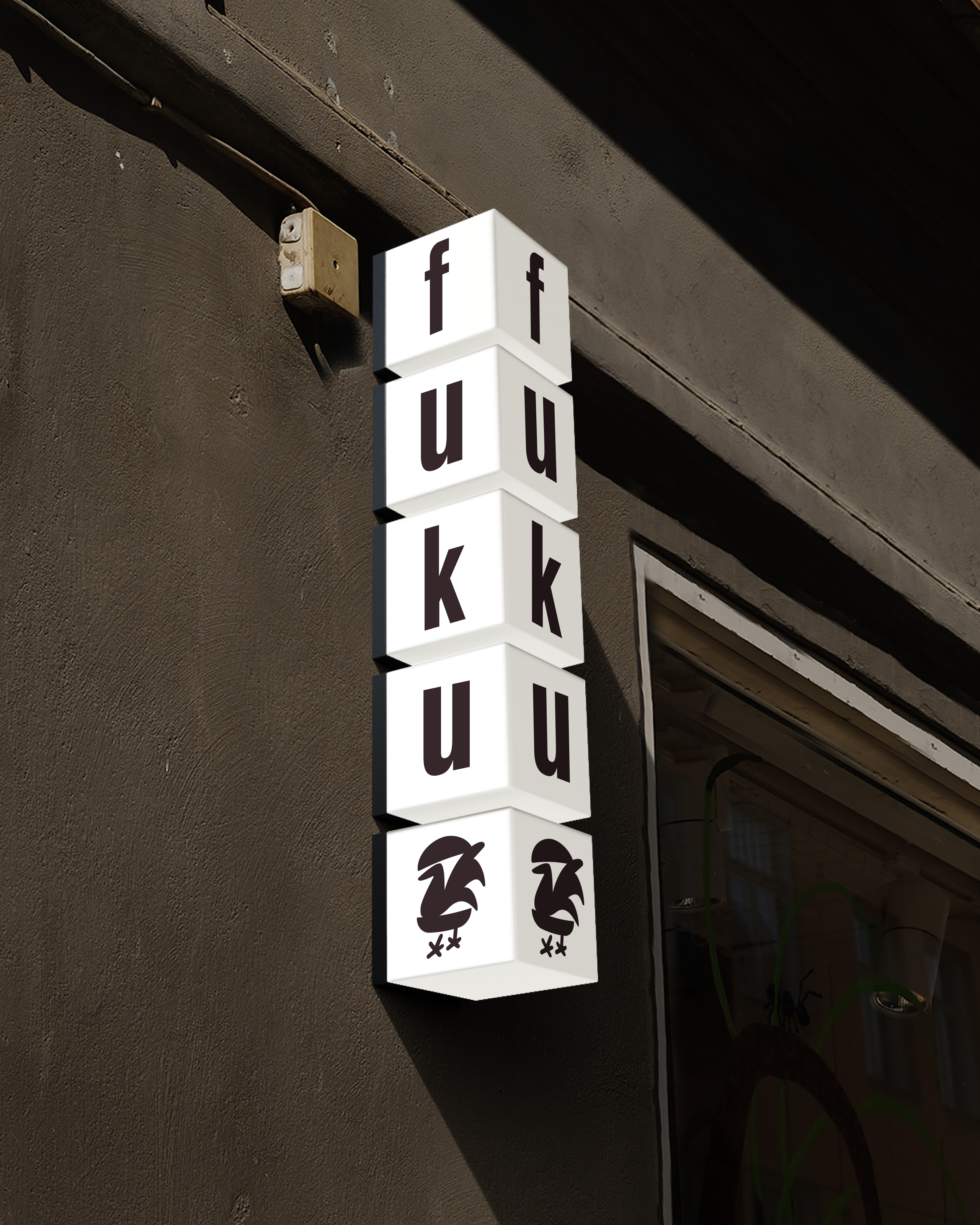
The wordmark itself is decent, using straightforward Akzidenz-Grotesk BQ Condensed, which works really well applied to things like signage (I love the 3D cubes of the external stacked sign shown in the case study). According to Red Antler, the font was chosen as a nod to the typography found on awnings across downtown Manhattan; and so much of the brand does the whole NYC thing brilliantly.
So many elements here are strong, but at times it can feel like the identity is all reaching a little too hard towards ‘cool’: there’s hell of a lot going on here, and at times, that leaves it feeling as though it’s a bit, well, desperate to be liked.

Take the stickers thing for example: it’s a decent enough concept, but I’m not totally sold on the execution – it feels a bit sloppy in places sort of phoned in, grasping at some sort of Gen X slackerish skater-bro cool thing where it didn’t really need to.
All that is to say that there’s no doubt the branding works in the way it needs to – especially on menus, which mix the unflinching photography style and excellent typography choices. It’s a super lively identity – unwaveringly evocative of its NYC home, and it’s a lot of fun – for those who can stomach a little walking chicken in a bun, that is.