Yaté by Herefor
Opinion by Emily Gosling Posted 3 April 2025
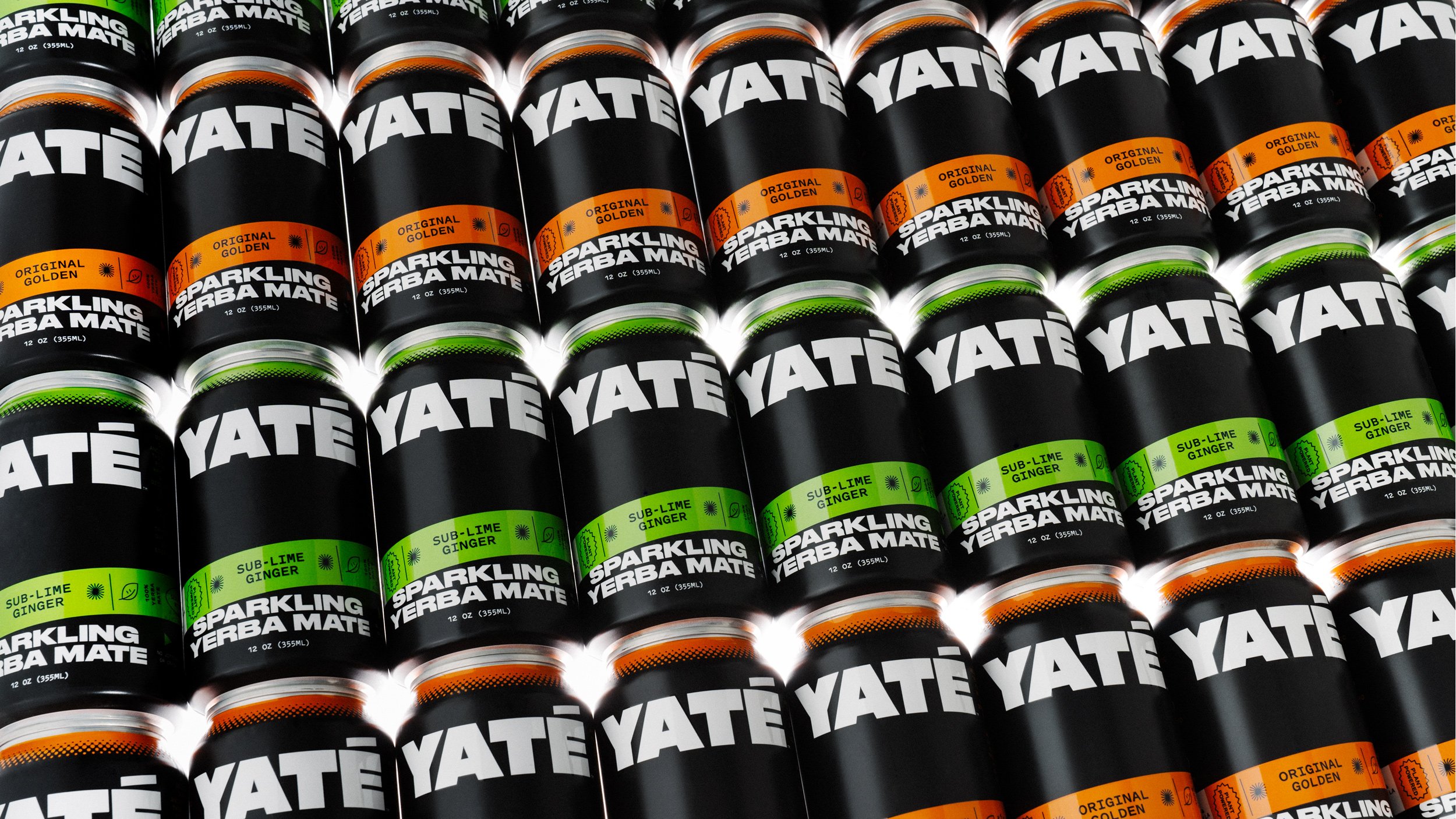
Long gone are the days when ‘energy drink’ connoted unwashed teenage gamers, amped up Twitch streamers, hungover/still going city boys on the Tube, or 2-4-1 deals on vodka Red Bull in sticky-floored suburban student nightclubs.
Like many things – such as reading books, going for a walk, or having a bath – the energy drink sphere has now collided with the ever-expanding world of ‘wellness’. The energy drinks of today are often just as comfortable on the shelves of Holland & Barrett as they are in the vast, bright white lights of a 24-hour Esso fridge.
And as such, the branding, too, has evolved beyond battery-like colourways and an (albeit very smart) logotype that’s both massive claw and massive ‘M’.
Such is the case for Yaté, a ‘clean-energy, low sugar sparkling yerba mate’ made with ‘simple ingredients’, and with a third of the calories of ‘the competition’, apparently. Its branding was created by Brooklyn- and Honolulu-based studio Herefor, and does a great job of situating the whole thing in the sweet spot between frantic ‘HELP I HAVE A DEADLINE/RAVE/HANGOVER’; hipster-adjacent health-goth; and high-end keto-leaning ‘gym bunny/rat.
Yerba mate is a naturally caffeinated South American tea, and is purportedly a healthier alternative to coffee and standard energy drinks. We’ve seen a rapid rise in its popularity in recent years: around a decade ago, Club-Mate – likely the most famous of the mate brands – was the preserve of 48-hour Berlin parties, but its siblings have long since made their way across the channel and into the hands of people who don’t stay up for three days straight doing the techno-two-step.
As such, countless brands have emerged within the space, but few stand out (Club-Mate as an OG is an exception, and an exemplar – its character design, type and label are weirdly masterful). Many have fallen into a sort of visual cliche that leans into a sort of drab earthiness, or which rather clumsily leans into mate’s South American heritage, which all gets a bit dull. Not so with Yaté’s new look.
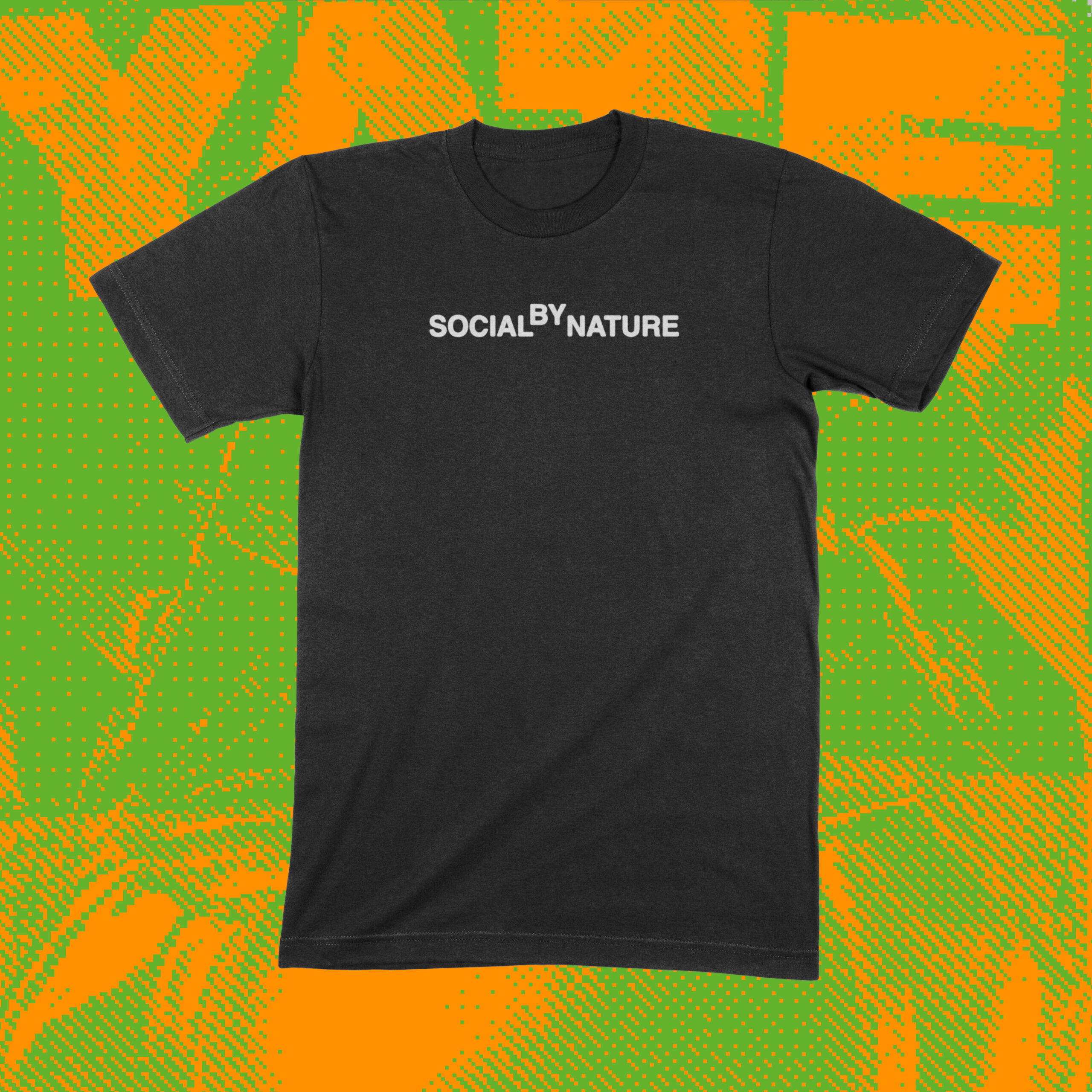
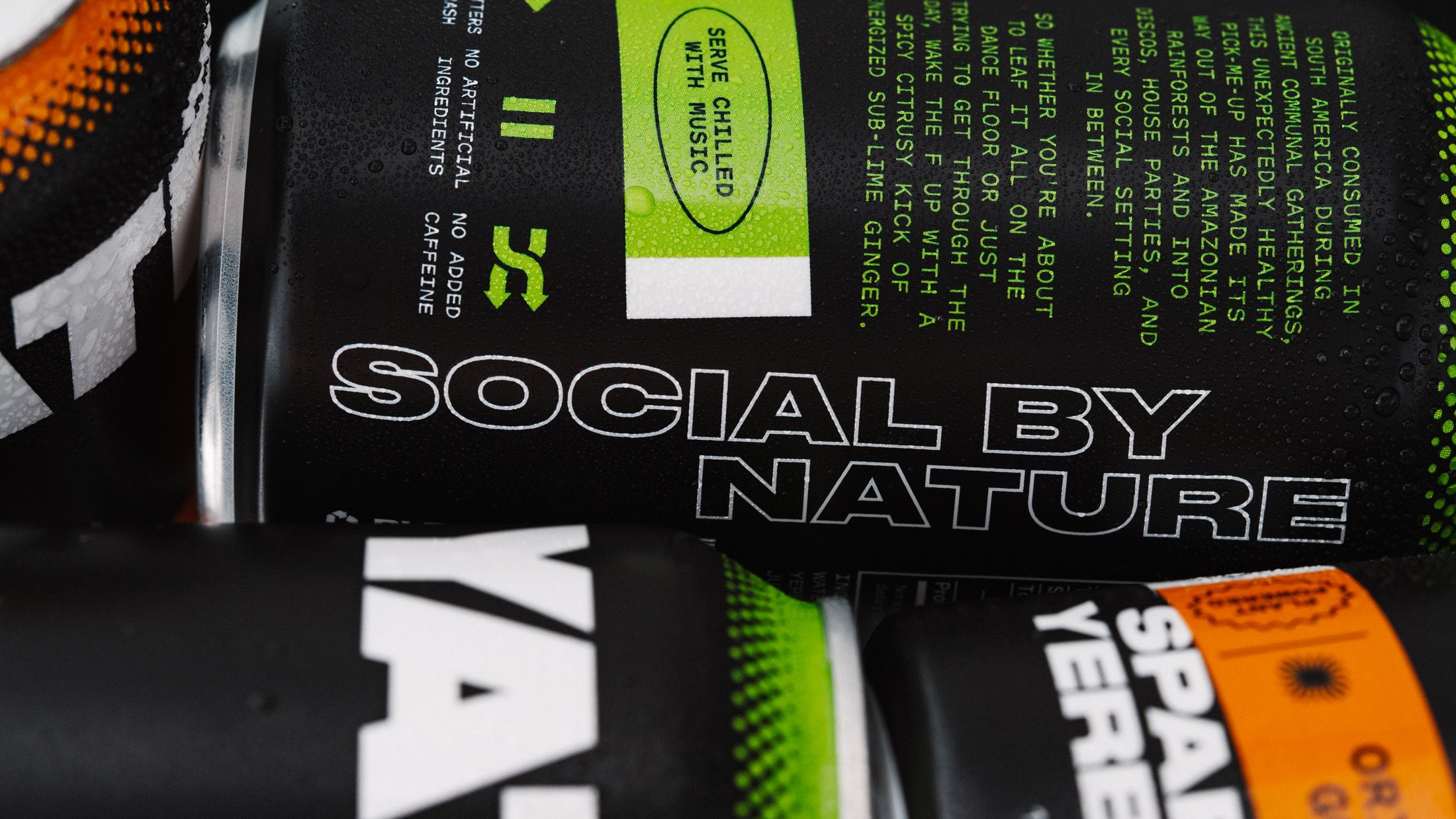
Rather than borrowing from the organic, minimalistic aesthetic that dominates the ‘better-for-you’ beverage landscape, Herefor looked instead to nightlife culture to inspire the look and feel: ‘Yaté is “social by nature” with roots in the music scene’, the studio explains. As such, a number of on-pack design elements such as flavour badges, icons, typography and the hyperactive neon colour palette are unequivocally ‘synonymous with music and going out’, it continues.
These elements merge into a big, unapologetic, and (obv) highly energetic aesthetic that brings a nice whack of attitude into an often overtly health-bore-baiting sector. It’s brash, and a bit silly, but it’s a lot of fun – and crucially, it’s more than a bit different.
Perhaps the most diminutive element is the delightfully garish colour palette of orange for ‘original golden’ flavour (no idea) and green for the ‘sub-lime ginger’ variant. The tones are uninhibitedly day-glo, retina-searing – thoroughly nocturnal in its luminescent neons against stark black. If you want colours that are HI-NRG, these are they.
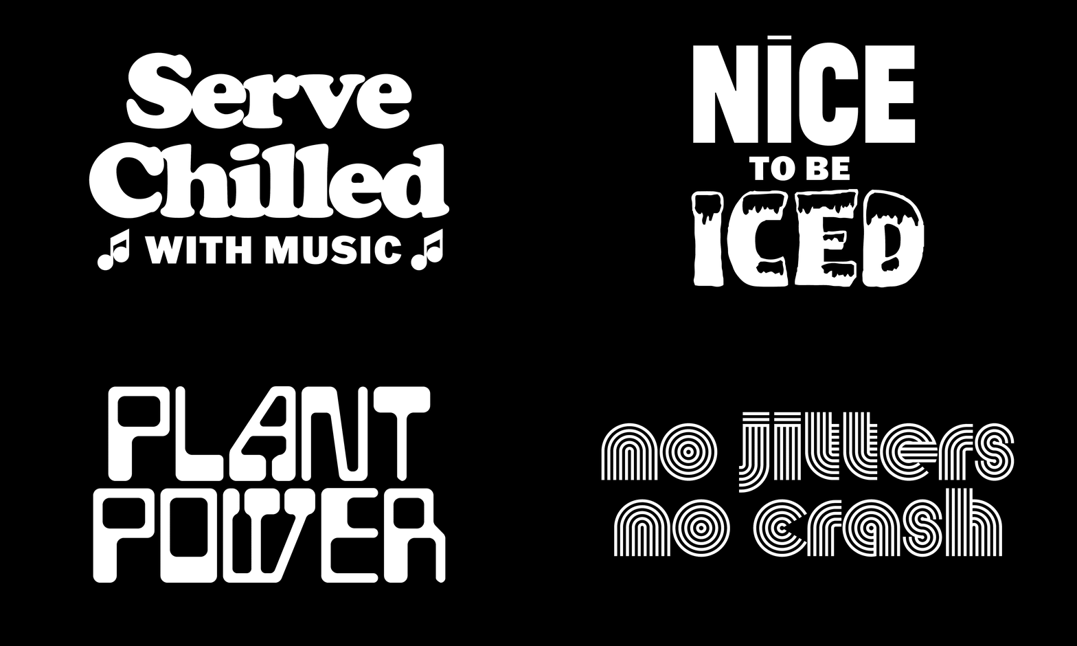
This in-yer-face positioning owes a lot to the use of good old Druk – Druk Wide Heavy, to be precise, by Commercial Type and used for the wordmark and other bold messaging. It’s the perfect typographic choice if you want to convey confidence, which you can only assume was Herefor’s intention with Yaté’s branding. The font’s imposing, densely hefty letterforms also tie in nicely with the nightlife/music foundations, calling to mind club posters, album covers, and niche printed music publications.
Druk Wide Heavy is supported by secondary typeface Pitch Sans by New Zealand type foundry Klim. It’s a slightly strange choice here: Pitch Sans is unmistakably a typewriter font, described by its creators as ‘a synthesis of digital and analogue’. Sure, it’s a nice contrast to the main brand font, but to me it doesn’t make a huge amount of sense here – not sure what the thinking was behind selecting something so unambiguously referencing mechanical processes (albeit in a very modern way). All that is to say, I don’t necessarily get it, but it’s not terrible.
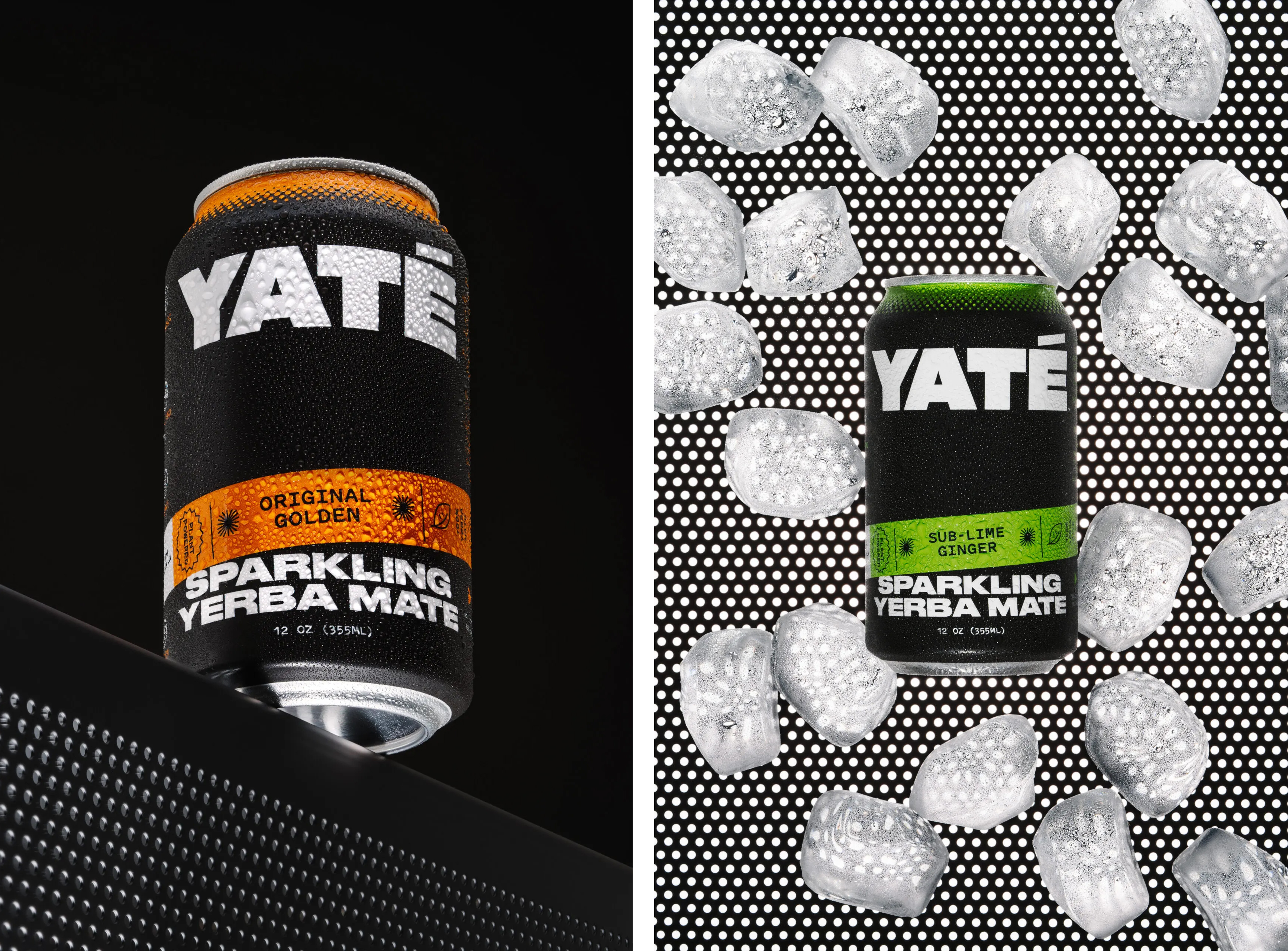
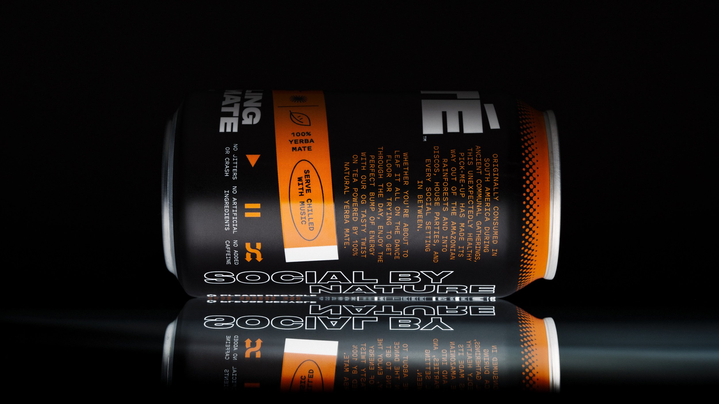
Herefor’s initial brief was to build a brand world ‘that’s social, energetic and differentiates itself in the BFY beverage category’, and it’s great to see a project that does that seamlessly across the verbal as well as the visual identity. The brand copy is smart and completely in sync with the vibe of the look and feel: confident, direct, punchy, but without veering into shouty, try-hard, macho nonsense.
The tagline ‘No Bad Energy’ is a double entendre that’s so smart that it feels almost too obvious, but perfectly encapsulates Yaté’s nightlife-meets-wellness positioning. And somehow, it doesn’t feel at all cheesy.
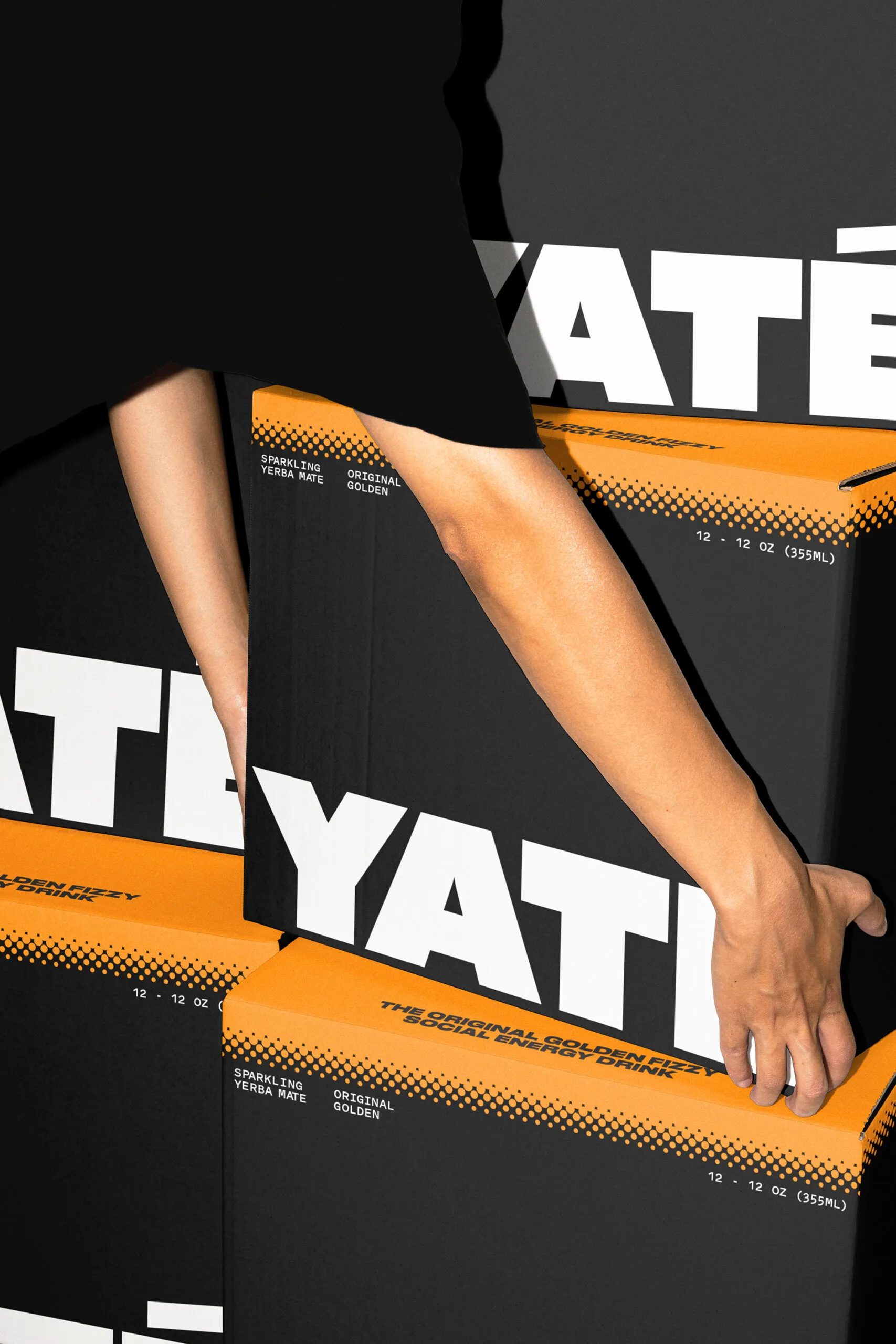
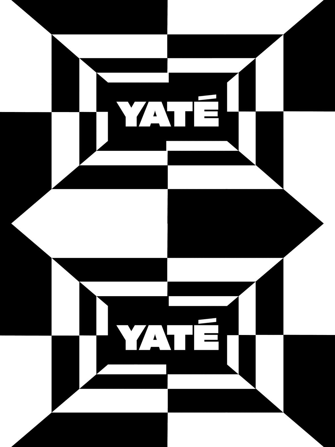
While the can designs are decent enough, the branding really comes into its own across other touchpoints. The posters and print campaign materials look superb, as does the merch – and the multipack cardboard box designs are a masterstroke of stripped-back, bare bones maximalism. At times the cans can feel slightly cluttered, but when the brand has room to breathe, it comes together beautifully.
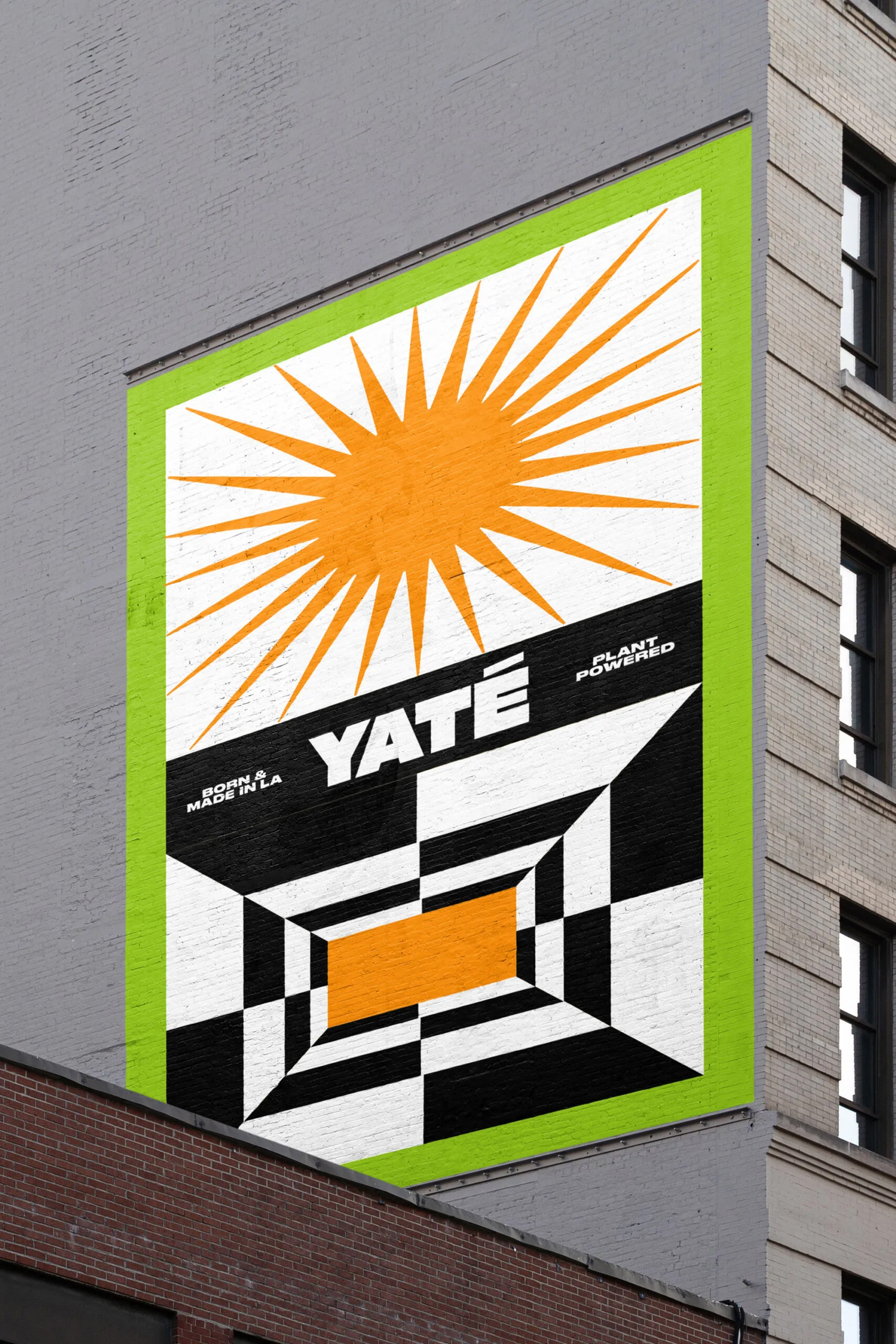
It’s really nice to see a ‘healthy energy drink’ brand that leans neither into the dry tropes of healthy nor the inane hyper-tweaker delirium of energy drinks – it’s never earnest, it’s never bellowing. Crucially, it’s never trying too hard to be ‘cool’. You wouldn’t feel embarrassed to drink this (and I speak as a person who drinks a lot of energy drinks called things like ‘Bulldog Power’ and ‘Predator’, often furtively) – probably quite the opposite, in fact.
