To My Ships by Formafantasma
Opinion by Emily Gosling Posted 29 May 2025
There’s something almost monk-like about the branding for To My Ships, a new personal care brand founded by Daniel Bense. As former Head of Commercial at Aesop and Managing Director at Sunspel, Bense is clearly a man who understands that today, luxury isn’t about bling, gold ornamentation, and gauche, showy baubles; but about minimalism and understatement, and things that smell very nice indeed.
There’s no doubt that To My Ships’ aesthetic is veritable catnip for the refined, understatedly but quietly, obviously wealthy Aesop masses – the yummy mummies of Broadway Market, the Ocado shoppers, the glossy haired hordes whose makeup aims primarily to look ‘dewy’ but also non-existent.
While To My Ships’ name is, I’d argue, not-great (nothing to do with boats as far as I can tell, the moniker sounds more like a grotesquely bland early 00s indie/folk/alt band, or a sixth form novella by someone who’s just discovered Virgina Woolf and not quite yet really understood her). But its identity is very smart indeed.


The brand design, identity, structural packaging and more were created by Milan- and Amsterdam-based research-centric design studio Formafantasma, which describes its raison d’etre as ‘investigating the ecological, historical, political and social forces shaping the discipline of design today’. And it certainly weaves these disparate threads together in its extensive work for To My Ships.
Bense commissioned the studio to undertake a complete audit of the brand, its materials, systems, and assumptions. What emerged from that process is a brand defined not by surface aesthetics, but by deep design ethics.
As such, the identity is characterised by branding that doesn’t yell, or make itself known, but reveals itself gradually as part of a more holistic, critically ecological approach to design, that’s all about slow consumption, graphic discretion, and of course, fine, fine fragrances.
The tone is measured, the gestures minimal. Indeed, this is branding built not for shelves or social feeds, but for longevity and ‘purpose:’ no saccharine pastel colourways, no botanical clichés, no gilded caps, no abstract swirls of colour, no gloss.
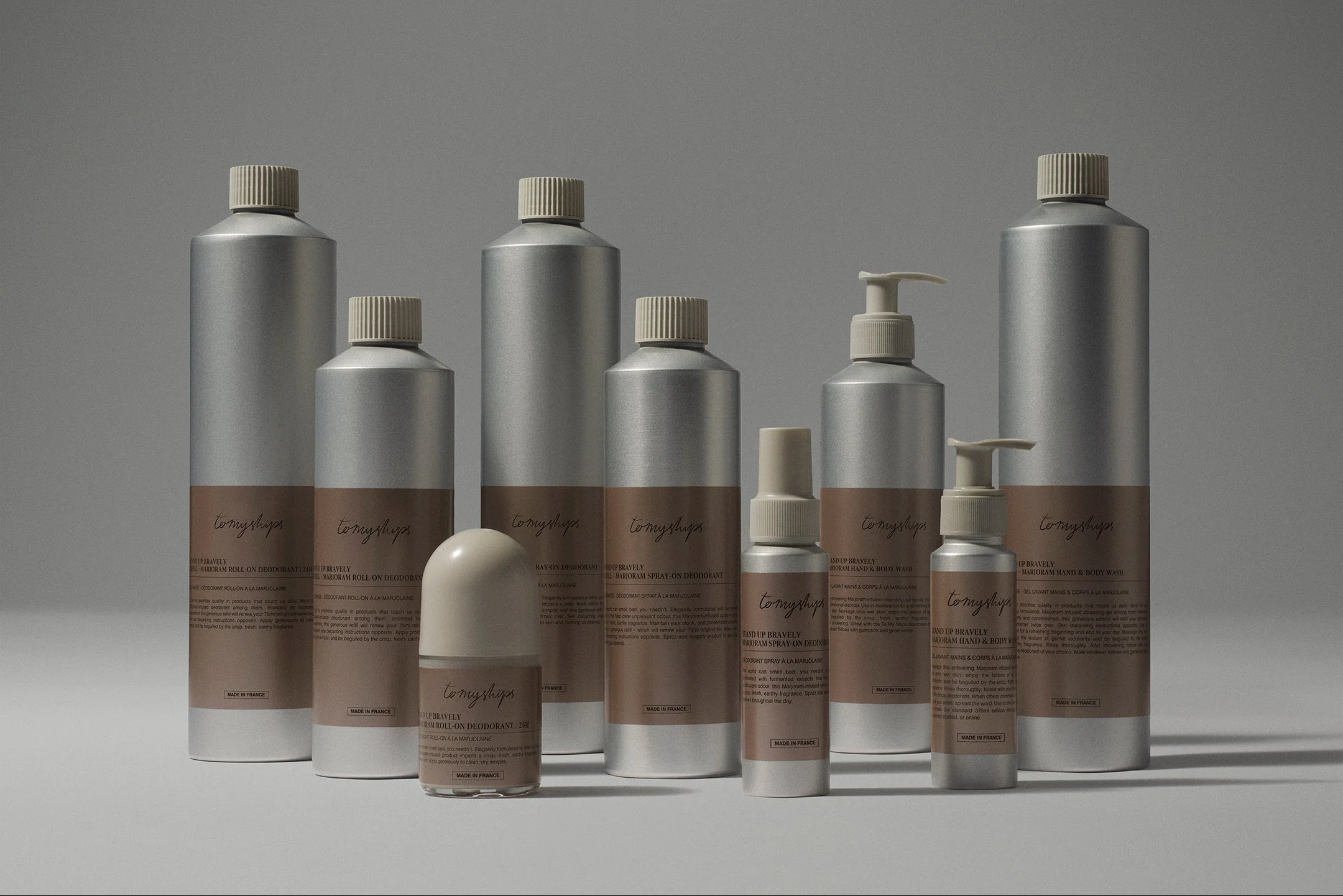
![]()


At first glance, there’s almost nothing to see. This is discretion by design: the branding exists not to overtly sell, but to inform, educate, and last – it suggests control, confidence, and crucially, an ecological conscience that you can tell everyone about via your artfully arranged bathroom shelves.
At the heart of the design are the vessels themselves. The bottles are made from 100% post-consumer recycled aluminium, a material decision based on research that found that it outperformed other pack materials in recyclability and transport efficiency. The caps and pumps are made from PCR plastic, the bare minimum required for function.
Meanwhile the taller, slimmer bottle forms were chosen by Formafantasma to reduce material by up to 10%, a telling technical decision that speaks to a new kind of luxury aesthetic minimalism born of economy rather than greenwashed affectation.


The brand’s single expressive gesture is the wordmark: tomyships, rendered in a scripty, hand-drawn style. Yes, it’s elegant, but I’m not a fan. It’s a millimetre shy of twee – it’s got a sharp whiff of Nan, or ‘live love laugh’ about it. I hate the all-one-word thing, I hate the typeface, but thankfully the rest of the design decisions make it somehow work. Could it have been better? I’d definitely argue a hard yes, but I can see the case for opting for such a style as a way to soften or humanise the starker minimalism used across the rest of the system.
Elsewhere, typography is cool, measured, and unobtrusive. Dinamo’s Diatype is paired with Sabon Pro Roman, bringing a balance of contemporary clarity and classical rigour. Together, they echo the project’s principles: rational, contemporary, absolutely no need for fluff or marketing jargon or tacky sloganeering.
The colour palette is likewise resolutely understated. Subtle shades of warm grey, natural aluminium, soft off-whites and muted greens echo the materials themselves rather than masking them. The labels carry minimal contrast, with text often rendered in a deep charcoal, rather than full black (less shouty, obviously).
Label design follows the same principles: reduced, refined, and ultimately removable. Adhesives are chosen specifically to leave no trace, enabling bottles to be repurposed and reused over merely recycled.


The design system is spare to the point of ascetic; a kind of industrial elegance. Beyond the tactile pleasure of the cool metal, there’s an architectural logic to the bottle family. It’s a clean break from the industry norm of ornate primary packaging and disposable refills – a kind of structural luxury, true to the Formafantasma way, a decision rooted in systems thinking rather than superficial differentiation.
In a market built on desire, To My Ships proposes something quieter and arguably more radical: genuine interrogation of how we use things and then use them again. As Formafantasma put it, ‘What we find sexy in the packaging is that it’s not sexy’. This is graphic design as audit – ethics in action. To My Ships isn’t just another clean beauty brand with recycled packaging. It’s a design experiment in how far rigour, honesty, and visual discretion can go. And weird name, twee scripty wordmark and all my snottiness around the Aesop aesthetes aside; this approach is, perhaps, is the most compelling form of branding in an age of overstimulation.