Church by Porto Rocha
Opinion by Emily Gosling Posted 3 June 2025
Naming your company ‘Church’ is, it’s probably fair to say, a bit of an edgy move. Some might even go as far as to suggest it to be sacrilegious. But here, in the case of this proverbial temple of film post production, Church seems to really fit – and without even the faintest hint of edgelordery about it all. And that’s largely thanks to its superb brand design and visual identity, courtesy of Brooklyn-based studio Porto Rocha (PAC NYC & Lunge).
LA-based post-production studio Church was founded by award-winning Brazilian-born film editor Mah Ferraz (coincidentally, the cofounders of Porto Rocha also hail from Brazil), and describes itself as ‘a congregation of globally-minded film editors who seek to bring creative visions to life’. Among its impressive portfolio is work for brands including Nike, Spotify, Calvin Klein, KFC, and Puma; as well as music videos for the likes of Megan Thee Stallion and Peggy Gou.
Where agency or studio identities often hold back, fearing being ‘too much’ and overshadowing its portfolio projects and/or the individuals (in this case, the editors in that ‘congregation’), Church’s new identity has boldly, unashamedly gone the other way, instead making a statement with its own brand that’s as strong as the work it cuts.
Collaborating closely with Church’s founding team, Porto Rocha has created a brand that is not only visually distinctive but conceptually tight, based on a system that communicates its unique positioning and worldview.
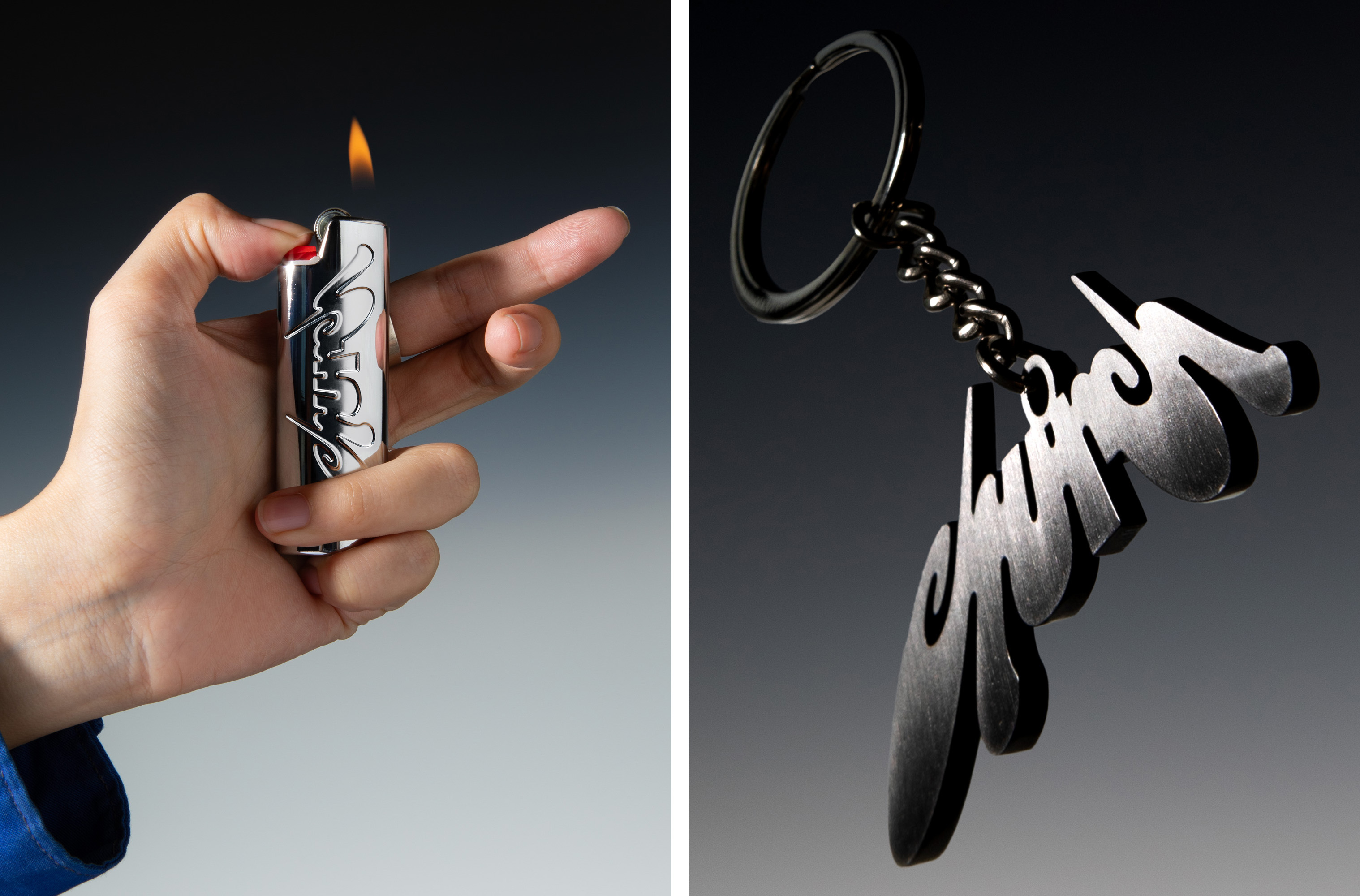
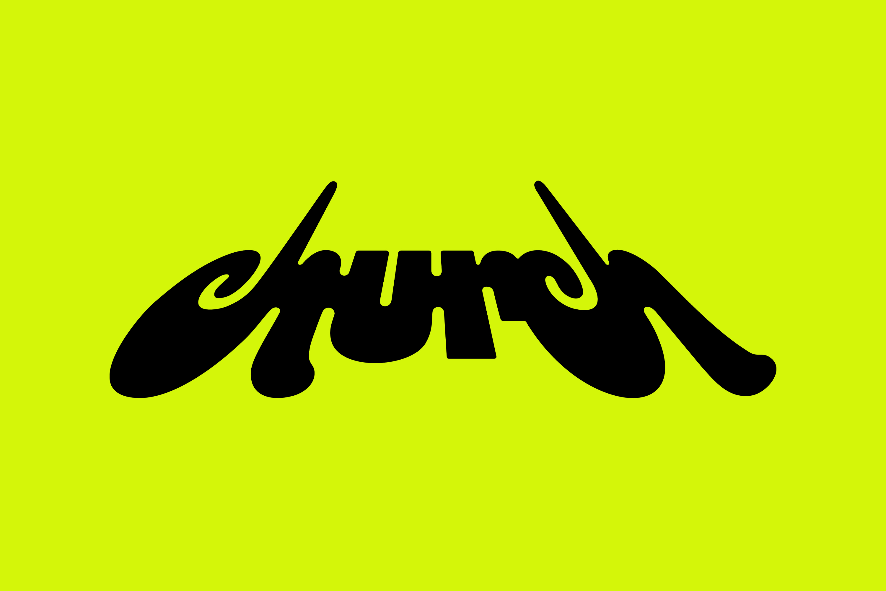
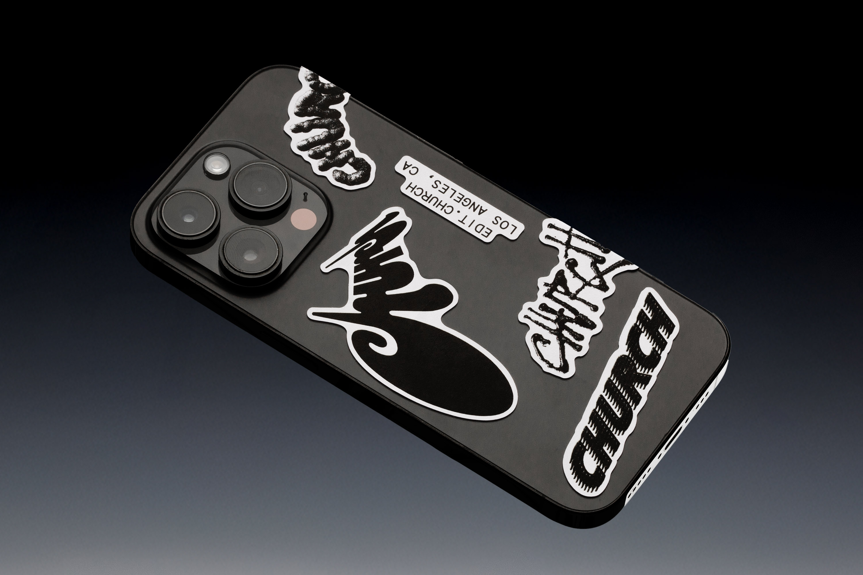
At the core of the identity is a logo that doesn’t behave. It’s not neat, it’s not clean, and it’s certainly not afraid to take up space. Conceived by visual artist Chloe Corriveau and then refined by Porto Rocha, the wordmark draws direct inspiration from cathedral architecture – specifically, the skewed verticality you experience when looking up from the ground at towering spires.
It’s befitting of Church’s name, of course, but more than that, it becomes a structural device for how the brand shifts and behaves across platforms. By introducing multiple perspectives of the logo – it appears cropped, angled, abstracted across the brand’s multifarious touchpoints – it provides a neat visual metaphor in forcing us to constantly look at things from new and unusual angles.
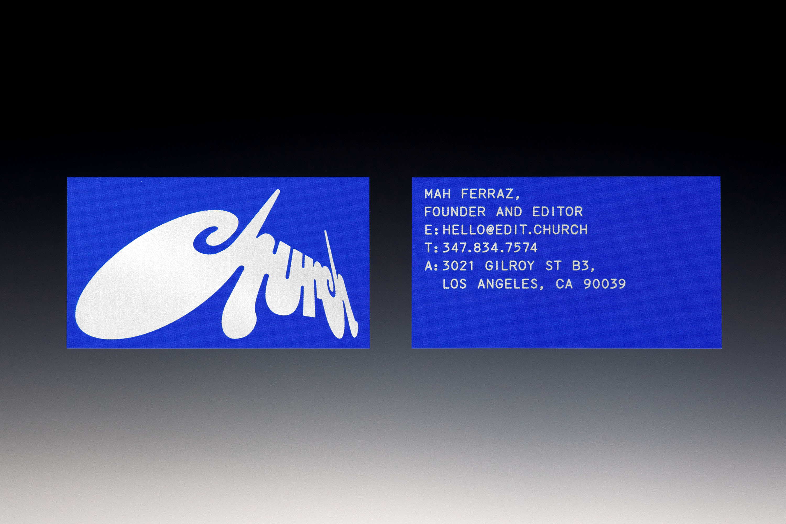
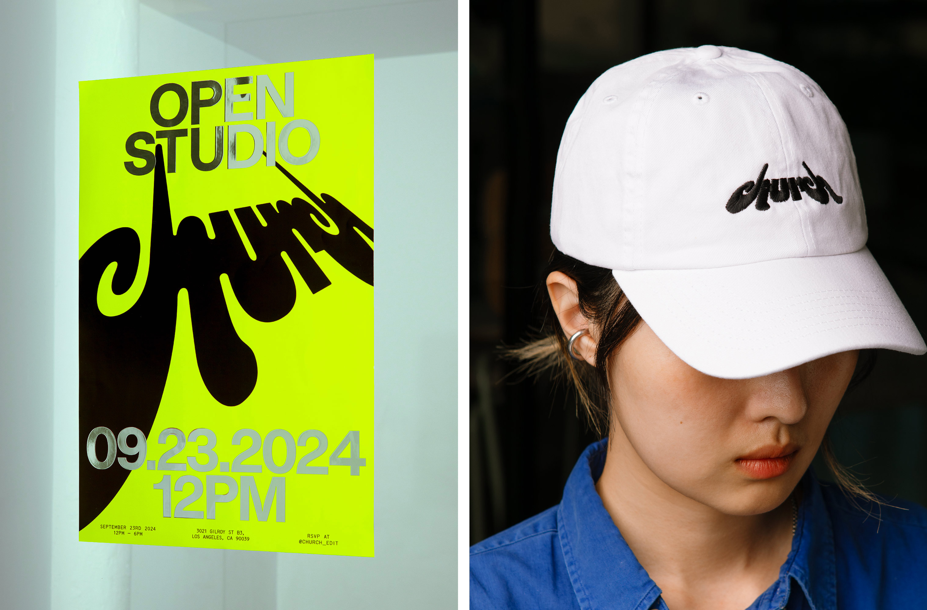
This theme of perspective and frequent visual nods to reframing, recontextualising, and resisting flatness appear across this deliciously modulating, flexible identity. And this in turn reinforces the skill of Church’s editors and the nature of editing itself: the ability to change meaning, mood, and momentum through subtle shifts in how a story is told.
Supporting the logo is a disciplined type system that balances expression and clarity. Superstudio by Swiss foundry Lineto, a contemporary monospaced typeface, serves as the functional backbone. It brings a technical sensibility to smaller copy, subtly echoing the tools of the trade: timelines, markers, code. In contrast, Studio Pro Ultra Bold takes centre stage for headlines, adding weight and character to editor names and project titles. Together, they create a nice sense of rhythm that remains legible.
One aspect of the brand which has been kept more on the restrained side is the colour palette of just black, white, a near-neon, nuclear waste-ish yellowy green, and the occasional flash of blue, often as a part-framing device in a shade that suggests Yves Klein in a post-digital LED future. By using subtle tonal shifts rather than overt chromatic statements, the work can shine while keeping the brand itself strong as ever.
Naturally, what with Church being a post production house for moving image, motion is central to the branding. Online, the brand zooms, reframes, mirrors itself; often in a way that feels borderline unhinged in its energy and unpredictability. These aren’t transitions for transition’s sake; they’re an extension of the identity’s core principle: that multiple viewpoints aren’t just welcome, they’re fundamental.
‘Taking inspiration from the perspectives of the logo, our motion system plays with extreme shifts in perspective – zooming in, tilting, rotating, and reframing in ways that feel both architectural and cinematic’, says Porto Rocha. ‘It mirrors the unexpected points of view found across Church’s roster, where each editor brings a distinct lens to their work. Nothing feels flat or fixed; everything is in motion, evolving, inviting you to see things from a new angle.’
The Church website, developed by Open Statement, is as much an immersive digital experience (one that’s honestly frustrating at times, when landing the cursor where you want it can feel impossible) as it is a portfolio or directory of editors. For all the frustration though, the site rewards curiosity.
Just like the movies, the brand is never static – in a literal sense of its focus on kinetic applications, and in being a visual language deliberately created to scale, adapt and grow with Church’s global-spanning editor team and its expansive portfolio.
Porto Rocha’s work never disappoints, and its approach to the branding for Church is no exception, subtly staking a claim as a new model for how post-production studios can communicate creativity, ambition, and vision without resorting to clichés or corporate polish. It proves that technical excellence and emotional resonance don’t have to be enemies – they can in fact work better as a unified force.
