BRiMM by Harriman Steel
Opinion by Emily Gosling Posted 17 June 2025
Combining an online shop, journal, and collective, BRiMM describes itself as a platform for ‘planet-positive living’, drawing together some big ideas and ruthlessly sustainable brands. Based between London and Stockholm, it was founded last year by James Haycock, who’s billed as, ‘an exited founder, angel investor, and the vision behind’ it all.
The fact the whole thing looks so great is perhaps down to Haycock’s background, a long-standing fixture of the London design scene. He had previously built, (and also exited) design and innovation studio Adaptive Lab, which he sold in 2018. However, the main reason is undoubtedly thanks to east London-based design and brand studio Harriman Steel, which led the creative direction and brand identity work from the get-go.
What’s clear from both BRiMM’s own website and the more abstract visual aspects of the identity is that BRiMM is big on overturning the idea that living sustainably means living a drab, boring life centred on kale and muted greenish brown tones. As such, it sets out to prove that living within limits isn’t the same as living less: things have well and truly moved on.
The product selection on the online BRiMM store reflects this: it’s described as ‘curated, not overflowing’, and sets out to be – and this is an idea that carries throughout the brand’s look, feel, and tone of voice – an ‘enough store, not the everything store’. And in a small but significant way, BRiMM seems to put its money where its mouth is: 10% of the brand’s margins are reinvested into its Planet Fund (unclear on exactly what this is, however), and it also supports carbon insetting, which means working directly with its value chain to finance emission-reducing initiatives such as regenerative agriculture or renewable energy systems.
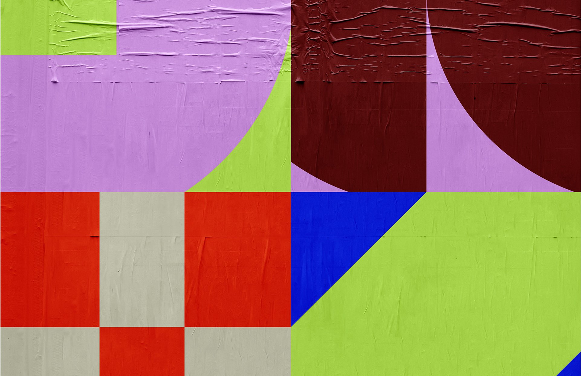
At the heart of the design system is a kit-of-parts approach, built from a collection of simple geometric forms that act as building blocks and conceptual devices that nod to some of the brand’s foundational pillars and overarching ethos.
Yes, the shapes are decorative and visually very appealing in their striking, Bauhaus-esque, quietly playful, and somewhat idiosyncratic little way – but they also succinctly convey BRiMM’s ideas around ‘addition and subtraction’, a logic rooted in the principles of repurposing, restraint, and reuse. Combining elements of ‘visual leftovers’ into something new, different, but functional; clutter is subtracted in the same way the brand encourages people to eschew overusing and mindlessly consuming things we really don’t need. The name BRiMM itself inherently nods to the idea of being full, well, filled to the brim, but stopping just before things spill over.
Throughout the BRiMM identity, this notion plays out as a visual shorthand that’s all about making space, articulating purpose, and acknowledging that we’ve reached our limit when it comes to material consumption.
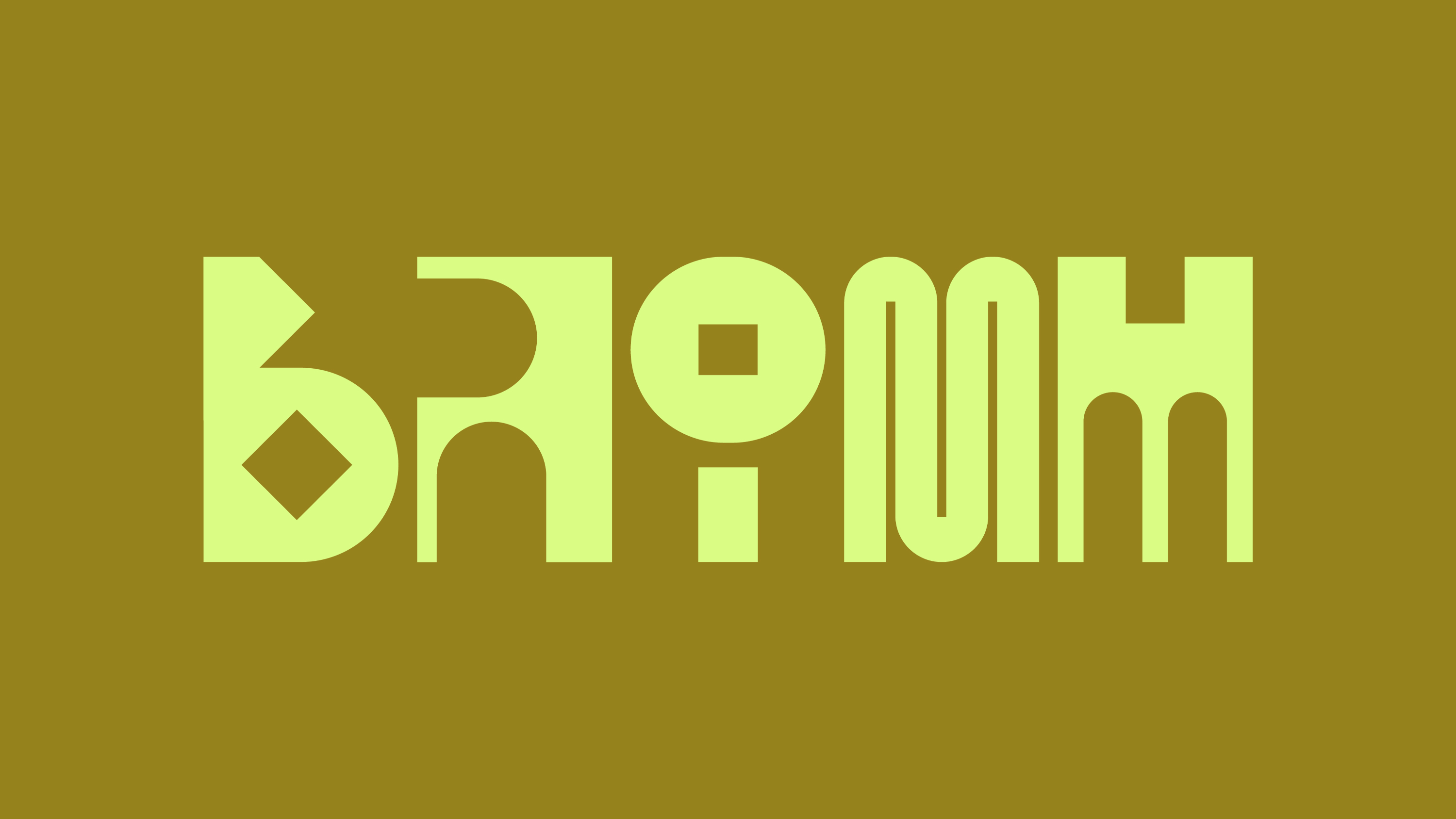
The wordmark uses the same system of adding and subtracting to create a constantly fluid, frequently motion-led motion. In both its static and motion forms, the wordmark again reflects the brand’s broader messages around resourcefulness, change, and circularity thanks to its near-infinite possible configurations of shapes, colour, and movement patterns. In the wrong hands, this could all feel slightly chaotic; but thanks to Harriman Steel’s razor sharp, considered and nuanced approach, everything comes back to an essentially invisible set of rules that gives the brand a uniformity across every single touchpoint.
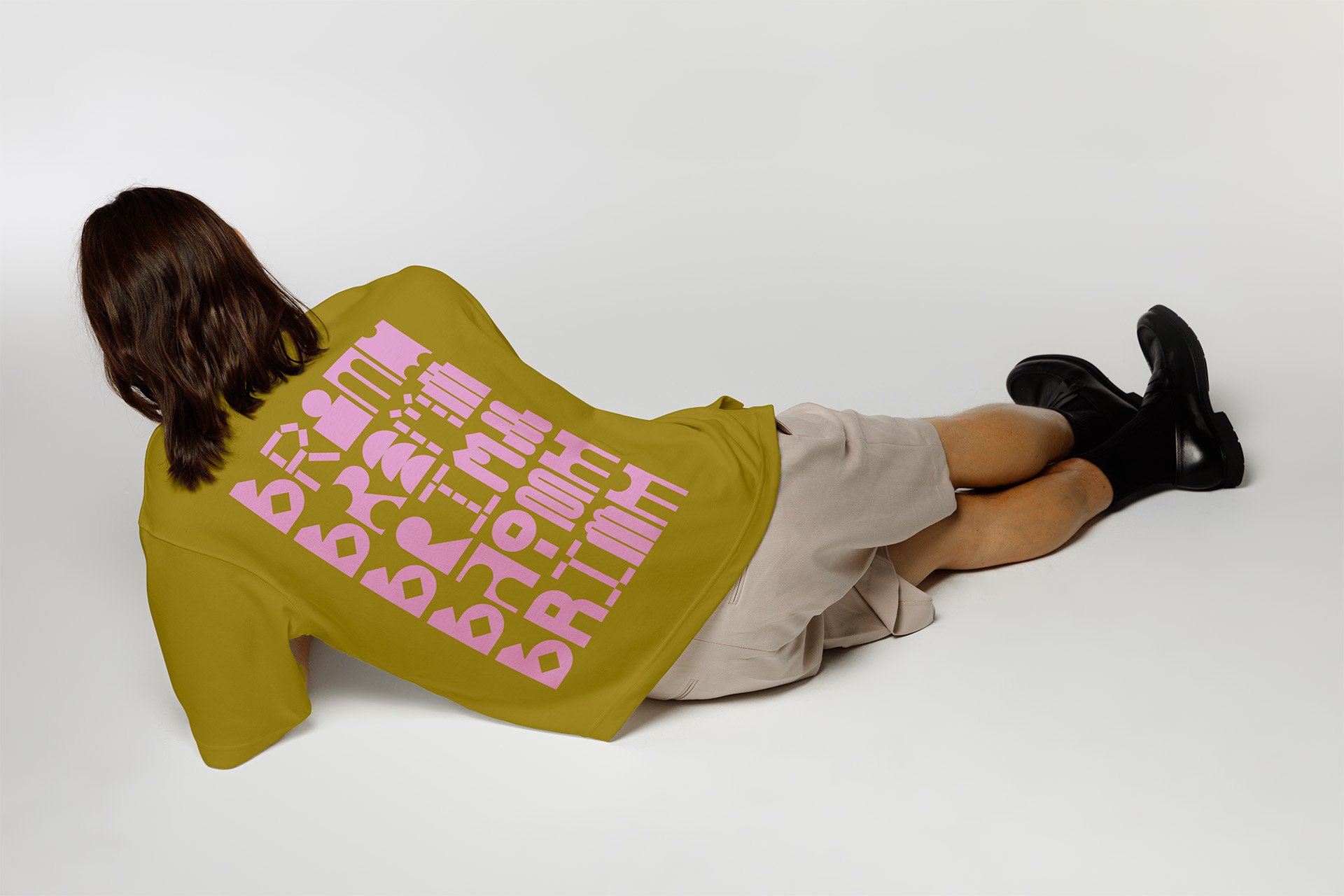
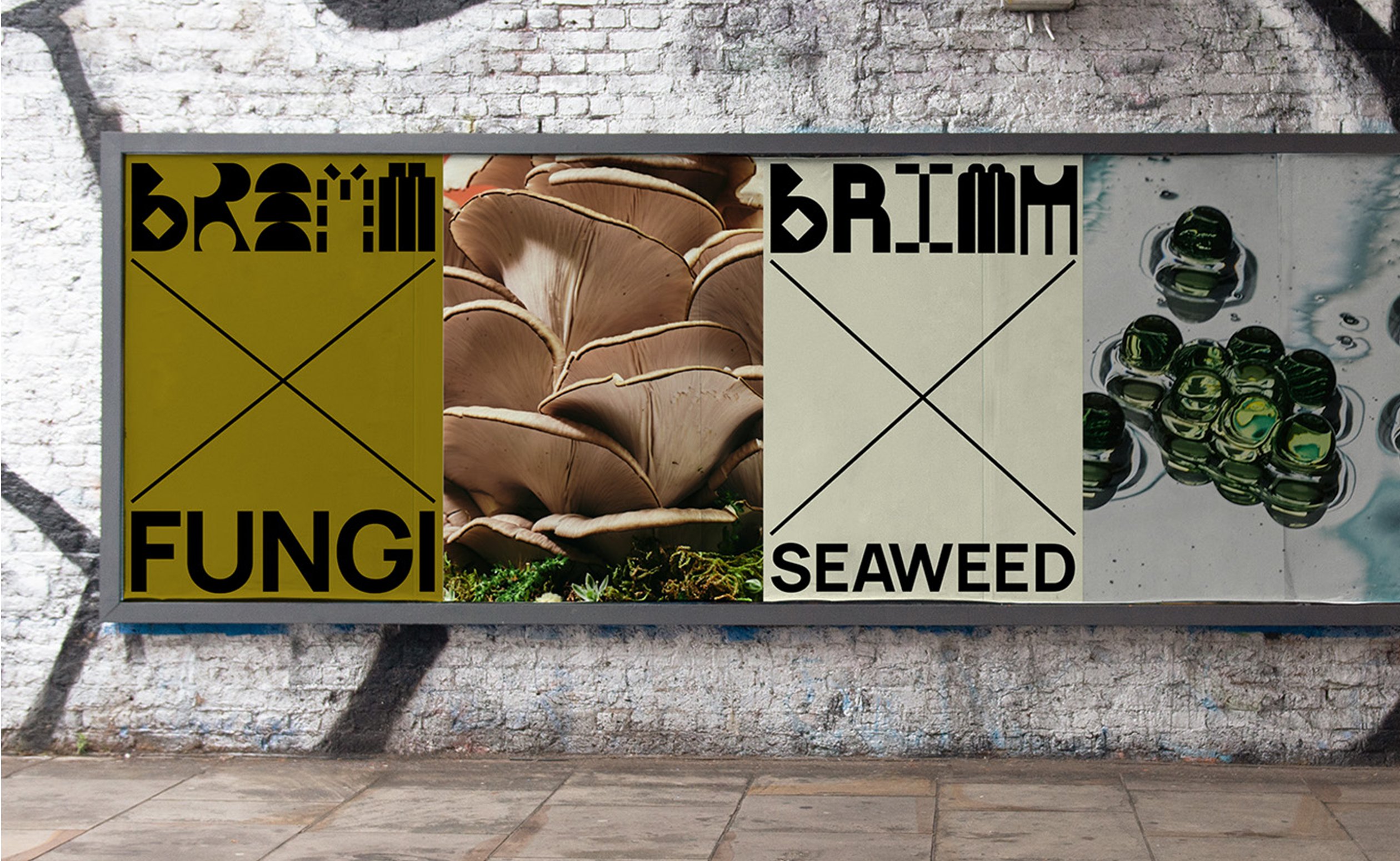
What makes the identity so beguiling is the fact that it’s resolutely distinctive, but never second-guessable: across billboards, abstract posters, merch such as t-shirts, social posts, or packing boxes, everything is instantly recognisable as BRiMM, but it’s also reactive, flexible, unpredictable. Once again, it’s a neat encapsulation of the brand’s own position as staunchly sustainability-focused, but adaptable – it welcomes rather than resists change.
Despite the rigid geometry of the shapes that form BRiMM’s branding, there’s a palpable humanity to the whole thing in the way that sometimes these forms show up as creaky old cogs, and at others as dynamic, living, breathing creatures. According to Harriman Steel, the identity looks to tell the story of BRiMM’s ‘disruptive and dynamic approach’, and we have no doubt that it certainly achieves that.
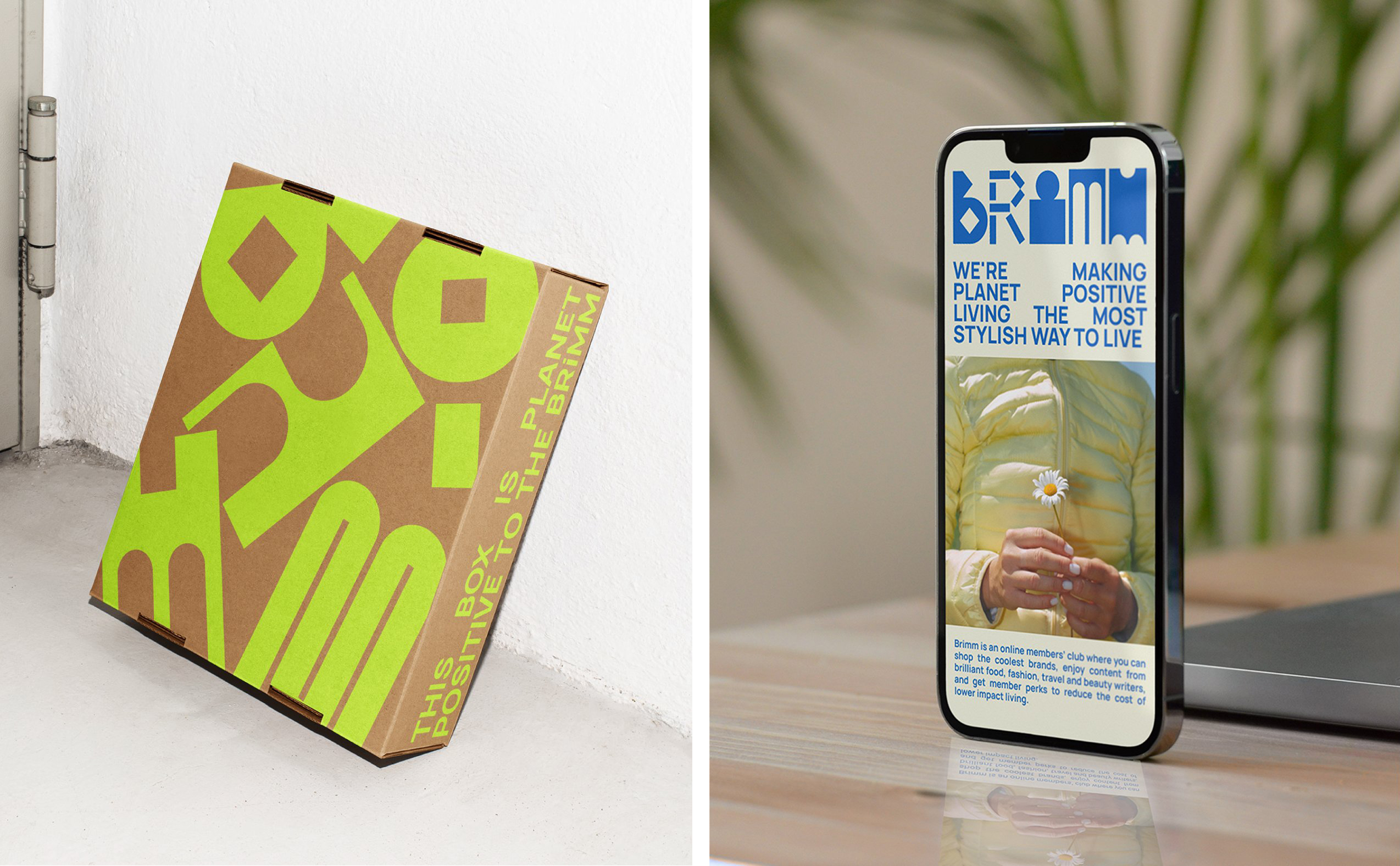
The custom typography used throughout the brand was also formed from elements within that modular system, making for idiosyncratic letterforms – often have exaggerated counters, asymmetric stroke weights, and irregular character widths – but within a clearly delineated and cohesive system. On the website, the bespoke lettering is used alongside neo-grotesque sans serif Manrope for body copy, keeping things clean and legible.
Colour is treated just as boldly as the typography, with a palette including vibrant orange, mint green, cobalt blue, canary yellow, and bright lilac. These shades are often paired in high-contrast, visually striking combinations that make the identity radiate a quiet confidence – no nonsense but human, fun but underpinned by serious ideas – further reinforcing BRiMM’s commitment to rejecting the idea that sustainable design has to be visually conservative.
It’s all about balance: enough, but not too much; modular, but not mechanical; expressive, but never shouty. There’s nothing extraneous here: Harriman Steel’s work demonstrates the power of great design to do a hell of a lot, with a lot less.
