Sigma by Stockholm Design Lab
Opinion by Richard Baird Posted 3 July 2025

You could argue that there’s a fair few similarities in terms of Japan and Sweden’s approach to design, and the aesthetics of life more generally. Both are known often for a specific kind of minimalism – a tastefulness that eschews fluff, luxuriates in crisp whites and keeps its edges, everything in its right place, rules and order and form following function.
But while Sweden fits snugly into the cold bosom of Scandinavia and as such, Scandi Design, Japan’s minimalist aspects are countered by its concurrent predilection for the exact opposite – a style that’s all the colours, all the time – a riot of cute characters, neons, and excitable noise (both aural and visual).
Sweden, Japan, and this dichotomy of simplicity and mascots has now come together beautifully in this new identity for Sigma, a Japanese manufacturer of photographic equipment including lenses, cameras, and accessories. Founded in 1961 by Michihiro Yamaki, Sigma remains a family-run operation, now under the leadership of his son, Kazuto Yamaki.

Since 1973 Sigma has designed and produced absolutely everything from its factory in Aizu in Japan’s Fukushima Prefecture, which oversees everything from lens polishing and injection moulding to assembly and quality control. It’s this intense level of craftsmanship and rigour that’s earned the company a reputation for both high quality and state of the art innovation.
And it’s this deep-rooted culture of precision and control – as well as a good smattering of creativity – which Stockholm Design Lab subtly brings to the fore. The new identity manages to succinctly reflect all of this, and ultimately its focus on quality, across every touchpoint without ever being overtly technical or dry, nor having to drive the point home through complex copy or reams of text.
Based in (you guessed it), Stockholm, Stockholm Design Lab boasts a client list including Polestar, The Nobel Prize, Ericsson, and Adidas; for this project, it worked across Sigma’s entire brand world including strategy, visual identity, packaging, website design, product branding, custom typography, uniforms, spatial design, product launch campaigns, art collaborations, and product films.
The most immediate visual shift is the reintroduction of the sigma symbol, which had been pushed to the wayside for a while but was once a mainstay in some earlier versions of the brand’s identity. Now, Stockholm Design Lab has seen the symbol make a triumphant return as a refined, geometric form – two circles and a precise, engineered line structure that echoes both the optical lens and the company’s Greek mathematical namesake. It functions as a mark of quality: compact, calm, and designed with utility front and centre, appearing on everything from hardware to physical spaces to digital applications and stitched into uniforms.
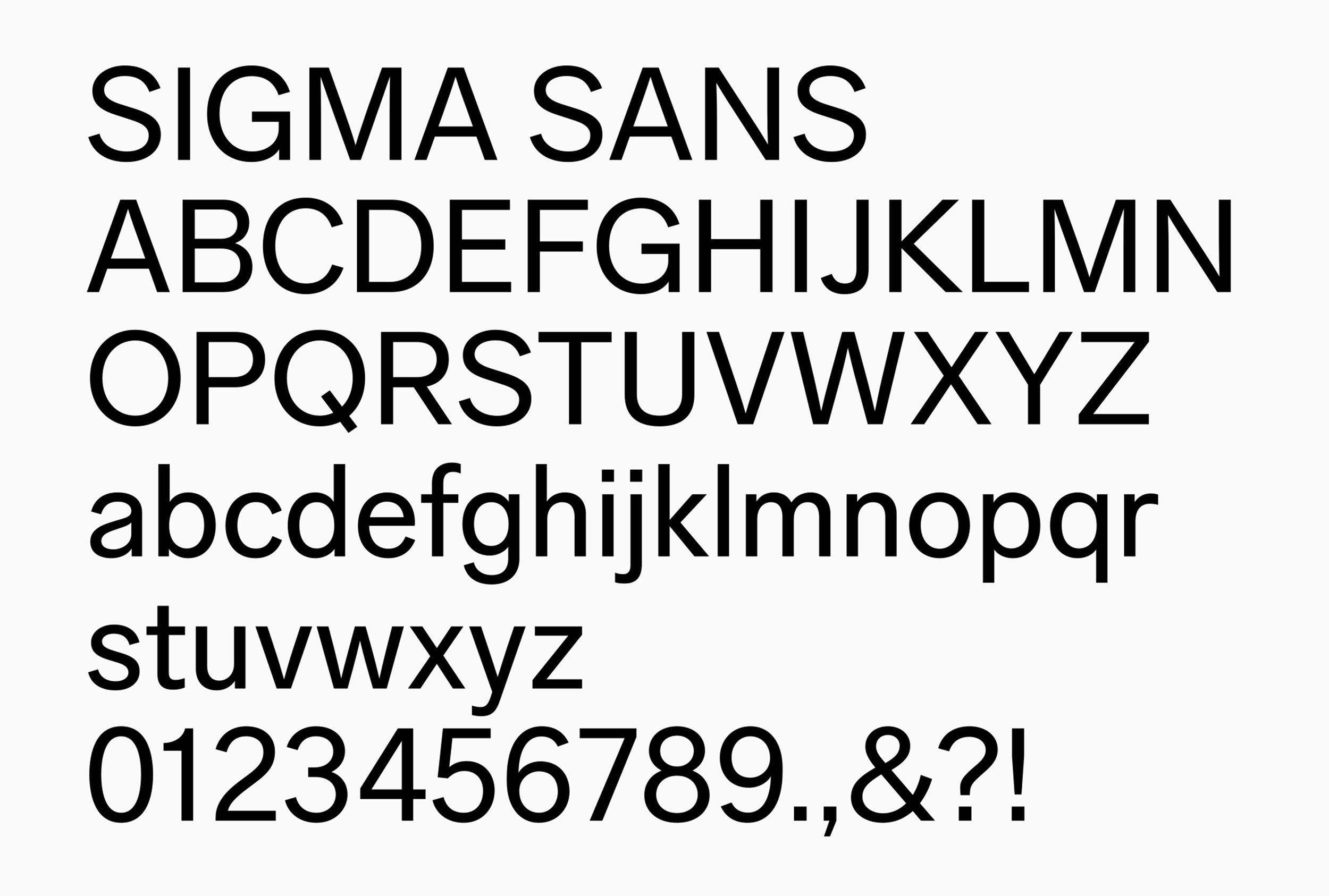
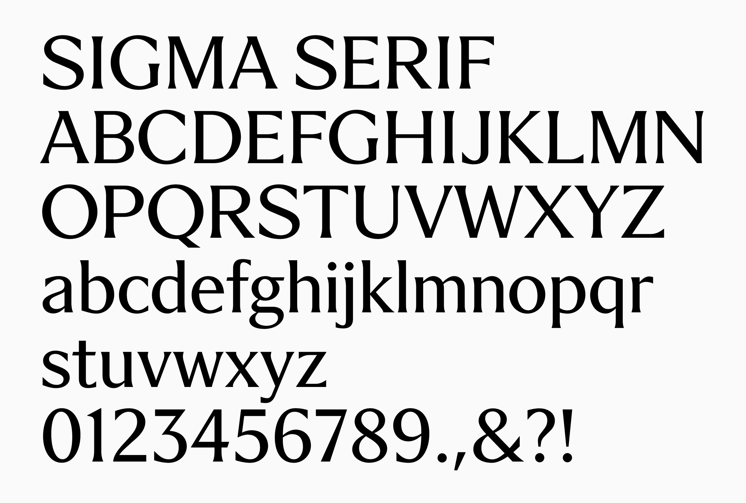
In many applications the sigma symbol is used as a compliment to the new all-caps wordmark, which like the rest of the brand typography, uses a font created in house at SDL. The studio created a pair of custom typefaces for the project, Sigma Sans and Sigma Serif, which share the same underlying geometry in terms of their shape and construction but each bring a different tone to the proceedings.
Sigma Serif (described by SDL as a ‘semi serif’) introduces bracketed forms inspired by Japanese lettering but adapted for the Latin alphabet, creating a sensibility that manages to feel both historical and technical, refined without straining for elegance.
So far, so minimal. So ‘Scandi’, it could be said. But here’s where things get a bit of a twist: mascots. Manga artist nerunodaisuki was commissioned to create a duo of Sigma brand characters, named Light and Shadow. As you might expect from their names, one is black and one is white; and as you might expect from a Japanese brand, they’re cute as hell like Sanrio-esque confections, cat-type figures that seem to get up to all sorts of adorable little japes.


Light and Shadow crop up all over the place, adding a bit of levity to things like manuals, guides, and customer portals, where they’re both fun and functional in the way they illustrate certain points. They’re functional, not ornamental, used to lighten moments that are often dry or technical.
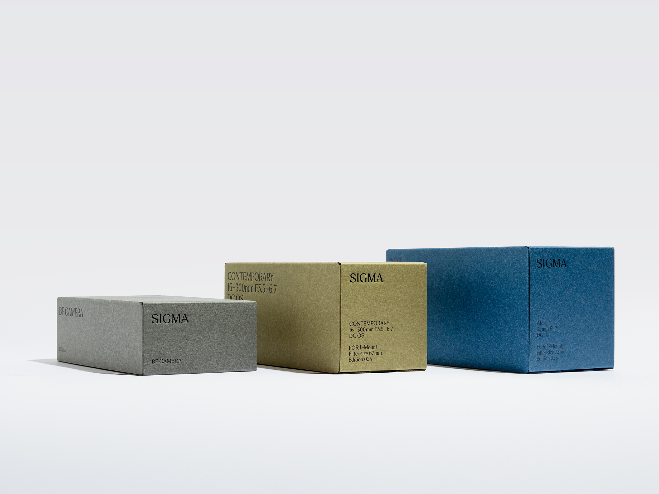
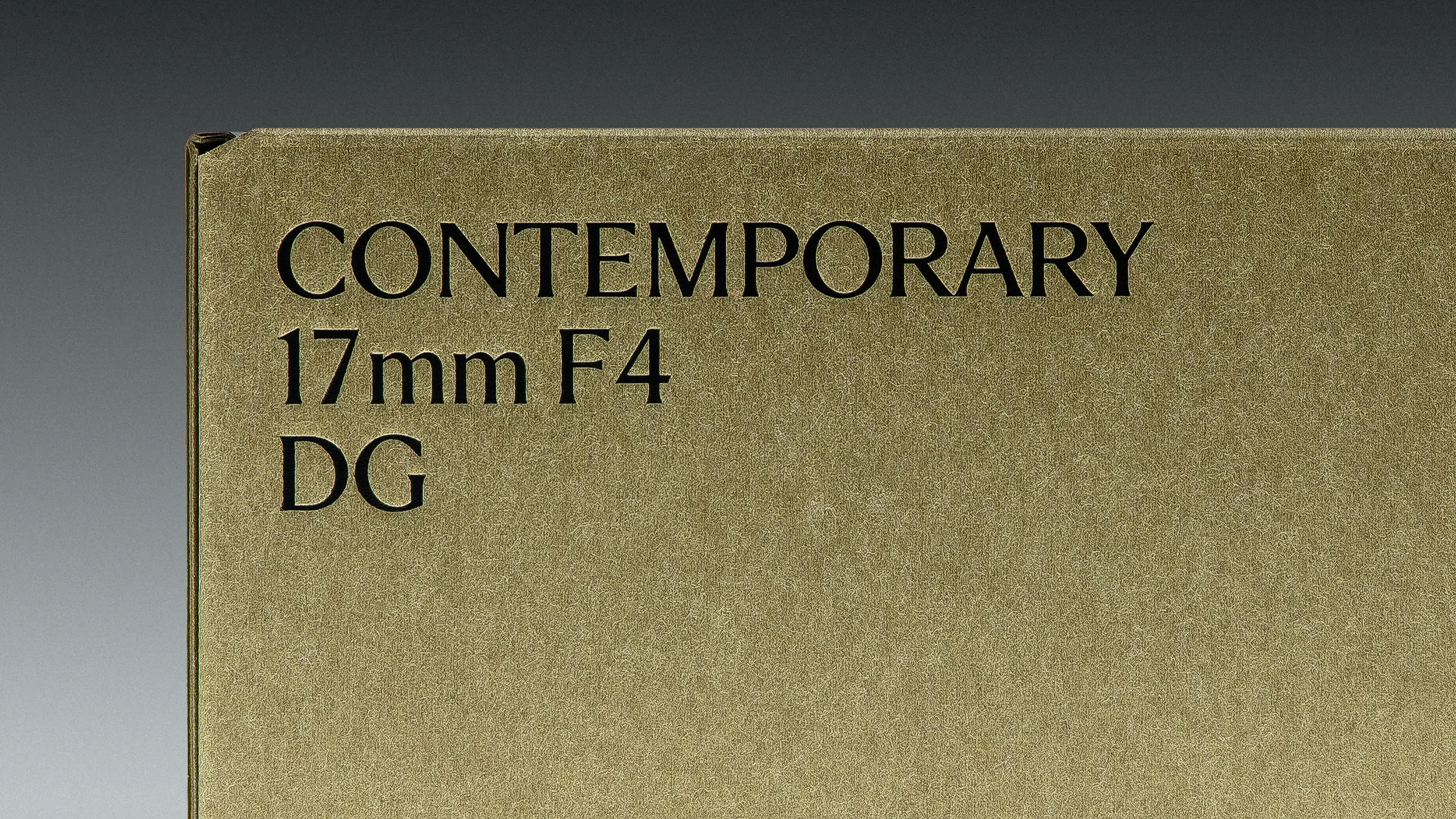
For product packaging, the material choices are considered but unpretentious: uncoated papers and precision folds work beautifully alongside the monochrome typography. Japanese craft paper is used where possible, balanced by industrial-grade production logic: it almost feels like a gentle rewriting of what ‘luxury’ manifests as in design – all about clarity, hyper-subtle touches such as how texture is used. Economy over ostentatiousness. And that makes the designs here a superb reflection of the values Sigma seems to hold as a brand, too.
Unlike FMCG brands that live largely across packaging,campaign images and said brand’s digital/social platforms, designing for Sigma meant also prioritising spatial design, since a significant part of its business involves the brand appearing in contexts like trade shows, specialised retail environments and so on. That meant that the identity needed to work at scale for things like architectural signage as well as miniscule sizes – on an actual camera, for instance.
For the spatial touchpoints, SDL opted to use a palette drawn from natural materials and muted tones, as well as utlising the striking contrasts between black and white. The new circular brand device is repeated to become almost like a bespoke branded pattern on floor cutouts, displays, and lighting.
Photography plays a dual role in the system: practical on the one hand (product demos, explainer content); atmospheric and expressive on the other. Emil Larsson’s campaign photography sets the tone, while collaborations with artists like Sølve Sundsbø and Julia Hetta lend an unexpected softness and human quality to what could easily become a pared-back-to-the-point-of-sterile visual world.
Films by Parapix and footage from Yu Yamanaka’s Made in Aizu project use an almost documentary-like style to further ground the brand in its physical place of origin, showing machines, workers, materials, and time.
Stockholm Design Lab’s rebrand is incredibly smart in its balancing of proudly placing Sigma up front as a brand, but never shouting. By aligning the design work with the same logic of Sigma’s products – technical engineering expertise, rigour, authenticity, and craftsmanship – the identity doesn’t have to. Each and every touchpoint communicates the same thing: Sigma’s quiet, obsessive attention to precision and process, underpinned by its doggedly independent spirit and craftsmanship.


