Pinky Swear by The Working Assembly
Opinion by Emily Gosling Posted 11 September 2025
I could be totally wrong, but it really does look like New York-based branding agency The Working Assembly had a lot of fun working on the branding for Pinky Swear.
A restaurant and cocktail lounge on Chrystie St on Manhattan’s Lower East Side, Pinky Swear opened earlier this year as a fascinating concept unlike anything we’ve really encountered before: yes, it’s a seemingly fairly swanky cocktail lounge, but it takes interiors into the realm of installation artworks. The venue’s own press release details that it boasts everything from ‘token-activated payphones that reveal life’s great mysteries and control the lighting and sound installations, to ancient marble busts whispering their secrets, and a NYC street parking meter that pays you for your time’.

There’s a lot going on, isn’t there. But smart brand design understands that its purpose isn’t to mirror or up the ante on the a lot’ness, but to subtly convey it in a way that leaves ample room for IRL surprise and delight in the physical space itself. It’s branding that draws you in, but doesn’t give you spoilers, because, as The Working Assembly puts it, ‘Pinky Swear welcomes one and all to a gathering place that challenges expectations and delights the senses… every corner is alive with stories waiting to unfold’.
The Working Assembly was briefed to create a cohesive brand identity that encapsulated the venue’s ‘whimsical and mischievous personality’, working across Pinky Swear’s overarching brand strategy; visual and verbal identity; brand applications; and collateral. The identity is based around the brand purpose ‘Escape in your community’, honing in on the idea that Pinky Swear is a place ‘to expand your mind, meet new people, and play in an uninhibited way’.
![]()
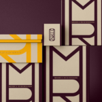
One of the biggest challenges of the project was creating a brand that fitted the space’s multiple different functions: Pinky Swear primarily presents as a bar, but is also a restaurant, club, immersive gaming experience, and gallery. These multiple uses led The Working Assembly to a solution we’ve seen before, but rarely if ever pulled off this beautifully: multiple logos.
But this isn’t just about having different versions of a singular logo that flex across different touchpoints – it’s an idea so pure in its simplicity and smart in its originality that it seems wild that we’ve not encountered it in any meaningful way before: the logos are based on Rorschach Test patterns.

For those unfamiliar with the concept, Rorschach testing came about in the 1920s and is named after its creator, Swiss psychologist Hermann Rorschach. It uses abstracted inkblot patterns as a way to assess people’s personality characteristics and emotional functioning, and was seen to be a useful way of detecting underlying ‘thought disorders’, especially in cases where patients were reluctant to describe their thinking processes openly. The long and short of it is they’re splodges, used in a way that’s very much like pareidolia – i.e. perceiving objects or shapes in unrelated things, like seeing a dog in a cloud, or Jesus in a piece of toast, or a man in a mandrake root.
They’re the perfect solution to the branding of somewhere as concurrently amorphous and specific as Pinky Swear. The Rorschach shapes immediately invite participation and curiosity, reflecting the proposition beautifully. Plus, their simplicity, iconicity and mutability make them superb for a brand that has multiple applications: as The Working Assembly has shown, such shapes work just as well across printed materials, concrete, glass etching, in motion, online and in physical manifestations.
The Working Assembly says that the brief challenged it to ‘push the status quo of a typical logo, and really tap into the experience guests would have in the space – expanding our minds and pushing the boundaries of traditional design’, and there’s no doubt this suite of marks certainly achieves that, all the while reinforcing the brand itself – look closely, and there’s often a central ‘PS’ of the venue’s initials, which morph and stretch and overlap to become a range of different shapes while subtly embedding the venue’s initials. Like the logo’s inspiration, both static and in motion, it eventually becomes up to the viewer to interpret what they wish, beyond the nuts and bolts of the lettering components.


Meanwhile the main wordmark uses no-nonsense, blocky all-caps lettering in a typeface that’s not used elsewhere in the brand: it’s super confident, almost letterpress-like in its structure, and never shouts above the central premise of the venue as somewhere to be discovered for yourself.
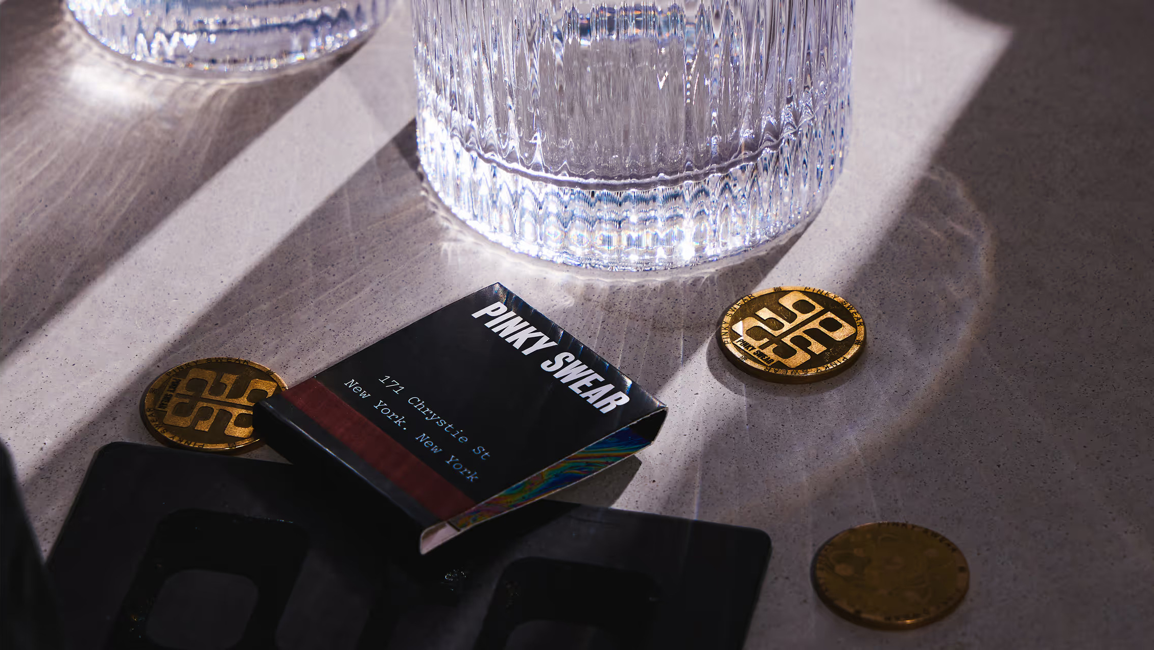
Similarly, the majority of the branding doesn’t really have a colour palette to speak of, in that it uses just black and white – so skilfully, though, that it took me quite a while to realise. The wordmark, logos, typography choices et al mean that monochromatic here doesn’t feel stark – quite the opposite in fact – it feels bold, intriguing, befitting of a place made for exploration, the unexpected, and crucially, the night time.
Flashes of colour come from some gorgeous patterning, like the saccharine-toned pink and turquoise marble effect on the inner side of a matchbook; or the bubblegum pink edges of a branded poker chip; or sumptuous satiny bar stool covers in sumptuous shades of purple and green.


As for the typography, The Working Assembly hit the nail on the head when it comes to quirk-leaning sophistication in using Sometimes Times by foundry Boulevard Lab, which is based in Victoria, Canada, as one of the main brand fonts. It feels classy, editorial, classic but somehow sort of Gen Zish: according to its creators, Sometimes is a timeless but thoroughly modern serif inspired by ‘individualistic old-style serifs and mid 90’s culture’. It works at large scales, it works for minuscule applications, and its forms are totally beguiling and beautiful – all super-round counters and exaggerated contrasts in stroke thickness.
As far as I can tell, aside from the blocky wordmark typography the only other font that’s used in Pinky Swear’s branding is Pitch by New Zealand’s Klim, a gorgeous little [love letter to the typewriter’, as the foundry puts it. In fact, Klim’s description of the font outlines exactly why it fits Pinky Swear so well: ‘tactile, analogue, immediate… it’s a synthesis of digital and analogue…’
If it wasn’t already obvious, I absolutely love this project. The Working Assembly’s branding for Pinky Swear marries playful and upscale seamlessly: it’s a hell of a lot of fun, but classy with it; whimsical and mischievous, but with a decidedly upscale edge. Difficult combinations indeed, especially when articulated in a way that’s both so savvy from a marketing perspective, and an absolute joy aesthetically.