IAAC by Mucho
Opinion by Emily Gosling Posted 25 September 2025
The IAAC (Institute for Advanced Architecture of Catalonia) is an organisation which boasts a remit that feels both nigh-on impossibly wide but also hyperspecific. Based in Barcelona and founded in 2001 as a hub for innovation in architecture and design, IAAC describes itself as ‘a platform for producing knowledge to shape the future of cities, buildings and society’.
The long and short of it seems to be that for the most part, it’s a university of sorts, but as an academic institution, IAAC has always occupied an interesting space. It seems to position itself as something more than simply a school of architecture, instead striving to sit at the intersection of technology, design, and urban life as a lab for research and experimentation with projects spanning everything from material innovation and digital fabrication to ecological systems and robotics.
As such, it needs a brand that can articulate and encapsulate a culture of constant testing and iteration, a place where the future of architecture is shaped in real time. No easy challenge, especially when a brand also has to communicate what the IAAC actually is and does.
The brave entity that rose to said challenge is Mucho (Ultraderp, Big C Charters, The Art Gallery of New South Wales) a branding and design agency with studios in Barcelona and San Francisco which has made a name for itself over the years for its bold, bright approach to brand design.

Mucho was tasked with creating a new identity for IAAC that’s both befitting of an institution at the forefront of experimentation, but which could also find a way of communicating its complexity, adaptability and its role in prototyping the future. Oh, and on top of all that, the new brand had to ‘inspire a diverse range of audiences, and establish a unified presence that resonates on a global scale’.
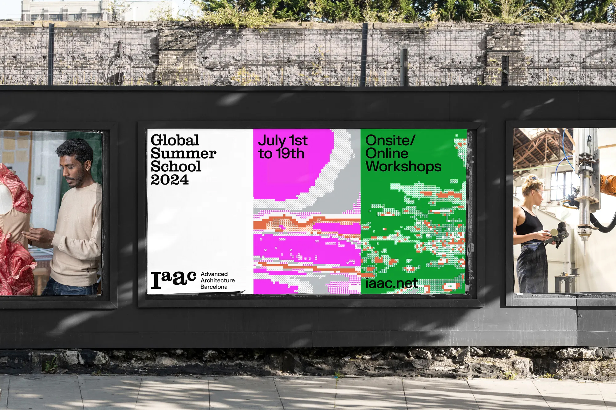
‘The existing identity, rooted in an acronym, did not fully convey the dynamic nature of IAAC’s work or its ambition to shape the built environment through innovation’, the agency continues. Its strategy to rectify that was to ‘shift IAAC from an acronym to a standalone brand with a clearer descriptor: Advanced Architecture Barcelona’.
And this is where things get a bit tricky: the name, wordmark and at first glance, the overarching brand itself still seems entirely rooted in ‘IAAC’ – ‘Advanced Architecture Barcelona’ appears, sure, but as a tagline or piece of copy, and only on certain applications such as billboards. Yes, this is still absolutely a move forward in terms of making the institution a modern, living, breathing brand that can comfortably sit on the world stage, but the acronym remains front and centre, and I’m not sure it’s presented as strongly as it could be in purely visual terms.
That’s not to say this isn’t well done – it really is, and there’s so much to love here. There’s no doubt that there’s strategic rigour underpinning it all, too: as Mucho says, it positioned IAAC as ‘more than just an educational institution, but as a hub for prototyping the future’ through crafting a new narrative focused on inspiring ‘architects of change’ and establishing IAAC as a leader in architectural innovation.
![]()
The flexibility is what makes this identity really sing, and it’s achieved through means absolutely fitting for an experimentation-centric organisation. Mucho worked with Fil Studio to develop a generative tool – a piece of custom software that lets IAAC produce endless visuals, animations and graphic assets, keeping things cohesive while embracing constant change. Mucho describes it as rooted in ‘the concept that every prototype starts with a fundamental unit’ – and the system indeed reflects this idea of modular building blocks, shifting and recombining into fresh forms. In concept and aesthetic, the system and the imagery born of it speak directly to the institute’s ethos of prototyping and experimentation.
From a purely visual standpoint, I love the weird glitchy patterns and palettes – it pixelates and tessellates and constantly regenerates in ways that could have veered into cliche in less skilled hands, but here, never do.
All that is to say, however, I feel like things are a bit let down by the wordmark. It could, in my opinion, do a lot more, or at least a lot different. It’s set in Clarendon Graphic by ever-superb Swiss foundry Optimo – a lovely font for sure, but here, in the way the wordmark vacillates between sizes and mixes upper and lower case, it gives the wordmark a slightly childish feel – playful to the point of veering a bit close to daft, which I’m not sure exactly fits IAAC’s vibe. I’m not sure it expresses experimentation, adaptability or innovation, nor does it seem to deviate from the acronym – in fact, it reinforces it.

Clarendon Graphic is also used elsewhere in the identity, with far more success. The other typeface used throughout the system is FK Grotesk by Czech Republic-based foundry Florian Karsten Typefaces – a nice sans counterpoint to CG but another typeface that feels like almost too safe a bet: both fonts are undoubtedly strong, smart workhorses as brand fonts, but perhaps a few more risks could have been taken in the context of IAAC’s ‘radical’ positioning.
The criticisms of the wordmark feel sharper because so much else here sings. The colour palette – a striking combination of lurid pinks and brutalist greys next to a somewhat festive red and green pairing that put paid to the notion that the two shades should ‘never be seen’ – works beautifully, deftly treading the balance between futuristic and innovative while conveying a sense of real-world nous and academic rigour. Mucho says the colour choices draw on ‘technology and nature’ as dual references, which makes sense: the cooler greys and blues nod to technology and precision, while brighter hues add an organic liveliness. It’s this tension between order and play that makes the visuals effective, particularly in motion.


On print materials, the tessellating imagery works as bold cover art, creating instant recognition while allowing each piece to feel unique; while online, the animations generated by the tool feel far more dynamic than static identity elements might, emphasising IAAC’s positioning as a future-focused institute. The new website, developed with Metódica, makes the most of these shifting graphics, layering movement and interactivity to reflect the idea of constant prototyping. Even in more restrained contexts – reports, signage, or academic papers – the colour and pattern system holds together without overwhelming. The real success here is consistency without monotony.
For the sound design, Mucho worked with Facundo Capece to translate the visual system into audio, using granular synthesis to create a logo sound that glitches and fractures in a way that feels deliberately imperfect – an echo of experimentation and process.
The identity’s strongest elements are those that align most closely with IAAC’s experimental spirit – the dynamic tool, the evolving patterns, the integration of sound and software. For an organisation that thrives on iteration, this flexibility is crucial – and in Mucho’s hands, said flexibility is also made brilliantly coherent and cohesive, not easy when branding an organisation with multiple programmes, events, research strands, and international collaborations. Things could easily become fragmented or diluted, but there’s real skill in the way that in this identity, they never do.