Forest Carbon by Design Bridge Singapore
Opinion by Emily Gosling Posted 16 October 2025
Despite the perennially frustrating widespread perception that the definition of branding is a logo (maybe a wordmark, at a push, a colour a la Cadbury’s purple or EasyJet orange ), it’s more obvious than ever as we settle into the screen-centric Digital Age that ‘brand’ is a vast and expansive thing – it’s verbal and visual and sonic, it moves and morphs and shifts.
While things like kinetic type and animated logos have become so commonplace to be almost unremarkable to most audiences, it’s baffling that so few brands have really made the most of the potential of any senses other than sight – namely, sound.
Obviously, sonic branding is hardly new, but its canon of standout moments is sparse, to say the least, in comparison to that of logomarks or even slogans: there’s Intel, with its dull, forgettable logo and insistently unforgettable ‘bong’ melody; and the somehow distinctly mainland European call and response of ‘m-mm’ in rising cadence and ‘Danone’. Much sonic branding veers into jingle territory – the dastardly earworm of “Go Compaaaarre!” or (because I’m old and spent 96.4% of my ’90s childhood watching telly) “If you like a lot of chocolate on your biscuit, join our Club.” And when it sticks, it really sticks, which makes it seem all the more daft that so few brands are truly tapping into the potential of sound – especially since, and this is a moot point I know, we’re so relentlessly online now, in 2025.
Kudos then to Design Bridge and Partners Singapore for its work with Forest Carbon, which stands out precisely thanks to its smart use of sound as part of a holistic, functional brand identity.
Founded in 2012, Forest Carbon describes itself as an ecosystem restoration company: operating across Southeast Asia, it works to restore and protect some of the planet’s most biologically rich yet critically threatened ecosystems, focusing largely on wetlands and Indonesia’s peatland forests. These landscapes are among Earth’s most effective natural carbon stores, yet decades of deforestation, draining and agricultural expansion have devastated them.
Using a mixture of scientific monitoring, local community partnerships and market-based mechanisms, Forest Carbon aims to ultimately show that living breathing forests can hold more long-term value than cleared land – in short, it makes conservation financially viable through projects that strive to revive biodiversity, rebuild natural flood defences and support sustainable livelihoods for the people who live within these fragile ecosystems.
Forest Carbon, then, is not an easy organisation to sum up nearly in a brand identity; nor is its story, function, and purpose a straightforward story to communicate. It’s dense, data-led and emblematic of the climate crisis – another reminder of how profoundly we’ve damaged our planet and how complex it is to repair. So, not the simplest brief, we’d assume; another reason Design Bridge’s work here is so impressive.
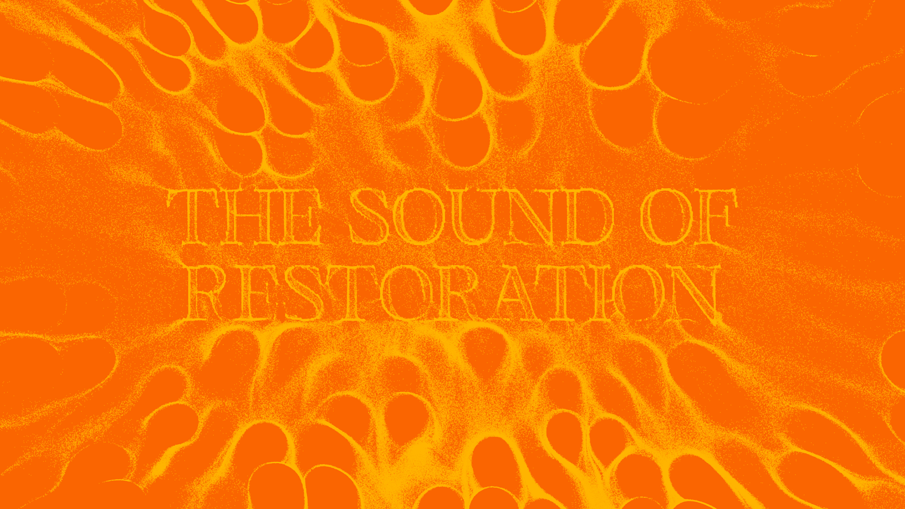
The agency’s identity for Forest Carbon is built around the concept “In Tune with Nature”, drawing on the emerging science of bioacoustics – the measurement of biodiversity through sound. It’s a beautiful idea: listening to the forests, tuning in to what’s present and, poignantly, what’s not.
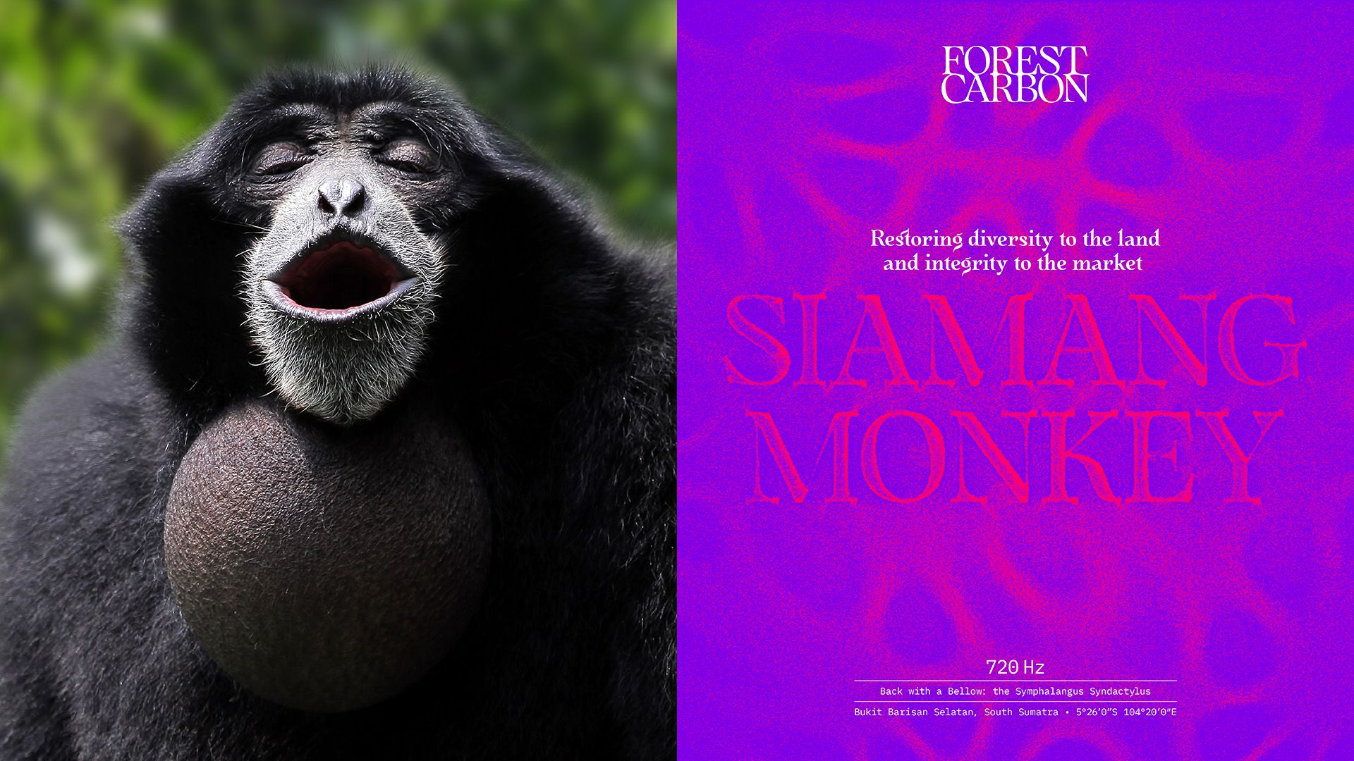
Forest Carbon actively uses bioacoustics in its work as a way to measure how far restoration has been successful in a particular area: by capturing the calls of birds, frogs and other endangered species, experts can analyse the extent to which a forest has or hasn’t recovered.
And in turn, Design Bridge used bioacoustics to form the very foundations of Forest Carbon’s new identity: as the agency puts it, “We translated the symphony of a thriving forest into an impactful visual language that gives nature a voice.”
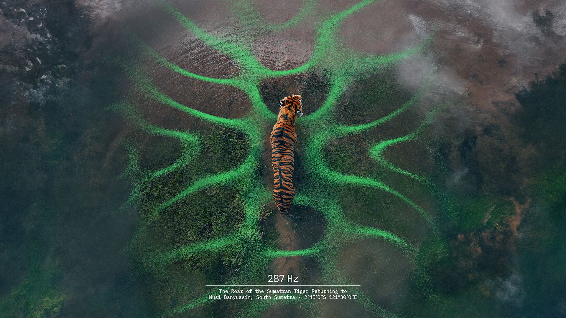
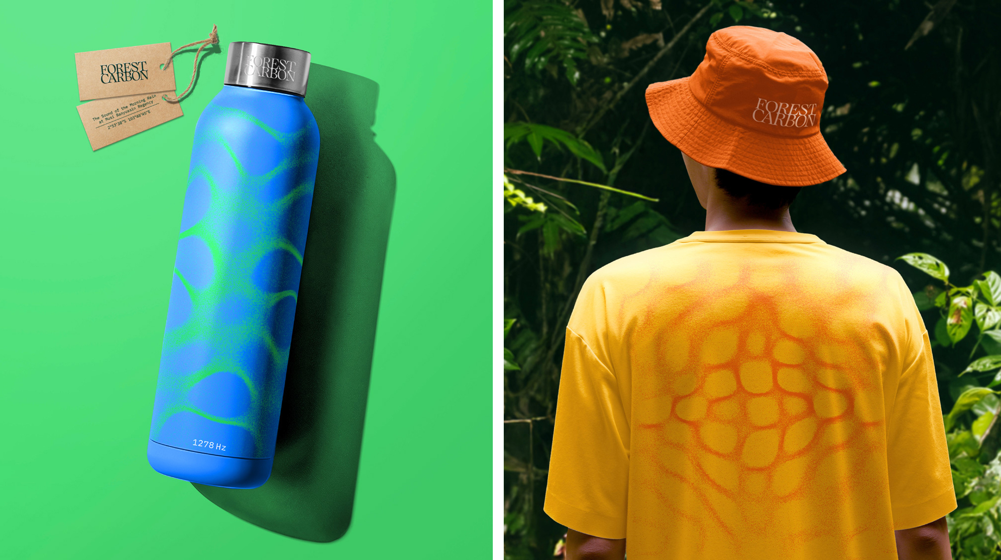
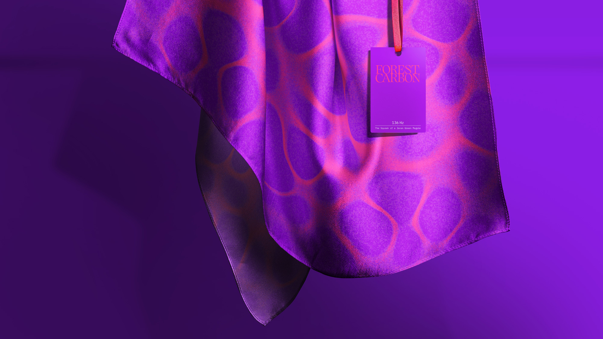
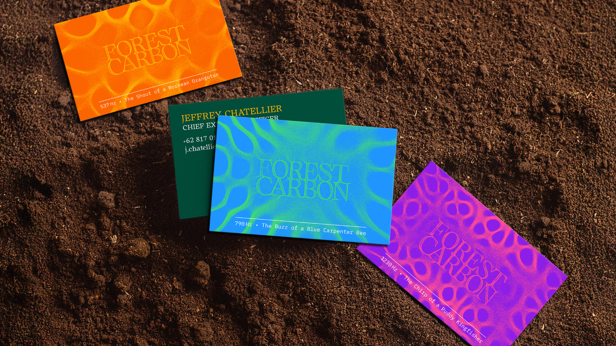
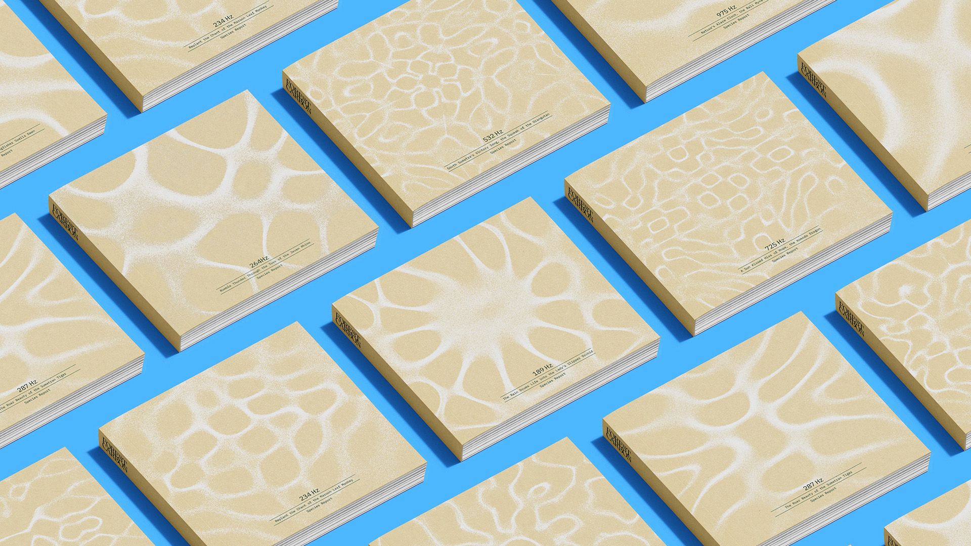
To convert sound into visual pattern form, Design Bridge used bespoke software based on real bioacoustics algorithms, converting forest recordings into Chladni figure-like patterns. Named after 18th-century German physicist Ernst Chladni, Chladni figures are intricate patterns created by scattering fine powder on a surface (like a metal plate) and vibrating it. The particles move into geometric shapes that visually represent sound frequencies. Here, those oscillating patterns became the foundation of Forest Carbon’s visual world – a design language that shifts between organic fluidity and scientific precision.
The wordmark sees the words ‘Forest’ and ‘Carbon’ stacked on top of one another, set in all caps in a gorgeous typeface called Quietism. Designed by Michael Rafailyk, it’s an unusual and very beautiful Antiqua-style font that its designer says is “inspired by the Quietism philosophy”. He continues, “Clarity of the mind is achieved by bringing the body into a state of calm and contemplation, and this is reflected in the design – the quiet horizontal serifs (body) are opposed to the peaky soaring ascenders (mind).”
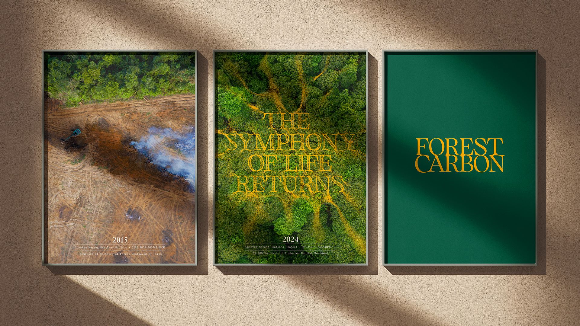
Quietism is used for various applications throughout the branding, supported by secondary font Plex Sans, a more modern but still slightly unusual font that feels technical yet soft: it grounds the brand in research-led credibility. It’s an intelligent play between emotion and empiricism – sensorial, but never sentimental.
While using green for an environmental brand might seem clichéd, it’s often justified. Here, it works largely because it’s both relevant, and because the palette feels so considered, creating something lush, bright and alive. The texture is lovely too, and the way that green is offset by a very vivid, contemporary array of purples, blues and coral-type shades make sure that this never veers into the territory of ‘just another eco brand’.
That grainy texture (those Chladni patterns again) is used to unify the suite of brand imagery used throughout the new identity. Photography ranges from people-led community and expert imagery to macro ecological detail, aerial views and before-and-after imagery anchors the work in measurable progress.
There’s no moralising tone here, no heavy-handed educational agenda. Instead, Forest Carbon’s world feels dynamic, research-driven and sensorially rich: proof that environmental storytelling can be both scientifically rigorous and emotionally stirring – a chorus from data, and a masterclass in smart use of sonics in brand.
