INTL 2025 by Warriors Studio and NAM
Opinion by Emily Gosling Posted 27 November 2025
International Assembly began life as Graphic Design Festival Scotland back in 2014, founded by then-recent-ish grads Beth Wilson, James Gilchrist. The pair also helm Warriors Studio, which has been taking care of the festival’s creative direction, branding and design since its inaugural edition, too.
GDFS became International Assembly, or INTL, in 2020; and when the new name and identity, also by Warriors, launched, the studio said it envisaged this to be an ongoing collaboration with different creative practitioners such as designers, artists, writers and those working in other disciplines as time went on. Indeed, GDFS’s identity famously changed with each year’s event, a tradition that it seems has been continued to a point with INTL.
This year’s identity is especially striking, and was created by Warriors in collaboration with NAM, a design studio based in Stuttgart and Barcelona helmed by Nam Huynh and Mark Bohle.
Warriors and NAM are no strangers to one another: they first worked together over a decade ago when Bohle’s posters were shown in an early edition of GDFS. Since then, the partnership has taken in shared exhibitions, workshops, and experiments across print, digital and spatial media. It’s a relationship that’s grown alongside the festival itself, and that familiarity becomes the starting point for the deliciously expansive visual world of the INTL 2025 identity.
Rather than anchoring the identity in a single aesthetic device, NAM and Warriors draw from the spirit of the festival as a lived experience: the unpredictable encounters, the sense of community, the celebratory charge that runs through its talks, workshops and exhibitions.
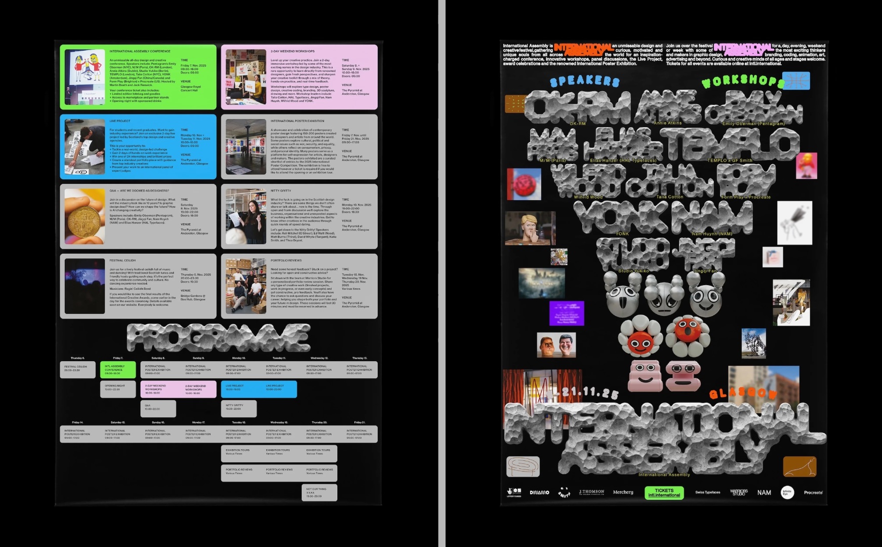
That atmosphere went on to inspire the designers to create a conceptual framework for the identity that’s based around the idea of an imagined parade of ideas and personalities which processes dynamically, and at times, charmingly chaotically, across both the physical festival spaces and its digital realms.
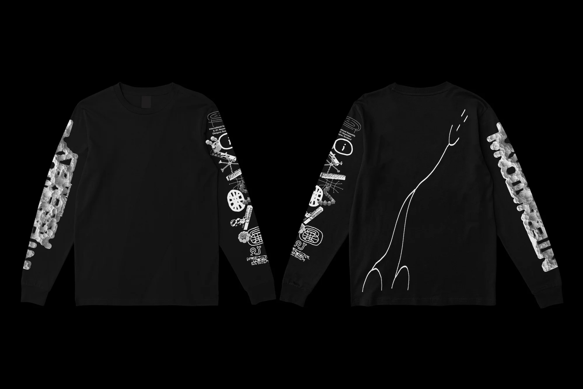
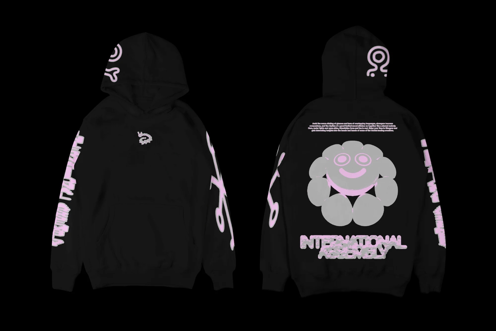
Central to that procession is a set of illustrated personalities, Erica the caterpillar, Daisy the flower, and a swelling assembly cast of other characters that provide playful presences and illustrative divides across the campaign and identity. Like carnival floats or oversized balloons drifting past the crowd, they give the festival both a sense of movement and an undeniably celebratory tone of voice.
That theatricality becomes a thread running through the identity: oversized gestures sit comfortably alongside small, intimate details; and the combination of scale, rhythm and a deliberately cinematic visual language is palpable throughout, even in static applications.
Alongside the character illustrations, the designers created a series of abstract symbols that appear throughout the campaign: some suggestive of mapping, some of global connectivity, each carrying an intended meaning but never enforcing a single reading, subtly nodding to INTL’s experimental, interdisciplinary ethos.
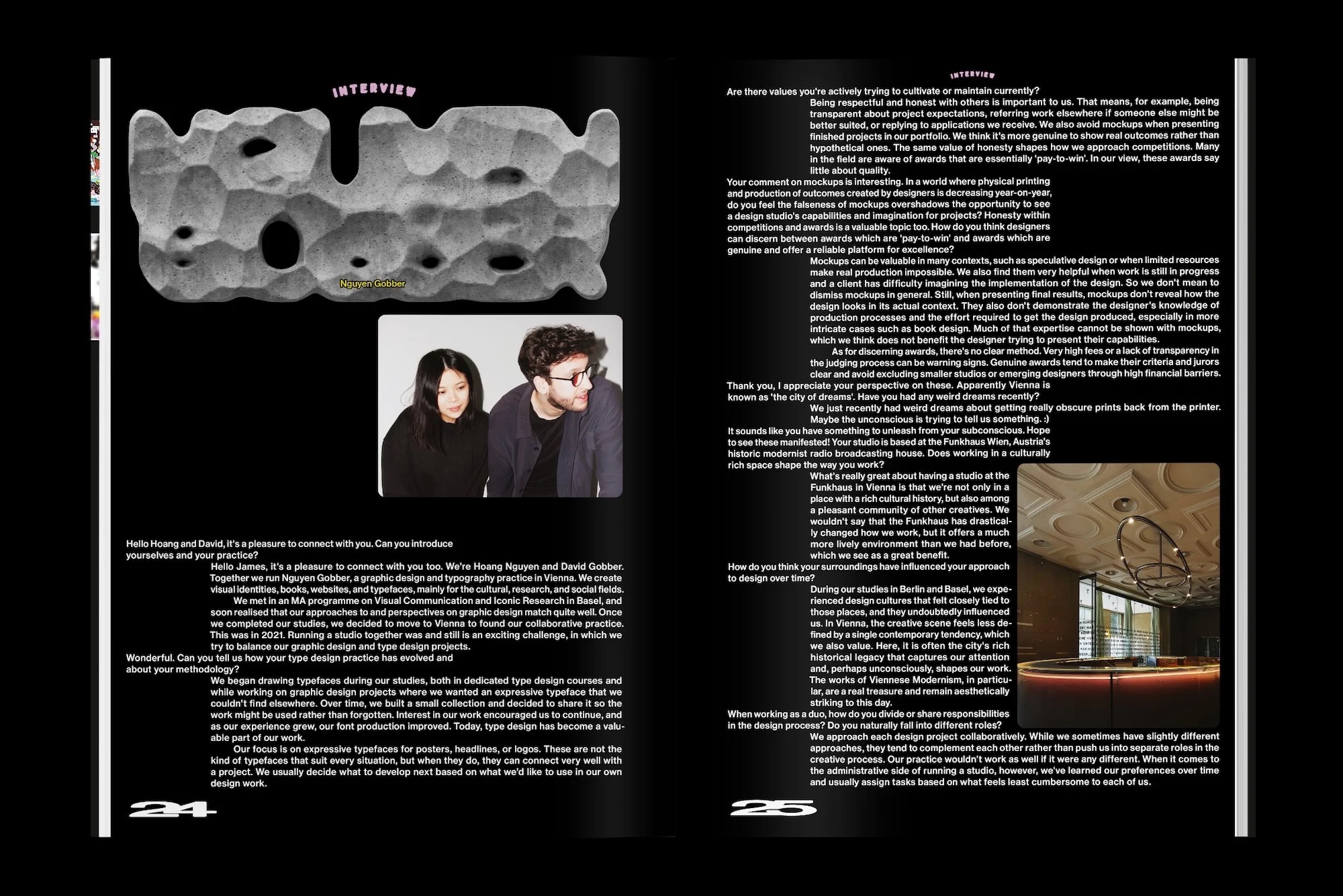
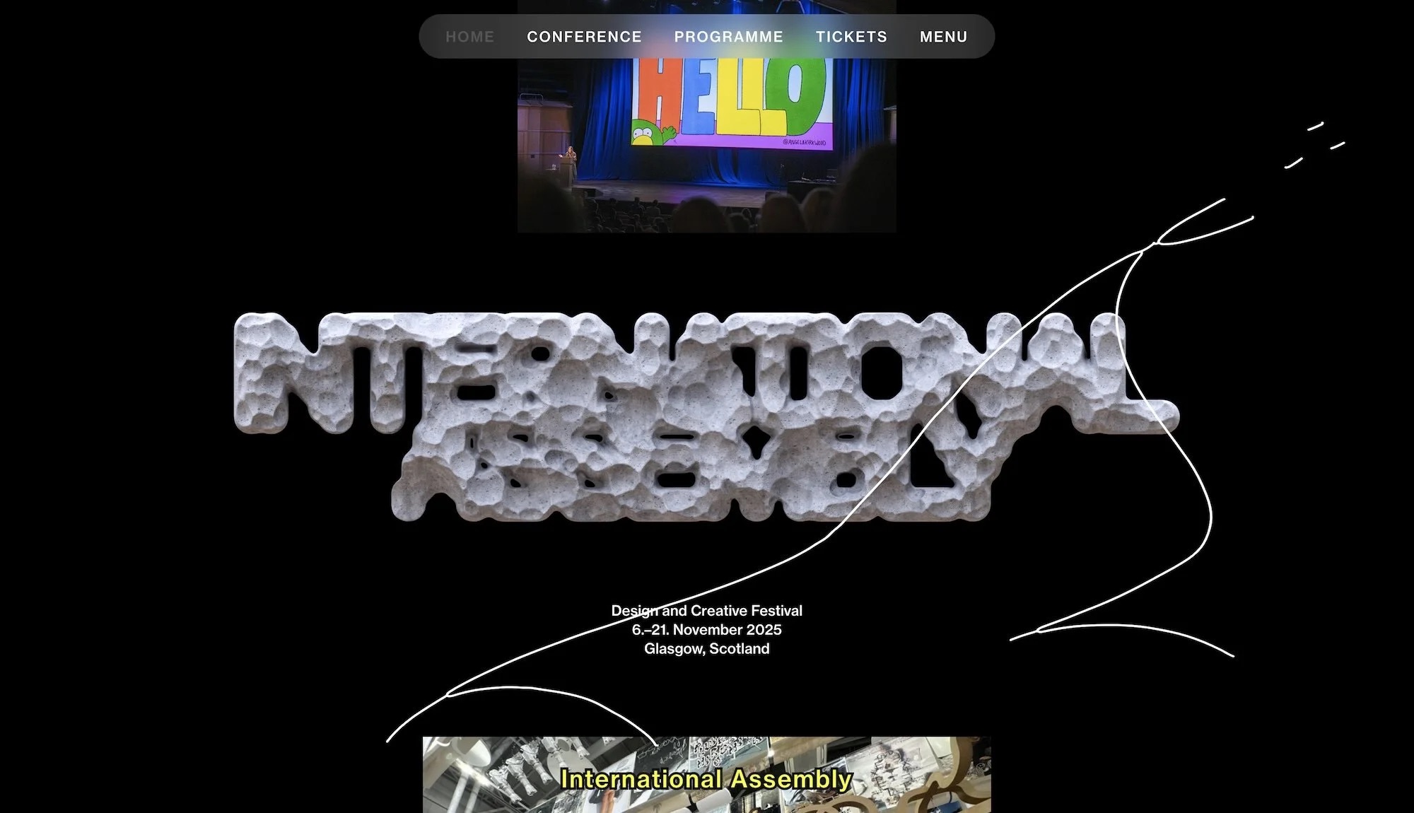
The undisputed star of the identity, however, is the typography. At its heart is a series of stone-like, hulking letterforms which at first glance feel almost sculptural, slipping between abstraction and legibility.
This lettering was created by ‘sculpting’ in VR, ultimately resulting in the wild textures, and seemingly unpredictable contrasts between shadow and light of the stone-like headline type. It’s all deliciously dimensional, feeling as much like a geological or stonemasonic feat as a digital one.
To counterbalance the density of these stone forms, each headline is paired with crisp,subtitlesâ set in Neue Haas Grotesk, providing a more deadpan layer of clarity beneath an intentionally opaque one.
This oscillation between the decipherable and the indecipherable functions as a commentary on contemporary design culture, according to NAM, where questions of usefulness and communication sit in tension with experimentation and expression.
As a secondary typeface the designers opted to use FK Raster by Czech Republic-based foundry Florian Karsten Typefaces. Its use introduces a distinctly digital, contemporary, and restless note to the suite of typefaces, serving to enrich the visual rhythm of the whole thing.
As well as the parade idea, cinema’s influence plays a big role in the look and feel for INTL 2025. Black is used as a unifying framing device; while on the website, the cinema concept is made kinetic through the use of continuous vertical streams of content rather than traditional grid formats.
As you might expect with an identity shaped not just by a collaboration between two studios with a lot of shared history (and clearly, mutual soft spots for one another) but by the underpinning concept of the carnivalesque, this identity is a hell of a lot of fun.
Together, Warriors and NAM have forged a design system that’s never rigid and never, ever, boring: it feels totally alive, whether literally in motion online or static in printed form.
The result is a maximal, expressive, highly textured identity that acknowledges the festival’s history of restless reinvention while offering something distinctly new: a nice succinct example of design that’s both resolutely functional, while managing to prod at the edges of just how experimental ‘functional’ can get.
