Blueberry by Studio NARI
Opinion by Emily Gosling Posted 4 December 2025
“Mind. Blown”, as someone in Gen Alpha might have said a long time ago, maybe while performing some flossing at a velocity so rapid as to be barely perceptible to the naked Millennial eye. But they probably wouldn’t say that any more, such is the rapacious speed at which all things ‘young person’ change.
Gen Alpha inhabits a world so wholly unfamiliar to me that it took me a ridiculously long time to figure out what Blueberry – this brand so squarely aimed at it – actually is. On the surface, it looks like 2025’s take on Bratz Dolls selling the sort of clothes I remember from places like Tammy Girl, because I am impossibly ancient.
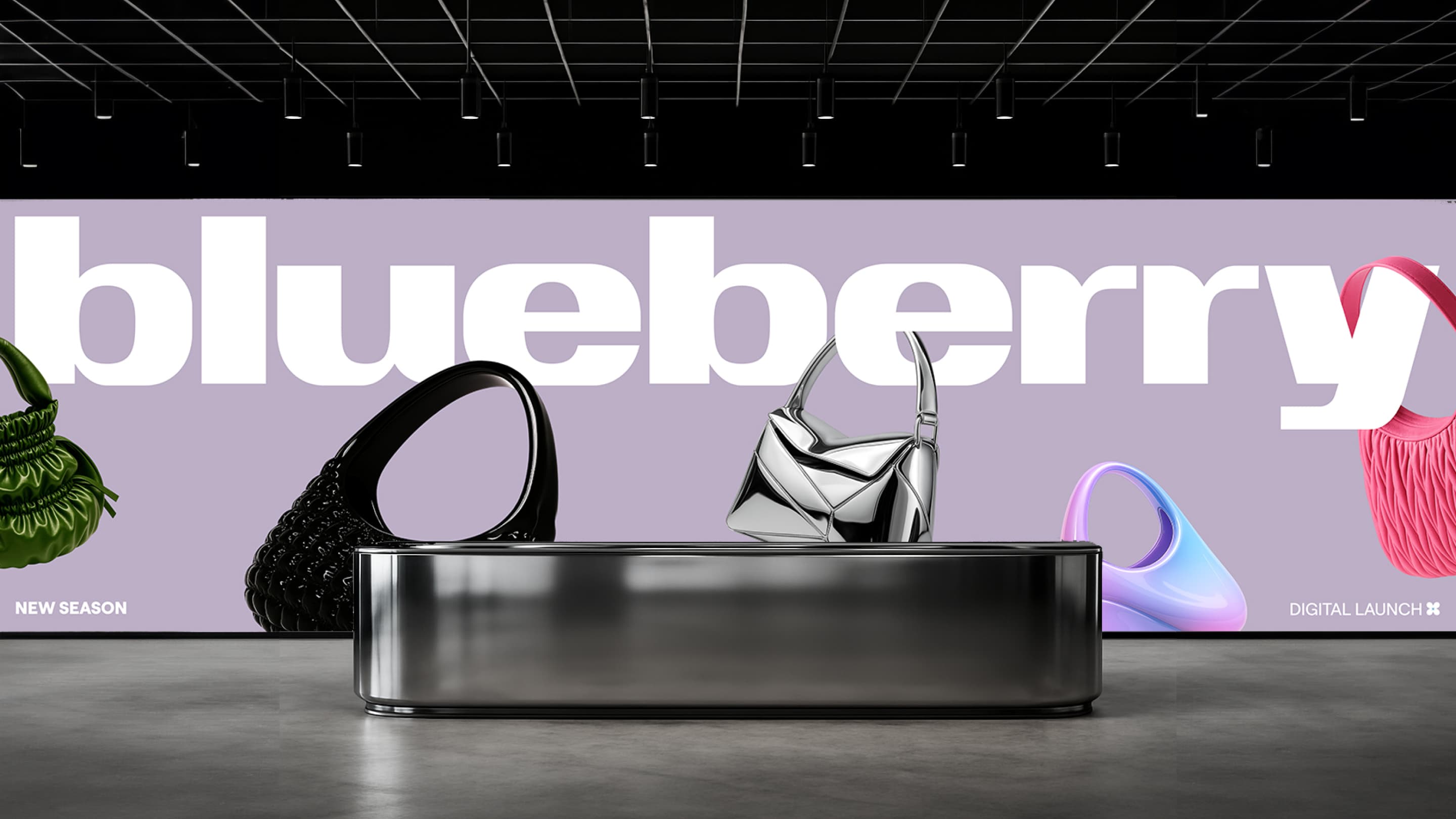
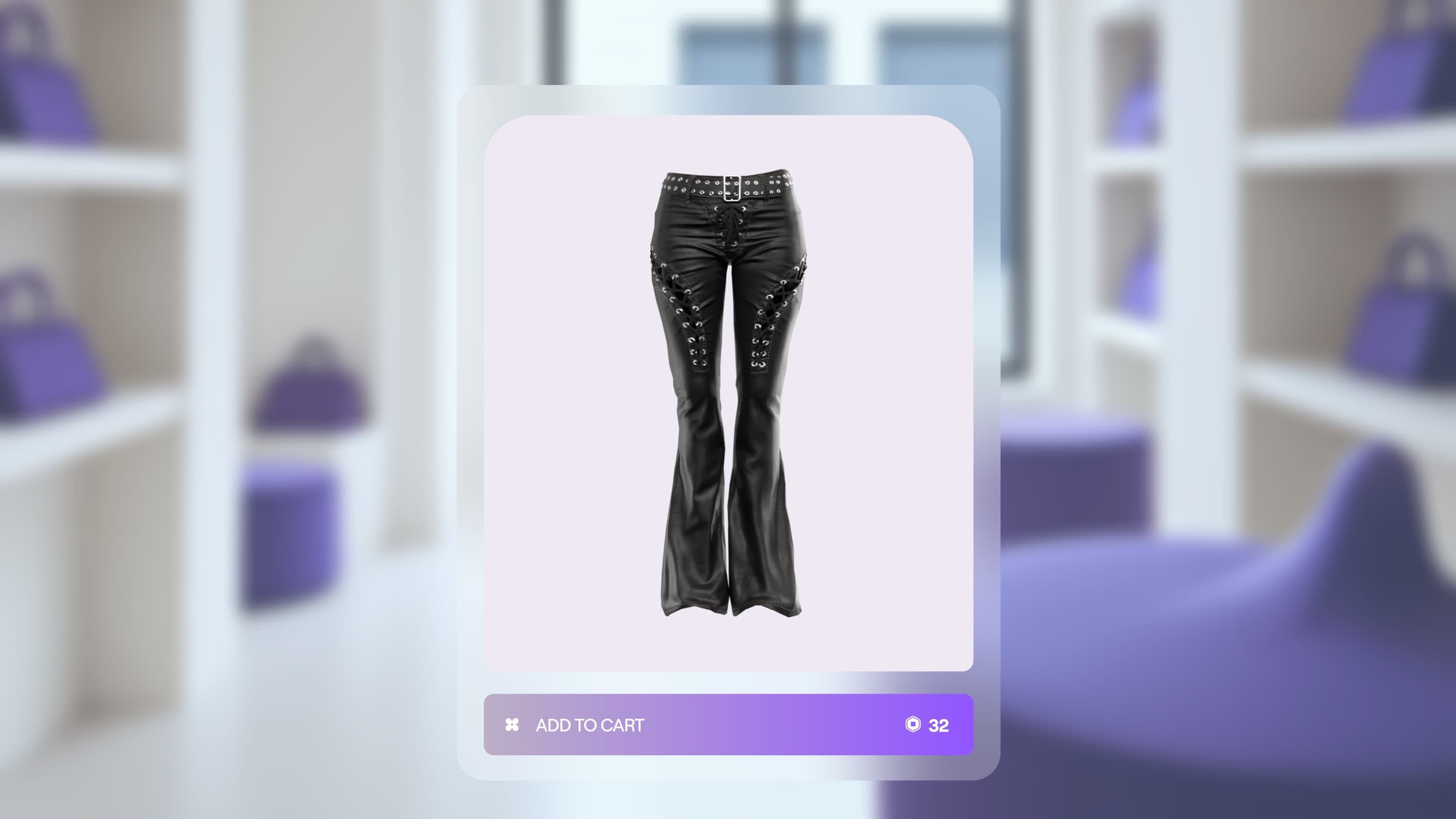
But these are not clothes as we/I know them – fabric, to be worn – these are clothes made entirely of pixels, with no physical counterpart, and no intention to be realised as such. This is a bold new frontier that’s fascinating and baffling and very much not for the likes of me, or, I’d wager, anyone over around 11 years old.
Blueberry – or House of Blueberry, for long – is apparently “the world’s leading digital fashion house”. It recently got a hefty write-up on Forbes, thanks to the recent appointment of new Blueberry CEO Amy Madison Luo, so it must be serious: indeed, the business platform claims that the global digital fashion market is expected to grow from $2.91 billion in 2025 to over $147.5 billion in the next decade, “an extraordinary rate that signals just how explosive this category could become,” it surmises.
With Luo came the introduction of Blueberry’s new platform on Roblox, Design UGC!, which invites its community to design alongside the brand (still with me?). There’s no doubt that if Blueberry has ever had its sights firmly fixed on going places – digital or otherwise, or both – it’s now.
I have no idea how difficult or otherwise it might be to design for such a brand, but either way, it was London-based design and branding agency Studio NARI that took on the challenge, working across Blueberry’s new brand strategy, visual identity, art direction, tone of voice and web design (in collaboration with Sb8 Studio), as well as creating its new avatar personas.
A new identity was in order for the brand as part of its bid to “move fluidly across gaming, socials, real life and beyond,” according to NARI, which dubs Blueberry “a true gamechanger with a boundless vision”.
The problem with the former identity, NARI says, was that it sat in a strange space between overly techy, gaming-type cues and rather too infantile aesthetics, which hindered its ability to become a truly category leading brand or express its pioneering potential and ambition.
“Gen A and Z are embracing digital fashion as a tool for self-expression,” NARI continues. “The market is set to explode, but no brand had claimed the space.” As such, the new identity was “built to create a space for limitless expression across worlds, for the main characters of tomorrow.”
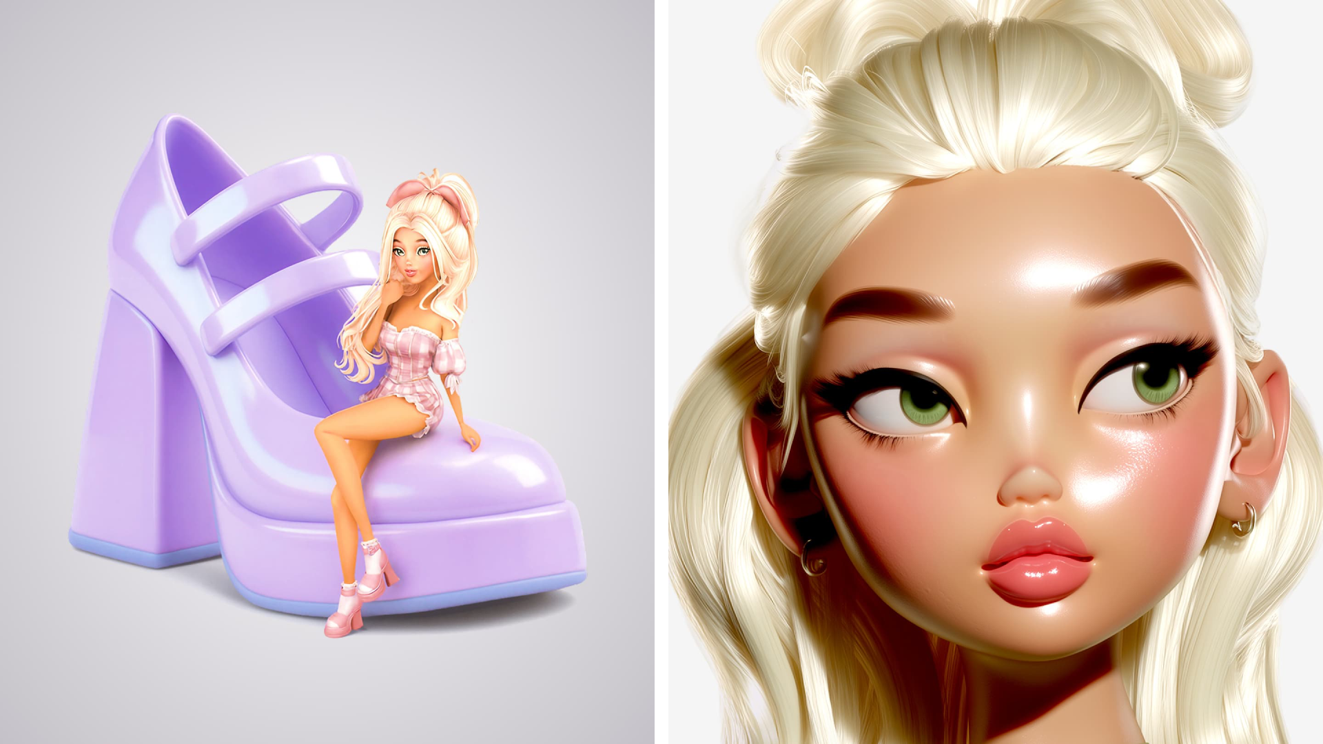
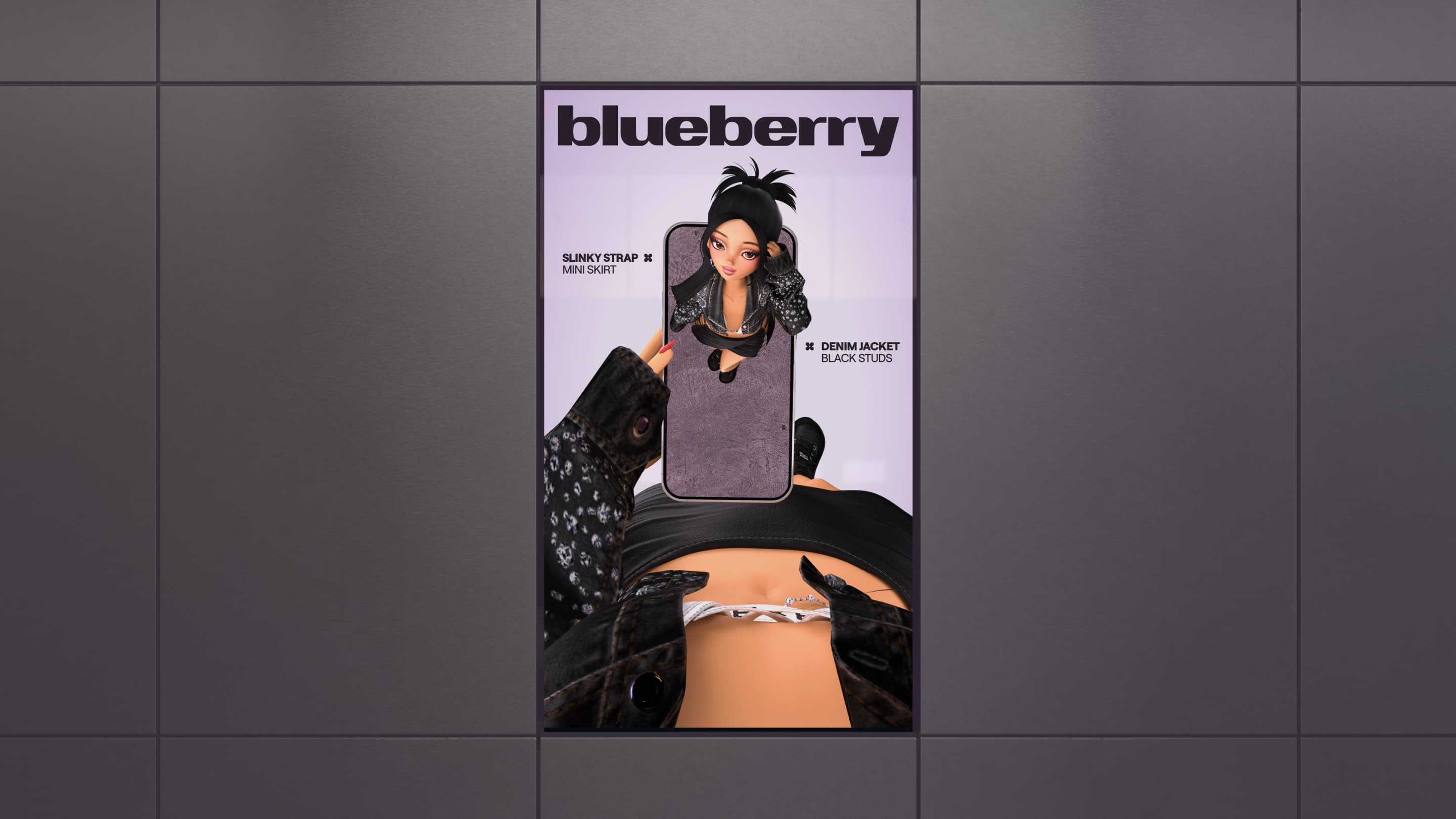
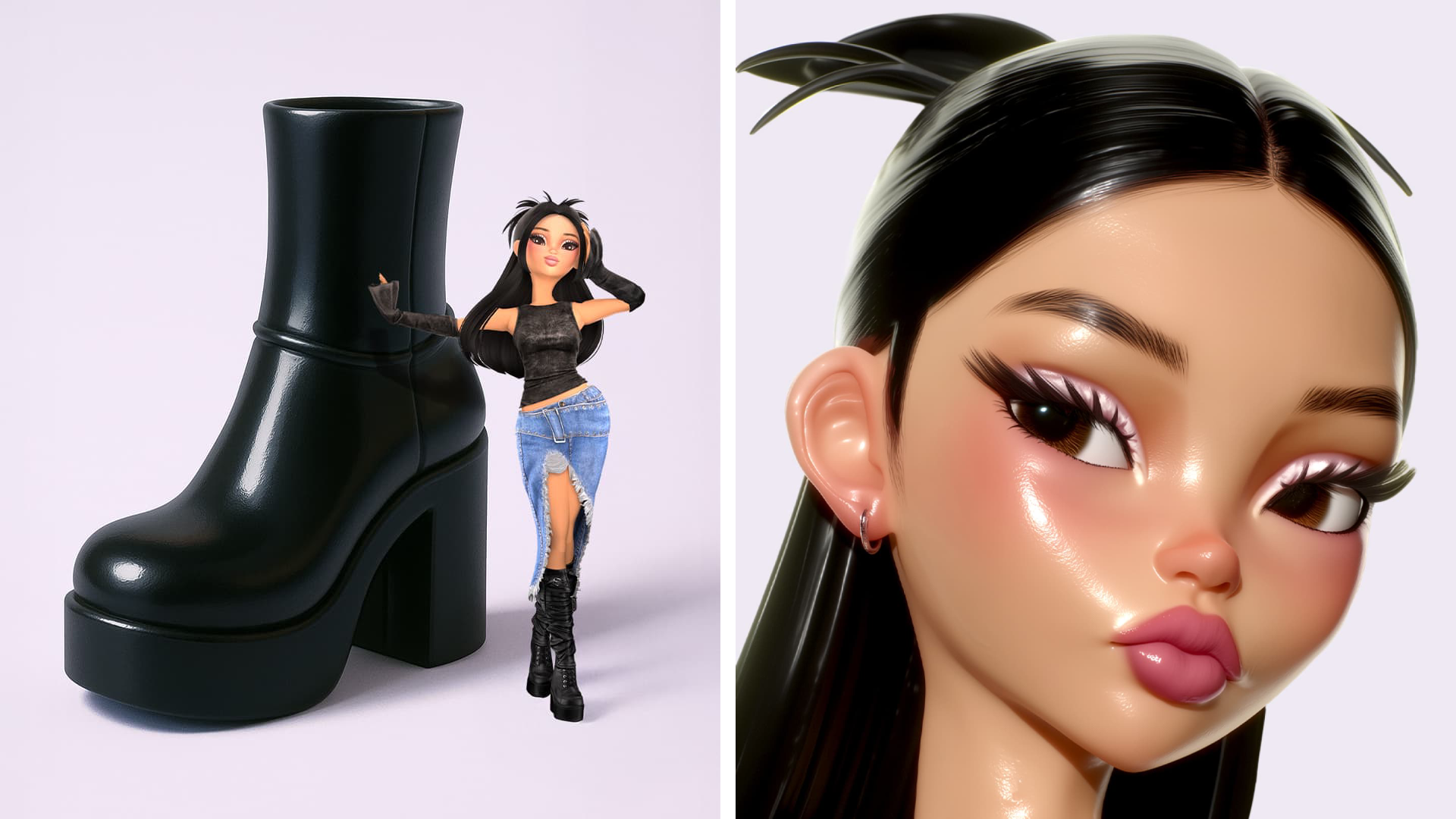
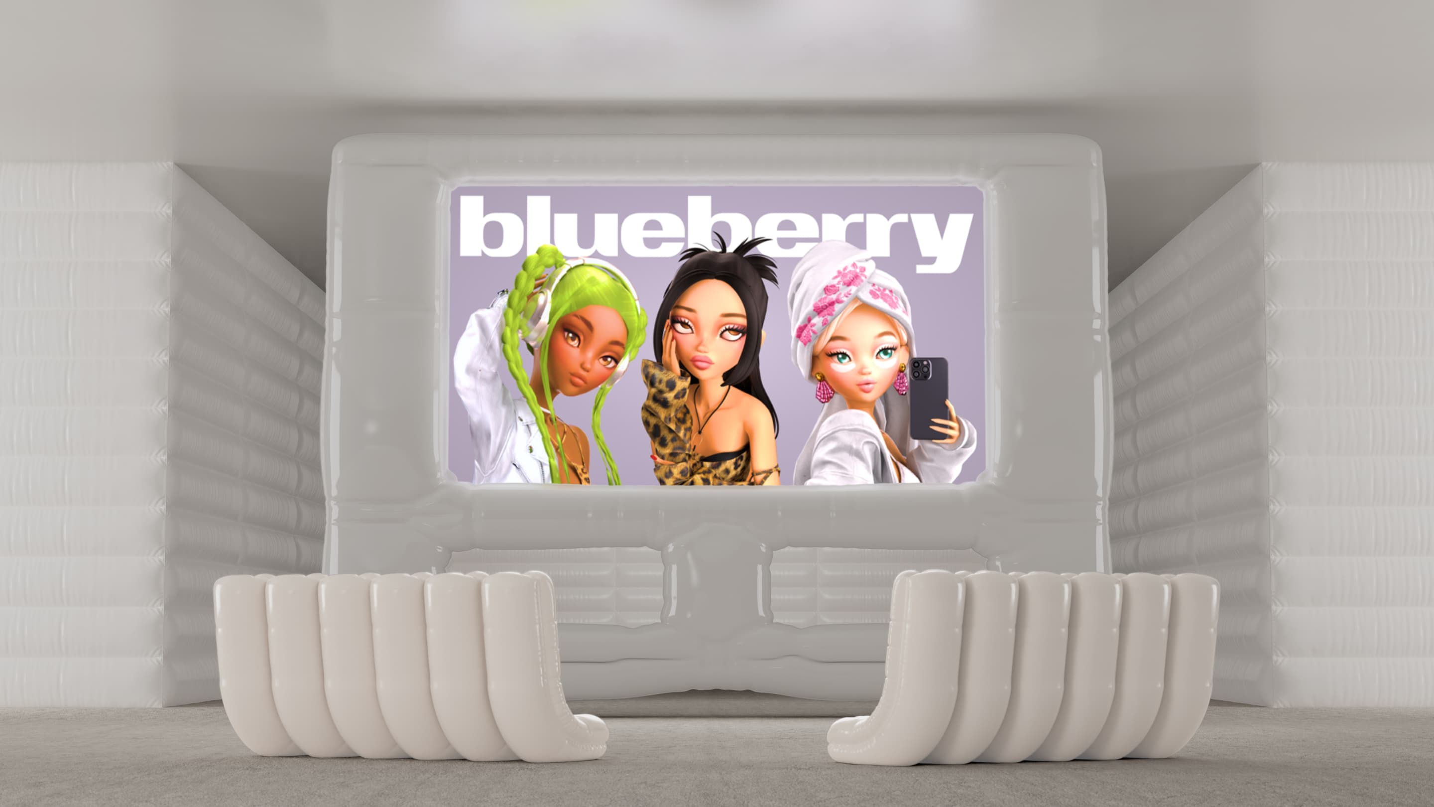
And the main characters of tomorrow need some characters of their own: here, in the form of those aforementioned Bratz-esque avatars, all huge hair and massive eyes and ickle wickle little bodies and nice shiny boots, short skirts, and baggy trousers slung low enough to show the straps of their underwear peeping out alongside neat little avatar belly buttons (plus ça change!)
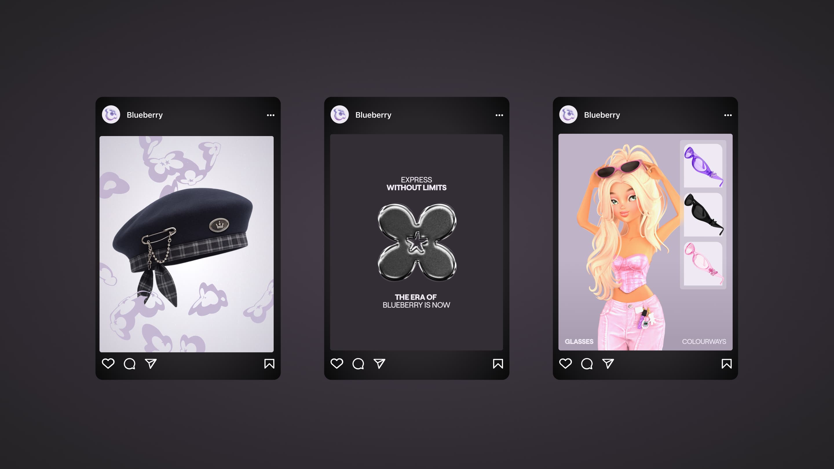
As may well be wise for a fashion brand that exists currently almost entirely in Roblox, from what I can surmise, the rest of the graphic elements are pretty pared back: all is decked in a few shades of purple (sort of like a Blueberry, I suppose), led by the “electric, juicy” ownable brand tone dubbed Vivid Blueberry, as well as supporting greys and other neutrals.
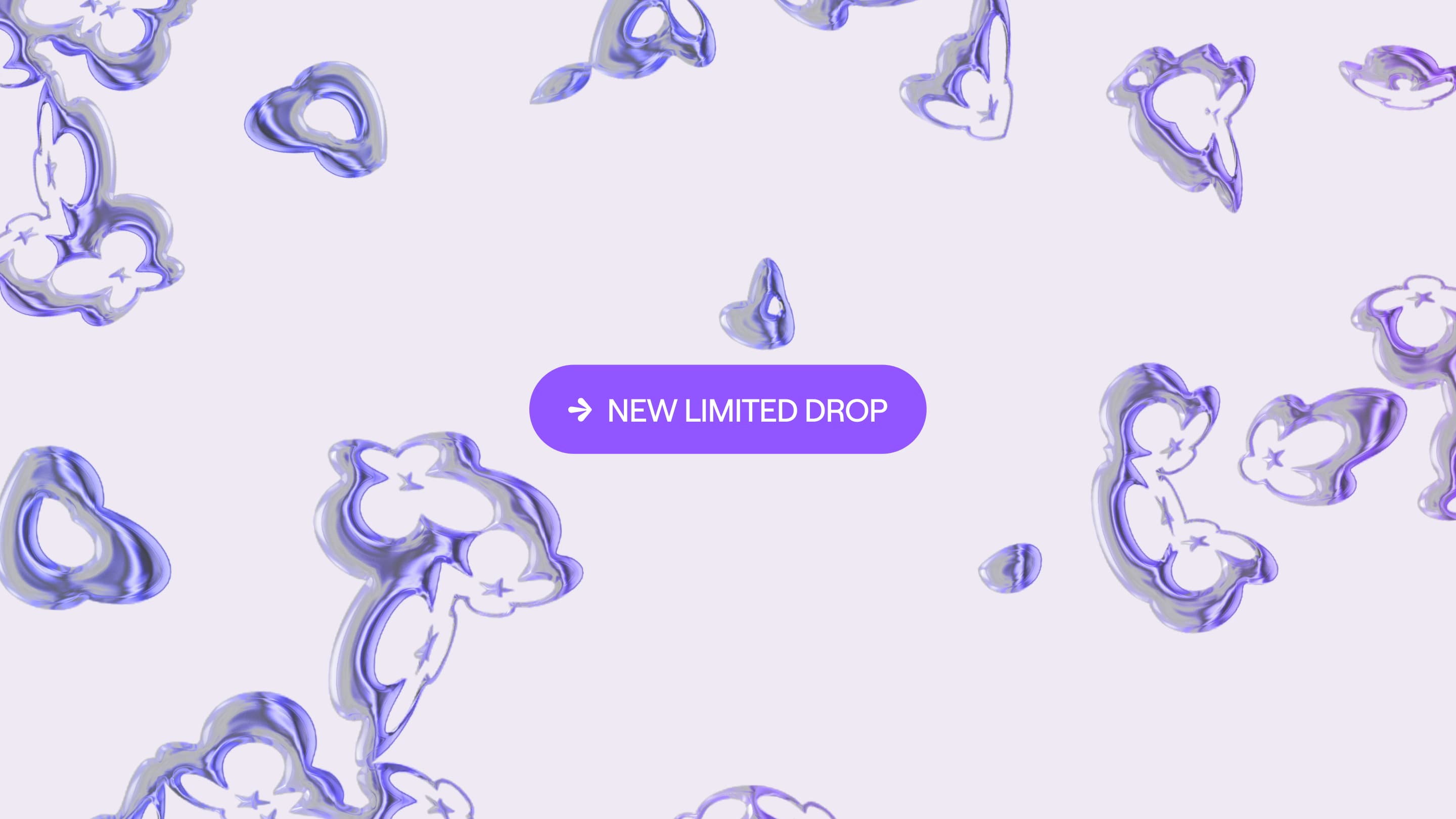
The wordmark, meanwhile, is a simple all-lower-case confection that animates nicely along with the brand mark. The mark I’m not sure about, but again, this is very much not a brand meant to please me.
To me, the mark and other graphic elements like the arrow device as shown above are very much giving the sort of gloopy future-as-imagined-in-the-past vibe of the Floorfillers Club Classics compilation CDs of yesteryear [those sweet, simple times… gazes wistfully, confusedly into the middle distance].
The typography elsewhere across the identity is kept very straightforward, using just two different weights of Roobert from Prague-based foundry Displaay. The monolinear, geometric sans-serif typeface makes for a good choice here thanks to its clarity – all “clean, horizontal and vertical terminals, and smooth connections on the stems,” as Displaay puts it.
And the font’s origins are fittingly centred on bridging various spaces – analogue and digital, for instance: it was originally created as a custom typeface for the 2017 edition of synthesiser mecca Moogfest.
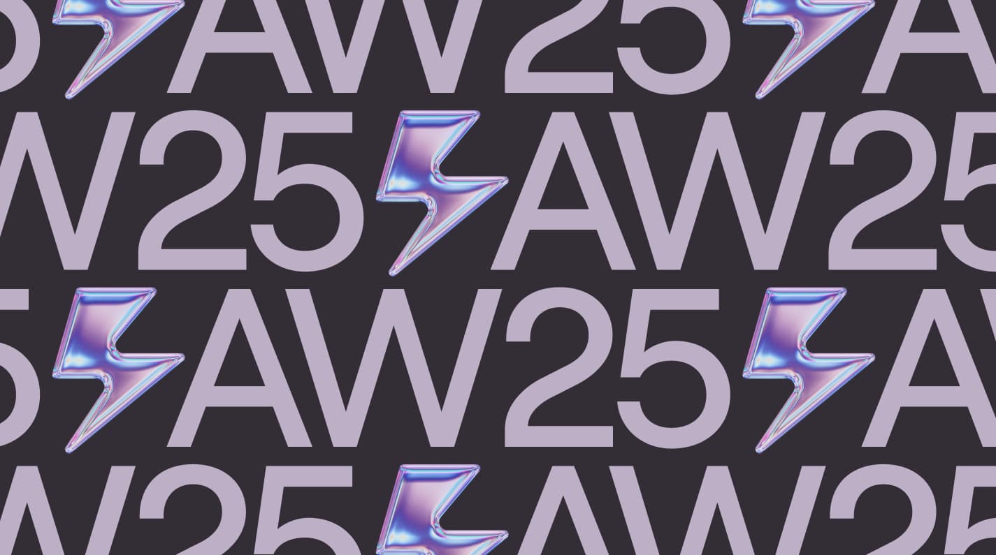
It’s a nice typographic nod to the overarching aim NARI had with Blueberry’s identity, looking to communicate it as a brand “built to evolve, pushing the boundaries of play and fluidity, with art direction that “blurs the line between IRL and URL” and in which “real environments merge with in-game ones, [and] avatars stand shoulder to shoulder with humans”.
The entire brand design concept is based around the strategic framework ‘Dare to Be’, created by NARI as a “call to action and creative north star that captured the brand’s belief in limitless expression and its drive to lead,” according to the studio.

‘Dare to Be’ acts as the foundational premise for the brand world, and enables it the flexibility to scale, grow and speak to audiences that change – and demand change – as quickly as the digital landscapes they inhabit.
And no, if you’re of legal age to buy a scratchcard you probably don’t understand said audiences or landscapes either – but Studio NARI is a reliably skilled pair of hands, and a deft, smart pair at that – so the Blueberry identity’s mixture of simplicity, clarity and personality-packed avatars at the fore is no doubt exactly what’s required for this strange, bold new world of jackets woven from pixels and Discord chats.
