4P’s by Base Saigon
Opinion by Emily Gosling Posted 18 December 2025
What with it being the season to be jolly and all that, it feels almost contrarian to not be as positive as I usually am in covering projects for BP&O – after all, it’s about showcasing the very best in brand design and packaging. But in the spirit of the ‘O’ for ‘Opinion’, it’s tricky to be as nigh-on-unanimously gushing as I’d ordinarily be.
The subject of this low-level bah-humbugging is the new branding for 4P’s by Base Design’s Saigon office. Formerly known as Pizza 4P’s, the chain of restaurants began life as a small eatery in Ho Chi Minh City thanks to its founders, a “visionary” Japanese couple according to BaseSGN, who “set out to make people smile through food”.
Since then, the chain “quickly became a phenomenon, loved for its craft, warmth, and optimism,” BaseSG continues, and as such, it has expanded to more than 50 locations across Vietnam, Cambodia, Japan, Indonesia, and India.
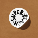
“Over time, 4P’s grew beyond pizza,” says Base (12, Murray’s Cheese, Urban Climb). “Behind every restaurant was a bigger vision: to create ‘platforms for peace’ that connect people through food, farming, education, and sustainability.” Indeed, that’s where the name comes from – 4P’s reads as ‘For Peace’, despite the fact that in terms of both spelling and grammatical accuracy, things are rather amiss.
![]()
Which brings me on to the first of my two big bugbears here: the name – its inconsistencies and the confusion it creates. As I read it – admittedly with no proper knowledge of either the brand nor the pizza restaurant market across the regions it serves – 4P’s sounds clinical, or like something you’d learn about in a seminar about marketing or sales, or a way of remembering how to check if someone’s had a stroke or something.
It begs the question: what are the four Ps? Yes, we get it, it sounds like ‘for peace’ said aloud, but surely there’s a playful double meaning here? It seems not – there’s pizza, yes; and peace. I’m no mathematician, but that seems to be two, and as such, two short of the foursome suggested by the brand name.
To be honest, former moniker Pizza 4P’s is no better; here’s how BaseSGN rationalises the subtle name change: “as its ambitions expanded, its original name began to feel too small,” says the agency. “Pizza 4P’s carried heritage, but it couldn’t hold everything the company had become.” The new branding needed to reflect the scope of the restaurant chain as it is now – comprising not just restaurants, but also cheese factories, organic farms, coffee roasteries, and new hospitality ventures.
The tricky thing was, BaseSGN continues, doing all that “without losing its soul… The challenge wasn’t how to scale, but how to stay true.” Credit where it’s due: the name certainly won’t alienate loyal customers, and is very recognisably the same entity – just like when Dunkin’ dropped its Donuts.
![]()
Working closely with the founders of 4P’s, BaseSGN worked to distill the essence of the brand into a single, unifying idea dubbed ‘Platforms for Peace’. “From there, Pizza 4P’s became one expression of a broader master brand: simply ‘4P’s’. This reframing elevated the company from a restaurant chain to a philosophy of doing business with intention and humanity,” the agency explains.
It feels like a bold claim: yes, eschewing the ‘pizza’ enables the brand to become a hell of a lot more expansive, but does it make sense? Absolutely not, as far as I see it. Nor is it consistent: the visual design elements are pretty charming, but sometimes – such as in the wordmark/logo lockup, there’s no apostrophe; elsewhere there is. It probably doesn’t really matter, but it’s irritating me a lot (more than it likely should do tbh).
All that is not to say it isn’t a strong piece of brand design, because in context, it probably is – and Base’s work is undoubtedly an improvement on the previous rather limp, phoned-in wordmark (have a ganders at it here) but it’s hard to get past what I personally see as two glaring snafus.
The second of these is the introduction of a brand mascot – albeit a cute one, but one who seems as confused as I am about who he is and why exactly he’s here. I’d initially thought he might be a dough ball, but apparently he’s a big blob of burrata (a mozzarella-like cheese) named, inexplicably, BUU.
I like the guy, I really do – and Base brought in the big guns to help create him, collaborating with former Pixar animator Andrew Gordon, no less. He also chimes with recent brand design shifts: there’s certainly been a welcome surge in the use of playful characters or brand mascots of late – the superb Butter Baby, Hank’s Bagelry by Studio Ongarato, Gander’s Yellowbird hot sauce, to name a few.
Here, though, little BUU seems out of place; at odds with the lofty world-changing, love-spreading ambitions of the brand strategy. Yes, the idea is that food brings joy and all that, but it seemed to be grasping for a more serious tone, a brand world that doesn’t feel like the most hospitable for daft, grinning little BUU.
Whinging over now – finally we’re moving on to what’s great about the identity, and there’s a lot of great stuff, honestly. The typographic choices are superb: I especially love the serif font BaseSGN has chosen, a beautifully personality-packed but classic looking font which seems to be Zen Old Mincho, a Japanese Google font designed by Yoshimichi Ohira which flexes beautifully into Roman lettering.
I absolutely love the look of the serif on applications like t-shirt designs – it’s a striking but super clean aesthetic on social and digital too, and feels just the right level of trendy and contemporary without ever trying too hard or shooting too desperately for cool points.
Its sans serif counterpart is just as lovely: another designed by Ohira and distributed on Google fonts, Zen Kaku Gothic New, a charming contemporary Japanese grotesque that’s simple, legible and stylish across any and every size and application.
The colour choices are also really smart, and set 4P’s apart from the usual slew of Italian flag hued pizza restaurants. Blue and white used to be seen as the preserve of more ‘serious’ or technical sorts of sectors – computing and finance and the like – but it’s reclaimed here in a way that feels fresh, hip and modern.
I feel bad being so down on the name, and my grumbles may well all be down to my aforementioned lack of understanding of the nature of running a pan-Asian pizza business-cum-’platform for peace’. And perhaps it’s pedantic, but as arguably the primary signifier of a brand or company, a name feels like a pretty hefty, important one to get right. Would making such a sweeping change for an already beloved and expanding entity be possible though? Perhaps not, but surely there’s something out there that makes more sense than 4P’s, sometimes with apostrophe, sometimes bereft of one.
Overall though, it certainly looks lovely as a piece of visual identity design: Base knows what it’s doing, and clearly this is a brand with bold ambitions far beyond its initial reach. Maybe it’s me who should give 4P’s a chance.