Cocolab by Wedge
Opinion by Emily Gosling Posted 6 January 2026
It’s pretty hard to get excited about dental floss. Oral care, for the most part, lives firmly in the realm of obligation rather than desire, a twice-daily chore that sits somewhere between setting your alarm and taking the bins out. It’s precisely this emotional dead zone that Cocolab (formerly Cocofloss) set out to disrupt when it was founded in California in 2015 by sisters Dr Chrystle Cu, a dentist, and Cat Cu, an artist.
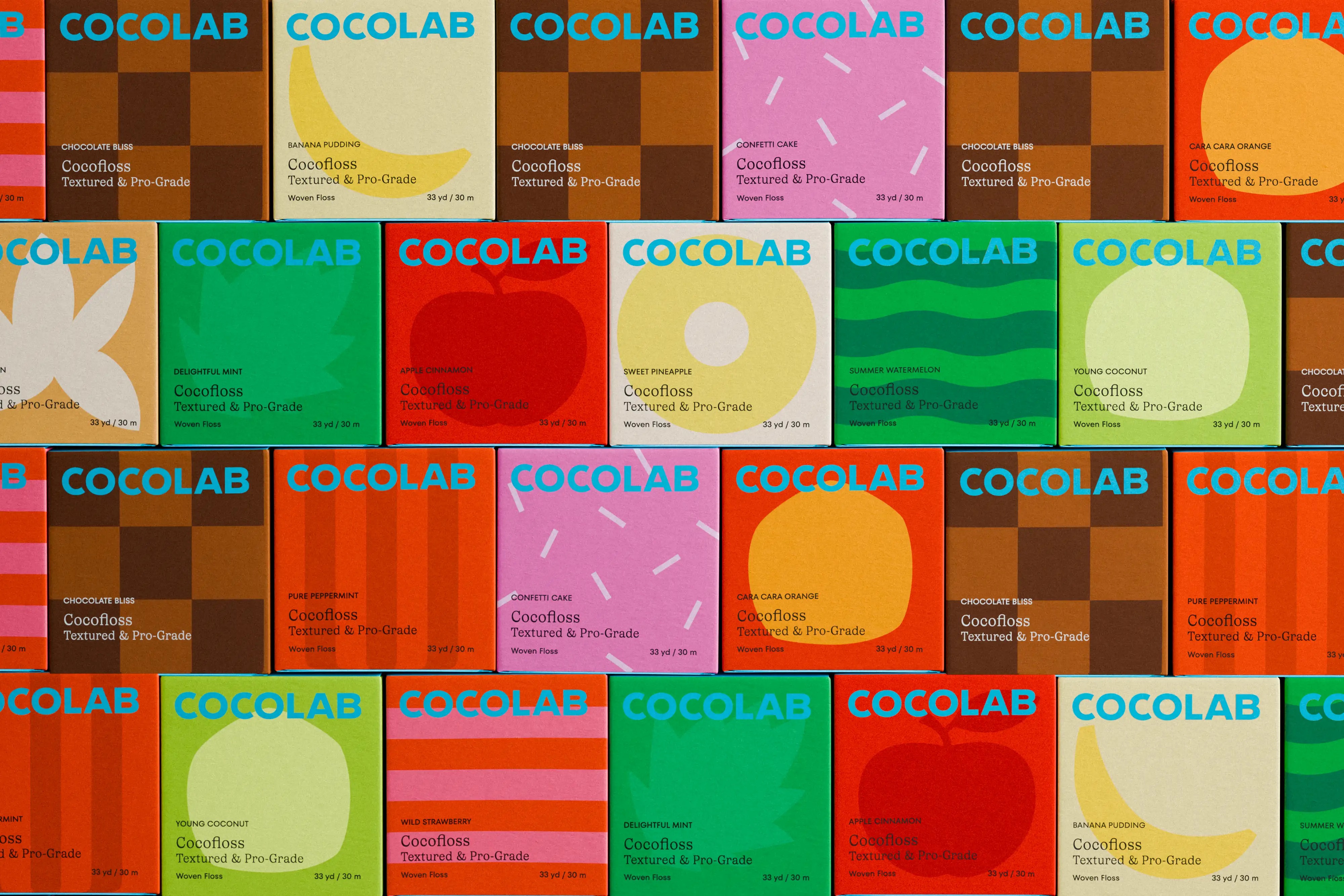
The Cu duo built the brand around the insight that nine out of ten dentists recommend making oral care more fun; and as such, Cocofloss has an unusual ‘loofah-like’ texture and was created in a variety of very un-oral-hygiene-like flavours such as confetti cake and chocolate.
It was a roaring success, earning the brand then-known as Cocofloss a cult-like following. But while the product became a hero, the founders’ ambition was always bigger. Floss was just the beginning.
![]()
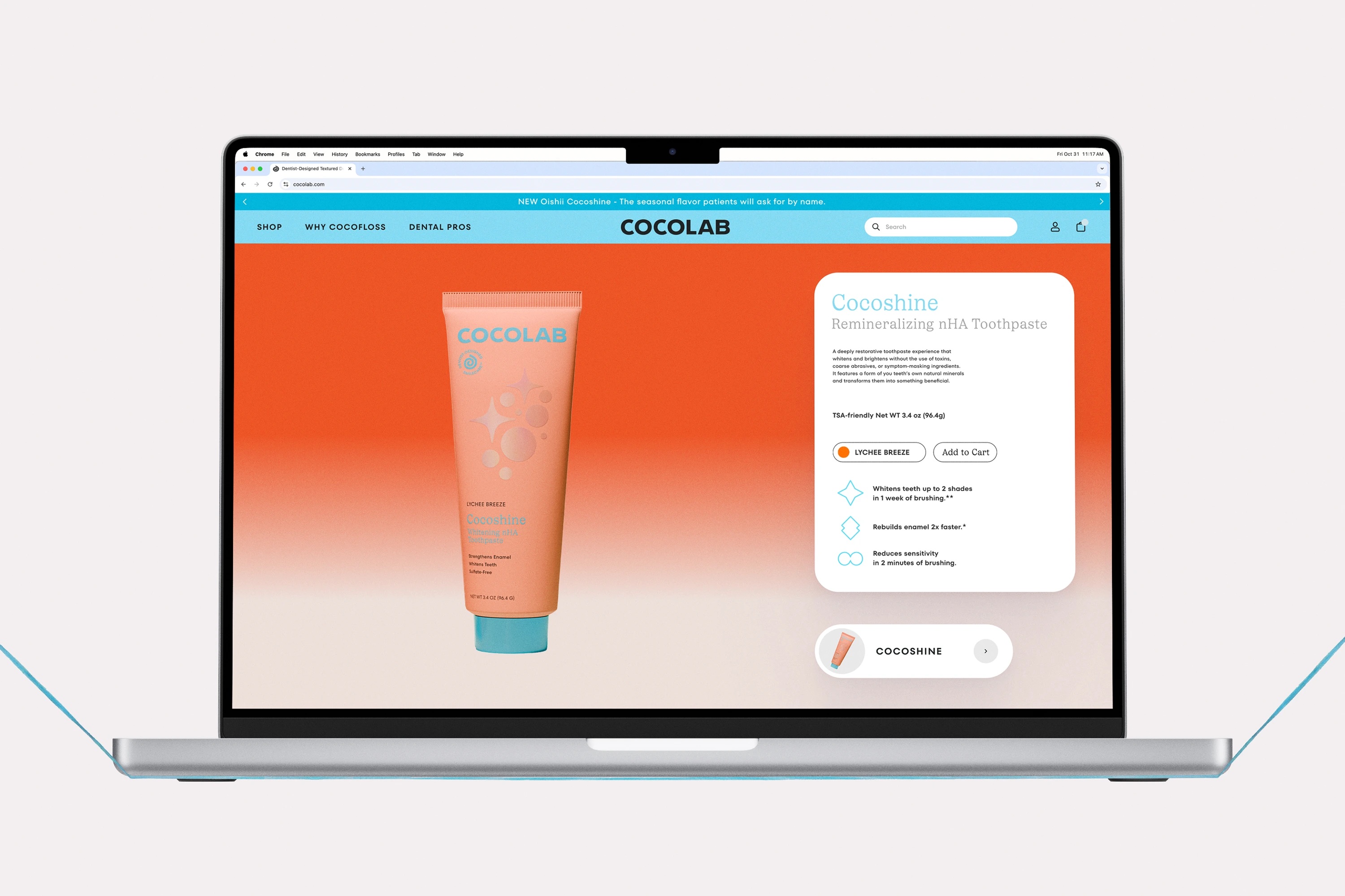
Montreal and Los Angeles-based creative agency Wedge (Matheson Food Company, Ami Ami) was brought in in 2023 to evolve Cocofloss into something more expansive; aiming to open the brand up by creating space for innovation, an expanded product range, and a credible move into beauty-led retail. The result is Cocolab, and a new brand built on the narrative “Your Daily Hit of Dental Dopamine”.
It’s a line that does a lot of heavy lifting. Oral care is reframed as beauty care; routine is interrupted by joy; pleasure is no longer a guilty add-on but the point. This idea of “reimagining an oral care world where joy crashes routine”, as Wedge puts it connects the entire identity across strategy, packaging, visual and verbal tone of voice, digital design, art direction and more.
Visually, Cocolab feels confident without being clinical, playful without tipping into gimmickry. The packaging has been rethought as a “Smile Care System”, a knowingly pared-back counterpoint to the faff and arguably unnecessary excess of ten-step beauty routines, making oral care feel both simpler and more considered.

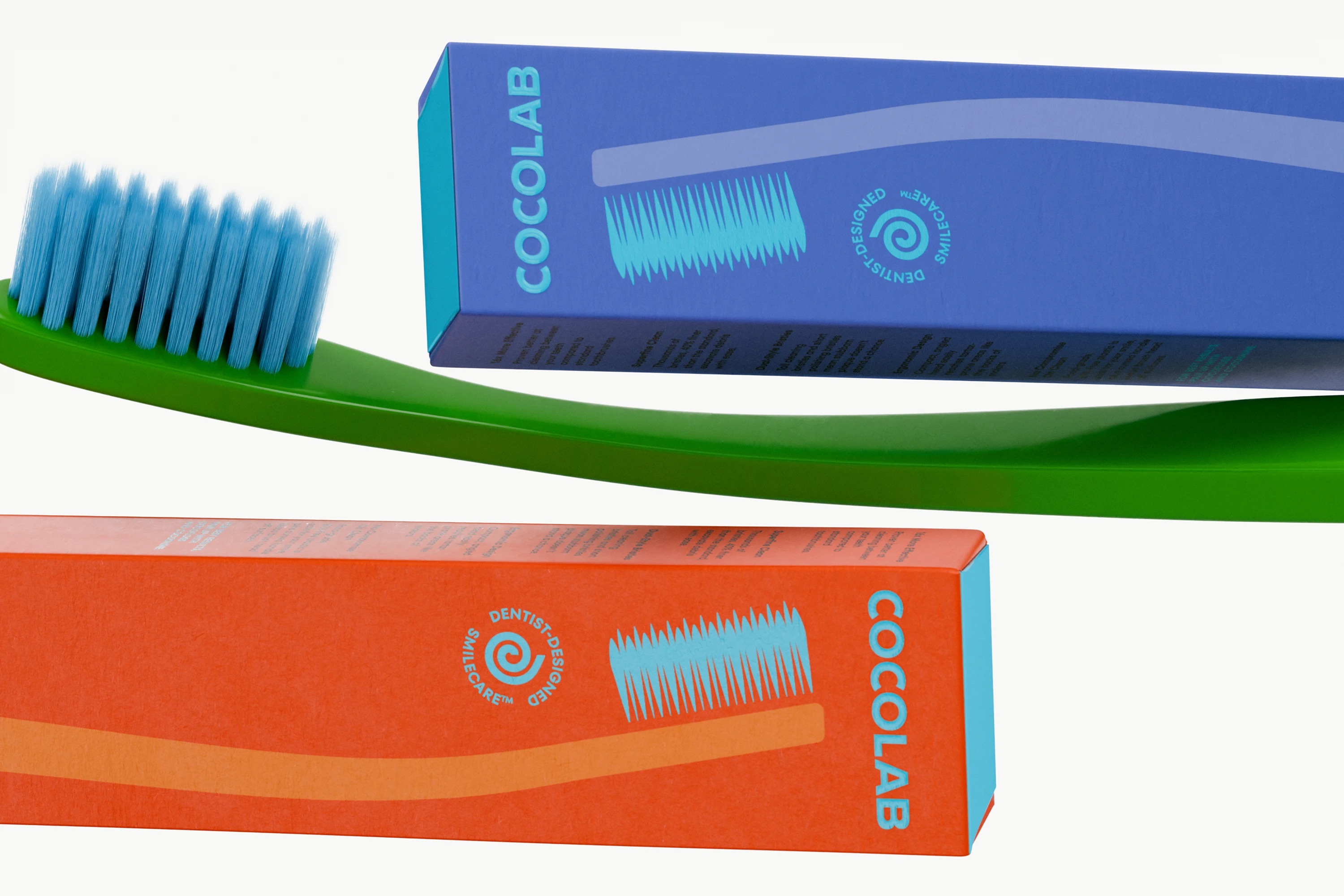
The simplicity is never boring , however, thanks to a palette that walks a careful line between exuberance and refinement. Colour is bold and unapologetic, but never chaotic. Likewise the graphic, illustrative forms are sharp and confident enough stand out in crowded retail environments while still signalling a sense quality and a brand that’s niche enough to remain true to its rather out-there origins.
The type used here is considered and smart, marrying a nice, neat, legible serif with its nice, neat legible sans serif counterpart. The fonts in question here are foundry Type Type’s TT Fors, used in its demibold weight – a geometric sans serif that anchors the brand with quiet authority – paired with Lineto’s Ivory, an expressive, yet elegant serif typeface.
![]()
The identity system is flexible enough to accommodate new products without diluting recognition – a crucial consideration for a brand explicitly positioning itself as a lab, not just a zany-tasting floss.
Photography and creative direction further help to make that shift out from singular product toi future-facing range. Rather than the cold, instructional dentist waiting room style visual language typical of much oral care, Cocolab’s imagery is sensorial and expressive – more like a skincare campaign in its sense of editorial leanings.
Performance and quality remain central – just delivered with a sense of delight that feels earned rather than forced. Wedge’s work doesn’t try to convince us that dental floss is thrilling. Instead, it accepts the premise – then redesigns the emotional experience around it.